The very first Gawker design
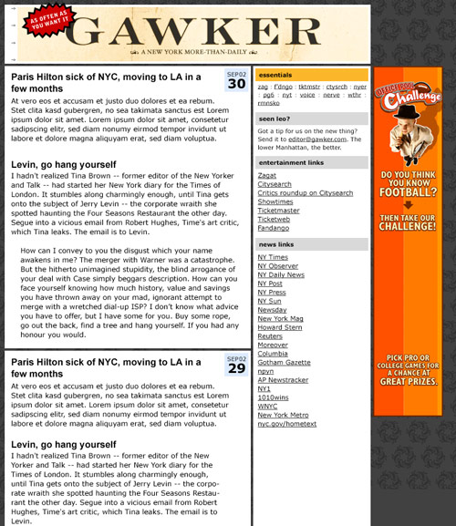
With all the buzz around the new Gawker design, I figured I’d dig out the first design I ever showed Nick for the site back in October of 2002:

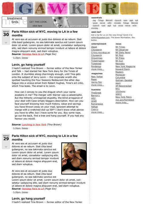
Nick didn’t like it too much. Background too dark, masthead text not logo-y enough. Two weeks later, I sent him this, with a half-assed technicolor logo that I’d dashed off in Photoshop in like 30 minutes:

To my shock, he loved it — so much so that they’re still using the damn thing! — and that design was very close to how the site looked when it launched.


Stay Connected