A Fresh Look for The Atlantic
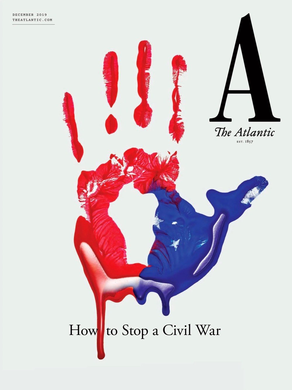
The Atlantic launched a new visual identity the other day, complete with a new logo, custom typeface, updated website, and iOS app. Here’s the first cover carrying the new look:

The effort was led by Peter Mendelsund and his senior art director Oliver Munday. You can hear the pair talk a bit about their process here:
And more from Mendelsund in this conversation with editor-in-chief Jeffrey Goldberg:
My favorite kind of design is a kind of time-released design, where you look at something and you have an immediate impression of it, and then you, upon further reflection, find something in the design that adds to or subverts that first impression.
Really nice work and methodology behind it. Hearing designers talk about how they approach their work always makes me miss practicing design on a daily basis, a former vocation of mine that seems very very far away these days.


Stay Connected