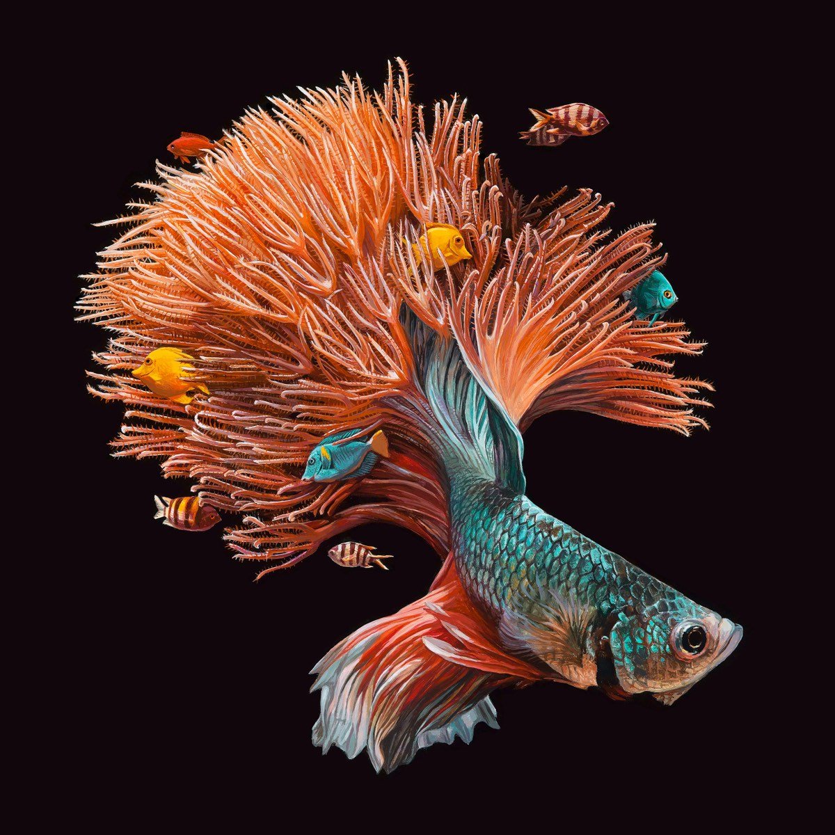
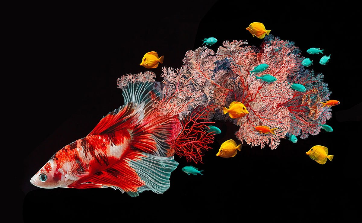
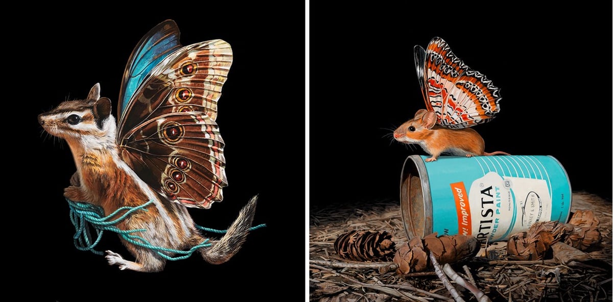
I love these colorfully imaginative drawings of animals by illustrator Lisa Ericson; fish with coral reef tails and mice with butterfly wings. Sadly her prints are sold out, but hopefully she’ll make more available soon.
BTW, Ericson’s husband is Josh Keyes, whose grafitti-themed art I featured last week. Talented household.
Artist Josh Keyes makes paintings that imagine graffiti written on objects not commonly tagged, like satellites, whales, icebergs, and the Space Shuttle. (via colossal)
If you spin these sculptures by artist John Edmark at a certain speed and light them with a strobe, they appear to animate in slowly trippy ways.
Blooms are 3-D printed sculptures designed to animate when spun under a strobe light. Unlike a 3D zoetrope, which animates a sequence of small changes to objects, a bloom animates as a single self-contained sculpture. The bloom’s animation effect is achieved by progressive rotations of the golden ratio, phi (ϕ), the same ratio that nature employs to generate the spiral patterns we see in pinecones and sunflowers. The rotational speed and strobe rate of the bloom are synchronized so that one flash occurs every time the bloom turns 137.5º (the angular version of phi).
The effect seems computer generated (but obviously isn’t) and is better than I anticipated. (via colossal)
Update: While not as visually smooth as his sculptures, Edmark’s rotation of an artichoke under strobe lighting deftly demonstrates the geometric rules followed by plants when they grow.
Here we see an artichoke spinning while being videotaped at 24 frames-per-second with a very fast shutter speed (1/4000 sec). The rotation speed is chosen to cause the artichoke to rotate 137.5º — the golden angle — each time a frame is captured, thus creating the illusion that the leaves are moving up or down the surface of the artichoke. The reason this works is that the artichoke grows by producing new leaf one at a time, with each new leaf positioned 137.5º around the center from the previous leaves. So, in a sense, this video reiterates the artichoke’s growth process.
If you point a video camera at a projection of the video camera’s output — and if the conditions are just so — you get some interesting patterns that look almost biological. It’s fascinating that video feedback strongly resembles the patterns on brain coral. There must be an underlying emergent process for filling space that links the two patterns together. The video was made by Ethan Turpin…you can see more of his work here. (via @sleeptest)
One of my favorite art experiences this year was seeing Bruce Conner’s short film Crossroads at The Whitney. (It’s part of the Dreamlands exhibition, on view until Feb 5, 2017.) The film pairs slow-motion clips of the 1946 nuclear tests at Bikini Atoll with music from composers Patrick Gleeson and Terry Riley. The result is mesmerizing…the film’s 37 minutes long and I sat through the entire thing and will likely go back once more before the show closes. Riley’s portion of the music was particularly memorable for me…I would love to have a recording of that. Neither the film or the music is available online, save for the short clip at the bottom of this page, so you’ll have to go to The Whitney or SFMOMA, where it also happens to be showing.
Update: It’s not an exact match, but this 51-minute song from Riley called Descending Moonshine Dervishes is quite close to the music he did for Crossroads.
Watch as dancer Lil Buck gracefully moves through an exhibit at Foundation Louis Vuitton in Paris. Icons Of Modern Art: The Shchukin Collection, which includes work from Picasso, Matisse, Gauguin, and Monet, is on view there through Feb 20, 2017. Lil Buck is on view at YouTube indefinitely.
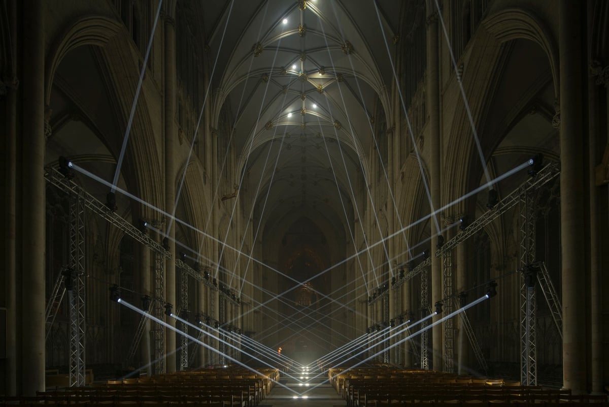
LightMasonry by Jason Bruges Studio recently paid homage to the work of the highly skilled masons and carvers using beams of choreographed light.
The beams seek out and outline the vaults of the huge space using a custom system of 48 computer-controlled lights. Designer Adam Heslop, who helped visualize the performance, said it required the studio to develop a whole range of new techniques.
This would be something to see and/or rave to in person. (thx, peter)
Ben Pieratt, who you may recall as the cofounder of Svpply (and many other diverse projects), has a new project called Dead Bookstore, wherein full-sheet pages of old books become art prints for sale. But there’s a DIY component as well…Pieratt helps you track down the original texts and has posted instructions so you can make your own prints.
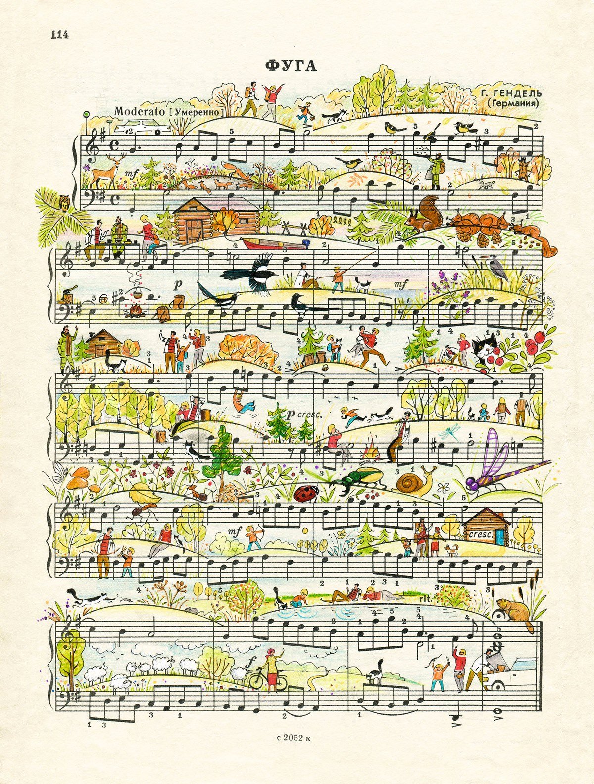
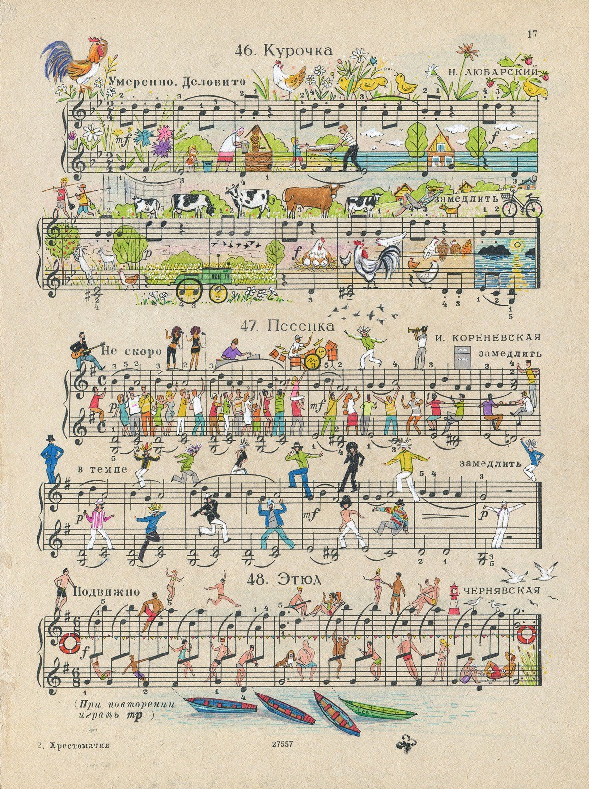
Russian illustrators Alexei Lyapunov and Lena Ehrlich use the notes, staffs, and other musical notation marks on vintage sheet music as a framework to create theseinventiveillustrations of everyday life and nature. Prints are available. (via colossal)
In 2013, art historian Bogomila Welsh-Ovcharov was asked to look at some drawings that may have been done by Vincent van Gogh. What she found was an entire sketchbook containing 65 drawings done by the artist during his time spent in Provence.
As Welsh-Ovcharov began the painstaking process of authenticating the works over the past three years, the story of the sketchbook also came to light.
It was, in fact, an old-fashioned business ledger, approximately 26 by 40 centimetres, that had been given to van Gogh in May 1888 by the owners of a café in Arles, where he was temporarily living. The high-quality blank pages were ideal for use as an artist’s sketchbook.
Two years later, after van Gogh cut off his ear following an argument with the painter Paul Gauguin and spent many months in hospitals in Arles and Saint-Rémy, a doctor he had befriended returned the book of drawings to the café owners. Then for generations, it languished, likely stored with other business ledgers.
Fortunately, there was independent proof that this was van Gogh’s work, thanks to a small notebook that had also belonged to the café, documenting daily activities. It contained an entry for May 20, 1890 noting that van Gogh’s friend, Dr. Felix Rey, had returned a large album of drawings, along with some empty olive jars and towels, to the café owners on behalf of the artist.
At an earlier stage (in 2008 and 2012), our experts gave their opinion on its authenticity — an opinion not mentioned in the publication — at the request of various owners of drawings from the album. Our researchers and curators are happy about every new work that can correctly be attributed to Van Gogh, but on the basis of high-quality photographs sent to them of 56 of the 65 drawings now published, they concluded that these could not be attributed to Vincent van Gogh. After examining a number of the original drawings in 2013 and reading the recent publication, our experts have not changed their minds.
Their evidence is that the drawings do not show van Gogh’s characteristic style, use the wrong ink, contain many topographical errors, and so on. (thx, everyone)
Artist Annette Labedzki has been uploading videos of paint mixing to Instagram and YouTube to great interest. The video above, in which the view is halved and then mirrored, starts off slow but is particularly mesmerizing…I think my brain is addicted to symmetry. Georgia O’Keeffe’s name popped into my brain early on while watching it. (via @colossal)
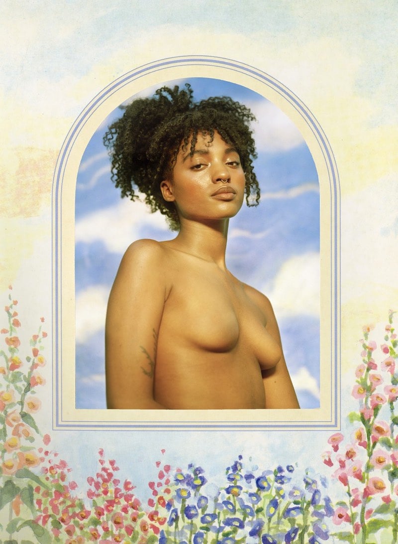
Note: if you’re browsing at work, there are photos below that are probably NSFW even though they are artistic and making a political point. The project itself suggests that the idea of NSFW is dumb, which makes me uncomfortable about calling it out like this, but you know, pragmatism…not everyone can afford to have a conversation with their boss about why viewing art during the workday is a good idea.
Posting photos of full frontal nudity on Instagram is against their terms of service.1 No nipples, no pubic hair and certainly no vaginas or penises. Butts are ok though because…I dunno, everyone has one? For a project entitled Busts, model and photographer Sasha Frolova took inspiration from Instagram removing one of her photos and took portraits of women and seamlessly erased their nipples.
The photo taken down from Instagram was the catalyst for this series. It was a black and white self-portrait I took exhausted in the bath after a panic attack at age 16. Releasing it was a coming to terms with the fact that I no longer feel so unstable. Because of that, having it removed was particularly violating. But more than anything though I was offended that all it takes is a pizza emoji over my discreetly revealed nipples to make the image appropriate. Is the implication then that a woman, simply in her own existence, and anatomy is inappropriate, vulgar?
If the goal of Instagram’s policy is to “protect” people from images of sexuality, Frolova’s project shows that they haven’t quite succeeded.2
Meanwhile, you can find porn of every kind on Twitter.↩
Also OK according to Instagram’s policies are photographs of male nipples, full frontal female nudity with nipples, public hair, and vaginas scratched out, female nipples behind see through clothing, and explicit illustrations of sex (for instance), all of which can be sexual in nature.↩
More than 40 years ago, food enthusiast and artist Salvador Dali published a cookbook called Les Diners de Gala. The book mixes Dali’s surrealist imagery and with dozens of recipes, including some that originated from the top restaurants in Paris at that time. The original book is quite rare and valuable now, but Taschen is reprinting it; it’s available for pre-order here.
This reprint features all 136 recipes over 12 chapters, specially illustrated by Dal’i, and organized by meal courses, including aphrodisiacs. The illustrations and recipes are accompanied by Dal’i’s extravagant musings on subjects such as dinner conversation: “The jaw is our best tool to grasp philosophical knowledge.”
Isabelle Mège does not call herself an artist, but she has nonetheless been working on an interesting project for the last 30 years. Mège contacts photographers she likes and asks them to incorporate her into their work, keeping a copy of each photograph afterwards. She has over 300 photographs and has curated 135 of them into what she calls “the collection”.
After each shoot, Mège would follow up and ask the artist for a print, signed and sometimes numbered by its edition. The print would go into her archive, along with any artifacts related to its making; Elkoury’s letter, for instance, is accompanied in the archive by Mège’s notes about their encounter (he was late to their first meeting, and arrived with his shoelaces untied). Also in her archive are the heels that Witkin attached to her feet during the 1990 shoot, and a news item about Japanese customs having seized incoming copies of the magazine ARTnews to prohibit their circulation; the photograph, in which Mège’s pubic hair is visible, was considered obscene. Her diarizing and collection of correspondence, clippings, image reproductions, and relevant items reveal that the planning around certain images often lasted years. Several times, having worked with an artist to make an image, she was unhappy with the results and excluded it from her collection. When approached by artists who wanted to work with her but for whose work she had no feeling, she refused.
Mège felt strongly that no money should be exchanged in these interactions. (“As soon as there’s a question of payment, it’s dead, you fall asleep,” she told me.) She also asked each artist to sign a contract printed on a three-inch slip of paper, stating that she would have the right to exhibit or publish the image for noncommercial reasons only.
Mège’s project fits neatly into contemporary selfie culture. Her collection reminds me of other creative people who have incorporated themselves into their media of behalf of someone or something else. Call them “selfie auteurs”. Adam Lisagor has starred in many of the videos his company makes for tech clients. Casey Neistat films himself going on adventures for clients like J. Crew and Nike. Noah Kalina was commissioned by VH1 to take photos of himself posing with celebrities in his Everyday stance. I’m sure there are many more examples1 but few have done it as cleanly and purely as Mège.
Maybe kottke.org should be in this list as well. This is my website — my name’s right at the top for crying out loud — and I share my opinion about things here all the time, but in a significant way, the site isn’t actually about me. It’s mainly about other people’s work and ideas. Sure, if you read long enough you learn about who I am as a person in the process, but it’s not the point.↩
Vugar Efendi has made a pair of videos showing scenes from films that have been inspired by famous paintings. The second video is especially good, showing references in There Will Be Blood, Lost In Translation, and a Jacques-Louis David reference from About Schmidt.
Leonardo da Vinci’s Mona Lisa is overrated. Why? For starters, the director of the Louvre said that 80% of the museum’s visitors are there just to see the Mona Lisa. 80%! We’re talking about one of the finest museums in the world, overflowing with some of the world’s greatest artworks, and people come to only see one thing. Overrated. The story of how that happened involves a passionate art critic and a crime.
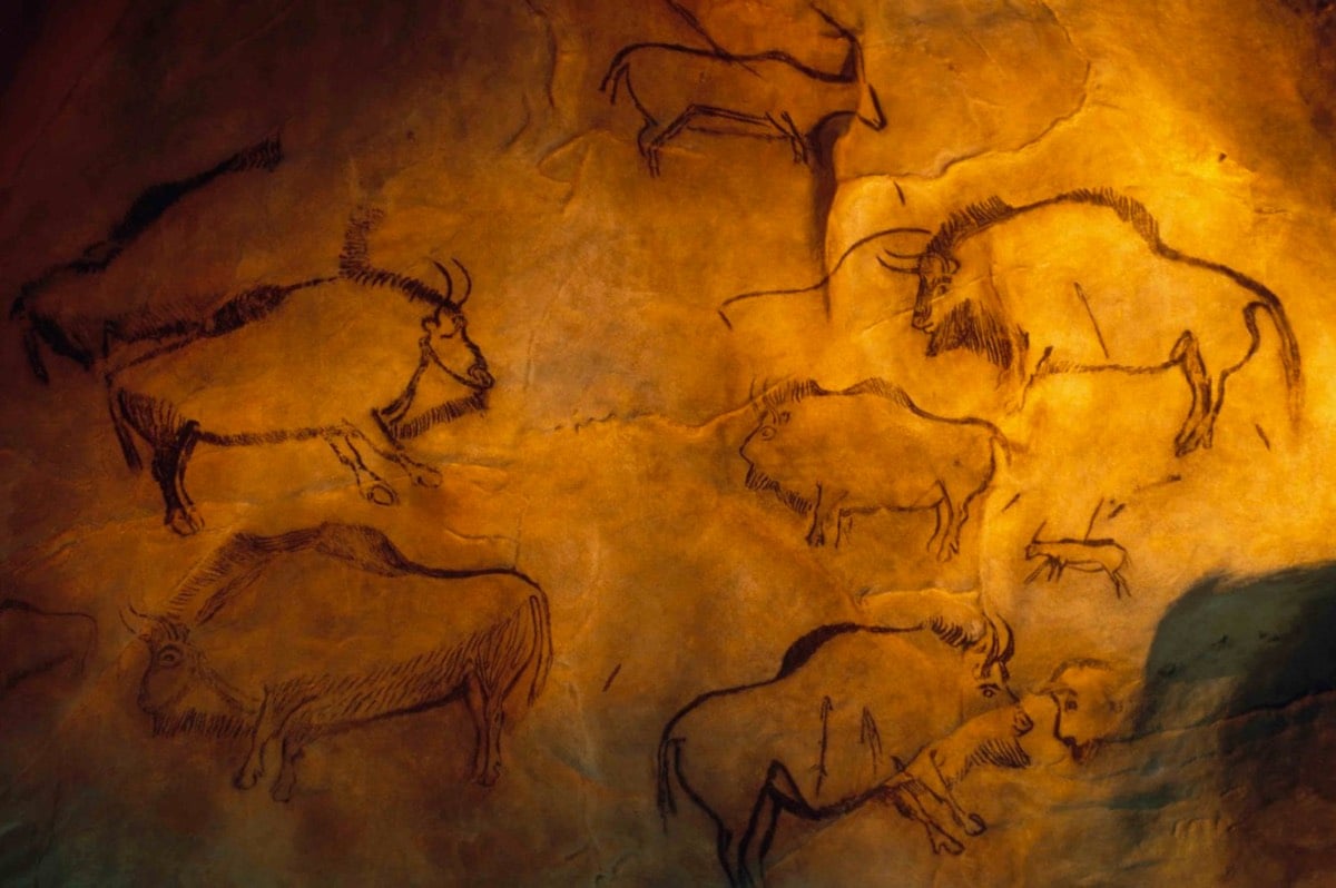
New York Magazine art critic Jerry Saltz has presumably been to most of the finest museums in the world, seen the works of the great masters, and generally spent a lifetime looking at great art. But he encountered what he calls “the most powerful artwork I have ever seen” in a French cave with drawings from about 13,000 years ago.
The idea that perspective was invented in Florence in 1414 collapsed in an instant. Here, larger mammals are in front of smaller ones who trail behind; animals at the back of packs are smaller than those in front. There’s also what’s called reverse perspective, the sort of system used in China, where closer things are rendered smaller than farther things. Elsewhere, an ibex is depicted from behind and over the shoulder — an incredibly sophisticated perspective. One horse is seen from a highly accomplished three-quarters view. Imagery seemed adjusted for curvatures and protrusions of the walls in the same ways that Renaissance frescoes adjust for distortions, distance, and odd viewing angles. I saw a bison with one horn curving up, the other curving down — either from battle or birth. Whatever the cause, this was something that had been seen and intentionally rendered.
Just penciled this in for my next trip to France, whenever that is.
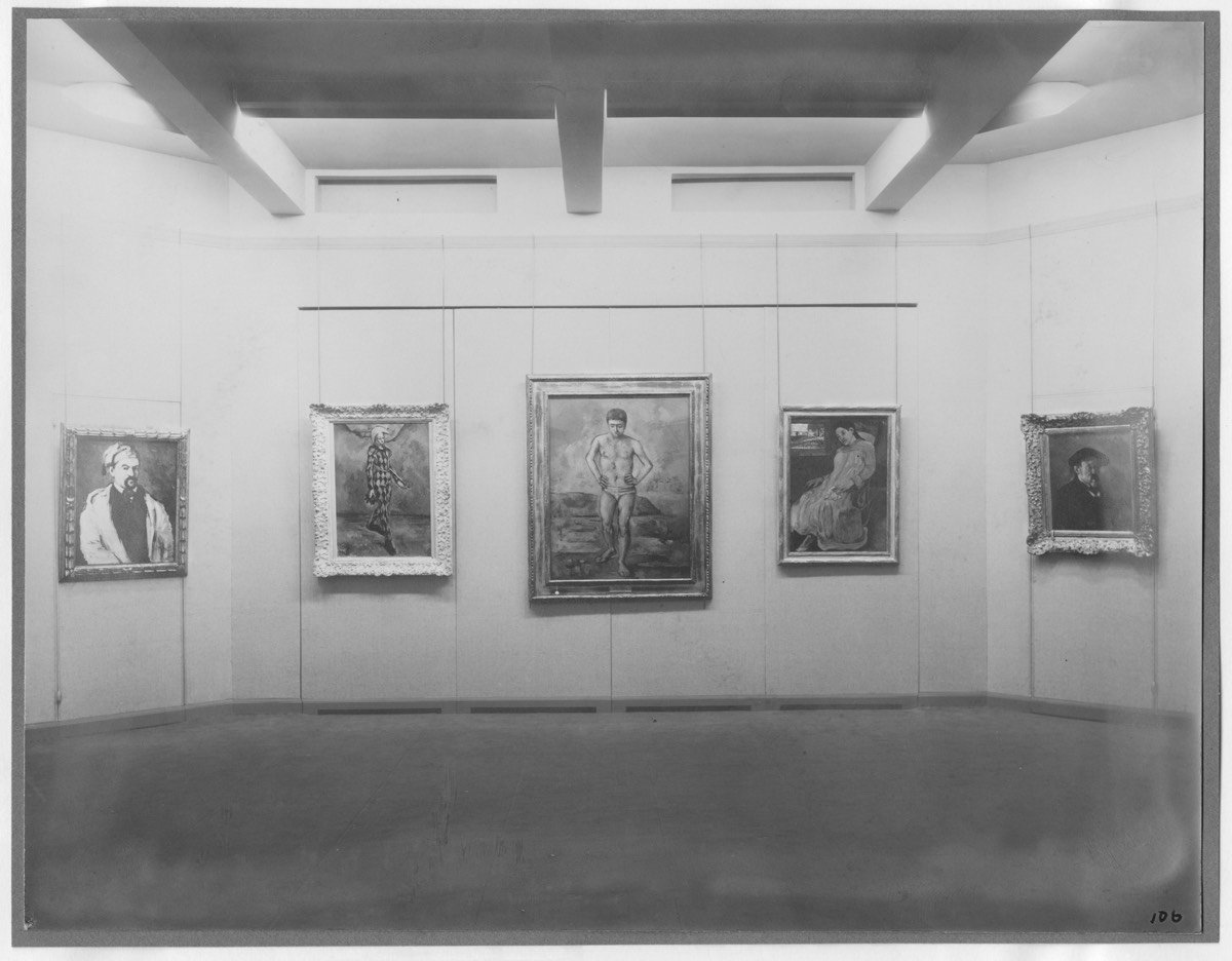
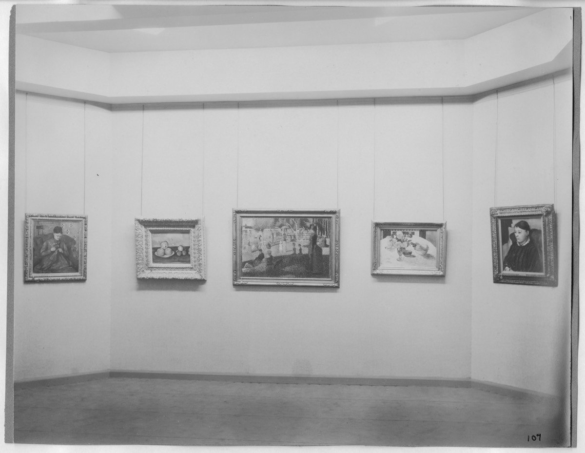
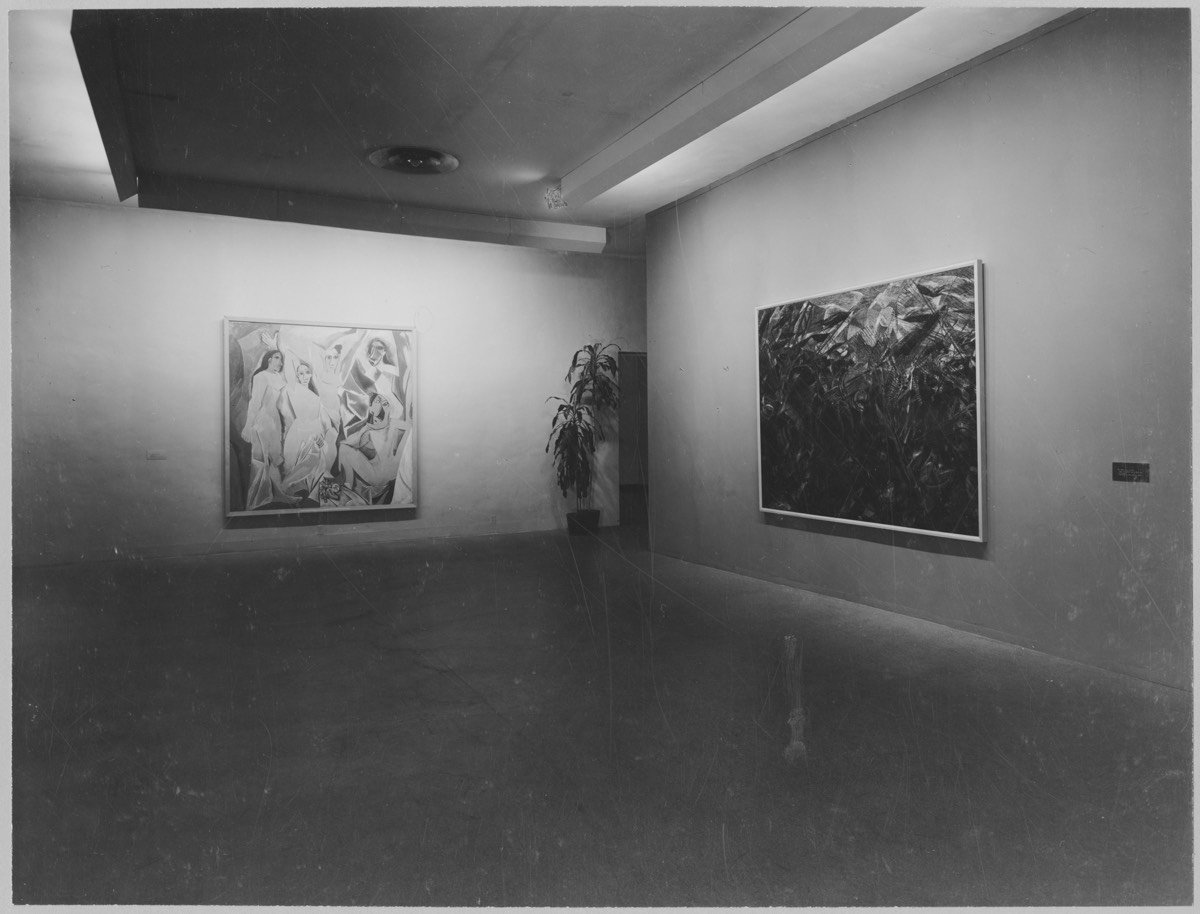
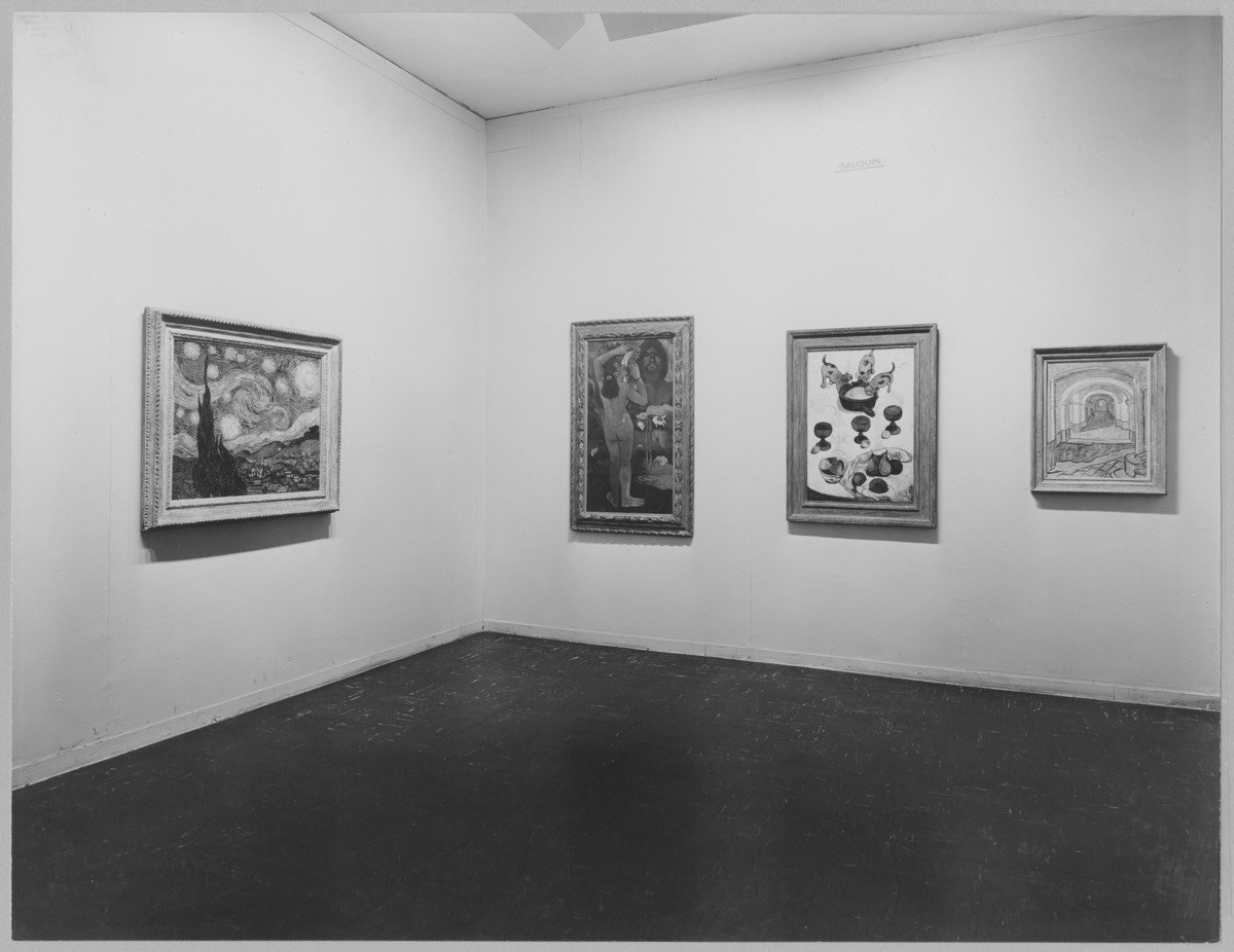
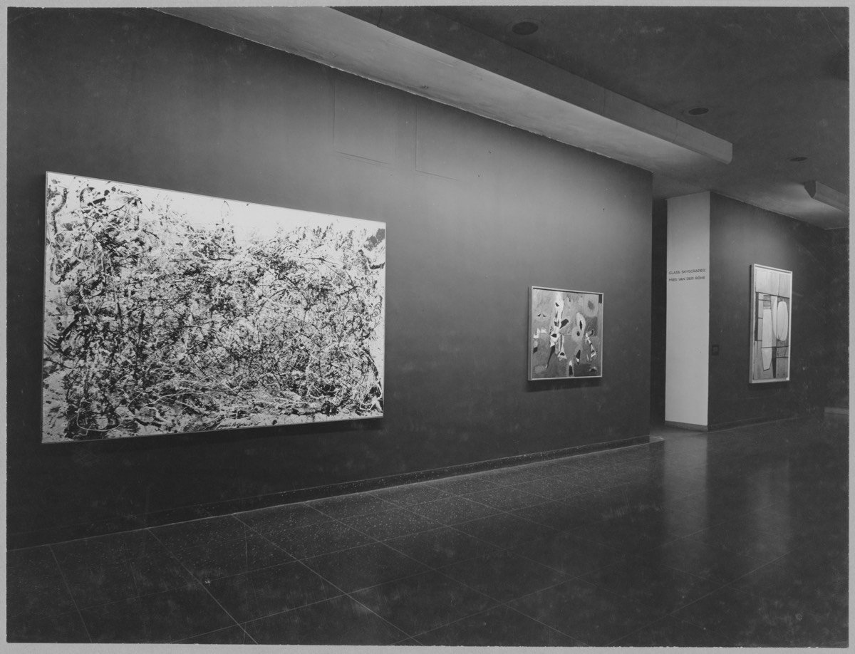
The digital archive project will include almost 33,000 exhibition installation photographs, most never previously available online, along with the pages of 800 out-of-print catalogs and more than 1,000 exhibition checklists, documents related to more than 3,500 exhibitions from 1929 through 1989.
Shown above are some notable works of art pictured among the first times they were displayed at the museum…the top one is from that first show in 1929. I happily spent an hour browsing through these exhibitions1 and I haven’t been gripped with this powerful of a desire to travel through time in quite some time. To be able to see that first exhibition…what a thing that would be. In part, I love going to museums for this very reason: standing in the very spot where the artist stood in making their drawing or painting is a very cheap form of time travel.
Suggested technique: search for an artist or artwork you particularly like and sort the results by “opening date, chronological” to see the first time that art or artist was displayed in the museum.↩
The past year Stian spent most of his time exploring the unique organic qualities of wood and how adding of a function can beautifully refine a piece of wood. The project consists of 365 unique hand carved spoons made from various types of wood. One carved everyday through a year.
By repeating the production of a spoon every day for a longer period of time (365 days), the goal is to challenge and explore a spoons aesthetic and functional qualities.
Artists Katja Kublitz and Ronnie Yarisal built Anger Release Machine, a vending machine stocked with breakable items like glass plates, porcelain statues, etc. When you put some coins in, the machine dispenses an item, sending it crashing against the bottom of the machine. Then, you feel better. I love the concept, but the implementation leaves something to be desired. Here’s a video of the machine in “action”:
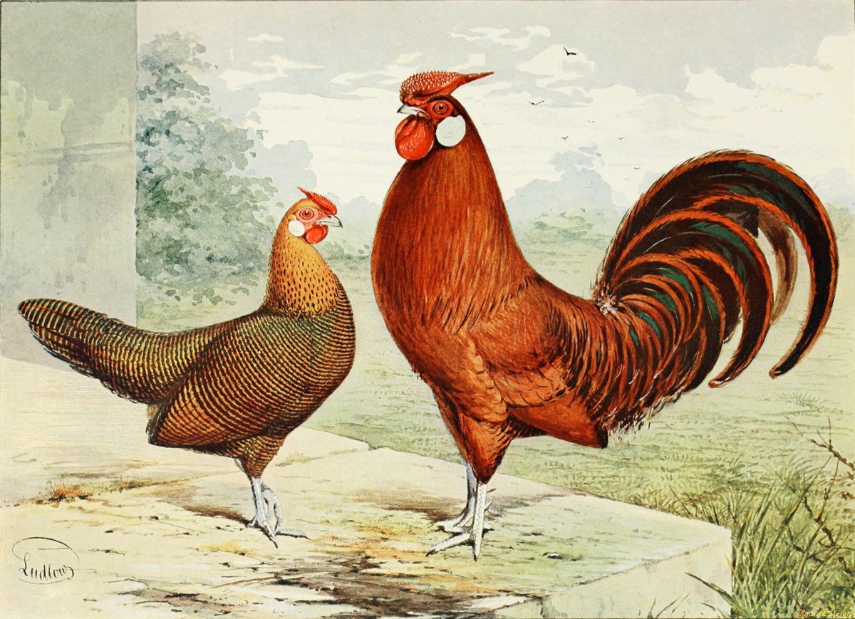
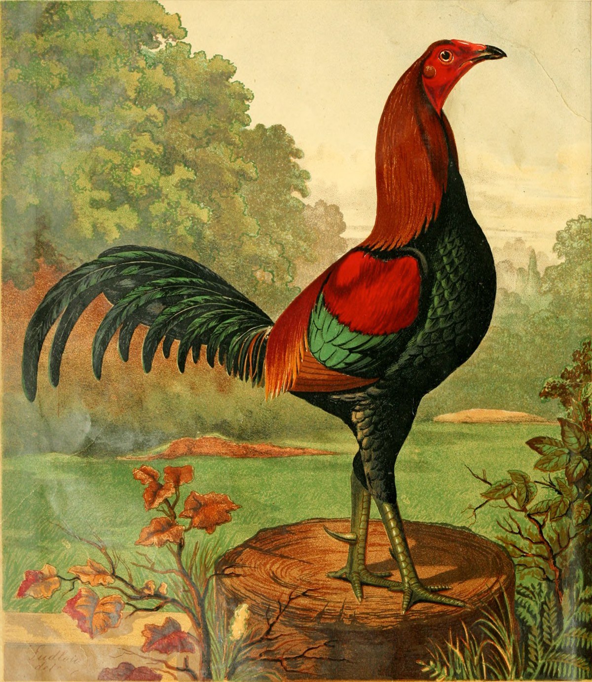
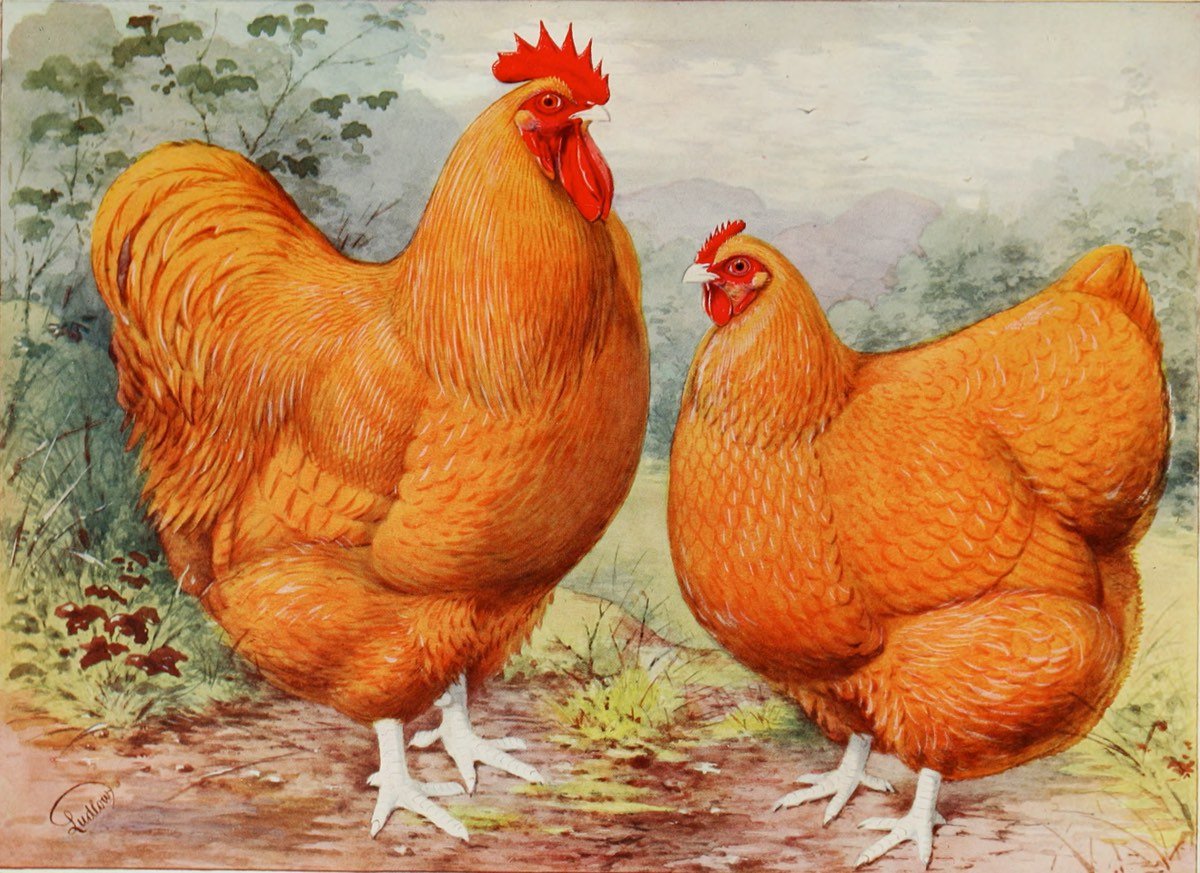
The Illustrated Book of Poultry by Lewis Wright, first published in 1870 and revised several times in the decades following, was “regarded as the most desirable of the English poultry books”. Poultry was very popular in Victorian England and the book housed a tremendous amount of practical poultry knowledge. From a Harvard Library blog post:
“Hen Fever”, as it became known during the Victorian Age, was an unprecedented obsession with owning, breeding, and showing the finest chickens in the world. The genesis of the poultry fancier owes much to Queen Victoria and her royal menagerie. In 1842, she acquired exotic chickens from China, and whatever the Queen did, the public would soon try to imitate and incorporate at home. The Illustrated London News reported “Her Majesty’s collection of fowls is very considerable, occupying half-a-dozen very extensive yards, several small fields, and numerous feeding-houses, laying-sheds, hospitals, winter courts, &c.”. From this point forward, poultry was no longer viewed as common farmyard critters, but valued and appreciated throughout the classes of Victorian Britain. The import and breeding of poultry was not just a leisurely hobby, but a profitable endeavor with sky rocketing price tags for the finest examples.
But the books also contained many wonderful illustrations of the finest examples of chickens and other poultry in the style of Audubon. The different breeds have amazing names like Buff Orpingtons, Plymouth Rocks, Dark Dorkingtons, and Gold Pencilled Hamburghs.
Gluten Free Museum takes works of art (high and low) and removes all of the gluten from them. A one-trick pony, but a particularly entertaining one. (via tmn)
In an episode of Doctor Who from 2010, the Doctor and his companion Amy take Vincent van Gogh, who was not a commercially successful artist in his own lifetime, to the Musée d’Orsay to see an entire room filled with his paintings. The resulting scene is unexpectedly touching.
The Virgin and Child with Saint Anne is one of the most beautiful paintings in the world. It is also one of the most mysterious. Disfigured and even jeopardised by “repairs” and by the successive layers of varnish applied to it over the centuries, it was also in very bad condition. To save the painting, it had to be restored.
The spectacular operation, the likes of which occurs only once a century, took over three years to complete. The complex and outstanding restoration process provided a unique opportunity to get as close as possible to the painting, to how it was originally painted, and to better understand the complex relationship Leonardo da Vinci had with one of his finest masterpieces.
Restorations are fascinating. I only had time today for the first five minutes, but it hooked me enough that I’m going to go back to it tonight. (via @BoleTzar)
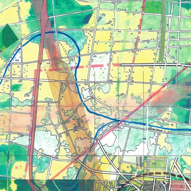
Since 1963, Jerry Gretzinger has been working on a map of a world that doesn’t exist. The map is never finished. In the morning, when Gretzinger draws a card out of the deck that sets his task for the day, sometimes that card says “scan”. That means a portion of the map is scanned and archived, and the copy is reworked to “upgrade” that part of the map. And that’s not even the half of it…just watch the whole thing to see how the map has evolved over the years.
It now comprises over 3200 individual eight by ten inch panels. Its execution, in acrylic, marker, colored pencil, ink, collage, and inkjet print on heavy paper, is dictated by the interplay between an elaborate set of rules and randomly generated instructions.
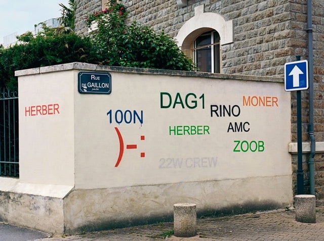
For a project called Tag Clouds, street artist Mathieu Tremblin paints over graffiti tags and makes them more legible. The result looks like when Word says that the Hardkaze and Aerosol fonts are used in the document you’re trying to open but are missing from your computer and you click OK to replace them with whatever’s available. I think the font above is Arial, which is perfect. I also like this faux-watermark piece he did:


Stay Connected