To be sure, the Van Meegeren story raises many, many questions. Among them: what makes a work of art great? Is it the signature of (or attribution to) an acknowledged master? Is it just a name? Or is it a name implying a provenance? With a photograph we may be interested in the photographer but also in what the photograph is of. With a painting this is often turned around, we may be interested in what the painting is of, but we are primarily interested in the question: who made it? Who held a brush to canvas and painted it? Whether it is the work of an acclaimed master like Vermeer or a duplicitous forger like Van Meegeren — we want to know more.
Morris ends the post with a cliffhanger that, if I didn’t know any better, was written specifically for me: “The Uncanny Valley.”
A museum installation consisting of a 100-ton jack connected to a gear box and a turnstile. The 100-ton jack pushes two large timbers against the bearing walls of the museum. Each visitor to the museum must pass through the turnstile in order to see the exhibition. Each input on the turnstile ever so slightly expands the jack, and ultimately if enough people visit the exhibition, Samson could theoretically destroy the building.
She was a librarian. Her husband was a postal worker. They lived on his salary and bought art with hers. Both are now retired. They have no children. “We bought art we could afford and that would fit into the apartment,” they say. Water from the fish tank once splashed a Warhol they owned. It later had to be restored.
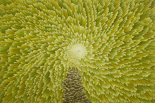
This is perhaps what the world would look like if human vision could perceive all of an object’s possible quantum mechanical states at the same time. (via today and tomorrow)
Imagine Finding Me is a project by Chino Otsuka where she inserts her adult self into photos taken of her as a child. More examples at Wallpaper. See also Ze Frank’s Youngme / Nowme and those neat half-kid, half-adult photos that I can’t find a link to right now…little help? (via waxy)
The shocking theft of the Mona Lisa, in August 1911, appeared to have been solved 28 months later, when the painting was recovered. In an excerpt from their new book, the authors suggest that the audacious heist concealed a perfect — and far more lucrative — crime.
Expecting new revelations, I read on but it was the same story told in previous books. Regardless, it’s a great story and worth the read but nothing new if you’ve heard it before.
I am offering large printable files to anyone interested at no cost. Computer files are the most easily reproducible information on the planet. In this particular case I see no reason to imbue a false sense of preciousness on the work. The information I gathered to create the collages is publicly availaibe, and the collages themselves are no different.
Trailer for a new film called Guest of Cindy Sherman. It’s a documentary about a man who becomes romantically involved with the famous artist, only to find that his ego can’t handle her fame. I wonder if we actually get to see the real Sherman in the film…the trailer is very teasing about it.
A collection of quirky toilet signage. And for what to read after you’ve latched that door, there are several sites dedicated to writing found on the walls of bathroom stalls. (Warning: most of it does contain language that falls soundly in the “potty mouth” category.)
Please Do Not Throw Toothpicks in The Urinals The Crabs can Pole Vault.
Long experience has taught me this about the status of mankind with regard to matters requiring thought: the less people know and understand about them, the more positively they attempt to argue concerning them, while on the other hand to know and understand a multitude of things renders men cautious in passing judgment upon anything new.
Ian Curtis is as haunting made of tape as he is on tape.
The artist, known as iRI5, is in her mid-twenties and lives in Georgia. Her work features found objects like old magazines, books, playing cards, and trash that she turns into treasure.
Researchers believe that this difference between men and women can best be explained by the fact that the former use eye contact to seek fertile and fit mates. Meanwhile, the latter shy from making eye contact or drawing unwanted attention onto themselves for fear of unwanted pregnancies and single parenthood, it has been said.
The same study found that it takes approximately 8.2 seconds of eye contact for a man to decide if a woman is attractive. It’s hard not to stare at the eyes of photographer Rankin’s hypnotizing Eyescapes for a whole lot longer, but that’s a different type of beauty.
The name Crayola was coined by Alice Binney, wife of company founder Edwin, and a former school teacher. She combined the words craie, which is French for chalk, and ola, for oleaginous, because crayons are made from petroleum based paraffin.
I don’t remember ever having scribbled with sticks of Manatee or Jazzberry Jam, but I do distinctly recall meticulously practicing my hearts and starts with the dulled point of Carnation Pink.
Biogen is an art installation by Hanna von Goeler that’s inspired by the genetic engineering of tomatoes. Consisting of oil paintings, sculptures, a mobile made of tomato skin, and a model of a “tomato six pack,” von Goeler’s work is striking, and notably unappetizing.
Food Fray offers an equally fascinating, though less creative case against GM fruits and veggies. Both the art and the argument raise questions about the dangers of chewing with an open mind.
Brooke Inman’s Everything Color Circle is mesmerizing. As somebody with limited organizational skills, I find it mind-boggling that she was able to put this together. And to think that it could be destroyed in a nanosecond if a sugar-addled kindergartner armed with construction paper wandered into the room. (via design milk)
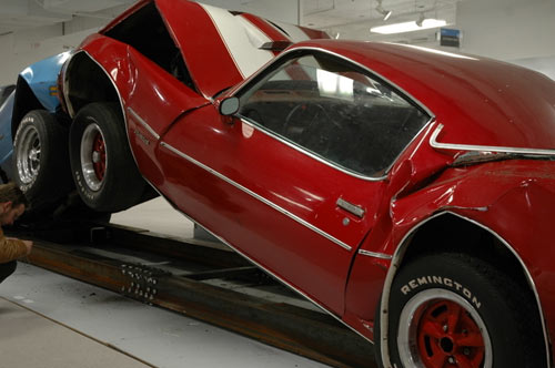
A system of sculptures that is constantly on the brink of collapse. My intention was to capture and sustain the exact moment of impending catastrophe and endlessly repeat it.
I do this too, only I use chairs and my own body and frequently tip over and hurt myself. Anything for my art.
Kontopoulos also did something called Conversation Piece, inspired by legendary film editor Walter Murch.
Film editor Walter Murch, who edited many of Francis Ford Copolla’s films, developed a theory about edits while working on The Conversation (1974). He noticed that in many cases, the best place to make a cut was when he blinked. Subsequently, Murch wrote about the human blink as a sort of mental punctuation mark: a signifier of a viewer’s comfort with visual material and therefore, a good place to separate two ideas with a cut.
Drain (1975) MTA and unknown artists Mixed Media on Metal and Concrete
Describing the irresistibility of natural urges, and situated thematically near the restroom, this drainage grate offers deliverance. Consequently, here lies an indeliable yellow nitrogen stain, as evidence of the passings of hundreds, if not thousands of strained commuters. Each straphanger, surreptitiously seeking relief, has helped create this totally organic, revolutionary art piece.
For many people he is the round-headed bald man seen on the First Folio of his collected works but evidence was presented yesterday arguing that we should rethink this. Instead we should visualise Shakespeare as a rosy-cheeked, long-nosed man who was something of a looker.
The portrait appear to be in good condition and Shakespeare looks a lot like Joseph Fiennes, who played the Bard in Shakespeare in Love.
On the long list of books I would read if I had the time for such a thing, reading, is Art & Fear. Ted Orland, one of the authors and a working artist himself, describes the book thusly:
This is a book about the way art gets made, the reasons it often doesn’t get made, and about the difficulties that cause so many artists to give up along the way.
The ceramics teacher announced on opening day that he was dividing the class into two groups. All those on the left side of the studio, he said, would be graded solely on the quantity of work they produced, all those on the right solely on its quality. His procedure was simple: on the final day of class he would bring in his bathroom scales and weigh the work of the “quantity” group: fifty pound of pots rated an “A”, forty pounds a “B”, and so on. Those being graded on “quality”, however, needed to produce only one pot — albeit a perfect one — to get an “A”. Well, came grading time and a curious fact emerged: the works of highest quality were all produced by the group being graded for quantity. It seems that while the “quantity” group was busily churning out piles of work - and learning from their mistakes — the “quality” group had sat theorizing about perfection, and in the end had little more to show for their efforts than grandiose theories and a pile of dead clay.


Stay Connected