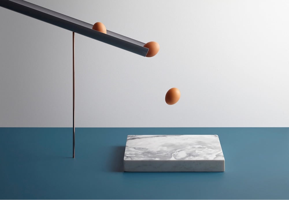
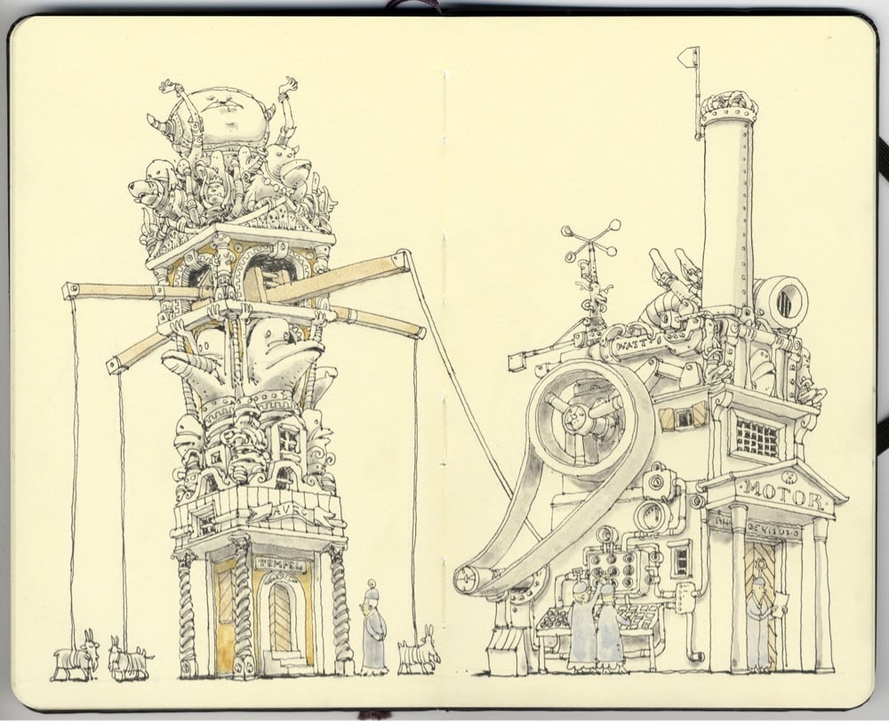
What I like about the still image above, along with the rest of the images in a project called In Anxious Anticipation by Aaron Tilley & Kyle Bean, is that it makes a noise. It’s so cool how your brain sees what’s about to happen and then you hear eggs smashing on a hard surface — splat, splat, splat. More still art should make noise! (via moss & fog)
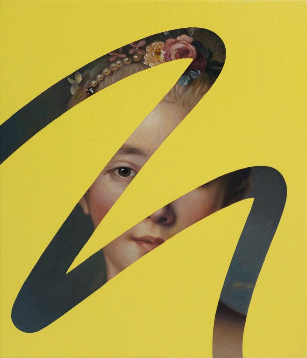
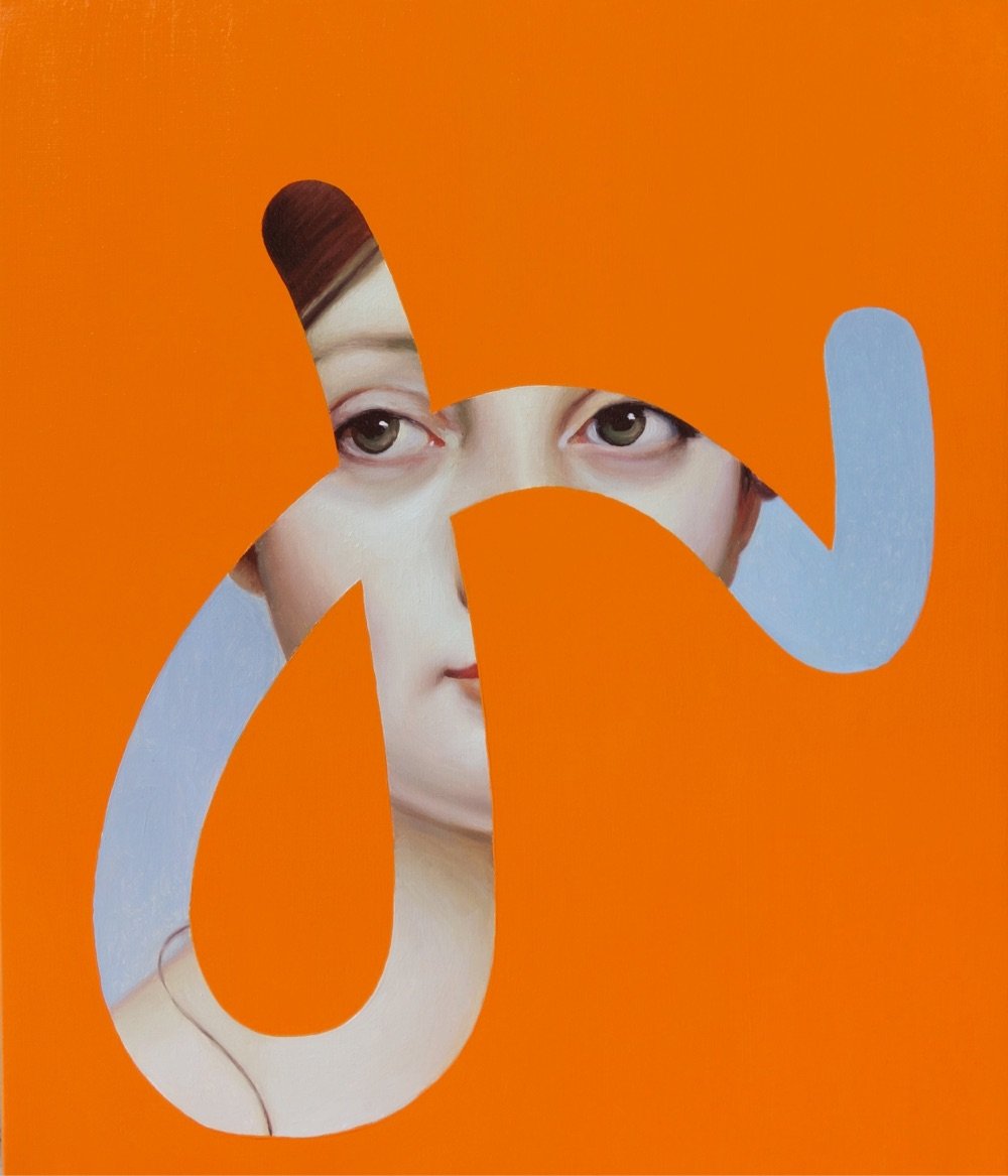
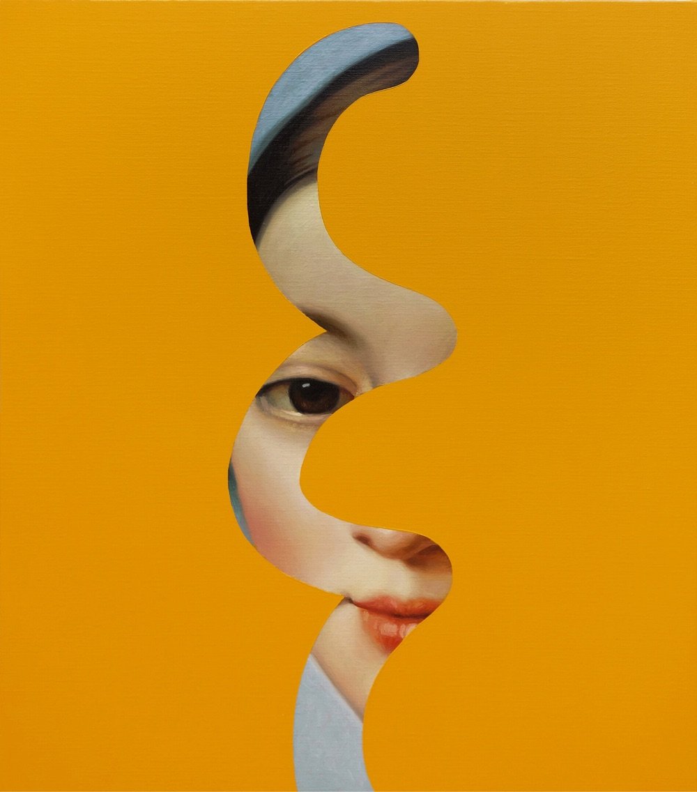
I like these paintings by Spanish artist Lino Lago where traditional oil painted portraits peek through bright color fields. He calls them Fake Abstracts. (via colossal)
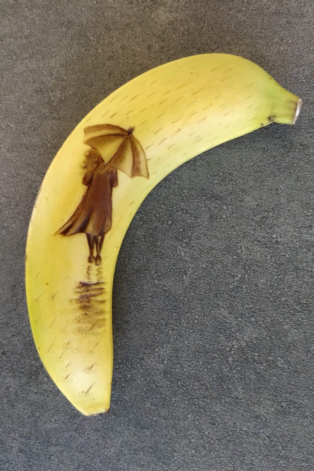
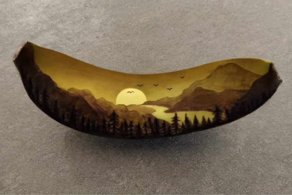
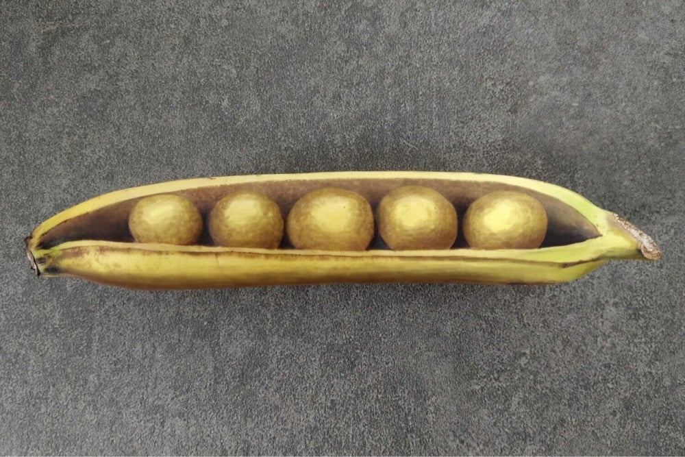
As it ripens, banana skin oxidizes and turns black. Bruising the skin speeds up the process, a fact that Anna Chojnicka exploits to create these bruised banana artworks (also on Instagram). Here’s how it works:
I bruise the peel by pressing into it lightly with a blunt point. Speeding up and controlling the bruising process conjures light and shade in the image.
Over a few hours, the mark gradually goes darker until black. I start with the darkest parts of the image first, and then work my way backwards, finishing with the lightest parts last.
By managing the timing, it’s possible to make intricate images with graduating shades. There’s a short window of time when the image looks its best; I photograph the banana, and then eat it.
Chojnicka started the project in the early days of the pandemic while bored/delirious at home with a suspected Covid infection. The increase in art using found objects during the pandemic is fascinating: people couldn’t spend a lot of time out of the house, so they reached for whatever they could find to express their creativity…in this case, bananas.
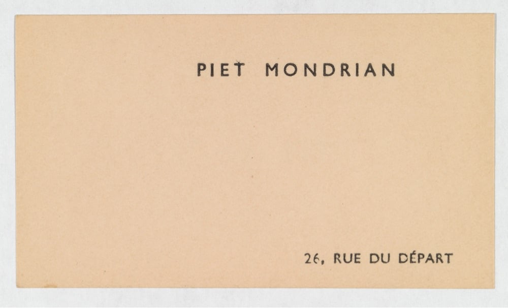
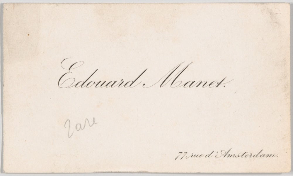
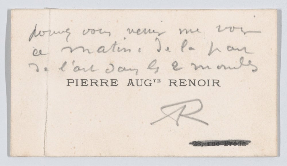
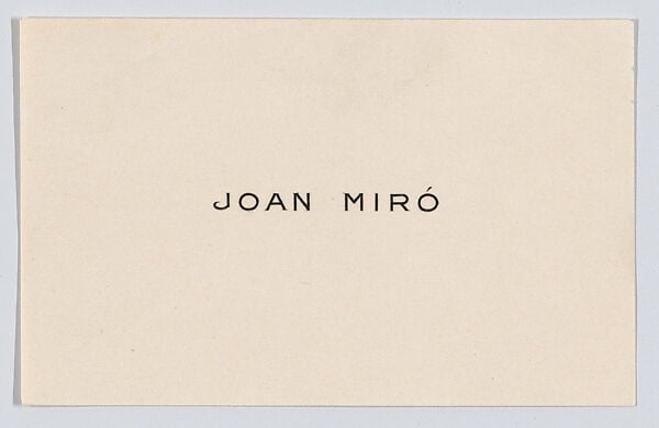
Calling cards derived from a custom, originating in England, in which messages were inscribed on the backs of playing cards. Cards made for the express purpose of sharing hand-written messages were manufactured beginning in the eighteenth century; by the early-nineteenth century, calling cards had become a popular means for sending well wishes, holiday greetings, condolences, and messages of courtship.
The cards include those of Klee, Renoir, Pissarro, Rodin, Monet, Mondrian, Braque, Toulouse-Lautrec, Manet, and many more. I think my favorites are Piet Mondrian’s (above) and Joan Miró’s, the former because it’s very much in keeping with the artist’s style and the latter because it isn’t:
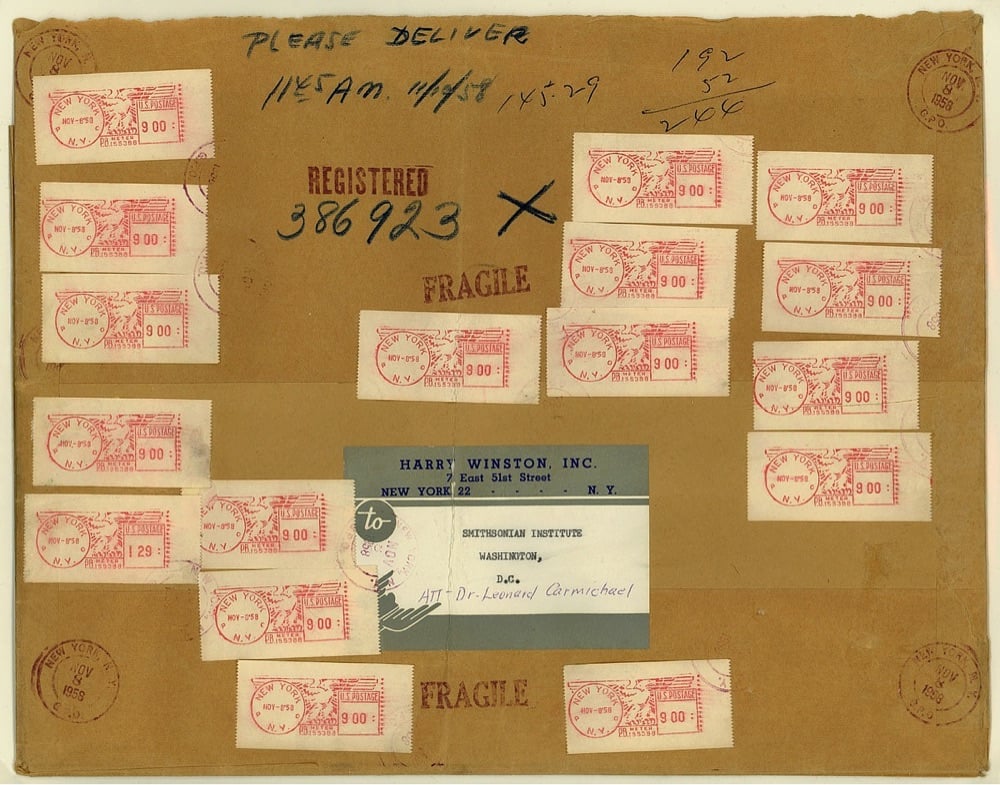
That last image is the mailing wrapper from when jeweler Harry Winston sent the Hope Diamond (currently valued at $200-350 million) to the Smithsonian through the regular US Mail.
Mailed on the morning of November 8 from New York City, the item was sent by registered (first class) mail — considered the safest means of transport for valuables at that time. The total fee was $145.29 (see the meter machine tapes). Postage only amounted to $2.44 for the package which weighed 61 ounces. The remainder of the fee ($142.85) paid for an indemnity of about $1 million.
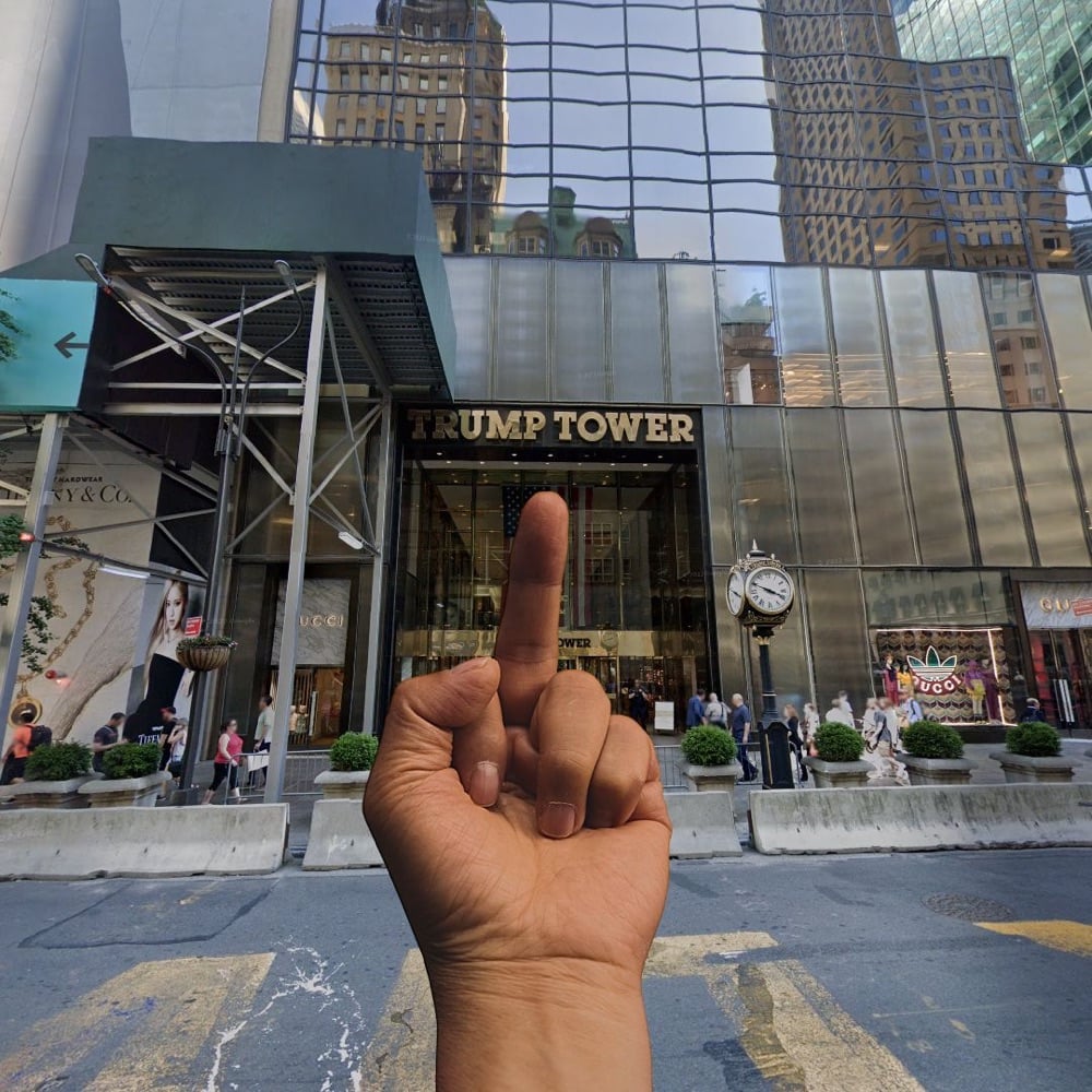
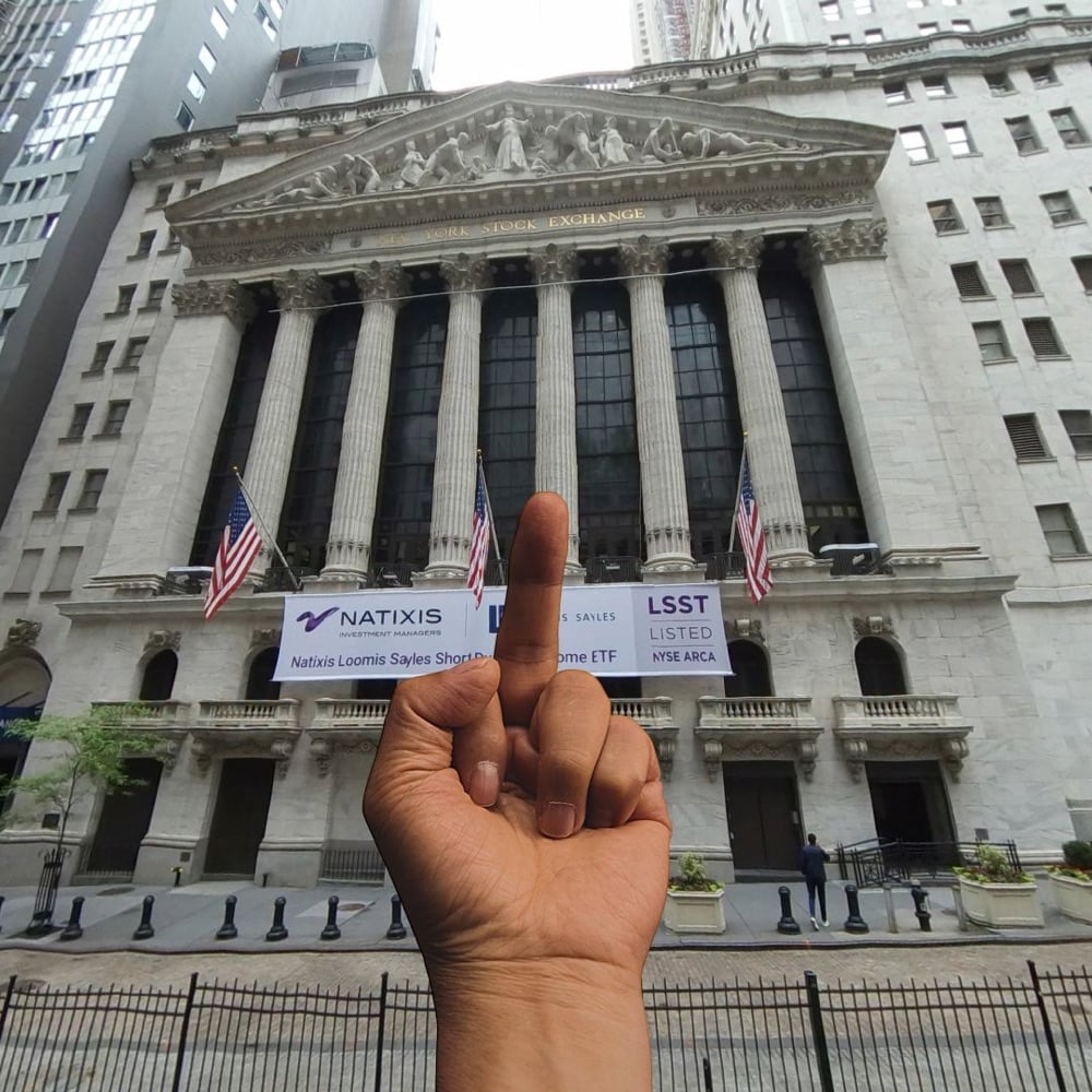
I’ve included a few examples above from the site’s archive. In a brief review of what folks have done with the site recently, I observed several shots of the Kremlin, the Eiffel Tower, churches, and various Trump buildings, but I also saw the Stonewall Inn and other gay landmarks.
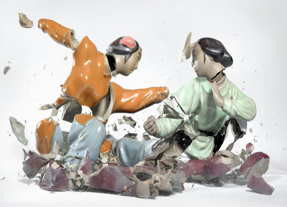
From a height of three meters, porcelain figurines are dropped on the ground, and the sound they make when they hit trips the shutter release. The result: razor-sharp images of disturbing beauty, more than the sum of its parts. Temporary sculptures made visible to the human eye by high-speed photography. The porcelain statuette bursting into pieces isn’t what really captures the attention; the fascination lies in the genesis of a dynamic figure that seems to stop/pause the time and make time visible itself.
See also Klimas’ Flowervases (“Flawlessly arranged flower vases are shot by steel bullets and captured at the moment of their destruction”) and Sonic Sculptures (“Klimas begins with splatters of paint in fuchsia, teal and lime green, positioned on a scrim over the diaphragm of a speaker — then, the volume is turned up”).
Japanese trains are renowned for their punctuality, comfort and overall reliability. But part of what makes them so reliable is an “unseen” workforce of overnight trains. These trains will be unfamiliar to the everyday rider because they only show themselves after regular service has ended for the day. Working through the wee hours of night and early morning, they perform maintenance work on tracks and electrical wires that ensures a smooth and uninterrupted ride during the day.
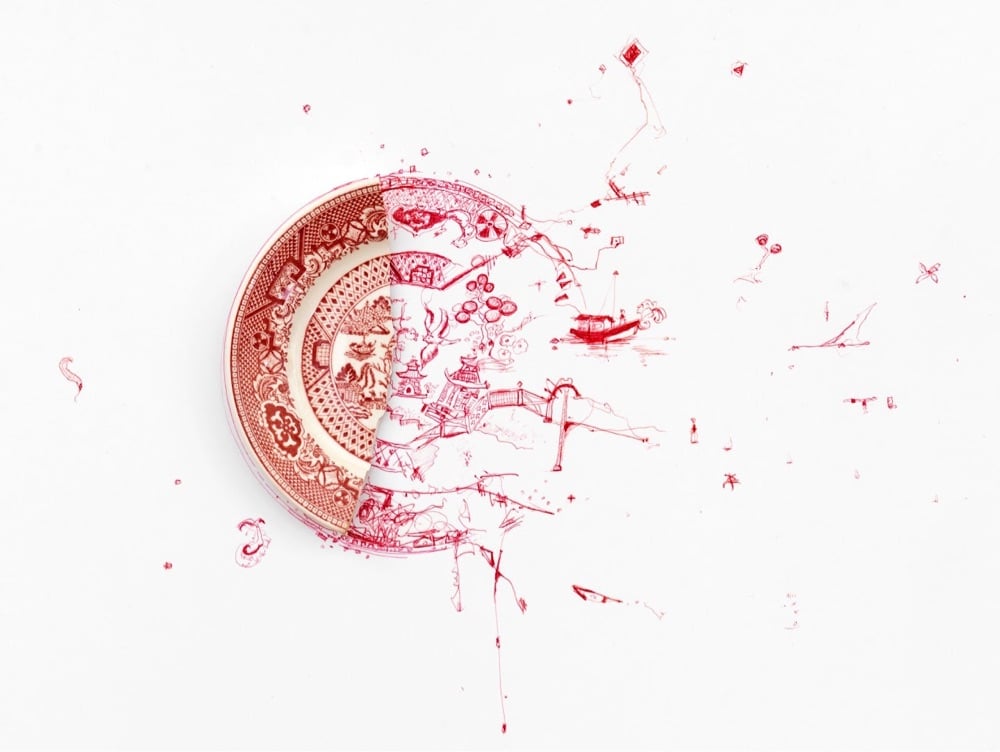
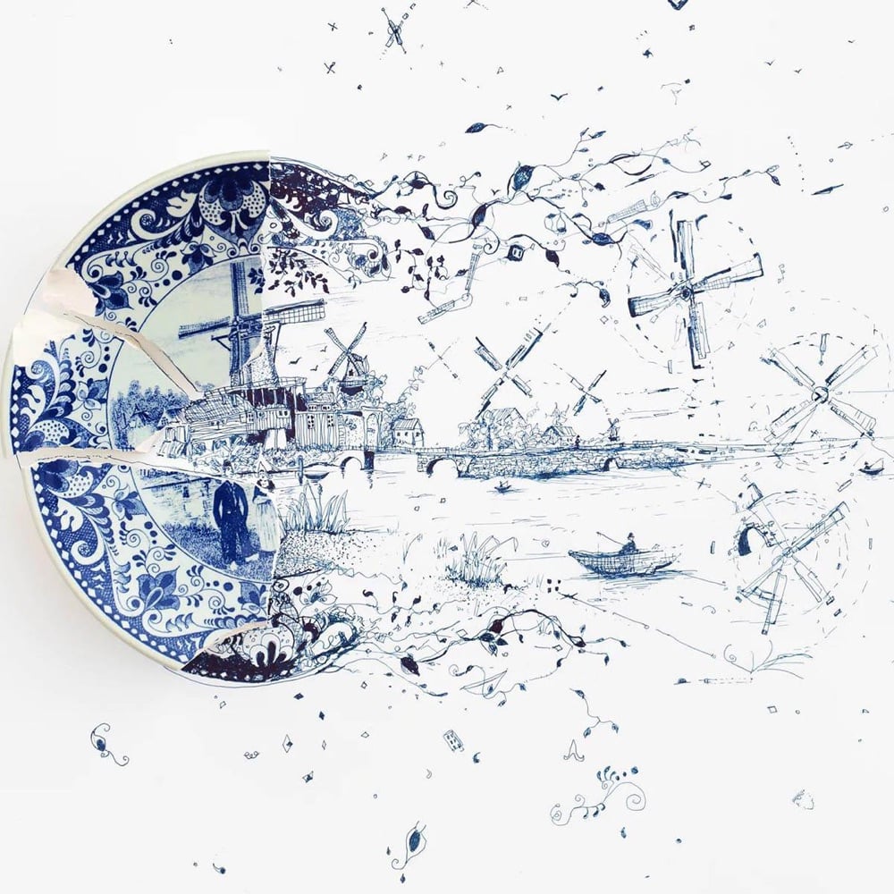
This work was inspired by a plate from my wife’s late mother, Barbara. One day it was dropped and shattered. Some time after, I picked up a pen and started working on the “Fragmented” series, exploring the possibilities of things broken and the stories that can evolve from them.
I have to admit that as much as I love Evan Puschak’s Nerdwriter videos, I did not have high hopes for his latest video on John Singer Sargent, a painter I didn’t know a lot about and assumed, mostly based on his name (ugh, I know), that he was some fusty 19th-century painter who was not as interesting as the Impressionists. What a pleasant surprise to discover, right from Puschak’s expertly concise show-don’t-tell opening, that I am Sargent’s newest fan.
Everywhere you look in this painting you see his supremely confident looseness, a kind of painting you maybe wouldn’t think to associate with a realistic representation of the world. And yet that’s exactly the final effect — a realism that is somehow more true than finely detailed painting.
Realism through impressionism? Sign me up. Stay curious, friends…you never know what interesting new (or old!) thing you’re going to discover next.
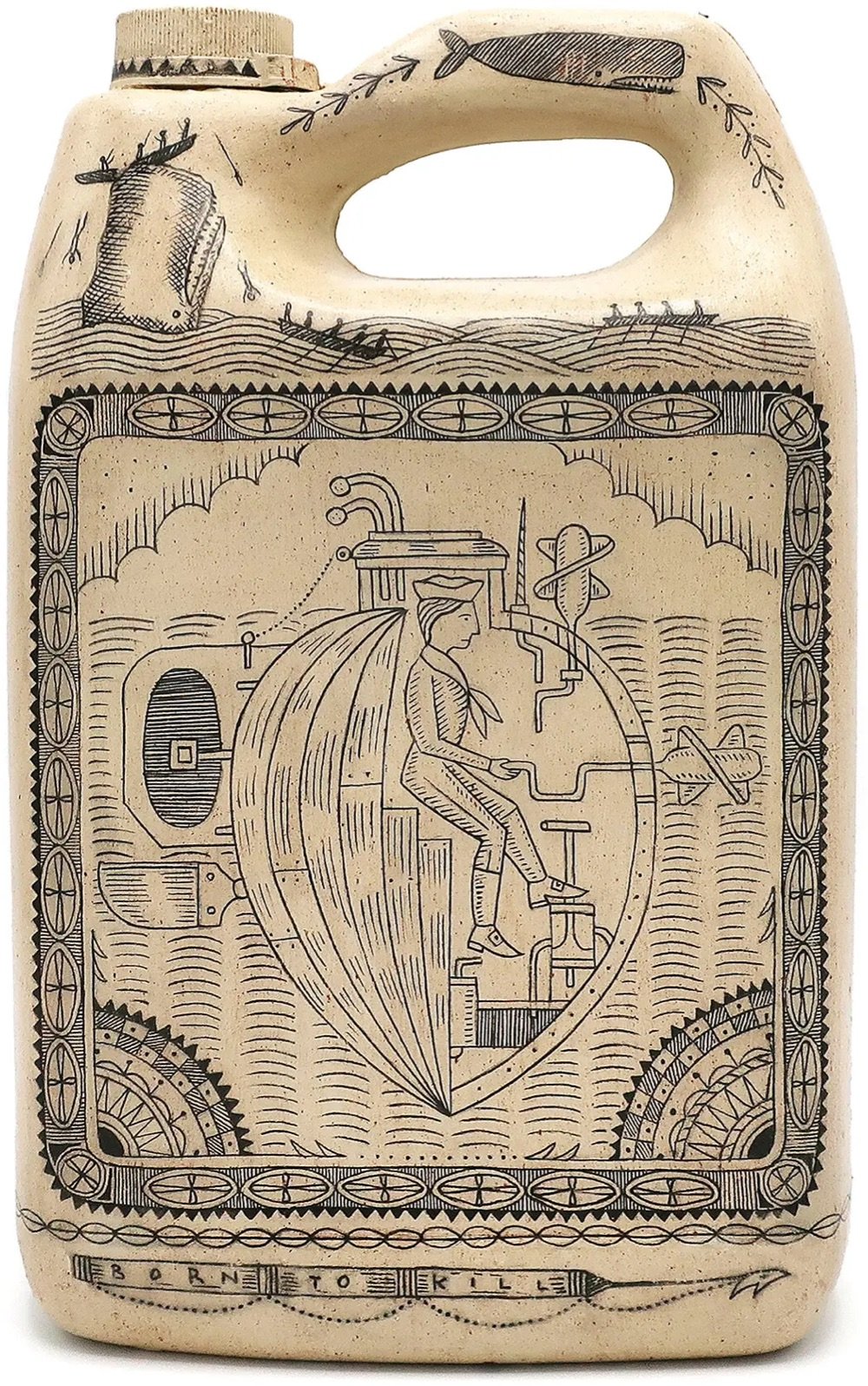
For an exhibition entitled DEATH TO THE LIVING, Long Live Trash now on view at the Brooklyn Museum, artist Duke Riley takes trash that he’s collected on the beach and turns it into art — think mosaics made from bottle caps, bread bag clips, and tampon applicators. But his plastic scrimshaw creations are absolute genius:
Scrimshaw art was made by whalers in the 19th century by carving designs into the teeth, bones, and baleen of whales. Riley has cleverly adopted the practice using aesthetically similar white plastics, producing a series he calls the Poly S. Tyrene Maritime Museum. The NY Times:
As whalers often depicted the leaders and profiteers of their day, Riley portrays the C.E.O.s of chemical companies, plastic industry lobbyists and others he deems responsible for producing the devastating tonnages of single-use plastics that are engulfing our oceans and threatening our ecosystems. It’s a downer, but if you look closely there’s often a Riley twist of humor, like the seagull shown relieving itself on the head of a water bottle magnate.
Every day for three years, Iancu Barbarasa drew a flower for his partner and recently he compiled all the drawings into this lovely short film set to Chopin’s Minute Waltz. I loved his acknowledgement of his sources and influences:
Questlove once said that “all creative ideas are derivative of another.” My project would not exist (or at least not in this form) without the influences of: Katsuji Wakisaka, textile designer and founder of Sou·Sou, who has drawn over 10,000 postcards for his wife — Christoph Niemann’s work and also his short film “A Tribute to Maurice Sendak” — “Beyond Noh (Masks of our world)” short film by Patrick Smith — “Plante” short film by Reka Bucsi — and Philippa Perry’s “The Book You Wish Your Parents Had Read (and Your Children Will Be Glad That You Did)”. Last but not least, the end credits are a tribute to Hayao Miyazaki’s wonderful “My Neighbour Totoro” film.
Say what you will about The Algorithms, but YouTube’s reliably informs this art history lover of every new episode of Great Art Explained and for that I am grateful. This latest episode is about the pointillist masterpiece by Georges Seurat, A Sunday on La Grande Jatte. I had a chance to see this painting in person last summer at The Art Institute of Chicago — spent quite a bit of time looking at it from all angles and distances — so this episode was the perfect accompaniment to that visit.
The lack of narrative means we really should look to the artist’s obsession with form, technique and theory — which is practically all he wrote about — and not to meaning or subject matter - which he didn’t write about at all. The painting is really his manifesto. His protagonists don’t have faces or body language, neither a history nor individuality. They are reduced to a hat, a corset, or a pet. They are just characters in his frieze. They exist only to give perfect balance to the composition.
Some paintings are designed for the viewer to “empathise with” but Seurat keeps us at arm’s length. We are not invited to “participate” in the promenade, and their psychological distance is clear. Both with their neighbors, and with us. It was ancient art that Seurat looked to — of Egypt and Greece. He once said that he “wanted to make modern people move about as they do on the Parthenon Frieze”, and placed them on canvases organized by harmonies of colour. It is what makes the painting so intriguing.
I am not a particular fan of fantasy games, but I do like watching people draw and talk about their process, particularly when it’s accessible to beginners. On his YouTube channel, JP Coovert shows people how to draw maps for fantasy games, books, and other media. Here’s a few examples to whet the appetite.
#notesArt is a style formed by the limitations of the medium: I draw with my finger on a screen the size of a 3-by-5 card, using drawing tools that were designed for annotating documents, not making artwork. Similar to an app, each work is minimalist and limited in scope. The simple nature of the tool allows me to focus on the essence of each piece; perhaps a strange thing to be able to do on a device known primarily for providing distraction.
Like he says, this is a great example of how contraints can foster creativity. Here’s what I don’t understand though: WTF? How does anyone do drawings this detailed in the Notes app with just their finger?! I just tried to make a smiley face and it looks like a 3-year-old did it. (Ok, a 1-year-old.)
Ok, this is one where you’re going to have to trust me and just watch it. Grands Canons is a stop-motion animated video by Alain Biet of thousands of meticulously hand-painted images of everyday items moving and dancing to music.
A brush makes watercolors appear on a white sheet of paper. An everyday object takes shape, drawn with precision by an artist’s hand. Then two, then three, then four… Superimposed, condensed, multiplied, thousands of documentary drawings in successive series come to life on the screen, composing a veritable visual symphony of everyday objects. The accumulation, both fascinating and dizzying, takes us on a trip through time.
It’s really just wonderful — once you get into it, you won’t be able to stop watching. More of Biet’s work can be found on his website or on Instagram. (via waxy & colossal)
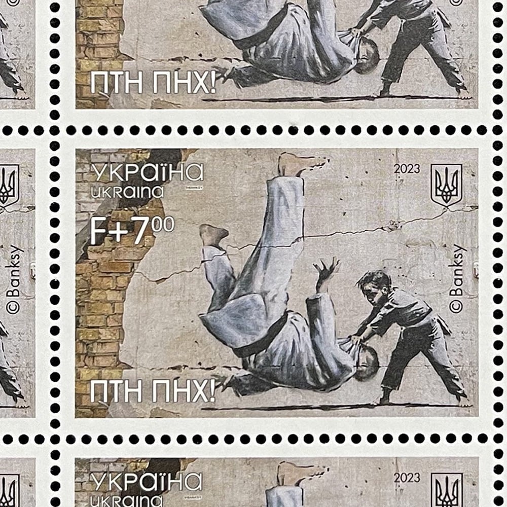
The Ukrainian postal service has released a stamp featuring artwork by Banksy to mark the first anniversary of the full-scale Russian invasion. The artist painted the image on a wall in the town of Borodianka in November 2022 and has apparently given his permission for use on the stamp. From The Guardian:
The image draws inspiration from the Russian president, Vladimir Putin, known to be a black belt in judo, and depicts a young judoka representing Ukraine knocking down a grown man.
The phrase “FCK PTN” in Cyrillic has been added to the lower left part of the new stamp.
See also: you might remember that the postal service ran a contest to design a stamp that illustrated “Ukrainians’ determination to defend their land” shortly after the invasion, which resulted in several eye-catching entries.
Rocky Bergen makes papercraft models of vintage computers like the original Macintosh, Commodore 64, the IBM 5150, and TRS-80. The collection also includes a few gaming consoles and a boombox. And here’s the thing — you can download the patterns for each model for free and make your own at home. Neat!
Phil Vance creates these wonderful typographic portraits of notable people like Audrey Hepburn, Albert Einstein, and Johnny Cash constructed from hand-painted type consisting of their own words. For instance, his portrait of Cash was created using the lyrics from his cover of God’s Gonna Cut You Down. You can check out more of Vance’s work on Instagram.
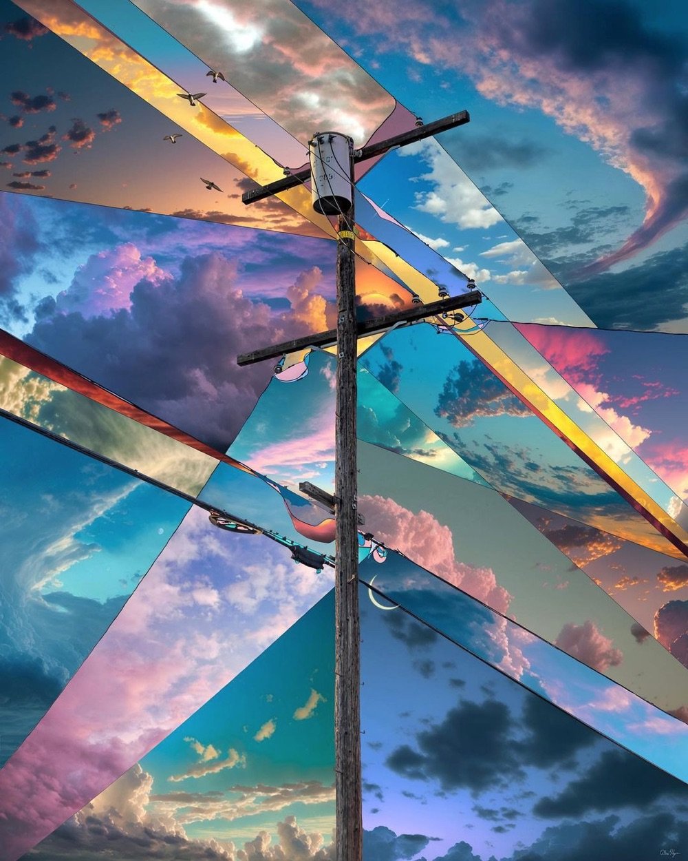
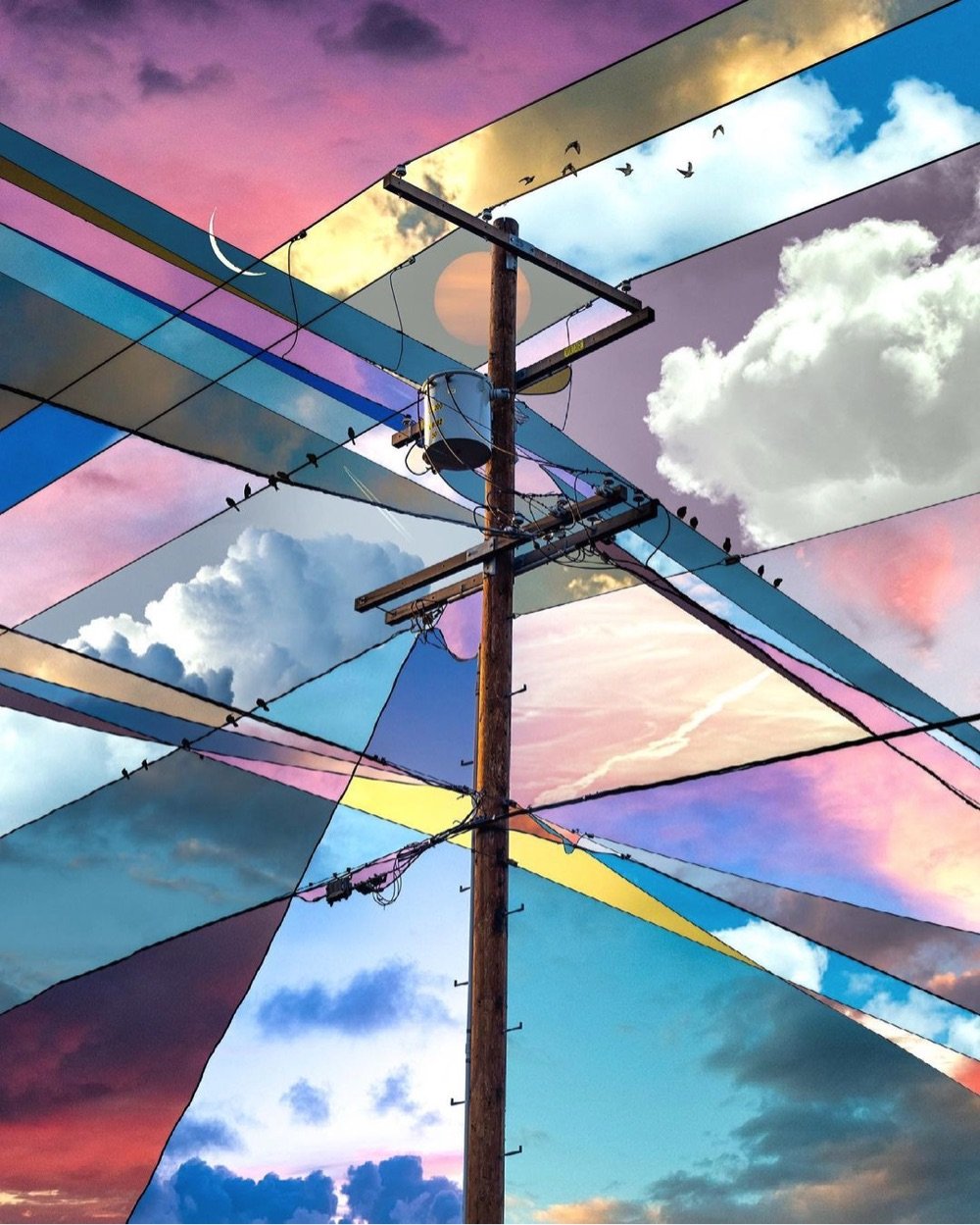
I love thesephotographiccollages by Alex Hyner centered around images of power lines — the intersections of the lines form geometric shapes that each get their own different shade and texture of sky. Such a simple idea done really well.
The Greek government and activists have long been calling for the return of the Parthenon Marbles from the British Museum to Greece. But how did the marbles get to Britain in the first place?
In the early 19th century, a British lord named Elgin removed a significant portion of the remaining marble decoration and statuary from The Parthenon in Athens and brought it back to Britain. To cover his debts, he sold the marbles to the British government and they eventually made their way into the British Museum. In the video above, Evan Puschak provides more detail about how it all went down.
For its part, the British Museum isn’t budging, although their official stance on the matter seems defensive, almost like they know they’re on thin ice, morally speaking. It’s long past time the marbles were repatriated and they should just get it over with already.
Update: This is interesting from David Allen Green: the return of the Parthenon Marbles isn’t up to the British Museum.
The fourth point is that the current legislation does make it difficult-to-impossible for the museum to dispose (to use the legal word) of the marbles as it wishes, either by returning them to Greece or otherwise.
An elaborate legal basis could, perhaps be provided, but — on balance — one suspects an English court would rule such a disposal as unlawful.
This means this is not a matter solely for the trustees of the museum (as I explain here).
For the marbles to be returned properly to Greece would require a change in primary legislation, which in turn means it has to have government support (or at least no government opposition).
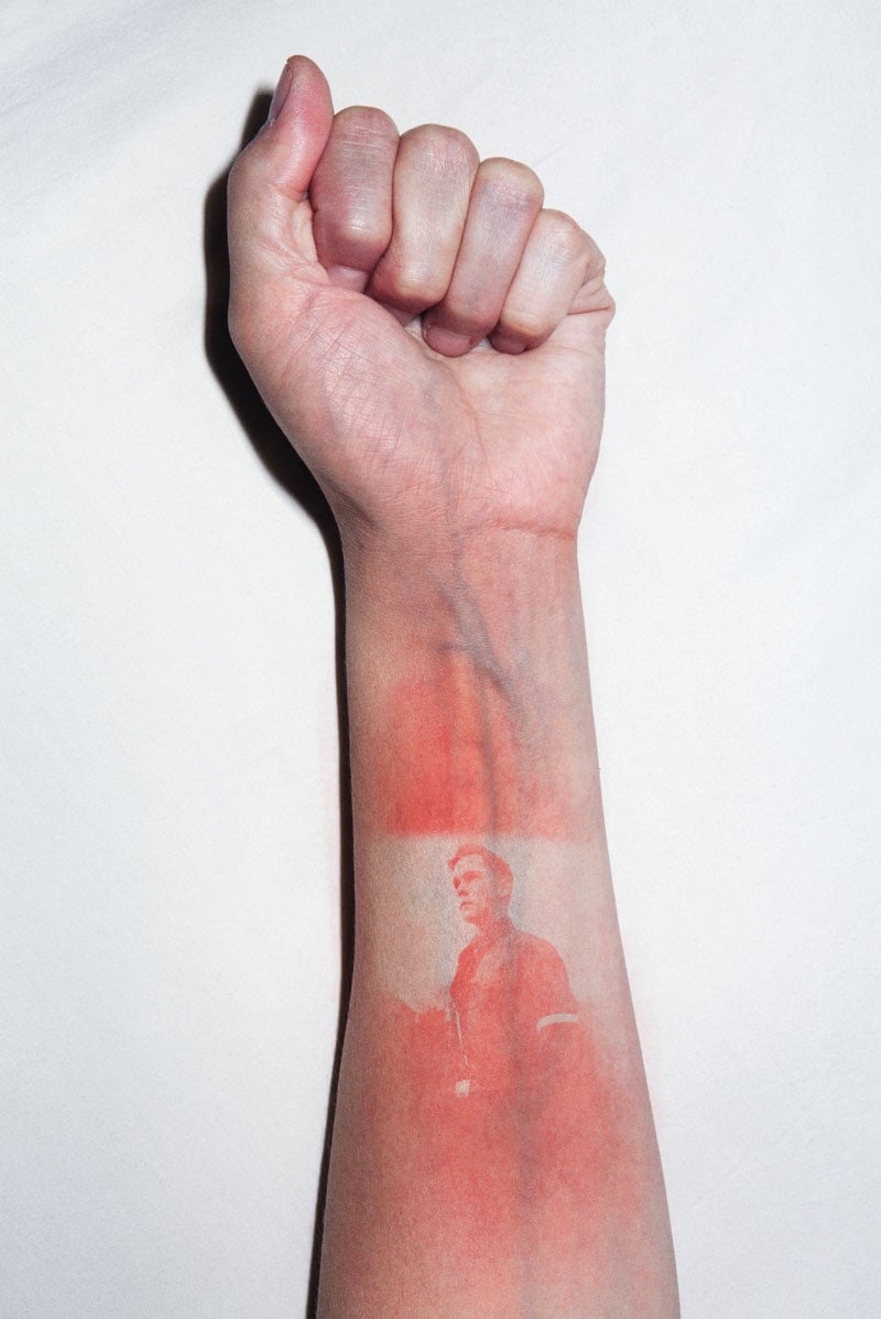
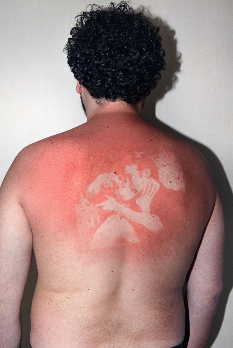
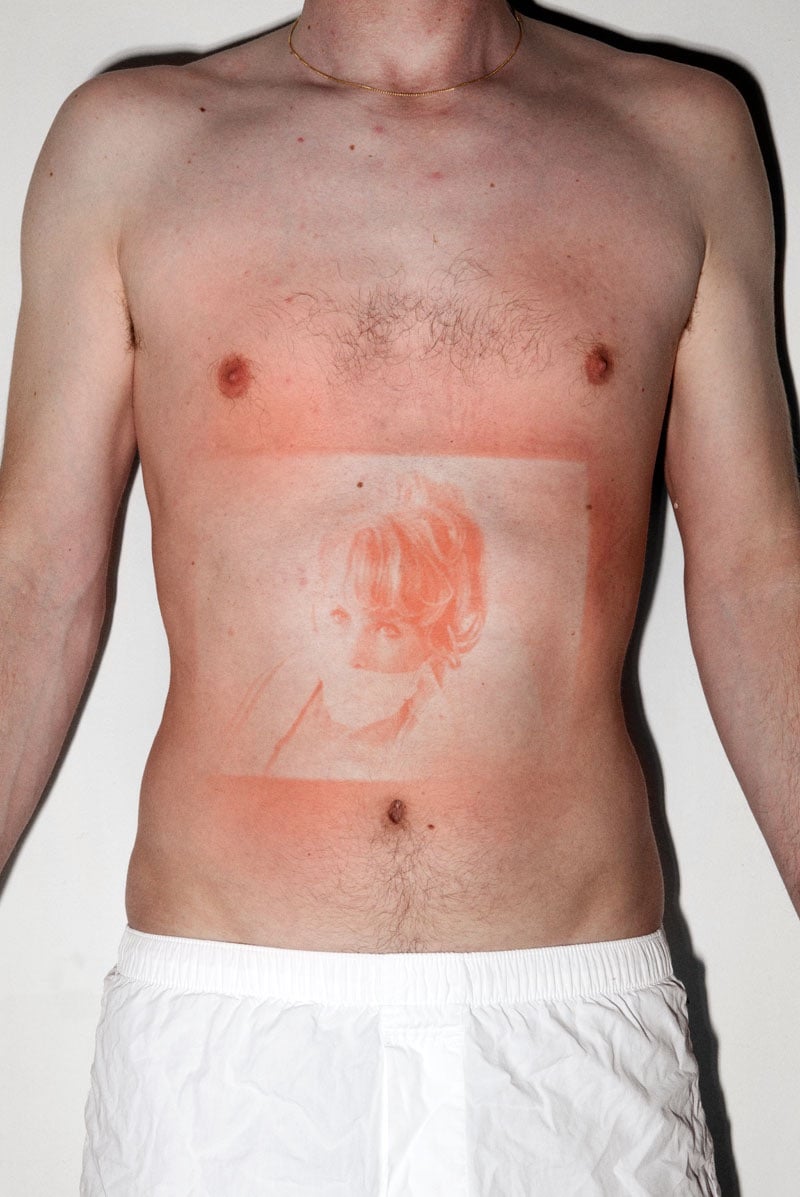
For his project Illustrated People, Thomas Mailaender imprinted photographic images onto people’s skin by shining a UV light through negatives. The visual effect created is not unlike that of a sunburn but it goes away as soon as the skin is exposed to light. I wonder…does it hurt like a sunburn?
Time is manifested in physical objects; in things that grow, develop or extinguish. Time is an ever forward-moving force and I wanted to make a clock based on times true nature, more than the numbers we have attached to it.
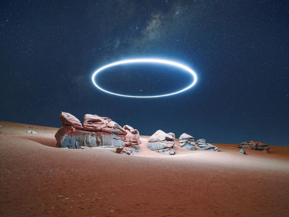
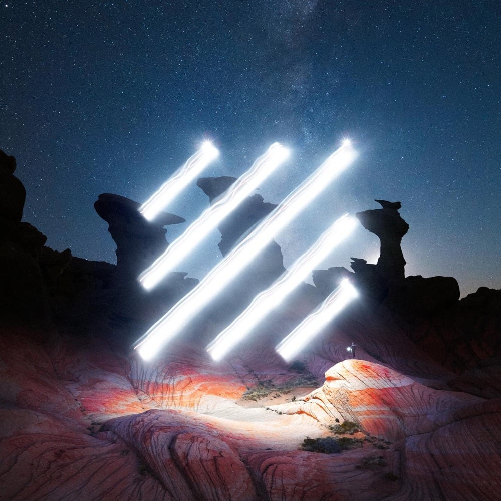
It’s been a bit since we’ve checked in on artist Reuben Wu, who uses drones to paint (sculpt?) with light in the sky over dark landscapes. Most of his recent stuff seems to be video on his Instagram account but I pulled a couple of photos of his that I haven’t featured before. Always inspiring stuff worthexploring.
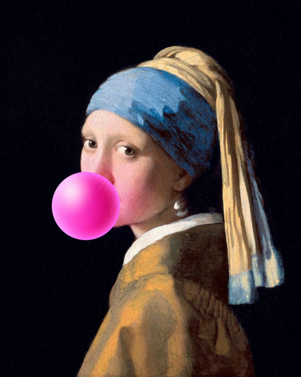
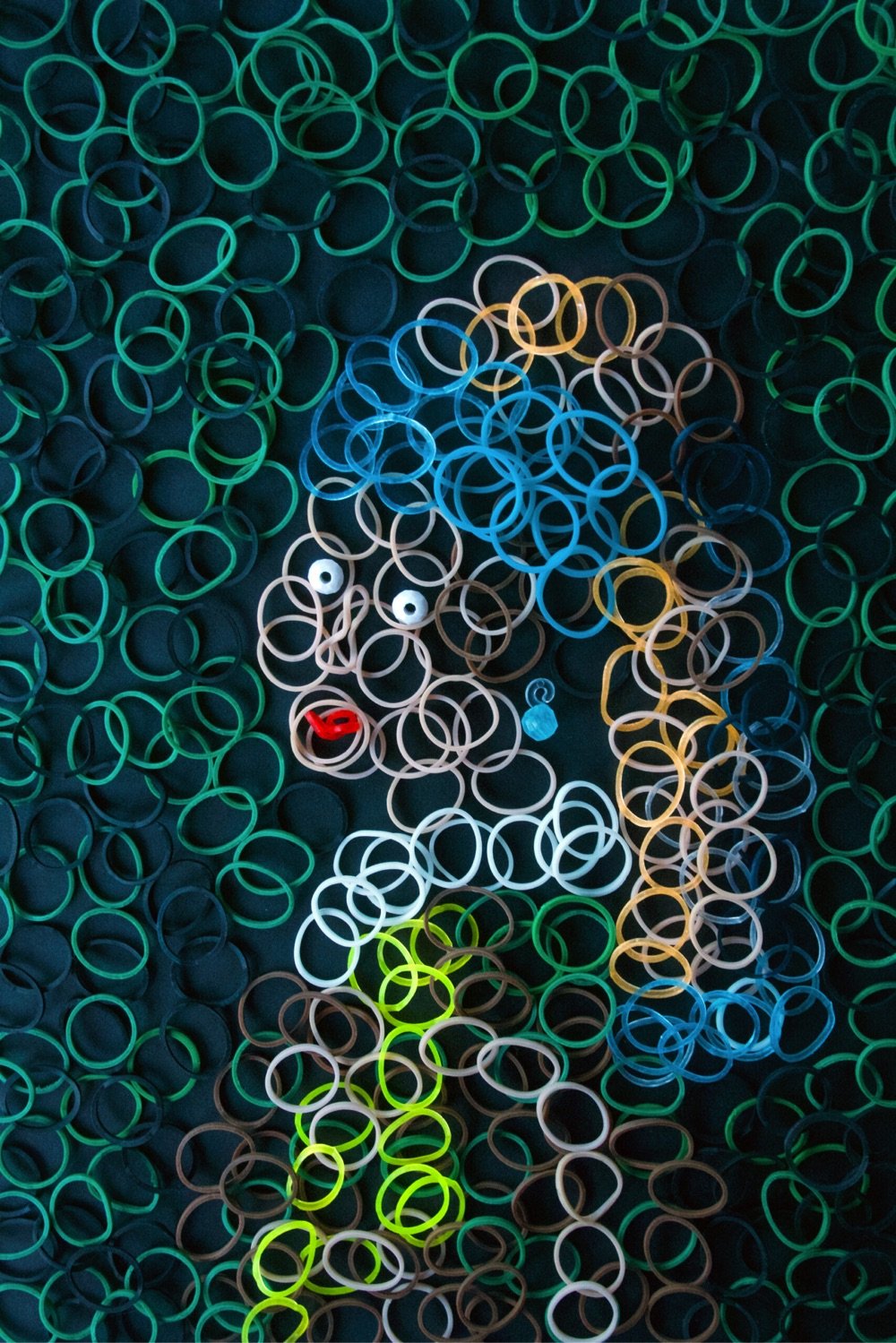
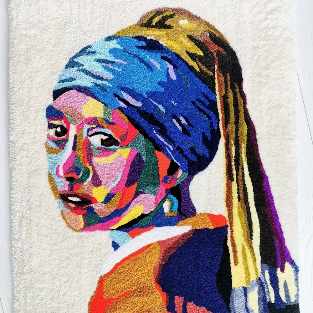
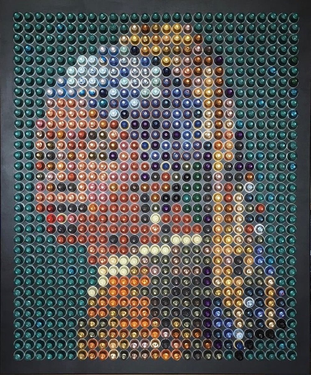
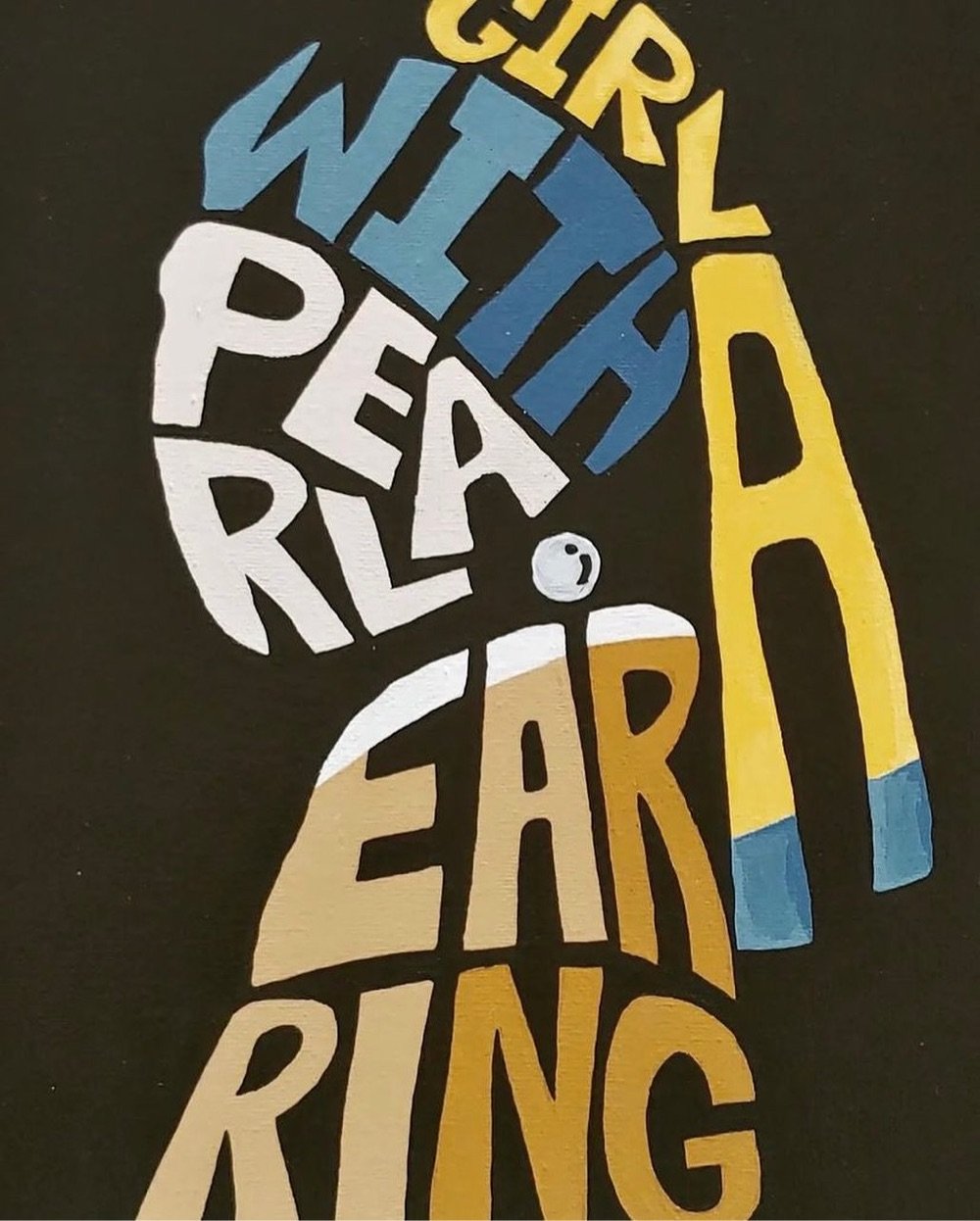
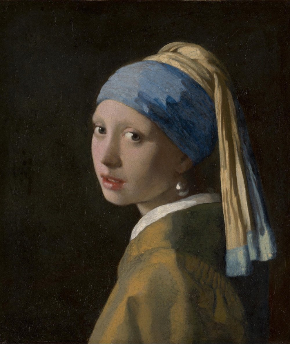
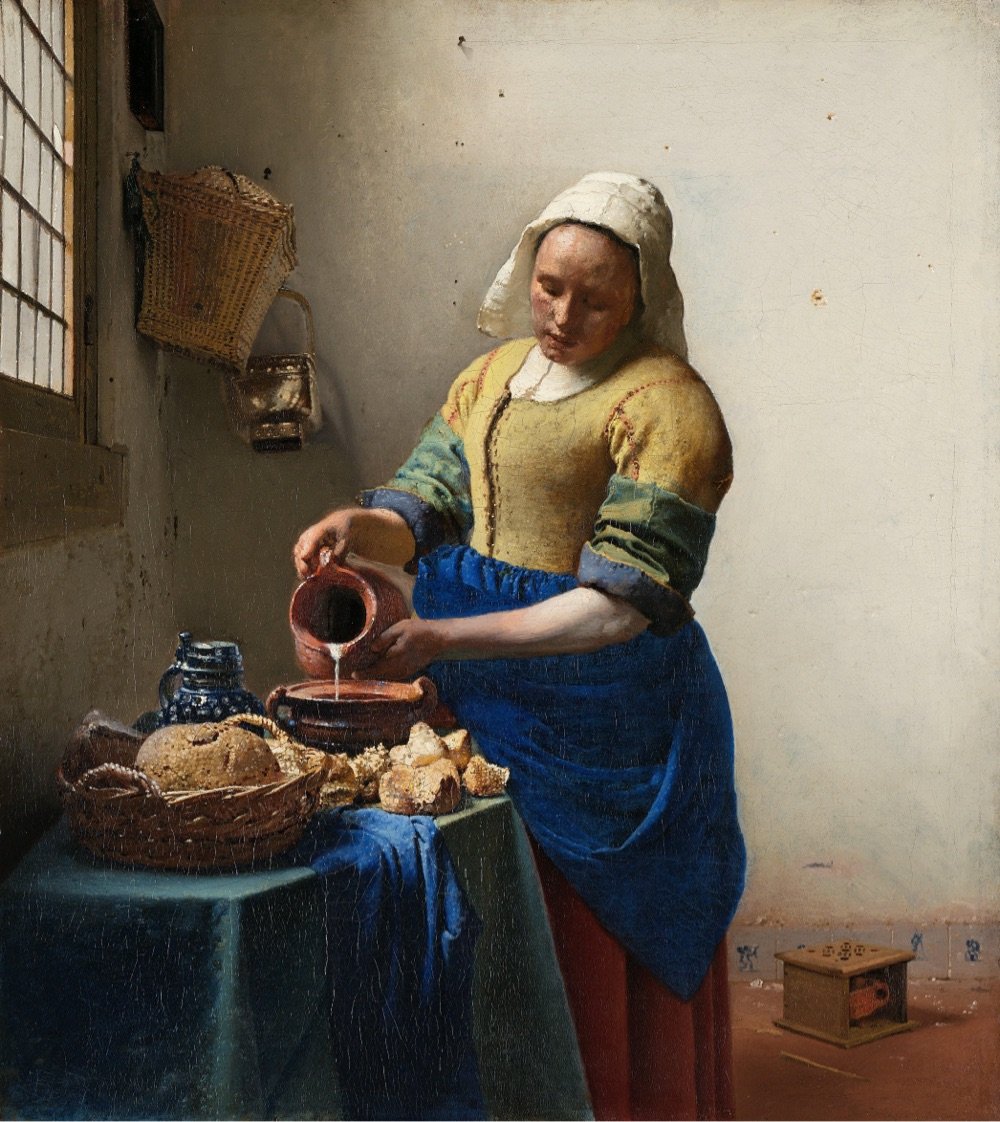
Wow! A forthcoming exhibition at Amsterdam’s Rijksmuseum will bring together 28 of the 37 known paintings by Dutch master Johannes Vermeer, including The Girl with a Pearl Earring. As the museum’s website says: “Never before have so many Vermeers been brought together”.
The exhibition will include masterpieces such as The Girl with a Pearl Earring (Mauritshuis, The Hague), The Geographer (Städel Museum, Frankfurt am Main), Lady Writing a Letter with her Maid (The National Gallery of Ireland, Dublin) and Woman Holding a Balance (The National Gallery of Art, Washington DC).
Works never before shown to the public in the Netherlands will include the newly restored Girl Reading a Letter at the Open Window from the Gemäldegalerie Alte Meister in Dresden.
This is one of the best virtual exhibitions I have ever seen, and I have seen a lot of them. It is written in a personable, light-hearted style that still manages to be incredibly information-rich. The way they zoom into the detail of the paintings to illustrate the commentary is flawlessly paced and takes full advantage of the ultra-high resolution photographs. Fry explains changes Vermeer made based on the most recent imaging and research into his process. There are also annotated areas of each painting which you can click on for a shot of additional information. The notes open in windows that have click-through images, so every note is really multiple notes. Then when you’re done exploring the nooks and crannies, you click back to the main tour and the narration picks up where you left off. Whoever designed this is a content management genius, seriously.
The exhibition runs at the Rijksmuseum from February 10 to June 4, 2023 — but note that The Girl with a Pearl Earring will only be available for viewing until March 30, at which point the painting will return to Mauritshuis in The Hague. I….think I might have to get to Amsterdam to go see this?
In 1812, Japanese woodblock print artist Katsushika Hokusai, who would later become famous for his iconic Great Wave off Kanagawa prints, published a three-volume series called Quick Lessons in Simplified Drawing. All three volumes are available online: one, two, three. Even if you’re not in the market for drawing lessons, the pages are wonderful to flip through.


Stay Connected