Coenfographic
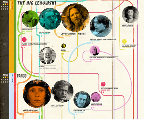
An infographic that stitches together the 15 films that the Coen brothers have made.


This site is made possible by member support. ❤️
Big thanks to Arcustech for hosting the site and offering amazing tech support.
When you buy through links on kottke.org, I may earn an affiliate commission. Thanks for supporting the site!
kottke.org. home of fine hypertext products since 1998.
As you can see in this visualization created by Information is Beautiful, the most commonly used words in horoscopes are amazingly consistent across the twelve different signs. As part of the analysis, they also created a meta-horoscope reading for use anytime during the year:
Ready? Sure? Whatever the situation or secret moment, enjoy everything a lot. Feel able to absolutely care. Expect nothing else. Keep making love. Family and friends matter. The world is life, fun, and energy. Maybe hard. Or easy. Taking exactly enough is best. Help and talk to others. Change your mind and a better mood comes along…
What a crock. (via @dens)
An hour-long documentary on statistics and infoviz produced by the BBC.
Documentary which takes viewers on a rollercoaster ride through the wonderful world of statistics to explore the remarkable power thay have to change our understanding of the world, presented by superstar boffin Professor Hans Rosling, whose eye-opening, mind-expanding and funny online lectures have made him an international internet legend.
(via waxy)
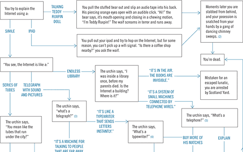
If you ever find yourself time travelling back to Victorian England, here’s a handy flowchart that will help you explain the internet to the youth of the era.
Lovely timeline of the progression of life on Earth.
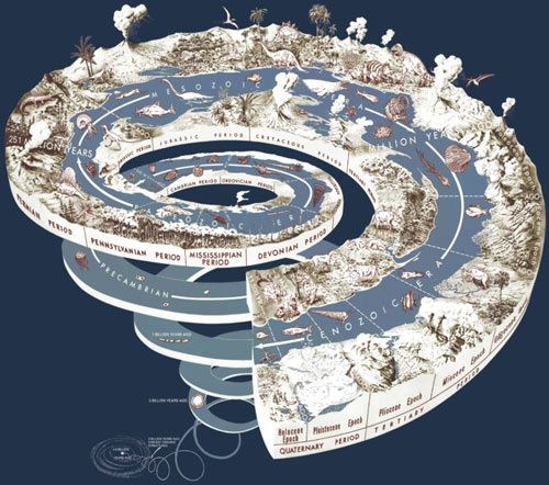
It’s work clicking through to see the larger image. (via @moleitau)
This infographic attempts to explain all the interpersonal connections in Infinite Jest. (via personal report)
Before peeking ahead, quick quiz: as 1884 came to a close, what was the tallest building in the world? It’s the one in the middle of this beautiful diagram of The Principal High Buildings of the Old World from Cram’s Unrivaled Family Atlas of the World:
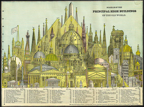
That’s right, the Washington Monument was the tallest building in the world for about five years before the Eiffel Tower, at almost double the height of the Washington Monument, took over the top spot for more than 40 years. (via modcult)
A 50-minute documentary on information visualization and its use in journalism.
Lots of kottke.org regulars in there…Fry, Wattenberg, Koblin, Felton, Stamen, etc. And Amanda Cox sounds like Sarah Vowell!
Pseudovariety — “the illusion of diversity, concealing a lack of real choice” — is when you go to the store and see an entire aisle filled with hundreds of different kinds of soda but most of those soda varieties are owned by three companies. Click through to see a neat visualization of soft drink brands and their market shares and owners.
Here’s what the communication between a web browser and YouTube looks like when the browser requests a video, slowed down 12X so you can actually see what happens.
Locals and Tourists is a set of maps showing where people take photos in various cities around the world. The results are broken down into tourist photos and photos taken by locals. Here’s NYC:

Blue points on the map are pictures taken by locals (people who have taken pictures in this city dated over a range of a month or more). Red points are pictures taken by tourists (people who seem to be a local of a different city and who took pictures in this city for less than a month).
Here’s European airspace shutting down as the ashcloud from Eyjafjallajokull drifts over the continent:
The music is an inspired choice. And here’s European airspace starting back up again:
(via infosthetics)

Shouldn’t the HDR Hole actually extend below the baseline? Larger version is here. See also Clayton Cubitt’s three-step guide to photography:
01: be interesting. 02: find interesting people. 03: find interesting places. Nothing about cameras.
(via clusterflock)
The NY Times’ Paper Cuts blog calls Cartographies of Time “the most beautiful book of the year”. I cannot disagree. In attempting to answer the question “how do you draw time?”, the authors present page after page of beautiful and clever visual timelines.
Cartographies of Time is the first comprehensive history of graphic representations of time in Europe and the United States from 1450 to the present. Authors Daniel Rosenberg and Anthony Grafton have crafted a lively history featuring fanciful characters and unexpected twists and turns. From medieval manuscripts to websites, Cartographies of Time features a wide variety of timelines that in their own unique ways-curving, crossing, branching-defy conventional thinking about the form. A fifty-four-foot-long timeline from 1753 is mounted on a scroll and encased in a protective box. Another timeline uses the different parts of the human body to show the genealogies of Jesus Christ and the rulers of Saxony. Ladders created by missionaries in eighteenth-century Oregon illustrate Bible stories in a vertical format to convert Native Americans. Also included is the April 1912 Marconi North Atlantic Communication chart, which tracked ships, including the Titanic, at points in time rather than by their geographic location, alongside little-known works by famous figures, including a historical chronology by the mapmaker Gerardus Mercator and a chronological board game patented by Mark Twain. Presented in a lavishly illustrated edition, Cartographies of Time is a revelation to anyone interested in the role visual forms have played in our evolving conception of history.
Phil Gyford’s spot-on critique of the number and quality of infographics currently choking the web. As Phil notes, far too many infographics decorate and don’t communicate.
Nice timelapse map view of taxi traffic across Manhattan.
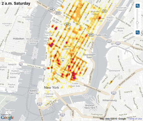
I’ve often wondered what an NYC version of Stamen’s Cabspotting project would look like.
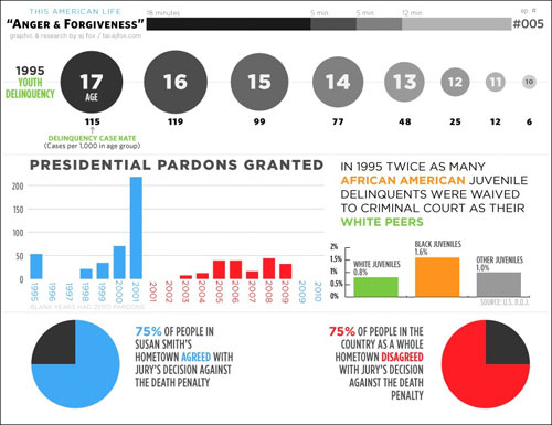
The goal of This American Infographic is to make a companion infographic for every episode of This American Life.
From a study on how people use Firefox, a heat map that highlights the most- and least-popular menu items. Bookmarks got the most use by far, followed by copy and paste. Copy was used about twice as much as paste, which suggests that about 50% of the time, people are copying things to be pasted into another program. Oh and not a single person used “Redo”. (via ben fry)
Photographer Michael Najjar took some of his photos from the Andes and turned them into stock market infographics. Here’s Lehman Brothers stock price from 1980 to 2008.
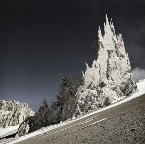
Boy, their stock price really fell off a cliff there, didn’t it? The rest of the series is worth a look as well, although Najjar’s site features the worst use of Flash I’ve seen in many months…it automatically fullscreens and generally wastes a bunch of time with transitions. To find the rest of the photos, wait until the map starts loading and put your mouse at the bottom of the screen. A menu will s.l.o.w.l.y. slide up…High Altitude is what you’re looking for. (via info aesthetics)
This visualization represents a year in color (summer is at the top, winter at the bottom).

The images were taken of the Boston Common, courtesy of Flickr.
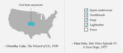
Information visualization of some well-known movie quotes. A picture is, how you say, worth a thousand words:
A representation of how deep the Mariana Trench is. Turns out it’s really, really, really, really, really, really, really, really, really, really, really, really, really deep. (via df)
Watch Twitter’s engineering team and code base grow as the site gets more and more popular. It gets nuts at the end.
(thx, chris)
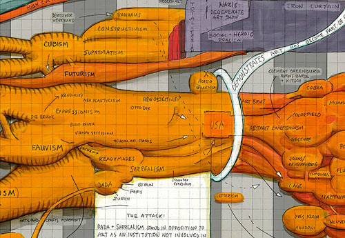
Ward Shelley paints these wonderfully intricate timelines of different things…his life, Frank Zappa’s career, and the history of the avant garde.
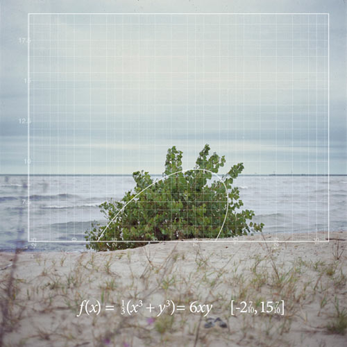
Photographs of curves found in nature and the graphs and functions that go with them.
(via snarkmarket)
Clever idea: you can measure the amount of ink required to print different typefaces simply by writing them out with ballpoint pens. The pens themselves become the usage graph:

Update: You can also use this technique to represent which colors you draw with most often.
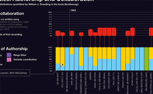
The most interesting of several infographics related to The Beatles is the first one depicting the declining rate of collaboration within the band gleaned from songwriting credit data.
(thx, bryan)
This clever graph by National Geographic shows the cost of healthcare compared to life expectancy in a number of countries. The way that the US healthcare expenditure is pictured entirely outside the confines of the graph’s scale and legend is a particularly effective design decision. (thx, jim)
Stay Connected