Watch a hand-lettering master at work
Glen Weisgerber is a wizard at the art of hand-lettering. Make sure you watch all the way through for the big flourish-y finish.
(via colossal)


This site is made possible by member support. ❤️
Big thanks to Arcustech for hosting the site and offering amazing tech support.
When you buy through links on kottke.org, I may earn an affiliate commission. Thanks for supporting the site!
kottke.org. home of fine hypertext products since 1998.
Glen Weisgerber is a wizard at the art of hand-lettering. Make sure you watch all the way through for the big flourish-y finish.
(via colossal)
More than 80 photos of marvelous wood type alphabets in this Flickr set.

The scans are from Rob Roy Kelly’s 100 Wood Type Alphabets. (via @H_FJ)
While researching the etymology of the word “fave”, a noun that’s in the process of being verbed,1 I noticed that, according to Google’s ngram viewer, the word was much more popular in the 1600-1700s than it is now.

A bit of investigation reveals that Google’s book-scanning software is at fault; it can’t recognize the long s commonly used in books prior to the 1800s. So each time it encounters “save” with a long s, it sees “fave”:
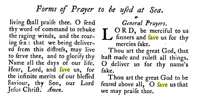
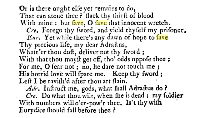
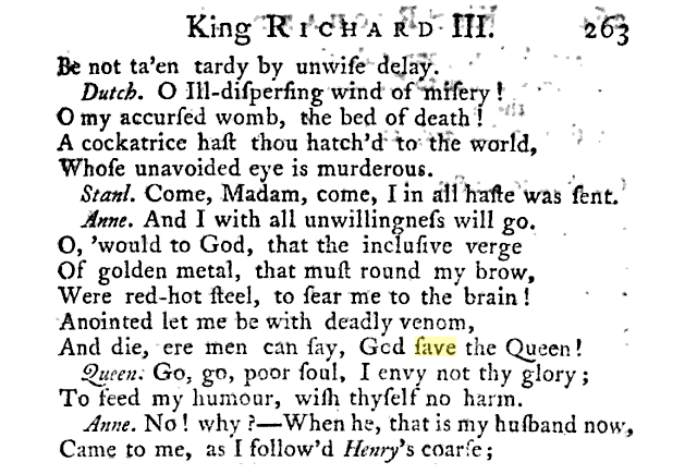
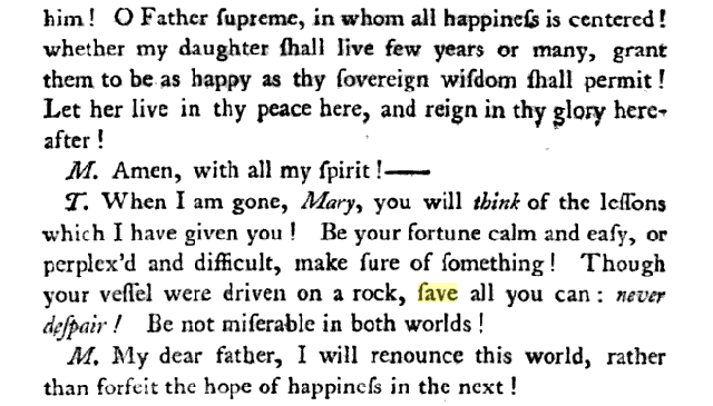
“Fave” (n., adj.) is slang for “favorite”, a usage that started in the US in the 1920s, as in “Teddy Roosevelt was totally my fave President”. Recently, “fave” (v.) has come to mean liking or marking an item as a favorite on social media services like Twitter, Flickr, Facebook, Tumblr, Stellar, etc. (IMPORTANT: It’s “fave”, not “fav”. Let’s get this one right, people.)↩
The Art of the Title chats with the excellent Jessica Hische about the lettering and type design she did for Wes Anderson’s Moonrise Kingdom.
To me, that was really fun because if you think about New England in the ’60s… it’s not like most places would be staying on top of the most current trends in type, using typefaces that were released that very year. So, using something from the ’40s made sense to me. If you think about a small, conservative New England town, lord knows all the printers and designers in town are probably still using type from years ago. I think when people think about historical type references, they often don’t think about that. You should be reaching from that time period to 15 - 20 years earlier and then you’ll be getting stuff that’s quote-unquote “current.”
And she’s releasing the typeface commercially so everyone can use it! Yay!
It was just me and Barack, but now Hoefler & Frere-Jones’ web fonts are available to all.
From the AIGA, a lovely short film on type designers Jonathan Hoefler and Tobias Frere-Jones. I love the bit about starting a typeface design with the O, H, and D. Elsewhere, Hoefler recommended other potential starting points:
Work out the B, the ampersand, and the bullet before you get too far: you’ll have to confront decisions about thinning strokes, intersections, and shapes without any counters, which might inform what you do on the other letters.
(via daring fireball)
Before personal brands were something to be seared into the minds of a rabid fanbase, brands were symbols that were literally burned into the flesh of livestock to keep track of ownership. The Texas and Southwestern Cattle Raisers Association has a guide to designing your own cattle brand.
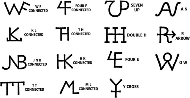
Smithsonian Magazine’s Jimmy Stamp has more info on what cattle brands are all about. For more info on what personal brands are all about, spend more than 30 seconds on Twitter.
Stephen Coles of Typographica says that 2012 was “a strong year” for new typefaces. He asked dozens of designers and font makers to nominate their favorite 2012 typefaces and here’s what they had to say.
The independent foundry has also cemented its place as the new foundation of the industry. Most of this year’s selections are from very small shops, several of which are entirely new to the market. It’s also significant that, in addition to offering their fonts through retailers like FontShop, MyFonts, and the newly revived Fonts.com, most of these indie foundries now sell directly to customers through their own sites. In some cases they have eschewed outside distribution altogether. The “majors” have not simply laid down, however. Monotype, Linotype, Font Bureau, FontFont, and H&FJ are all represented in this year’s list, each with releases that are remarkably characteristic of their respective brands.
(via df)
Marco Arment has added a typeface optimized for dyslexics to Instapaper.
I’m happy to report that in this update, I added the Open-Dyslexic font by Abelardo Gonzalez. Its bottom-weighted characters are designed to reduce letter-swapping and increase differentiation between similar-looking letters, which improves readability for people with dyslexia. It’s now the bottom-most option in the font list in Instapaper’s text-controls (“aA”) panel.
Nicely done.
Flavorwire has a quick look at some noted directors (Kubrick, Wes Anderson, Fincher) and the typefaces that they often used. (via @curiousoctopus)
You may remember a short piece by Errol Morris in the Times a few weeks ago that was more of a quiz than a essay. Well, the quiz turned out to be a smokescreen for how people’s opinions change when the text is set in different typefaces.
Each Times participant read the passage in one of six randomly assigned fonts - Baskerville, Computer Modern, Georgia, Helvetica, Comic Sans and Trebuchet. The questions, ostensibly about optimism or pessimism, provided data about the influence of fonts on our beliefs.
The test consisted of comparing the responses and determining whether font choice influenced our perception of the truth of the passage.
The results pointed to a small but noticeable effect in the authority of each font.
DAVID DUNNING: Baskerville seems to be the king of fonts. What I did is I pushed and pulled at the data and threw nasty criteria at it. But it is clear in the data that Baskerville is different from the other fonts in terms of the response it is soliciting. Now, it may seem small but it is impressive.
ERROL MORRIS: I am completely surprised by this. If you asked me in advance, I would have guessed Georgia or Computer Modern, something that has the imprimatur of, I don’t know, truth - truthiness.
DAVID DUNNING: The word that comes to my mind is gravitas. There are some fonts that are informal - Comic Sans, obviously - and other fonts that are a little bit more tuxedo. It seems to me that Georgia is slightly tuxedo. Computer Modern is a little bit more tuxedo and Baskerville has just a tad more starchiness. I would have expected that if you are going to have a winner in Baskerville, you are also going to have a winner in Computer Modern. But we did not. And there can be a number of explanations for that. Maybe there is a slight difference in how they are rendered in PCs or laptops that causes the starch in Computer Modern to be a little softer than the starch in Baskerville.
ERROL MORRIS: Starchiness?
DAVID DUNNING: Fonts have different personalities. It seems to me that one thing you can say about Baskerville is that it feels more formal or looks more formal. So that may give it a push in terms of its level of authority. This is, of course, speculation. I don’t really know. What one would do with, when you get surprising results is you now have to think about, O.K., what do we do to take that back-ended speculation and support it with data?
Update: Pentagram’s Michael Bierut weighs in on Morris’ article.
Whether or not a typeface can do any or all of those things, I do agree the landscape has changed. Once upon a time, regular people didn’t even know the names of typefaces. Then, with the invention of the personal computer, people started learning. They had their opinions and they had their favorites. But until now, type was a still matter of taste. Going forward, if someone wants to tell the truth, he or she will know exactly what typeface to use. Of course, the truth is the truth no matter what typeface it’s in. How long before people realize that Baskerville is even more useful if you want to lie?
Lovely type and illustration on these architectural stationery vignettes collected by BibliOdyssey.
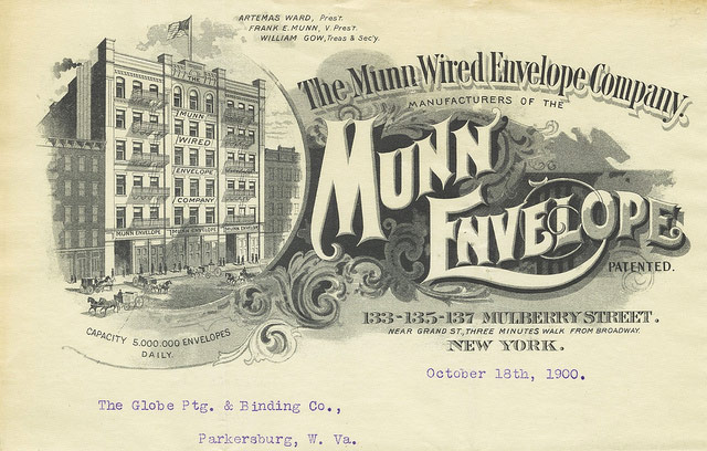
The images in this post all come from Columbia University’s very large assortment of commercial stationery (featuring architectural illustrations): the Biggert Collection.
The vast majority of the images below have been cropped, cleaned and variously doctored for display purposes, with an intent towards highlighting the range of letterform/font and design layouts. The underlying documents are invoices (most), letters, postcards, shipping records and related business and advertising letterhead ephemera from the mid-1800s to the 1930s.
See also the Sanborn fire insurance maps.
Typographica shares their favorite typefaces of 2011.
The idea is simple: I invite a group of writers, educators, type makers and type users to look back at 2011 and pick the release that excited them most.
(via ★essl)
Type designer Matthew Butterick sent a letter to director Brad Bird about the use of Verdana in captions and subtitles in the latest Mission Impossible movie.
Second, it’s not stylistically suitable. Verdana is a built-in font on nearly every Windows and Mac computer. It’s used on zillions of web pages. It’s ubiquitous. Therefore, the person who uses Verdana suggests to readers “I couldn’t be bothered to pick anything better.” It’s also well-known as the corporate font of IKEA — probably not the association you’re going for.
(via ★aaronsw)
The Internet Archive is hosting a copy of the American Specimen Book of Type Styles put out by the American Type Founders Company in 1912. It’s a 1300-page book listing hundreds of typefaces and their possible use cases.
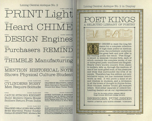
There’s also a 1910 copy of what is basically the German version of the ATF book. Look at these swirls! (via @h_fj)
Old-school font foundry Emigre is doing most (all?) of their typefaces as web fonts. I’m going to redo my goth blog in Exocet.
An excellent 26-minute talk by Jonathan Hoefler of the Hoefler & Frere-Jones about how they think about designing typefaces and webfonts in particular.
Today, as webfonts are buoyed by a wave of early-adopter enthusiasm, they’re marred by a similar unevenness in quality, and it’s not just a matter of browsers and rasterizers, or the eternal shortage of good fonts and preponderance of bad ones. There are compelling questions about what it means to be fitted to the technology, how foundries can offer designers an expressive medium (and readers a rich one), and what it means for typography to be visually, mechanically, and culturally appropriate to the web. This is an exploration of this side of web fonts, and a discussion of where the needs of designers meet the needs of readers.
I love Typekit, but I am very much looking forward to switching Stellar over to Whitney or somesuch when H&FJ’s webfonts are released (if the price and performance are right).
Remember the kerning game? The same folks have built a letter shaping game where you can play at being a type designer. I found this to be a bit more difficult than kerning.
A lovely collection of hand-lettered American department store logos from the late 19th and early 20th century.
You’re given a name and you have to guess if it’s a cheese or a font. This might be the most difficult game I’ve ever played. (thx, @ziggy444)
Kern Type is a game that compares your kerning efforts to those of professional designers. It’s surprisingly fun. (thx, damien)
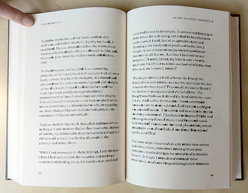
From Fathom, a copy of Mary Shelley’s Frankenstein constructed from found type on the web…as the book goes on, the type gets less legible.
The incomplete fonts found in the PDFs were reassembled into the text of Frankenstein based on their frequency of use. The most common characters are employed at the beginning of the book, and the text devolves into less common, more grotesque shapes and forms toward the end.
When I heard the news, my immediate reaction was not positive. There may have been an expletive uttered. I am happy for the crew at Typekit, several of whom are my friends, but Adobe products do not fill me with joy when I use them. No one I know is filled with joy when using Adobe products…mostly the opposite. Typekit is a great service; I hope Adobe keeps it that way.
Moritz Resl took all of the fonts installed on his computer and averaged them together to make a new font: the average font.

The full alphabet is available on Flickr. (via stellar)
Absolutely beeeeeyooootiful typography on these Sanborn fire insurance maps.
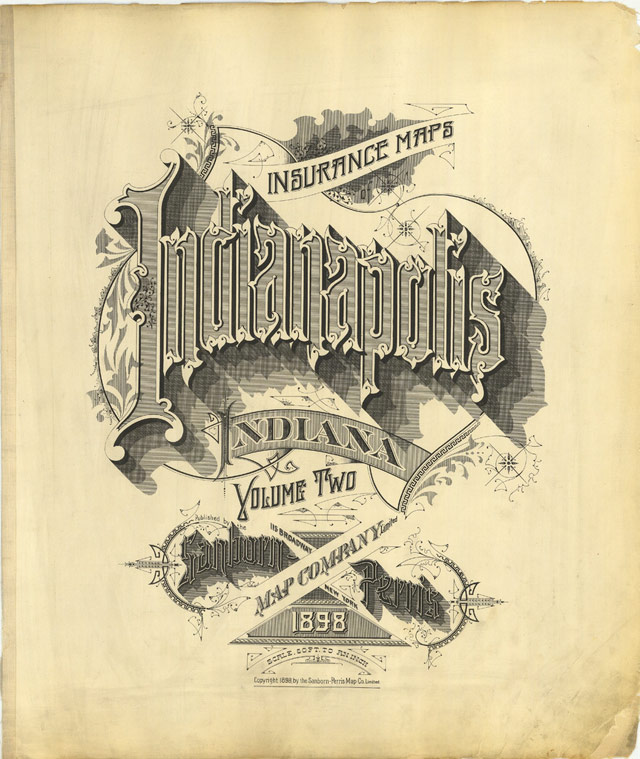
Sanborn’s fire insurance enterprise produced not only excellent and detailed urban maps, but they also maintained an elegant aesthetic in the headings and legends on the maps themselves, and in the title pages of the (larger) city volumes. The ornamental flair is diverse — I don’t think any of the examples above repeat type styles — and lends an air of individuality and refinement to each of the towns surveyed.
Although this sort of artistic embellishment was unlikely to have increased map sales on its own, it’s a charming addition which will have perhaps made the purchasers feel a sense of pride and a little more secure about their own unique town. And it’s certainly in keeping with the cartographic tradition of decorative trimmings.
Chris Ware must have a stack of these babies near his drawing table from which to crib.
Christian Boer designed a typeface especially for dyslexics called dyslexie.
Research by the University of Twente indicates that the typeface decreases reading errors by dyslexics.
Andy Clymer of H&FJ built a prototype tool that uses facial recognition to design fonts.
(via h&fj)
I love these two related typefaces by Klim Type Foundry: Metric and Calibre.
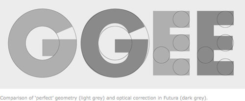
Metric & Calibre are a pair of typefaces that share a fundamental geometry yet differ in the finish of key letterforms. Metric is a geometric humanist, sired by West Berlin street signs. Calibre is a geometric neo-grotesque, inspired by the rationality of Aldo Novarese’s seldom seen Recta. They were conceived as a pair but function independently of each other.
The development of Metric & Calibre is based upon two ideas-1: “engineered geometry” and it’s application to street signage, 2: alternate letterforms in typefaces.
(via df)
Stay Connected