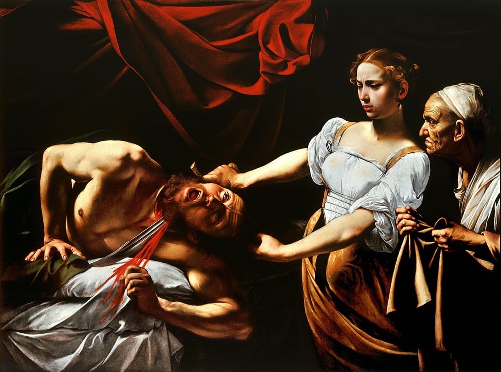
In the story, Judith, a beautiful widow, is able to enter the tent of Holofernes because of his desire for her. Holofernes was an Assyrian general who was about to destroy Judith’s home, the city of Bethulia. Overcome with drink, he passes out and is decapitated by Judith; his head is taken away in a basket.
The story has been a rich vein for artists to explore throughout the centuries. Michelangelo worked it into the Sistine chapel, Botticelli & Rubens painted it, and Italian painter Caravaggio’s rendition is probably the most well-known:
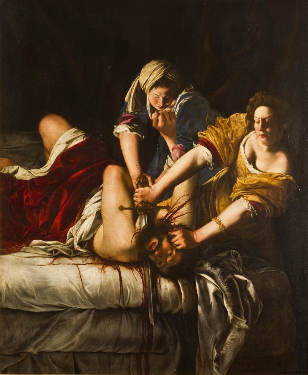
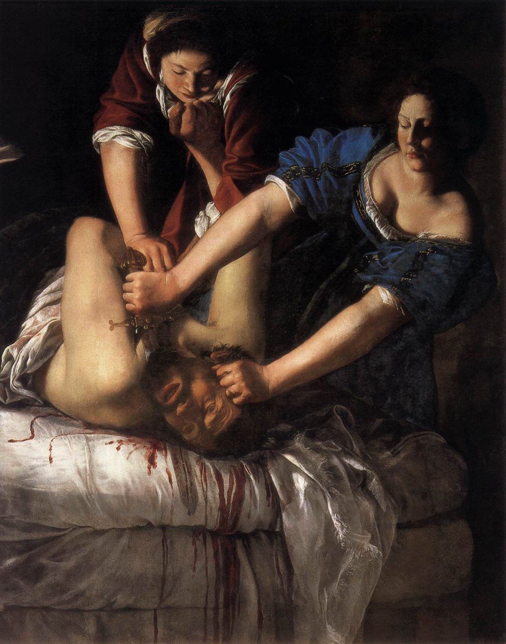
As it was from a young age in her father’s studio, her mastery is readily apparent but some context is helpful to appreciate the painting more fully. Throughout her career, Gentileschi featured women, often from mythology or the Bible, as primary subjects with real agency in her paintings. But the story of Judith and Holofernes likely appealed to her for another reason as well. When she was 17 or 18, Gentileschi was raped by her painting instructor, Agostino Tassi. He was convicted at trial, with Gentileschi having to testify in detail about the assault and submitting to torture to ensure she was telling the truth:
During the trial, she was subjected to sibille, a process in which ropes were tied to her fingers and tightened progressively. The practice was meant to divine whether or not she was telling the truth. After seven months in court, the judged finally ruled in Gentileschi’s favor. Tassi was sentenced to five years in prison, but never actually served time.
There appears to be some scholarly disagreement about this, but many believe that Judith Slaying Holofernes, first painted around the time of the trial, was a self portrait, with Gentileschi painting herself as Judith and Tassi as Holofernes. More recently, some critics & historians have tried to draw emphasis away from her assault in the interpretation of this and other paintings, focusing on her growing proficiency and not her victimhood. Whatever her intent at the time, the painting stands as a powerful statement and the young artist was able to continue painting, eventually becoming one of the most famous and sought-after artists in Europe.
By the time Gentileschi made Self-Portrait as the Allegory of Painting, she’d received perhaps the greatest honor bestowed upon the era’s painters: induction into the Accademia del Disegno. She was the first woman to receive the distinction and, according to the 2007 catalogue for the exhibition “Italian Women Artists: From Renaissance to Baroque,” it changed the course of her life.
With this badge of honor, Gentileschi could buy paints and supplies without a man’s permission, travel by herself, and even sign contracts. In other words, through painting, she had gained freedom. Gentileschi would go on to separate from her husband and live and work independently, primarily in Naples and London, for the rest of her life. All the while, she supported her two daughters, who also went on to become painters.
After her death, Gentileschi’s influence waned and her contributions were nearly forgotten. It was only in the 20th century that her work started to be recognized again. If you’d like to see Judith Slaying Holofernes in person, there are two copies of the painting. The earlier one, painted around the time of the trial, is housed at the Museo di Capodimonte in Naples:
A copy painted a decade later (the one shown above, with Judith in yellow) is on display at the Gallerie degli Uffizi in Florence.
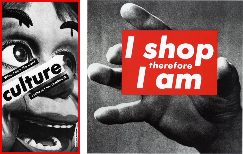
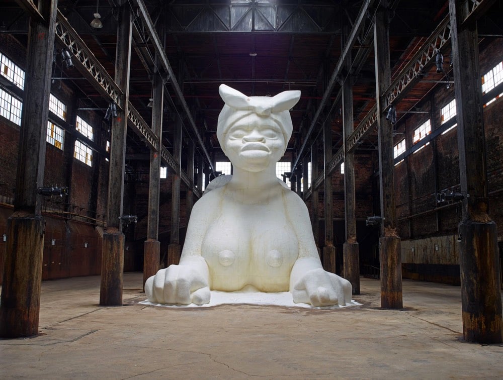
The NY Times convened a group of curators and artists to decide on a list of the 25 artworks made since 1970 “that define the contemporary age”. At various times, the panelists objected to the futility of such an exercise, but eventually ended up with a list that’s highly subjective, grossly incomplete, and full of great work.
Nan Goldin, Barbara Kruger, Jenny Holzer, and Kara Walker all made the list. Jeff Koons is listed, somewhat reluctantly both by the panel and himself: “The artist did not grant permission for the named work to be published.”
Perhaps just as interesting as the artworks is the panelists’ discussion, a mini-tour of recent art history. Artist Martha Rosler said of Walker’s “A Subtlety, or the Marvelous Sugar Baby”:
“A Subtlety” made lots of people furious because it was about the history of labor and sugar in a place that was already about to be gentrified. It was this gigantic, mammy-like, sphinxlike, female object, and then it had all these little melting children. “A Subtlety” is part of a very longstanding tradition that began in the Arab world that had to do with creating objects out of clay but also out of sugar. So it’s the impacted value of extractive mining, but it’s also the impacted value of the labor of slaves. And it’s also on the site where wage slavery had occurred — sugar work was the worst. The Domino Sugar factory was once owned by the Havemeyers, and Henry Havemeyer was one of the main donors to the Metropolitan Museum of Art. The sugar king was the art king. So it had all of these things — and then there’s the idea of all these people taking selfies in front of it. It was extremely brilliant without having to say a thing.
During the course of his television career, Bob Ross painted more than 1000 paintings. But you never see them for sale. You can buy Bob Ross paint sets and even a waffle maker that makes waffles that look like Bob Ross — “Pour in the batter, lower the lid, and before you know it, there’s Bob Ross ready for butter and syrup.” — but good luck buying one of his actual paintings. In this charming little video from the NY Times, we learn where all of Bob Ross’s paintings are, meet the paintings’ custodians, and discover why the art isn’t for sale.
In 1994, the talk show host Phil Donahue asked Mr. Ross to “say out loud your work will never hang in a museum.”
“Well, maybe it will,” Mr. Ross replied. “But probably not the Smithsonian.”
Some of Ross’s paintings can be viewed at The Bob Ross Art Workshop & Gallery in New Smyrna Beach, Florida. Every episode of The Joy of Painting can be viewed on YouTube or sometimes streaming on Twitch. I watched on Twitch for a couple minutes just now and was tickled to catch him saying one of his signature phrases: “happy little trees”.
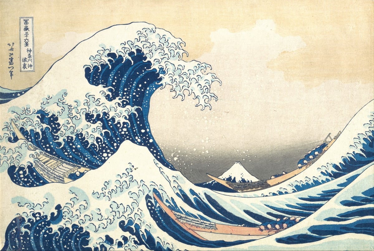
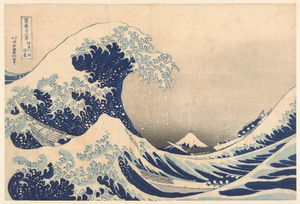
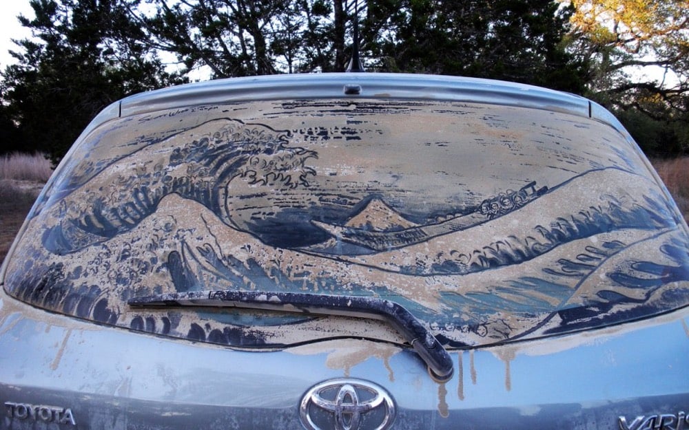
One of the world’s great art masterpieces is Katsushika Hokusai’s woodblock print Kanagawa oki nami ura, popularly known as The Great Wave. Thousands of prints were made and some of the surviving copies made their way into museums & private collections. I’ve selected three of the highest resolution prints available for free download (from top to bottom):
Douglas McCarthy recently wrote about The Great Wave and the various ways that museums choose to offer digital copies on their websites.
If we consider the customer journey of acquiring a digital image of ‘The Great Wave’ from our fourteen museums, a definite trend emerges — the more open the policy of a museum is, the easier it is to obtain its pictures.
Like the other open access institutions in our sample group, The Art Institute of Chicago’s collections website makes the process incredibly simple: clicking once on the download icon triggers the download of a high-resolution image.
In contrast, undertaking the same process on the British Museum’s website entails mandatory user registration and the submission of personal data.
Update: A few years ago, woodblock printmaker David Bull documented the process of making prints of The Great Wave in this great series of videos. Part of his process included a fascinating investigation of previous prints and trying to determine which of the many prints might be printed by the original printer. He shares bits and pieces of that investigation in the first three videos and also the eighth & tenth videos, in which he zeroes in on two candidates for original prints (the one at the Met shown above and the British Museum print) and concludes, controversially I would think, that one (and possibly both) of these prints was made as a knock-off, a forgery. After watching Bull’s explanation, it’s not at all difficult to think that perhaps very few prints made from the original blocks by the original printer exist today. (via @gregalor)
With your support this book will for the first time reveal and re-assemble around ninety drawings made between 1988 and 2018.
Working with the designer Simon Esterson we are producing the book independently and by using Kickstarter we have total control of the design and quality of production, resulting in a beautiful edition — if we reach the target!
I am delighted that the introduction will be by Luc Sante, the brilliant writer and chronicler of cities, known best for Low Life : Lures and Snares of Old New York.
Google Arts & Culture, with expertise from music video geniuses La Blogothèque, have produced a series of videos they’re calling Art Zoom. Inspired a bit by ASMR, the videos feature musicians talking about famous artworks while they zoom in & out of high-res images taken with Google’s Art Camera. Here, start with Maggie Rogers talking about Vincent van Gogh’s Starry Night:
The other two videos in the series feature Jarvis Coker talking about Monet’s La Gare Saint Lazare and Feist talking about The Tower of Babel by Pieter Bruegel the Elder.
From Evan Puschak, this explanation of how art went from almost fully representational painting to abstract impressionism in about 100 years is a 6-minute whirlwind tour of modern art, from Édouard Manet to Jackson Pollock’s drip paintings. I always love when Puschak dips back into art…the first video of ever posted of his was about Jacques-Louis David’s The Death of Socrates.
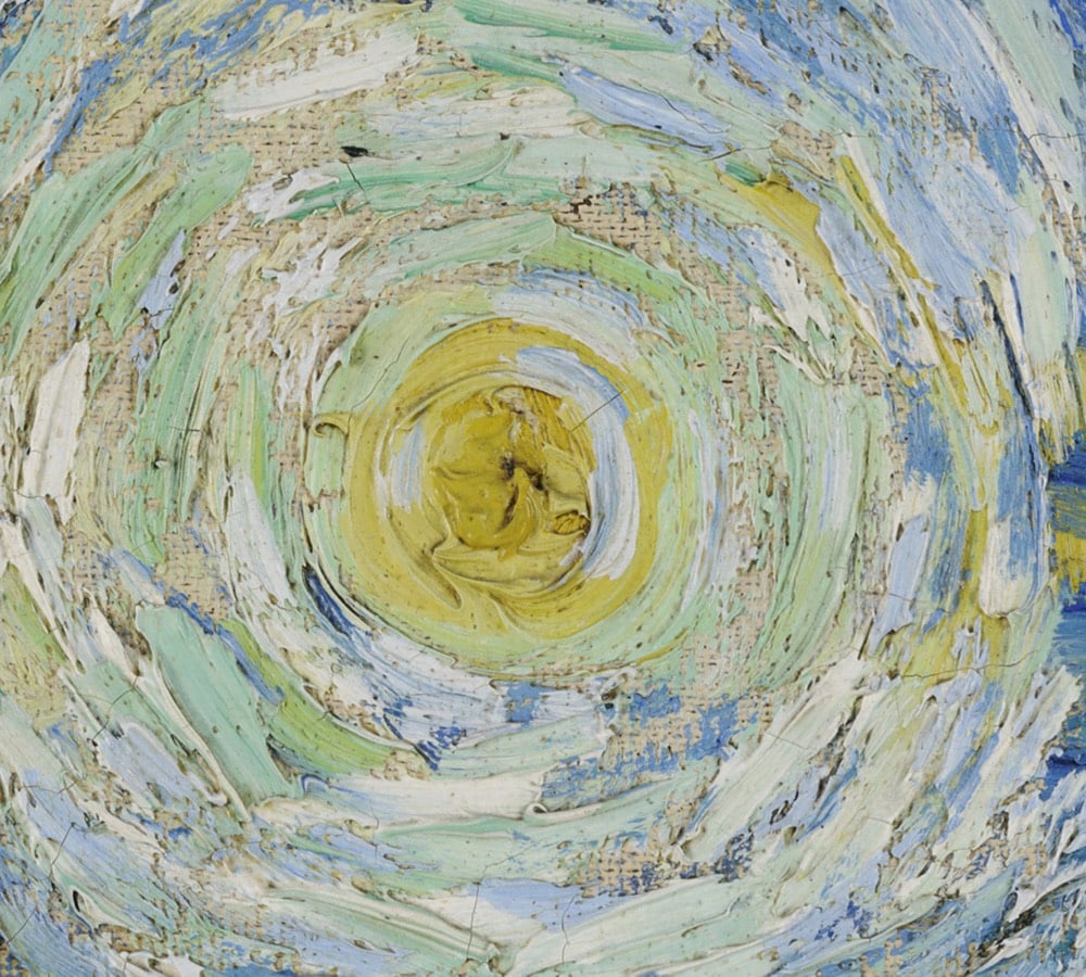
It takes some imagination, but standing before a painting by Hilma af Klint, a sculpture by Bernini, or a cave painting in Chauvet, France draws you back in time in a powerful way: you know you’re standing precisely where those artists stood hundreds or even thousands of years ago, laying paint to surface or chisel to stone. Even experiencing art through prints or photographs leads the mind to consider all the cultural, political, technological, and economic things that were happening when the work was produced. Art is a doorway to past worlds.
Fisk’s maps represent the memory of a mighty river, with thousands of years of course changes compressed into a single image by a clever mapmaker with an artistic eye. Looking at them, you’re invited to imagine the Mississippi as it was during the European exploration of the Americas in the 1500s, during the Cahokia civilization in the 1200s (when this city’s population matched London’s), when the first humans came upon the river more than 12,000 years ago, and even back to before humans, when mammoths, camels, dire wolves, and giant beavers roamed the land and gazed upon the river.
I don’t know if this needs a disclaimer or not, but 20x200 paid me a modest amount to write this blog post for their site but not the post you’re reading now. 20x200 didn’t pay me to write this here post; they didn’t even ask me if I would link to their post from my site. I once wrote a slightly longer (and progressively unhinged) disclaimer for a previous post about 20x200.
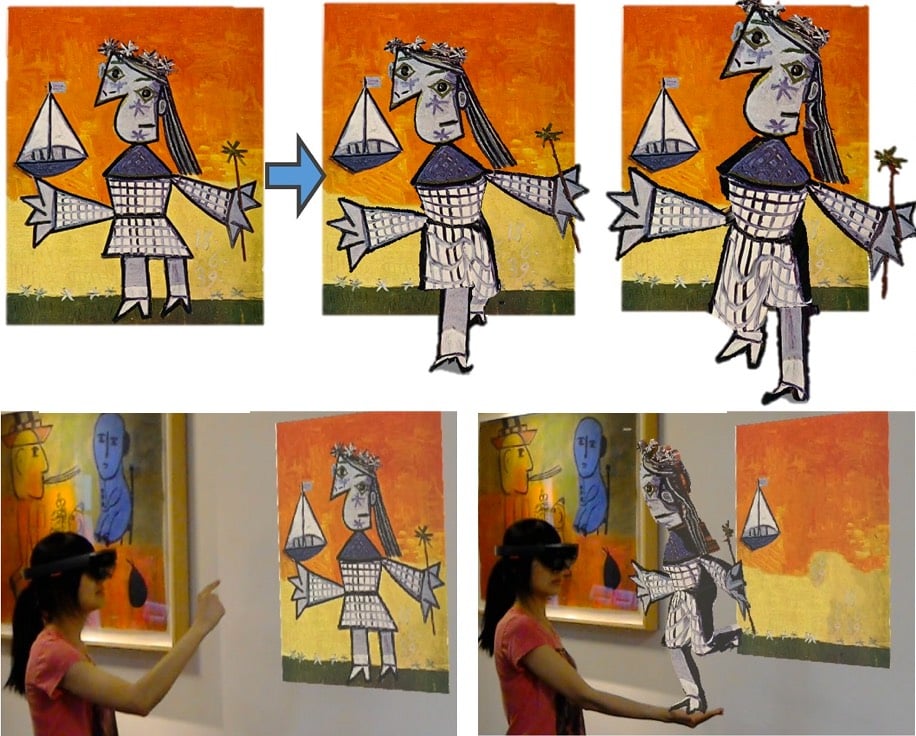
Researchers at the University of Washington and Facebook have developed an algorithm that can “wake up” people depicted in still images (photos, drawings, paintings) and create 3D characters than can “walk out” of their images. Check out some examples and their methods here (full paper):
The AR implementation of their technique is especially impressive…a figure in a Picasso painting just comes alive and starts running around the room. (thx nick, who accurately notes the Young Sherlock Holmes vibe)
The National Sound Library of Mexico says they have found the only known audio recording of Frida Kahlo’s voice. Take a listen:
The library have unearthed what they believe could be the first known voice recording of Kahlo, taken from a pilot episode of 1955 radio show El Bachiller, which aired after her death in 1954.
The episode featured a profile of Kahlo’s artist husband Diego Rivera. In it, she reads from her essay Portrait of Diego, which was taken from the catalogue of a 1949 exhibition at the Palace of Fine Arts, celebrating 50 years of Rivera’s work.
Film footage of Kahlo is difficult to come by as well; I could only find these two clips:
The first video is in color and shows Kahlo and husband Diego Rivera in her house in Mexico City. The second shows Kahlo painting, drawing, and socializing with the likes of Leon Trotsky. At ~0:56, she walks quickly and confidently down the stairs of a ship, which is a bit surprising given what I’ve read about her health problems.
Update: According to this article (and its translation by Google), the voice on the recording isn’t Kahlo but belongs instead to actress Amparo Garrido:
Yes, I recognize myself. For me it was a big surprise because so many years had passed that I really did not even remember. […] When listening to this audio I remembered some things and I got excited because I did recognize myself.
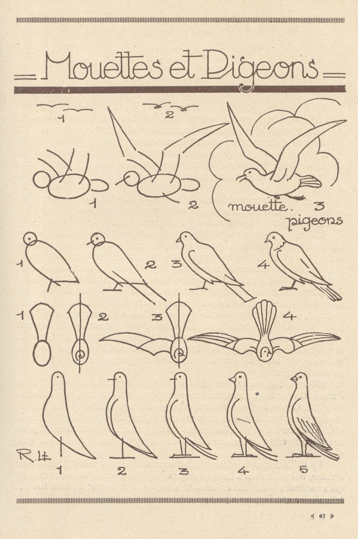
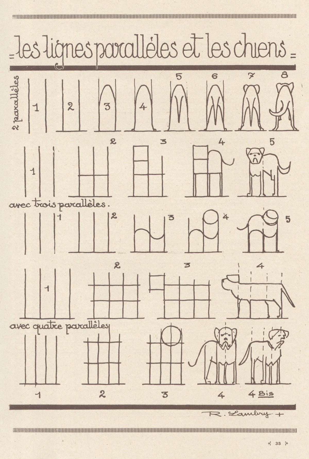
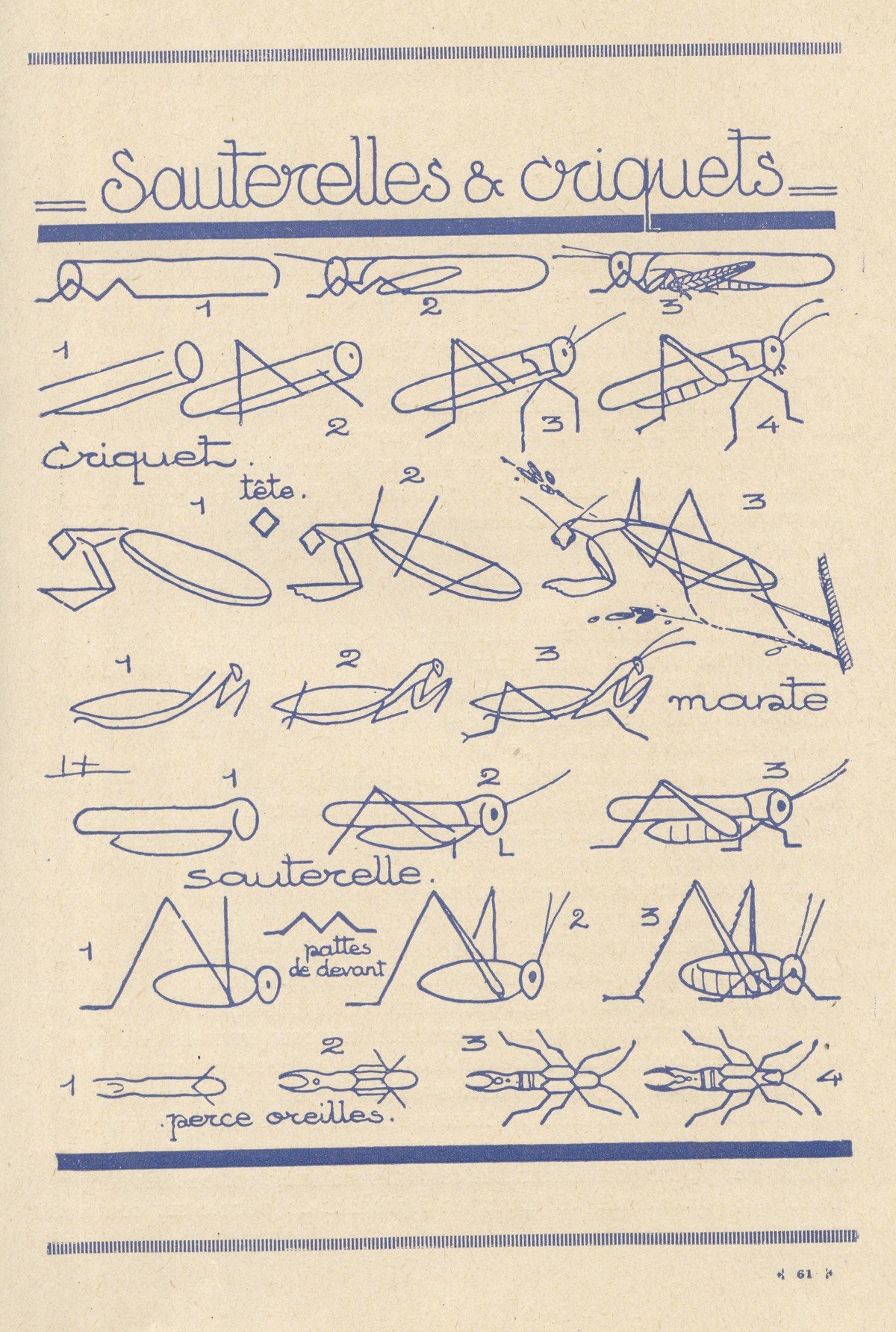
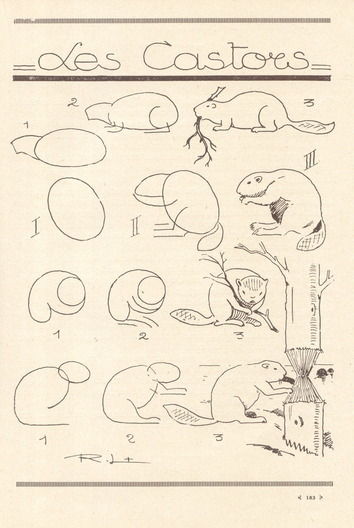
Les Animaux Tels Qu’ils Sont is a 1930s book by Robert Lambry that contain instructions for drawing all kinds of animals, from elephants and snakes to birds and horses. Each drawing starts with basic forms — circles, rectangles, etc. — which Lambry builds into simple line drawings of each animal. I love the dogs drawn with parallel lines.
Update: A new English edition of Lambry’s book is being released this fall as The Draw Any Animal Book. (thx, matt)
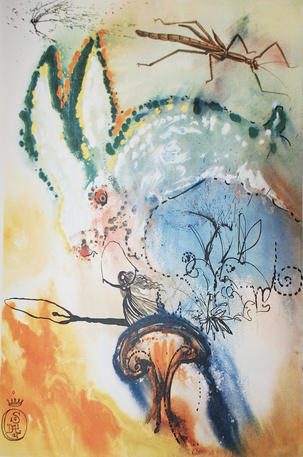
In 1969, surrealist Salvador Dali provided a set of 12 illustrations for an edition of Alice in Wonderland, a seemingly perfect match of artist to subject matter. It was released in a limited edition and copies are now a coveted collector’s item — here’s a signed copy on eBay for $10,000. Luckily, Princeton Architectural Press put out a 150th anniversary edition a few years ago that’s more manageable (Amazon).
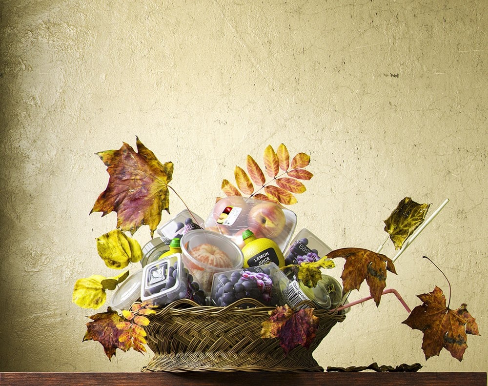
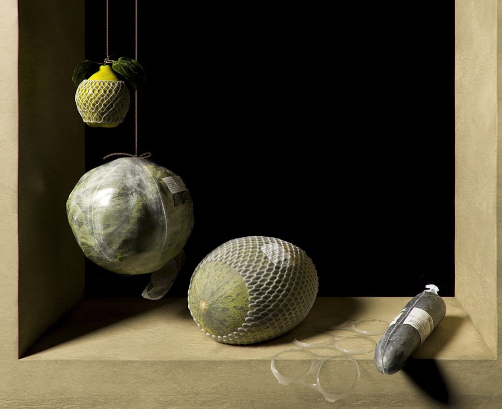
Still lifes of fruits and vegetables arranged on tables and in baskets & bowls have been a staple of Western art for centuries. Spanish creative studio Quatre Caps has brought the still life into the supermarket age with their project Not Longer Life. The project was conceived to call attention to wasteful plastic packaging of fruits and vegetables, but as this post points out, packaged and pre-cut foods can be easier to eat for disabled people.
As a person with limited hand dexterity, I look at this and see an easier way to eat healthy food. I actively avoid eating oranges, not because I dislike them (they are definitely tasty) but because I have so much difficulty peeling them. Any attempt to peel an orange is likely to result in an unappetizing mess because I’ve squeezed the orange to hard while trying to maneuver it for peel removal.
I don’t have access to peeled oranges from my grocery store though I’d probably take advantage of them if I did. I do buy precut vegetables all the time because it is more convenient and safer for me to do so.
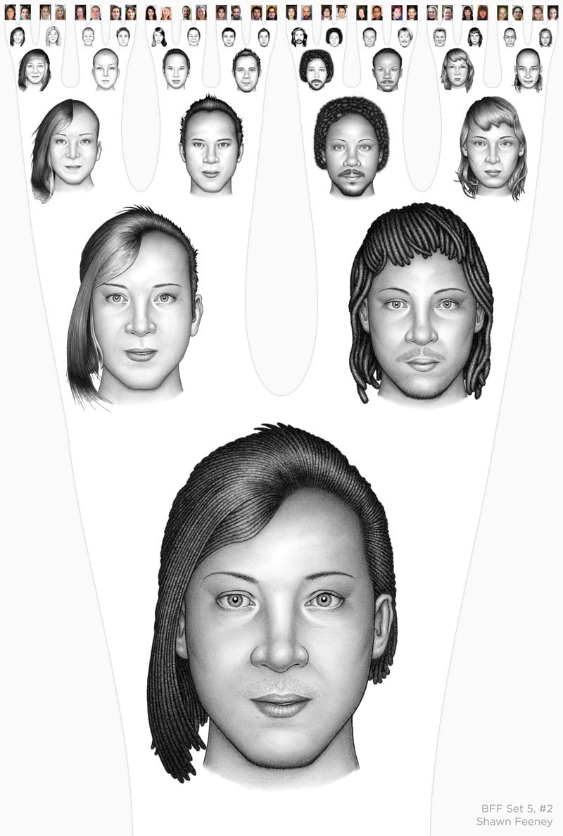
Artist Shawn Feeney worked as a forensic artist for a few years and was inspired by that experience to produce BFF, a project where he combined the faces of pairs of friends into composite portraits, and then pairs of those composites into composite drawings, and so on until a single composite remained from 128 initial faces. Here are two of the quarterfinalist brackets:
And in this video, you get a closer look at the complete bracket and how the lineage of each starting drawing develops through the generations:
Ok, that was more than a couple. But there are so many more on his website and Instagram (including work-in-progress stuff)…check them out!
Naddeo recently shared his process for making these paintings with Colossal:
Naddeo tells Colossal that he starts with a loose sketch by hand. He then uses 3D software to help define a plausible shape for his imagined constructions, and creates a reference composition in Photoshop. After years of practice, Naddeo shares that he is able to recreate the texture, color, and shadows of various building materials like brick and concrete from memory. He uses reference photos to help flesh out small detail items, which are similarly rendered in watercolor.
A prime example of Robin Sloan’s concept of the flip-flop.
Liberty Crumbling is sand sculptor Damon Langlois’ version of the statue of Abraham Lincoln at the Lincoln Memorial, which won first prize at 2019 Texas SandFest. (via colossal)
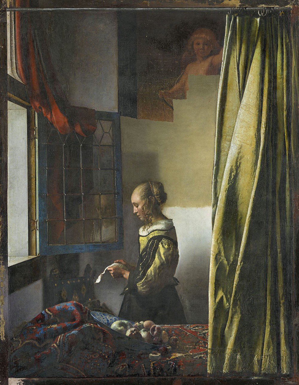
For more than 250 years now, the famous painting by Johannes Vermeer featuring a profile depiction of a girl intently reading a letter in front of a light-coloured empty wall has held a firm place among the masterpieces in the Dresden Gemäldegalerie. This picture, which dates to around 1657/59, is regarded as one of the earliest interior paintings by Vermeer with a solitary figure. Previous x-ray examinations indicated that a picture of a naked Cupid in the painting had been overpainted. Today, new laboratory tests have conclusively determined that the overpainting was not by Vermeer’s hand. On this basis, the Gemäldegalerie Alte Meister decided in the course of the current restoration of the work to remove the overpaint.
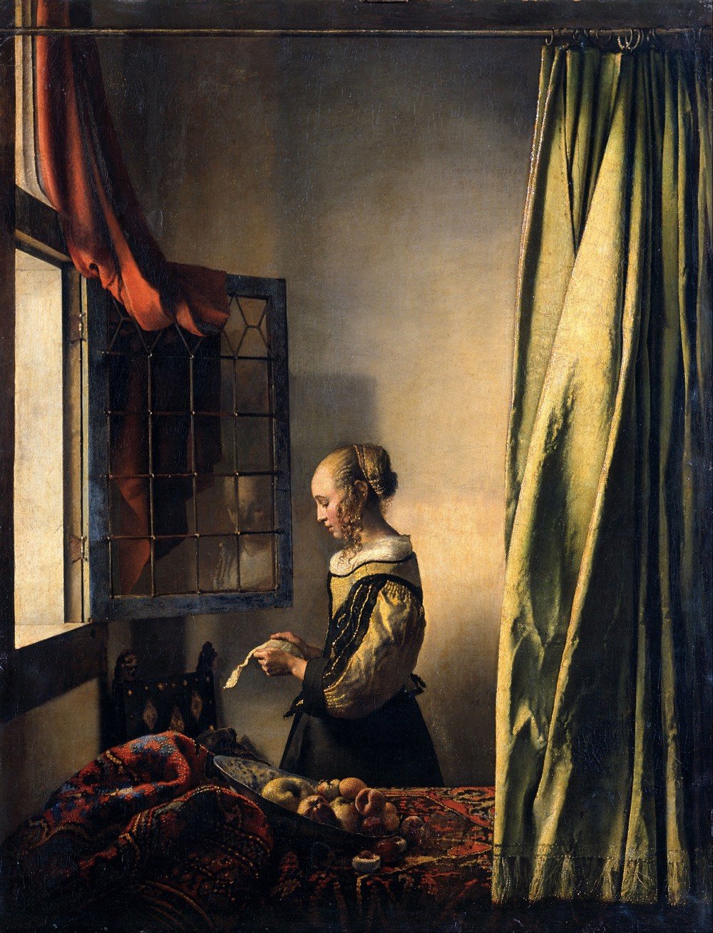
And what it looked like before the restoration started:
The partially restored painting will be on display at the Gemäldegalerie Alte Meister in Dresden until June 16, after which they will take another year to complete the painstaking restoration.
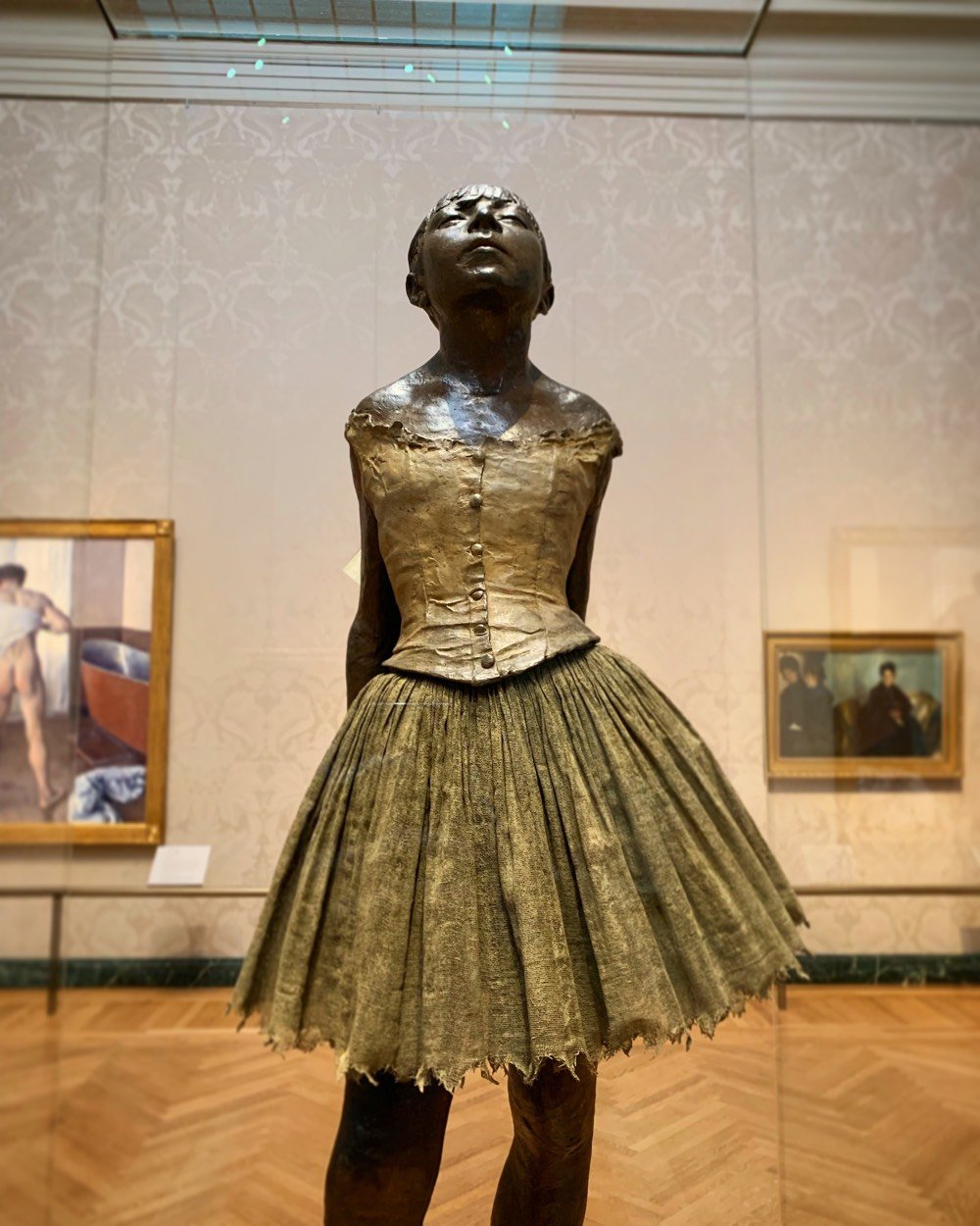
This past weekend I was in Boston for some cultcha and went to The Museum of Fine Arts. Among several paintings, pastels, and drawings of dancers by Edgar Degas, a bronze casting of his sculpture La Petite Danseuse de Quatorze Ans caught my eye:
This is Degas’s largest surviving sculpture and the only one he titled and exhibited. The original wax version, a portrait of a young Belgian dancer named Marie van Goethem, was shown at the 1881 Impressionist exhibition in Paris. The wax was tinted to resemble flesh, she wore a wig of real hair, and was dressed in pink slippers and bodice in addition to a skirt and ribbon similar to those on this cast. The excessive naturalism of the work offended many viewers, but the critic J.K. Huysmans called it “the only really modern attempt that I know in sculpture.”
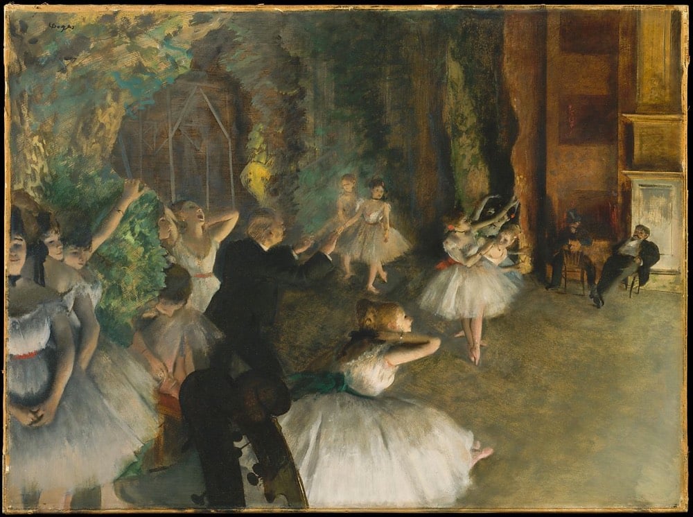
I’ve seen many representations of ballet dancers in Degas’ work over the years, but this time around was different because I had read Julia Wolkoff’s The Sordid Truth behind Degas’s Ballet Dancers last year.
The formerly upright ballet had taken on the role of unseemly cabaret; in Paris, its success was almost entirely predicated on lecherous social contracts. Sex work was a part of a ballerina’s reality, and the city’s grand opera house, the Palais Garnier, was designed with this in mind. A luxuriously appointed room located behind the stage, called the foyer de la danse, was a place where the dancers would warm up before performances. But it also served as a kind of men’s club, where abonnés — wealthy male subscribers to the opera — could conduct business, socialize, and proposition the ballerinas.
Young members-in-training of the ballet companies were called “petits rats” in reference to their often impoverished backgrounds. As Wolkoff observes of the subject of the sculpture:
Marie van Goethem was the “petit rat” who posed for the sculpture, and she likely engaged in the sexually predatory economy of the ballet world to survive. Van Goethem disappeared from the public eye shortly after the sculpture was completed; after being late to a rehearsal, the Paris Opera Ballet dismissed her. The teenager probably returned home to follow in the footsteps of her mother — a laundress and likely prostitute — and older sister, who was also a sex worker.
What might look at first glance like a depiction of the beauty of dance takes on a more sinister nature when you notice the men on the right side of the painting, perhaps a pair of wealthy subscribers getting a special preview of that night’s ballet and their choice of ballerinas. You might never look at another of Degas’ ballet paintings the same way again.
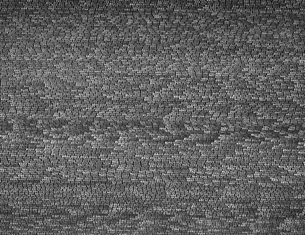
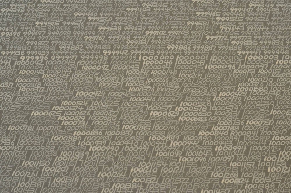
In 1965, French-born Polish painter Roman Opalka began work on his series of paintings OPALKA 1965/1 - ∞. Starting in the top-left corner of a canvas, he painted the number “1”, then “2”, then “3”, and so on, continuing until the canvas was full of consecutive whole numbers. At the top of the next canvas, he picked up where he’d left off, and then just kept going from canvas to canvas. By 1970, Opalka abandoned working on anything else and devoted himself solely to filling canvases with numbers.
He pursued this culmination on a daily basis, eight hours a day, until the process of painting led him to “white/white” — that is, white numbers on a canvas with a background painted white, the same as the numbers. After three years (1968, possibly 1969), Opalka began to add 1% white pigment to the black background. Gradually, over time, as more paintings were painted, the black surface would become gray. As he continued to count and to paint five, six, and seven digit numbers, he discreetly added 1% white to each canvas, thus making the surfaces appear increasingly lighter. In the late 1970s he declared that the background of his canvases would eventually appear white, the same white used to paint the numerals that would finally dissolve into the surface, embody the surface. Ultimately, there would be no distinction between the white numerals and the white surface; they would culminate as a form of blankness, possibly transcendent, as the numerals grew invisible within the prospect of infinity, the Samadhi or highest level of meditation.
According to Opalka’s website, the last number he painted was 5607249, in white paint, invisible on a white canvas. (via moss & fog)
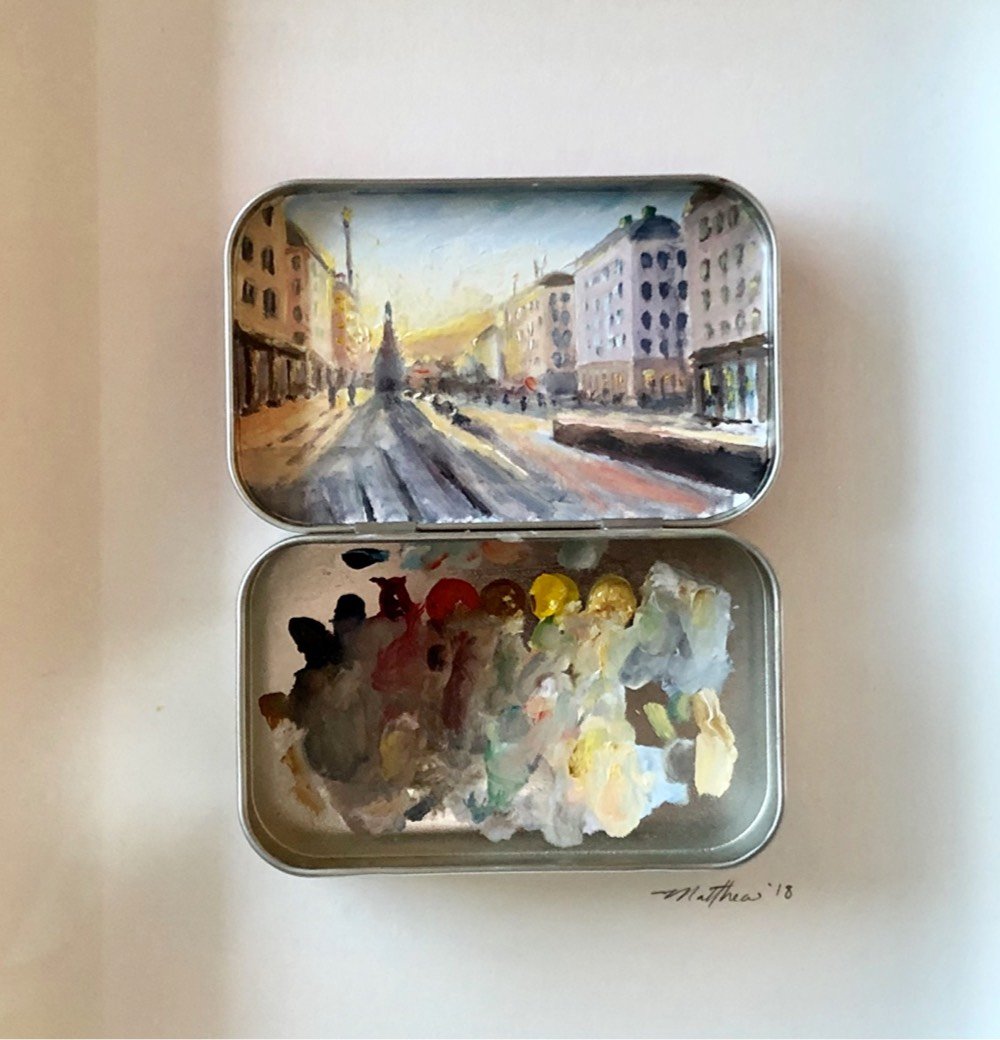
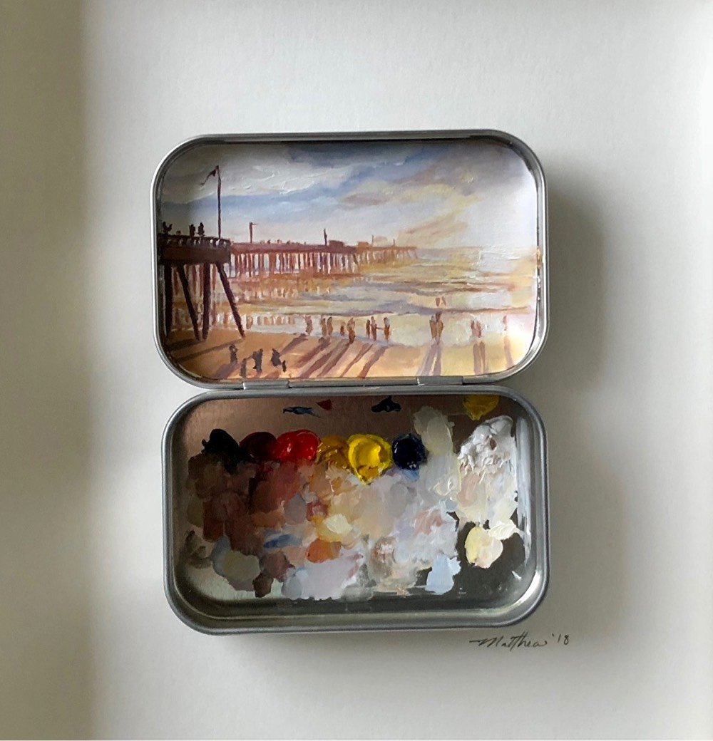
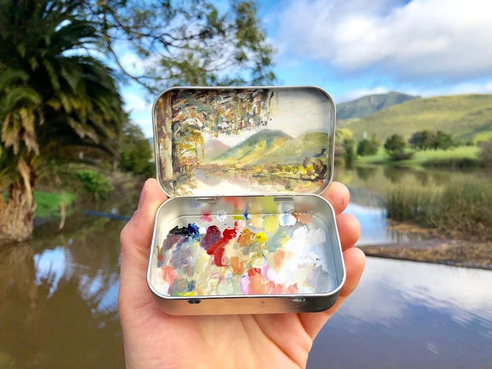
Painter Matthew Betancourt paints these miniature works of art inside the covers of Altoids tins. Aside from the playfulness and cuteness factor, I love that he uses the bottom half of the tin as a palette and it’s displayed along with the finished painting. You get to see the process along with the work. It’s something that Betancourt plays with even more on his Instagram account, where he displays subject, palette, and finished product all in one go:
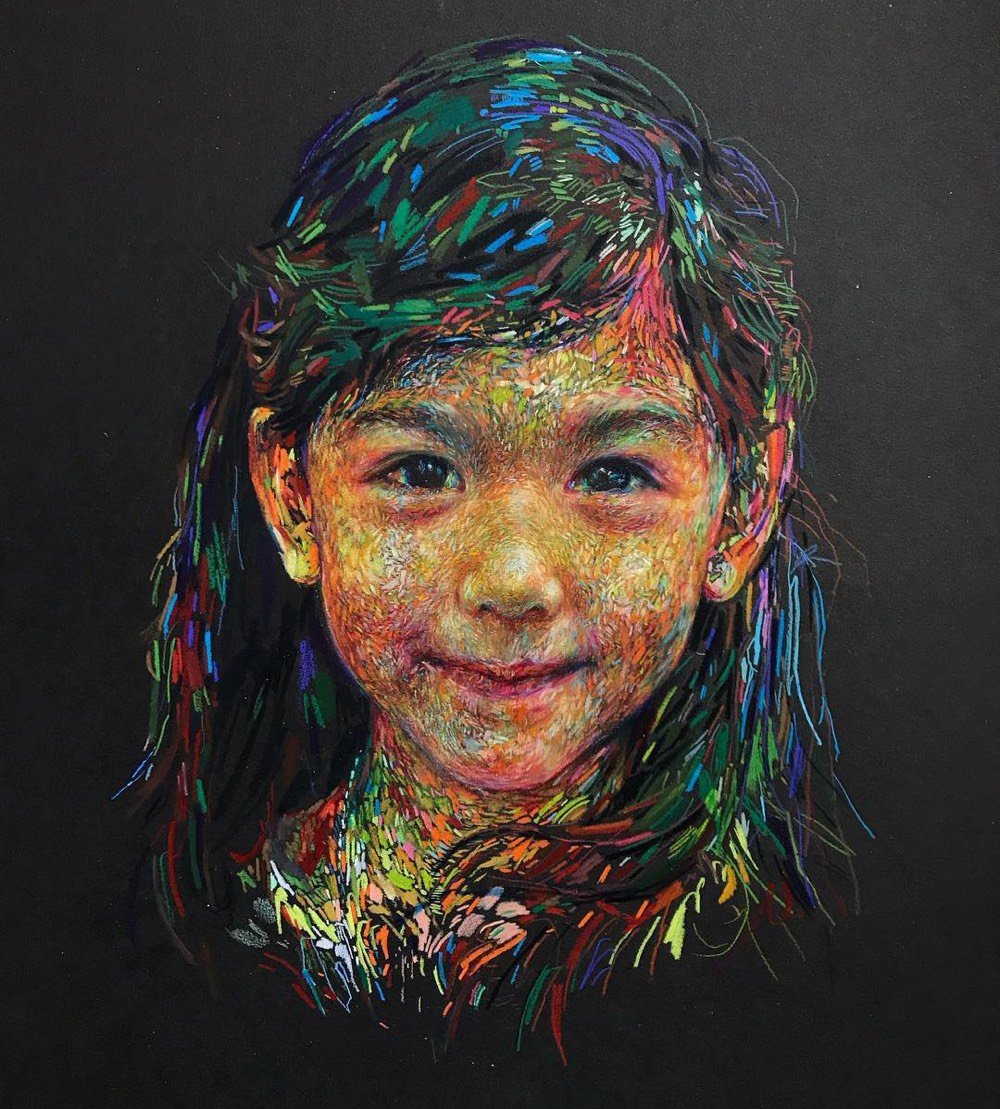
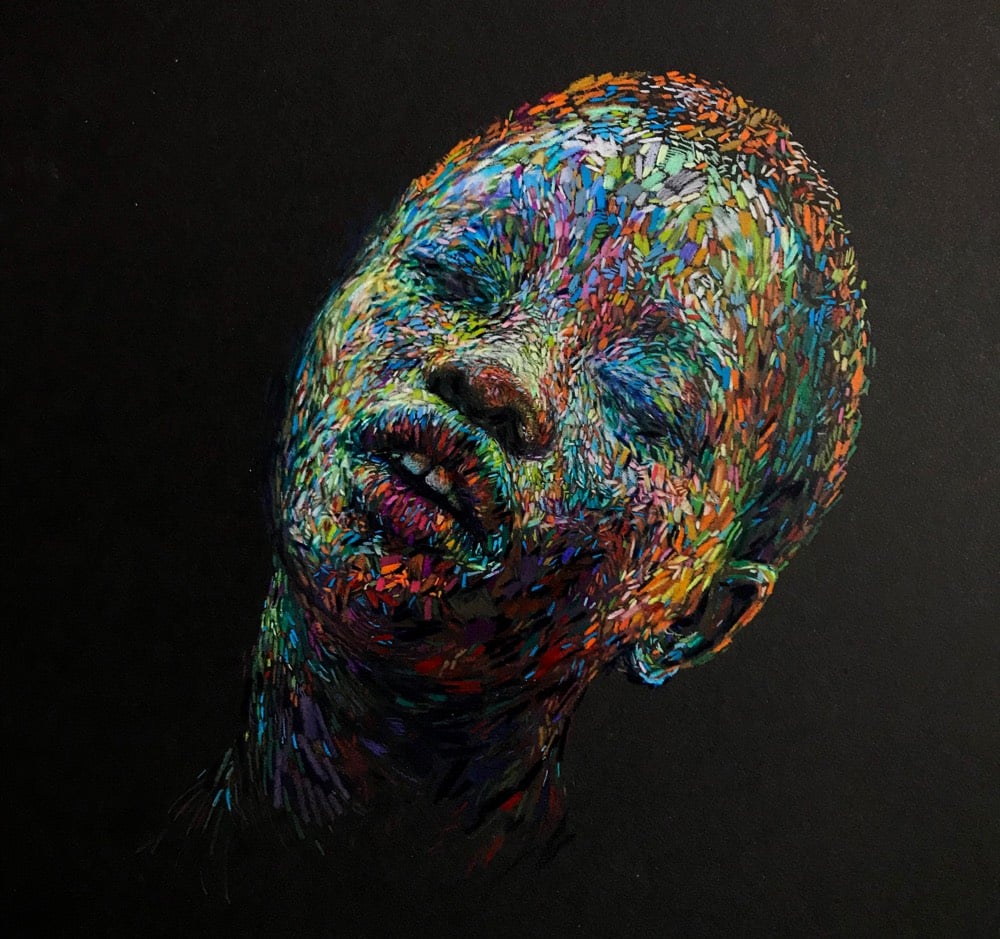
I really like these portraits by artist, illustrator and conceptual designer Linsey Levendall.
Like I said last week, I am a sucker for any sort of contemporary impressionism that reminds me of the likes of van Gogh, Seurat, or Monet. Maybe I’m just a rube who didn’t see enough art as a kid, but I will never not be impressed by how a thousand tiny strokes of a pen or brush magically come together to make not only a recognizable human face but can also spark a feeling in my brain. (also via colossal)
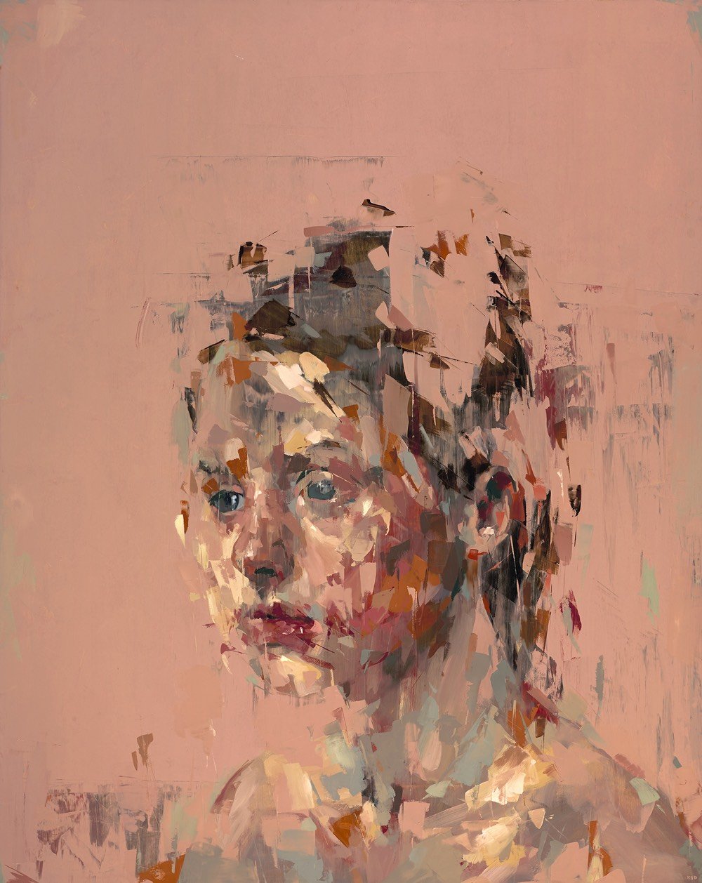
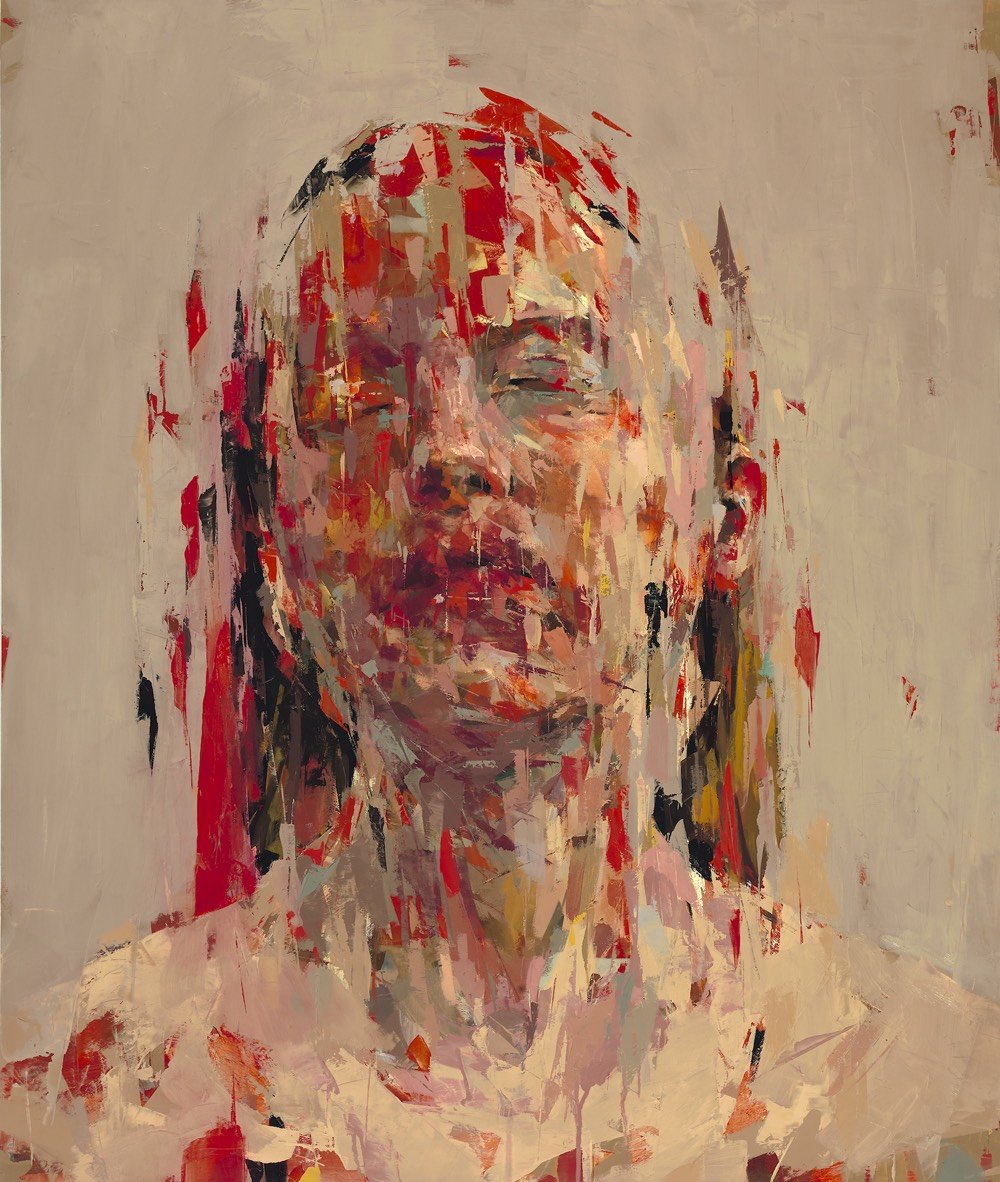
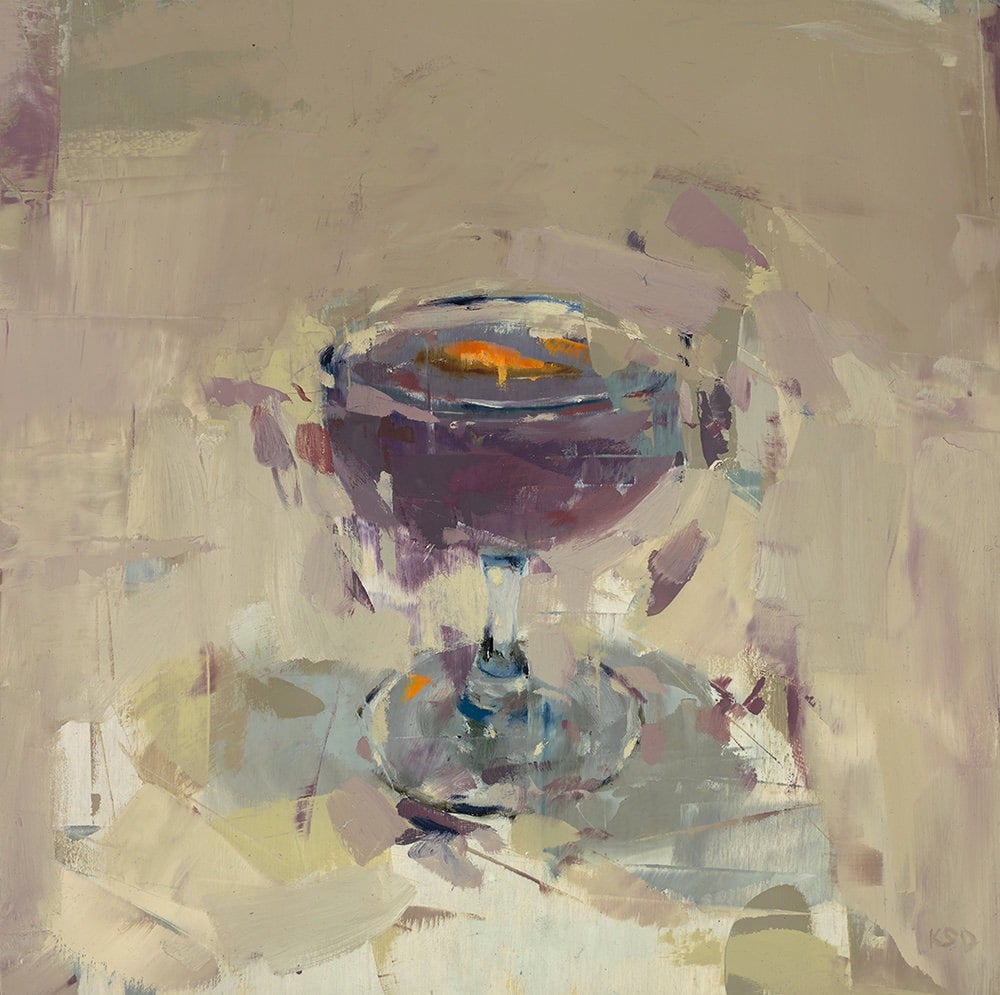
Using found images as his starting point, Kai Samuels-Davis paints portraits & objects in an impressionistic way.
I am a sucker for any sort of contemporary impressionism that reminds me of the likes of van Gogh, Seurat, or Monet. I am also a sucker for observing how artists progress as they mature. Take a look at Samuels-Davis’s older work, from 2015 and before. The older stuff is good but his recent work is stronger and cleaner and more abstract without sacrificing any of the “legibility” of the figures & objects he’s representing. It does more with less. (via colossal)
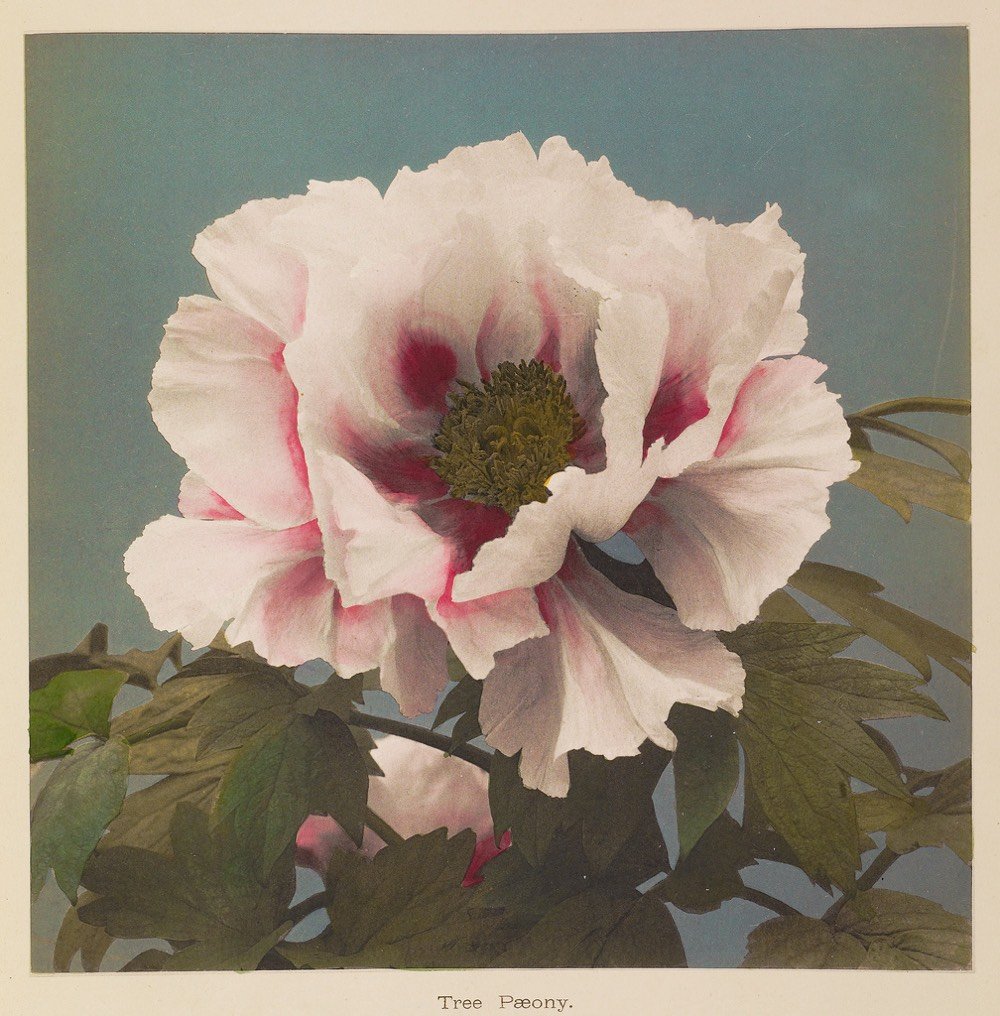
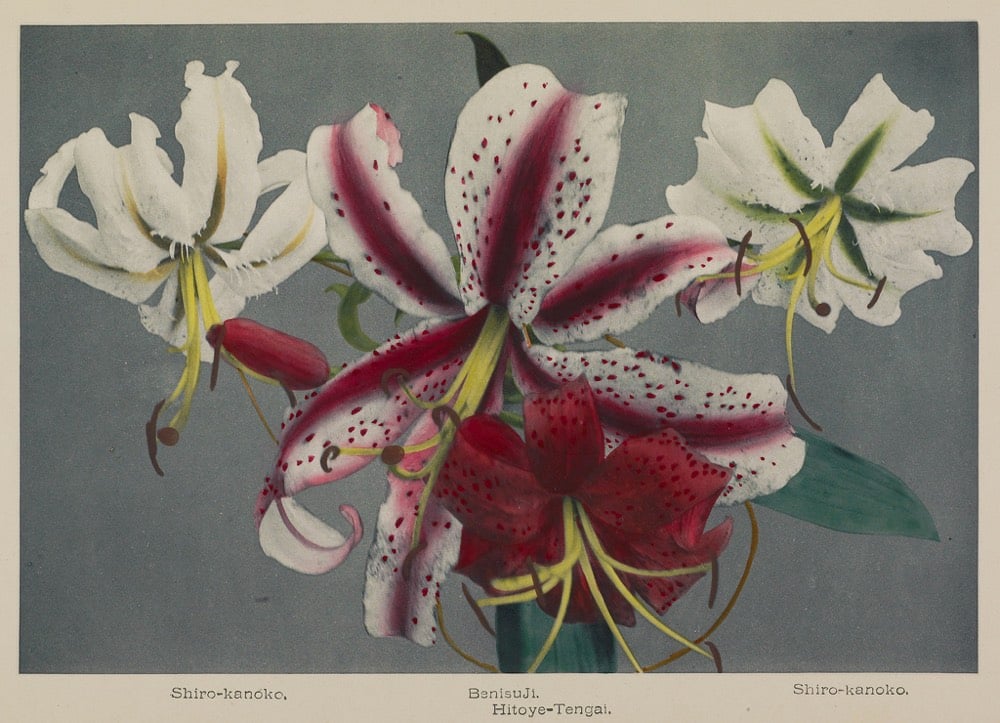
The stunning floral images featured here are the work of Ogawa Kazumasa, a Japanese photographer, printer, and publisher known for his pioneering work in photomechanical printing and photography in the Meiji era.


Stay Connected