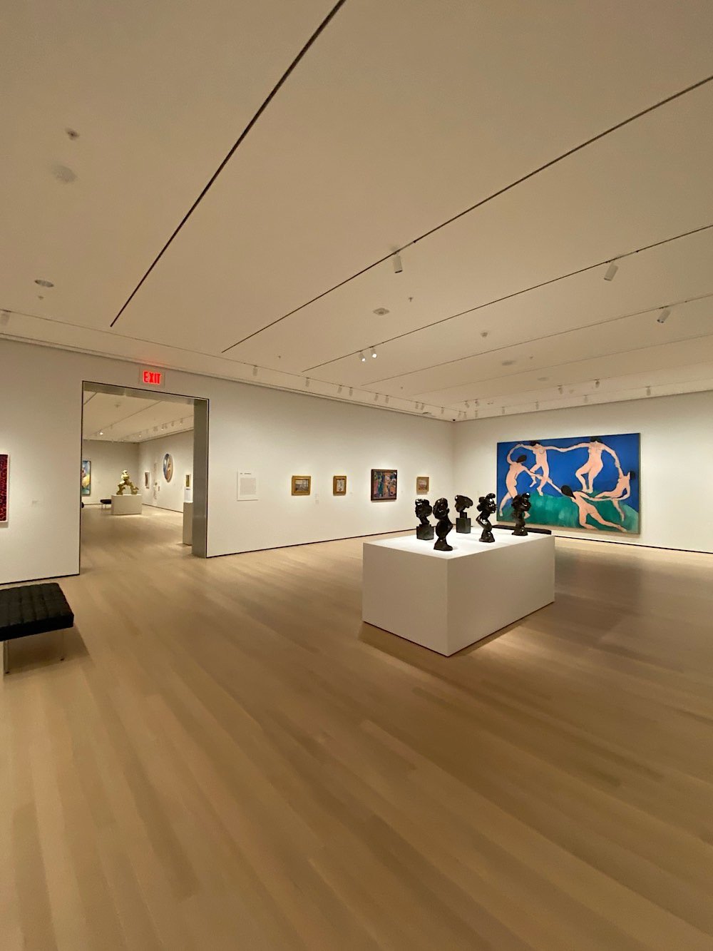
After months of renovations and a week or two of previews, MoMA officially reopens for business today. I was able to attend a press preview last week and here are some observations I had about my visit.
One of the main goals of the museum’s expansion was to “focus new attention on works by women, Latinos, Asians, African-Americans and other overlooked artists”. I’ll leave the question of their success in more qualified hands, but even making the attempt is an admission by one of the most influential museums in the world that the art that society considers important is highly subjective. If there are good paintings that aren’t currently considered that interesting or important (because they’re not by Picasso or Degas or Cezanne), maybe that can change depending on what stories you tell about them. Look at what the Hilma af Klint show at the Guggenheim did for example.
The display of the main collection is now not just paintings and a sprinkling of sculpture but also includes photography, film, architecture, performance art, design, and drawings. The art is also placed into much more of an historical context than before…the visitor gets more of a sense of what was going on in the world when these pieces were created and what societal happenings the artist may have been reacting to in creating their work. I very much enjoyed these improvements.
The general feel of the place is more casual than before. In Amy Sillman’s Artist’s Choice gallery, paintings and sculptures were resting on risers around a large room, all unlabelled. Gallery titles were sometimes colloquial instead of formal or academic. In the one of the exhibitions, the gallery titles were in all lowercase — “a revolution of limits” vs “A revolution of limits” or “A Revolution of Limits”.
In some areas, the space still smelled vaguely of construction.
One of the things I love about The Whitney is how it incorporates the city into the art viewing experience. On the top floors, you can look at what’s on display and then head out to the terrace to see the city on display: the architecure, the construction, people walking on the High Line, the Hudson River traffic. It doesn’t have the best location to work with, but the new MoMA tries to do this a little more after the renovation. There are new overlooks to the sculpture garden and larger windows with street views.
Was it my imagination, but was Matisse’s Swimming Pool room actually a bit warmer and more humid than the other galleries? You know, like an actual indoor swimming pool?
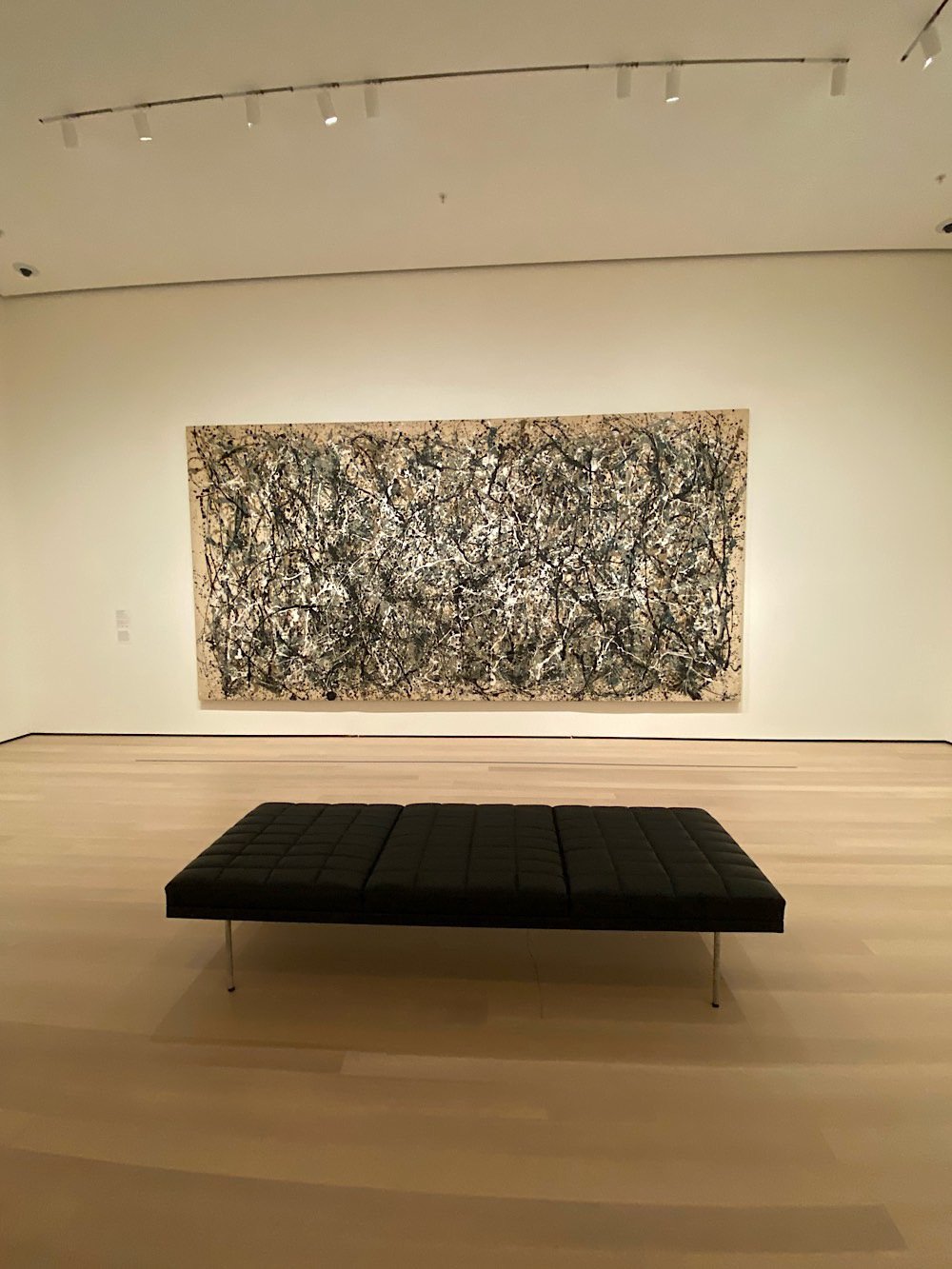
Honestly, the best part of my experience was how few people were there. This was the last of four press previews and was sparsely attended because most people had already filed their stories. In many galleries, I was completely alone with these amazing works of art. I stood in front of Starry Night for two minutes all by myself — same with Pollock’s One: Number 31, 1950 and Les Demoiselles d’Avignon. Monet’s Water Lillies gallery was empty. Empty! I sat for several blissful minutes taking it all in — it was almost meditative. This reveals a sad truth about large and popular art museums like MoMA: they are often not good places for actually viewing art. They’re just too crowded. Starry Night is basically an Instagram selfie wall at this point. During a normal visit, you can’t actually look at the thing to see what van Gogh was up to with his brushstrokes because there are 20 people waiting their turn to see it too. But you can’t spend $450 million on a renovation and just let a few hundred people a day into the place, right?
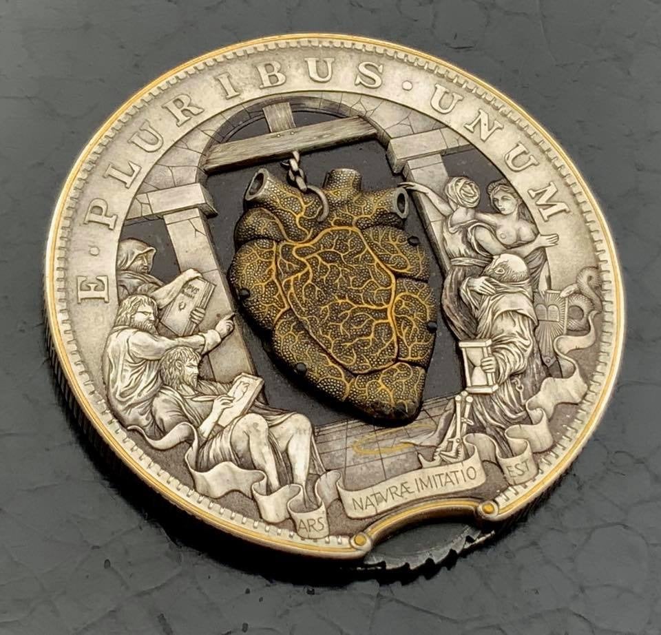
Roman Butin is a Russian artist who modifies coins with elaborate hand-engraved designs of his own. His latest creation is a coin with a beating heart. Here is the tiny mechanism in action…you turn the gear at the bottom of the coin and the heart beats!
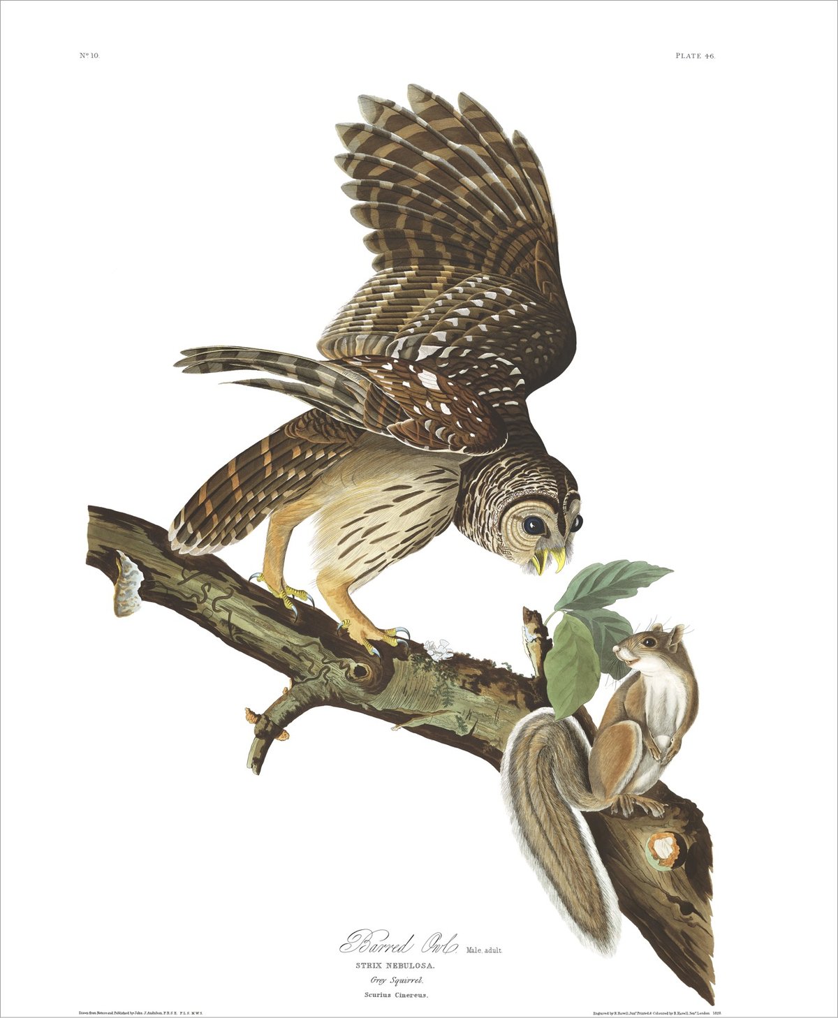
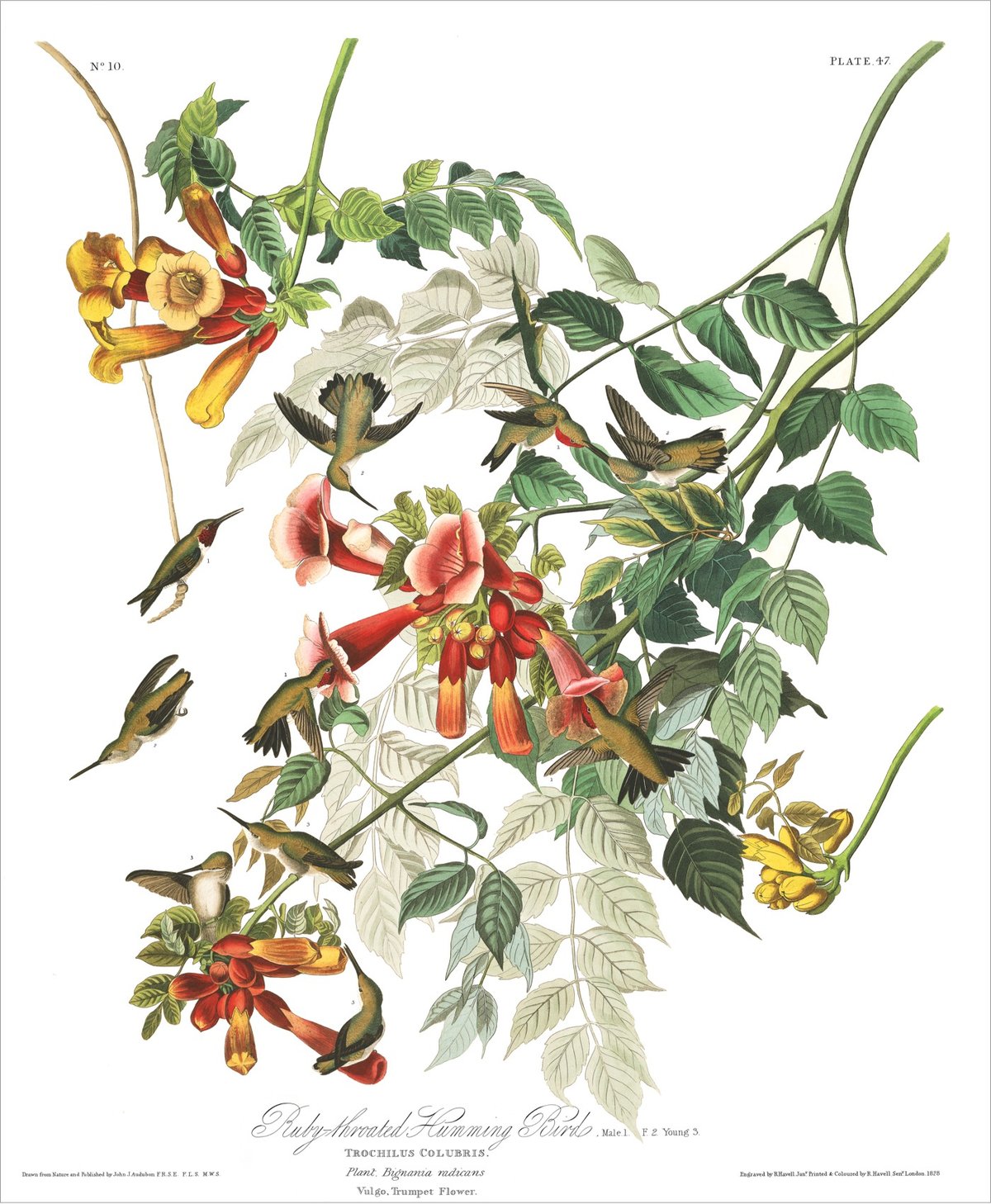
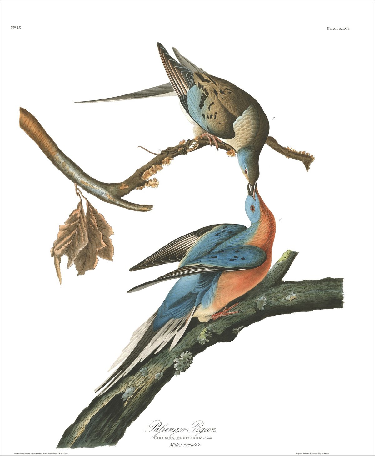
One of the (several dozen) posts I started writing ages ago but never finished was a collection of the hundreds of bird illustrations pictured in John James Audubon’s seminal Birds of America. The images have been floating around on the web forever, in various sizes and collections, and I wanted to group (or at least link to) all of them in one place. But now I don’t have to because the Audubon Society has put them up on their website.
John James Audubon’s Birds of America is a portal into the natural world. Printed between 1827 and 1838, it contains 435 life-size watercolors of North American birds (Havell edition), all reproduced from hand-engraved plates, and is considered to be the archetype of wildlife illustration.
Thumbnails of all 435 illustrations are presented on a single page (sortable alphabetically or chronologically by their creation date) and then each illustration is given its own page with Audubon’s notes on the bird pictured, a link to the bird in Audubon’s Bird Guide (where you can see photos and hear bird calls, etc.), and a link to download a high resolution image (if you sign up for their mailing list). The barred owl image is 111-megapixels. What a resource!
And if you’ve never had a chance to see some of these illustrations in real life, you should keep your eyes peeled for the opportunity. They really are something. (via open culture, which has been particularly great lately)
This past weekend for a project called VIGIL, artist Jenny Holzer projected texts about the impact and realities of gun violence onto the buildings of Rockefeller Center.
Employing her signature text-based practice, Holzer will project testimonies, responses, and poems by people confronting the everyday reality of gun violence onto the iconic buildings at Rockefeller Center after sundown. These hauntingly sober first-person accounts serve both as an acknowledgement of communities impacted by gun violence and an invitation for dialogue around the prevalence of this issue in the United States. Holzer will feature texts from the compilation Bullets into Bells: Poets & Citizens Respond to Gun Violence, stories from Moments that Survive collected by Everytown for Gun Safety, and poems by teens who have grown up in the shadow of mass shootings.
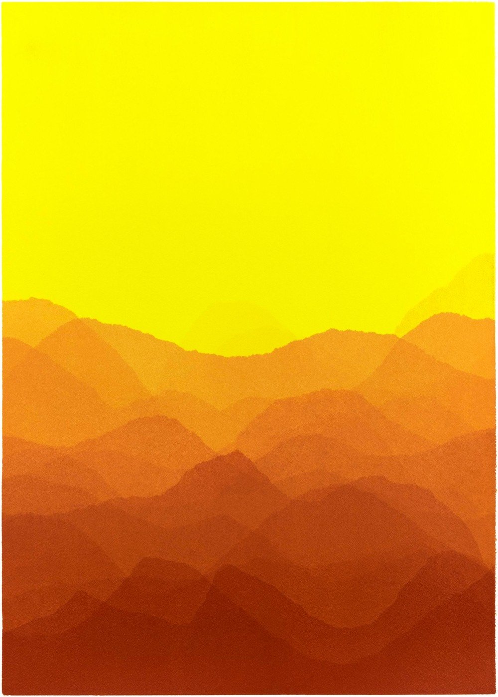
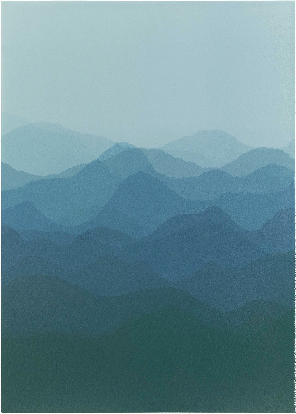
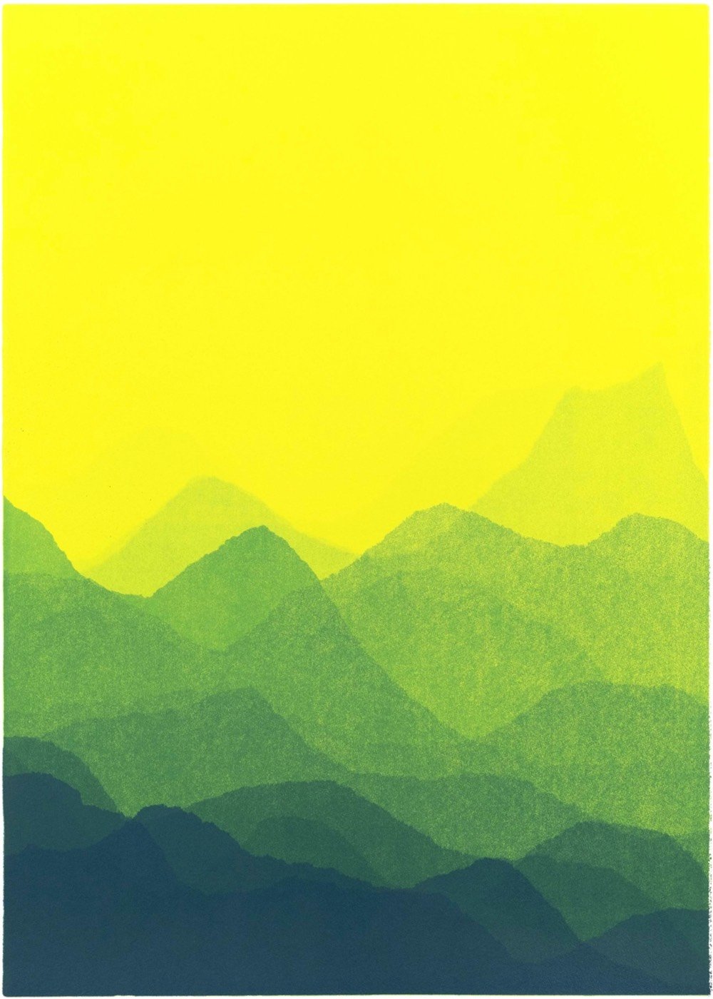
Creative director and artist Matt Jukes makes these lovely prints of “misremembered landscapes and nearly forgotten memories”. To me, they look like depictions of landskein, “the weaving & braiding of horizon lines, often seen most clearly on hazy days in hill country”.
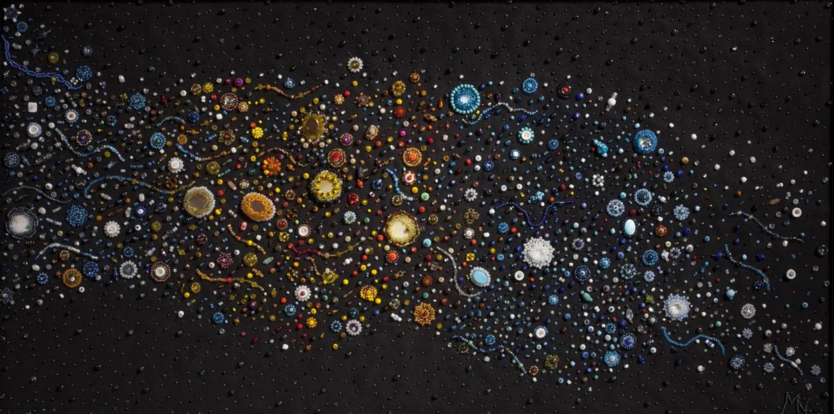
Inspired by some photos taken by the Hubble Space Telescope, Margaret Nazon began in 2009 to make beaded artworks of stars, galaxies, planets, and nebula. I love her representation of the Milky Way, pictured above. Nazon grew up in a First Nation community in Canada’s Northwest Territories and in this interview she talks about using traditional materials for her cosmic drawings.
I consider my art to be “abstract.” Aboriginal people have used animal skins, bones, seeds, quills and rocks for decoration, and I figured it would fit in my artwork. I was given buttons made of caribou bones as a gift and I decided I should try to incorporate a solid piece of bone into one of my galaxy pictures. Viewers loved that. I spent last December in Salt Spring Island B.C. One of my friends asked if I was going to incorporate B.C. rocks or shells in my work and I thought that was a great idea. I started receiving rocks and shells as inspiration. Just recently a Gwich’in friend gave me willow seeds to use. The Gwich’in people used to use willow seeds to decorate their clothing.
Oh, and he also caught the recent total solar eclipse in Chile in this video and this photo. Wow. Kicking myself a little bit that I did not get organized to head to Chile for this.
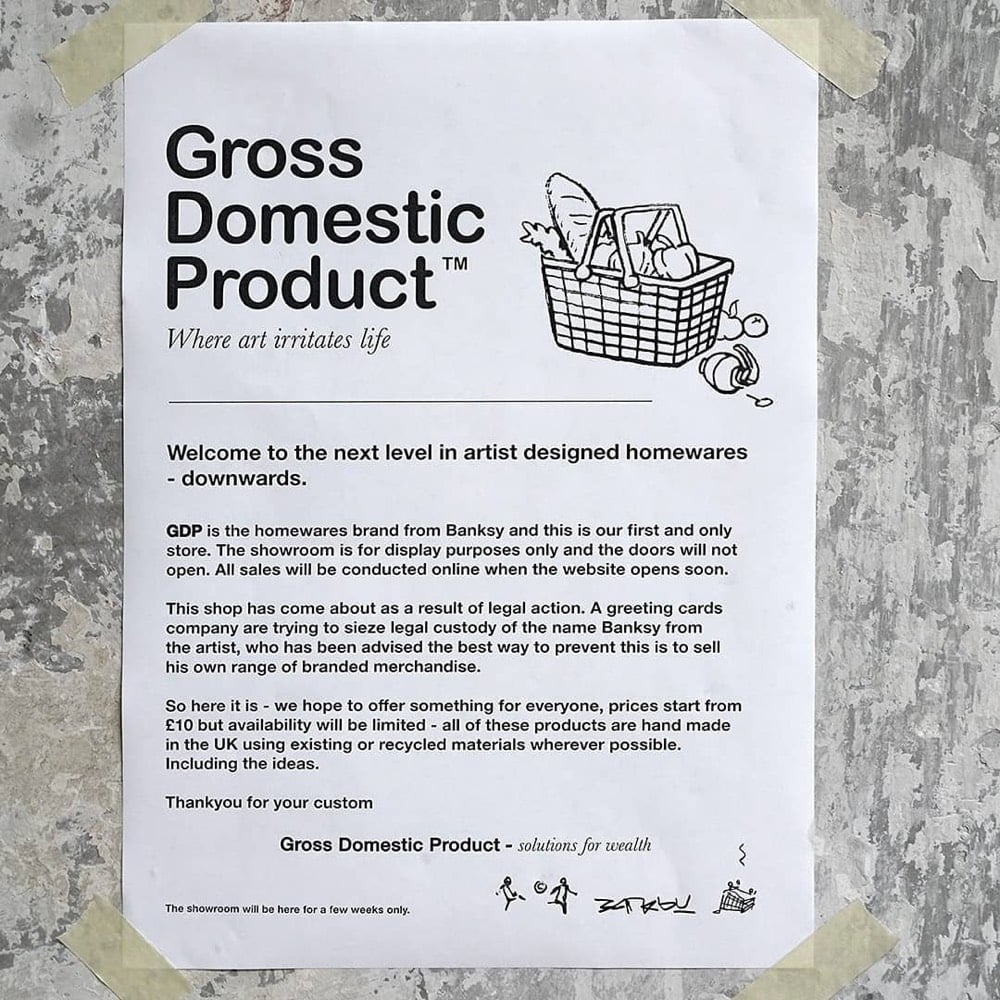
Artist Banksy has opened a storefront in the South London borough of Croydon called Gross Domestic Product. It’s literally a storefront and not a store…you can’t go in and buy anything. Here’s a quick tour:
The impetus behind the store, aside from the artist’s continuing discourse with capitalism, is to help settle a legal dispute with a greeting card company:
The temporary installation, which will be on view for two weeks in the Croydon neighborhood, incorporates multiple window displays for a shop that is not in fact open to passersby. However, some of the items on display are available for purchase in GDP’s associated online store including the welcome mats, which Banksy hired refugees in Greek detainment camps to stitch; all proceeds go back to the refugees. Revenue from sales of the doll sets will also support the purchase of a replacement boat for activist Pia Klemp, whose boat was confiscated by the Italian government. The product line is rounded out with such oddities as disco balls made from riot gear helmets, handbags made of bricks, and signed — and partially used — £10 spray paint cans.
No fooling, I would love to cop one of those used spray paint cans.
p.s. Does anyone remember Grot, the shop Reggie opens in The Fall and Rise of Reginald Perrin? For some reason, Banksy’s shop reminds me of that.
Watch as MoMA art conservator Diana Hartman repairs some weak spots of Paula Modersohn-Becker’s 1907 self-portrait. The painting is still on the artist’s original canvas stretchers, so Hartman can’t access the back of the canvas during the repair process. So she employs a tiny curved needle made for doing eye surgeries to gently darn with some linen thread.
The first thing I like to do when I sit down is just get my tools. No tools displayed on this tray were made specifically for conservation.
Watching someone tend to a treasured object with such devotion is quite relaxing, perhaps because it’s comforting to imagine ourselves being treated with equal concern by those around us. (via colossal)
Or, I wonder if it’s possible that I was wrong, that I’ve always been wrong, that art has no power at all over the world and its brutalities, over the minds that conceive them and the systems that institutionalize them. Those folks I cited earlier, the ones who offer their grim reassurances that the world has always sucked as much as it does now, in particular for women, the poor, the disenfranchised, the enslaved, the downtrodden, and the exploited, these folks might point out that art and misery have coexisted for the whole span of human existence on earth, and suggest that perhaps the time to abandon hope for the redemptive power of art is long overdue.
Maybe the world in its violent turning is too strong for art. Maybe art is a kind of winning streak, a hot hand at the table, articulating a vision of truth and possibility that, while real, simply cannot endure. Over time, the odds grind you down, and in the end the house always wins.
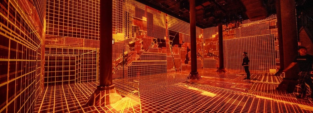
Machine Hallucination, Anadol’s first large-scale installation in New York City is a mixed reality experiment deploying machine learning algorithms on a dataset of over 300 million images — representing a wide-ranging selection of architectural styles and movements — to reveal the hidden connections between these moments in architectural history. As the machine generates a data universe of architectural hallucinations in 1025 dimensions, we can begin to intuitively understand the ways that memory can be spatially experienced and the power of machine intelligence to both simultaneously access and augment our human senses.
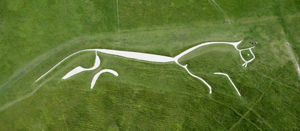
The Uffington White Horse is a prehistoric monument that’s been around since the late Bronze Age, some 3000 years ago. Situated on a hill in the South of England and measuring 360 feet long, the horse is made of deep trenches filled with white chalk and is easily visible in the satellite view on Google Maps.
So cool. Here’s the truly amazing thing though: the horse requires regular maintenance or erosion and grass growing over the chalk will obscure the figure. Which means that the inhabitants of this area have continuously cleaned and maintained the horse — through changes in religion, king, climate, and empire — for 30 centuries.
It’s chalking day, a cleaning ritual that has happened here regularly for three millennia. Hammers, buckets of chalk and kneepads are handed out and everyone is allocated an area. The chalkers kneel and smash the chalk to a paste, whitening the stony pathways in the grass inch by inch. “It’s the world’s largest coloring between the lines,” says George Buce, one of the participants.
Chalking or “scouring” the horse was already an ancient custom when antiquarian Francis Wise wrote about it in 1736. “The ceremony of scouring the Horse, from time immemorial, has been solemnized by a numerous concourse of people from all the villages roundabout,” he wrote.
In the past, thousands of people would come for the scouring, holding a fair in the circle of a prehistoric fort nearby. These days it’s a quieter event. The only sounds are the wind, distant birdsong and the thumping of hammers on the chalk that can be felt through the feet.
The maintenance may have actually been the point of the horse:
From the start the horse would have required regular upkeep to stay visible. It might seem strange that the horse’s creators chose such an unstable form for their monument, but archaeologists believe this could have been intentional. A chalk hill figure requires a social group to maintain it, and it could be that today’s cleaning is an echo of an early ritual gathering that was part of the horse’s original function.
A group from the Long Now Foundation recently went to help out with the chalking of the horse and the trip report touches on the importance of upkeep to the infrastructure that our society depends on:
Though it requires considerably less resources to maintain, and is more symbolic than functional, the Uffington White Horse nonetheless offers a lesson in maintaining the infrastructure of cities today. “As humans, we are historically biased against maintenance,” Smith said in her Long Now lecture. “And yet that is exactly what infrastructure needs.”
When infrastructure becomes symbolic to a built environment, it is more likely to be maintained. Smith gave the example of San Francisco’s Golden Gate Bridge to illustrate this point. Much like the White Horse, the Golden Gate Bridge undergoes a willing and regular form of maintenance. “Somewhere between five to ten thousand gallons of paint a year, and thirty painters, are dedicated to keeping the Golden Gate Bridge golden,” Smith said.
I can’t give my students more time in their lives; but what I try to do is change the way they think about and value it in the first place. My class typically includes students who aren’t art majors, some of whom may never have made art before. I give them the same advice every quarter: Leave yourself twice as much time as you think you need for a project, knowing that half of that may not look like “making” anything at all. There is no Soylent version of thought and reflection — creativity is unpredictable, and it simply takes time.
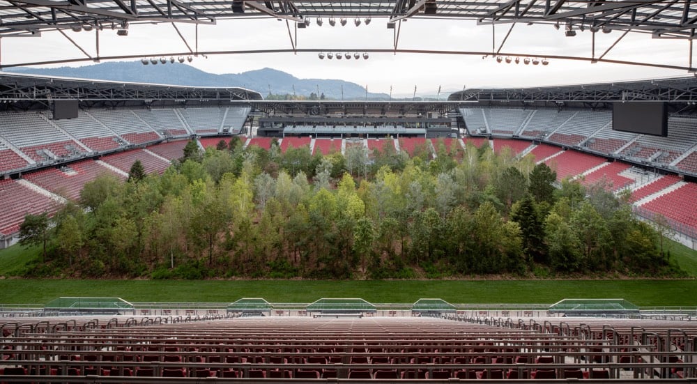
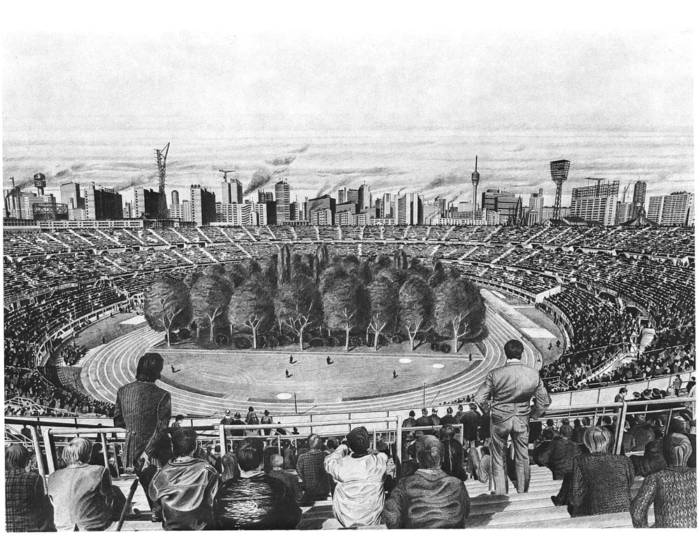
For Forest — The Unending Attraction of Nature is an art installation from Klaus Littmann that features a forest made up of 300 trees in the middle of a soccer stadium in Klagenfurt, Austria.
Using 300 trees, some of which weigh up to six tonnes, landscape architect Enzo Enea will cover the entire playing field with a mixed forest characteristic of Central Europe.
From the grandstands, visitors can admire the spectacle of the trees day and night (from 10am until 10pm). Admission is free. A sight that is as unfamiliar as it is fascinating and bound to stir up a range of emotions and reactions! Depending on the time of day (or night), the trees will constitute a constantly changing landscape that is shaped by the weather as well as the autumnal turning of the leaves. The installation is a clever play on our emotions when faced with what should be a familiar sight, placed in an entirely different context. With this monumental work of art, Littmann challenges our perception of nature and sharpens our awareness of the future relation between nature and humankind.
The project also sees itself as a warning: One day, we might have to admire the remnants of nature in specially assigned spaces, as is already the case with zoo animals.
Littmann modeled the project on a 1970 drawing by Max Peintner.
I didn’t think much of this project from just the photos, but this short video really highlights the darkly comedic experience of having to go to a soccer stadium to look at nature — not to experience nature, but to sit in a moulded plastic seat a few hundred feet away from nature to look and cheer but not to touch or walk around in.
I would love to see this in person. For Forest is on view until late October.
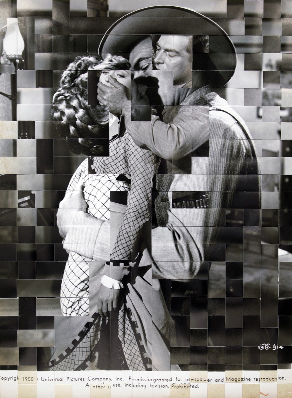
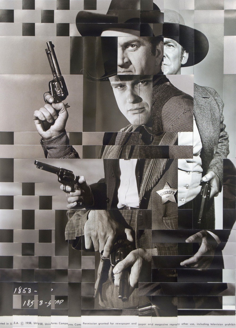
For her O.P.P. series, Heather Oelklaus weaves together strips of cut-up prints to form new scenes.
In the series O.P.P. (Other People’s Photography), hand woven silver gelatin and inkjet prints survey stereotypical and nostalgic notions. Found photographs from US Army wives’ gatherings and Hollywood film stills are woven together to reconstruct new narratives. The expressive gaze within these staged photographs breaks through the picture’s surface as if to confront the viewer. These sophisticated slices of history illustrate an era of inclusion and exclusion while leaving the viewer to compare present day relationships.
Guernica is one of Pablo Picasso’s greatest masterpieces, and, like a lot of his other work, can be difficult to decipher. The painting is obviously anti-war, anti-fascist, and pro-Spain, but beyond that, art scholars have been puzzling over details for decades. In this TED-Ed video, Iseult Gillespie offers a short tour of the painting and its history. You might find this piece (and the list of works cited at the bottom) useful as well.
However, Picasso declared the inspiration for the painting was the aftermath of the 1937 attack of the Spanish town Guernica. On market day April 26, 1937, the citizens of Guernica gathered for their customary shopping and socializing; unfortunately, German war planes descended upon the town. The Nazis bombed Guernica and killed 1600 people; fires burned for three days and destroyed the town. Picasso captured the “la douleur et la mort” or “pain and death” of the aftermath. Yet, Picasso maintained his place that he did not assign meaning to the individual images. Nonetheless, this large-scale monochromatic painting encourages the inner critic to react, deconstruct, and create their own dialogue.
Besides celebrating the Führer’s birthday, the attack on Guernica served as a tactical military and aeronautical experiment to test the Luftwaffe’s ability to annihilate an entire city and crush the morale of its people. The Condor Legion’s chief of staff, Colonel Wolfram von Richthofen, painstakingly devised the operation to maximize human casualties, and above all deaths. A brief initial bombing at 4:30 PM drove much of the population into air-raid shelters. When Guernica’s citizens emerged from these shelters to rescue the wounded, a second, longer wave of bombing began, trapping them in the town center from which there was no escape. Low-flying planes strafed the streets with machine-gun fire. Those who had managed to survive were incinerated by the flames or asphyxiated by the lack of oxygen. Three hours of coordinated air strikes leveled the city and killed over 1,500 civilians. In his war diary, Richthofen described the operation as “absolutely fabulous!…a complete technical success.” The Führer was so thrilled that, two years later, he ordered Richthofen to employ the same bombing techniques, on an infinitely greater scale, to lay waste to Warsaw, thereby setting off World War II.
With that sort of casual brutality, it’s no wonder Picasso was still livid about it years later:
In occupied Paris, a Gestapo officer who had barged his way into Picasso’s apartment pointed at a photo of the mural, Guernica, asking: “Did you do that?” “No,” Picasso replied, “you did”, his wit fizzing with the anger that animates the piece.
The Atavist’s “Masterpiece Theater,” by Anna Altman, traces the works of an art forger, Geert Jan Jansen (aka, among others, Jan Van den Bergen). Among other notorious works, Jansen forged a Picasso drawing which was thought to have been destroyed in a robbery, then directed a writer to it so the painting could be rediscovered.
Altman spends a fair amount of time chipping away at Jansen’s motives, and those of art forgers in general:
It takes a certain psychology to exploit art’s loopholes: a tendency toward self-aggrandizement, a loose relationship with the truth, and a sense of superiority, particularly vis-à-vis art royalty. Many forgers take a perverse pleasure in thumbing their noses at gatekeeping elites. And forgers can be something of a Rorschach test for the public. The art world, with its exclusivity, money, and pretension, elicits strong, sometimes negative reactions. The idea of someone skilled enough with a paintbrush or pen to fool the rich and powerful can be tantalizing. “To art critics, the forger is a mediocre artist seeking revenge; to the media, a conman interested only in money; to the apologist, he is the equal of the masters he forged; to the public he is often a folk hero,” Wynne writes.
There’s an element of Catch Me If You Can here:
Inside the château, Schoeller found hundreds of artworks that he and the French police suspected were fraudulent. They were attributed to masters like Picasso, Matisse, and Joan Miró. They were arranged in neat stacks, apparently ready for sale. Fake Chagall paintings hung above the stove, drying. Several rooms were designated for a particular artist whose style was being faked. Authorities also found half-finished works, sketches for new ones, contracts with auction houses in Belgium, Switzerland, and New York, and false authentication certificates. Moreover, Van den Bergen had all the tools required to produce fake certificates of authenticity, including a bag full of stamps and 30 vintage typewriters used to approximate typefaces from various time periods. In a dustbin were strips of paper cut from forged certificates to eliminate watermarks, which might have given away the documentation’s true age.
But the tools of the craft, the seams in the story, might always be more interesting than penetrating whatever depths are in the characters at work:
Strategy, or deciding what kind of art to fake, is also key. Potentially blockbuster works—oil paintings by Michelangelo, say, that might be worth tens of millions of dollars—are likely to be put through the authentication wringer. Less prized items are not. Prints, works on paper, and gouaches (opaque watercolors) usually sell for less than $10,000 and pass through small auction houses and dealers. It’s much easier to elude detection when the stakes, relatively speaking, are low.
That may have been one reason Van den Bergen forged the types of works he did—smaller-scale compositions on paper rather than oil paintings. But he may have had other, more personal motives. Among the paintings recovered from the château were large-format abstract canvases, filled with geometric shapes in shades of lime green and orange. They were originals of the artist, and Schoeller wasn’t impressed. “He’s a perfect craftsman but not an artist,” the investigator told the Stuttgarter Nachrichten. “He has no style of his own.” Perhaps that’s why he’d become a forger in the first place—an abundance of artistic ambition without the vision to realize it.
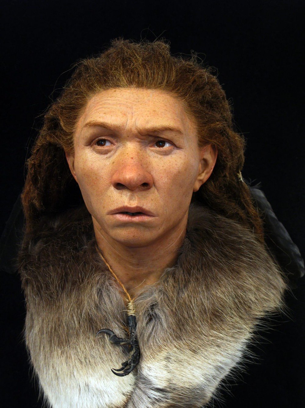
This young woman lived in what is now Britain about 5500 years ago. DNA evidence shows that the skin color of the region’s inhabitants at the time was quite dark, akin to that of modern North Africans.
This man was around 20 when he died in northern Switzerland 1300 years ago. His skull was unusual in that it contained a full set of perfect teeth.
Nilsson’s forensic technique starts with an exact 3D replica of the original skull, scanned, printed, and then modeled by hand to reflect bone structure and tissue thickness based on the individual’s origin, sex, and estimated age at death.
Recent genome studies of ancient European populations enable Nilsson to outfit his reconstructions with reasonably accurate estimates of skin, hair, and eye color. The Neolithic population that the 5,600-year-old Whitehawk woman belonged to, for instance, generally had lighter skin and darker eyes than earlier occupants of Britain such as Cheddar Man, but were darker than the exhibit’s Ditchling Road man, who arrived on the island in the first wave of light-skinned, light-eyed Beaker people from continental Europe around 4,400 years ago.
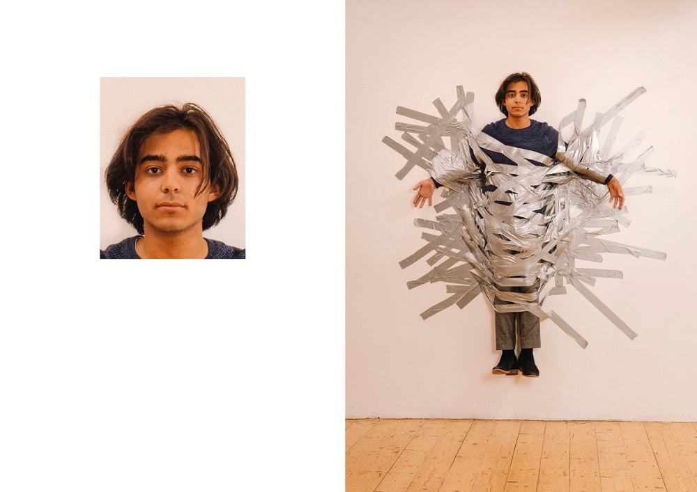
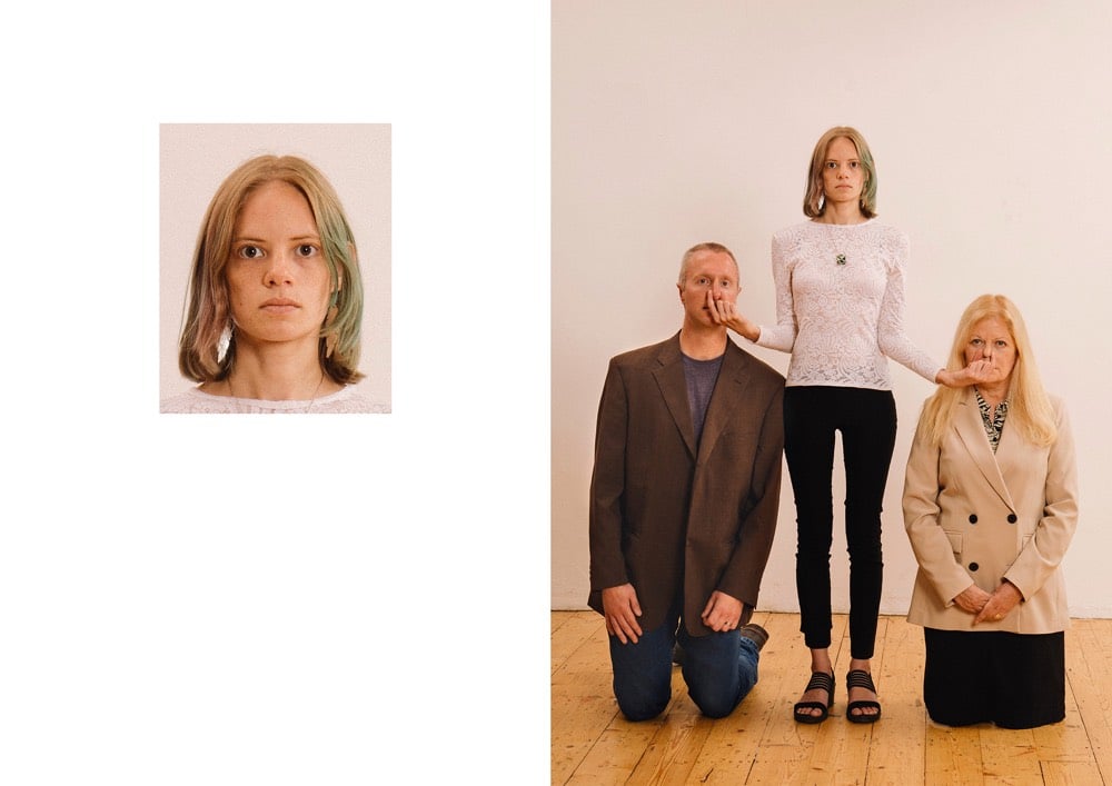
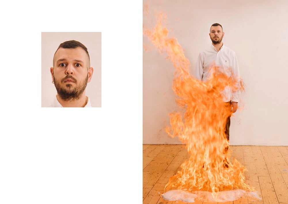
Passport photos are subject to an extensive list of guidelines and restrictions — for instance, the background has to be “plain white or off-white” with no pattern, you can’t wear glasses or hats, and the photo must be tightly cropped on your face. Max Siedentopf’s Passport Photos project imagines what might have been going on outside of that carefully controlled frame when the photos were taken. (via colossal)
Le Corbuffet was a series of performances by artist Esther Choi that sought to bring together food with notable artists and designers, along with a healthy dose of puns. A cookbook based on the project will be out in October: Le Corbuffet: Edible Art and Design Classics. Here’s the page for Quiche Haring:
Other dishes include Rhubarbara Kruger Compote, Shigeru Banchan Two Ways, Yokonomiyaki, Rem Brûlée, and the Robert Rauschenburger. Here’s the full menu/table of contents:
Says Choi about where the idea for the project came from:
In 2014, I stumbled across an elaborate menu crafted by László Moholy-Nagy. The multi-panelled bill of fare was for a dinner held in tribute to the Bauhaus founder and architect, Walter Gropius, in 1937. Inspired by the menu for Gropius’s dinner, and the questions that it raised about the elitism of cultural production, I decided to conduct a social experiment a year later.
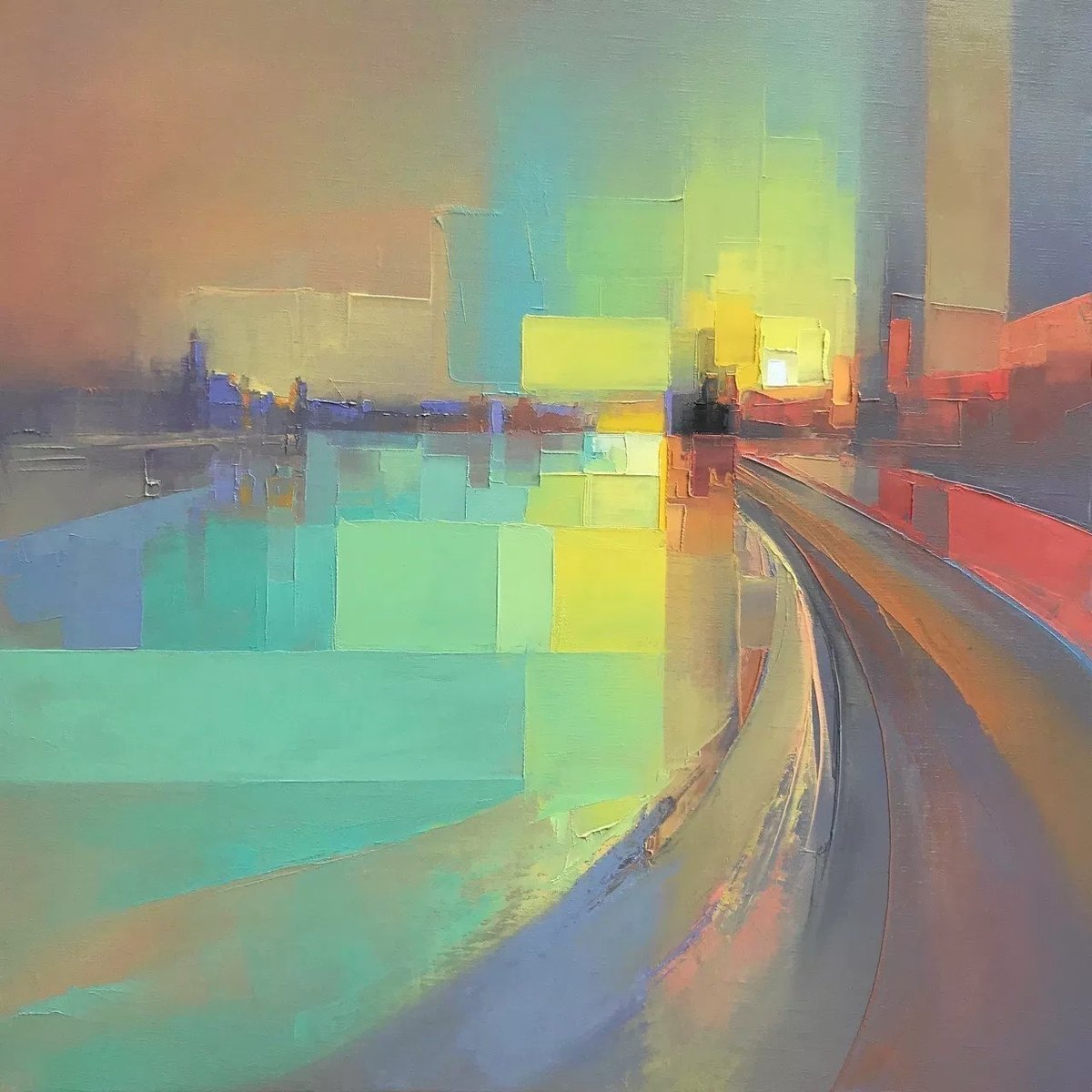
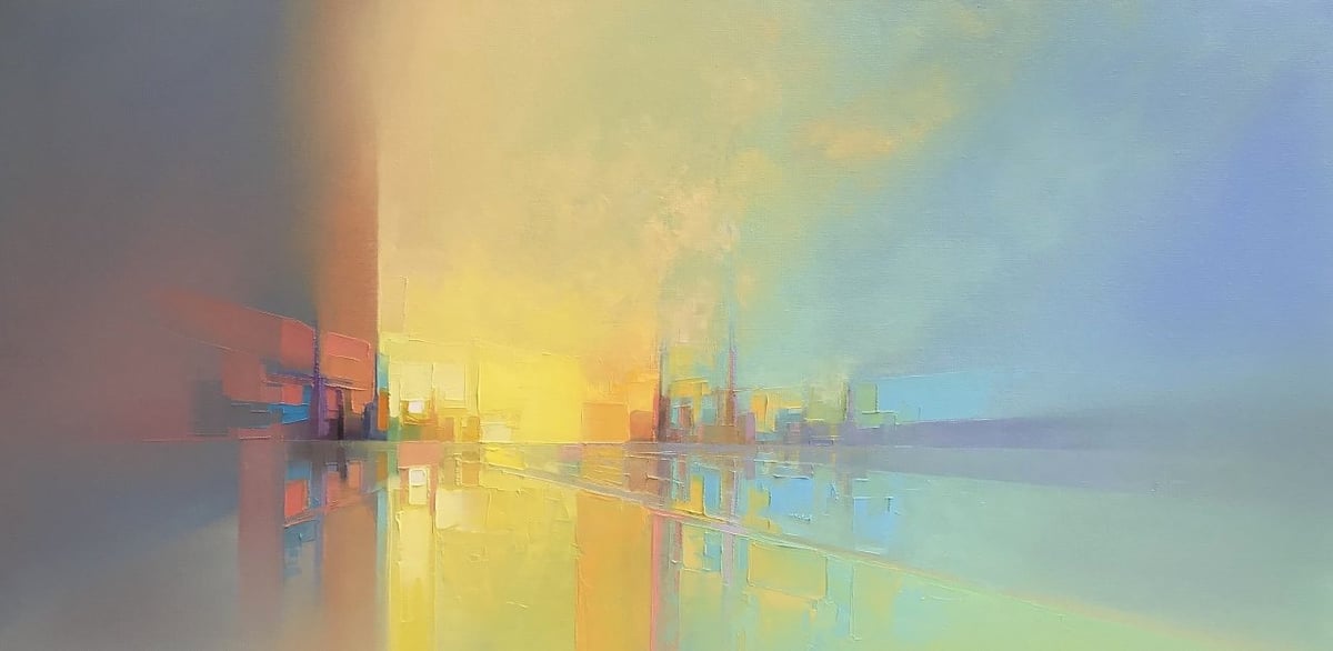
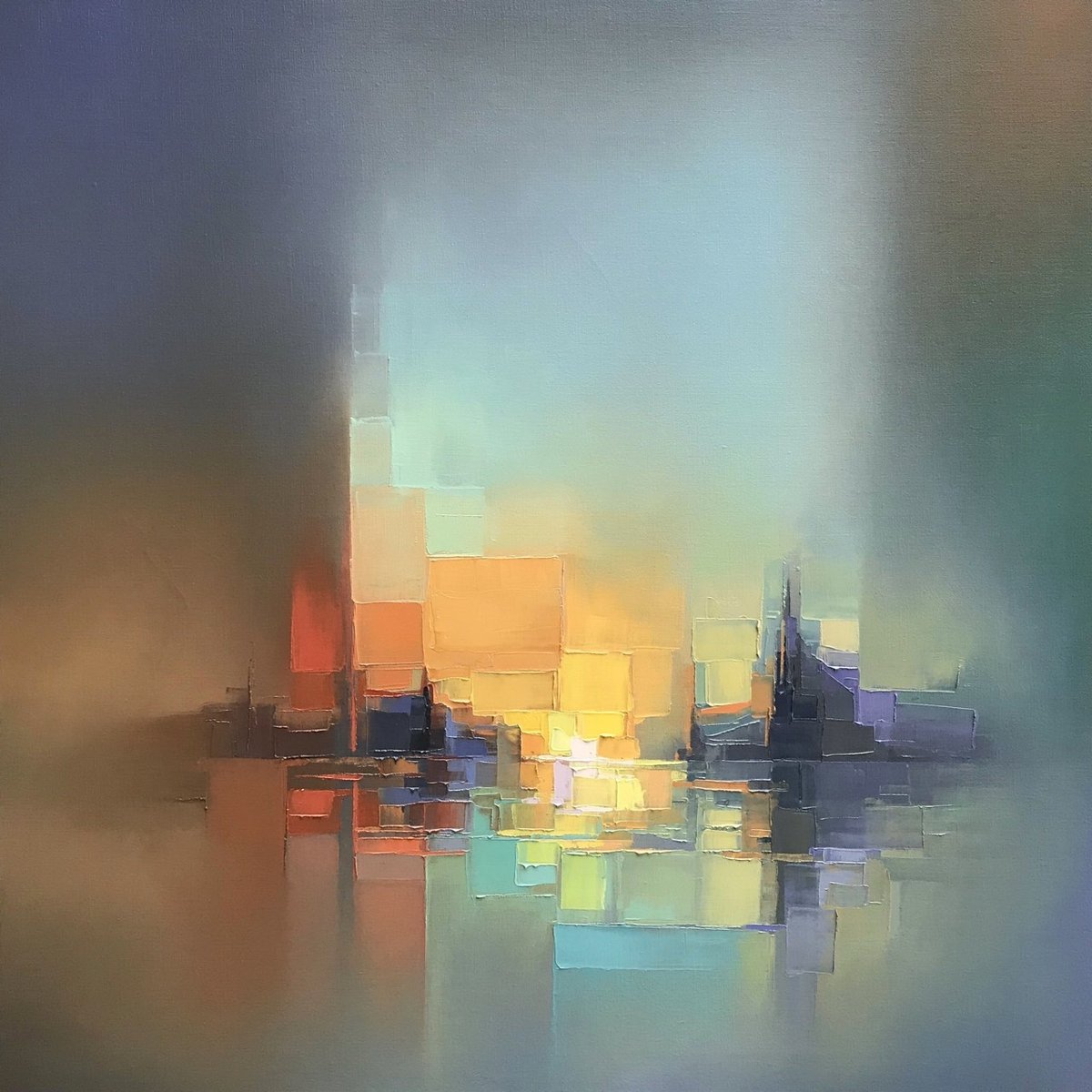
Oh, I love these abstract oil paintings by Jason Anderson. They are analog and organic but also more than a little pixel-y. Every time I see something like this, I want to get out my paints, stretch a canvas, and try it out. Note: I do not own any paints nor have I ever built any canvases. These “chunky” abstracts (see also Joseph Lee’s work) always make me curious about how much abstraction you can get away with and still have it look like something the viewer can recognize. Abstraction also always makes me think about Scott McCloud. (via colossal)
I realize that many of you have probably seen it already, but I ran across this while away on vacation and thought it was one of the most clever, moving, and powerful creative projects I’ve seen recently. Working off of a concept from 2009, activist architects Ronald Rael and Virginia San Fratello installed three seesaws through the US/Mexico border wall near El Paso which allowed children on both sides of the border to enjoy playing together.
Their beautiful intention was to bring people together through design. As you may have guessed, I really like this idea. It has power, playfulness, humanity, humour and simplicity in equal measure. But most importantly, it has a gentle anarchy at its core. Great ideas like these have this essential creative point of view. There are no rules. Reject the world as it is or how others tell you to see it. Realise you have the ability to make the world the way you want it to be. And, it will be fun or at the very least, unboring. Gentle anarchy. This point of view can be scary for many. But without it, almost nothing will change or move forward.
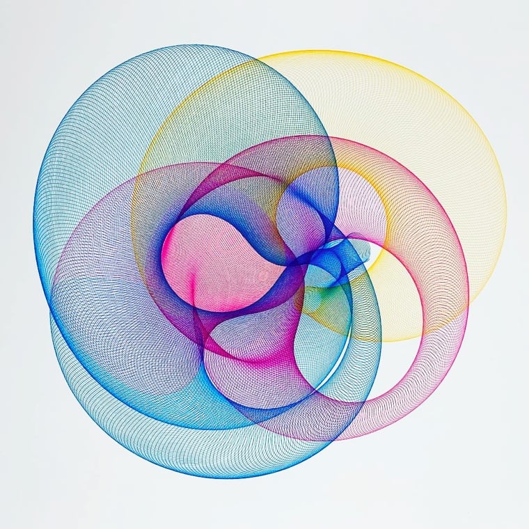
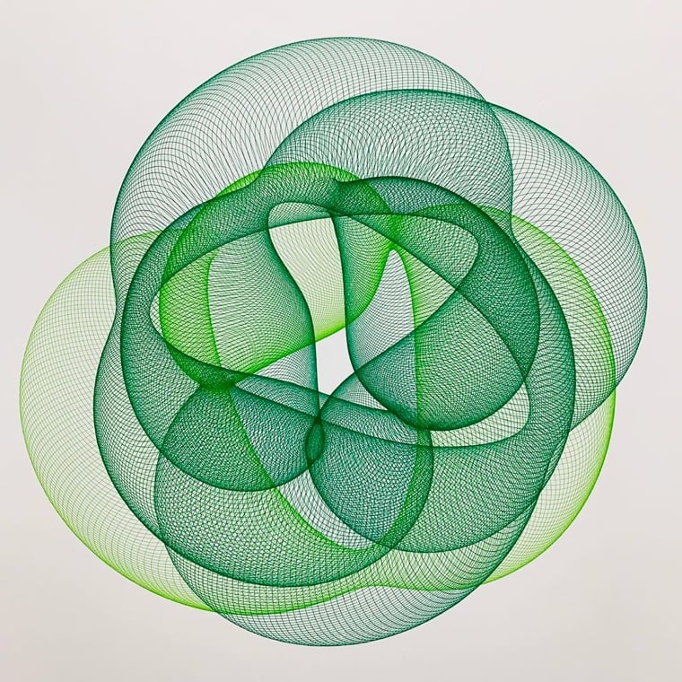
If you are old enough, you probably have fond memories of the kids’ drawing toy, Spirograph. Actually, they still exist but I’m pretty sure they are less of a thing than a few decades back.
To create multi-color works Gandy must pause the machine to switch out each color, furthering the collaboration between the built artistic object and his own aesthetic desires.
Music pioneer Fab 5 Freddy is most well-known for hosting the seminal Yo! MTV Raps, but his earliest public attention came because of his art.
In the late 1970s, Freddy became a member of the Brooklyn-based graffiti group the Fabulous 5, known for painting the entire side of New York City Subway cars. Along with other Fabulous 5 member Lee Quiñones, under his direction they began to shift from street graffiti to transition into the art world and in 1979 they both exhibited in a prestigious gallery in Rome Italy, Galleria LaMedusa. In 1980, he painted a subway train with cartoon style depictions of giant Campbell’s Soup cans, after Andy Warhol.
Hip hop pioneer Fred Brathwaite — aka Fab 5 Freddy — goes on a quest to uncover the hidden black figures of Italian Renaissance art. “Not only were Renaissance artists making art that defined high aesthetic ideals, but they were also groundbreaking in showing an ethnically diverse, racially mixed Italy in the 15th and 16th century. You just have to look at the art.”
Pairing a hip hop legend with Renaissance art might seem like a bit of a stretch, but NYC in the 70s and 80s was a place that a curious kid could get into all sorts of things: hip hop, graffiti, and Caravaggio.
“When I was a kid,” he says, “I would cut school to travel around Manhattan museums.” The Metropolitan was his favourite because of its lax entry policy. “I would show up and toss a nickel in the admissions box then spend a day in fantasy land, going from English armour to Renaissance paintings, pop art to expressionism.”
It was an unusual interest, not one he could share with “the kids on the corner from the hood”. But it sparked his own artistic career as a subway graffiti artist and led to a lasting bond with Basquiat, who he met as a teenager. “He would spend a lot of his childhood at the Brooklyn Museum just as I did at the Met,” he says. “Finally, there was someone I could talk to about Caravaggio and Rothko. We were both so impressed with the radical nature of modernist manifestos like futurism. They gave us — two young, black kids — the capacity to articulate what we wanted to say.”
There doesn’t seem to be a trailer or any clips available online and I don’t know if this will be released in the US at all, but I would love to see this show up on Netflix or Amazon at some point.
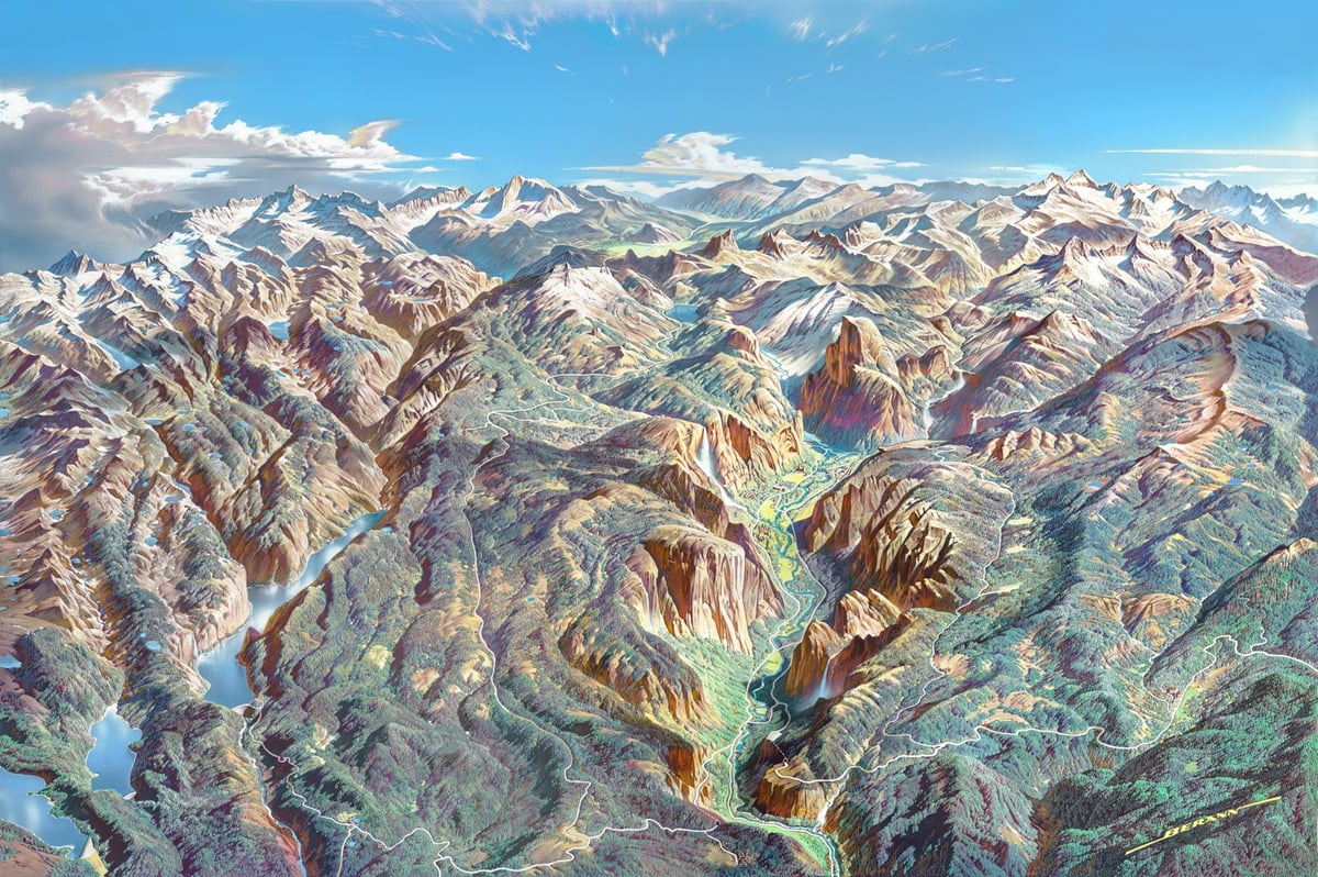
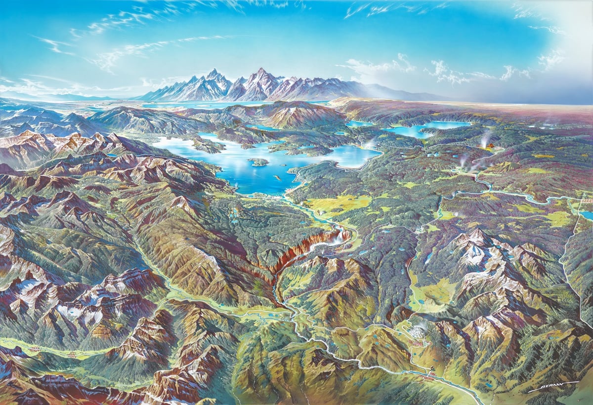
Part of the appeal of Berann’s depictions of the national parks is that they look fairly realistic while at the same time greatly enhancing the landscapes in a number of ways. The end result is similar to what you might see from the window of a plane, and yet better than any possible real-world view, Patterson says.
Berann made sure all the important features of each park were visible in the scene. Sometimes this required some creative distortion. On the Yosemite National Park panorama below, for instance, Yosemite Valley is widened to allow all the rock formations, waterfalls, and man-made structures to be clearly seen. All of the valley’s iconic natural features are exaggerated, with Half Dome and El Capitan much taller than in real life, and the waterfalls significantly longer.
(As an aside, I got this link from Open Culture, who said they found it via Boing Boing. I clicked through to Boing Boing to see that they’d discovered the link from, uh, kottke.org? Perhaps from this link last year?)
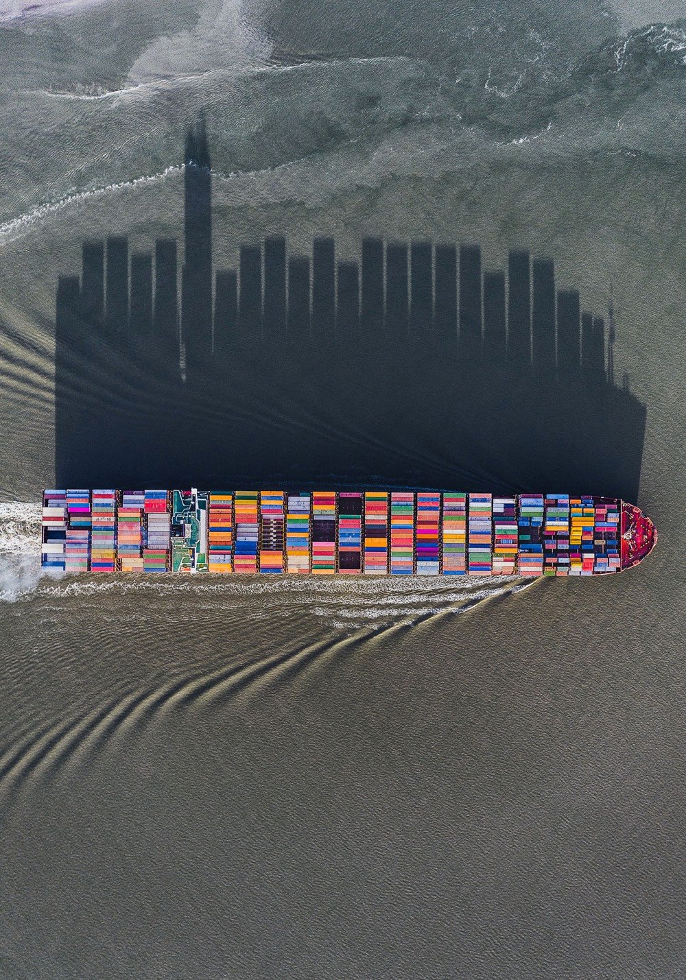
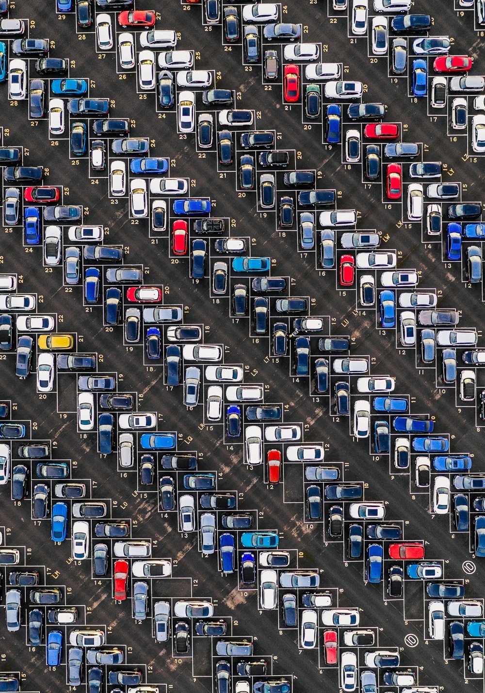
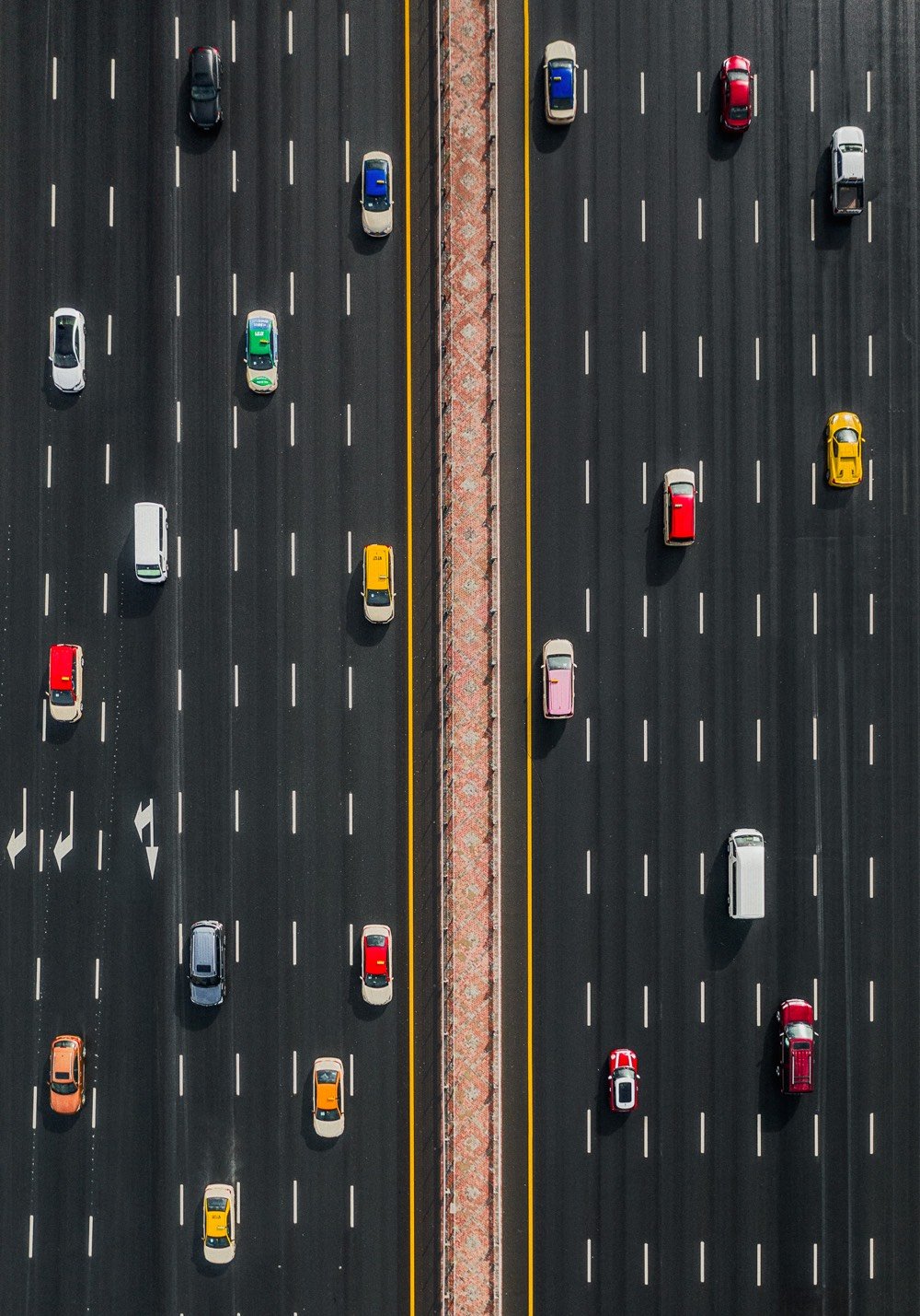
The Andrews brothers travel the world taking overhead drone photos that they offer as prints on their site Abstract Aerial Art. I was especially struck by this photo of a container ship, whose shadow doubles as a graph of how tall each row’s containers are.


Stay Connected