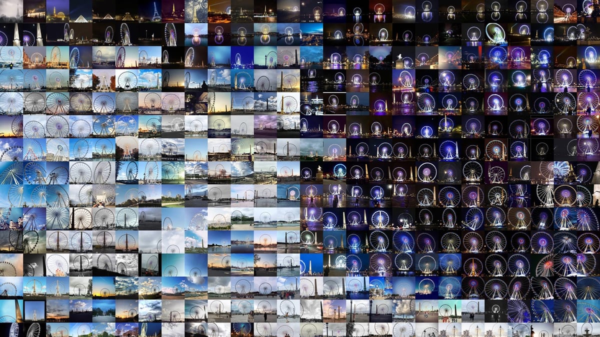
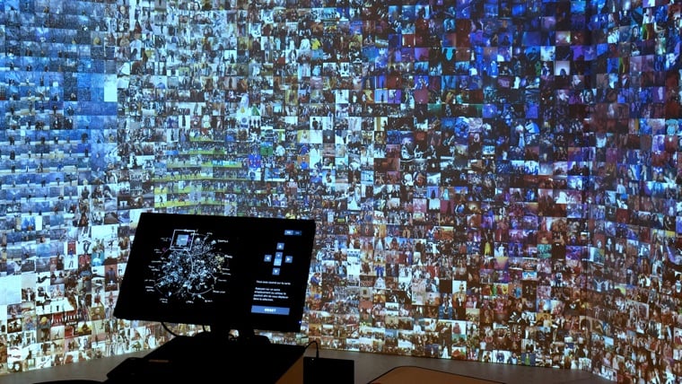
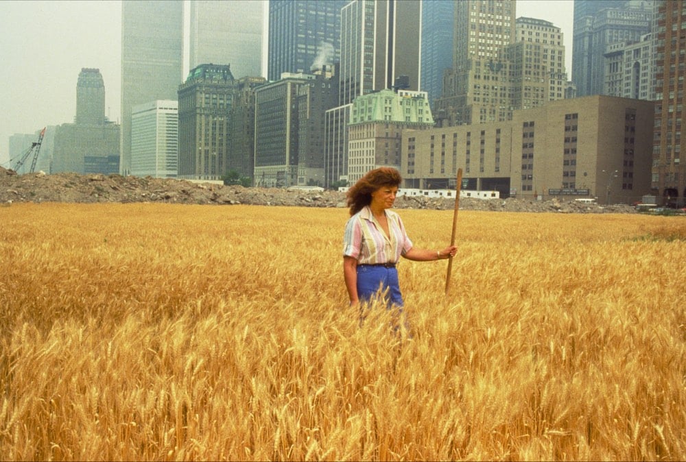
This is beautiful and fascinating, a representation of Paris through the photos shared online. The creator, Moritz Stefaner, used millions of Instagram pictures to create his Multiplicity installation. From those millions he selected 25K, then analyzed and classified them using neural networks and various processing tools. Presented on large screens, it offers touch and joystick control to dive into, pan and zoom through the clusters of images.
Today, we collectively and continuously document our city experience on social media platforms, shaping a virtual city image. Multiplicity reveals a novel view of this photographic landscape of attention and interests. How does Paris look as seen through the lens of thousands of photographers? What are the hotspots of attraction, what are the neglected corners? What are recurring poses and tropes? And how well do the published pictures reflect your personal view of the city?
The projected display seamlessly zooms from the cloudy overview map over a gridded version of the cloud to a full grid. This layering allows to understand the clustering and neighborhood structure well in the zoomed out view, while providing a tidy and efficient image display in zoomed views.
The interplay between automatic analysis, inspection of the results — what does the machine suggest and conclude — and my own actions — (in terms of layout, content selection, parameter tweaking…) was inspiring to explore.
As a design hint, the use of handwriting for the map annotations hints at the involvement of me as an active author and a subjective sense-making process.
The final result emerged from a dialogue between me and the city, the image contents and the algorithms, which actually managed to surprise and inspire me throughout the project.
The linked article provides a lot more details, including the process of placing the images and the software Stefaner used. The installation is part of the 123 data exhibition in Paris.
A large part of the appeal of the Ni No Kuni series is how the games look: it’s like you’re wandering around inside a lush Studio Ghibli animated film while playing a fantastical role-playing game. That was certainly true of the recent Ni No Kuni II: Revenant Kingdom — this in spite of the fact that the famed animation house wasn’t technically involved. It still bore the telltale signs of a Ghibli production, however, including the charming character designs of Yoshiyuki Momose and huge, stunning locations including mysterious, bioluminescent forests and vast kingdoms.
Modern art museum patrons are often confounded by all-white paintings like those of Robert Ryman. Like, what the hell? It’s just a white painting? “I could do that.” In this video, Vox’s Dean Peterson talks with The Whitney’s assistant curator Elisabeth Sherman about how you might approach thinking about minimalist art.
Always, Ryman invites contemplation of the light that falls on his paintings (which when I saw them, on a recent cloudy day, was glumly tender as it filtered through the Dia skylights) and of their formal relation to the rooms that contain them. There’s no savoring of style, just stark presentation. His work’s economy and quietness may be pleasing, but its chief attraction is philosophical. What is a painting? Are there values inherent in the medium’s fundamental givens — paint skin, support surface, wall — when they are denied traditional decorative and illustrative functions? Such questions absorb Ryman. Do they excite you? Your answer might betray how old you are.
White has a tendency to make things visible. With white, you can see more of a nuance; you can see more. I’ve said before that, if you spill coffee on a white shirt, you can see the coffee very clearly. If you spill it on a dark shirt, you don’t see it as well. So, it wasn’t a matter of white, the color. I was not really interested in that. I started to cover up colors with white in the 1950s. It has only been recently, in 2004, that I did a series of white paintings in which I was actually painting the color white. Before that, I’d never really thought of white as being a color, in that sense.
After Piet Mondrian moved to New York in 1940, his work became influenced by Manhattan’s grid system, particularly expressed in Broadway Boogie Woogie. Similarly, for his City DNA project, Xinjian Lu studied satellite maps of cities like Beijing, Athens, New York, and Los Angeles and then created these maze-like paintings that resemble the street layouts of each city. Mondrian++. Holy moly, I *love* these.
From top to bottom, Lu’s paintings depict Beijing, London, and Paris.
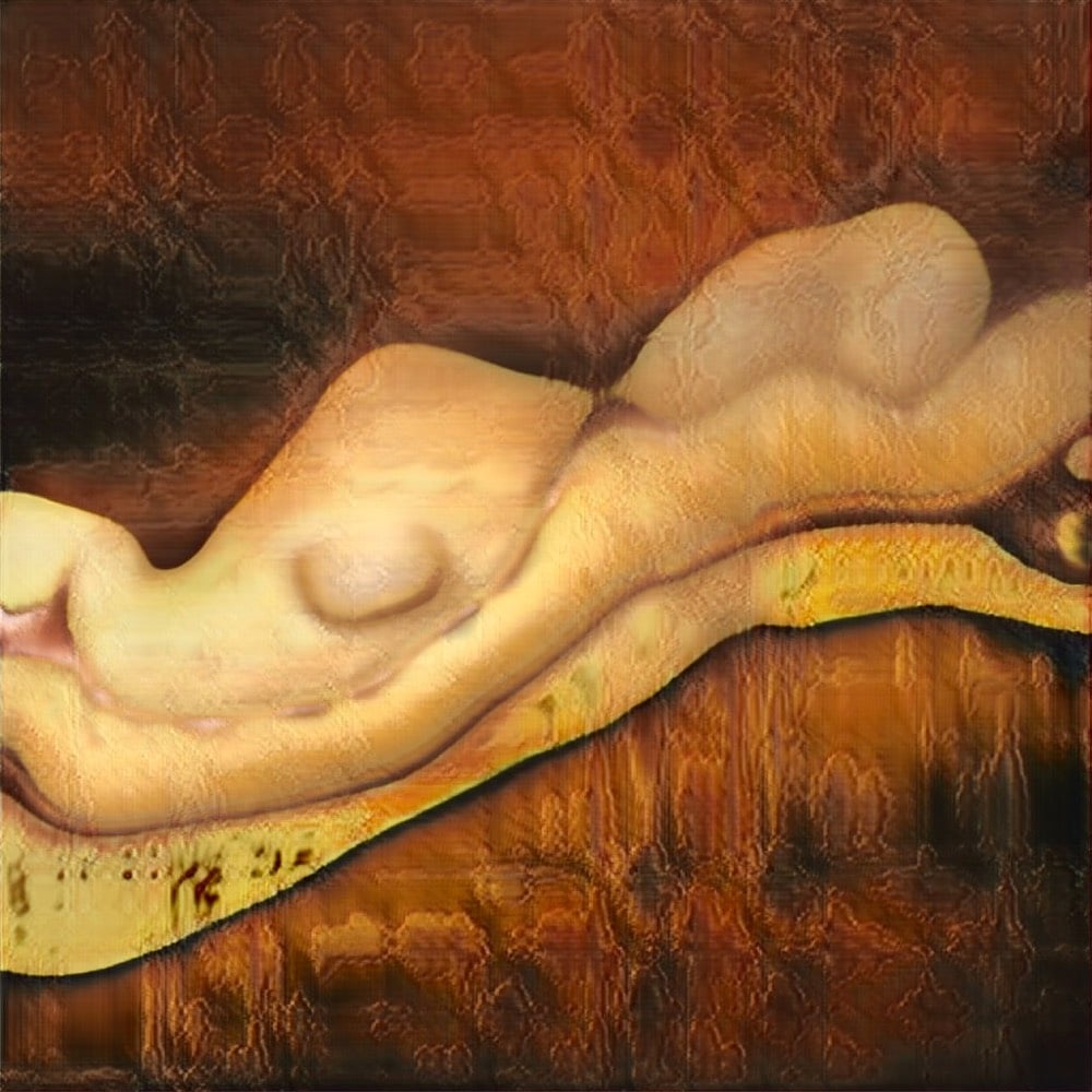
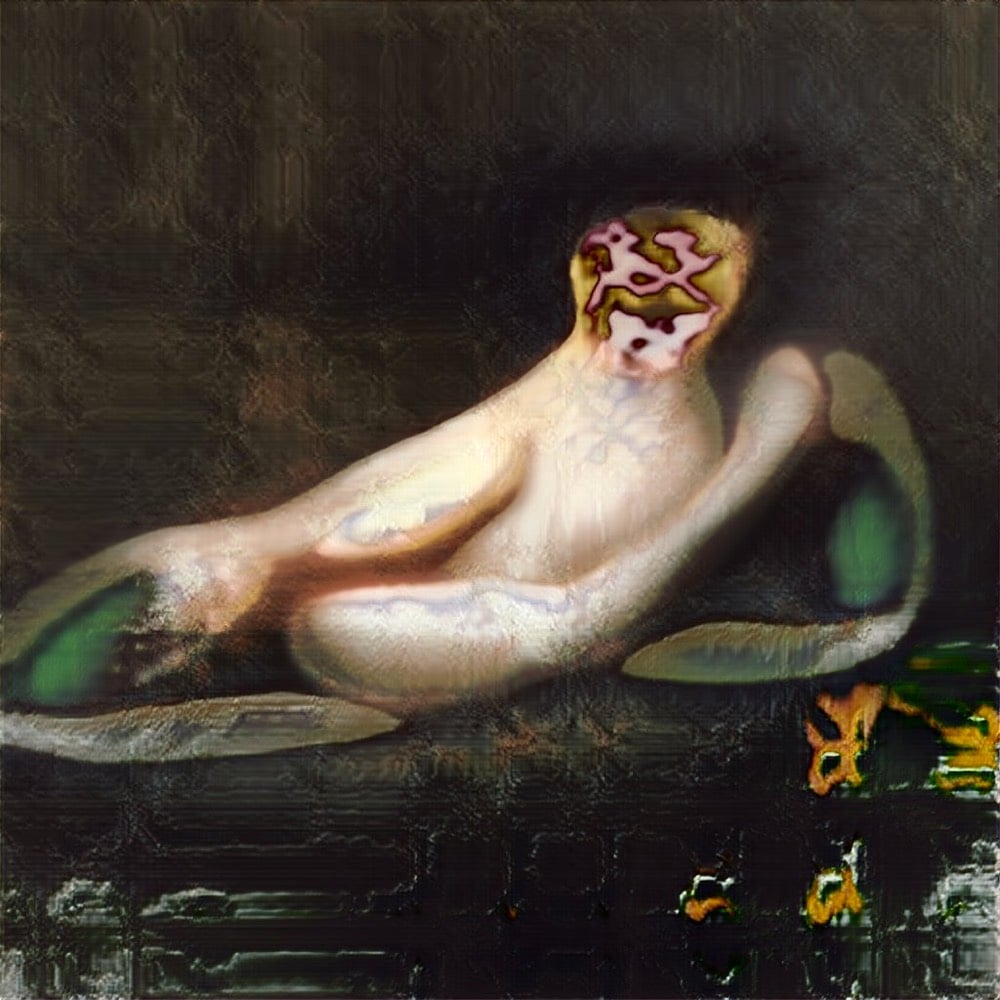
Titian on shrooms? Francis Bacon turned up to 11? Picasso++? Dali, um, well, Dali would probably come up with something like this tbh. Robbie Barrat is a machine learning researcher at Stanford who’s using an AI program to generate nude portraits (more, more, and more).
Usually the machine just paints people as blobs of flesh with tendrils and limbs randomly growing out — I think it’s really surreal. I wonder if that’s how machines see us…
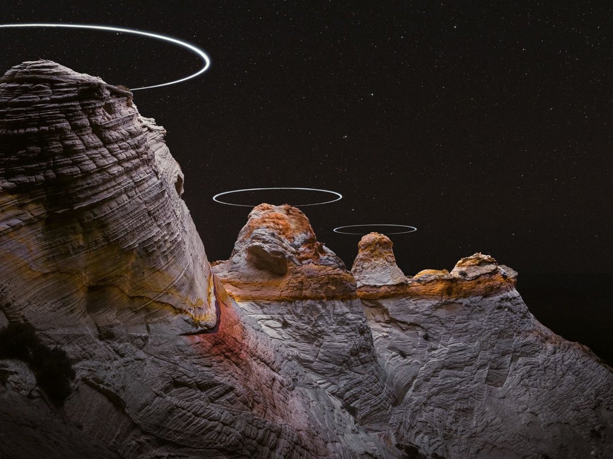
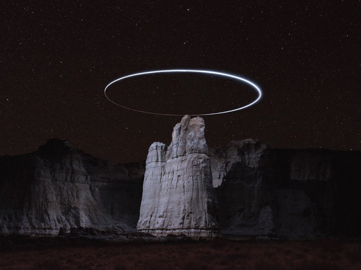
Oh, I love these photos by Reuben Wu. As part of his project Lux Noctis, Wu flies drones in circles around mountain peaks and takes long-exposure photos, creating these beautiful haloed landscapes. Wu spoke to Colossal about his interest in zero-trace land art:
Recently Wu has evolved his process of working with the drones to form light paths above topographical peaks in the mountainous terrain. “I see it as a kind of ‘zero trace’ version of land art where the environment remains untouched by the artist, and at the same time is presented in a sublime way which speaks to 19th century Romantic painting and science and fictional imagery,” said Wu to Colossal.
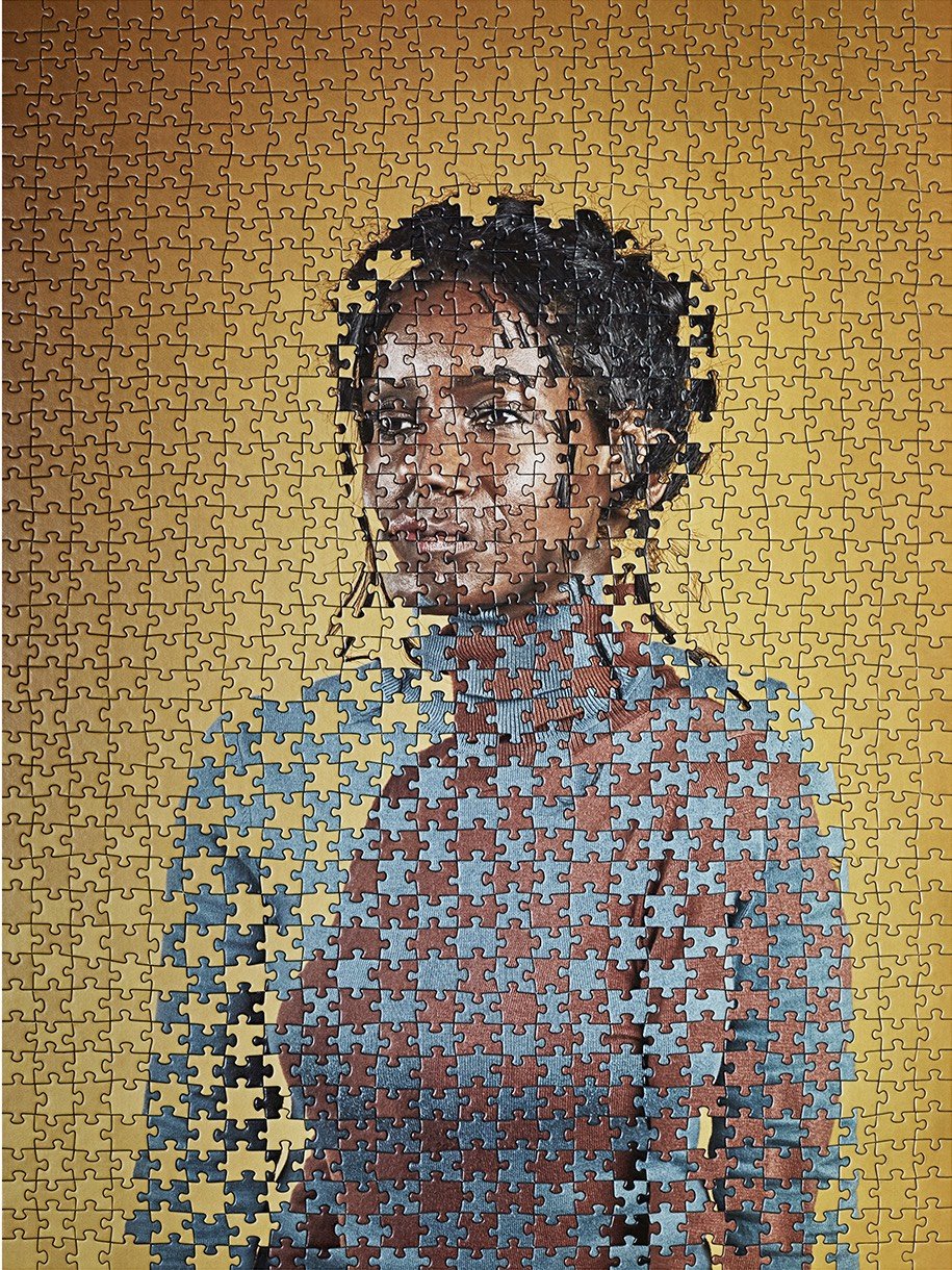
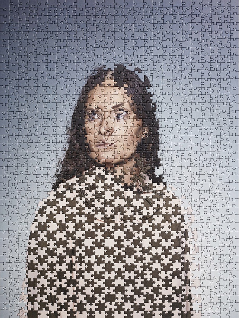
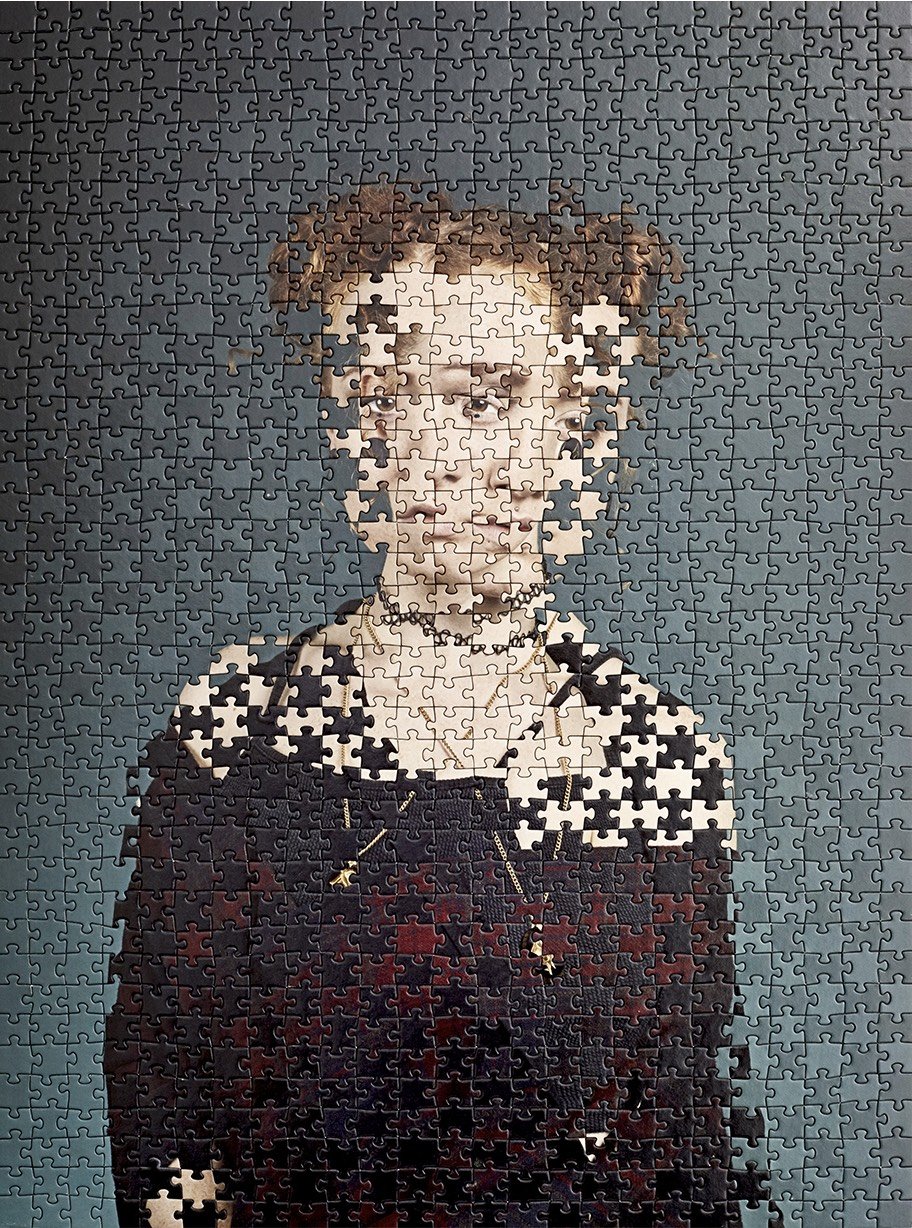
For her project entitled Within 15 Minutes, artist Alma Haser made identical jigsaw puzzles out of portraits she’d taken of identical twins and then swapped every other piece when putting them together, creating these serendipitously fragmented portraits. She said of her first attempt last year:
So today for no apparent reason I thought I’d test out a crazy idea I had. For the project I have been switching just the faces of the identical twins, but today I decided to see what it would look like to swap every other pieces with reach other. Completely entwining the beautiful @being__her sisters. And wow, what an effect! It really make you double take at their faces, trying to decipher one for the other.
You can follow Haser’s work, including the twin puzzles, on Instagram.
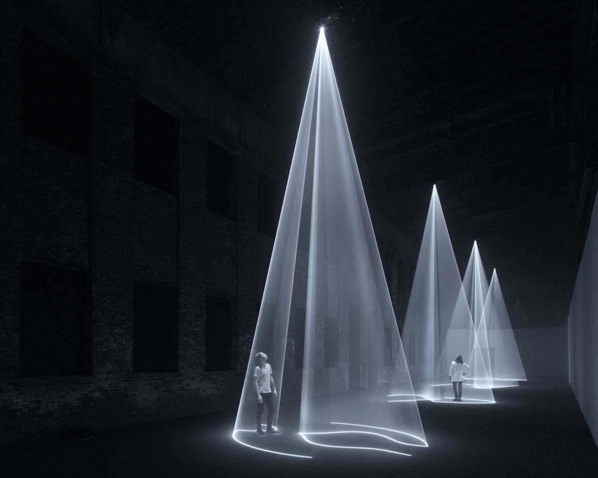
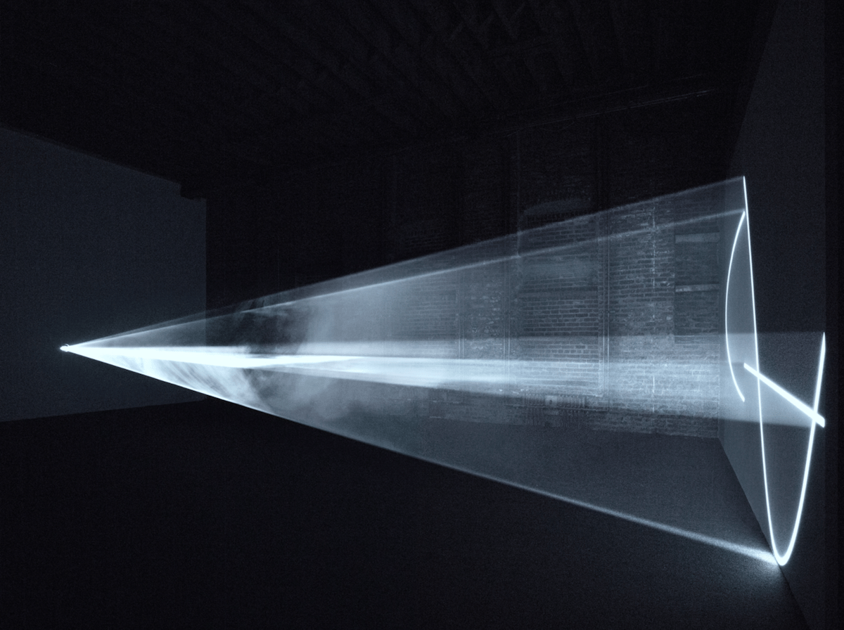
Pioneer Works in Red Hook, Brooklyn is currently showing six large-scale pieces by local artist Anthony McCall. The main hall of the massive warehouse space is blacked out and filled with haze for the show of his Solid Light Works series, which he began work on in 1973. The pieces require thirty feet of clearance from the floor to ceiling for the vertical and horizontal cones of light.
McCall regards these works as occupying a place somewhere between sculpture, cinema, and drawing: sculpture because the projected volumes must be occupied and explored by a moving spectator; cinema because these large-scale objects are not static, but structured to progressively shift and change over time; and drawing, because the genesis of each installation is a two-dimensional line-drawing.
Solid Light Works explore the intersections of light, movement, drawing, and space that form evanescent and ever changing three-dimensional forms that exist not only as “objects” in space but also as environments to be experienced.
In anticipation of the show’s closing, Pioneer Works will stay open all night on Saturday. I hope someone’s sending a street style photographer to capture the crowd.
In the latest installment of Nerdwriter, Evan Puschak explains why Francisco Goya’s painting Saturn Devouring His Son is so disturbing, not only from the standpoint of the subject matter but also the circumstances surrounding its creation.
I am especially fond of Art History Nerdwriter because the first video of his I ever watched was on Jacques-Louis David’s The Death of Socrates. I’ve been a fan ever since.
This short film from 1968, set to Classical Gas, shows 3000 years of fine art in just three minutes. As the final frame of the film says:
You have just had all of the Great Art of the World indelibly etched in your brain. You are now cultured.
As mesmerizing as the film is, especially for 1968, the backstory is perhaps even more interesting. Mason Williams, who wrote and recorded Classical Gas, saw this film by UCLA film student Dan McLaughlin and arranged, with McLaughlin’s permission, to have the original soundtrack replaced with his song and to have it aired on The Smothers Brothers Comedy Hour on CBS, then the number one show on TV in America.
The impact of the film on television opened the door to realizations that the viewer’s mind could absorb this intense level of visual input. It was a double shot of a hundred proof music and video that polished the history of art off in three minutes! It was also the beginning of the fast images concept now called kinestasis (a rapidly-moving montage technique set to music) that has over the years been exploited so effectively by television commercials, documentaries, etc.
Curiously, a similarly produced film called American Time Capsule also aired on The Smothers Brothers Comedy Hour that year. Directed by Chuck Braverman, it showed 200 years of American history in less than 3 minutes:
I was actually working in the same building as [Tommy Smothers], at CBS as an assistant — really as a messenger — trying to get into the cameraman’s union in the news department. They literally made the Comedy Hour just upstairs. I called, made a meeting, and Tommy looked at my other work and we discussed doing a film on the history of the United States — American Time Capsule. I made it and it aired on the weekend before the November ‘68 election and it was a huge hit. It catapulted me into a career. Not only did it appear on the Smothers’ Brothers Show, which was huge, but it appeared on The Tonight Show within a few weeks and then 60 Minutes picked it up. So I got a reputation right away for being the king of the fast-cut montage. I ended up doing dozens of commercials and lots of title sequences.
My favorite use of the technique is in the trailer for A Clockwork Orange:1
But anyway, getting back to Mason Williams and Classical Gas, after the success of the 3000 years of art video, he wrote a sketch about video jockeys playing music videos on TV:
As a result of the response to the CLASSICAL GAS music video, in September of 1968 I wrote up a piece for The Smothers Brothers Comedy Hour, projecting the idea that someday VJ’s would be playing hit tapes on TV, (as well as DJ’s hit records on radio), a prophesy of what was, 13 years later, to become MTV.
All this film and media history, just barely surviving in YouTube videos, video descriptions, partial scans of out-of-print books, and interviews & obituaries scattered willy-nilly all over the we, what a mess. What a fascinating mess. (via open culture)
Who made this trailer? Kubrick? His editor? Braverman? A Warner Brothers employee who was in charge of making film trailers and was a fan of Braverman? I couldn’t find any info on this.↩
In a new video for Vox, Phil Edwards talks about one of my favorite low-tech technologies: dazzle camouflage. Instead of trying to hide warships with paint the color of the ever-changing sky or sea, dazzle camouflage aimed to confuse the enemy by disguising the silhouettes and headings of ships.
World War I ships faced a unique problem. The u-boat was a new threat at the time, and its torpedoes were deadly. That led artist Norman Wilkinson to come up with dazzle camouflage (sometimes called “razzle dazzle camouflage”). The idea was to confuse u-boats about a ship’s course, rather than try to conceal its presence. In doing so, dazzle camouflage could keep torpedoes from hitting the boat — and that and other strategies proved a boon in World War I.
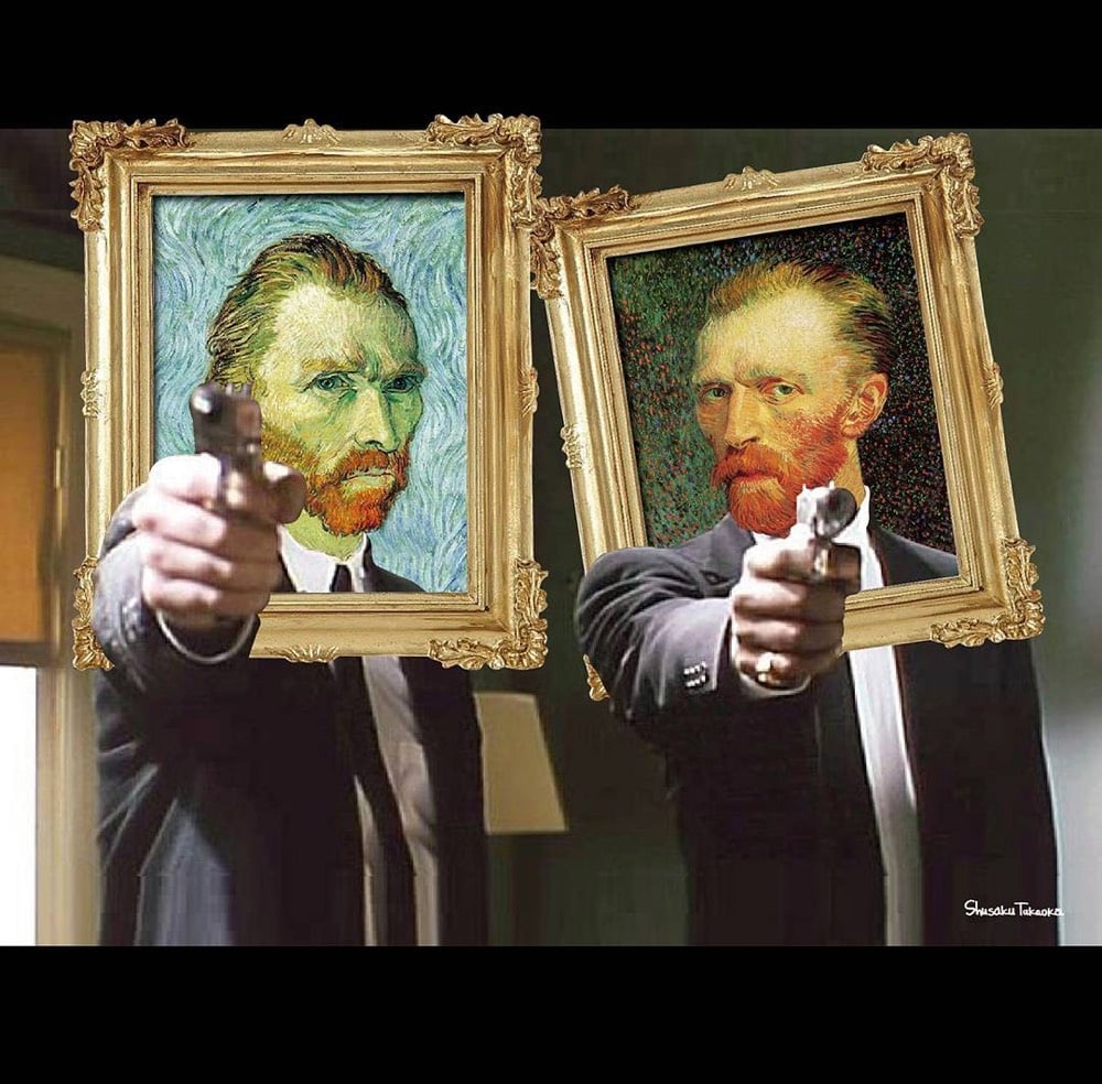
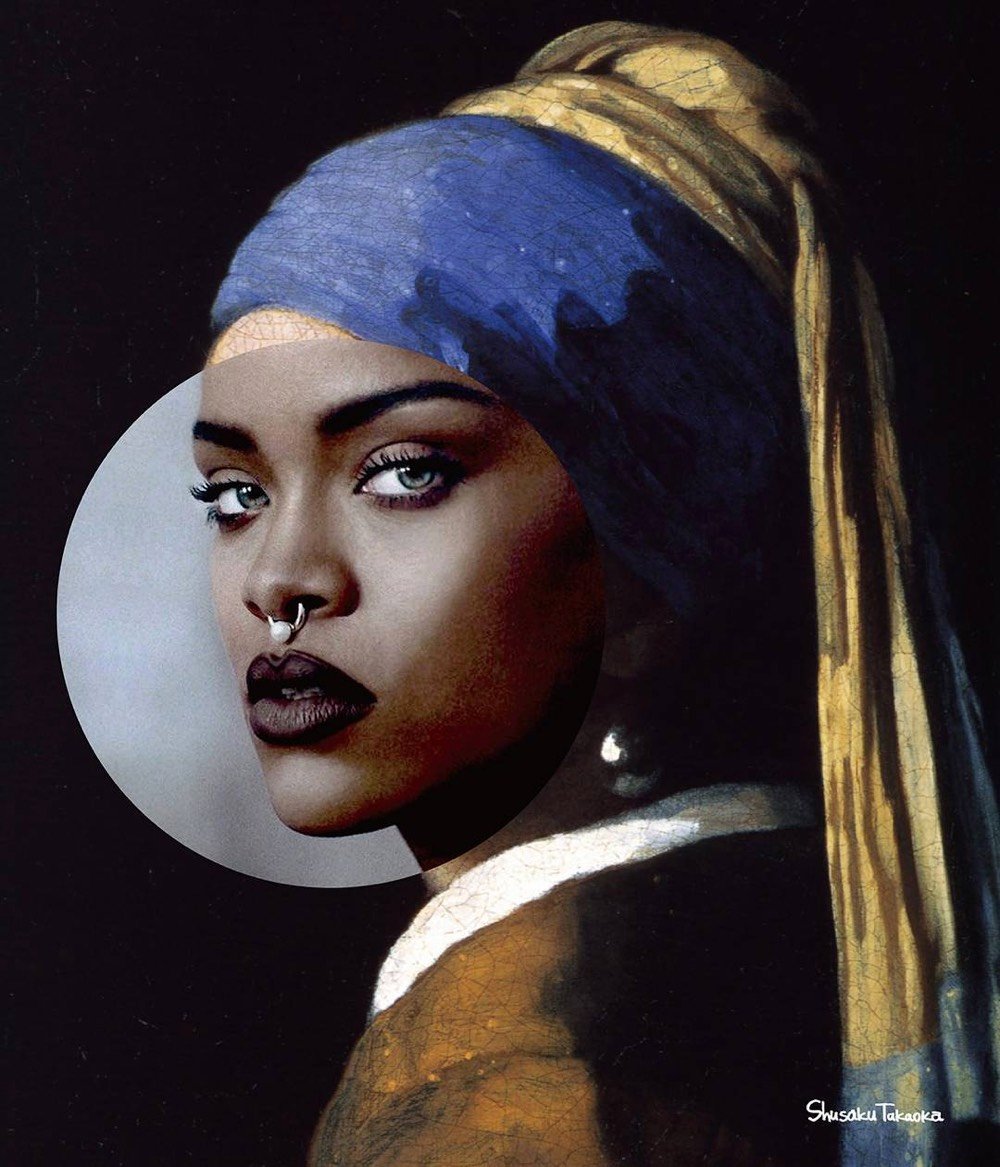
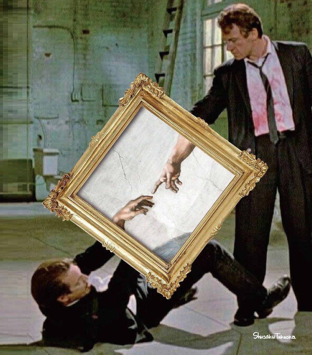
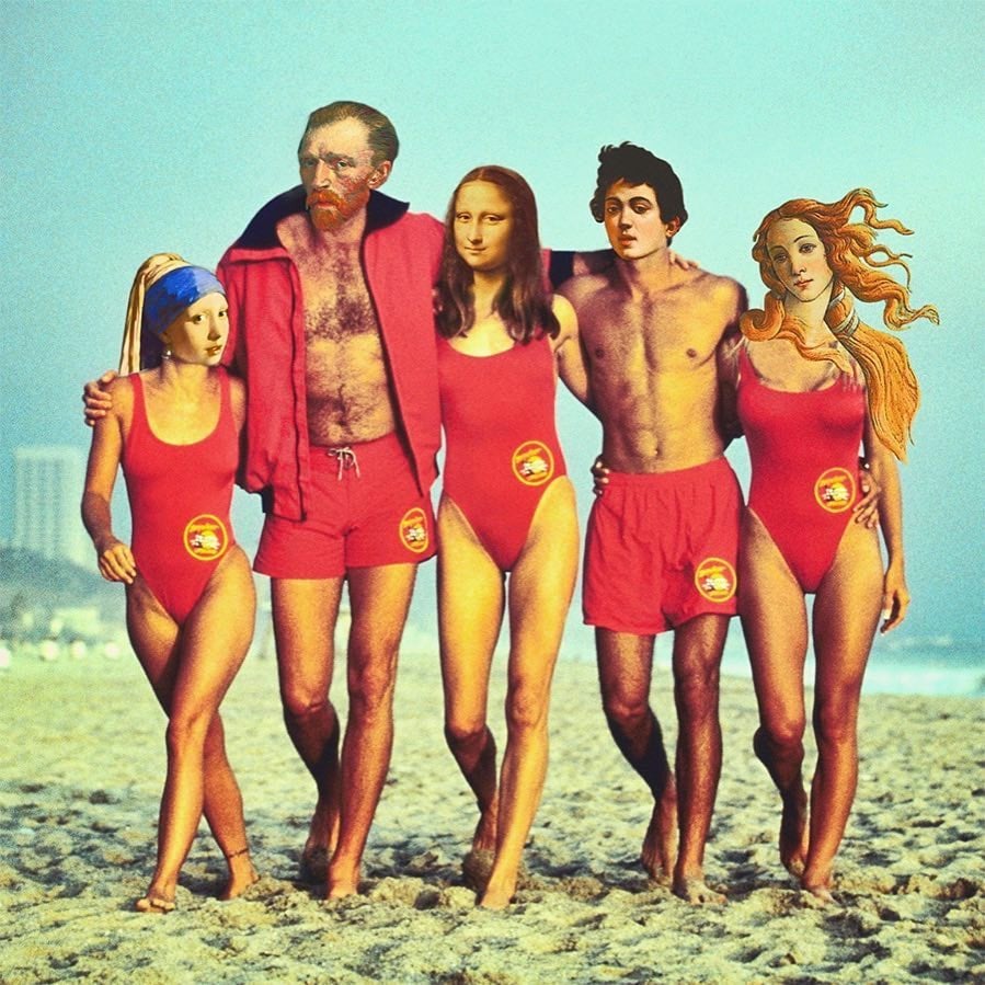
Japanese graphic designer Shusaku Takaoka takes famous artworks and cleverly incorporates them into movies scenes or celebrity photos. If you scroll back through his earlier photos,1 you can see him experimenting with various techniques before hitting his stride around September of last year.
One of my favorite things to do is scroll back through Instagram accounts like this to see the evolution not only of the work but of their self-presentation. You can often see the moment where they go, “oh shit, I’ve got lots of followers now, I’d better think more about what I post here”. See also the unbearable lightness of being yourself on social media.↩
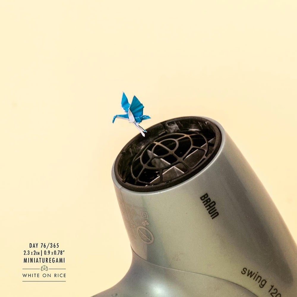
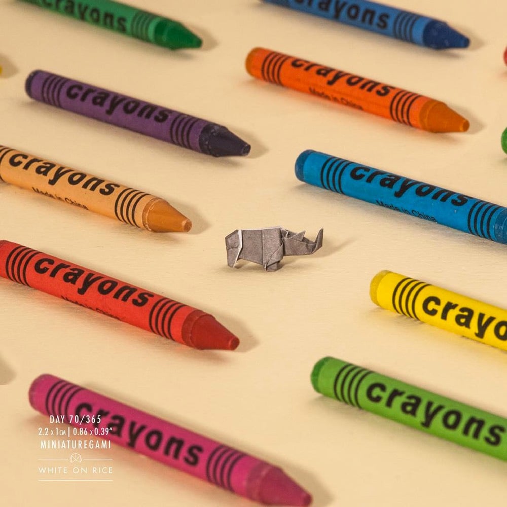
Origami artist Ross Symons makes tiny origami creations and posts them to his Instagram account, White on Rice. The account became pretty popular and Symons was able to turn his hobby into his full-time job doing installations, exhibitions, and social media campaigns featuring origami.
For his Pixel Art TV project, Gustavo Viselner illustrates scenes from TV shows in a pixelized video game style. Looks like he’s done scenes from Game of Thrones, The Handmaid’s Tale, Breaking Bad, The Fresh Prince of Bel-Air, Seinfeld, Star Trek, and several others. (via @john_overholt)
Update: See also The Screenshots, a project by Jon Haddock from 2000 in which scenes from historical & fictional events are rendered in a The Sims-like style. (via @dens)
The Smithsonian’s National Portrait Gallery commissions paintings of each outgoing President and First Lady. The Obamas selected a pair of black artists, Kehinde Wiley and Amy Sherald, to paint their portraits, which were unveiled today. From Colossal:
Wiley’s depiction of President Obama features the artist’s signature style of richly-hued background patterns setting a vibrant symbolic environment for the portrait’s subject. President Obama is surrounded by a carefully selected variety of foliage: jasmine, which represents Hawaii; African blue lilies for his father’s Kenyan heritage; and Chicago’s official flower, the chrysanthemum. For Mrs. Obama’s portrait, Sherald engaged her distinctive combination of depicting skin tone in grayscale, offset by the sharply rendered full-color fabric of Mrs. Obama’s floor-length dress.
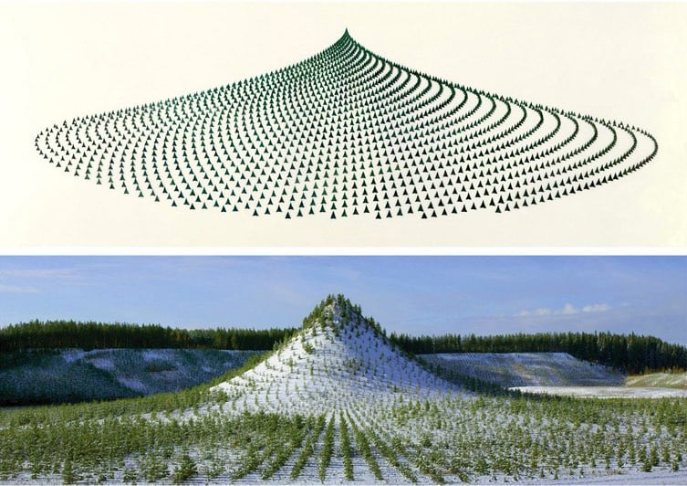
Tree Mountain is a man-made mountain 125 feet high covered in 11,000 trees planted in a configuration according to the Golden Ratio. This art installation was conceived and built by artist Agnes Denes in Finland and is designed to endure for 400 years.
A mountain needed to be built to design specifications, which by itself took over four years and was the restitution work of a mine that had destroyed the land through resource extraction. The process of bioremediation restores the land from resource extraction use to one in harmony with nature, in this case, the creation of a virgin forest. The planting of trees holds the land from erosion, enhances oxygen production and provides home for wildlife. This takes time and it is one of the reasons why Tree Mountain must remain undisturbed for centuries. The certificate the planters received are numbered and reach 400 years into the future as it takes that long for the ecosystem to establish itself. It is an inheritable document that connects the eleven thousand planters and their descendents reaching into millions, connected by their trees.
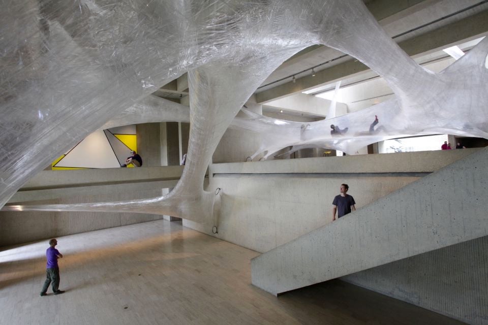
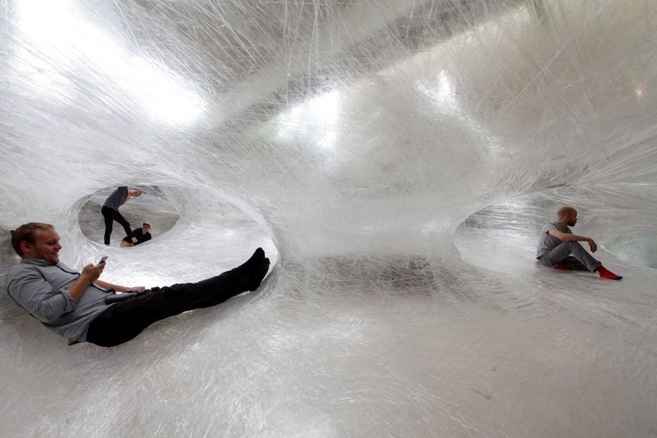
For their project Tape Des Moines, art collective Numen / For Use constructed tunnels in the Des Moines Art Center building made out of packing tape and invited people to crawl around in them. They’ve previously done tape tunnels in Vienna, Paris, and Frankfurt, but I have a looootta questions related to the structural soundness of packing tape. Like: how would puncturing the tunnel with a sharp object (accidentally or otherwise) affect the overall stability of the tunnel? (via colossal)
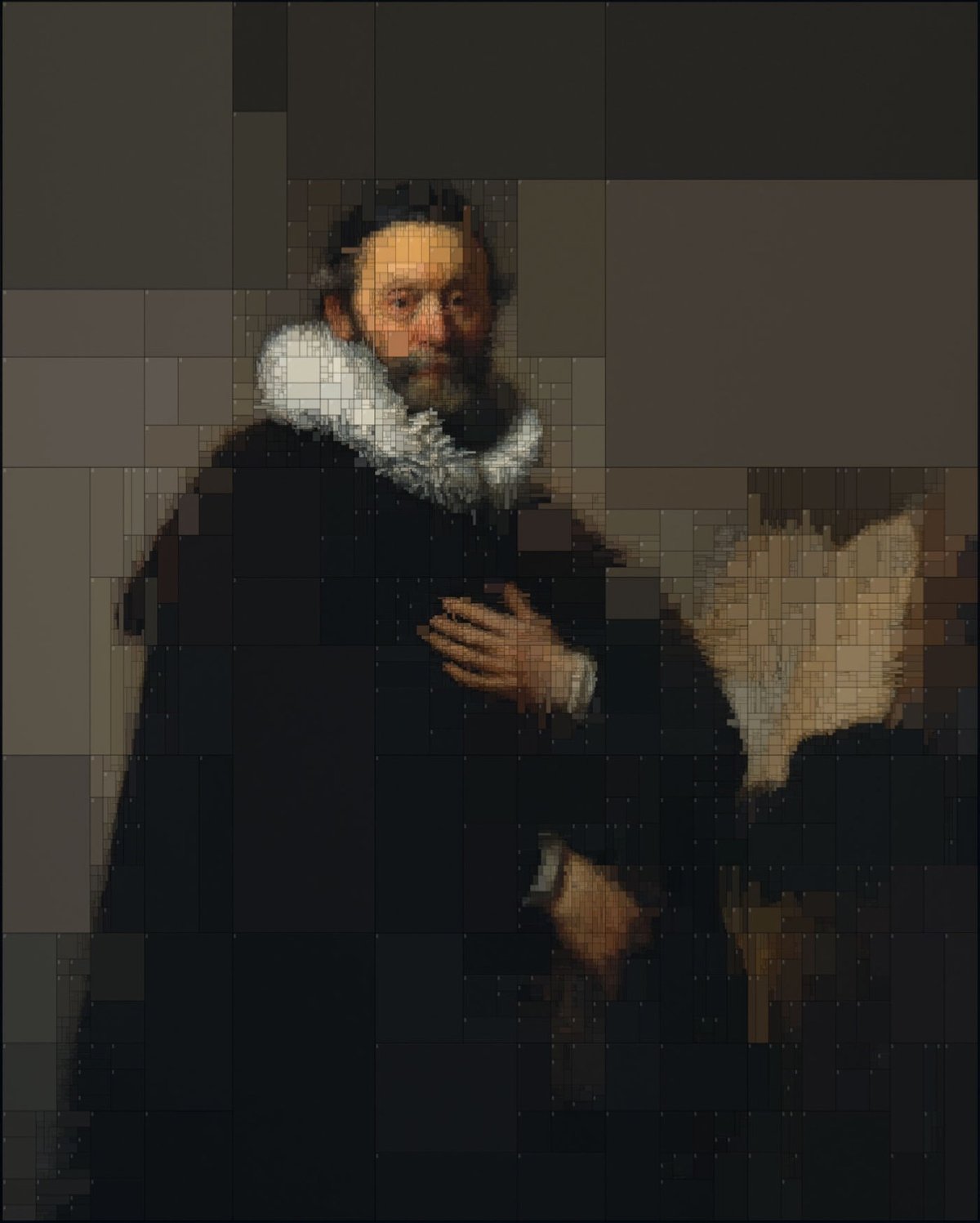
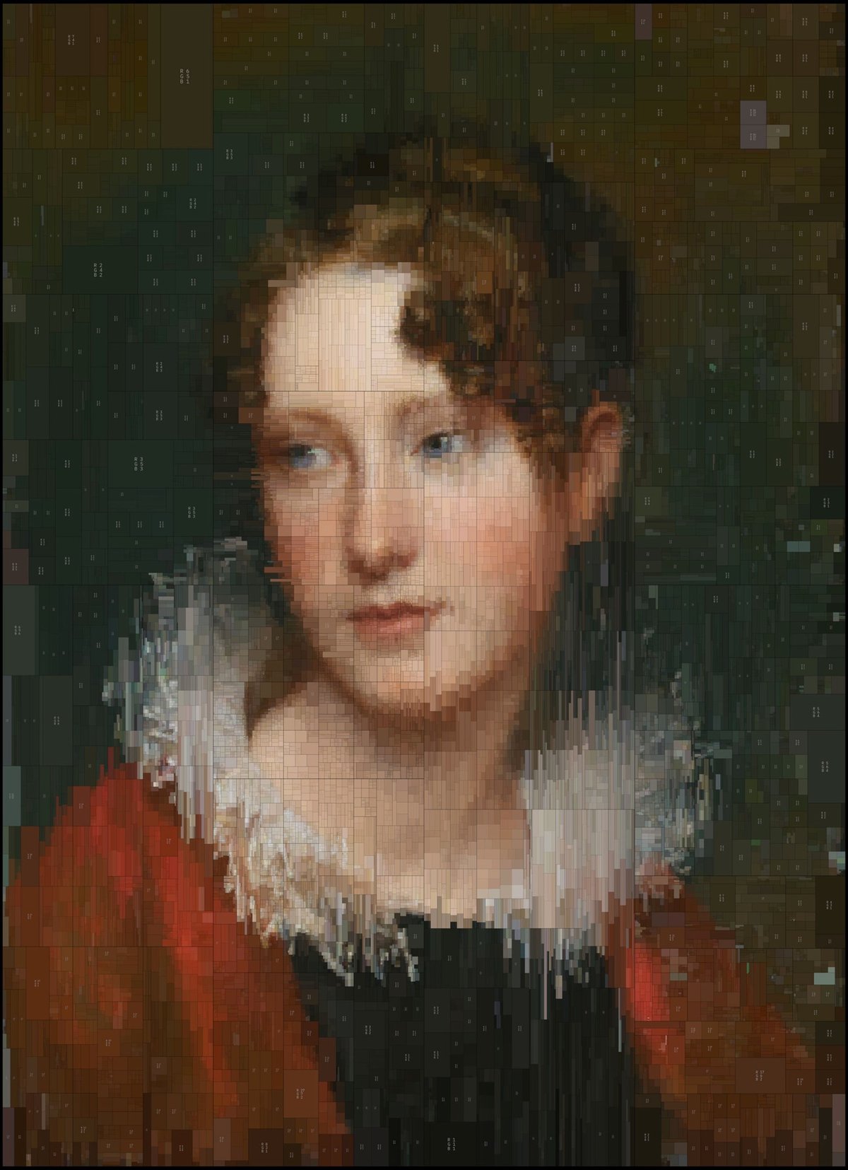
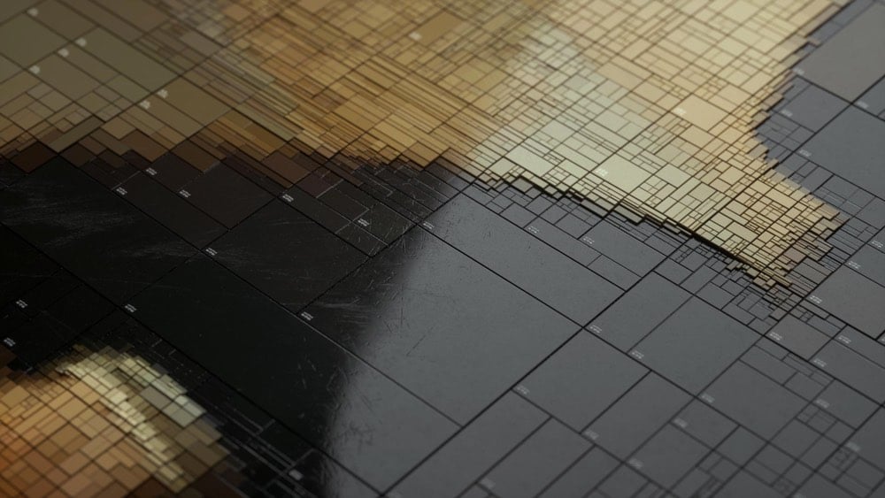
Greek visual designer Dimitris Ladopoulos took two of his favorite oil paintings, one by Rembrandt and the other (confusingly) by Rembrandt Peale, and used a piece of 3D modeling software called Houdini and pixelized them into treemaps of color. They look great in 2D (above), but he also rendered them in 3D with a worn texture:
Those worn plastic rectangles with the beveled edges are reminding me of something in particular, like a piece of electronics. Something from Sony maybe? Anyone? (via colossal)
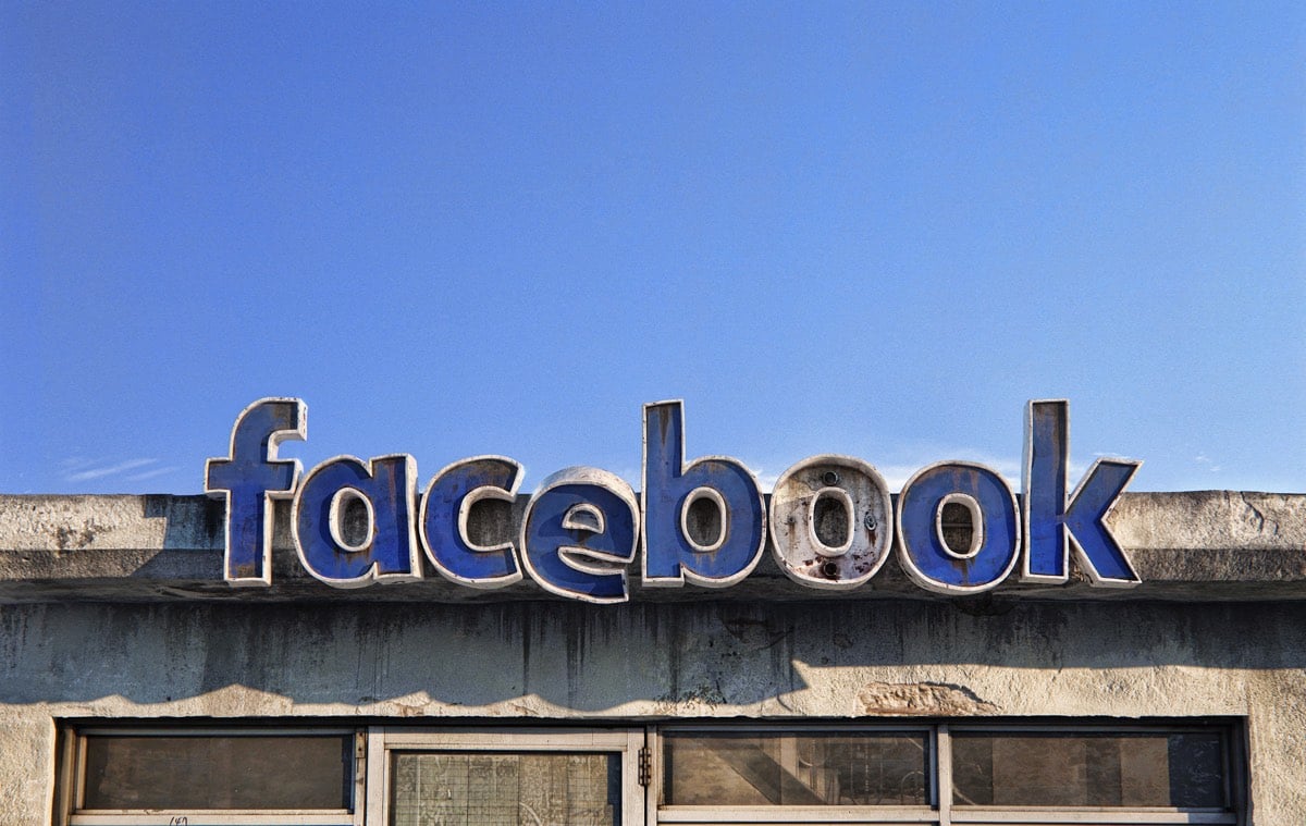
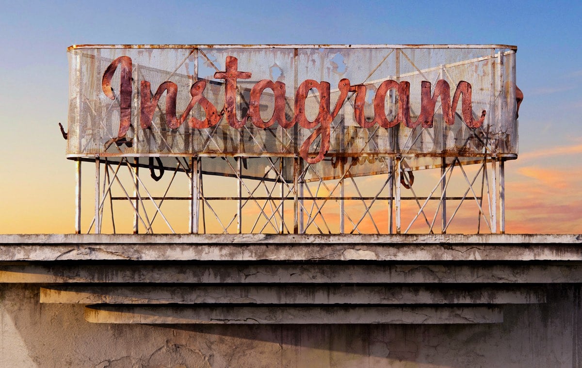
For a project called Social Decay, Andrei Lacatusu imagines what it would look like if big social media companies were brick & mortar and went the way of Blockbuster, Woolworth’s, and strip malls across America. These are really well done…check out the close-up views on Behance.
In a study done by UPenn researchers, first-year medical students who were taught art observation classes at the Philadelphia Museum of Art were more proficient at reading clinical imagery than students who didn’t take the classes.
If you’re unfamiliar or uncomfortable with how art and science can mingle to produce something clinically beneficial, it’s a study premise that might seem far-fetched — but it didn’t seem that way to Gurwin, an ophthalmology resident at Penn, in part because she’d already seen the benefits of art education on a medical career firsthand.
“Having studied fine arts myself and having witnessed its impact on my medical training, I knew art observation training would be a beneficial practice in medical school,” she said. “Observing and describing are skills that are taught very well in fine arts training, and so it seemed promising to utilize their teachings and apply it to medicine.”
Gurwin and Binenbaum’s findings, published in the journal Ophthalmology in September: The medical students who’ve dabbled in art just do better.
It’s a glimpse at how non-clinical training can and does make for a better-prepared medical professional. Not only does art observation training improve med students’ abilities to recognize visual cues, it also improves their ability to describe those cues.
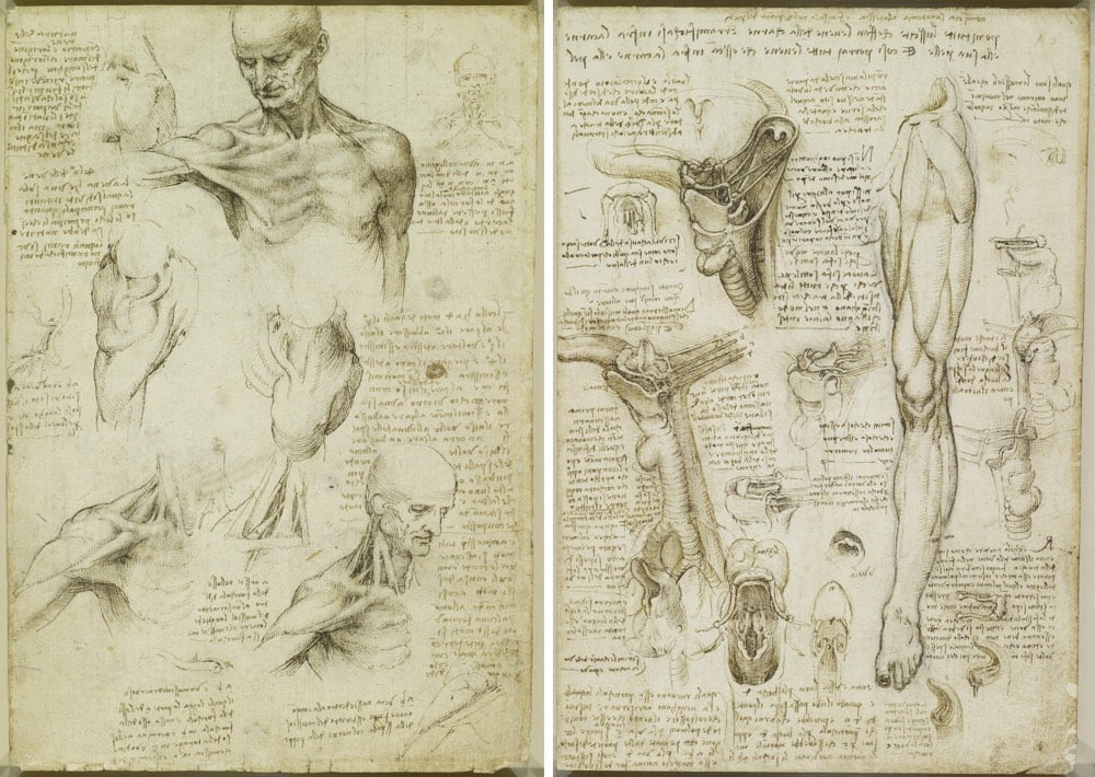
The results of this study reminded me of Walter Isaacson’s assertion in his book that Leonardo da Vinci’s greatest skill was his keen observational ability. Not coincidentally, Leonardo was both an artist and a medical researcher who dissected more than 30 human cadavers to study human anatomy. These dissections helped him to represent the human form more realistically in his paintings and drawings.
It’s easier to draw a hand, particularly a hand that appears to be moving (as Leonardo liked to do), if you know that’s going on underneath the skin. Looking carefully and purposefully at art, at anatomy, at the physical world, at people’s actions, at movies; it’s all the same skill that can be applied to anything.
Isaacson argues that Leonardo’s observational powers were not innate and that with sufficient practice, we can all observe as he did. People talk in a precious way about genius, creativity, and curiosity as superpowers that people are born with but noticing is a more humble pursuit. Noticing is something we can all do.
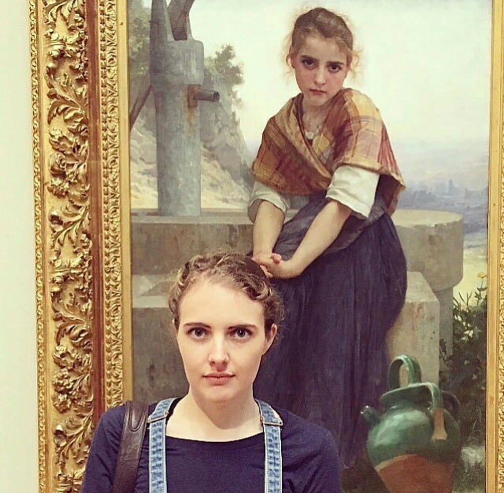
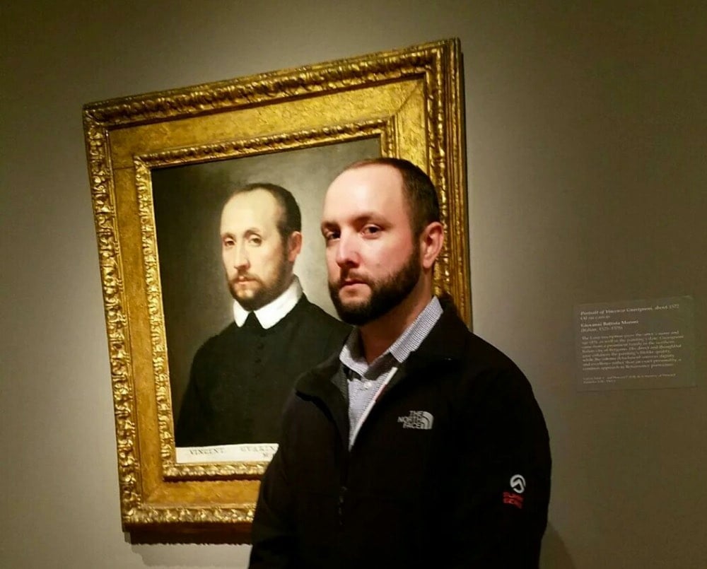
Now the Google Arts & Culture app lets you take a selfie and find your own art doppelganger. The results are kinds iffy — even when making my best Jesus-suffering-on-the-cross face, I couldn’t get it to match me with an actual Passion painting — but you can see some of the results here.
Donald Hanson has created a digital art piece called Permanent Redirect that moves to a new URL every time someone views it.
A net art piece that moves to a new URL whenever someone views it. It is not possible to link to the art piece. Over time the art piece will become very hard to view. This is an experiment in introducing artificial scarcity into digital work.
So, it was here and then here but now it’s not, so good luck tracking it down. Or, ok, it’s not really the point, but you can cheat a little and find a screenshot on Twitter. (via @nickbaum)
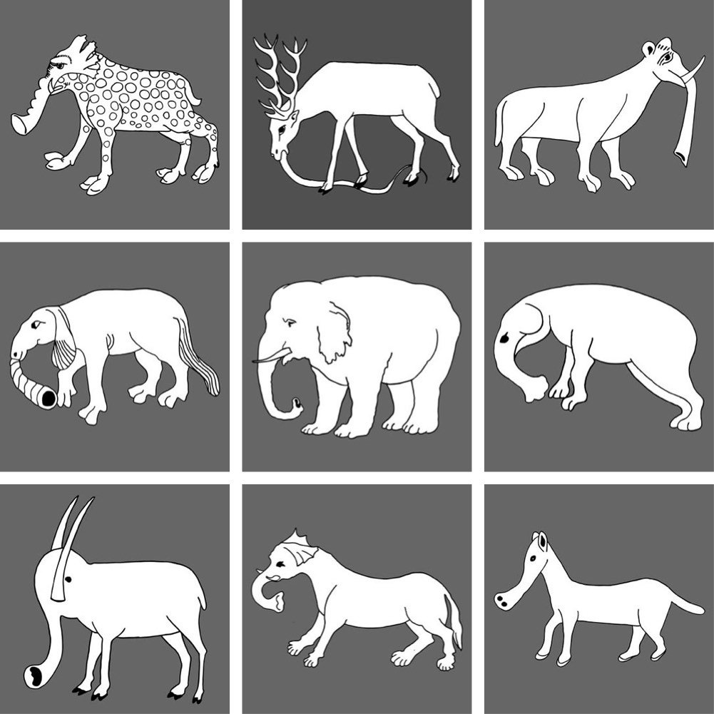
For his Elephas Anthropogenus project, Uli Westphal collected European illustrations of elephants dating from the fall of Rome to the end of the Renaissance, a period of time when very few people actually knew what an elephant looked like.
After the fall of the Roman Empire, elephants virtually disappeared from Western Europe. Since there was no real knowledge of how this animal actually looked, illustrators had to rely on oral and written transmissions to morphologically reconstruct the elephant, thus reinventing an actual existing creature. This tree diagram traces the evolution of the elephant depiction throughout the middle ages up to the age of enlightenment.
Have you ever wondered why, when you’re driving along on a straight road in the Western US, there’s a weird curve or short zigzag turn thrown into the mix? Grids have been used to lay out American roads and houses since before there was a United States. One of the most prominent uses of the grid was in the Western US: the so-called Jefferson Grid.
The Land Ordinance of 1785, drafted by Thomas Jefferson, extended government authority over the Mississippi River and the Great Lakes regions. As a response to what he believed to be a confusing survey system already in use, Jefferson suggested a new grid system based on the rectangle. The grid divided land into plots one mile square, each consisting of 640 acres. The grid also placed a visible design upon a relatively untouched landscape.
As most people know, the Earth is roughly spherical. When you try to cover the surface of a sphere with squares, they are not going to line up perfectly. That means, every so often, sections of the grid shift away from each other. Gerco de Ruijter’s short film, Grid Corrections, shows dozens of examples of places where this shift occurs and the corrections employed to correct them.
By superimposing a rectangular grid on the earth surface, a grid built from exact square miles, the spherical deviations have to be fixed. After all, the grid has only two dimensions. The north-south boundaries in the grid are on the lines of longitude, which converge to the north. The roads that follow these boundaries must dogleg every twenty-four miles to counter the diminishing distances.
If you want to look at some of the corrections yourself, try this location in Kansas (or this one). See that bend? Now scroll the map left and right and you’ll see a bunch of the north/south roads bending at that same latitude.
Hi son, just reading your blog on the section lines….don’t forget, you used to live on a correction line…that is why 3 of my 40’s were only 26.3 acres….
“40’s” refers to 40 acre plots…a common size for a parcel of land back when that area was divvied up. Wisconsin has so many lakes, rivers, and glacial features that interrupt the grid that it’s difficult to tell where the corrections are, but looking at the map, I can see a few roads curving at that latitude. Cool!


.jpg)
Stay Connected