For the beginning of school, second-grade teacher Aeriale Johnson had each of her students mix up a container of paint that matched their skin color so they could use it in paintings of themselves during the rest of the school year.
We started with a base of brown or peach tempera for each child then, in small groups, added white, yellow, red, dark brown and/or green to get to just the right hue. They looked like they were at Ulta trying to find foundation. :) The conversations were great!
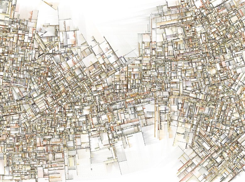
In his piece Why Love Generative Art?, Jason Bailey takes us on a short journey through the history of using computers to generate artwork, from the influence of Cézanne to the algorithmic art of Sol Lewitt to the women generative artists in the 60s and 70s, to John Maeda to the AI-generated artworks of the present day.
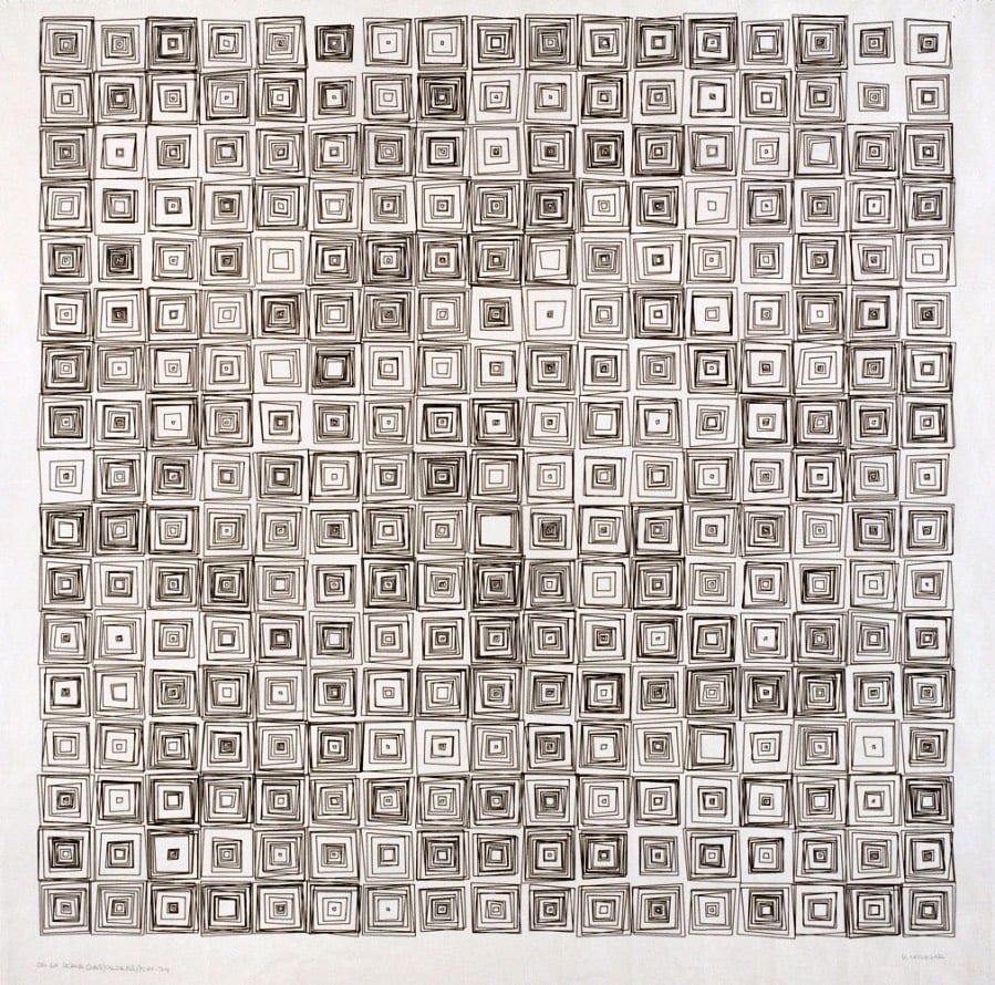
Imagine for a second that you drew the image above yourself using a pen and a piece of paper and it took you one hour to produce. It would then take you ten hours if you wanted to add ten times the number of squares, right? A very cool and important characteristic of generative art is that Georg Nees could have added thousands more boxes, and it would only require a few small changes to the code.
Unlike analog art, where complexity and scale require exponentially more effort and time, computers excel at repeating processes near endlessly without exhaustion. As we will see, the ease with which computers can generate complex images contributes greatly to the aesthetic of generative art.
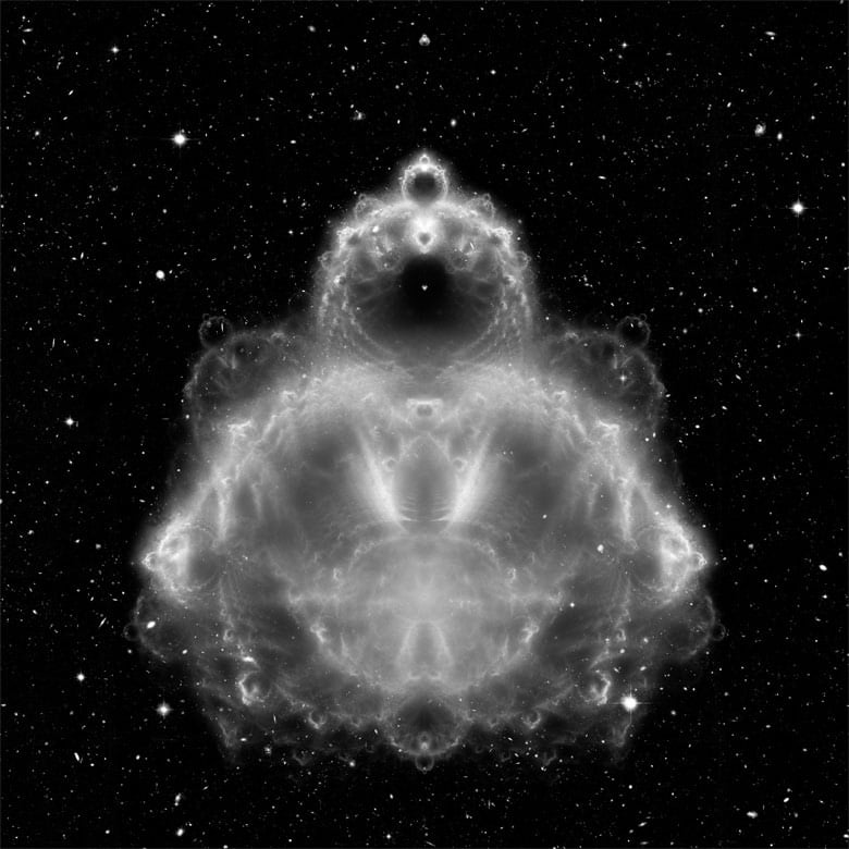
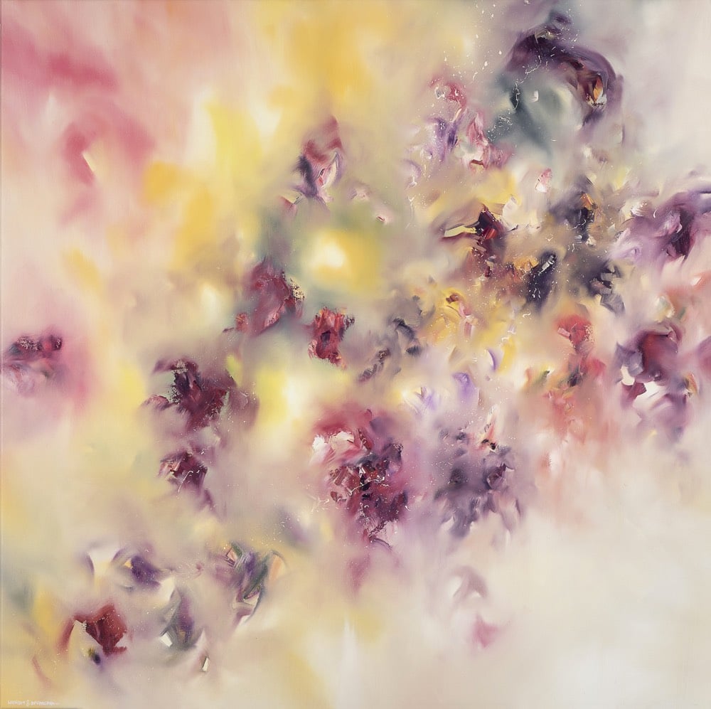
The image at the top of the post is a piece done by Vera Molnar in 1974. I’m an instant fan…her stuff is fantastic.
The post also praises the work of Jared Tarbell, which I was obsessed with back in the 2000s. Tarbell’s work is still one of my favorite online things ever.
There’s something so relaxing about watching art conservator Julian Baumgartner restore this damaged painting, a self-portrait by Italian painter Emma Gaggiotti Richards. I love how he paints tiny cracks in the damaged areas to match those in the rest of the painting.
As a fundraiser for the Leukemia & Lymphoma Society, Micah Sherman and Mark Stetson produced a web series called The Bob Ross Challenge in which 13 comedians attempt to paint along with Bob Ross as he does his thing with the trees and little fluffy clouds. Here’s the first episode, featuring Aparna Nancherla:
I feel like she does a lot better than I would have! The episodes are each less than 2 minutes long…you can burn through the whole season in about 20 minutes. Or if you want to try the challenge yourself, you can watch every episode of The Joy of Painting on YouTube. (via open culture)
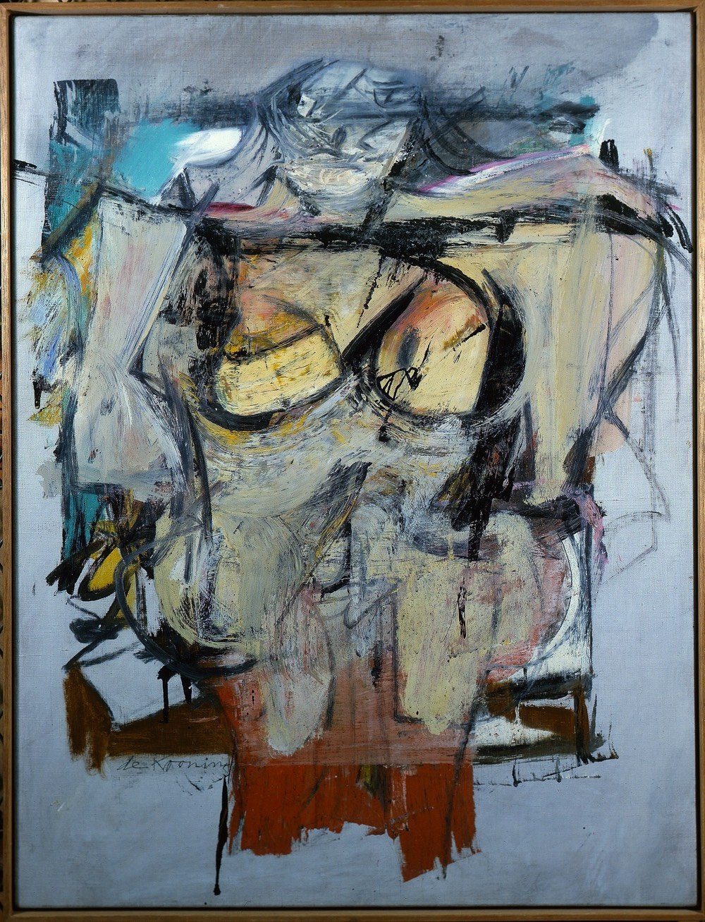
When Jerry and Rita Alter died, a painting was found in their bedroom in the tiny town of Cliff, NM, and then was sold to an antiques dealer along with the rest of their effects for $2000. The dealer soon discovered that the painting was an original Willem de Kooning worth in the neighborhood of $150 million. The painting had been stolen in a daring raid from a Tucson museum in 1985 and a recently discovered piece of evidence shows the Alters were in Tucson on the day before the theft.
The next morning, a man and a woman would walk into the museum and then leave 15 minutes later. A security guard had unlocked the museum’s front door to let a staff member into the lobby, curator Olivia Miller told NPR. The couple followed. Since the museum was about to open for the day, the guard let them in.
The man walked up to the museum’s second floor while the woman struck up a conversation with the guard. A few minutes later, he came back downstairs, and the two abruptly left, according to the NPR interview and other media reports.
Sensing that something wasn’t right, the guard walked upstairs. There, he saw an empty frame where de Kooning’s “Woman-Ochre” had hung.
At the time, the museum had no surveillance cameras. Police found no fingerprints. One witness described seeing a rust-color sports car drive away but didn’t get the license plate number. For 31 years, the frame remained empty.
Earlier this year, WFAA made a short documentary film about the Alters and the heist.
(If you don’t want to watch the entire video, at least check out the bit starting at 18:00 where the painting is given back to the museum and authenticated…that is something you rarely see on video as it happens.)
Adding to the mystery: the couple obviously never sold the painting but they retired early, travelled the world, and left a $1 million inheritance, all seemingly beyond their means as public school employees.
Something else doesn’t add up. Jerry and Rita Alter worked in public schools for most of their careers. Yet they somehow managed to travel to 140 countries and all seven continents, documenting their trips with tens of thousands of photos.
And yet, when they died, they had more than a million dollars in their bank account, according to the Sun News.
“I guess I figured they were very frugal,” their nephew, Ron Roseman, told WFAA.
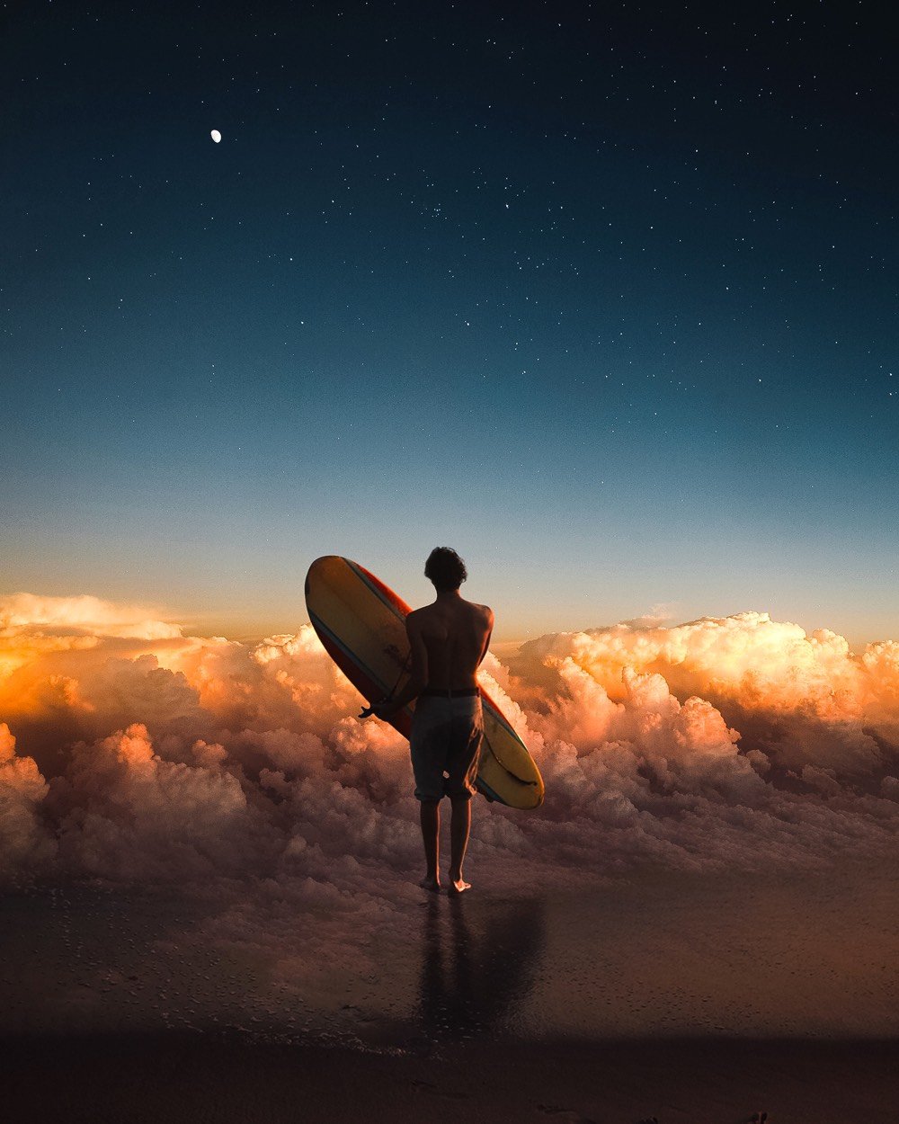
From Vladimir Tomin, a fun augmented reality video where he uses a set of image editing tools to manipulate the scenery in fanciful ways. (It’s kinda hard to describe this…just give it 5 seconds and you’ll get the idea.)
(via Instagram’s explore page (yes, I’m the guy who uses the IG explore page))
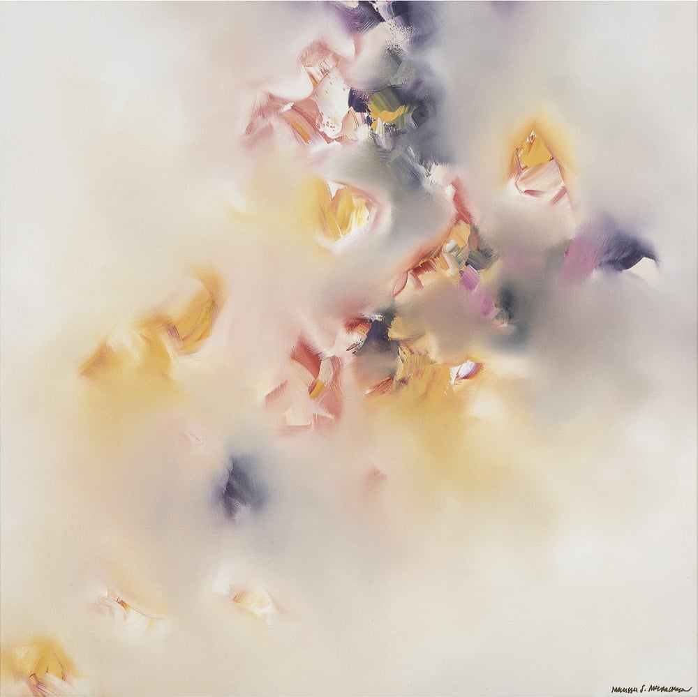
Melissa McCracken has synesthesia and experiences seeing the music she listens to as shifting colors. In an old artist statement, McCracken explained how she sees the world differently than many people:
Basically, my brain is cross-wired. I experience the “wrong” sensation to certain stimuli. Each letter and number is colored and the days of the year circle around my body as if they had a set point in space. But the most wonderful “brain malfunction” of all is seeing the music I hear. It flows in a mixture of hues, textures, and movements, shifting as if it were a vital and intentional element of each song.
Great Big Story did a short video profile of McCracken a couple of years ago:
I like how she says she dislikes how some songs sound but likes how they look. What a cool way to be able to experience the world.
McCracken is a bit coy on her site and Instagram about which songs inspired which paintings, but the paintings above are titled Love Is Touching Souls (from a Joni Mitchell lyric), Life on Mars (David Bowie), and Wasn’t It Kind of Wonderful (lyrics from a Lianne La Havas song?).
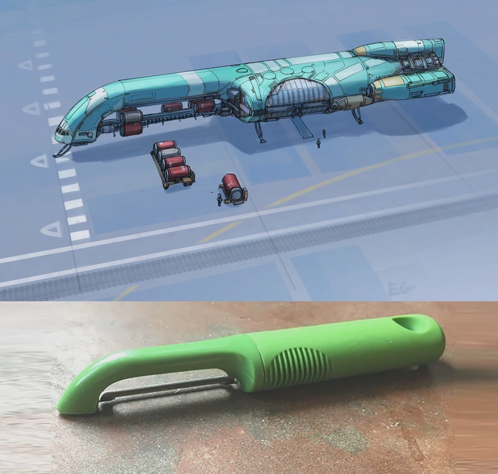
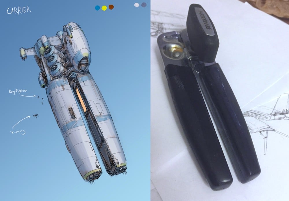
Eric Geusz takes everyday objects like can openers, tongs, and potato peelers and turns them into spaceships that wouldn’t look out of place in Star Wars or Star Trek.
This is a short video profile of Martin Frost, who might be the last remaining professional fore-edge painter in the world.
Dating back centuries, the delicate art form places intricate scenes on the side of books, cheekily hidden beneath gold gilded pages. The beautiful paintings are only visible to the trained eye, but once you unlock the secret, you’ll find pure magic.
I love the two-way paintings…you fan the book’s pages out one way it depicts one scene and if you fan them out the other, you get another scene.
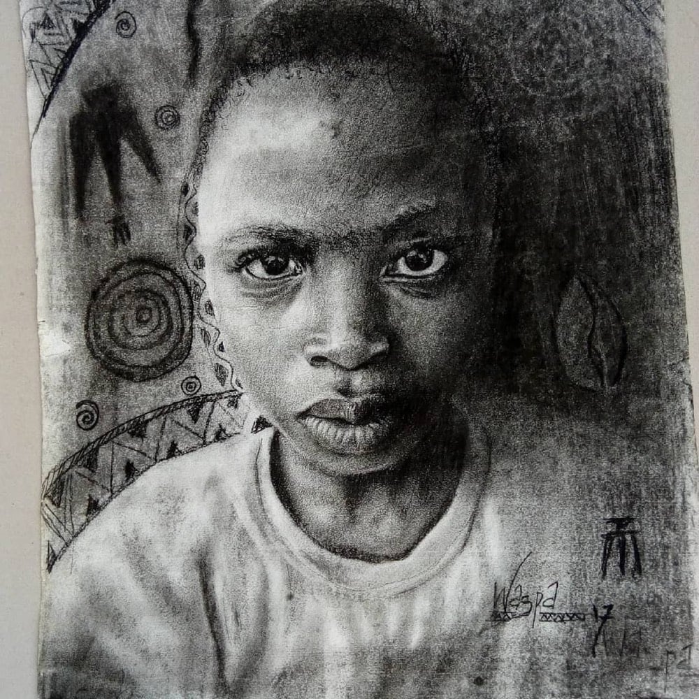
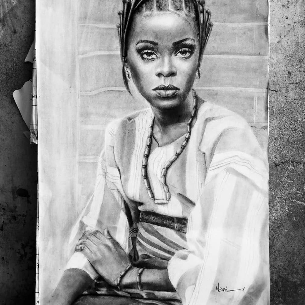
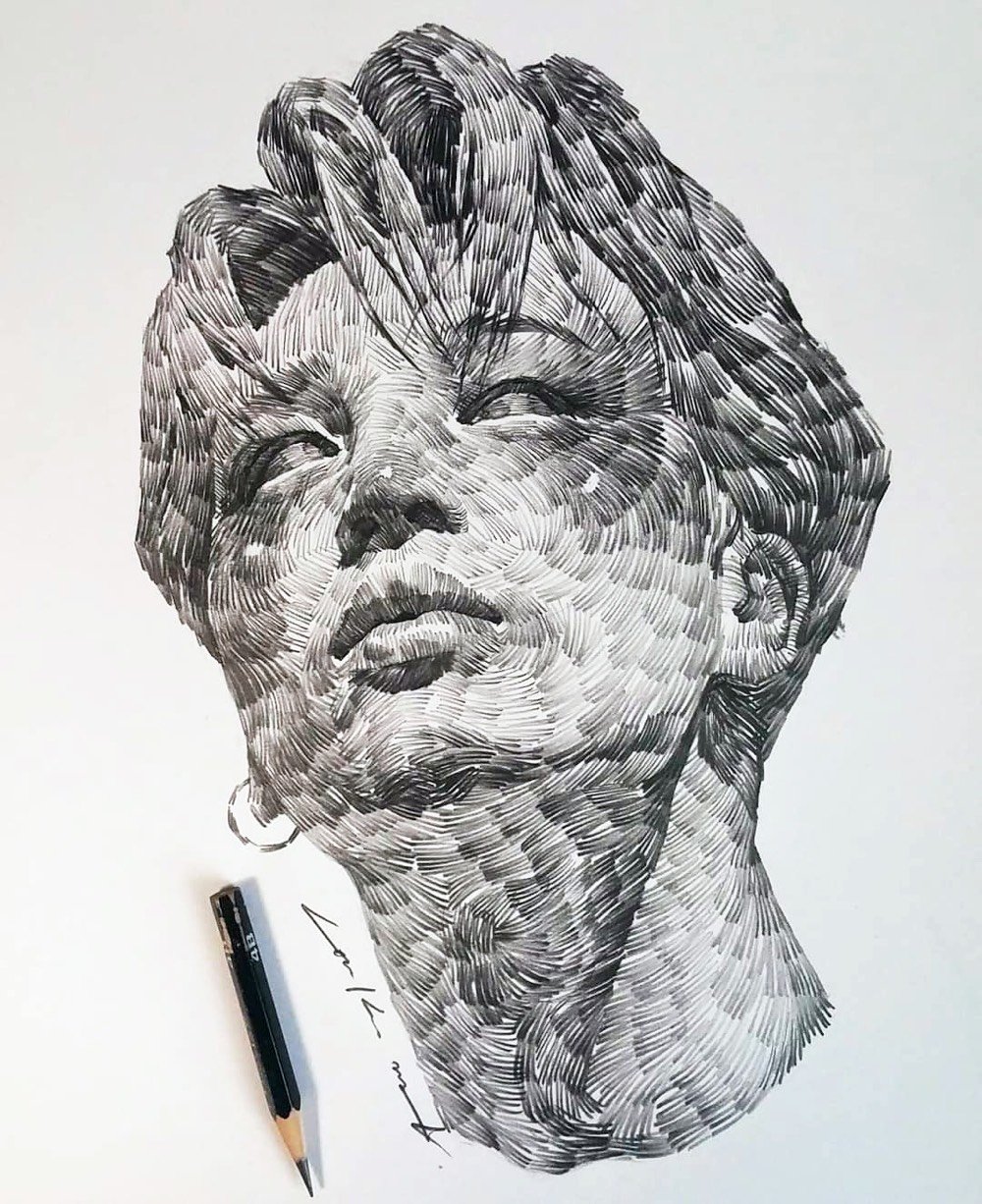
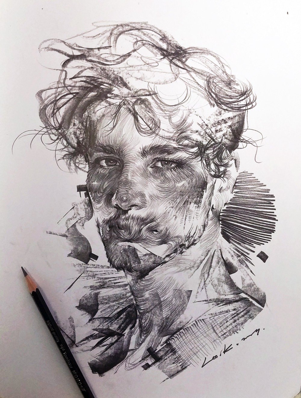
Kareem Waris Olamilekan is 11 years old and makes very realistic drawings like these of his friends, family, and other faces he runs across (like Rihanna):
Olamilekan, who goes by Waspa on Instagram, is inspired by Michelangelo and fellow Nigeria artist Arinze Stanley Egbengwu and is a full-on prodigy in my book. BBC recently did a one-minute video look at Olamilekan’s work:
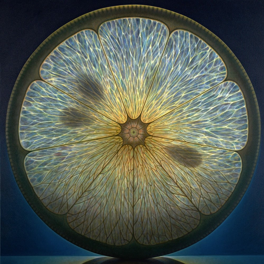
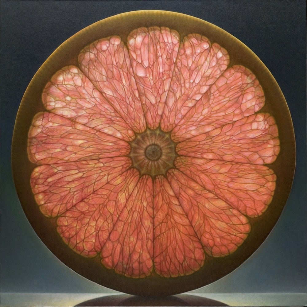
At first, I thought these images by Dennis Wojtkiewicz were photographs of backlit fruit slices, but they’re actually super-realistic paintings four or five feet across. Ok, “super-realistic” is probably not the right description. Under scrutiny, the images are too perfect. Wojtkiewicz refers to his technique as a “heightened approach to realism”, a conscious journey into the uncanny valley.
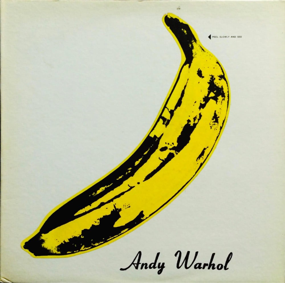
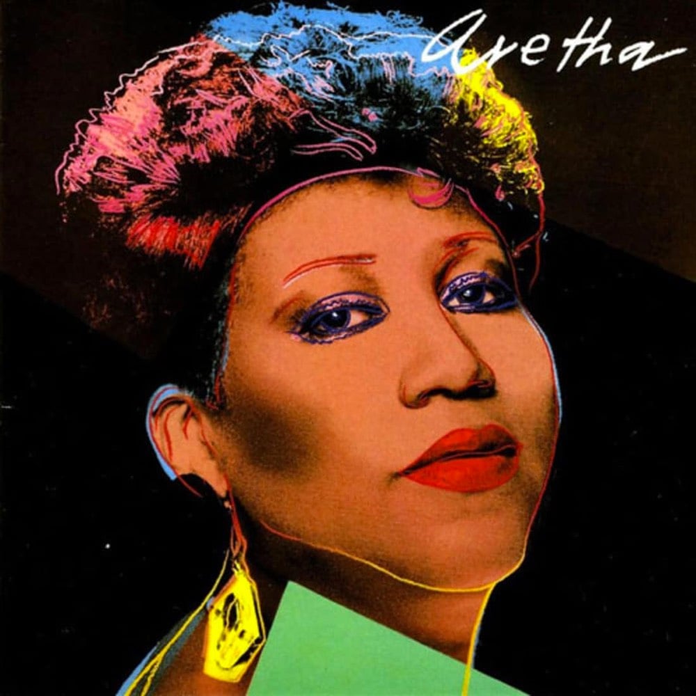
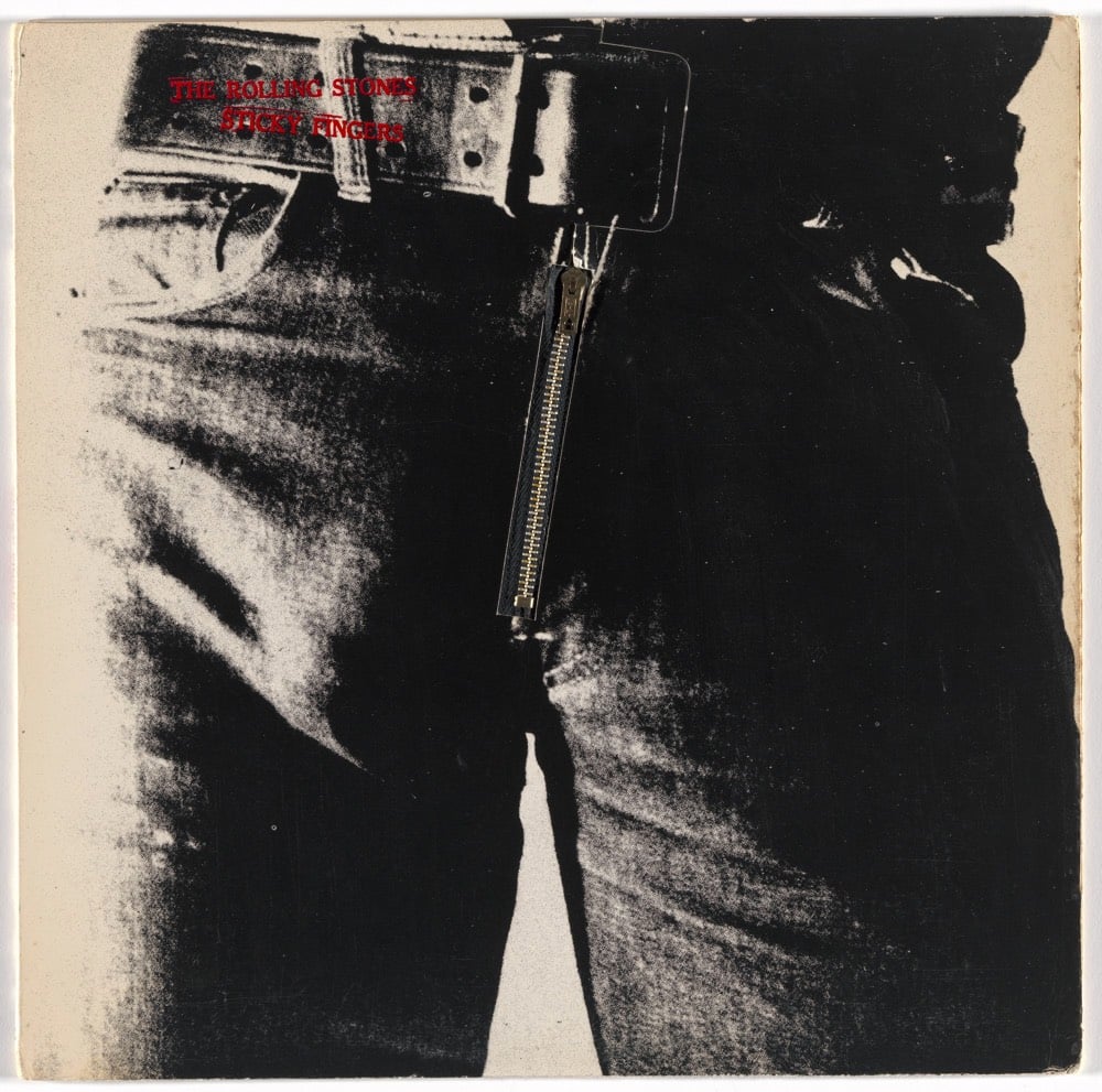
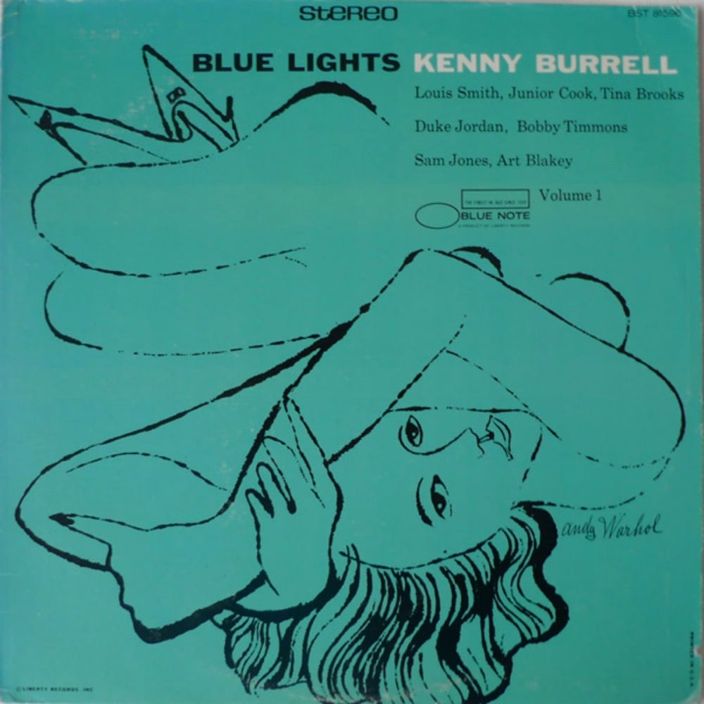
Of course you know he designed the album cover for The Velvet Underground & Nico…Warhol’s name (and not the band’s or the album’s) is right there underneath the electric yellow banana. But he also designed covers for the likes of Paul Anka, John Lennon, The Rolling Stones, Count Basie, Diana Ross, Kenny Burrell, and Aretha Franklin.
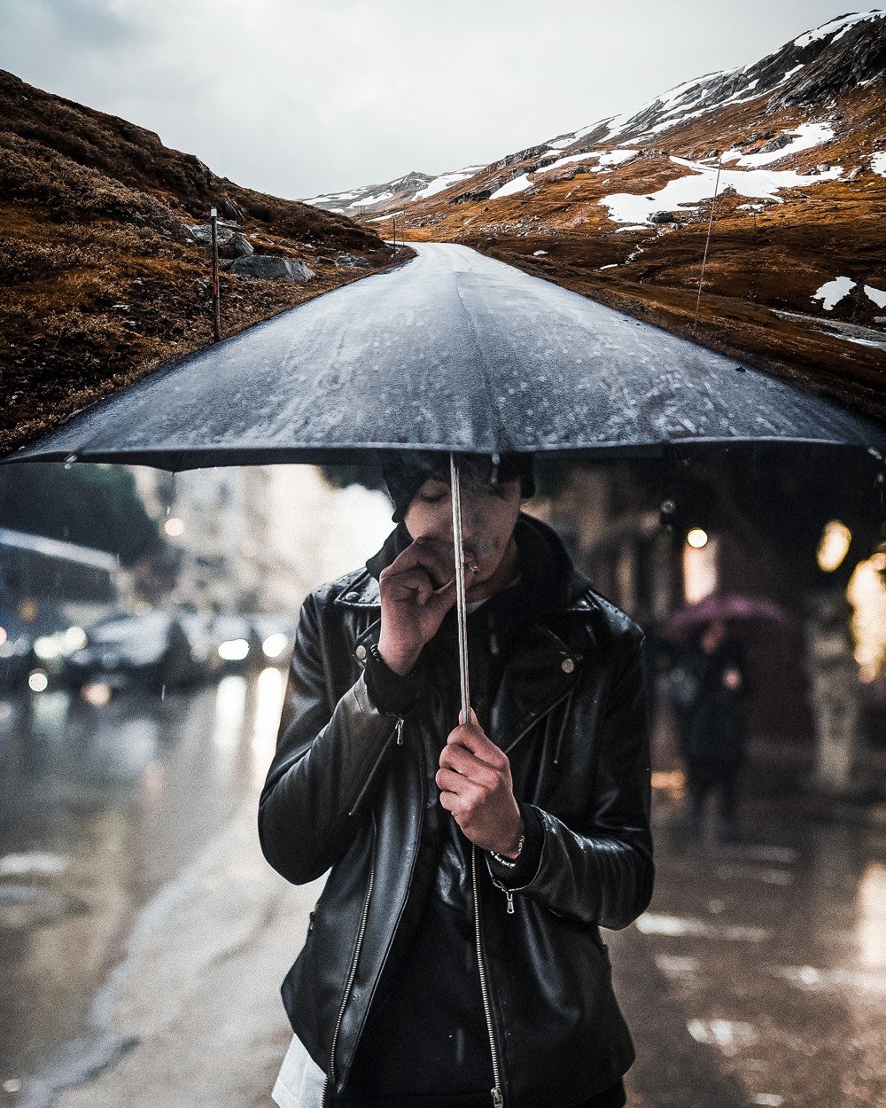
Justin Peters takes stock photos and combines them into fantastical and mind-bending scenes. I’ve seen lots of this sort of thing, but these are particularly well done. The one with the umbrella and the road is a straight-up optical illusion and broke my brain for awhile. (via colossal, which has been a real source of joy & possibility these days)
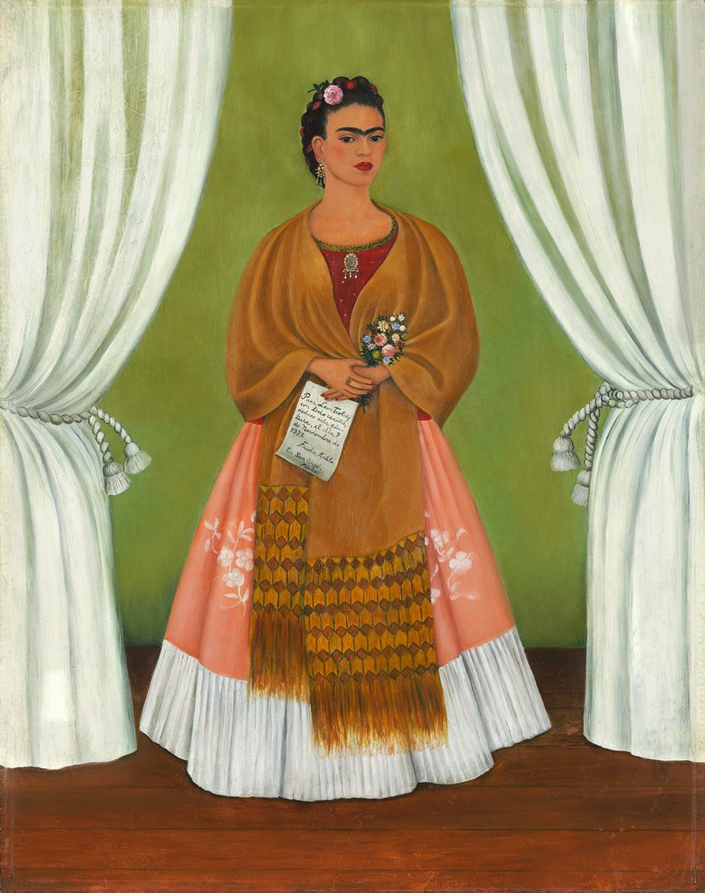
In partnership with over 30 museums and institutions from around the world, Google Arts & Culture has launched Faces of Frida, a massive collection of art, letters, essays, videos, and other artifacts about the life and work of Frida Kahlo. There’s a *lot* here, including dozens of zoomable high-resolution scans of her artwork and essays by art historians and experts.
This is the kind of “organizing the world’s information” I want to see more of from Google. (via open culture)
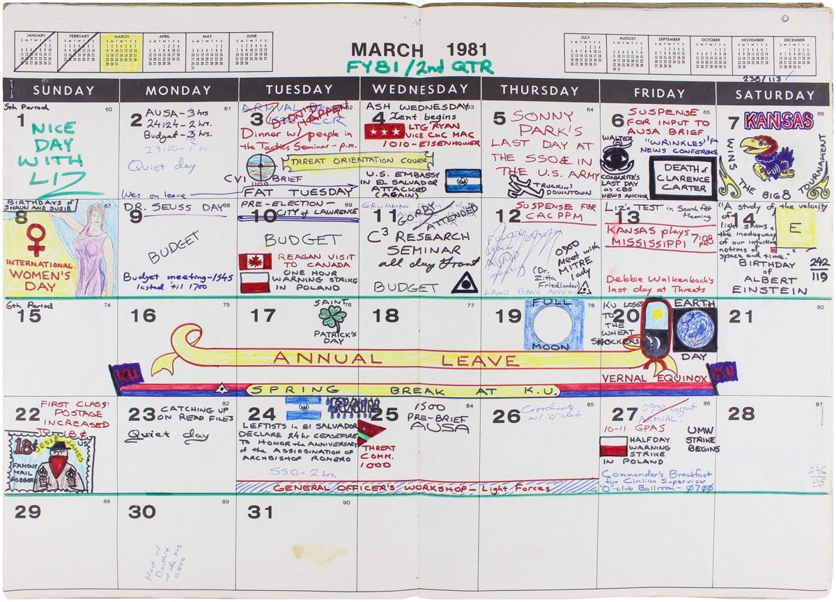
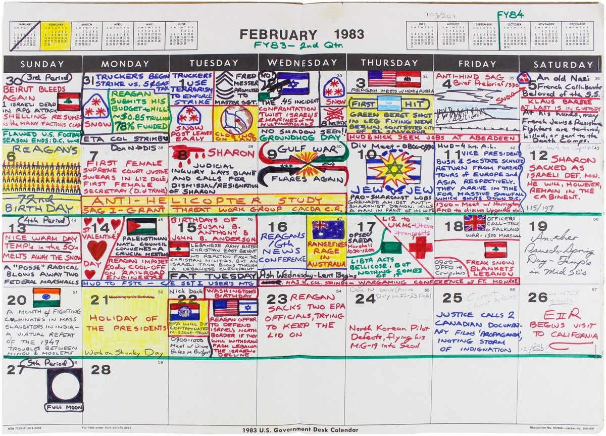
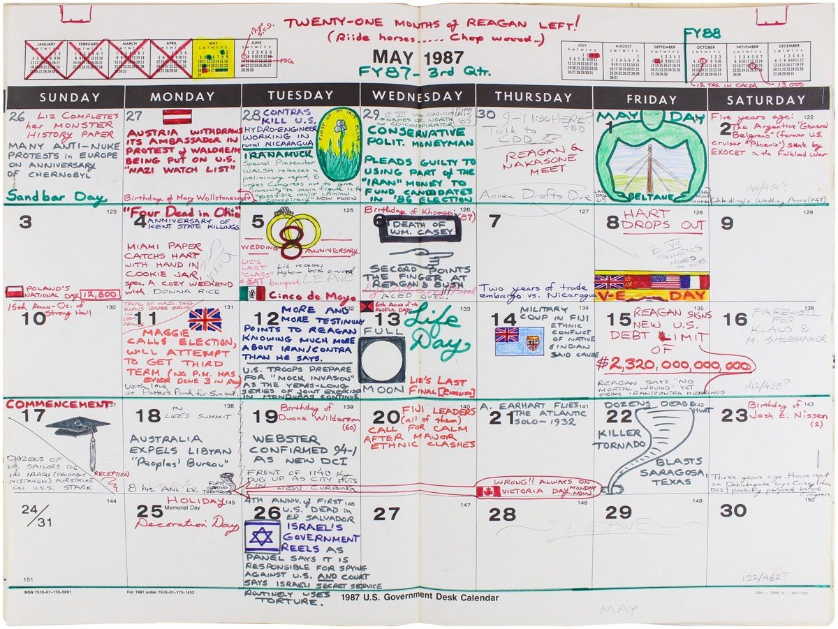
The majority of the entries focus on domestic politics and international affairs, providing (with the exception of 1988) a day-by-day view of the Reagan Administration and the waning years of the Cold War. It all seems to be here: the end of the Iran hostage crisis, the invasion of Afghanistan, Poland’s Solidarity movement, supply-side economics, and the Space Shuttle, to name just a few, along with hundreds of lesser-known events all but forgotten today except by scholars.
Over 300 different people drew/illustrated moments from a real-life dance performance, which Kristen Lauth Shaeffer then assembled into one cool animated performance. This strongly reminds me of Oliver Laric’s clip-art animation.
For his projects Exodus and Timeout, Marcus Lyon takes overhead photographs and edits them into fantastical scenes that nonetheless seem plausible. LAX isn’t that large, no waterpark in Houston has that many pools, and Dubai’s roads do not have 70+ lanes, but you kinda have to look at satellite imagery on Google Maps to verify the fabrications.
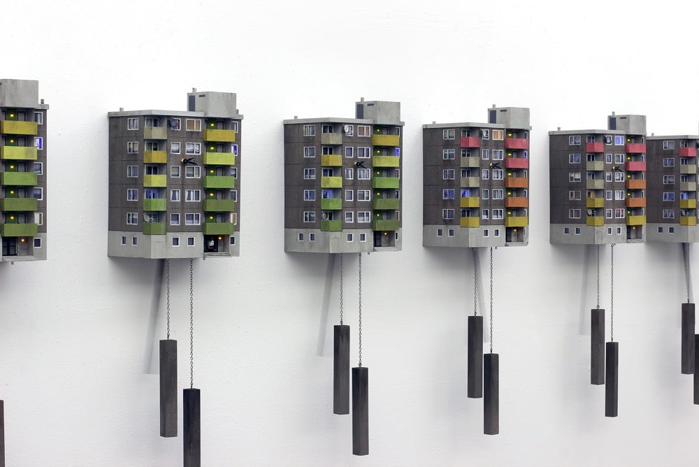
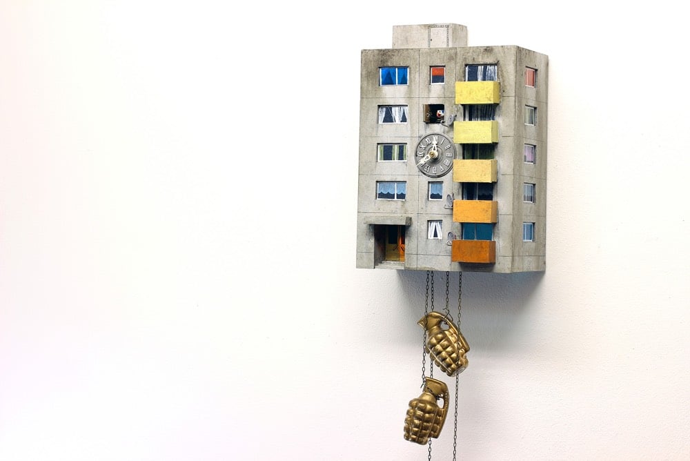
The classic cuckoo clock is a symbol for prosperity in the middle class and is considered a kind of luxury for the home. The updated version, a prefabricated panel construction (“plattenbau”), reveals today’s urban and social life in residential blocks.
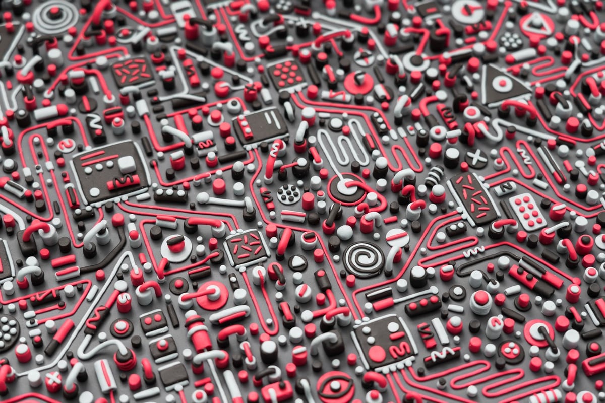
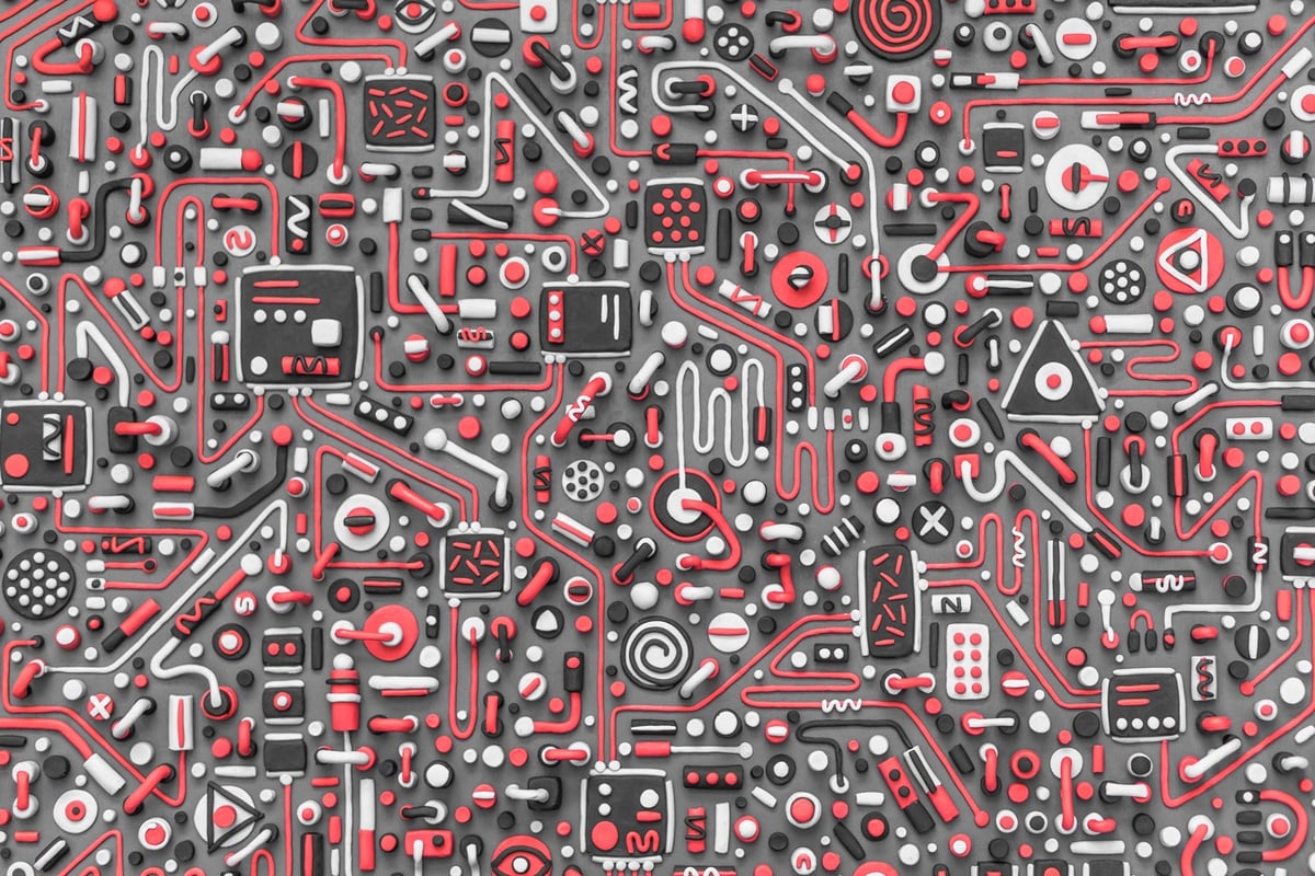
The idea behind the cover was how the modified men of the future may make artwork out of ancient circuit boards, not quite understanding what they were for because of their crude appearance. For this I created a design with representations of computer chips and wires.
He then photographed the results for an album cover and other printed matter. (via colossal)
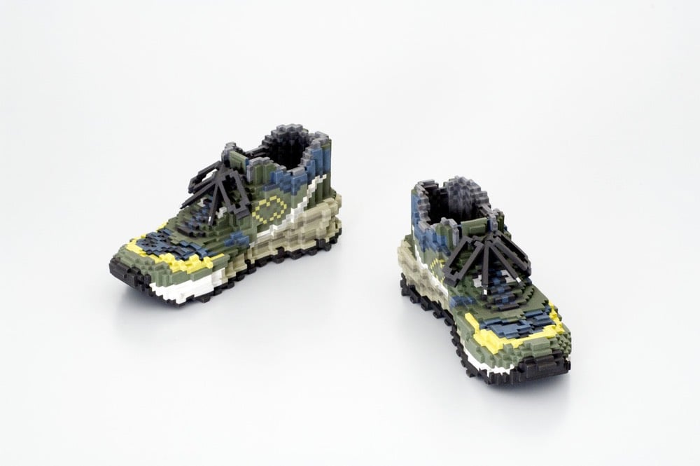
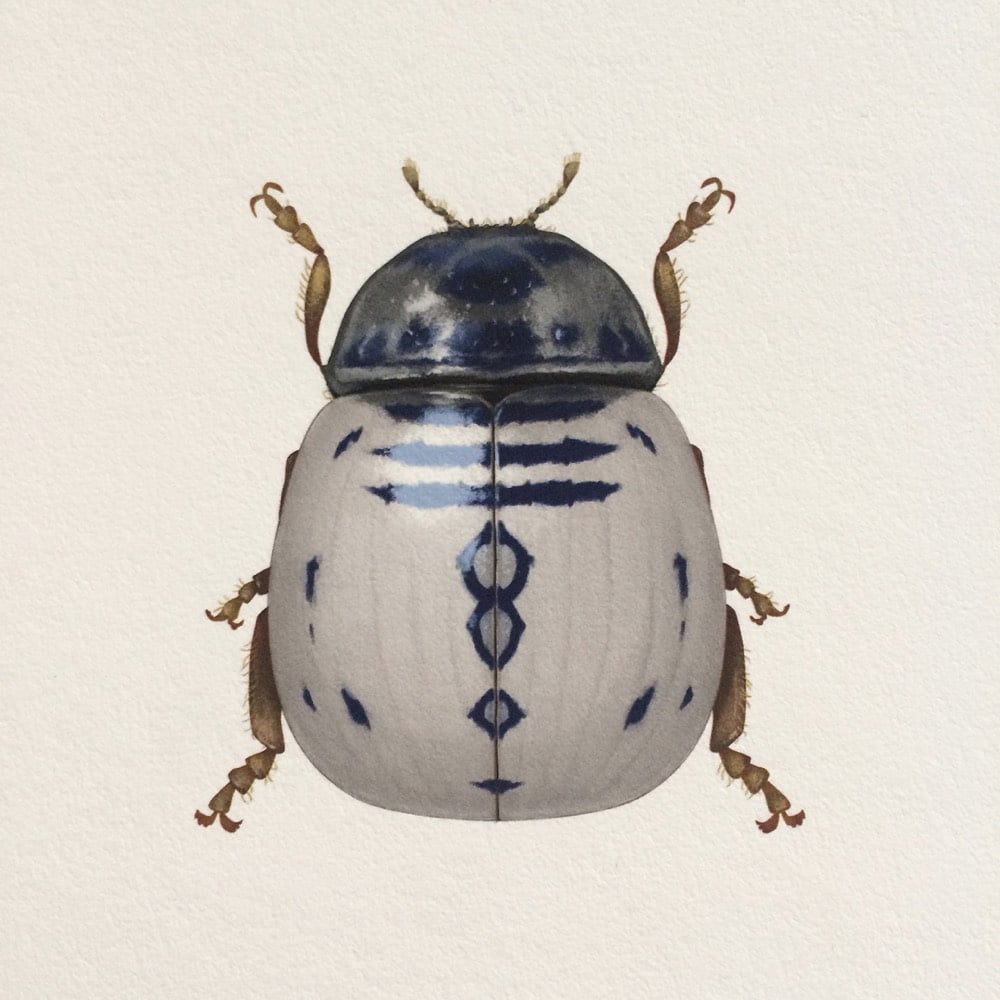
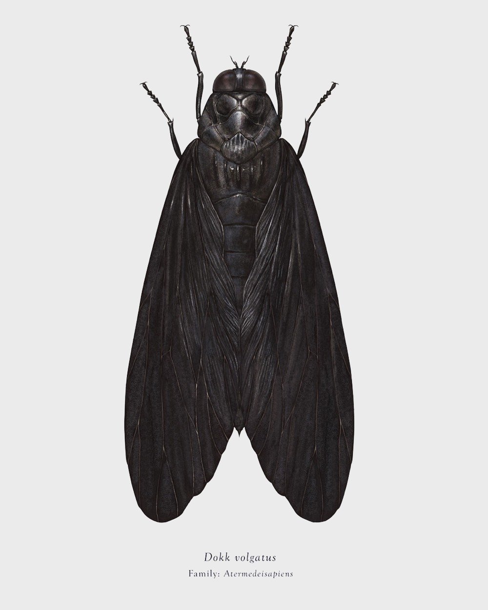
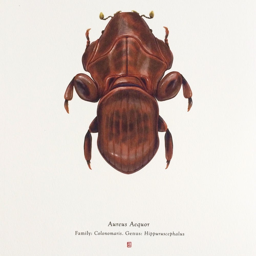
This project was born out of a fascination with collecting, cataloguing and classifying.
It draws inspiration from classic Natural History illustration but explores the subjects that we love to collect and classify from the modern world: Films, TV, Video Games, Comics, Vehicles, Sneakers, Brands etc.
The first book of the series, working title: “Arthropoda Iconicus Volume I: Insects From A Far Away Galaxy”, is a collection of insects that bear a subtle yet uncanny resemblance to characters and vehicles from the worlds favourite space opera.
Suddenly, Scott’s doubts seem to diminish. Kourtney finds him a few days later examining carpet samples and asks if they’re for his new home. He delivers a maxim we should all live by: “I look at carpet only for aviation and yachts.” When Kourtney asks why he’s “suddenly into this,” he begins screaming: “I’VE ALWAYS BEEN INTO BEING ULTRA RICH! I JUST NEVER BELIEVED IT WAS GOING TO HAPPEN THE WAY IT’S GOING TO HAPPEN!”
The tension builds to obscene absurdism. The idea that the Kardashians — who live in Calabasas, a city with a median income of $119,624, and who film each scene sprawled on pristine white couches in endless living rooms, and snacking off giant marble countertops in family room-sized kitchens — are dreaming about getting rich is almost too…rich. But then, this is the arc of American promise, regardless of how much money you have: this idea that something everyone else thinks is worthless or pointless is actually going to make you rich and famous is what has fueled 22 seasons of Antiques Roadshow, is perhaps the foundation of Southern Gothic literature, and is what makes people believe in the American dream to begin with.
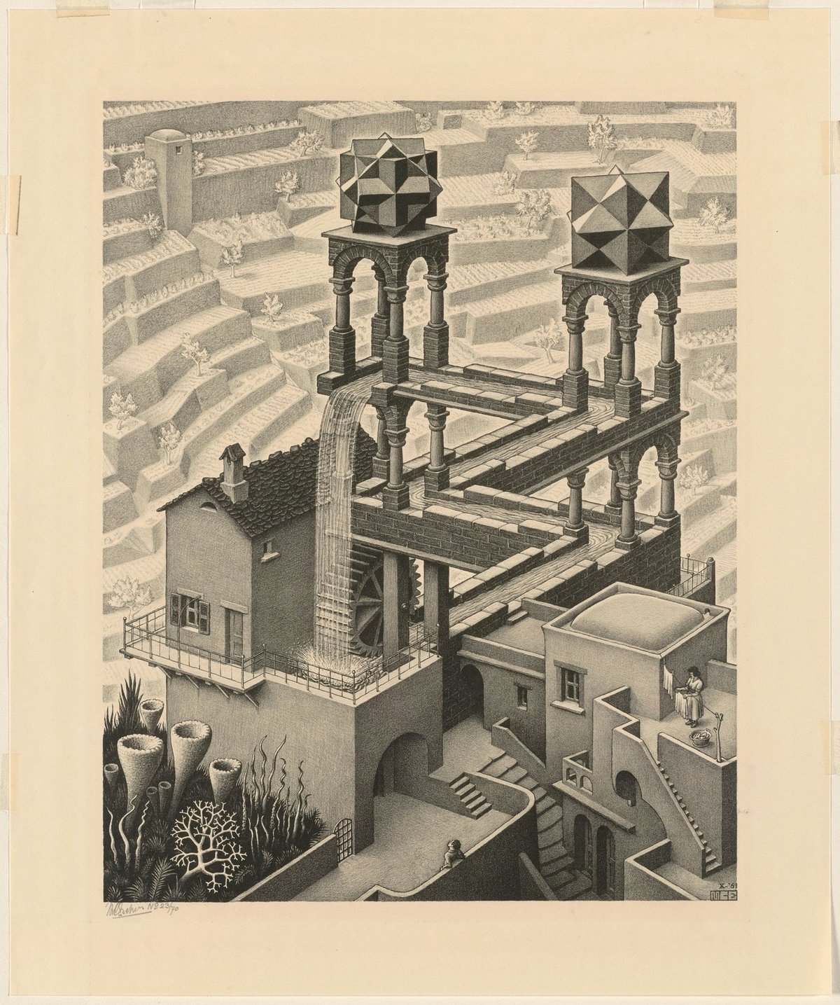
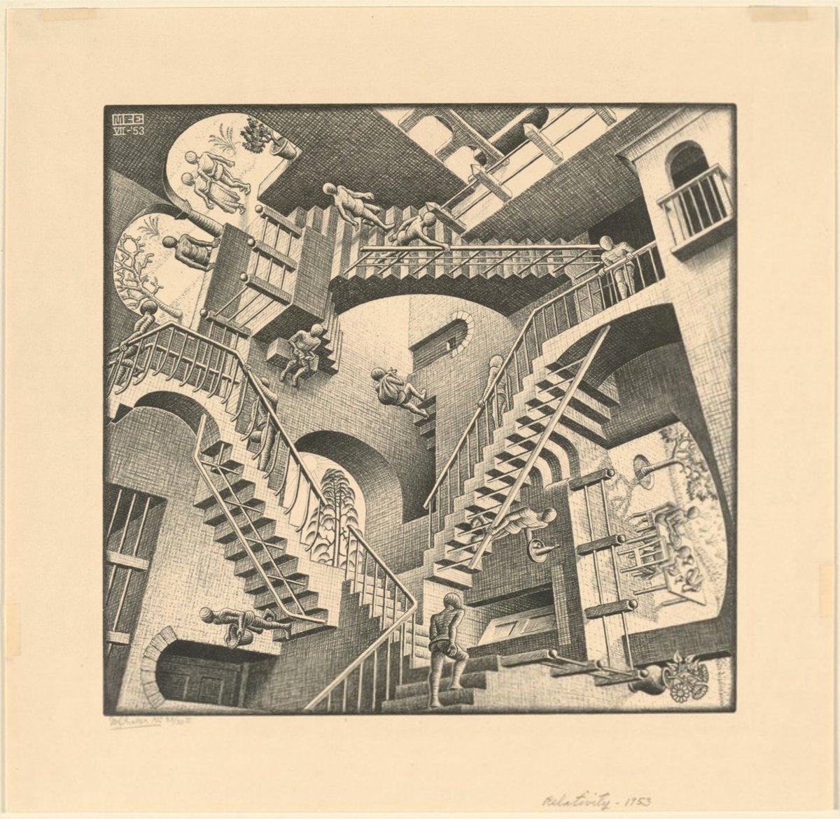
Traveling to Spain in 1936, Escher visited the Alhambra for the second time and visited the mosque in Córdoba. The renewed exposure to Arabic design occasioned an important change in his work — he became fascinated with geometry and symmetry and how those abstract design elements could be incorporated into his representations of the natural world. The images in his later prints are created from within his mind rather than representations of the physical world. He explored how to represent people, animals, and objects rising from the flat page and then returning, as well as how to represent the endlessness of infinity.
Browsing through these takes me back to my college days. I don’t know what the situation is now, but when I was in school, it was almost a requirement that 50% of the dorm rooms on any given floor had to have an M.C. Escher poster hanging on the wall. (via @john_overholt)


Stay Connected