Star Wars characters as Greek statues
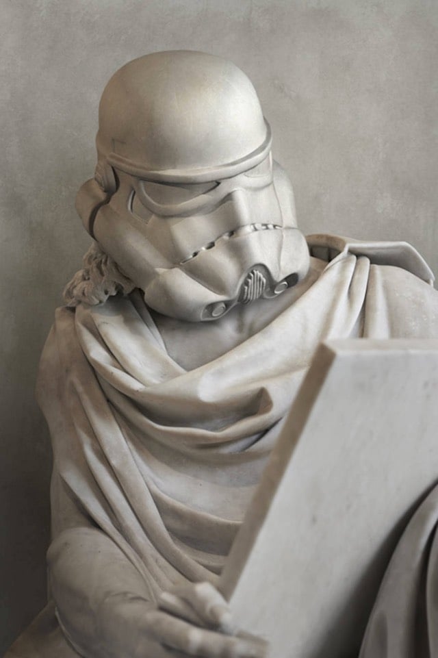
From artist Travis Durden, Greek-style faux-marble sculptures of Star Wars characters. I think the one of General Grievous is my favorite. (via colossal)
P.S. Colossal is on a roll lately. Go look.
This site is made possible by member support. 💞
Big thanks to Arcustech for hosting the site and offering amazing tech support.
When you buy through links on kottke.org, I may earn an affiliate commission. Thanks for supporting the site!
kottke.org. home of fine hypertext products since 1998.
From artist Travis Durden, Greek-style faux-marble sculptures of Star Wars characters. I think the one of General Grievous is my favorite. (via colossal)
P.S. Colossal is on a roll lately. Go look.
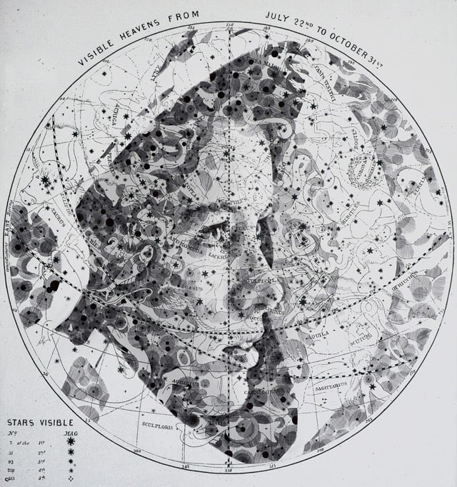
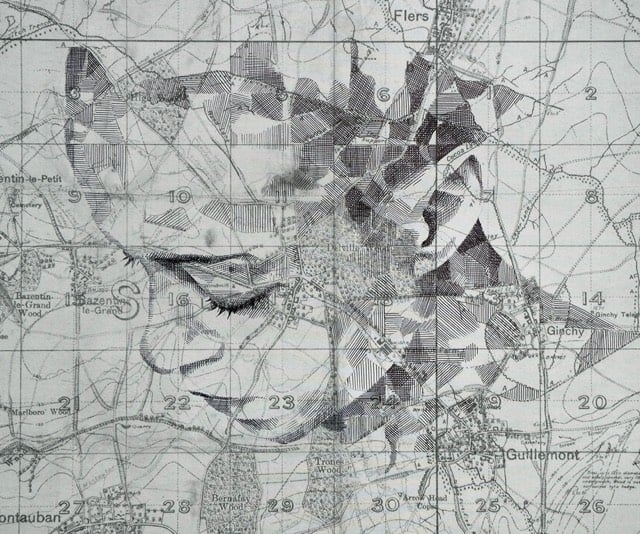
Colossal notes that artist Ed Fairburn has produced a bunch of new work (previously). Love these.
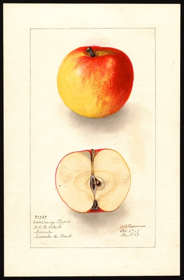
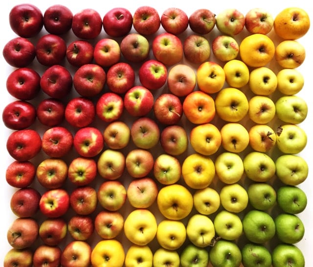
The U.S. Department of Agriculture’s National Agricultural Library contains around 3800 watercolor paintings, lithographs, and drawings of different apple varieties, most of which you will not find at the typical American grocery store. They also have another 3500 images of other fruits and nuts. (via slate)
Update: Until recently, the high-resolution images from this collection were not freely available to the public. After some agitation by Parker Higgins of the EFF, the Department of Agriculture decided to post high-res JPGs of each painting for free download. Higgins recently gave a talk about how it went down. This is a good example of the value of the public domain (and activists like Higgins)…without those images being available, neither Slate or I would have written about the collection, and who knows what someone who read them will do with that information. Maybe nothing! But maybe something cool! It’s worth putting it out there to find out…governments should be in the business of increasing the possibility space of their citizens. (via @stvnrlly)
Operating under the name of Zolloc, Hayden Zezula makes all sorts of cool, creepy, lovely, trippy animated GIFs. This one is my favorite. (via ignant)
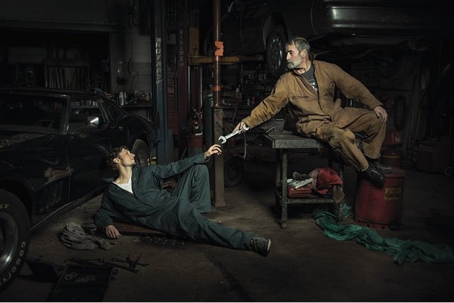
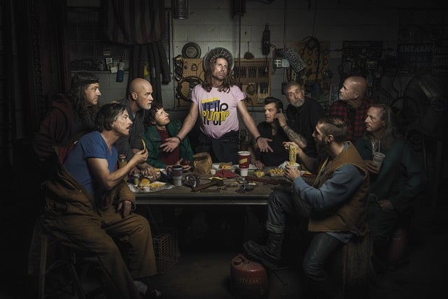
From photographer Freddy Fabris, The Renaissance Series, photographs of auto mechanics posed in the style of Renaissance paintings. (via colossal)
The Joy of Painting, hosted by Bob Ross, ran for 11 years on public television for a total of more than 400 episodes. The very first episode ever broadcast was just uploaded to Ross’ YouTube channel.
Gene Kogan used some neural network software written by Justin Johnson to transfer the style of paintings by 17 artists to a scene from Disney’s 1951 animated version of Alice in Wonderland. The artists include Sol Lewitt, Picasso, Munch, Georgia O’Keeffe, and van Gogh.

The effect works amazingly well, like if you took Alice in Wonderland and a MoMA catalog and put them in a blender. (via prosthetic knowledge)
From 1915, a short film of Claude Monet painting one of his series of Water Lilies paintings. Monet created about 250 oil paintings depicting the lilies and other flowers in his flower garden at Giverny.
Open Culture has posted a few other videos of old masters at work and at leisure, including Edgar Degas, Auguste Renoir, and Auguste Rodin.
The Nerdwriter takes on Children of Men, specifically what’s going in the background of Alfonso Cuarón’s film, both in terms of references to other works of art & culture and to things that push the plot along and contribute to the tone and message of the film.
[This is NSFW.] Artist Hilde Krohn Huse needed a minute or two of film of herself hanging naked upside down from a tree branch for a project she was working on. But when the rope tightened around her ankle too much, things went a little wrong.
My first thought was, “OK, you’ve fucked up, Hilde, but let’s try to get you out of this so nobody needs to know.” I hauled myself up, hand over hand, until I was swinging horizontally, just below the branch, and tried to yank my foot free.
It was hopeless. Righting myself, I put my free foot back on the ground to rest for a moment, then tried again, pulling myself up and fighting, puppet-like, against my bonds. My left foot, taking my weight in the lowest noose, started to spasm and I knew my strength wouldn’t hold out. But my pride was still uppermost — the idea of having to draw the attention of others to my humiliating plight still seemed unthinkable. I was losing strength, but full of adrenaline, my face dragging along the woodland floor, leaving me spitting twigs.
As any good artist would, Huse turned her ordeal into an art piece in the form of the 11 minutes of video shot before her camera shut off:
The eruption of Mount Tambora in Indonesia in 1815 was the most powerful volcanic eruption in recorded history. According to Tambora: The Eruption That Changed the World by Gillen D’Arcy Wood, the eruption affected the world’s weather for at least three years, inspired artists & writers, triggered famine, contributed to the world’s cholera epidemic, and altered economic systems all over the world.
Here, Gillen D’Arcy Wood traces Tambora’s global and historical reach: how the volcano’s three-year climate change regime initiated the first worldwide cholera pandemic, expanded opium markets in China, and plunged the United States into its first economic depression. Bringing the history of this planetary emergency to life, Tambora sheds light on the fragile interdependence of climate and human societies to offer a cautionary tale about the potential tragic impacts of drastic climate change in our own century.
William Broad reviewed the book recently for the NY Times.
The particles high in the atmosphere also produced spectacular sunsets, as detailed in the famous paintings of J.M.W. Turner, the English landscape pioneer. His vivid red skies, Dr. Wood remarked, “seem like an advertisement for the future of art.”
The story also comes alive in local dramas, none more important for literary history than the birth of Frankenstein’s monster and the human vampire. That happened on Lake Geneva in Switzerland, where some of the most famous names of English poetry had gone on a summer holiday.
The Tambora eruption must have also unleashed quite a racket, perhaps louder than Krakatoa’s loudest sound in the world.
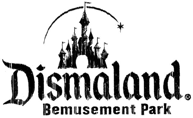
Banksy has opened an apocalyptic theme park called Dismaland in an abandoned resort in an English coastal town, Weston-super-Mare.
Are you looking for an alternative to the sugar-coated tedium of the average family day out? Or just somewhere a lot cheaper? Then this is the place for you. Bring the whole family to come and enjoy the latest addition to our chronic leisure surplus…
The entrance fee is £3 and the park will be open for five weeks. Colossal has the scoop, including a list of artists who contributed art to the park, er, show.
A demented assortment of bizarre and macabre artworks from no less than 50 artists from around the world including Damien Hirst, Bill Barminski, Caitlin Cherry, Polly Morgan, Josh Keyes, Mike Ross, David Shrigley, Bäst, and Espo. In addition, Banksy is showing 10 artworks of his own.
Colossal’s own Christopher Jobson curated the park’s short film program. Congrats! (Also, super jealous!)
Update: For a closer look at the park, check out the trailer:
Photographer Clayton Cubitt started a project in 2012 called Hysterical Literature. In each of the project’s resulting videos, a female participant is filmed from the waist up reading a story of her choosing while she is stimulated to orgasm with a vibrator by Cubitt’s partner, Katie James. His first subject was adult film star Stoya; her thoughts on the experience are here.
Vanity Fair recently sent writer Tony Bentley to participate in an HL session. Her reading choice? The Portrait of a Lady by Henry James.
With Katie now in position under the table, takeoff is imminent and the stakes are high: the sessions are a one-shot deal, no retakes, and no editing of the footage after the fact. It was not lost on me that a perfect triangulation between Clayton (auteur, cameraman), Katie (Hitachi artist), and me (the canvas) was in play, and it mirrored my internal mixture of curiosity, exhilaration, and stage fright. I couldn’t help wondering if this adventure qualified as having a threesome with two strangers. But soon enough such intellectualizing sexualizing was rendered naught.
“Rolling,” says Clayton, and everything instantly disappeared except the book in my hands and the words on the page. The world was out and I was on.
By the time I’d read two pages, I was struggling mightily to keep my countenance. “She spent half her time in thinking of beauty, bravery and mag-nan-nnn-im-im-ity…”
There’s no nudity in the videos, but you might still find them NSFW.
A painting of fruit done by Giovanni Stanchi sometime in the mid 1600s shows that the watermelon has changed somewhat in the intervening 350 years.
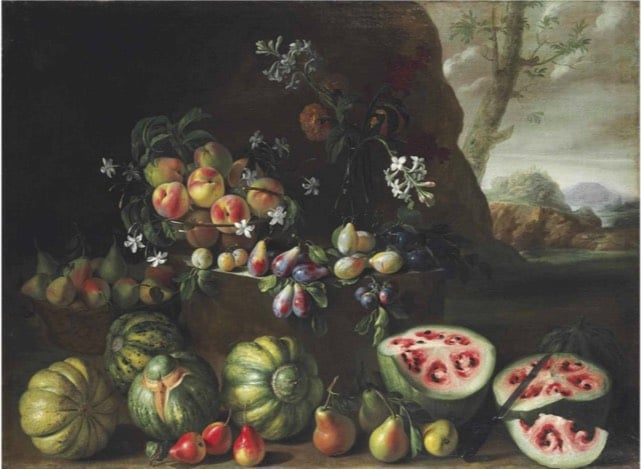
That’s because over time, we’ve bred watermelons to have the bright red color we recognize today. That fleshy interior is actually the watermelon’s placenta, which holds the seeds. Before it was fully domesticated, that placenta lacked the high amounts of lycopene that give it the red color. Through hundreds of years of domestication, we’ve modified smaller watermelons with a white interior into the larger, lycopene-loaded versions we know today.
(via @robinsloan)
I had no idea Ol’ Dirty Bastard and medieval paintings had something in common. One of ODB’s AKAs was also the reason why babies in medieval paintings looked like ugly middle-aged men: Big Baby Jesus.
I mean, this baby looks like he wants to tell you that a boat is just a money pit.
Artist Sam Van Aken is using grafting to create trees that bear 40 different kinds of fruit. National Geographic recently featured Van Aken’s Tree of 40 Fruit project:
The grafting process involves slicing a bit of a branch with a bud from a tree of one of the varieties and inserting it into a slit in a branch on the “working tree,” then wrapping the wound with tape until it heals and the bud starts to grow into a new branch. Over several years he adds slices of branches from other varieties to the working tree. In the spring the “Tree of 40 Fruit” has blossoms in many hues of pink and purple, and in the summer it begins to bear the fruits in sequence — Van Aken says it’s both a work of art and a time line of the varieties’ blossoming and fruiting. He’s created more than a dozen of the trees that have been planted at sites such as museums around the U.S., which he sees as a way to spread diversity on a small scale.
(via colossal)
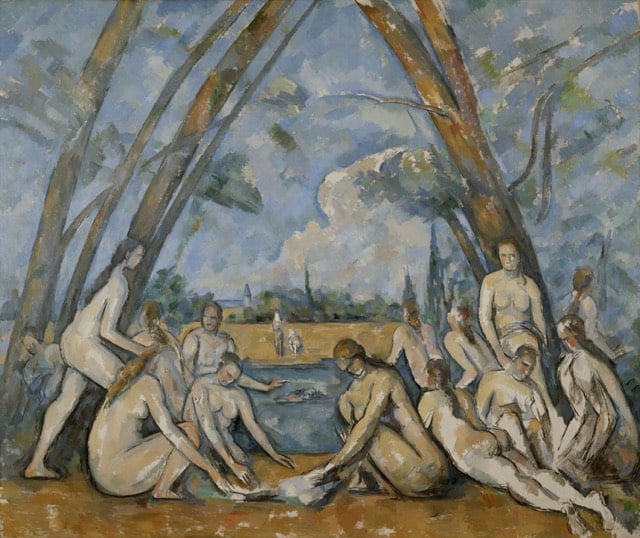
Paul Cezanne’s The Large Bathers is the subject of the second video in The Nerdwriter’s series, Understanding Art. (The first was on Jacques-Louis David’s The Death of Socrates.)
The Large Bathers is part of a series of similar paintings by Cezanne. The one used in the video is housed at the Philadelphia Museum of Art:
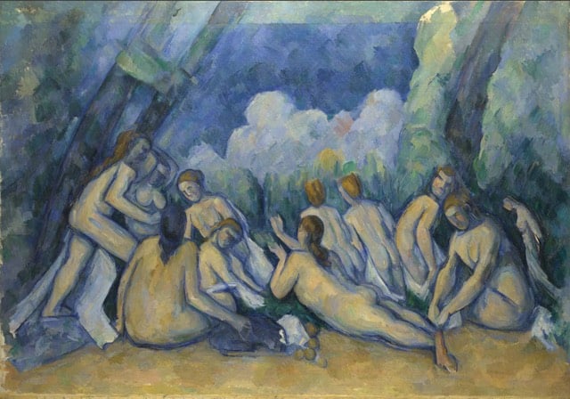
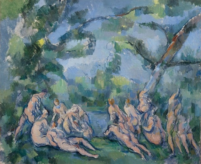
Other pieces include those from (top to bottom) The National Gallery, The Art Institute of Chicago, and The Barnes Foundation:
The Met recently cleaned and repaired a 1660 painting by Charles Le Brun called Everhard Jabach and His Family. It took ten months of painstaking work, as this video shows:
Colossal has some before-and-after shots of the painting.
Lee John Phillips is attempting to draw every single item in his late grandfather’s tool shed.
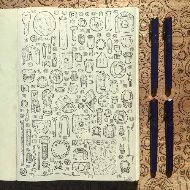
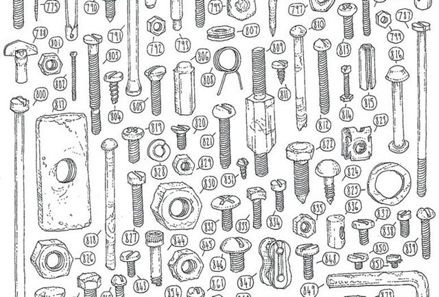

You can follow his progress on Instagram.
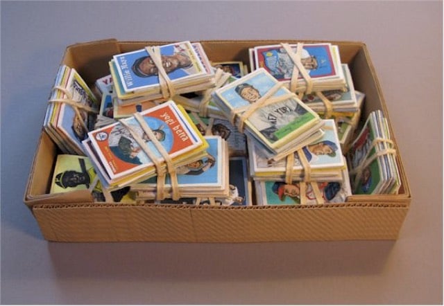
Randall Rosenthal makes amazingly realistic wooden sculptures of everyday objects like newspapers, legal pads, baseball cards, and kitchen scenes. He carves each of his sculptures out of a single block of wood. So, this is carved entirely out of wood:

And so is this:

And this too:
And here’s a look at that last sculpture in progress:

(via @pieratt)
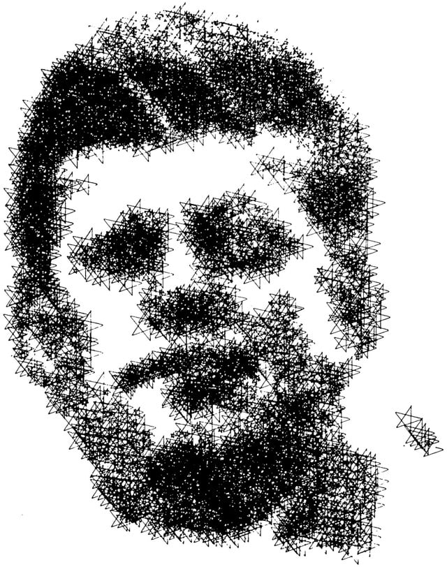
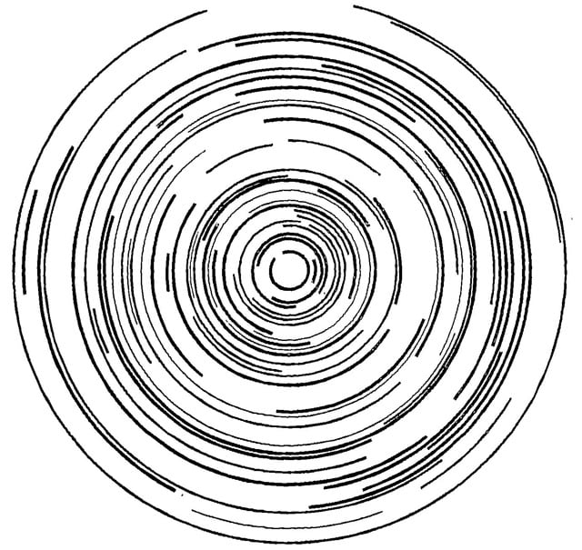
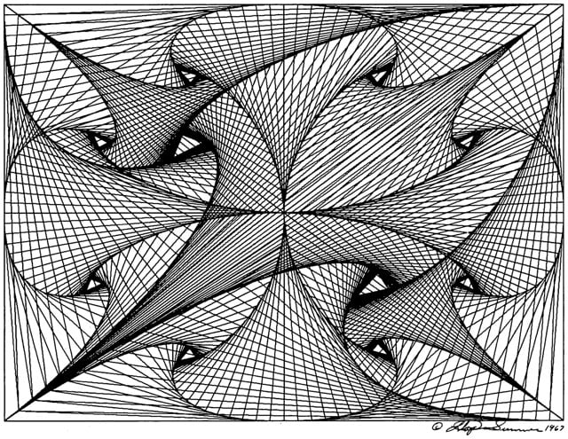
From the August 1968 issue of Computers and Automation magazine, the results of their Sixth Annual Computer Art Contest (flip to page 8).
It’s also worth paging through the rest of the magazine just for the ads.
Update: Looks like The Verge saw this post and did a followup on the history of the Computer Art Contest.
In any given issue, Computers and Automation devoted equal time to the latest methods of database storage and grand questions about the future of their “great instrument,” but the Computer Art Contest was soon a regular event. A look back through old issues of the journal (available at Internet Archive) shows how the fledgling discipline of computer art rapidly evolved. At the time, computers were specialized tools, most commonly used by individuals working in research labs, academia, or the military — and this heritage shows. Both the first and second prizes for the inaugural 1963 competition went to designs generated at the same military lab.
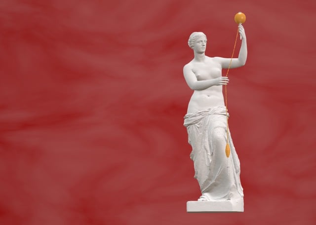
The Venus de Milo’s arms are lost to history but that hasn’t stopped historians and scholars wondering what exactly she was doing with them when the statue was carved. In order to test out a theory that Venus was spinning thread, Virginia Postrel hired designer and artist Cosmo Wenman to construct a 3D model of Venus de Milo.

Artificial Killing Machine is an art installation that listens to a public database on US military drone strikes. When there’s a strike, a cap gun fires for every death.
This time based work accesses a public database on U.S. military drone strikes. When a drone strike occurs, the machine activates, and fires a children’s toy cap gun for every death that results. The raw information used by the installation is then printed. The materialized data is allowed to accumulate in perpetuity or until the life cycle of either the database or machine ends. A single chair is placed beneath the installation inviting the viewers to sit in the chair and experience the imagined existential risk.
The goal of the project is to breathe humanity back into data:
When individuals are represented purely as statistical data, they are stripped of their humanity and our connection to them is severed. Through the act of play and the force of imagination, this project aims to reconnect that which has been lost.
(via prosthetic knowledge)

MoMA has announced that they’ve acquired the Rainbow Flag for their permanent collection. The flag has been a symbol of the LGBT community around the world since its creation in 1978. As part of the acquisition, MoMA Curatorial Assistant Michelle Millar Fisher interviewed the man who designed the flag, artist Gilbert Baker.
And I thought, a flag is different than any other form of art. It’s not a painting, it’s not just cloth, it is not a just logo — it functions in so many different ways. I thought that we needed that kind of symbol, that we needed as a people something that everyone instantly understands. [The Rainbow Flag] doesn’t say the word “Gay,” and it doesn’t say “the United States” on the American flag but everyone knows visually what they mean. And that influence really came to me when I decided that we should have a flag, that a flag fit us as a symbol, that we are a people, a tribe if you will. And flags are about proclaiming power, so it’s very appropriate.
So the American flag was my introduction into that great big world of vexilography. But I didn’t really know that much about it. I was a big drag queen in 1970s San Francisco. I knew how to sew. I was in the right place at the right time to make the thing that we needed. It was necessary to have the Rainbow Flag because up until that we had the pink triangle from the Nazis — it was the symbol that they would use [to denote gay people]. It came from such a horrible place of murder and holocaust and Hitler. We needed something beautiful, something from us. The rainbow is so perfect because it really fits our diversity in terms of race, gender, ages, all of those things. Plus, it’s a natural flag — it’s from the sky! And even though the rainbow has been used in other ways in vexilography, this use has now far eclipsed any other use that it had…
Update: Baker died at his home on March 30, 2017. He was 65 years old.
Mr. Baker replicated his flag dozens of times over the years. He crafted a mile-long banner to parade down Fifth Avenue in Manhattan, and he sent flags around the world in support of gay rights protests. He sewed the rainbow flag used in the movie “Milk,” along with a new flag for this year’s television miniseries “When We Rise.”
“I remember the most fabulous queen I’d ever seen in my life shows up in sequins with a sewing machine in his arms, and he insisted on creating that flag exactly the same way he’d created it then,” said Dustin Lance Black, who wrote “Milk” and wrote and directed “When We Rise,” which was based on Jones’ memoir of the same name.
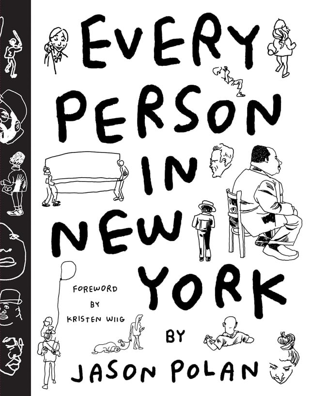
Jason Polan has turned his long-term project to draw each and every person in New York into a book coming out in August. As a long-time Polan fan, I’m looking forward to this.
Christoph Niemann’s Sunday Sketches are typically great, but this one from last Sunday really grabbed my attention:
So good. I am also a sucker for this one:

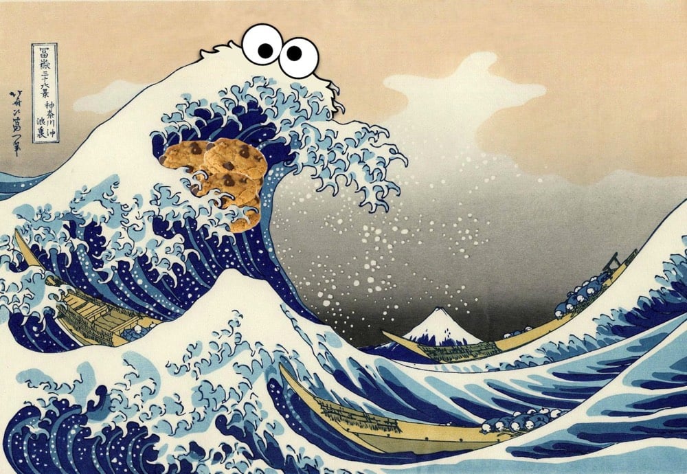
Magisterial. The Great Wave off Kanagawa by Katsushika Hokusai, modified by Reddit users Put_It_All_On_Red and photosonny. (via @craigmod)

Director and choreographer Wayne McGregor, artist Olafur Eliasson, music producer Jamie XX (new album!), and dancers from the Paris Opera Ballet are collaborating on a contemporary ballet performance based on Jonathan Safran Foer’s Tree of Codes.
Award-winning choreographer Wayne McGregor’s groundbreaking practice embraces dance, science, film, music, and technology to generate intriguing, expansive works. For Tree of Codes, McGregor is collaborating with artist Olafur Eliasson and producer/composer Jamie xx to create a contemporary ballet. Eliasson’s large-scale projects, including The New York City Waterfalls and The weather project at the Tate Modern, have captured the attention of audiences worldwide. Mercury Prize-winning Jamie xx blurs the boundaries between artist and audience in sonic environments like the one he created with his band, The xx, at the Armory in 2014.
Triggered by Jonathan Safran Foer’s Tree of Codes (an artwork in the form of a book which was in turn inspired by Street of Crocodiles by Bruno Schulz), this new, evening-length work features a company of soloists and dancers from the Paris Opera Ballet and Company Wayne McGregor.
Two performances are planned so far: at the Manchester International Festival (July 2-10) and the Park Avenue Armory (Sept 14-21). (thx, michelle)
Britney Wright takes photos of food arranged in size and color gradients.

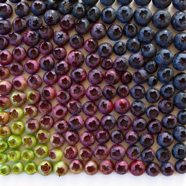
Follow Wright on Instagram and buy her prints.
From Sarah Urist Green of The Art Assignment (and former curator of contemporary art at the Indianapolis Museum of Art), The Case for Andy Warhol, in which Green discusses Warhol’s importance as an artist.
Like Jay Z but far earlier, he understood that to be an artist in a market economy meant not being “a businessman” but being “a business, man”. And he turned himself into a globally recognized brand.

Stay Connected