“When We Return You Won’t Recognise Us”
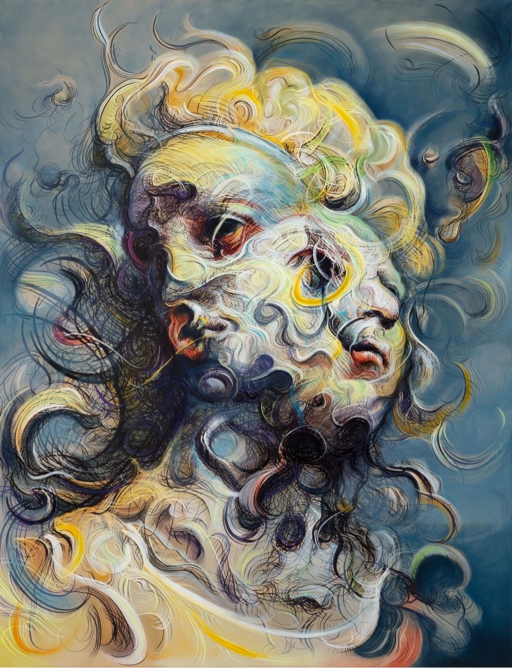
I do not remember how I stumbled upon this painting by British artist Glenn Brown but I like it quite a lot. You can check out more of his work on his website.


This site is made possible by member support. 💞
Big thanks to Arcustech for hosting the site and offering amazing tech support.
When you buy through links on kottke.org, I may earn an affiliate commission. Thanks for supporting the site!
kottke.org. home of fine hypertext products since 1998.

I do not remember how I stumbled upon this painting by British artist Glenn Brown but I like it quite a lot. You can check out more of his work on his website.


Using an iconic Superman pose, artist Mike Mitchell has translated all sorts of familiar characters onto that pose, including C-3PO, Velma from Scooby Doo, Charlie Brown, Ned Flanders, Pee-wee Herman, Bert from Sesame Street, Steve Zissou, and Spongebob Squarepants. Here’s an animation of all them. (via moss & fog)


Absolutely stunning embroidery piece by Narumi Takada of boot prints and animal tracks1 in freshly fallen snow. Just lovely.
Since he was a toddler, artist C.W. Moss has made the artwork for his family’s Christmas card. Here are some early installments from when he was three & seven:

Some from when Moss was 17 and 29:

And the most recent one from age 36 (you can watch how he draws it):

It’s fascinating to see his artistic sense grow and shift over the years, not only increasing in artistic skill as he gets older but also moving from simple depictions of holiday scenes to more conceptual creations.
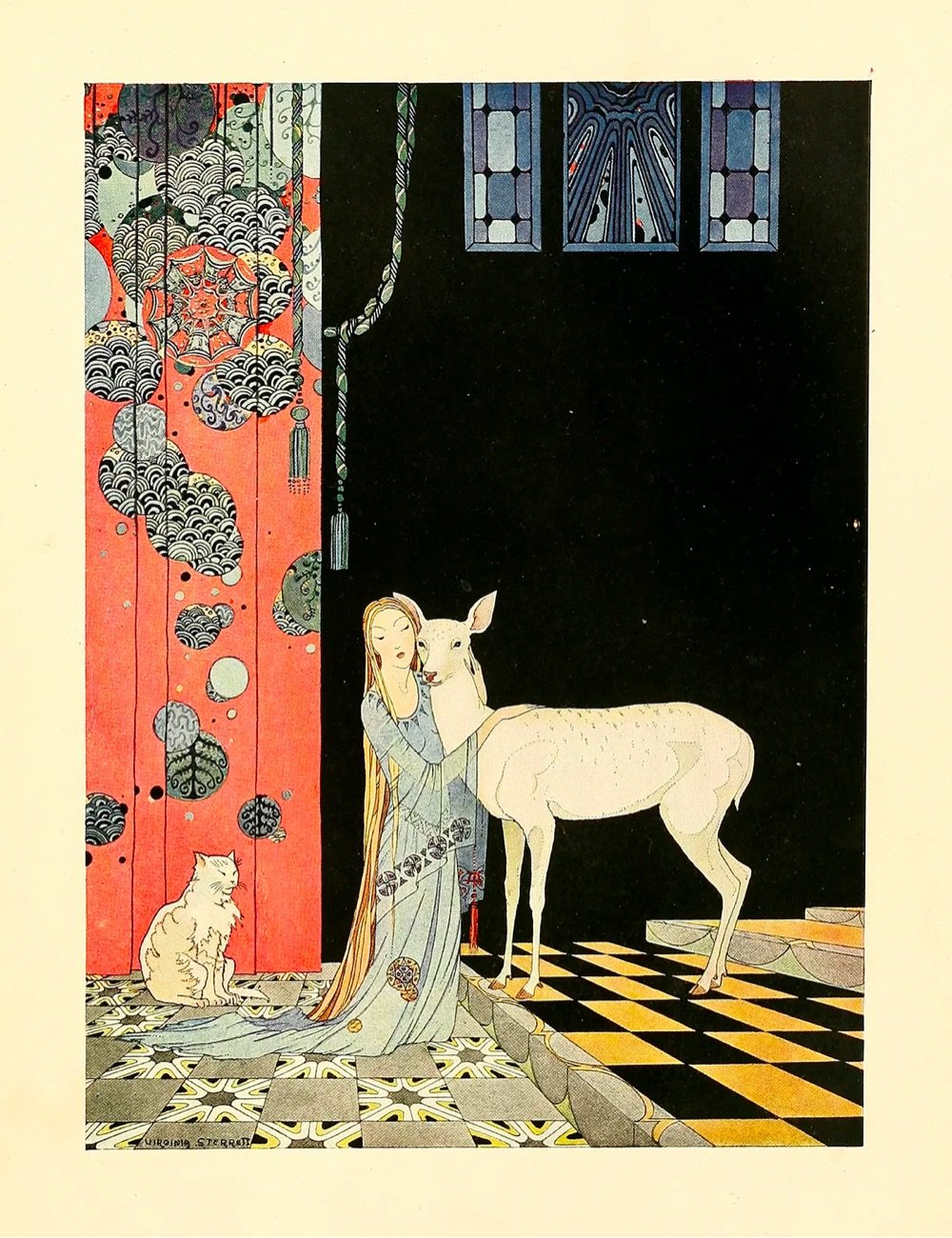
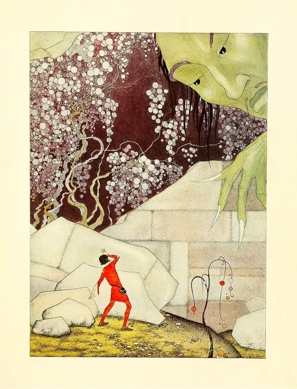
I love these drawings by Virginia Frances Sterrett.
At fourteen, unthoughtful of achievement and ambition, friends persuaded her to send her drawings to the Kansas State Fair. To her surprise, she won first prize in three different categories. The originality of her drawings — which, throughout her life, came to her as visions she felt she was merely channeling onto the page with her pen and brush — captivated two successful local artists, who encouraged her to pursue formal study.

Every so often on Instagram I come across Harry Clarke’s stringy, spooky illustrations for the 1919 Edgar Allan Poe collection Tales of Mystery & Imagination (above left) or the 1925 version of Goethe’s Faust. Poking around led me to this 2016 story in the Public Domain Review: “Harry Clarke’s Looking Glass.” As I learned, he once wrote to a friend that his publisher thought a set of his Faust illustrations were “full of stench and steaming horrors.”
50watts has more great images, and here’s a zoomable version of the “Sea Witch” (above right) from his illustrations for Hans Christian Andersen’s “The Little Mermaid.”
 I came across Alex Tomlinson’s work on Instagram one day in 2022 (it was featured on Audubon Society merch, which I bought immediately), and have been enjoying it ever since. I’m having one of his “Red-Eyed Birds of North America” posters framed as a gift for myself this Christmas! He also sells tons of cards, stickers, and apparel on his website. [hootalexarchive/pigeonpost]
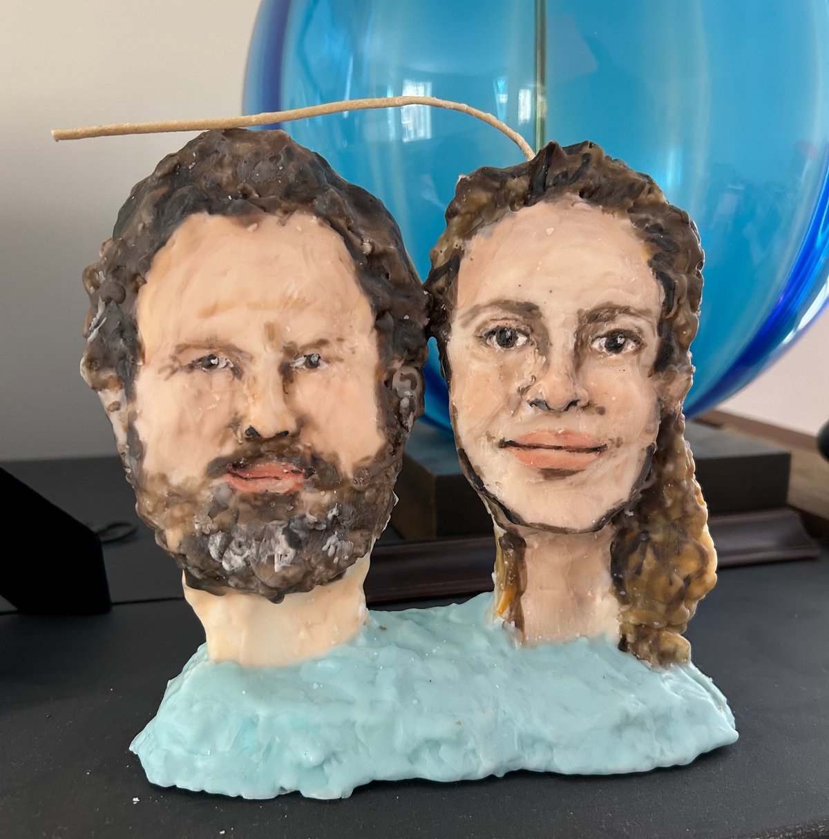
For my husband’s birthday, I got him a candle sculpted to look like us, by the artist Janie Korn. It’s brought a lot of joy. She also makes custom pet and house candles, as well as cookie, cigarette, and Marie Antoinette candles, among many others. [Janie Korn]
This video from MoMA follows master printer Jacob Samuel as he makes his final print before he retires.
As he inks, hand wipes, and rolls his final print through the press, he reflects on his philosophy. “My goal is to leave no fingerprints,” he says. All you see is the artist’s work. I’m just another pencil. I’m just another brush. But I want the pencil to be sharpened really well. I want the brush to be sable. And to do that and be completely spontaneous, I trust the materials.”

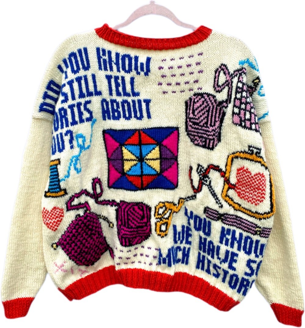

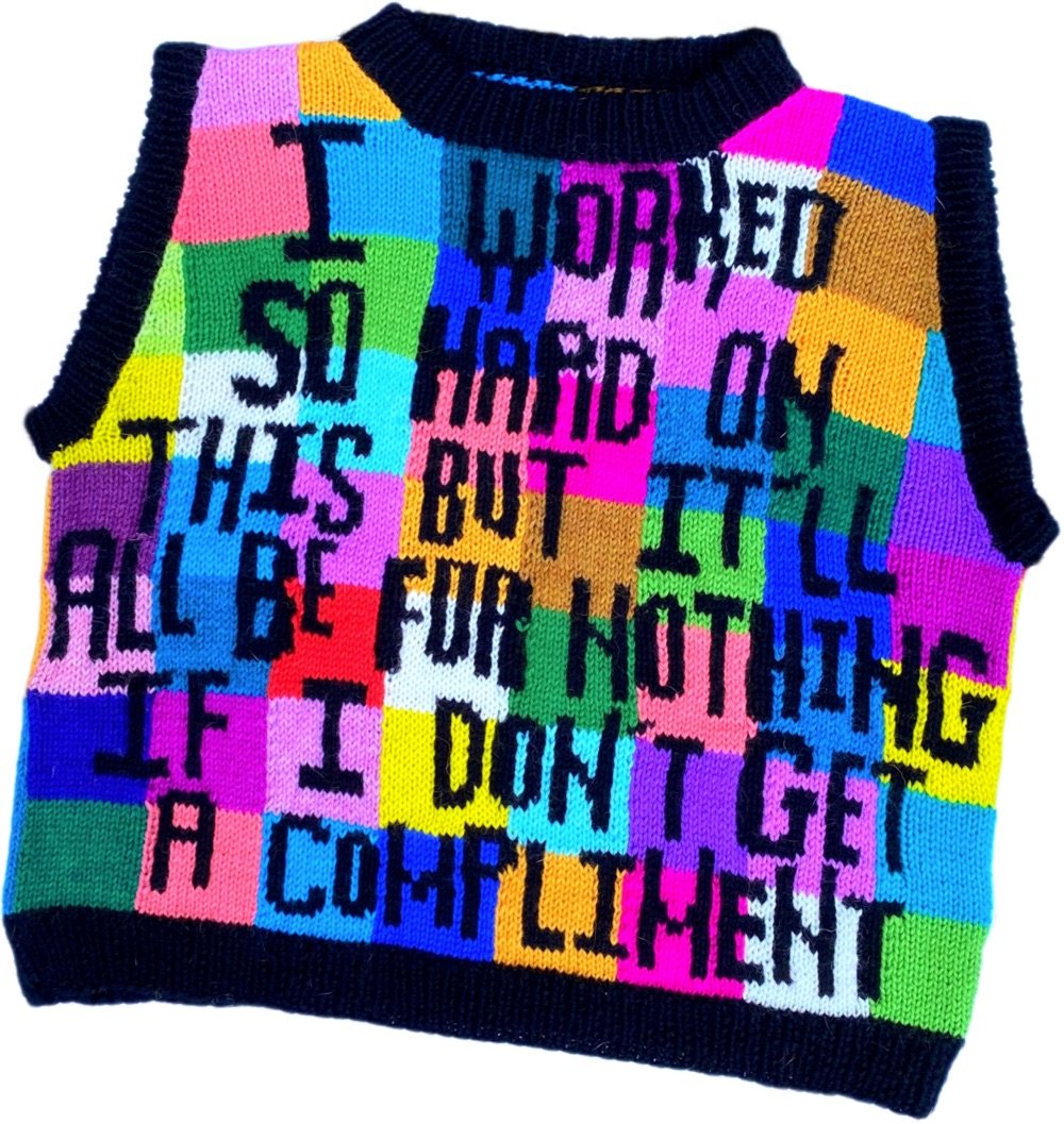
I love these busy, wordy, and brightly colored sweaters from Kendall Ross. From her about page:
Kendall Ross, aka “I’d Knit That”, is an Oklahoma City based fiber artist. She is best known for hand-knitting colorful, wearable art pieces. She uses intricate hand-knitting colorwork methods like intarsia and fair isle to illustrate images and incorporate her original texts into the fabric of her work. Each stitch on every sweater, vest, mural, and textile is painstakingly planned and knit over countless hours using two needles and wool.
You can check out more of Ross’s work on Instagram.


Many thanks to Colossal for introducing me to artist Olga Prinku, who forages for flowers, branches, and other natural elements and incorporates them into large-scale embroidery works. Quite lovely. Check out more of her art on her website and on Instagram.

Illustrator Christoph Niemann shares 10 Things I Remind Myself Before I Draw. I’m a strong advocate of his 10th rule:
Sitting at my desk is always right. I’ve spent a lot of time thinking about how to make good work. There are millions of tips and tricks and manifestos out there. But at the end there’s only one single truth for me: sit down and start drawing.
(thx, matt)
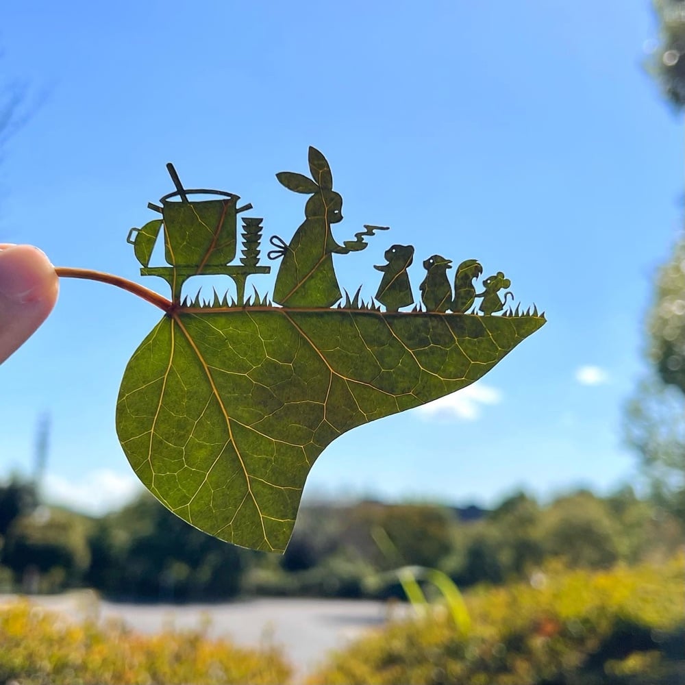
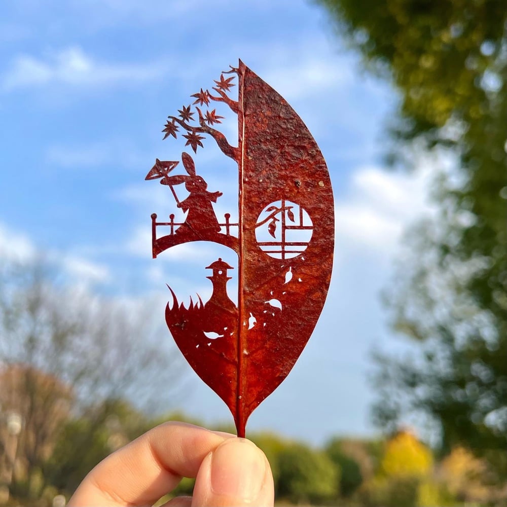
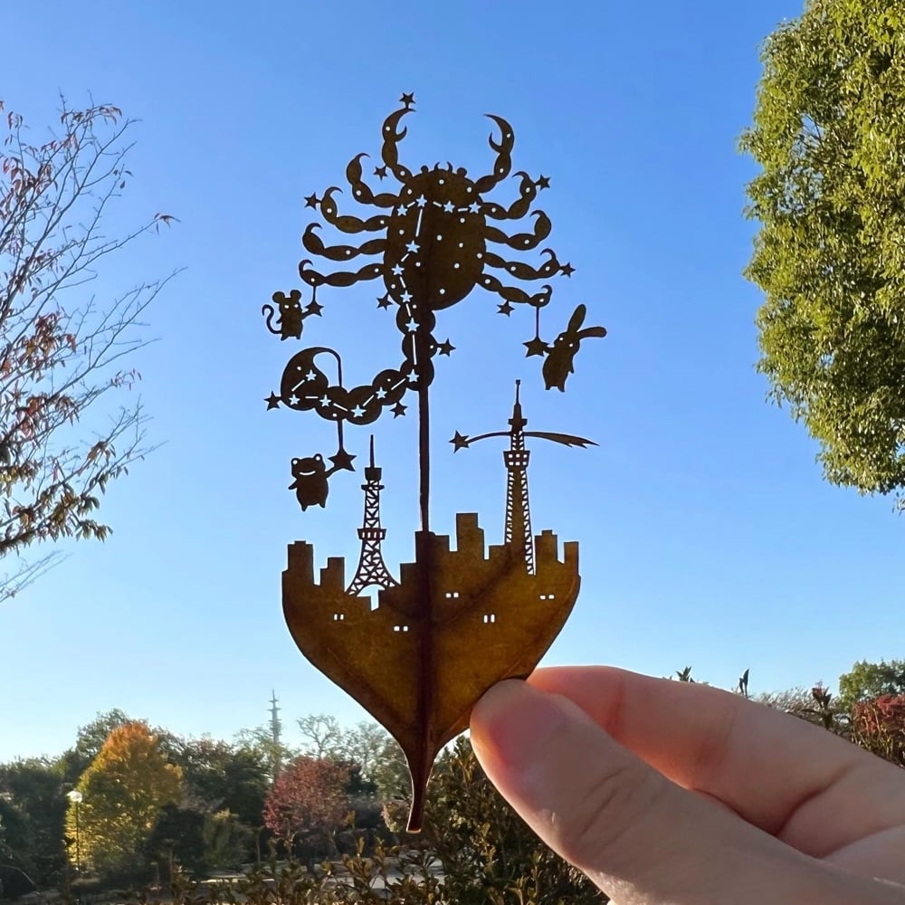
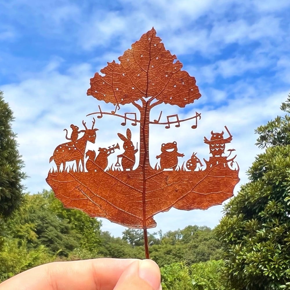
A man named Lito makes these incredibly intricate artworks using the natural canvas of tree leaves — he posts all of his creations on Instagram.
Lego master Jumpei Mitsui spent over 400 hours building a 3D version of Hokusai’s Great Wave off Kanagawa out of 50,000 Lego bricks — you can watch a time lapse of the construction in the video above. The build was included at an exhibition of Hokusai’s work at the MFA in Boston:
In order to create Hokusai’s Wave in three dimensions, he made a detailed study of rogue waves and their characteristics. He also drew on childhood memories of waves near his family home at Akashi on the Inland Sea.
The video slows down to realtime in spots, so you can see how fast he’s actually building (quite fast). And you can also see the level of trial and error involved as he builds and then un-builds the waves until he’s happy with them. (via the kid should see this)
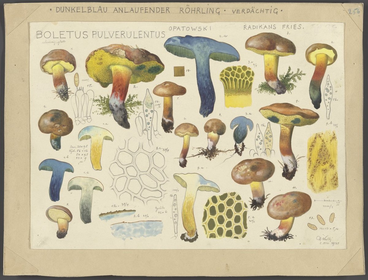
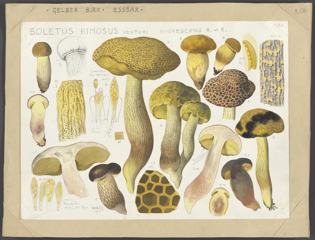
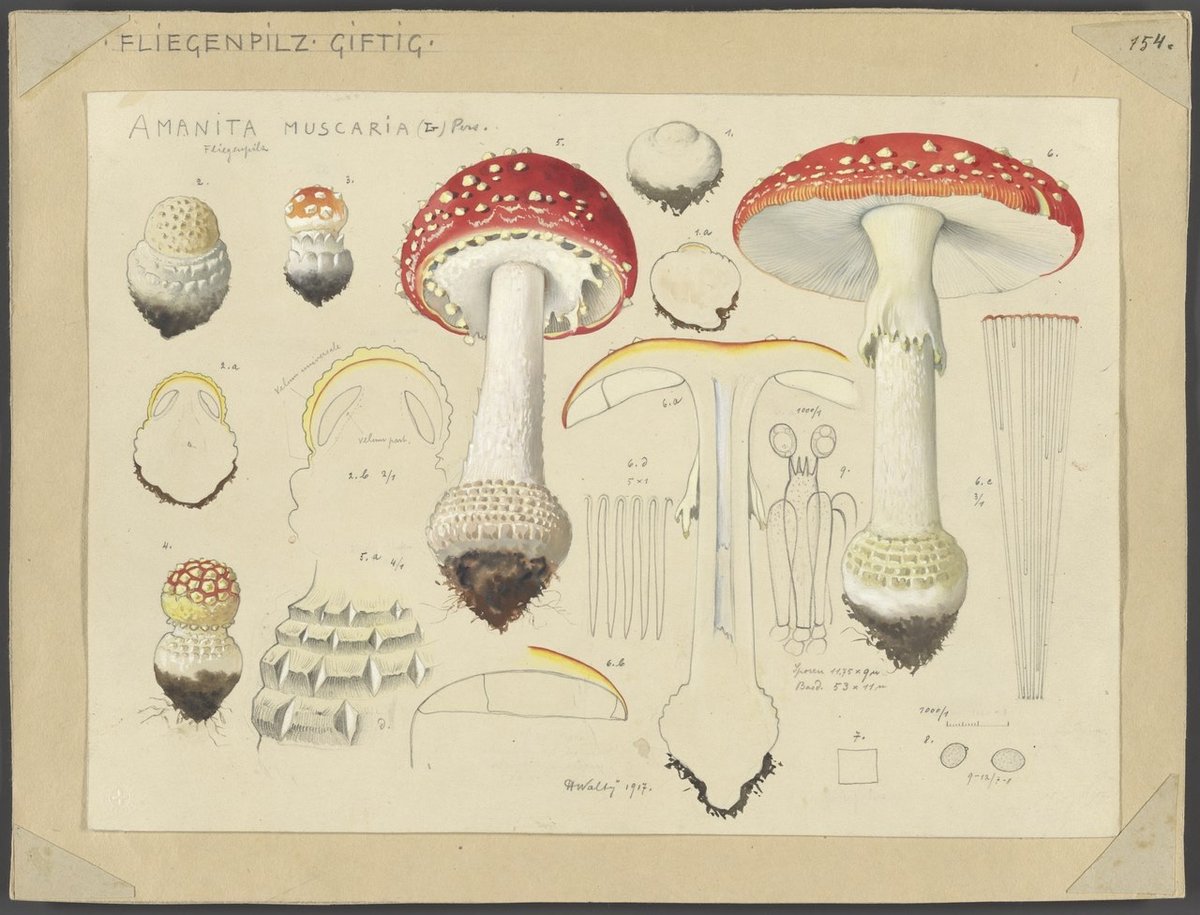
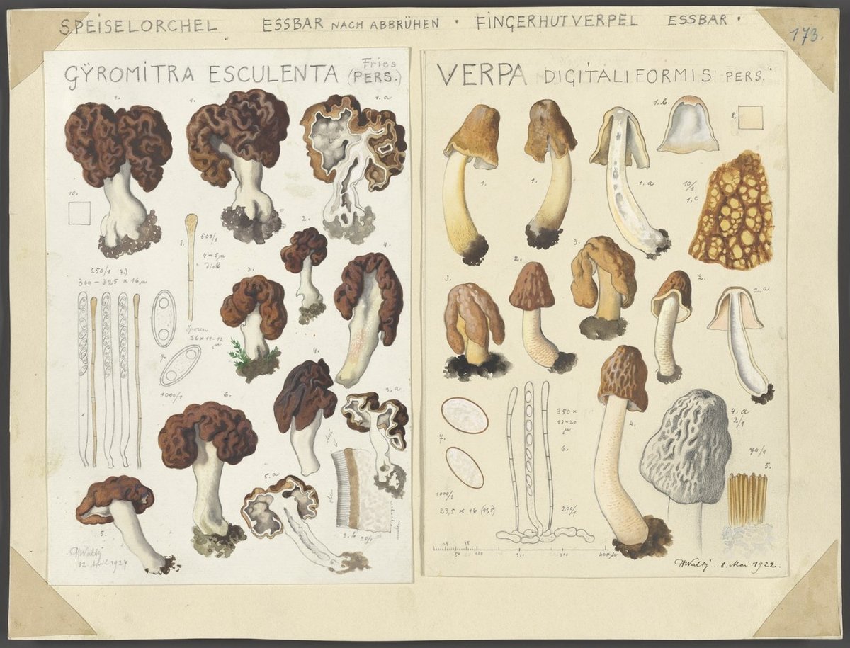
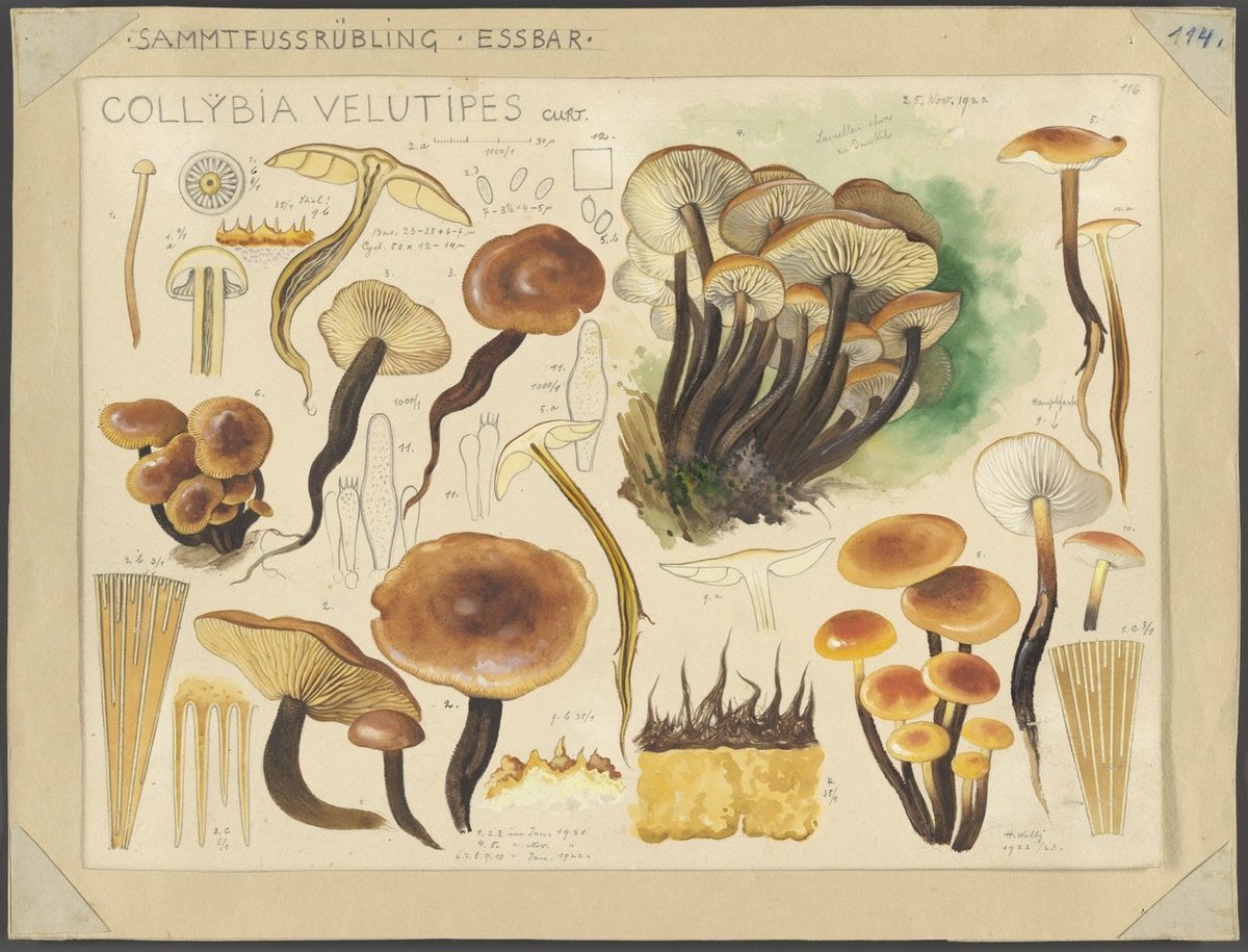
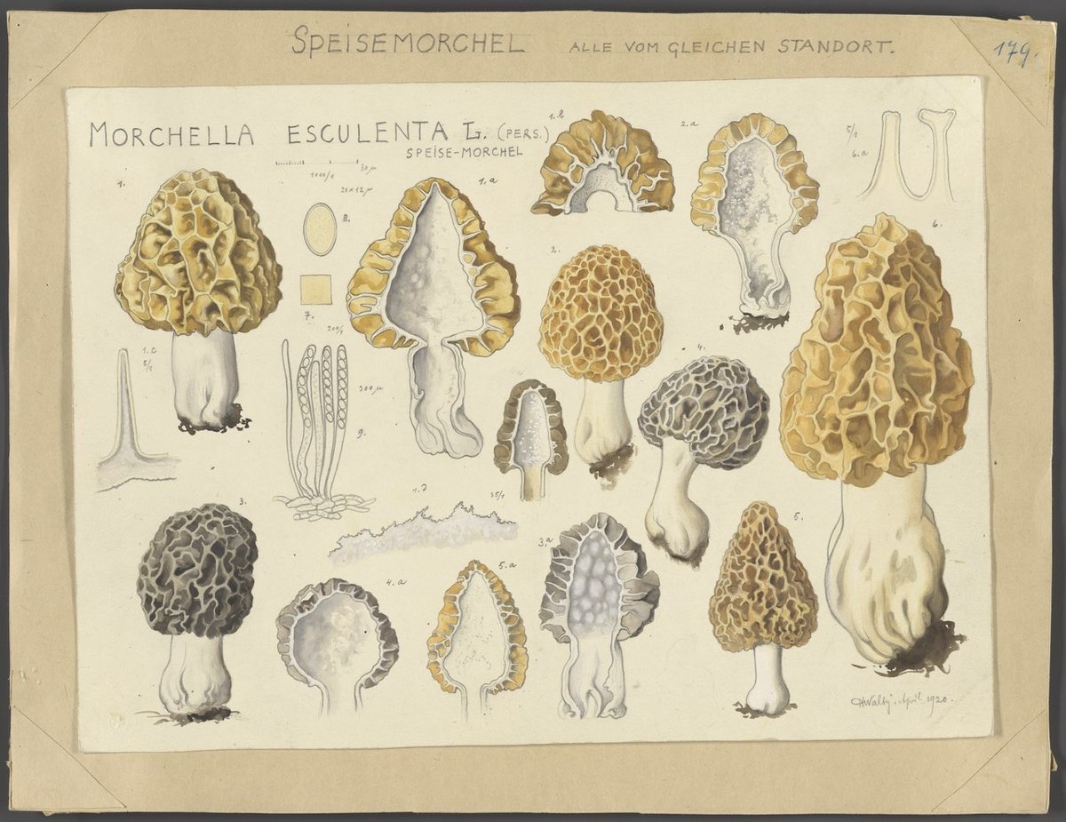
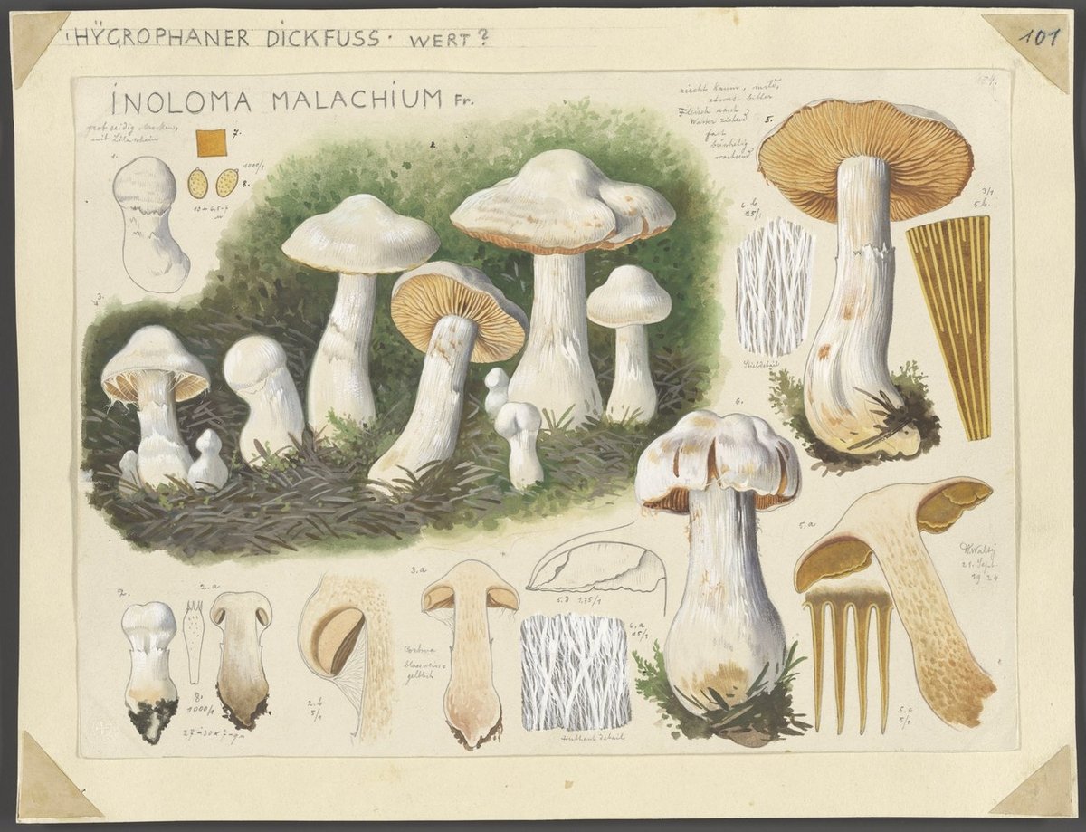
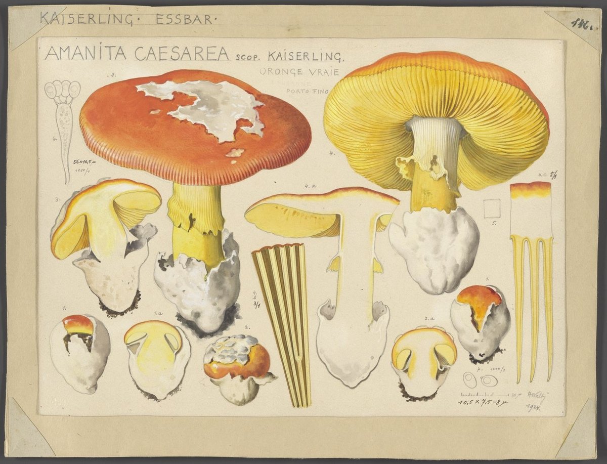
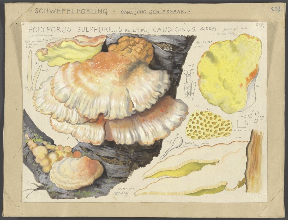
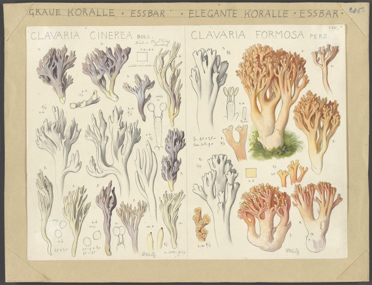
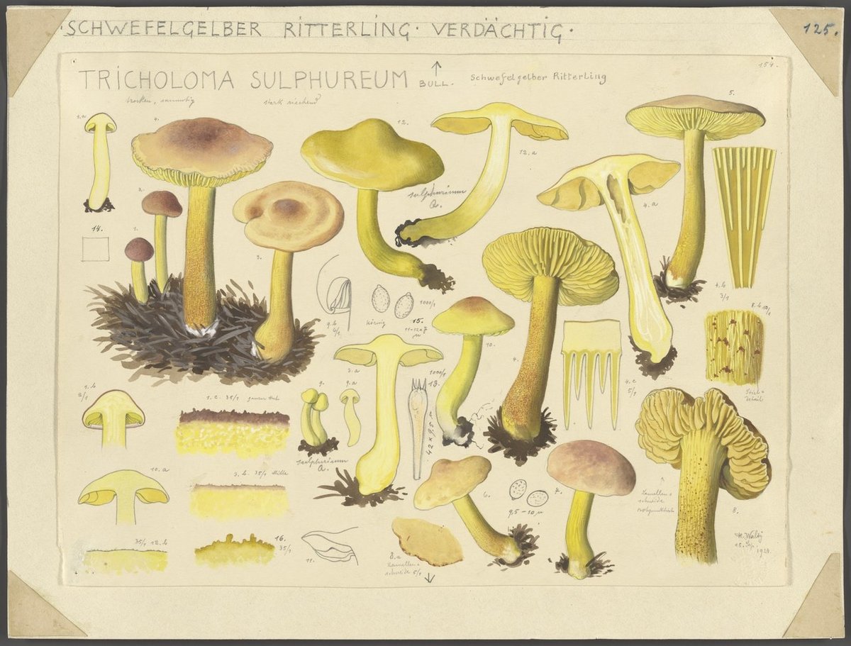
From 1913 to 1944, amateur mycologist Hans Walty created hundreds of fantastic watercolor illustrations of mushrooms, which are available to peruse in very high-resolution at Wikimedia Commons. There’s not a great deal of information about Walty or his drawings online,1 but I did find this piece from the Swiss National Library.
His images depict the colours and shapes of the mushrooms’ fruiting bodies and sometimes also include drawings of microscopic views. The fungi are usually depicted from the side and often from the top and bottom as well. Walty also frequently documented the characteristics of the stems, spores and undersides of the caps. The hobby mycologist also produced an explanatory book to accompany his illustrations that contains descriptions of the mushrooms, with each specimen being assigned a family and genus. His illustrations often contain notes about the time and date the mushroom was found and whether it was edible, inedible or poisonous.
Walty’s illustrations were published in multiple editions of a Swiss mushroom guide from the 40s through the 70s. According to the German version of Wikipedia (translated): “For decades, 500 of his illustrations on mushrooms were considered a standard work on mushroom identification, especially in Switzerland.”
Again, you can browse through hundreds of Walty’s mushroom illustrations at Wikimedia Commons. (thx, christoph)
Not in English at least; Walty was born in Italy and lived in Germany and Switzerland for much of his life. A biography is available on the German version of Wikipedia. ↩

Papercraft artist Charles Young has been sourcing color combinations from this book and using them to construct extremely tidy and precise little buildings.
Starting in May 2020 I used Sanzo Wada’s Dictionary of Colour Combinations as inspiration for a new project introducing colour to my paper work for the first time. The book is made up of two, three and four colour combinations drawn from Japanese design and publishing in the early 20th century.
Check this out to get a sense of the scale — they’re really tiny. You can see many more of these on Instagram. It is actually hard to believe these are made out of paper and not computer generated. (via present & correct)
This story is a few years old but it charmed me too much this morning to let it slide. In 2017, four years after its grand reopening, Amsterdam’s Rijksmuseum welcomed its 10-millionth visitor, a man named Stefan Kasper. His lucky timing resulted in getting to spend the night in the museum, where he dined and slept underneath Rembrandt’s the Night Watch.

Here’s a short video of Kasper’s time in the museum:
I still can’t believe it. I discovered characters that I have never seen before. They came to life in front of me. It’s an experience that is forever etched in my memory.
Not the same, but I got to go to a press preview when the MoMA reopened a few years ago after renovations and it was quite an experience to wander those familiar galleries pretty much by myself. I stood in front of Starry Night and One: Number 31, 1950 for a really long time that morning.
One of my recent favorite YouTube channels is James Payne’s Great Art Explained, which does exactly what it says on the tin, showcasing works of art like Starry Night, the Great Wave, and A Sunday on La Grande Jatte. Payne recently launched a new channel in the same vein: Great Books Explained. Here’s a trailer, featuring a short clip of his exploration of Alice’s Adventures in Wonderland.
Being an avid reader, I always wanted to do a book channel as well, but did not have the time, so these films are collaborations with different writers who are passionate about certain books, and the first release will be James Joyce’s Ulysses (in this case co-created with Henry Mountford). This will be followed by Alice.
The video on James Joyce’s Ulysses is out now:
(via open culture)

Wow, Nicholas Rougeux has restored John Gould’s A Monograph of the Trochilidæ, or Family of Humming-Birds, which was published between 1848 & 1887 and contains hand-colored lithographic depictions of almost every single hummingbird species known to exist at the time.


From Rougeux’s page about the project:
The monograph is considered one of the finest examples of ornithological illustration ever produced, as well as a scientific masterpiece. Gould’s passion for hummingbirds led him to travel to various parts of the world, such as North America, Brazil, Colombia, Ecuador, and Peru, to observe and collect specimens. He also received many specimens from other naturalists and collectors.
The image at the top of the post is the gorgeous poster that Rougeux created from the drawings in Gould’s monograph…you can order some for your walls and read a making-of.
Perhaps the most prominent part of the most well-known painting of Henry VIII (a now-lost work by Hans Holbein the Younger) is the giant codpiece poking through the male-heirless king’s tunic. Evan Puschak analyzes the painting and fills us in on what makes this a particularly effective work of 16th-century propaganda.
Puschak had some fun with this one…I lol’d at “triple dick”, which under no circumstances should you google (like I did) at work or really anywhere else. Although, “triple dick art history” did lead me to this interesting piece on “ostentatio genitalium”:
Ostentatio genitalium (the display of the genitals) refers to disparate traditions in Renaissance visual culture of attributing formal, thematic, and theological significance to the penis of Jesus.
This bit got me laughing again:
…these Renaissance images shock us because they are so frequently ithyphallic: Christ has risen, but not in the way we have come to expect.


Danielle Currie creates these amazing hand-embroidered artworks of satellite views of Earth.
Danielle Currie’s intricate hand embroidered pieces capture the beauty of Earth from a satellite view. Each piece is named with the latitude and longitude coordinates, providing observers the opportunity to independently explore the area which inspired the piece.
Here’s the Landsat 8 satellite photo that inspired the embroidery at the top of the post.
Currie sells the original artworks as well as some prints of her work.
P.S. Apparently I’ve posted more than a little about embroidery over the years, so I gave the subject a tag page. There’s some cool stuff in there…I’d forgotten about The Embroidered Computer.
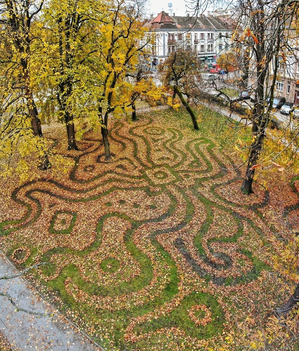
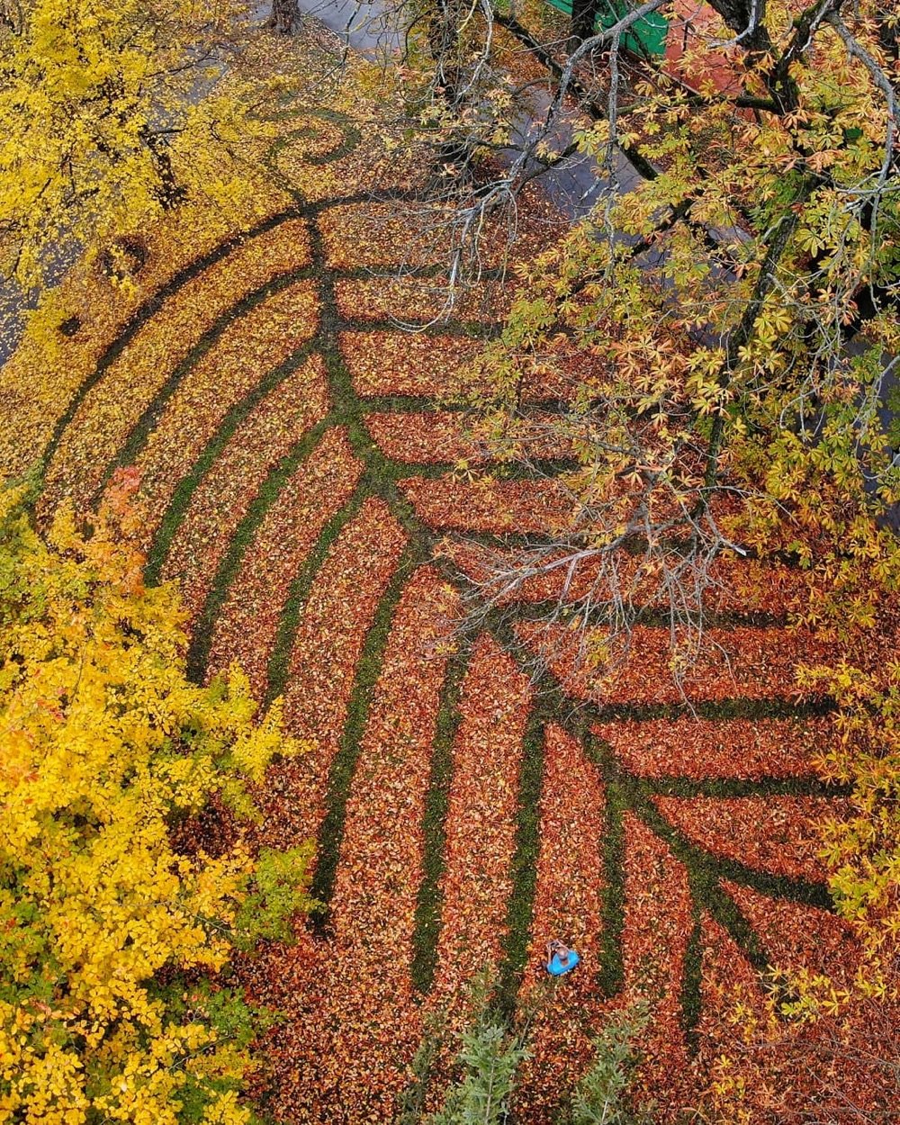
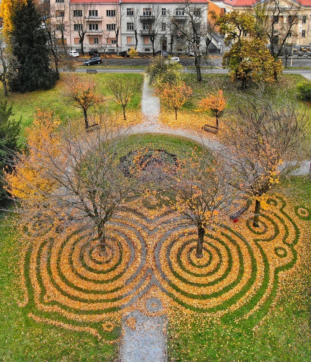
In a nice example of accidental occupational surnames, land artist Nikola Faller travelled to a pair of European parks (in Croatia and Hungary) to rake fallen leaves into a variety of patterns. You can check out more of Faller’s work, including the sand art he’s most well-known for, on Instagram and Facebook.
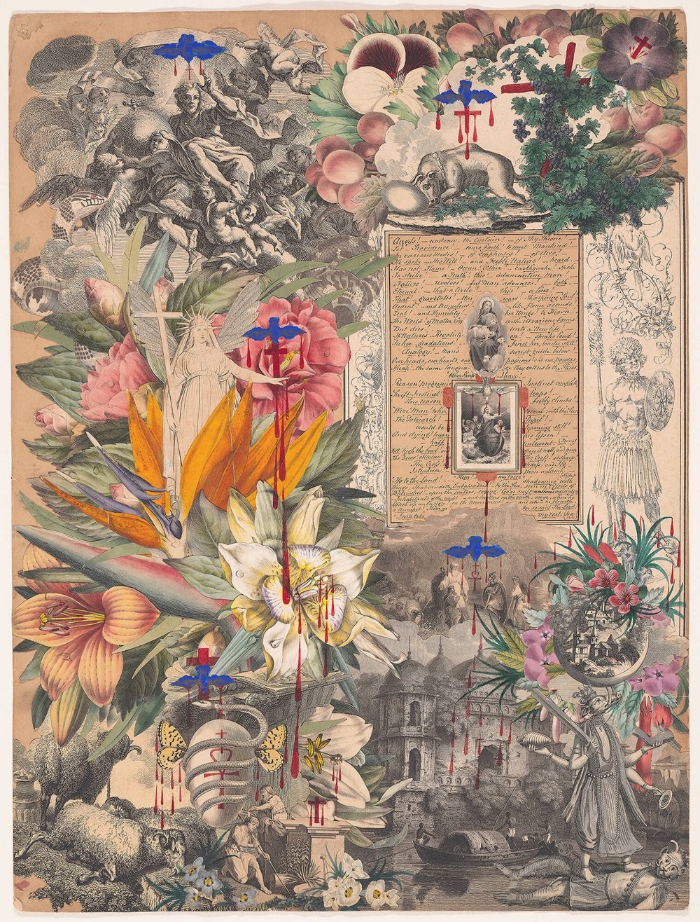
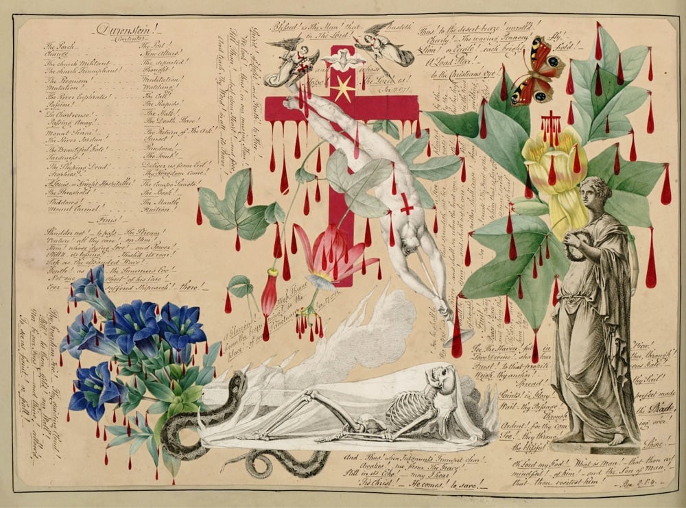
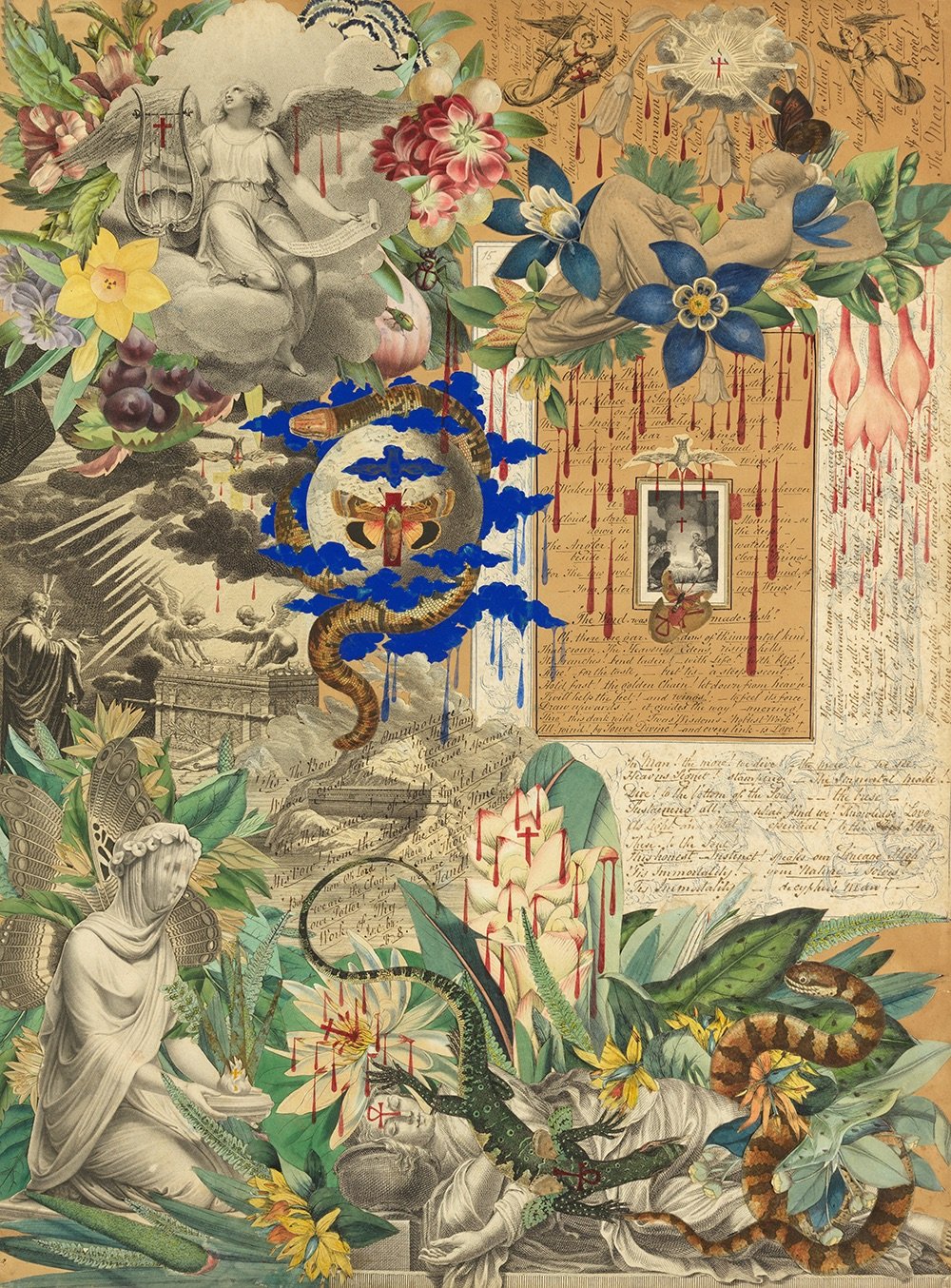
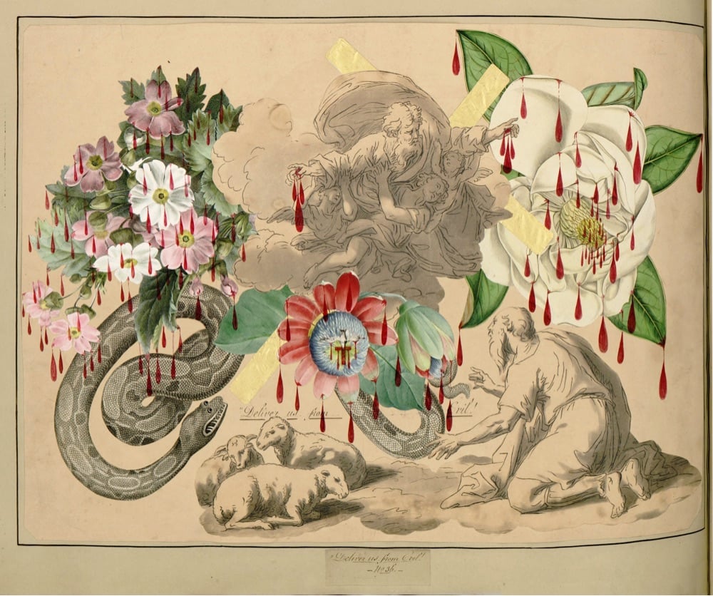
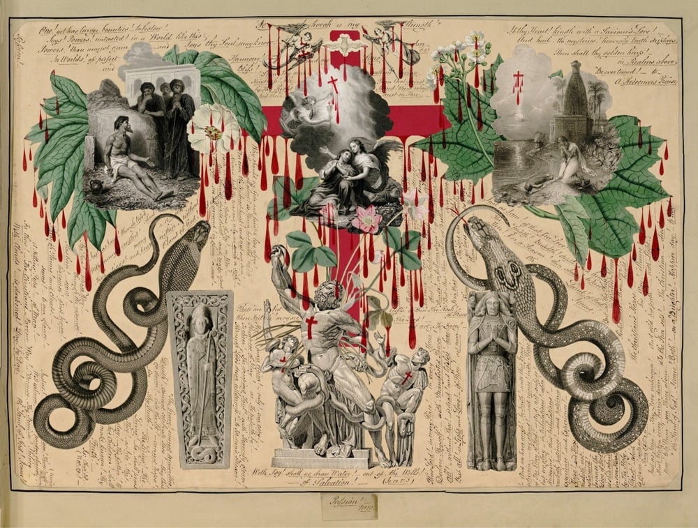
I don’t know about you, but the title “The Blood Collages of John Bingley Garland (ca. 1850–60)” made me click pretty damn fast to see what sort of Victorian age shenanigans this dude was up to. From the Public Domain Review:
The Blood Book is handmade, folio-sized, with a handsome marbled endpaper and forty-three pages of exquisitely crafted decoupage. John Bingley Garland, the manuscript’s creator, used collage techniques, excising illustrations from other books to assemble elegant, balanced compositions. Most of the source material is Romantic engravings by William Blake and his ilk, but there are also brilliantly colored flowers and fruits. Snakes are a favorite motif, butterflies another. A small bird is centered on every page. The space between the images is filled with tiny hand-written script that reads like a staccato sermon. “One! yet has larger bounties! to bestow! Joys! Powers! untasted! In a World like this, Powers!” etc.
The book’s reputation, however, rests on a decorative detail that overwhelms: To each page, Garland added languid, crimson drops in red India ink, hanging from the cut-out images like pendalogues from a chandelier. Blood drips from platters of grapes and tree boughs, statuaries and skeletons. Crosses seep, a cheetah drools, angels dangle bloody sashes. A bouquet of white chrysanthemums is spritzed.
To be clear, Garland’s blood is not that of surgery or crime or menses, but of religious iconography. He obviously intended the blood to represent Christ’s own.
The Blood Book are strikingly modern; as PDR states, Garland uses “techniques usually dated to Cubism in the early twentieth century” to make his collages. I love running across seemingly out-of-time objects like this.
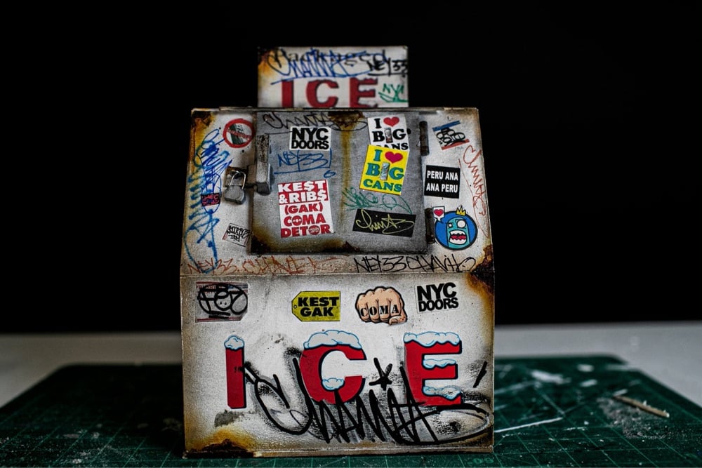
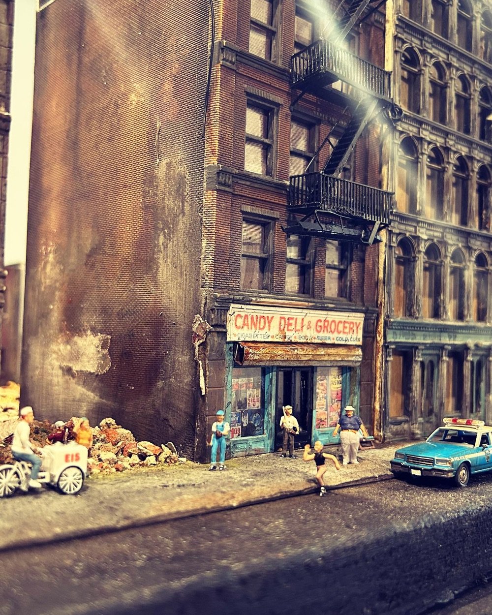
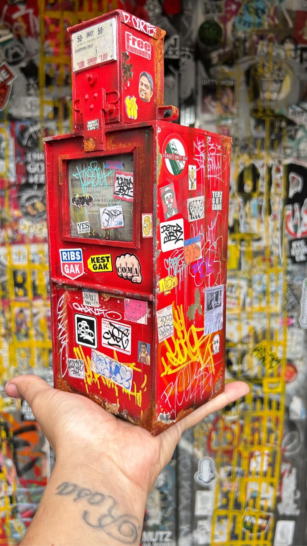
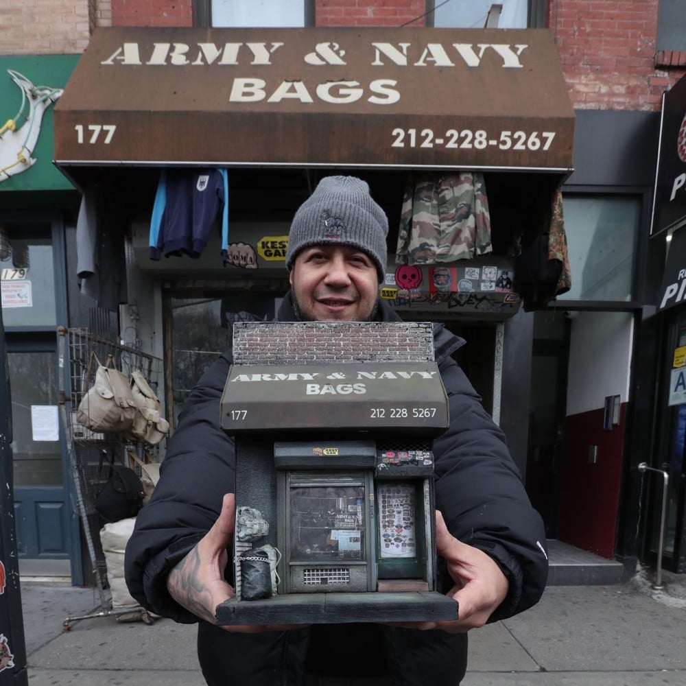
Danny Cortes took up making patinated miniatures of familiar NYC objects during the pandemic and it turned into a full-time vocation for him. He spoke to the NY Times about how his work puts him in the flow state:
“I loved that when I worked on a piece, I didn’t think about my problems — my divorce, the pandemic,” said Mr. Cortes. “It was an escape — like I’m meditating, literally floating. I didn’t have a problem in the world. I wanted that high again, I kept chasing that.”
Love that and love the miniatures…they are crazy realistic.
Blighted façades and distressed structures are the very scenes which fuel Daniel’s attention to detail. The work to produce each piece is arduous and requires great precision to achieve such realism. Daniel had developed techniques that can give a model an aged, distressed or patinated style. He also recreates miniature scaled vintage advertising posters and graffiti art on his models. Daniel’s miniature models make unique collectable creations that will take you on a gritty romantic journey through New York that everyday passers by have overlooked.
You can check out more of Cortes’ work on Instagram.


Birds of the World: The Art of Elizabeth Gould is a new book documenting the work of early 19th century naturalist artist Elizabeth Gould.
Artist and illustrator Elizabeth Gould is finally given the recognition she deserves in this gorgeous volume that includes hundreds of her stunning and scientifically precise illustrations of birds from nearly every continent.
For all of her short life, Elizabeth Gould’s artistic career was appreciated through the lens of her husband, ornithologist John Gould, with whom she embarked on a series of ambitious projects to document and illustrate the birds of the world. Elizabeth played a crucial role in her husband’s lavish publications, creating beautifully detailed and historically significant accurate illustrations of over six hundred birds -many of which were new to science. However, Elizabeth’s role was not always fully credited and, following her tragic death aged only thirty-seven, her efforts and talent were nearly forgotten.
Birds of the World: The Art of Elizabeth Gould is available for pre-order from Amazon or Bookshop.org and comes out on November 7. (via colossal)


London artist Nick Gentry takes old recording media (VHS tapes, cassette tapes, floppy disks) and turns them into portraits (Instagram). Gentry gets his materials from members of the public:
Made from floppy disks contributed by members of the public. As a social art project, the process is open to everyone. Find out how to recycle and include your obsolete materials in future artworks by getting in touch.
(via colossal)
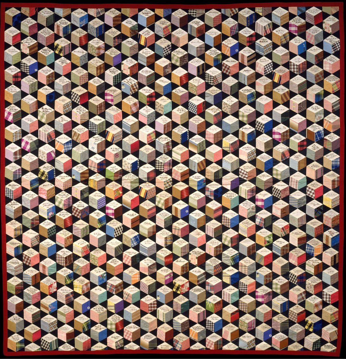
In 1856, a 17-year-old girl named Adeline Harris started making a unique quilt. Over the next two decades, she sent pieces of silk to famous people from around the world and they signed them and sent them back to her. She assembled them into a quilt with a tumbling blocks pattern (aka, the Q*bert pattern).
The signatures that Harris was able to acquire are astounding: Harriet Beecher Stowe, Charles Dickens, Oliver Wendell Holmes, Samuel Morse, Alexandre Dumas, Ralph Waldo Emerson, Henry Wadsworth Longfellow, Alexander von Humboldt, Washington Irving, and Nathaniel Hawthorne. Oh, and eight US Presidents: Martin Van Buren, John Tyler, Millard Fillmore, Franklin Pierce, James Buchanan, Abraham Lincoln, Andrew Johnson, and Ulysses S. Grant.
The aesthetics of this thing are just marvelous, with all the different colors and patterns arranged into a strict grid.
Oh and I couldn’t resist checking The Great Span of the quilt. The earliest-born signatory I could find is Alexander von Humboldt, who was born in 1769, and the last person to die was Mary Virginia Hawes Terhune, who died in 1922. That’s a span of 154 years, all in one incredible quilt.
I found this via the Public Domain Review, who is offering prints of the quilt.
Swiss Post has released a stamp that features concrete, an important material in the history of architecture. But first of all, look at the aesthetics of this thing:

Aaahhh, it looks so nice and clean and Swiss. Love it. Even better: the stamp was designed to feel like concrete:
To give the concrete wall depicted in the design a tactile dimension, cement pigments were added to the ultra-matt finish.
In 2021, Swiss Post made a stamp out of canvas for the same series of stamps regarding art. Not quite as aesthetically pleasing as the concrete one, but still pretty cool.
You can order the concrete stamp from the Swiss Post online shop. (via greg.org)
Jan Hakon Erichsen does weird things with dried pasta, mostly spaghetti but also lasagna. This is goofy and fun. Check out his Instagram and YouTube for more artistic hijinks. (thx, clarke)
Very Expensive Maps is, well, I can’t say it much plainer than host Evan Applegate: “Very Expensive Maps is a podcast by cartographer Evan Applegate in which he interviews better cartographers.” A podcast about a visual medium like maps is maybe a tiny bit like dancing about architecture, but Applegate makes it work. The archives are a key part of the show…lots of links to the maps discussed during each episode. Here’s a sampling of some of the visuals from recent shows:


Stay Connected