New maps of the growth of American slavery in the South

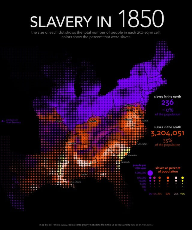
From Bill Rankin at Radical Cartography, a series of maps showing the rapid explosion of slavery in the United States from 1790-1860. Departing from previous efforts, Rankin used a uniform grid of dots to represent slave populations rather than counties.
First, I smash the visual tyranny of county boundaries by using a uniform grid of dots. The size of each dot shows the total population in each 250-sqmi cell, and the color shows the percent that were slaves. But just as important, I’ve also combined the usual county data with historical data for more than 150 cities and towns. Cities usually had fewer slaves, proportionally, than their surrounding counties, but this is invisible on standard maps.
A detail that struck me while cycling through the years was that the number of slaves as a percentage of the total population of the South stayed relatively steady at 33% from 1790 to 1860.


Stay Connected