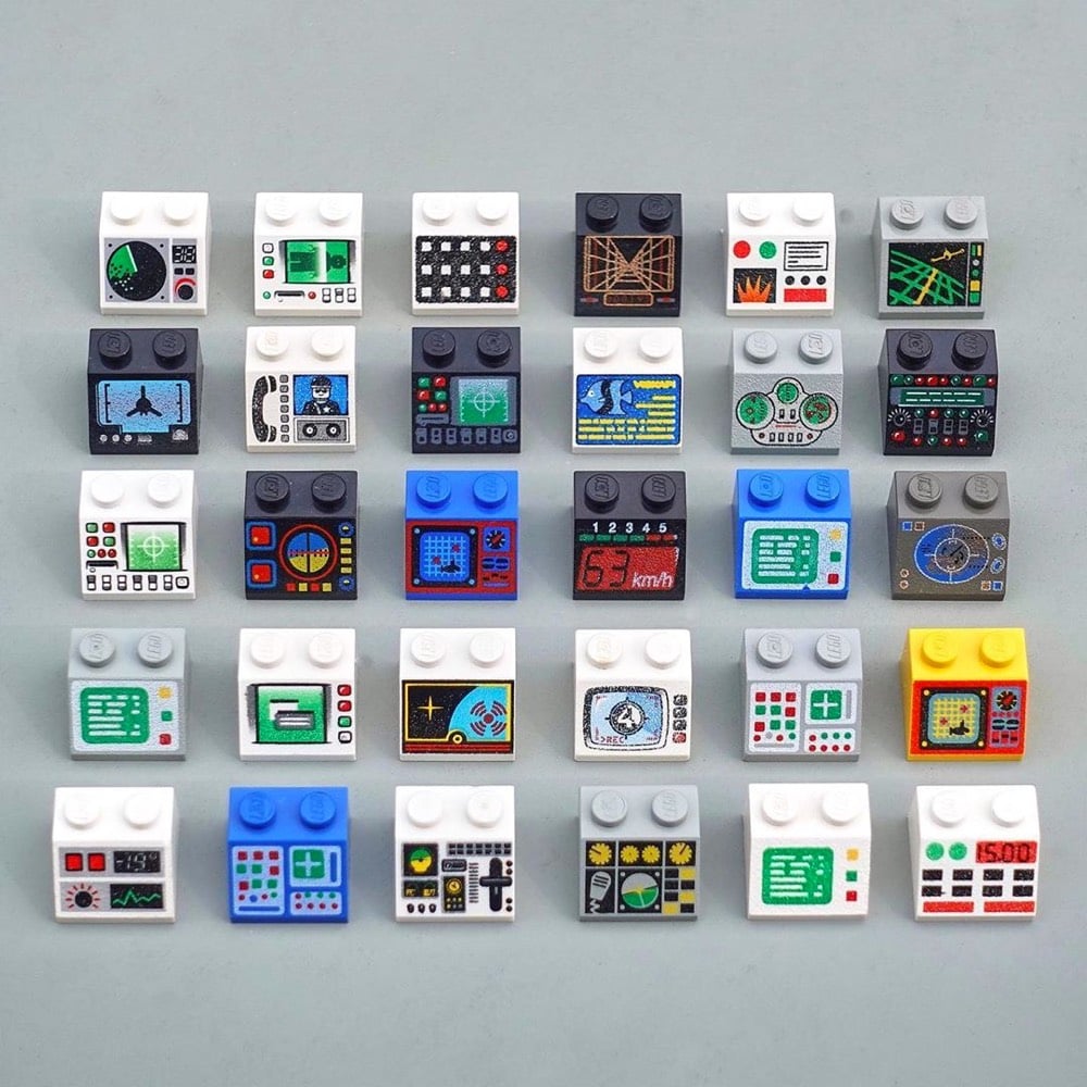
The User Experience Design of Lego Interface Panels

I thought George Cave’s The UX of LEGO Interface Panels was going to be a fun distraction, but it’s actually a great layperson’s explanation, using familiar Lego pieces, of how interfaces work in the real world and the design considerations that go into building them.
Shape coding is one approach to differentiation, but there are many others. Colour coding is perhaps the only one to break into our everyday vocabulary, but we can add four more: size, texture, position and operation coding. Together these six are our allies in the design of error-proof interfaces.
Size, shape and colour-coding are the fundamentals: quick-wins that can fix a lot of interface problems. Texture is also a great differentiator for blind operation, particularly on small dials requiring precise control.
(via sidebar)


Stay Connected