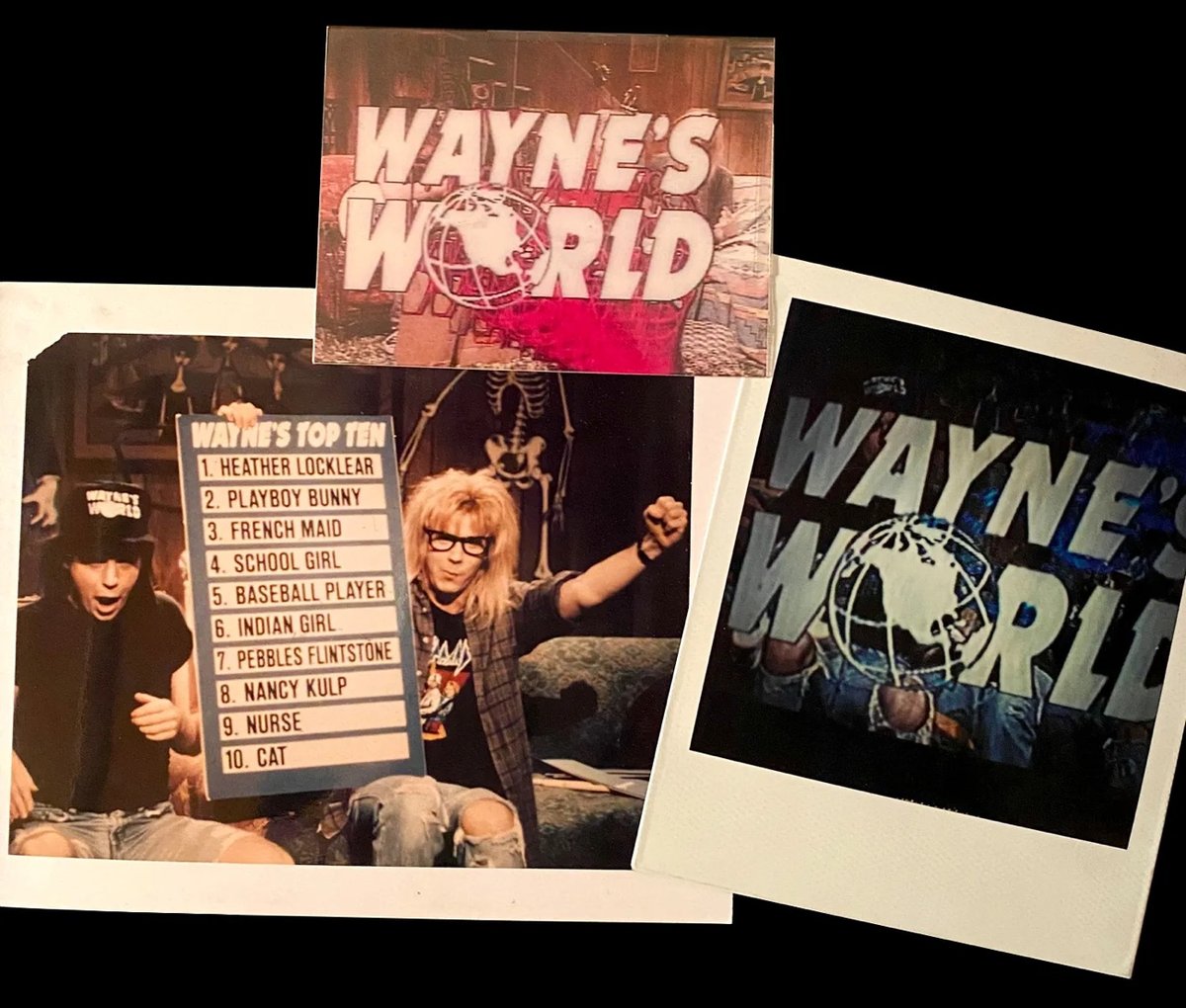
Early 90s SNL Graphic Parodies


Marlene Weisman was a graphic designer for Saturday Night Live from 1988–1994, which is the sweet spot of when I was really into the show. So this interview with Weisman by Steven Heller is right up my alley.
I did have a close working relationship with Mike Myers, who basically wrote his own sketches and would come down to our art department to talk to me about the graphics. He wanted to approve everything himself. He was very specific in what he wanted, and I truly enjoyed working with him.
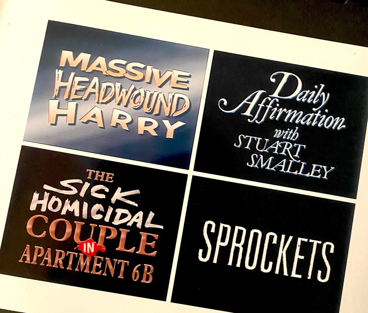
I clicked with him on where he was coming from creatively. I loved establishing the Euro-style SPROCKETS graphics for him, and creating all his Simon drawings for that series of his sketches, which was really fun. As someone with a similar passion for UK ’60s pop culture, I also loved drawing and creating the title sequence for his “1960s Movie” sketch, which I have a hunch was the seed of the idea for his Austin Powers movies!
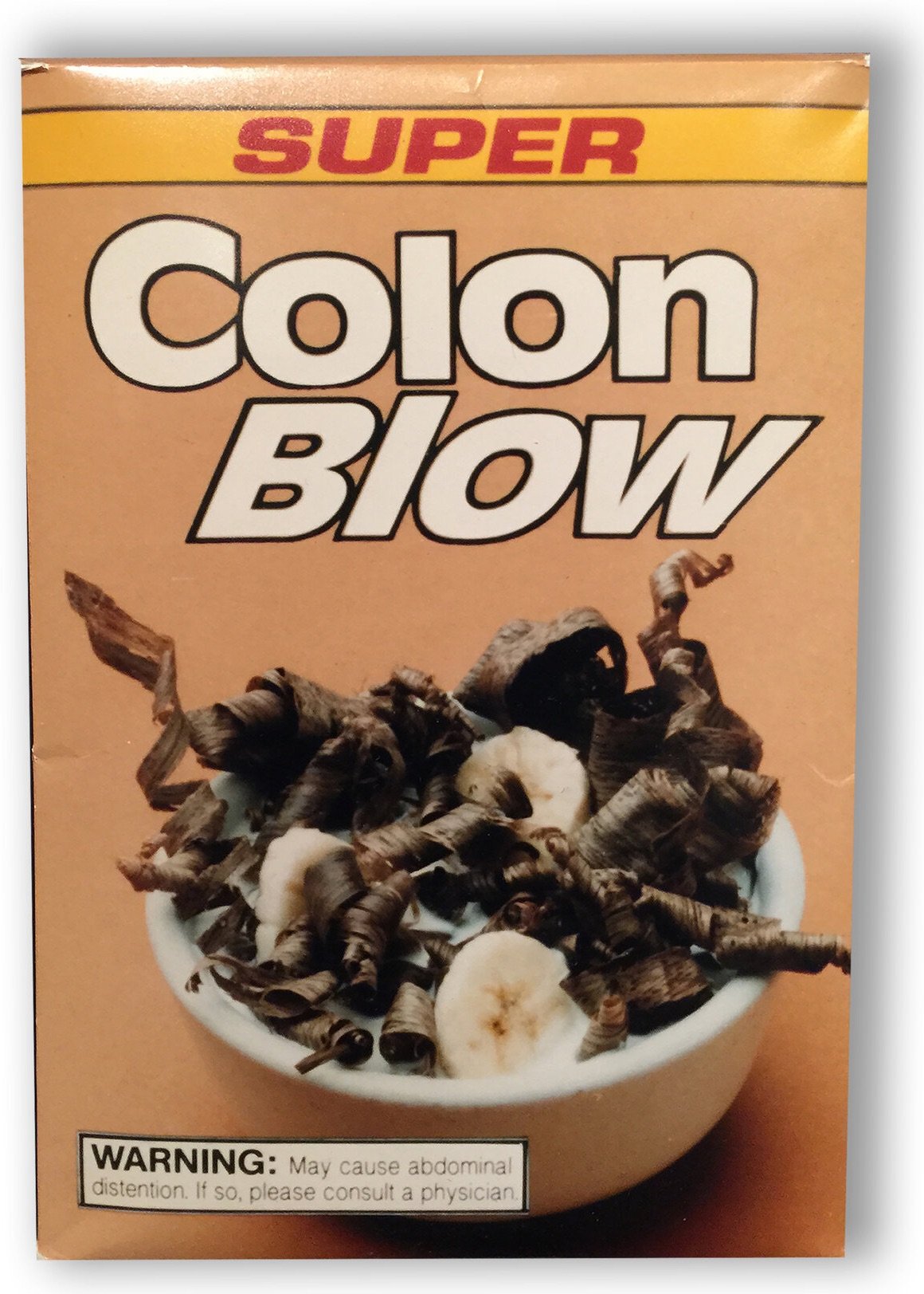
You can check out more of Weisman’s SNL work on her website and see some of the graphics she helped create in classic sketches like Colon Blow, Toonces the Driving Cat, Happy Fun Ball, Wayne’s World, and Sprockets.
See also Creating Saturday Night Live’s Cue Cards. (via chris glass)


Stay Connected