kottke.org posts about aigadc2005
Slideshow of the biggest emerging design trends according to Murray Moss. This came out of a presentation at the 2005 AIGA Design Conference, which presentation (and audio recording) can be downloaded on the AIGADC resources page.
IT Conversations will be streaming presentations from PopTech 2005 live…Windows Media Player required. :( From Etech to the AIGA Design Conference to Web Essentials 05, more and more conferences letting those of us who can’t attend listen in anyway.
The AIGA has podcasts and presentation materials up for some of the speakers from the Design Conference (my full coverage here). Several of the main stage speeches are up, as well as backstage interviews with some of the participants. In particular, I would recommend:
- Audio of the main stage presentation and interview with Juan Enriquez.
- Audio of the main stage presentation by Bill Strickland on The Design of Leadership.
- Audio of the main stage presentation by Milton Glaser and Nicholas Negroponte.
- Audio of the main stage presentation by Murray Moss, although I’m not sure how well this one would work if you listened to it without the slides.
- The PDF of Stefan Sagmeister’s presentation doesn’t make too much sense without the audio, but the last 50 or so slides are worth checking out for the design candy.
These aren’t just for designers; they’re perfectly fine for non-designers as well. Here’s the RSS file with all the resources…it should work well with your favorite podcasting software or newsreader. It’s great that the AIGA is making these presentations freely available…you’re getting a lot of the conference for free here. If I remember correctly, not even O’Reilly offers the presentations or podcasts for download after their events like Etech.
Update: Wrong again! IT Conversations has several podcasts from the last Etech conference. (thx tim)
Here’s a sampling of the rest of the AIGA Design Conference, stuff that I haven’t covered yet and didn’t belong in a post of it’s own:
- Juan Enriquez gave what was probably my favorite talk about what’s going on in the world of genetics right now. I’ve heard him give a variation of this talk before (at PopTech, I think). He started off talking about coding systems and how when they get more efficient (in the way that the Romance languages are more efficient than Chinese languages), the more powerful they become in human hands. Binary is very powerful because you can encode text, images, video, etc. using just two symbols, 1 and 0. Segue to DNA, a four symbol language to make living organisms…obviously quite powerful in human hands.
- Enriquez: All life is imperfectly transmitted code. That’s what evolution is, and without the imperfections, there would be no life. The little differences over long periods of time are what’s important.
- Enriquez again: The mosquito is a flying hypodermic needle. That’s how it delivers malaria to humans. We could use that same capability for vaccinating cows against disease.
- Along with his list of 20 courses he didn’t take in design school, Michael Bierut offered some advice to young designers:
1. Design is the easy part.
2. Learn from your clients, bosses, collaborators, and colleagues.
3. Content is king.
4. Read. Read. Read.
5. Think first, then design.
6. Never forget how lucky you are. Enjoy yourself.
- Nicholas Negroponte: If programmers got paid to remove code from sofware instead of writing new code, software would be a whole lot better.
- Negroponte also shared a story about outfitting the kids in a school in Cambodia with laptops; the kids’ first English word was “Google”, and from what Negroponte said, that was followed closely by “Skype”. He also said the children’s parents loved the laptops because at night, it was the brightest light in the house.
- Christi recorded Milton Glaser’s mother’s spaghetti recipe. “Cook until basically all of the water is evaporated. Mix in bottle of ketchup; HEINZ ketchup.”
- Ben Karlin and Paula Scher on the challenges of making America, The Book: Books are more daunting than doing TV because print allows for a much greater density of jokes. In trying to shoot the cover image, they found that bald eagles cannot be used live for marketing or advertising purposes. The solution? A golden eagle and Photoshop. And for a spread depicting all the Supreme Court Justices in the buff, they struggled — even with the Web — to find nude photos of older people until they found a Vermont nudist colony willing to send them photos because they were big fans of The Daily Show.
- Bill Strickland blew the doors off the conference with his account of the work he’s doing in “curing cancer” — his term for revitalizing violent and crime-ridden neighborhoods — in Pittsburgh. I can’t do justice to his talk, so two short anecdotes. Strickland said he realized that “poor people never have a nice day” so when he built his buildings in these poor black neighbohoods, he put nice fountains out front so that people coming into the building know that they’re entering a space where it’s possible to have a good day. Another time, a bigwig of some sort was visiting the center and asked Strickland about the flowers he saw everywhere. Flowers in the hood? How’d these get here? Strickland told him “you don’t need a task force or study group to buy flowers” and that he’d just got in his car, bought some flowers, brought them back, and set them around the place. His point in all this was creating a place where people feel less dissimilar to each other…black, white, rich, poor, everybody has a right to flowers and an education and to be treated with respect and to have a nice day. You start treating people like that, and surprise!, they thrive. Strickland’s inner city programs have produced Fulbright Scholars, Pulitzer Prize winners, and tons of college graduates.
- I caught 30 minutes of David Peters’ presentation of Typecast: The Art of the Typographic Film Title and realized I should have gotten there in time to see the whole thing. I could sit and watch cool movie titles all day long. Among the titles he showed were Bullit, Panic Room, Dr. Strangelove, Barbarella, The Island of Dr. Moreau, and Superman. The title sequence for Napoleon Dynamite (which was discussed on Design Observer last year) was shown later in the main hall.
- At the closing party at the Museum of Science, we checked out the cool Mathematica exhibit that was designed by Charles and Ray Eames, two designers who were also pretty big science/math nerds.
- And some final thoughts from others at the conference. Peter Merholz says that “form-makers”, which make up the vast majority of the AIGA audience, “are being passed by those who are attempting to use design to serve more strategic ends”. (That’s an interesting thought…) A pair of reviews from Speak Up: Bryony was a bit disappointed with the opening Design Gala but left, like everyone else, in love with emcee John Hockenberry while Armin noted that the preservation of digital files is a big concern for museums in building a collection of graphic design pieces…in 35 years, how are you going load that Quark file or run that Flash movie?
For more of what people are saying about the conference, check out IceRocket. There’s a bunch of photos on Flickr as well.
I quite enjoyed Sagmeister’s presentation on happiness…where else but a design conference would you find a talk on that topic?[1] Early in, he suggested that visualizing happiness with design is easy (photos of someone laughing or a smiley face will do it) but that creating design that provokes happiness in the viewer is something else entirely. He then shared three designs that have made him happy recently:
- Emma Gasson made a day-planner with room for 82 years, the current life expectancy of a British citizen. It looked to be about a foot thick.
- Omnivisu. Richard The and Willy Sengewald constructed a kiosk in Berlin with video cameras inside. When you look into the kiosk through the viewfinder (very much like peering into a pair of binoculars), the cameras record your eyes and beam the video to a nearby location where the images are projected onto a building which rather looks like it’s got a head. When you blink into the kiosk, the building’s head blinks also.
- Ji Lee pastes empty speech bubbles over advertisements on the streets of Manhattan, people often fill them in, and Lee returns to photograph the results.
Sagmeister wrapped up his talk with a list of things he has learned and how he’s used that list in a recent series of projects:
- “everything i do always comes back to me”
- “trying to look good limits my life”
- “everybody thinks they are right”
- “money does not make me happy”
- “thinking life will be better in the future is stupid. i have to live now”
- “complaining is silly. act or forget.”
- “having guts always works out for me”
“Complaining is silly…” is my favorite, both as advice and his implementation of the design. A few of these are in this video shot by Hillman Curtis.
[1] Ok, maybe at a clown conference, but still.
At the beginning of the conference, sketchbooks were distributed to every attendee. We were urged to sketch our thoughts during the sessions & panels in our books and then tape the results onto the Sketch Wall in the Design Fair. As I was too busy typing into my virtual sketchbook (plus, I can’t draw), I left the drawing to others, but I did head down to the Design Fair to see what other attendees had done. Here’s a couple I found interesting:
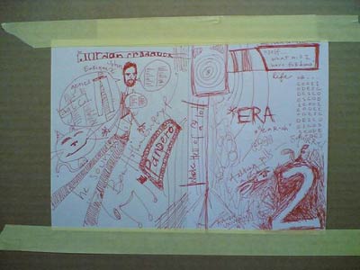
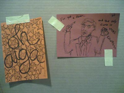
In addition to the sketches, the wall was also being utilized more generally for graffiti, both written (with marker and paint) and created with the tape used to fasten the sketches to the wall. Here’s a favorite bit of tape graffiti (tapeffiti?):
![I [heart] undo](/cdn-cgi/image/format=auto,fit=scale-down,width=1200,metadata=none//plus/misc/images/aiga-sk-undo.jpg)
That would make a great tshirt.
Coming soon to the MoMa: Safe: Design Takes on Risk “presents more than 300 contemporary products and prototypes designed to protect body and mind from dangerous or stressful circumstances, respond to emergencies, ensure clarity of information, and provide a sense of comfort and security”.
Update: Business Week has a preview of the exhibition as well as a slideshow of some of the objects in the exhibit.
A couple of guys calculated the average color of the universe to be turquiose. Then it turned out they had made an error and the actual color of the universe is beige.
As part of my ongoing series of thoughts about conference badge and program design (Poptech 2004, Web 2.0 2004, PopTech 2003), here’s a quick review of the AIGA conference badges and programs. The badges are pretty good. Both first and last names are printed in large type for easy glancing and the schedule fits in the badge holder.
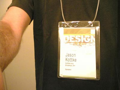
The badge lanyards are not the usual string/cloth, but a simple length of thin hollow plastic tube that’s looped together with a small piece of plastic that fits inside the tube like so:

If the lanyard is too long (as they often are at these things) and your badge is hanging down to your belt buckle, just grab a scissors, cut a bit off one end of the tube, and stick it back together. The program is a small thick book which I’ve left in my hotel room the entire time, preferring to rely on the Web site for event descriptions and the smaller schedule that fits in the badge holder for times, room numbers, etc. The schedule is actually not a booklet, but a series of folding pieces, one for each day of the conference, so when Friday is over, you can take the Friday schedule out of your badge holder and leave it behind, which is kind of handy.
Nicholas Negroponte spoke this morning about the MIT Media Lab’s $100 laptop initiative. “One does not think of community pencils—kids have their own. They are tools to think with, sufficiently inexpensive to be used for work and play, drawing, writing, and mathematics. A computer can be the same, but far more powerful.” More info at BBC News and Technology Review.
I must be living in a cave because I hadn’t really heard of the Daily Show’s America the Book (more here) before today’s presentation by Paula Scher and Ben Karlin.
Designboom interview with designer/citizen Milton Glaser. Glaser is responsible for one of my favorite sayings: just enough is more.
Clip of Dj Spooky’s “Rebirth of a Nation”, a remix of D.W. Griffith’s “Birth of a Nation” adapted from a Ku Klux Klan propaganda piece.
Going all city is graffiti slang for putting your graffiti on trains in all five boroughs of NYC.
“I/O Brush is a new drawing tool to explore colors, textures, and movements found in everyday materials by ‘picking up’ and drawing with them. I/O Brush looks like a regular physical paintbrush but has a small video camera with lights and touch sensors embedded inside.”
Some miscellaneous bits I haven’t had a chance to post yet about the conference:
- Congressman Barney Frank didn’t talk at all about “Design and Civic Leadership”, but he did say he was in favor of limiting free speech in one small way: he would ban the use of metaphors in the discussion of public policy.
- Dj Spooky on the standarization (i.e. Gapization, Starbucksification, etc.) of American retail (paraphrased): If you think about it, the US is almost more totalitarian than the Soviet Union was; we buy our own uniforms.
- Peter Merholz on the death of user experience: What people not call “user experience” used to be called “design” (by the Eames generation). The term “user experience” was necessary because “design” had become associated almost exclusively with the way something looked. The pretty, the aesthetic. Who did Peter blame? Professional organizations (including the AIGA) and designers themselves. Peter notes that design is making a comeback, particularly in the business press, something I noted in earlier in the week.
- From the Three Minds blog, a summary of a presentation by Murray Moss of 10 things that he likes right now. Well, not so much things as ideas or trends. Or commerce…all of the items he showed are on sale in his Soho store/gallery.
- More blog action from the conference: Peterme has some quick thoughts, David Panarelli has several posts from Friday (1, 2, 3, 4, 5, 6) and UnBeige tells us about Ellen Lupton, Dj Spooky, a David Carson sighting (I totally didn’t know he was here…seeing his work for the first time made me want to be a designer, so I may have to accost him and gush a little), and then promptly goes off to nap. Nap!? That’s allowed??
More tomorrow, already the last full day of the conference.
OPENSTUDIO was announced at the conference today by John Maeda. Keith sez about the project: “described as an experiment in creativity, collaboration, and capitalism, Open Studio is designed to simplify tools for the creative process and provide a pseudo-currency model for tool use and sharing.” Gotta go check this one out in the Media Lab space here.
Something to look forward to: podcasts from the AIGA Design Conference. I’ve been told they’ll be up in a week or two and that they will include many of the presentations as well as a lot of interviews with speakers. I’ll point to them when they’re available.
The Designing for User eXperience conference “[gathers] together researchers and practitioners of all the design disciplines and related fields to share their stories and experiences on how the needs and goals of both users and businesses are met through design”. Looks like the blog has yet to get going.
Are you at the AIGA conference? Are you taking notes? Are those notes on a computer or posted to a blog? There are several sessions going on at a time now and I’m trying to get to as many as I can without, you know, going insane. If you’ve got notes (especially from sessions I didn’t get to) and you don’t mind sharing them, send them along and I’ll put them up on the site. If you’re blogging, send your links or post them in the comments below. Thanks!
ps. Did anyone go to the yoga at 6:30am this morning? What percentage of the participants were hung over? Was everyone in black?
The Design Encyclopedia is a wiki that aims to be filled with definitions and descriptions of design terms, people, concepts, companies, etc. This could become a great resource. (thx armin)
UnBeige blogged the blog panel that I participated on with Michael Bierut, Jen Bekman, Armin Vit, and Steven Heller. More here and here.
New vocabulary word (to me): gangsta nerd.
Paul D. Miller (aka Dj Spooky) has a new book out about remix culture called Rhythm Science. More on the book at MIT Press and it’s available at Amazon.
Helvetica vs. Arial. Two of the world’s most popular typefaces battle it out for supremacy.
Design for Democracy is utilizing the skillset of designers to improve the election process in America, including ballot redesigns and polling place signage.
Older posts


![I [heart] undo](/cdn-cgi/image/format=auto,fit=scale-down,width=1200,metadata=none//plus/misc/images/aiga-sk-undo.jpg)

Stay Connected