The varying wavelengths of colors

Rain-Bros by Daniel Savage is a fun visualization of the different wavelengths of light in the visible spectrum, from the loping walk of red to blue’s energetic bounce.


This site is made possible by member support. ❤️
Big thanks to Arcustech for hosting the site and offering amazing tech support.
When you buy through links on kottke.org, I may earn an affiliate commission. Thanks for supporting the site!
kottke.org. home of fine hypertext products since 1998.

Rain-Bros by Daniel Savage is a fun visualization of the different wavelengths of light in the visible spectrum, from the loping walk of red to blue’s energetic bounce.
From Orbital Mechanics, a visualization of the 2153 nuclear weapons exploded on Earth since 1945.
2153! I had no idea there had been that much testing. According to Wikipedia, the number is 2119 tests, with most of those coming from the US (1032) and the USSR (727). The largest device ever detonated was Tsar Bomba, a 50-megaton hydrogen bomb set off in the atmosphere above an island in the Barents Sea in 1961. Tsar Bomba had more than three times the yield of the largest bomb tested by the US. The result was spectacular.
The fireball reached nearly as high as the altitude of the release plane and was visible at almost 1,000 kilometres (620 mi) away from where it ascended. The subsequent mushroom cloud was about 64 kilometres (40 mi) high (over seven times the height of Mount Everest), which meant that the cloud was above the stratosphere and well inside the mesosphere when it peaked. The cap of the mushroom cloud had a peak width of 95 kilometres (59 mi) and its base was 40 kilometres (25 mi) wide.
All buildings in the village of Severny (both wooden and brick), located 55 kilometres (34 mi) from ground zero within the Sukhoy Nos test range, were destroyed. In districts hundreds of kilometers from ground zero wooden houses were destroyed, stone ones lost their roofs, windows and doors; and radio communications were interrupted for almost one hour. One participant in the test saw a bright flash through dark goggles and felt the effects of a thermal pulse even at a distance of 270 kilometres (170 mi). The heat from the explosion could have caused third-degree burns 100 km (62 mi) away from ground zero. A shock wave was observed in the air at Dikson settlement 700 kilometres (430 mi) away; windowpanes were partially broken to distances of 900 kilometres (560 mi). Atmospheric focusing caused blast damage at even greater distances, breaking windows in Norway and Finland. The seismic shock created by the detonation was measurable even on its third passage around the Earth.
The Soviets did not give a fuck, man…what are a few thousand destroyed homes compared to scaring the shit out of the capitalist Amerikanskis with a comically large explosion? Speaking of bonkers Communist dictatorships, the last nuclear test conducted on Earth was in 2013, by North Korea.
From designer Karl Sluis, a list of nine great book about information visualization not written by Edward Tufte. Gonna keep my eye out for Stephen Few’s Now You See It and David McCandless’ The Visual Miscellaneum, but Herbert Bayer’s World Geographic Atlas is a little too rich for my blood.
This is an amazing video visualization of military and civilian deaths in World War II. It’s 18 minutes long, but well worth your time.
There’s an interactive component as well, allowing you to explore the data. (via @garymross)
Nick Barnes is a football commentator for BBC Radio Newcastle. For each match he does, Barnes dedicates two pages in his notebook for pre-match notes, lineups, player stats, match stats, and dozens of other little tidbits.
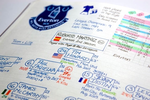
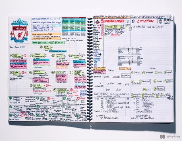
Wonderful folk infographics. NBC commentator Arlo White also shared his pre-match notes. Both men say they barely use the notes during the match…by the time the notes are done, they know the stuff. (via @dens)

This is…weird. The National Archives contains a Cocktail Construction Chart made in an architectural style, for some reason, by the US Forest Service in 1974.
Update: Kenny Herzog at Esquire did some digging and found out some of the chart’s backstory.
If it does, royalties might be due to the family of late Forest Service Region 8 Engineer Cleve “Red” Ketcham, who passed away in 2005 but has since been commemorated in the National Museum of Forest Service History. It’s Ketcham’s signature scribbled in the center of the chart, and according to Sharon Phillips, a longtime Program Management Analyst for Region 8 (which covers Virginia, Georgia, Florida, Oklahoma and Puerto Rico, though Ketcham worked out of its Atlanta office), who conferred with her engineering department, there’s little doubt Ketcham concocted the chart in question. “They’re assuming he’s the one, because the drawing has a date of 1974, and he was working our office from 1974-1980,” she said. And in case there’d be any curiosity as to whether someone else composed the chart and Ketcham merely signed off on it for disbursement, Phillips clarified that, “He’s the author of the chart. I wouldn’t say he passed it along to the staff, because at that time, he probably did that as maybe a joke, something he did for fun. It probably got mixed up with some legitimate stuff and ended up in the Archives.”
I contacted the librarian at the Forest History Society and found similar information. An archivist pulled a staff directory from the Atlanta office (aka “Region 8”) from 1975 and found three names that correlate with those on the document: David E. Ketcham & Cleve C. Ketcham (but not Ketchum, as on the document) and Robert B. Johns (presumably aka the Bob Johns in the lower right hand corner). Not sure if the two Ketchams were related or why the spellings of Cleve’s actual last name and the last name of the signature on the chart are different.
However, in the past few days, I’ve run across several similar charts, most notably The Engineer’s Guide to Drinks.1 Information on this chart is difficult to come by, but various commenters at Flowing Data and elsewhere remember the chart being used in the 1970s by a company called Calcomp to demonstrate their pen plotter.

As you can see, the Forest Service document and this one share a very similar visual language — for instance, the five drops for Angostura bitters, the three-leaf mint sprig, and the lemon peel. And I haven’t checked every single one, but the shading employed for the liquids appear to match exactly.
So which chart came first? The Forest Service chart has a date of 1974 and The Engineer’s Guide to Drinks is dated 1978. But in this post, Autodesk Technologist Shaan Hurley says the Engineer’s Guide dates to 1972. I emailed Hurley to ask about the date, but he couldn’t point to a definite source, which is not uncommon when you’re dealing with this sort of thing. It’s like finding some initials next to “85” scratched into the cement on a sidewalk: you’re pretty sure that someone did that in 1985 but you’d have a tough time proving it.
FWIW, if I had to guess where this chart originated, I’d say that the Calcomp plotter demo got out there somehow (maybe at a trade show or published in an industry magazine) and every engineer took a crack at their own version, like an early internet meme. Cleve Ketcham drew his by hand while others probably used the CAD software running on their workplace mainframes or minicomputers.
Anyway, if anyone has any further information about where these CAD-style cocktail instructions originated, let me know. (thx, @john_overholt & tre)
Other instances include these reprints of drawings from 1978 on eBay and an advertisement for a Cocktail Construction drawing in the Dec 1982 issue of Texas Monthly. ↩

I’ve never looked closely at my dishwasher’s instruction manual before, but apparently all the manuals tell you how best to load the dishwasher. Joe Clark went through a bunch these manuals and compiled screenshots of the “Loading Your Dishwasher” pages and put them on Flickr.
The Pew Research Center shares some of the most interesting findings from the reports they published in 2014. The increasing gap in wealth between white and non-white households since the 2007 recession was the most shocking to me.
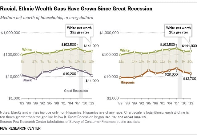
Over the past 10 years, the net worth of black households has been cut in half.
From the New Yorker’s Vauhini Vara, four charts that defined the world in 2014.
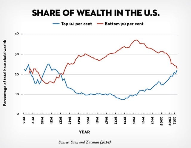
One of the most talked-about charts of the year, tucked inside a National Bureau of Economic Research working paper published in October by the economists Emmanuel Saez and Gabriel Zucman, isn’t, strictly speaking, about 2014. The chart stops in 2012, which is the last year for which relevant data was available. Saez and Zucman found that wealth in the U.S. has been distributed increasingly unequally over the past three decades, and that almost the entire increase in inequality has to do with the rising share of wealth held by the 0.1 per cent — from seven per cent, in 1978, to twenty-two per cent, in 2012, a level comparable to what the richest families held in the early twentieth century.
So, if the trend held over the past two years, the top 0.1% of Americans have more wealth than the bottom 90% for the first time since right before WWII. When that data comes out, we’ll see a ton of think- and trend-pieces about it…but unless the US government gets serious about redistributing that wealth, not much will be done about it.
Update: From Co.Design, The 18 Best Infographics Of 2014. And on Medium, Eleven Stunning Graphs From 2014 That You Should See.
Pianograms are visualizations of the relative distributions of piano key presses for songs. For instance, this is Prelude in C-sharp by Rachmaninov:
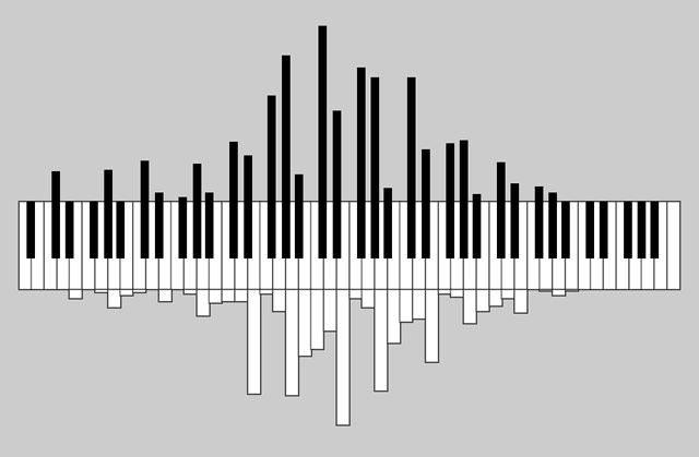
(via @pomeranian99)
A children’s book about space featuring information graphics illustrated by the completely awesome Jennifer Daniel!?
The third in a visually stunning series of information graphics that shows just how interesting and humorous scientific information can be. Complex facts about space are reinterpreted as stylish infographics that astonish, amuse, and inform.
INSTANT PURCHASE. February 2015 cannot come fast enough.
Using the Flesch-Kincaid readability test, Vocativ analyzed more than 600 speeches from all the American Presidents for ease of comprehension. What they found was a trend toward simpler language as speeches needed to appeal to a wider range of people, not just super-educated white men.
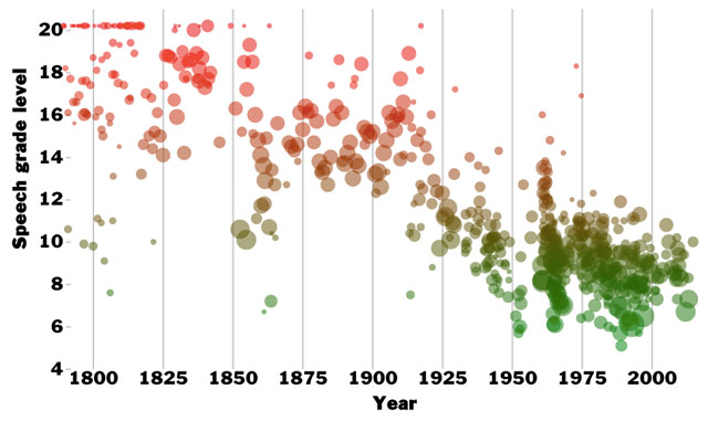
I think President Obama, no more or less than President Bush, tries to pack a lot of nuance and subtext into language that is as plain and straightforward as possible. While President Bush was often inarticulate off the cuff, Bush’s speeches were underestimated. There was a crisp formality to a lot of his best speeches, particularly the ones he delivered shortly after Sept. 11.
Definitely click through for their analysis of the data.
Eleanor Lutz has a degree in molecular biology, works as a designer, and loves to combine the two interests by making these wonderful information graphics on her site, Tabletop Whale. Her most recent post is an animated graphic showing how several animals (birds, bats, insects) move their wings while flying.
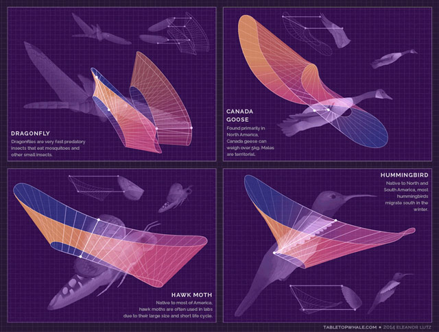
I love love love Lutz’s animated chart of North American butterflies. So playful!
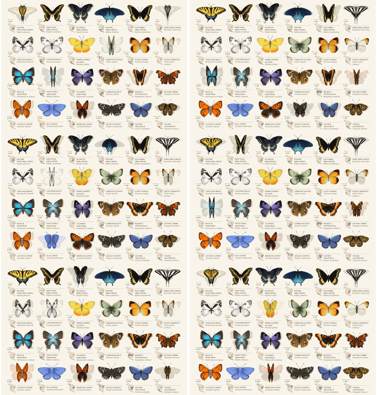
There are only four posts on the site so far, but she’s done other stuff as well; this woodcut map for instance. Prints are available…I’m getting one of the butterflies for sure.

David McCandless has been highlighting good information design for years on Information Is Beautiful. The site spawned a book of the same name in 2009. Now McCandless is back with a new book, Knowledge Is Beautiful.
Every day, every hour, every minute we are bombarded with information, from television, from newspapers, from the Internet, we’re steeped in it. We need a way to relate to it. Enter David McCandless and his stunning infographics, simple, elegant ways to interact with information too complex or abstract to grasp any way but visually. McCandless creates visually stunning displays that blend the facts with their connections, contexts, and relationships, making information meaningful, entertaining, and beautiful. And his genius is as much in finding fresh ways to provocatively combine datasets as it is in finding new ways to show the results.
Here’s some more information about the book.
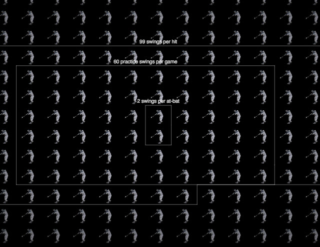
Love this New York Times visualization of how many times Derek Jeter has swung a bat during his career. This is like Powers of Ten, but with Derek Jeter bat swings.
From Flowing Data, 19 Maps That Will Blow Your Mind and Change the Way You See the World. Top All-time. You Won’t Believe Your Eyes. Watch. It’s the maps listicle to end all maps listicles.
This clever and well-done visualization shows where individual NYC taxis picked up and dropped off their fares over the course of a day.

Mesmerizing. Has anyone done analysis on which drivers are the most effective and what the data shows as the most effective techniques? The best drivers must have their tricks on where to be at which times to get the most fares. (via @dens)

In an adaptation of a talk he gave at the recent Eyeo Festival, Mike Bostock talks about visualizing algorithms.
Algorithms are a fascinating use case for visualization. To visualize an algorithm, we don’t merely fit data to a chart; there is no primary dataset. Instead there are logical rules that describe behavior. This may be why algorithm visualizations are so unusual, as designers experiment with novel forms to better communicate. This is reason enough to study them.
But algorithms are also a reminder that visualization is more than a tool for finding patterns in data. Visualization leverages the human visual system to augment human intellect: we can use it to better understand these important abstract processes, and perhaps other things, too.
If nothing else, skim through the text and play the visualizations. The one of the maze turning into a tree visualization baked my noodle a little bit.
The center of the population of the United States has been moving steadily west and south since 1790. This video shows the progression until 2010:
You can step through the animation yourself on the US Census Bureau site. It’s interesting to see how even the changes are…there was one big jump from 1850 to 1860 and a slow down in westward migration from 1890 to 1940, but other than that, it shifted west about 40-50 miles each decade.
These maps, diagrams, and charts by John Philipps Emslie done in the mid-to-late 1800s are gorgeous.
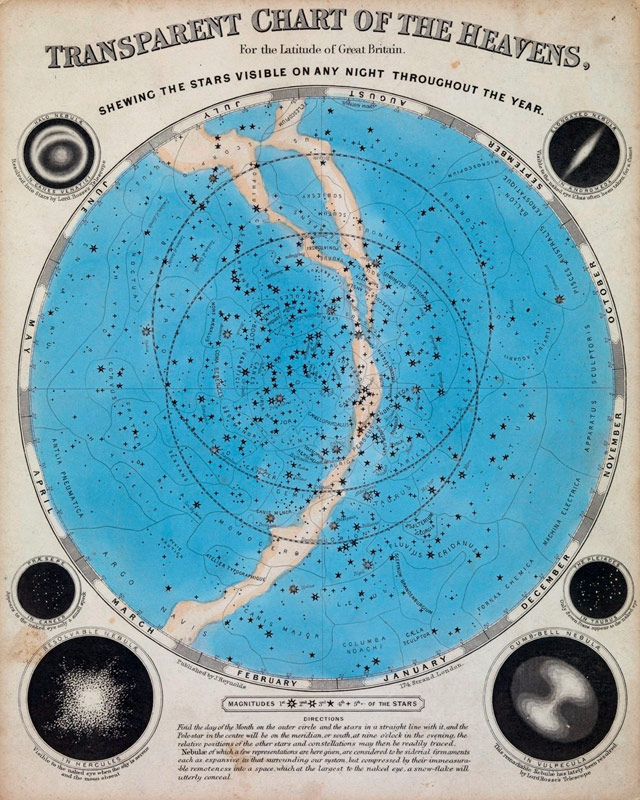
Intrigued, I went searching for more examples. I loved this one just for pure compositional beauty:
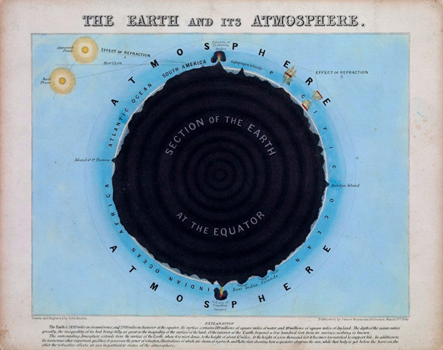
And this lithograph from 1850 showing various machines of the time:

(thx, greg)
The Pew Research Center has data and visualizations showing how much more polarized Americans have become about their politics over the past 20 years.
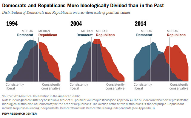
In 1994, the overlap was much greater than it is today. Twenty years ago, the median Democrat was to the left of 64% of Republicans, while the median Republican was to the right of 70% of Democrats. Put differently, in 1994 23% of Republicans were more liberal than the median Democrat; while 17% of Democrats were more conservative than the median Republican. Today, those numbers are just 4% and 5%, respectively.
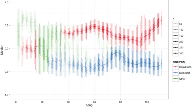
Even more pronounced is the shift by the Republican members of Congress toward the right.
(via @mulegirl)
Tyler Vigen is collecting examples of data that correlate closely but are (probably) otherwise unrelated.
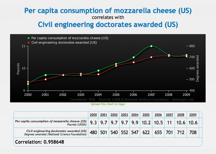
Remember kids, correlation != causation.
Programming sorting techniques visualized through Eastern European folk dancing. For instance, here’s the bubble sort with Hungarian dancing:
See also sorting algorithms visualized. (via @viljavarasto)
Data visualization of Citi Bike trips taken over a 48-hour period in NYC:
Love seeing the swarms starting around 8am and 5:30pm but hate experiencing them. I’ve been using Citi Bike almost since the launch last year and I can’t imagine NYC without it now. I use it several times daily, way more than the subway even. I hope they can find a way to make it a viable business.
![]()
Nice visualization of the solar system; the Moon is one pixel across and everything else is scaled to that, including the distances between planets. Get ready to scroll. A lot.
It would be neat to do this with a plutonium atom or something. Related: typographically speaking, what’s the point size of the Moon?
NASA announced the discovery of 719 new planets today. That brings the tally of known planets in our universe to almost 1800. 20 years ago, that number was not more than 15 (including the nine planets orbiting the Sun). Here’s a rough timeline of the dramatically increasing pace of planetary discovery:
4.54 billion BCE-1700: 6
1700-1799: 1
1800-1899: 1
1900-1950: 1
1951-1990: 1
1991-2000: 49
2001-2005: 131
2006-2010: 355
2006: -1 [for Pluto :( ]
2011-2014: 1243
Last year, Jonathan Corum made an infographic of the sizes and orbits of the 190 confirmed planets discovered at that point by the Kepler mission. I hope the Times updates it with this recent batch.
In a presentation for the Visualized conference, Jonathan Corum says that he looks for the “weight of rain” when working on data graphics.
So when I’m looking at data, or working on an explanatory graphic, these are the moments I’m looking for. Little “Aha!” moments that I can point to, and say “Look here, something happened,” and then try to explain. Often those small moments can help lead a reader into the graphic, or help to explain the whole.
The actual non-metaphorical weight of rain is surprisingly heavy; an inch of rain on an acre of land weighs 113.31 tons.
I love this sort of thing: visualizations of Olympic venues plopped into Manhattan to provide a sense of scale. My favorite is the bobsled run in Times Square:

My son and I were just talking about this and when he asked me, I had no idea how big the track actually was. Can’t wait to show him this when I get home tonight.
In other news, the news media has arrived in Sochi and the town doesn’t seem to be ready for the Games. Oopsie!
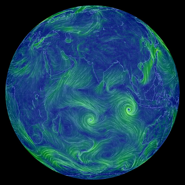
You’ve probably seen the cool wind map of the US, but there’s one for the whole Earth now. (via df)
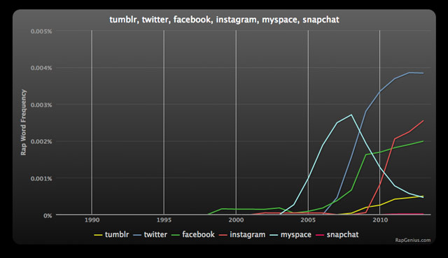
From Rap Genius, a chart showing mentions in rap songs of popular social sites and apps like Twitter and Instagram:
Compare with the graph for the same terms from Google News:
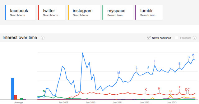
And here’s the graph for general search terms. (I excluded Snapchat from the Google graphs because Google wouldn’t allow 6 search terms at a time…it barely showed up in either case.) Twitter rules the rap roost, but Facebook demolishes everyone in general and news search traffic.
Stay Connected