Bill Murray’s Face Inserted Into Famous Paintings
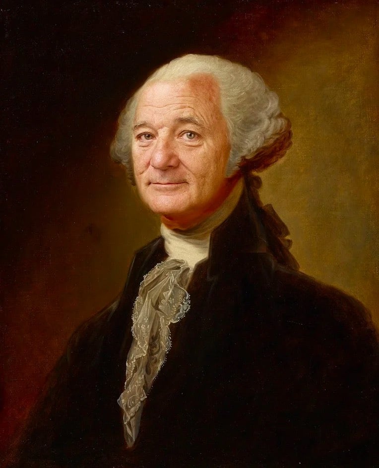

These photoshopped images of Bill Murray by Eddy Torigoe are silly and perfect. The George Washington and American Gothic are uncanny; the Napoleon one is quite good too. (via moss & fog)
This site is made possible by member support. 💞
Big thanks to Arcustech for hosting the site and offering amazing tech support.
When you buy through links on kottke.org, I may earn an affiliate commission. Thanks for supporting the site!
kottke.org. home of fine hypertext products since 1998.
These photoshopped images of Bill Murray by Eddy Torigoe are silly and perfect. The George Washington and American Gothic are uncanny; the Napoleon one is quite good too. (via moss & fog)
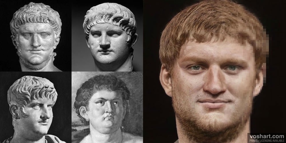
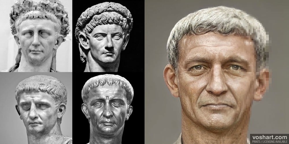
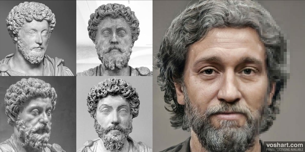
For his Roman Emperor Project, Daniel Voshart (whose day job includes making VR sets for Star Trek: Discovery) used a neural-net tool and images of 800 sculptures to create photorealistic portraits of every Roman emperor from 27 BCE to 285 ACE. From the introduction to the project:
Artistic interpretations are, by their nature, more art than science but I’ve made an effort to cross-reference their appearance (hair, eyes, ethnicity etc.) to historical texts and coinage. I’ve striven to age them according to the year of death — their appearance prior to any major illness.
My goal was not to romanticize emperors or make them seem heroic. In choosing bust / sculptures, my approach was to favor the bust that was made when the emperor was alive. Otherwise, I favored the bust made with the greatest craftsmanship and where the emperor was stereotypically uglier — my pet theory being that artists were likely trying to flatter their subjects.
Some emperors (latter dynasties, short reigns) did not have surviving busts. For this, I researched multiple coin depictions, family tree and birthplaces. Sometimes I created my own composites.
You can buy a print featuring the likenesses of all 54 emperors on Etsy.
See also Hand-Sculpted Archaeological Reconstructions of Ancient Faces and The Myth of Whiteness in Classical Sculpture.
The British Museum contains hundreds of contested items, the spoils of the British Empire’s reach (and smash n’ grab) across the globe. Some of the museum’s most popular and prized items are included: the Parthenon Marbles, the Rosetta Stone, and the Benin Bronzes. The countries from which these artifacts were taken are increasingly asking for their return.
Some of the world’s greatest cultural and historical treasures are housed in London’s British Museum, and a significant number of them were taken during Britain’s centuries-long imperial rule. In recent years, many of the countries missing their cultural heritage have been asking for some of these items back.
Benin City in Nigeria is one of those places. They’ve been calling for the return of the Benin Bronzes, hundreds of artifacts looted in 1897 when British soldiers embarked a punitive expedition to Benin. Many are now housed in the British Museum.
And it’s just the beginning. As the world reckons with the damage inflicted during Europe’s colonial global takeover, the calls for these items to be returned are getting louder and louder.
See also this piece from the NY Times: This Art Was Looted 123 Years Ago. Will It Ever Be Returned?


I love this zoomable interactive display of British & Exotic Mineralogy. To create it, Nicholas Rougeux collected 718 hand-drawn mineral illustrations by James Sowerby sourced from a pair of multi-volume books called British Mineralogy and Exotic Mineralogy, published between 1802 and 1817. Then he arranged them according to hue and brightness in a collage worthy of Knoll.
British Mineralogy and Exotic Mineralogy comprise 718 illustrations by James Sowerby in an effort to illustrate the topographical mineralogy of Great Britain and minerals not then known to it. Sowerby’s plates are some of the finest examples of hand-drawn mineral illustrations ever created. The detail and care with which these illustrations were created is incredible and worthy of close examination. See the samples below.
And, oh boy, he’s selling posters of it too.
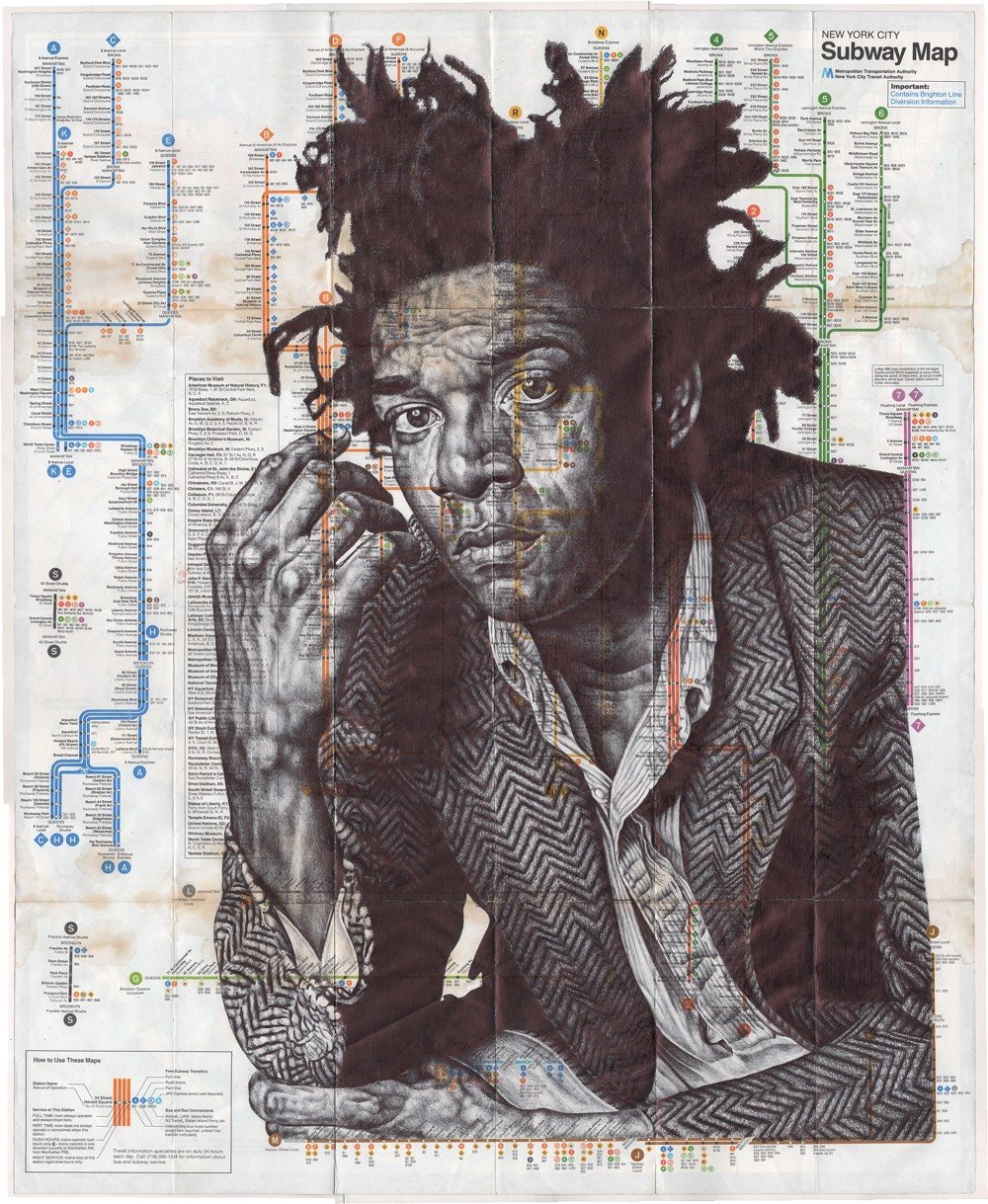
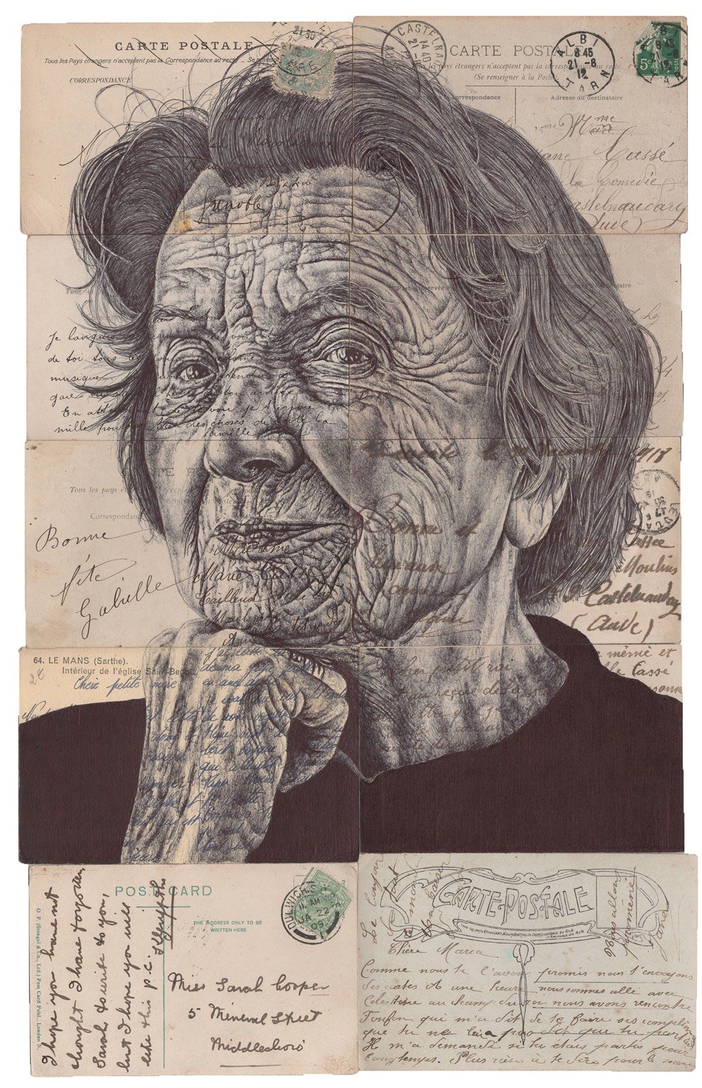
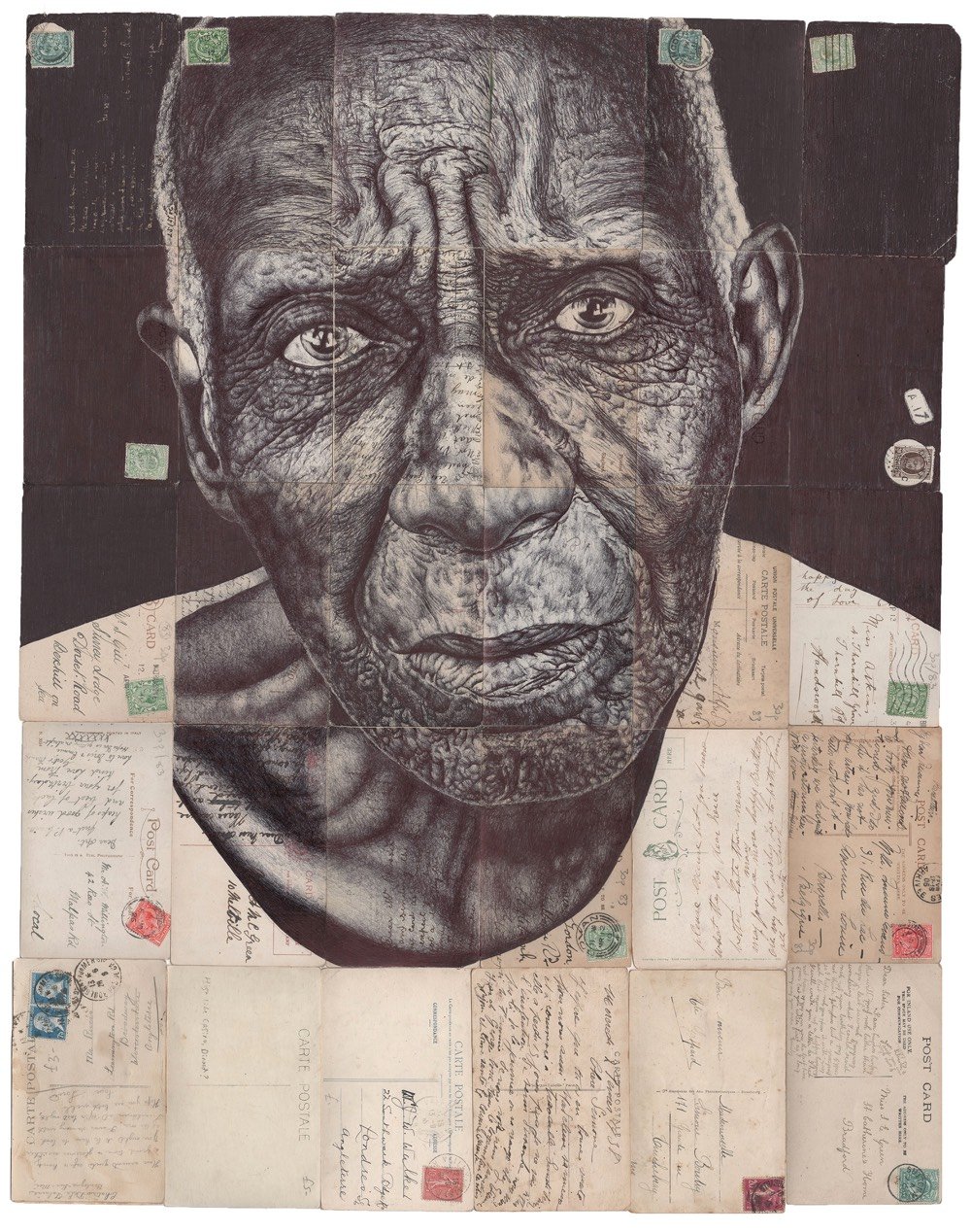
Artist Mark Powell draws portraits on repurposed canvases (old maps, newspapers, ads, postcards) with a ballpoint pen. I could have sworn I’d featured Powell’s work before, but I was probably thinking of the work of Ed Fairburn or Matthew Cusick.
The best way to check out Powell’s work is on Behance or on his website (where he has prints and originals for sale). (via colossal)
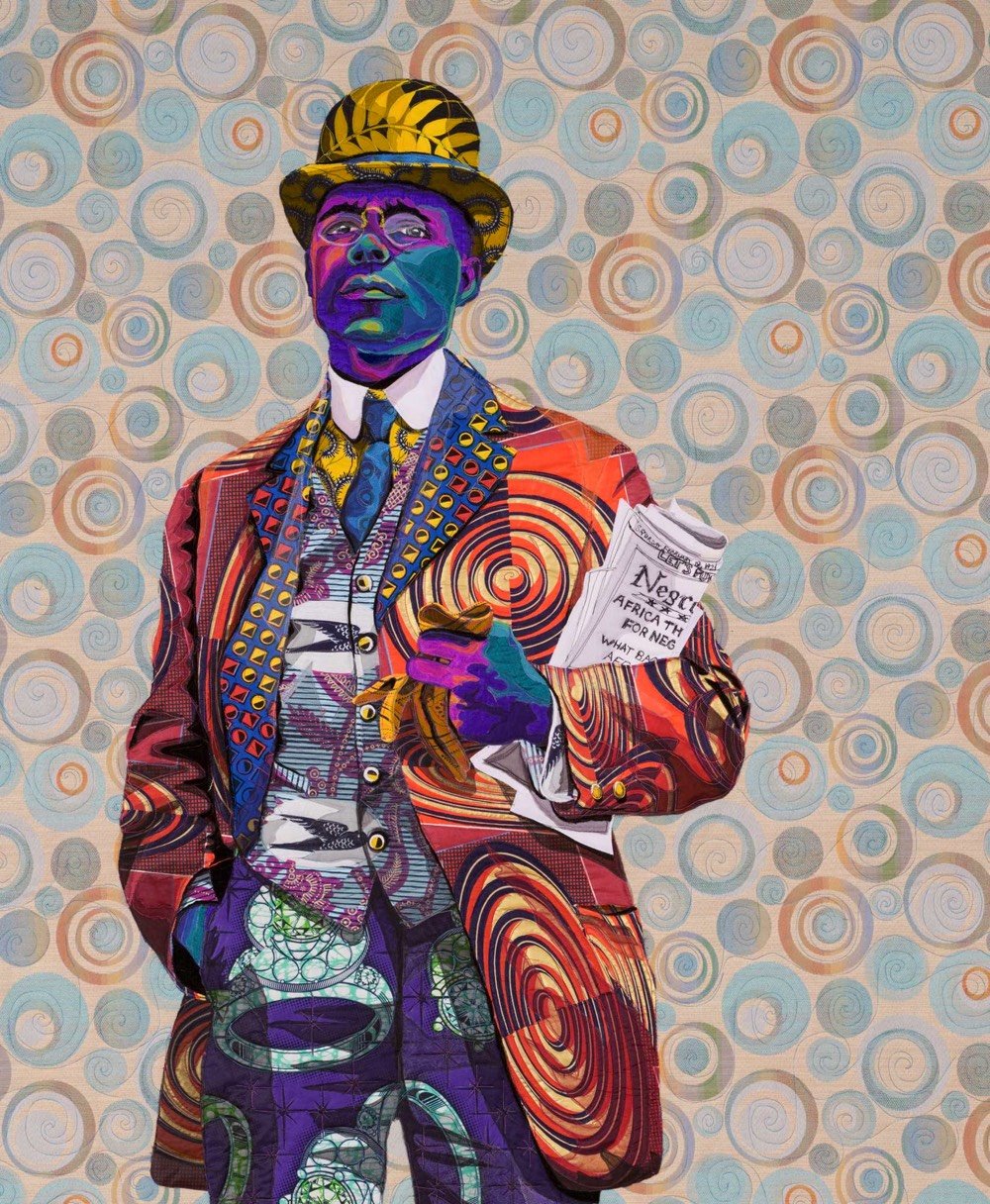
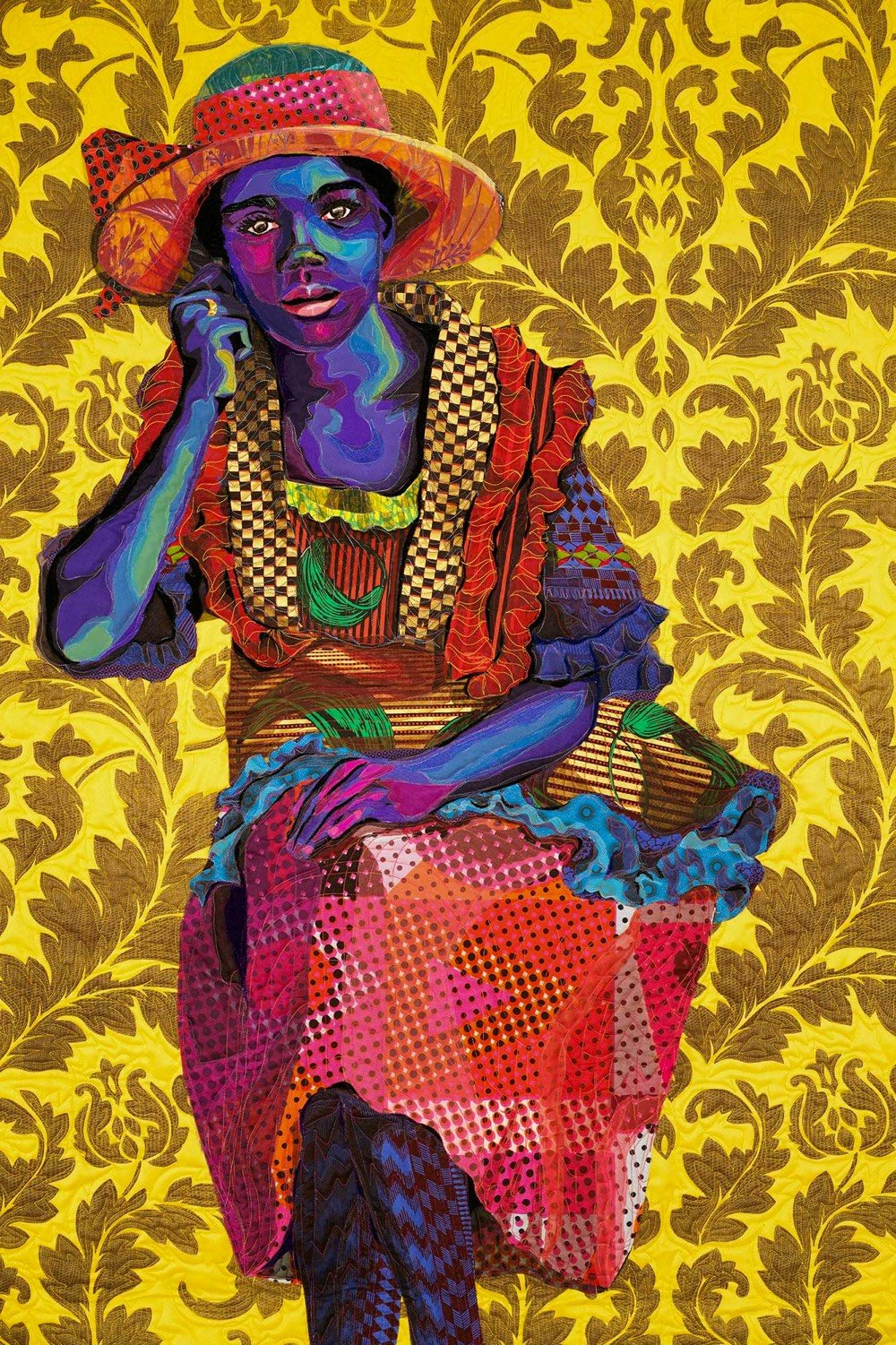
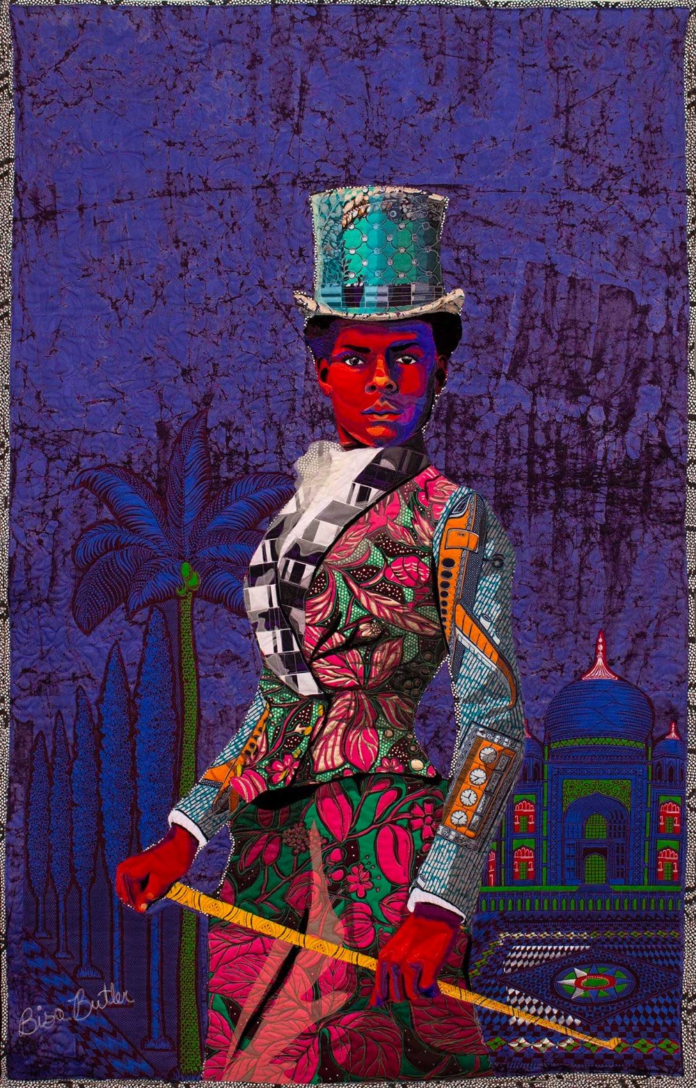
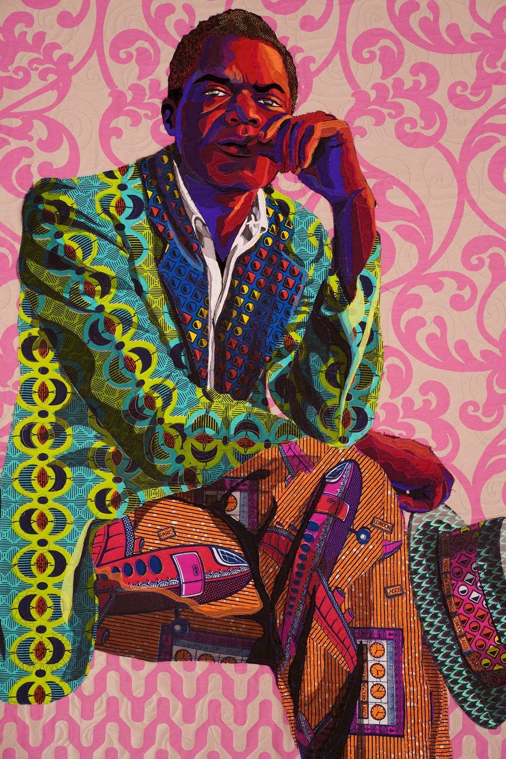
Using colorful African textiles, Bisa Butler makes large quilted portraits of Black Americans. From a statement on her gallery’s website:
In my work, I am telling the story — this African American side — of the American life. History is the story of men and women, but the narrative is controlled by those who hold the pen.
My community has been marginalized for hundreds of years. While we have been right beside our white counterparts experiencing and creating history, our contributions and perspectives have been ignored, unrecorded, and lost. It is only a few years ago that it was acknowledged that the White House was built by slaves. Right there in the seat of power of our country African Americans were creating and contributing while their names were lost to history.
In this short video, you can see how Butler creates her portraits. Look at the amazing sewing machine she uses — it’s got a steering wheel!
You can see more of her work on Instagram and in person at the Katonah Museum of Art in New York through Oct 4, 2020 and at the Art Institute of Chicago starting in November.
Update: I swapped out the previous video embedded above for a longer one that includes sound and an interview w/ Butler. (via @10engines)
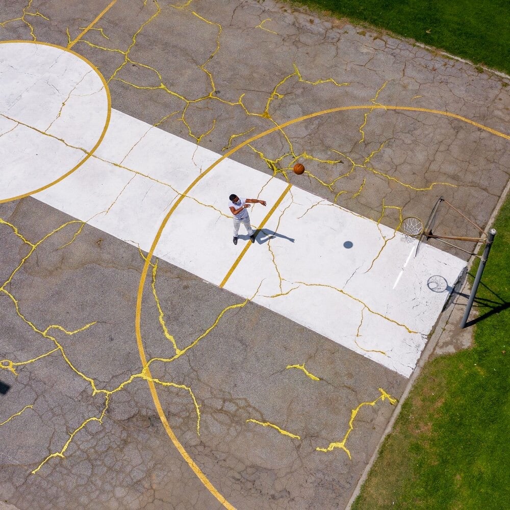
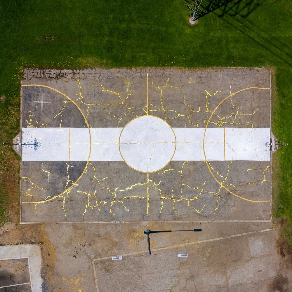
As part of his Literally Balling project, artist Victor Solomon fixed up a rundown basketball court, repairing the blacktop using the Japanese art of kintsugi. Traditionally, the kintsugi method involves repairing pottery with glue mixed with gold powder, which results in visible cracks, a reminder of the pottery’s past and what it’s been through. Says Solomon of the project:
With the heartbreaking beginning to 2020 and this weekend’s return of basketball — I’ve been thinking about the parallels between sport as a uniting platform to inspire healing and my ongoing experiments with the technique of Kintsugi that embellishes an objects repair with gold to celebrate it’s healing as formative part of the journey.
(via the kid should see this)
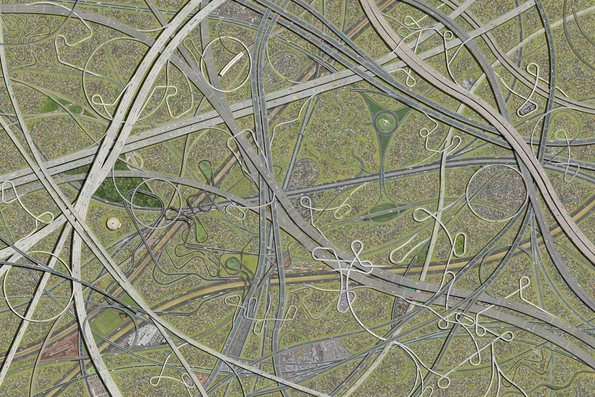
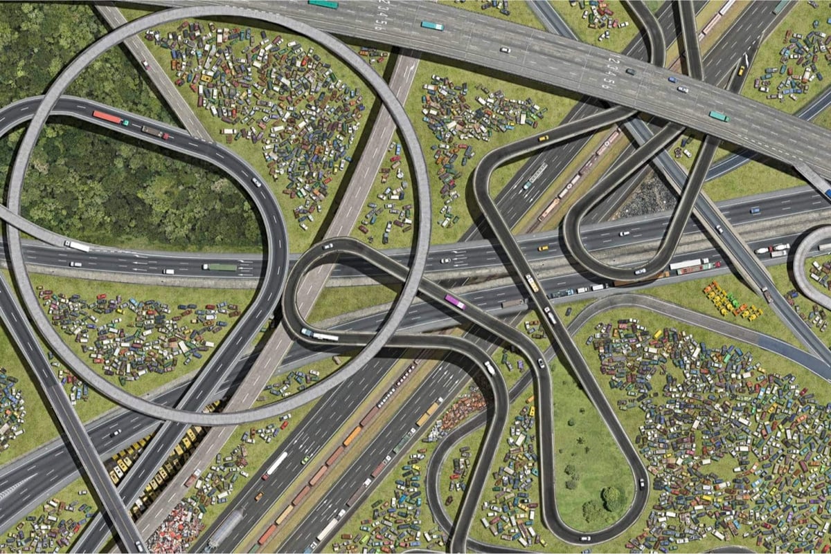
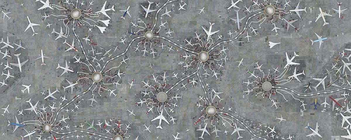
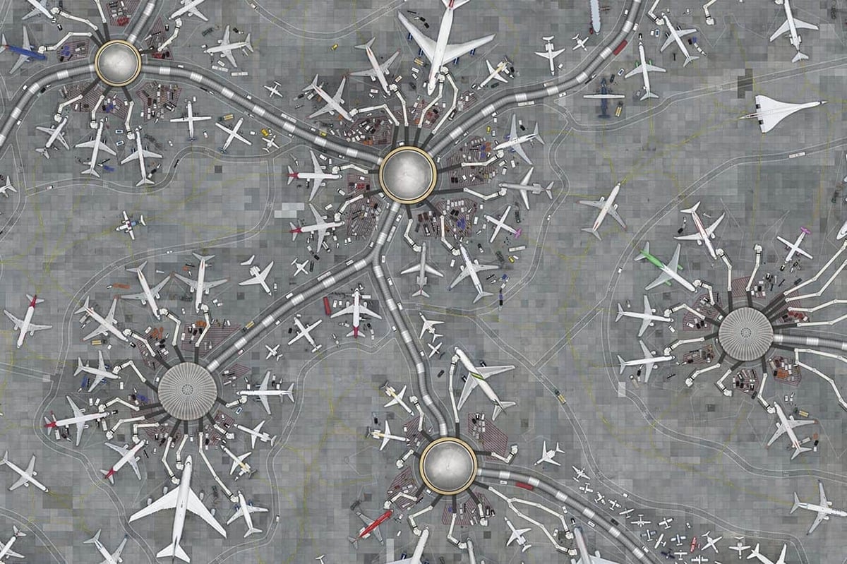
For his Collectives series, Cássio Vasconcellos takes crowded urban scenes and stitches them together to form fantastical patterns of human activity that look abstract from far away but detailed close up. These are great onscreen, but I’d love to see them in person someday. I could imagine looking at the highways one for hours, zooming in and out on all the details.
See also Sporting Events Compressed into Single Composite Photos. (via print)
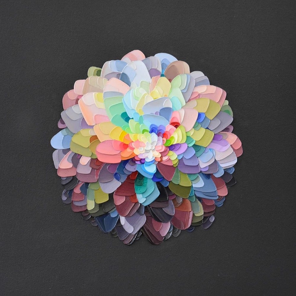
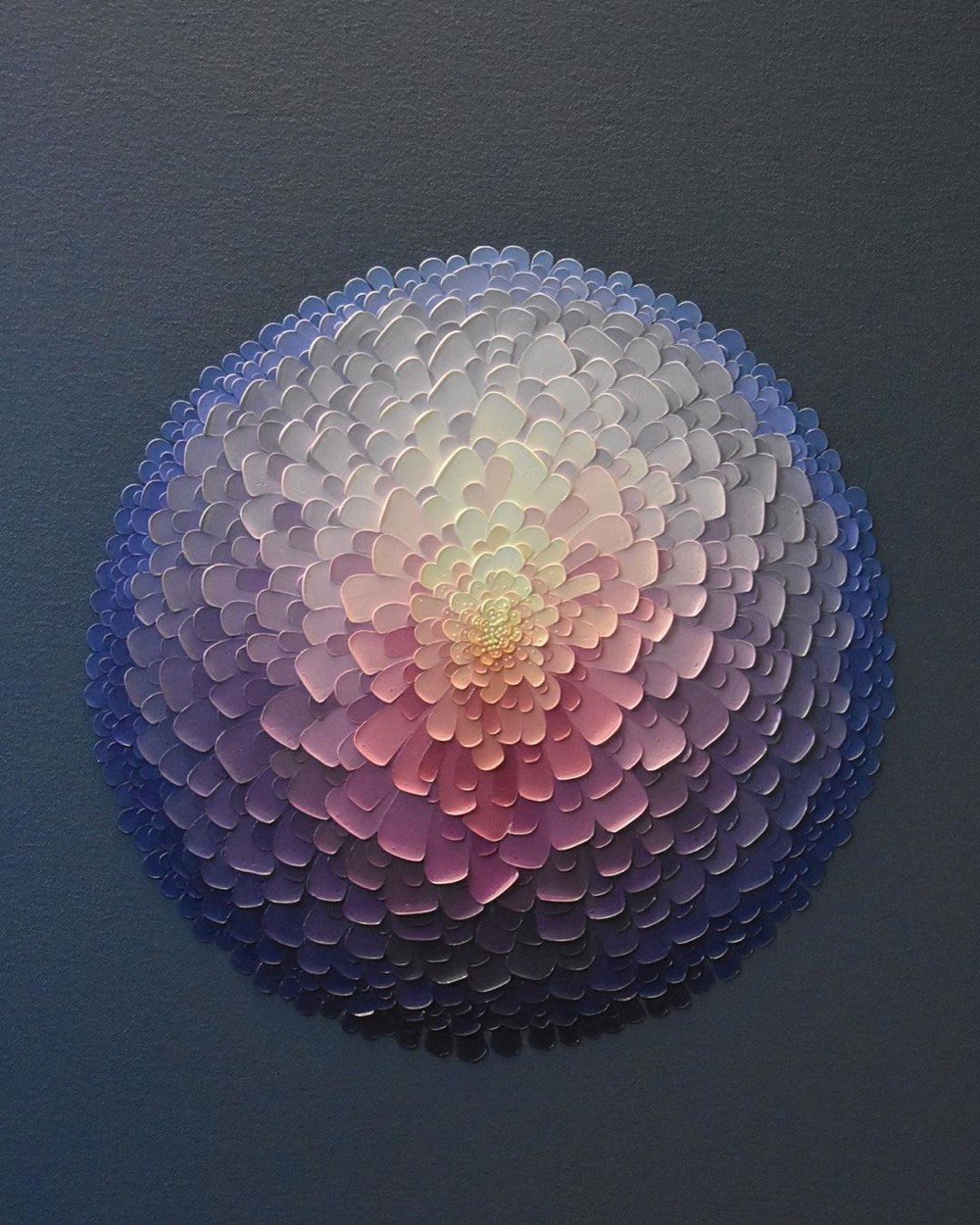
I quite like this work by New Zealand artist Joshua Davison, who uses a palette knife to build these sculptural paintings of flowers. Mmmm, gradients. (via colossal)

As part of their NYC Dance Project and in partnership with Harper’s Bazaar, photographers Ken Browar and Deborah Ory photographed Misty Copeland, a principal dancer with the prestigious American Ballet Theatre, recreating scenes from the works of French artist Edgar Degas. Above, Copeland poses as the subject of Degas’ La Petite Danseuse de Quatorze Ans (Little Dancer of Fourteen Years) dressed in a $9000 Alexander McQueen dress & corset.
The Harper’s piece vaguely hints at his representation of the ballerinas being “far from sympathetic” but as Julia Fiore wrote in The Sordid Truth behind Degas’s Ballet Dancers, the reality of the Parisian ballet that he was depicting was unsettling.
The formerly upright ballet had taken on the role of unseemly cabaret; in Paris, its success was almost entirely predicated on lecherous social contracts. Sex work was a part of a ballerina’s reality, and the city’s grand opera house, the Palais Garnier, was designed with this in mind. A luxuriously appointed room located behind the stage, called the foyer de la danse, was a place where the dancers would warm up before performances. But it also served as a kind of men’s club, where abonnés — wealthy male subscribers to the opera — could conduct business, socialize, and proposition the ballerinas.
Degas himself did not partake in this scene; he was a misogynist celibate, a Belle Époque incel if you will:
For Degas, the fact that young dancers had sex with old men read not as abuse on the part of the latter but as sin on the part of the former. He assumed girls’ transactions with powerful men meant they could pull strings from behind the scenes, a thought that elicited both horror and fascination. Degas clearly saw something vital in his recurring subjects, who spurred quotes from him like, “I have locked away my heart in a pink satin slipper.”
Degas’ disdain for women — and ballerinas in particular — is writ across “Little Dancer” itself, whose sculptural features were altered to emphasize van Goethem’s moral degeneracy. Degas subscribed to physiognomy, which presumes that criminal behaviors are passed on genetically and thus manifest in physical features. And so he flattened van Goethem’s skull and stretched her chin so she appeared especially “primitive,” a visual reflection of an internal state.
The subject of La Petite Danseuse de Quatorze Ans, Marie van Goethem, did not remain a ballerina for that long after posing for the sculpture:
Marie van Goethem was the “petit rat” who posed for the sculpture, and she likely engaged in the sexually predatory economy of the ballet world to survive. Van Goethem disappeared from the public eye shortly after the sculpture was completed; after being late to a rehearsal, the Paris Opera Ballet dismissed her. The teenager probably returned home to follow in the footsteps of her mother — a laundress and likely prostitute — and older sister, who was also a sex worker.
I wonder if the photographers were aware of this context when taking these photos? Is there something about the photos, about Copeland’s life story or status as a prominent Black ballerina, or about dressing her in thousands of dollars of contemporary couture that subverts Degas’ work and its themes? If so, I’d be fascinated to read an expert analysis that explored these issues. (via cup of jo)
Artist Seamus Wray is painting a series of self-portraits of himself painting previous self-portraits, Inception-style. Here’s the first painting:

And then the most recent one (cats are increasingly involved):

You can see the full progression so far on his Instagram. The influence of MC Escher is obvious here, but the two things that sprung to mind more immediately for me were Annie Wong’s “time-tunnel artwork” (she takes periodic photographs of her and her son with the previous photograph in the background) and Macaulay Culkin wearing a t-shirt of Ryan Gosling wearing a t-shirt of Macaulay Culkin. Oh, and the Droste effect.
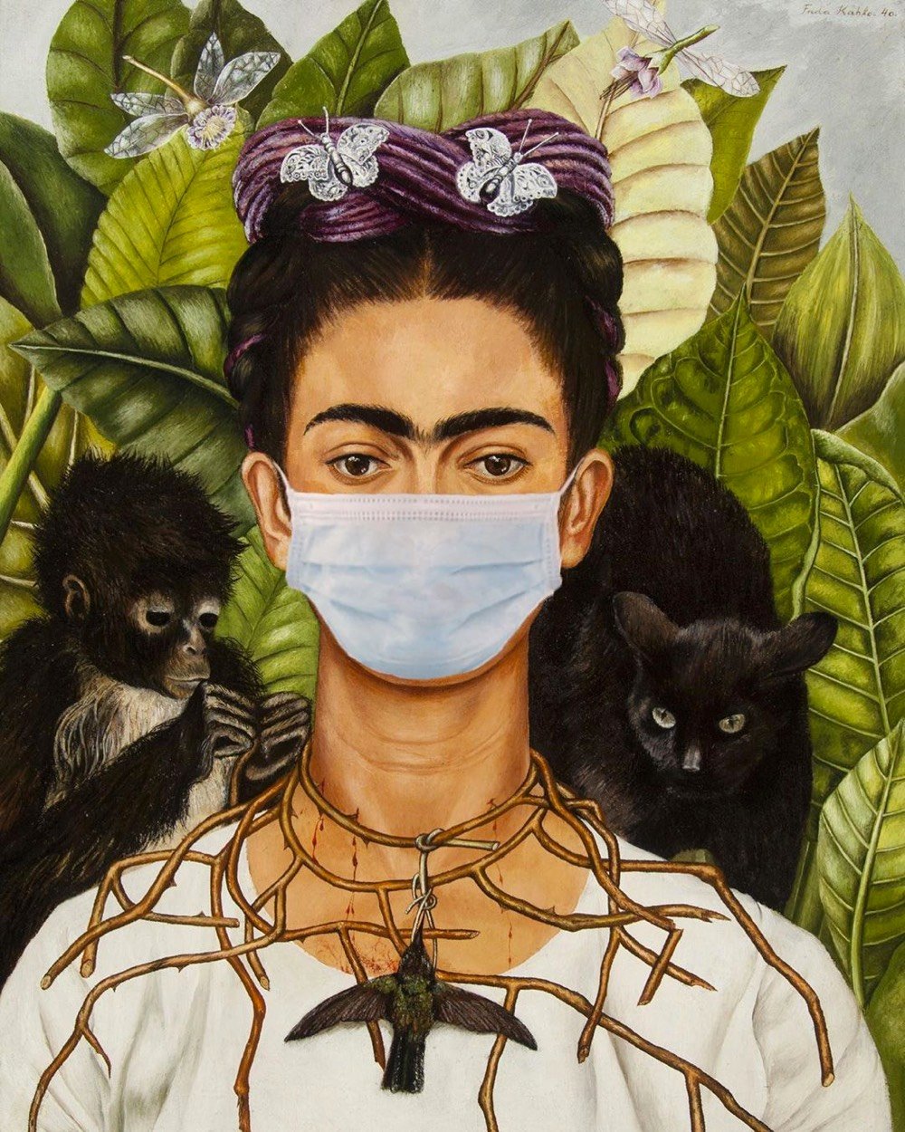
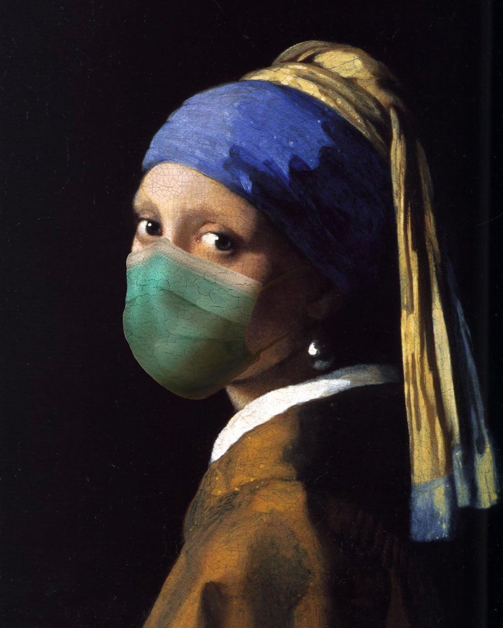
On an Instagram account called Plague History, artist Genevieve Blais has been modifying the subjects of artworks to give them face masks. You know I couldn’t resist including her rendition of Vermeer’s Girl with a Pearl Earring.
See also Iconic Art & Design Reimagined for the Social Distancing Era, Famous Art Recreated at Home During the Pandemic, and Jesus Christ, Just Wear a Face Mask! (via moss & fog)
After producing over 220 art history videos in 6 years, YouTube channel The Art Assignment is going to take an extended break to “reassess what educational art content should look like in 2020 and beyond”. In the video above, creator Sarah Urist Green reflects on her experience so far and what’s happening next. I’m always interested in what people have to say about their projects at inflection points like this, but I was blindsided by the almost total resonance of Green’s remarks with my own thoughts about the advantages & limitations of how I’ve chosen to work here at kottke.org. Here’s an extended quote from the transcript of the particularly resonant bit:
I don’t actually enjoy being on camera, but individual authentic voices have always been at the core of what makes YouTube great. And I’ve been glad to be able to lend my own voice in the hopes of making art and art history more accessible.
Over time I’ve learned to appreciate the specificity of my own point of view — but also its limitations. I’m a person who’s more interested in art from the 1960s than the 1560s. I have a deeper background in art from North America than South America.
Making this channel has been a hugely rewarding way to stretch beyond my formal education and natural inclinations. But any channel on YouTube, and indeed any experience, is shaped by bias and perspective — both the content itself and the way that each of us interprets and responds to it. The fact that my voice sounds grating to some and comforting to others is a reminder of that.
I’ve also learned that these biases are often reinforced by the recommendation algorithms that govern the platforms we frequent. Whether we want to or not, we citizens of the internet work in collaboration with these algorithms to curate information feeds for ourselves. And even if our feeds feel objective, they never are.
The Art Assignment isn’t, and has never been, the history of art or an introduction to the art world. It’s always been my history of art and a glimpse into my art world. I hope that’s been part of what makes it good, but it’s also part of what makes it limited, subjective, and necessarily incomplete.
The more videos we make, the more aware I am of the vast amount we haven’t covered. Trying to make content on this platform that is both educational and also clickable can be a challenging task with many pitfalls.
We’ve used what I think of as a buckshot technique — making a huge variety of kinds and formats of episodes to see what might possibly stick.
In doing so, we’ve discovered that more people click on names of art movements they’ve already heard of, artworks they’ve seen before, and already famous artists (mostly male).
More people watch when I do a hot take about those rare moments when art hits the wider news, like a Banksy stunt or a banana duct-taped to a wall.
I’ve also learned what YouTube viewers are less likely to click on, which is artists they’ve never heard of, artworks they haven’t seen before, and topics that don’t court controversy or outrage. This says something about the YouTube algorithm, but it also says something about what kinds of information we’re all drawn to online. Who wants to watch an educational video when you can watch The Try Guys eat 400 dumplings? (Seriously, I just watched it, it’s great.)
But because I know what tends to get clicked on more and watched for longer stretches, I’ve been more likely to try to serve that to you. Not all the time of course, but even when served in moderation that’s not really good for art history. It reinforces dominant narratives and offers up the same boring old menu of famous artists again and again.
However, I’ve also learned that you all are willing to dive down lesser-known and unexpected rabbit holes of research and bear with me as I simultaneously cook poorly and attempt to understand the eating and cooking lives of artists. You’ve taught me you’re willing to reconsider art and artists you didn’t think you liked, and you’ve tried approaches to art that are far outside of your comfort zones and made beautiful and vulnerable work in response. You’ve tackled really difficult questions with me and been willing to linger in grey zones and leave questions unanswered. I mean we’ve never even established a definition of art on this channel.
Because of your capacity for the abstract and lesser-known, we’ve been able to keep going all these years. And, with the incomparable backing of PBS, we’ve been able to make content not just for the most people, but for an open-minded and discerning audience like you.
I can’t adequately relate to you how unnerving it was for me to hear her say all that — change a few specific references and I very easily could have written it (but not as well). Doing kottke.org is this constant battle with myself: staying in my comfort zone vs. finding opportunities for growth, posting what I like or find interesting vs. attempting to suss out what “the reader” might want, celebrating the popular vs. highlighting the obscure, balancing the desire to define what it is I do here vs. appreciating that no one really knows (myself included), posting clickable things vs. important things I know will be unpopular, protecting myself against criticism vs. accepting it as a gift, deciding when to provoke & challenge vs. when to comfort & entertain, feeling like this is frivolous vs. knowing this site is important to me & others, being right vs. accepting I’ll make mistakes, and saying something vs. letting the content and its creators speak for themselves.
I know that all sounds super dramatic — I don’t intensely feel all of that when I’m working, but that video made me reflect on it hard. And I suspect that many people who do creative work in public struggle in similar ways. Like Green with respect to PBS, I am grateful to kottke.org’s members (“an open-minded and discerning audience” if there ever was one) for their support of my work and trust in the limited & imperfect human who does it.

Felicia Chiao’s illustrations depicting isolation, dissociation, and loneliness have taken on an added resonance during the pandemic. In a caption for one of her illustrations, she explains where the drawings come from:
I dissociate a lot. I like to think of my brain as a series of rooms. On good days I’m up front engaging with the world, and on bad days I’m waaay in the back. I can still kind of see and hear what’s going on outside but it’s far away and I don’t feel a part of it. It’s not unpleasant but time moves weird and I feel everything and nothing. A lot of you are connecting with my work because you’re literally stuck inside and probably a little depressed too so…Welcome to my rooms! Please take your shoes off and be nice.
Prints (and more) of Chiao’s work are available. (via colossal)
In this meditative short film, Etsuro Sotoo talks about what made him want to spend 41 years working as a sculptor in an attempt to finish Antoni Gaudí’s Sagrada Família basilica in Barcelona. From a website dedicated to Sotoo:
In 1978 Etsuro Sotoo arrived in Barcelona. He had just graduated in Fine Arts, he had just one year of experience as an Art teacher. When impressed by the unfinished temple: “It was the most fabulous pile of stones I had ever seen” …He asked for a job as a stonecutter. He wanted to continue the Nativity façade (the only façade that, thanks to his work, would be declared by Unesco World Heritage). He did a test and they gave him the position. Since then, he has completed what Gaudí did not even have time to think about. When he finished with the gaps, he started with the architect’s notes. When the tracks are over, it’s up to him to make decisions.
According to the video, Sotoo even converted to Catholicism as a way for him “to know Gaudí”. (via craig mod)
In 1995, after his massively popular single-panel cartoon The Far Side had run daily in newspapers for 15 years, cartoonist Gary Larson retired at the top of his game and scarcely a peep has been heard from him since. Until recently. Back in September, Larson launched a website for The Far Side with a daily archival cartoon. But then yesterday, Larson revealed that he’s been working on some new stuff with “a digital tablet” (likely an iPad).
The “New Stuff” that you’ll see here is the result of my journey into the world of digital art. Believe me, this has been a bit of a learning curve for me. I hail from a world of pen and ink, and suddenly I was feeling like I was sitting at the controls of a 747. (True, I don’t get out much.) But as overwhelmed as I was, there was still something familiar there — a sense of adventure. That had always been at the core of what I enjoyed most when I was drawing The Far Side, that sense of exploring, reaching for something, taking some risks, sometimes hitting a home run and sometimes coming up with “Cow tools.” (Let’s not get into that.) But as a jazz teacher once said to me about improvisation, “You want to try and take people somewhere where they might not have been before.” I think that my approach to cartooning was similar — I’m just not sure if even I knew where I was going. But I was having fun.
There are only three new pieces so far, but I’d guess more are on the way. The new stuff is more painterly and definitely has that drawn-in-Procreate feel to it, but the Larson’s trademark humor is very much in evidence.
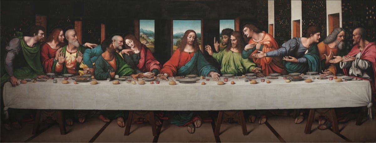
The Royal Academy of Arts and Google teamed up on a high-resolution scan of a copy of Leonardo da Vinci’s The Last Supper painted by his students. Even though the top part of the original is not depicted, this copy is said to be “the most accurate record of the original” and since the actual mural by Leonardo is in poor shape, this copy is perhaps the best way to see what Leonardo intended.
This version was made around the same time as Leonardo made his original. It’s oil paint on canvas, whereas Leonardo’s was painted in tempera and oil on a dry wall — an unusual use of materials — so his has flaked and deteriorated badly. It probably didn’t help that Napoleon used the room where the original hung as a stable during his invasion of Milan.
A zoomable version is available here. The resolution on this scan is incredible. The painting is more than 26 feet wide and this is the detail you can see on Jesus’ downcast right eye:
Wow. You can compare this painting to a high-resolution image of the original on the Haltadefinizione Image Bank or Wikimedia Commons. And you can learn more about the copy and how it relates to the original on the Royal Academy website.
The genius of Leonardo’s composition is much clearer in the RA copy. The apostles are arranged into four groups of three and there are many subtle interactions between the figures. Leonardo believed that gestures were very important in telling the story. He explained that the power of his compositions were such that “your tongue will be paralysed with thirst and your body with sleep and hunger before you depict with words what the painter shows in a moment”.
There are many elements in the copy which are more distinct that the original, such as the figure of Judas clutching his money bag and knocking over the salt. The landscape beyond the windows with its valleys, lakes and paths is well preserved in the copy, but has almost disappeared in the original. Leonardo’s use of colour was was greatly admired, but in the original the colours are very faded — Saint Simon on the extreme right clearly wears a pink cloak, but this is not visible in the original.
(via open culture)
For her series Counternarratives, artist and media critic Alexandra Bell takes newspaper articles and layouts from the NY Times that demonstrate racial bias and fixes them. For example, Bell took the notorious double profile of Michael Brown and his killer Darren Wilson and placed the focus entirely on Brown:

In this video, Bell explains her process:
I think everything is about race. Black communities, gay communities, immigrant communities feel a lot of media representations to be inadequate, biased. There’s a lot of reporting around police violence and black men, and I realized a lot of the arguments that we were having were about depictions. I started to wonder how different would it be if I swapped images or changed some of the text.
See also Kendra Pierre-Louis’ recent article for Nieman Lab: It’s time to change the way the media reports on protests. Here are some ideas.
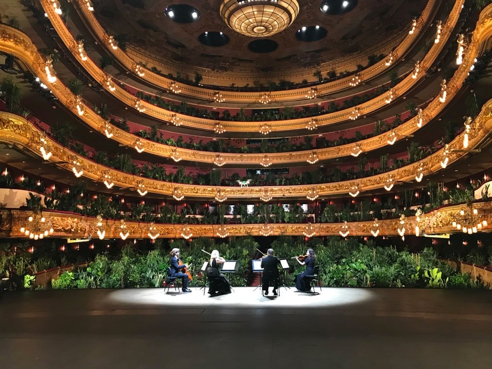
As promised last week, Barcelona’s Gran Teatre del Liceu reopened on Monday with a string quartet performance of Puccini’s Crisantemi played before a packed house of 2,292 plants. You can watch the performance here:
A strange & beautiful performance. I love that they did the “please silence your mobile phones and no pictures please” announcement before beginning.
The performance was the brainchild of artist Eugenio Ampudia, who wanted to “offer us a different perspective for our return to activity, a perspective that brings us closer to something as essential as our relationship with nature”. Afterwards, the plants were donated to healthcare workers who have been battling Covid-19 for the past few months.
In the second video in his Concatenation series (check out the first one), Donato Sansone edited a bunch of footage of Olympic divers, gymnasts, and track & field athletes together to make a single twisting, jumping, tucking, spinning routine that’s both seamless and completely disorienting. (via colossal)
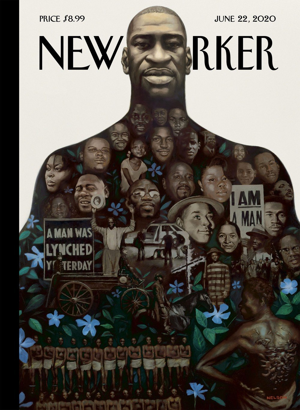
This week’s issue of the New Yorker features a cover designed by artist Kadir Nelson. The magazine has an interactive version of the cover online that identifies the people shown, along with their stories. Along with George Floyd, there’s Tony McDade, Trayvon Martin, Freddie Gray, Sandra Bland, Breonna Taylor, Tamir Rice, Martin Luther King, Jr., Medgar Evers, Emmett Till, Rodney King, the victims of the Tulsa Race Massacre, and too many others. The cover also features periwinkles, which have been used to locate the often unmarked graves of slaves.
The Periwinkle Initiative derives its name from the flower that certain scholars believe was the most common wildflower brought to gravesites of enslaved Americans. This perennial flower has guided researchers to many abandoned burial grounds that would have otherwise gone undetected. The resilient Periwinkle is a perfect symbol to represent the endurance of enslaved Americans and their legacy.
One other thing. According to the NYer, the name of the cover is “Say Their Names”. This is a take on the #SayHerName hashtag that was created to bring “awareness to the often invisible names and stories of Black women and girls who have been victimized by racist police violence”. Phrases and associated hashtags like “Say His Name” and “Say Their Names” have been used over the past few weeks, but some activists say that co-opting specifically takes the spotlight away from the victims the original hashtag was meant to highlight. Here’s Precious Fondren for Teen Vogue:
Since Floyd’s death, there have been uprisings around the country. There’s also been an influx of people using hashtags like #SayHisName and #SayTheirNames to remember the names of other male victims of police violence. While everyone deserves to be honored and remembered, especially when they are being murdered at the hands of those sworn to protect us, it should be noted that such hashtags muddle the very reasoning behind the creation of the #SayHerName.
Conceived in 2014 by the African American Policy Forum and the Center for Intersectionality and Social Policy Studies, the #SayHerName hashtag was meant to amplify the names and narratives of Black women and girls who have also been the victims of police killings; people simply couldn’t name them the way they can name Tamir Rice, Mike Brown, or Freddie Gray.
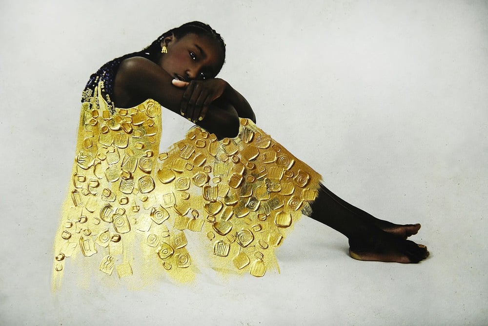
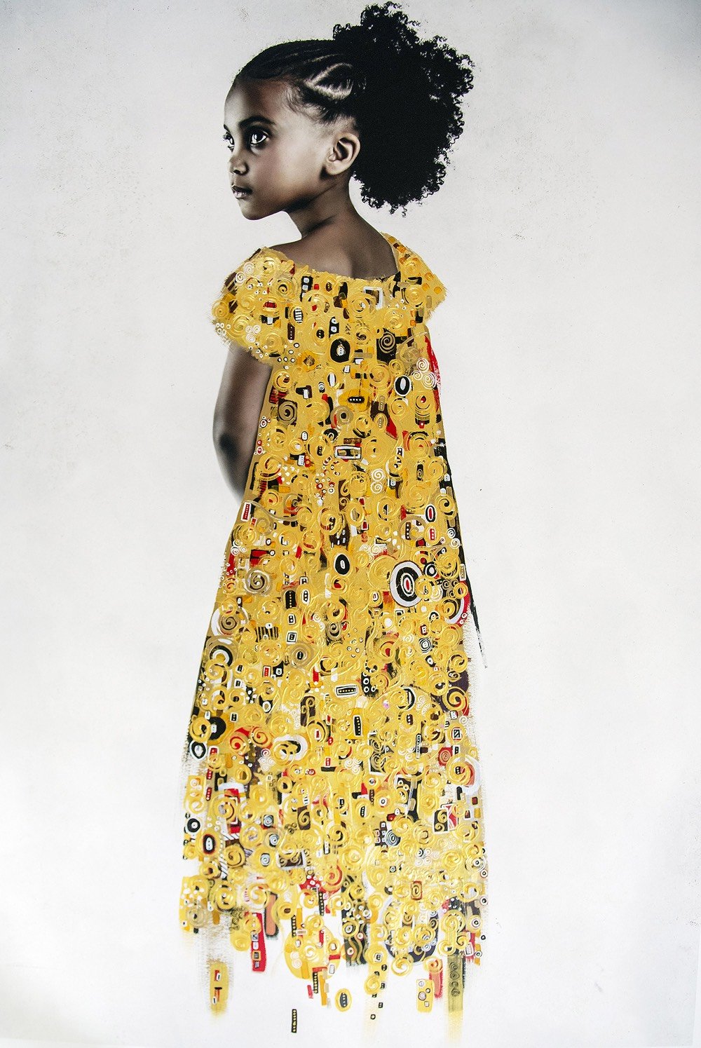
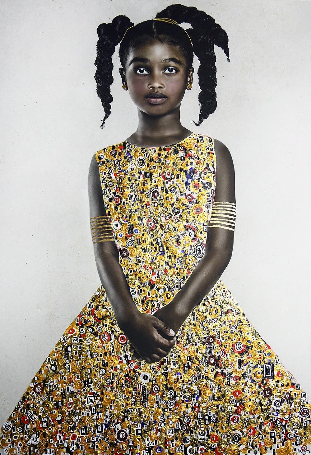
Directly inspired by the paintings of Gustav Klimt’s Golden Phase, the intention of Tawny Chatmon’s project The Redemption is to “celebrate and reinforce the beauty of Black hair, features, life, and culture”.
In the United States and abroad, the hair types and styles that are distinctively akin to Black people and culture continue to be policed and labeled as unkempt, unruly, unattractive, and unprofessional. While we proudly celebrate and adorn these styles with beads, barrettes and other accessories within our cultural norms, they continue to be labeled unacceptable. In schools worldwide, there are rules set in place deeming cornrows, barber designs, hair beads, afros, locs, and protective styles that use hair extensions as “violations of the dress code”. “Violations” that are punishable by ridicule, suspension, exclusion from extracurricular activities and expulsion. Still, in 2019, Black women and men are faced with similar discrimination in the workplace.
Great work — definitely click through to see the entire project. (via colossal)
Adrian Brandon’s Stolen is a series of portraits of Black people who have been killed by police officers. He colors each portrait in for as long as the person was alive: 1 minute of coloring for each year of their life. (From top to bottom: Breonna Taylor, Tamir Rice, and Michael Brown.)
Tamir Rice was 12 when he was murdered, so I colored his portrait for 12 minutes. As a person of color, I know that my future can be stolen from me if I’m driving with a broken taillight, or playing my music too loud, or reaching for my phone at the wrong time. So for each of these portraits I played with the harsh relationship between time and death. I want the viewer to see how much empty space is left in these lives, stories that will never be told, space that can never be filled. This emptiness represents holes in their families and our community, who will be forever stuck with the question, “who were they becoming?”
Brandon is revisiting this series on Instagram with portraits of George Floyd, Breonna Taylor, and others. Here’s a time lapse video of the creation of Taylor’s portrait.
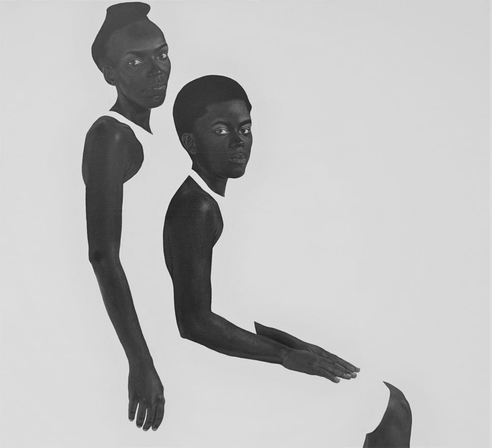
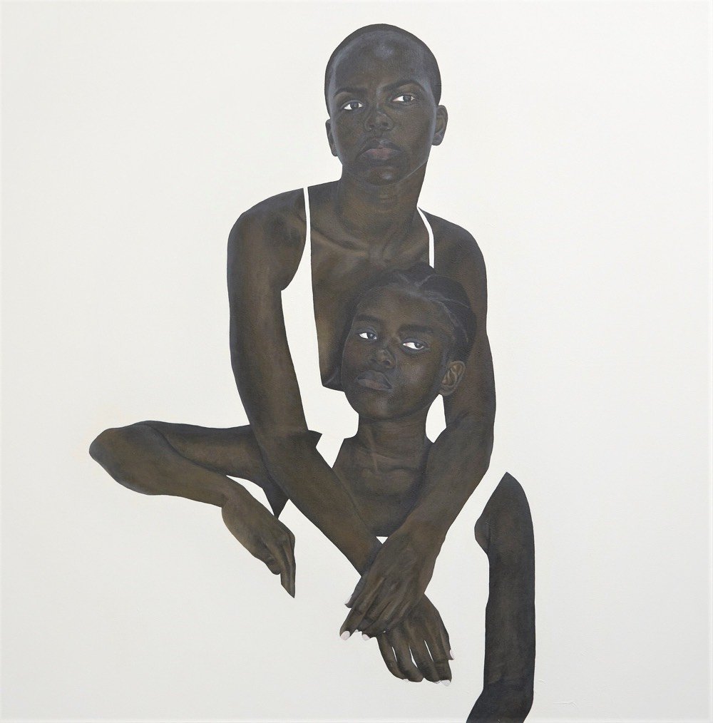
I love this work by self-taught Tanzanian artist Sungi Mlengeya. From an interview with the artist:
I stumbled into the minimalist space in one of the earliest paintings I made, and I remember how free I felt knowing that I could choose to paint or leave out anything I wanted, and that I could still be bold by being simple. Using negative space makes me focus more on my subjects, and the high contrast it creates makes it difficult not to pay attention to them.
You can follow Mlengeya’s work on Instagram and purchase her art through Afriart Gallery. (via claire salvo)
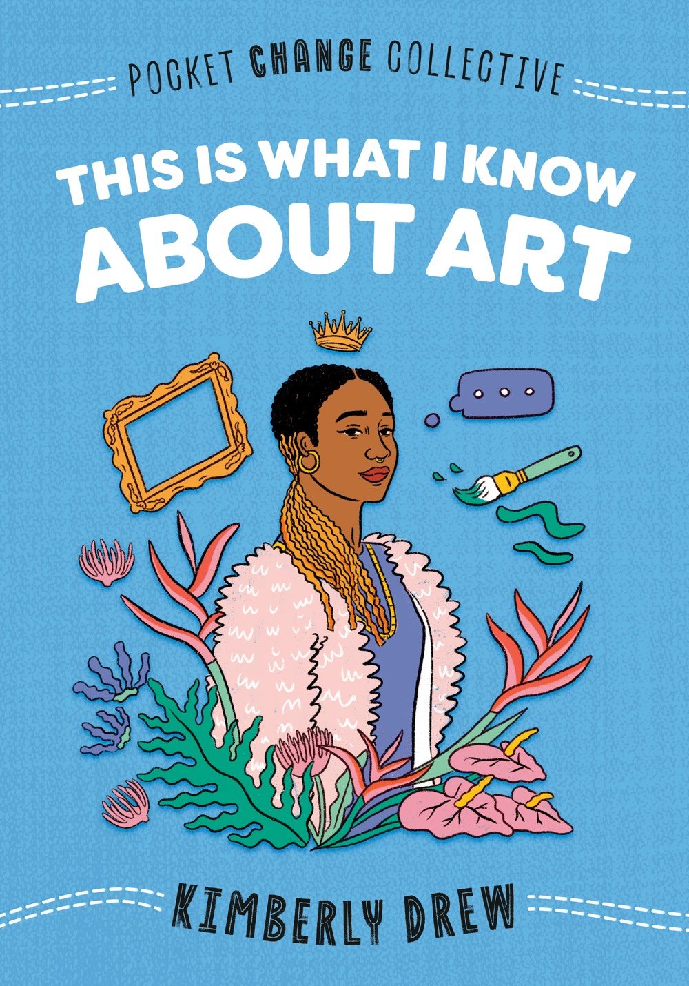
Author, curator, and activist Kimberly Drew has published This Is What I Know About Art, a book aimed at young adults about her experience studying art history in school and then working in the art world. In a piece for Teen Vogue, Drew outlined why she wrote the book.
For far too long, people across the globe have suffered due to the direct effects of colonialism, patriarchy, state violence, and so much more, but it is our art and creativity that have helped us to communicate our collective rage. Art has helped us build bridges intergenerational so that we do not feel alone — and so we can make sure that we do not forget our own history.
And from the introduction to the book:
I am not your typical art historian. I am not your typical activist. I am still learning what art and protest mean to me. And so, this book is more about my journey through art toward activism. This book is about discovery, confusion, and progress.
I love how she ties “discovery, confusion, and progress” together here — a powerfully messy combination for growth.

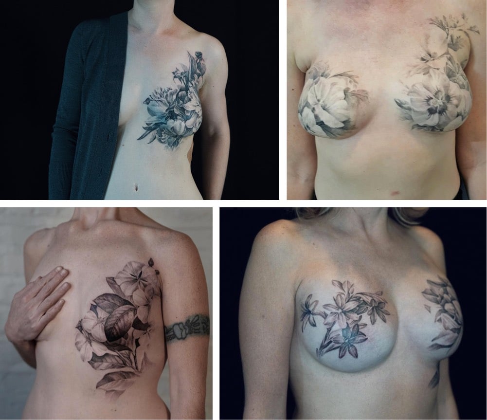
David Allen is a tattoo artist who does postmastectomy tattooing. He works with women who survive breast cancer to design and implement tattoos that cover scarring from mastectomies, transforming what might be seen as a destructive disfigurement into something creative and beautiful. Here’s Allen writing for The Journal of the American Medical Association (abstract):
I am a tattoo artist who works with women after they’ve had mastectomies to transform their sense of disfigurement and loss of control into feelings of beauty and agency. On a good day, I can heal with my art.
The women with breast cancer with whom I work share a feeling that they’ve been acted upon — by cancer, the health industrial complex and its agents, the sequelae of their treatments. Their physical and psychological points of reference are destabilized, having changed so quickly. A successful tattooing experience establishes a new point of reference, a marker that’s intimately theirs that replaces their sense of rupture and damage with an act of creation and, in my work, images of natural life.
Allen even does “solidarity tattoos” for his clients’ partners and friends. You can see more of his postmastectomy work on Instagram.

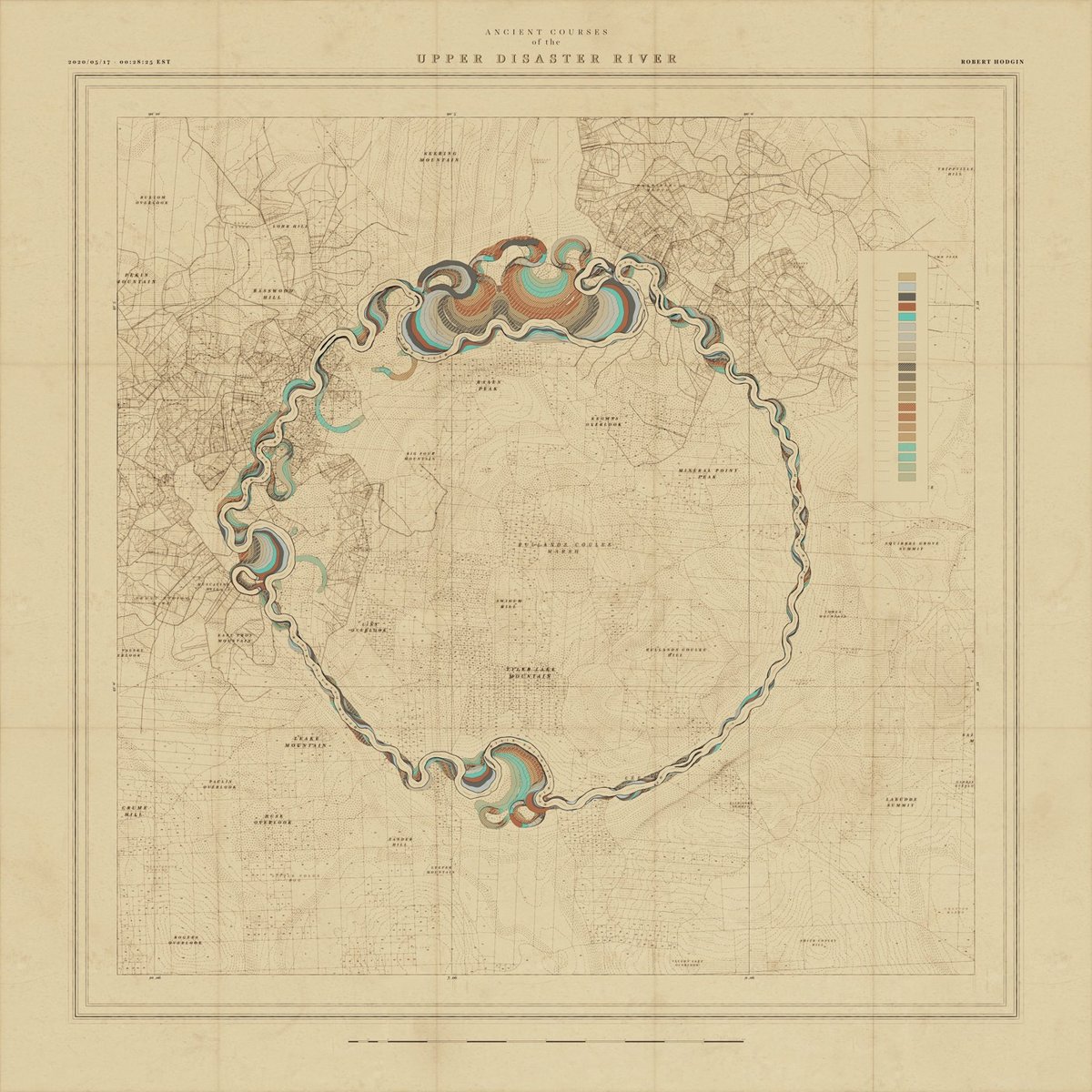
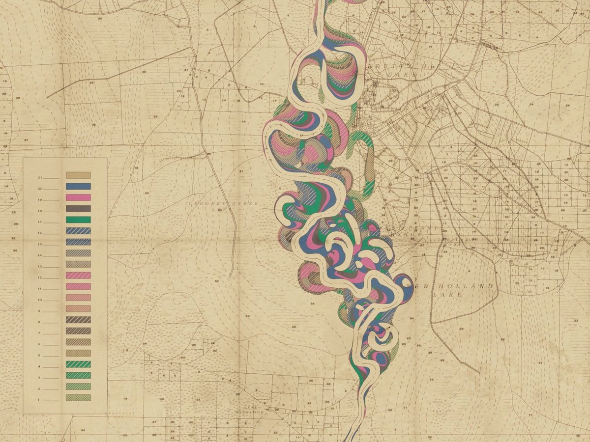
I have written previously about cartographer Harold Fisk’s wonderful meander maps of the Mississippi River produced for the Army Corps of Engineers. Borrowing the aesthetic of these maps, interactive artist & engineer Robert Hodgin wrote some software called Meander to generate meander maps for fictional rivers.
From an input curve, the terrain, land plots, side roads, highways, marsh land and mountain peaks are generated and prominent features are named. The map is then weathered and rendered in the style of old US Army Corp of Engineers maps from the 1930s and 40s.
You can check some of the generated maps out on Twitter or on Instagram, including some prototypes and animations (this one is my favorite). Hodgin has promised a full write-up of the project; I’ll link to it when he publishes it.
Coincidentally, while I was writing this post I got an email from a reader about an audiovisual installation called Meandering River that displayed “real-time visuals generated by an algorithm and music composed by an A.I.”
Synchronicity!
Update: Hodgin wrote about the Meander project on his website and included several more gorgeous examples of his output.
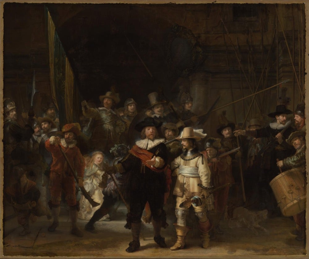
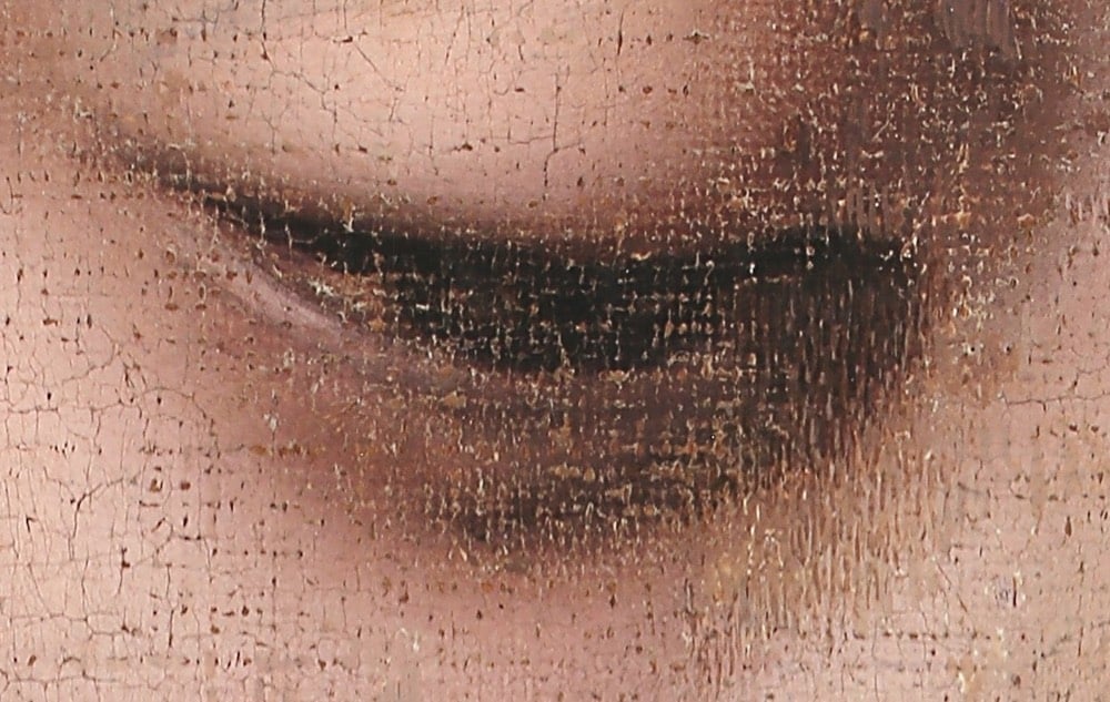
One of Rembrandt van Rijn’s most iconic paintings The Night Watch is currently undergoing restoration at the Rijksmuseum in Amsterdam. As part of the effort, the team took hundreds of photographs of the Dutch master’s painting and stitched them together into a massive 44.8 gigapixel image, which they have released online in a zoomable interface. The level of detail available here is incredible. Here’s the max zoom level on the right eye of the gentleman in the middle, the captain of the company that paid Rembrandt to do the painting:
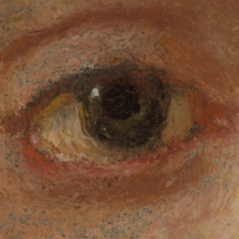
Crazy right? You can see the brushstrokes better than if you were standing in front of the actual painting in the museum.
The Rijksmuseum’s imaging team led by datascientist Robert Erdmann made this photograph of The Night Watch from a total of 528 exposures. The 24 rows of 22 pictures were stitched together digitally with the aid of neural networks. The final image is made up of 44.8 gigapixels (44,804,687,500 pixels), and the distance between each pixel is 20 micrometres (0.02 mm). This enables the scientists to study the painting in detail remotely. The image will also be used to accurately track any future ageing processes taking place in the painting.
Ok, I told you a little fib just now. Actually, this is his eye at the true maximum zoom level:
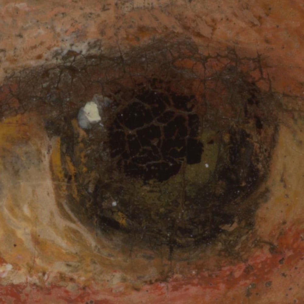
Each pixel is 0.02mm across — and keep in mind that this painting is almost 12 feet high and more than 14 feet across. An astounding level of detail and a gigantic image.
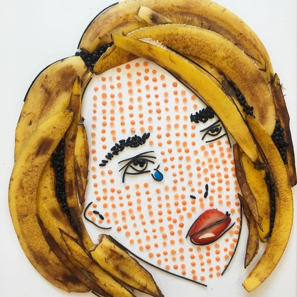
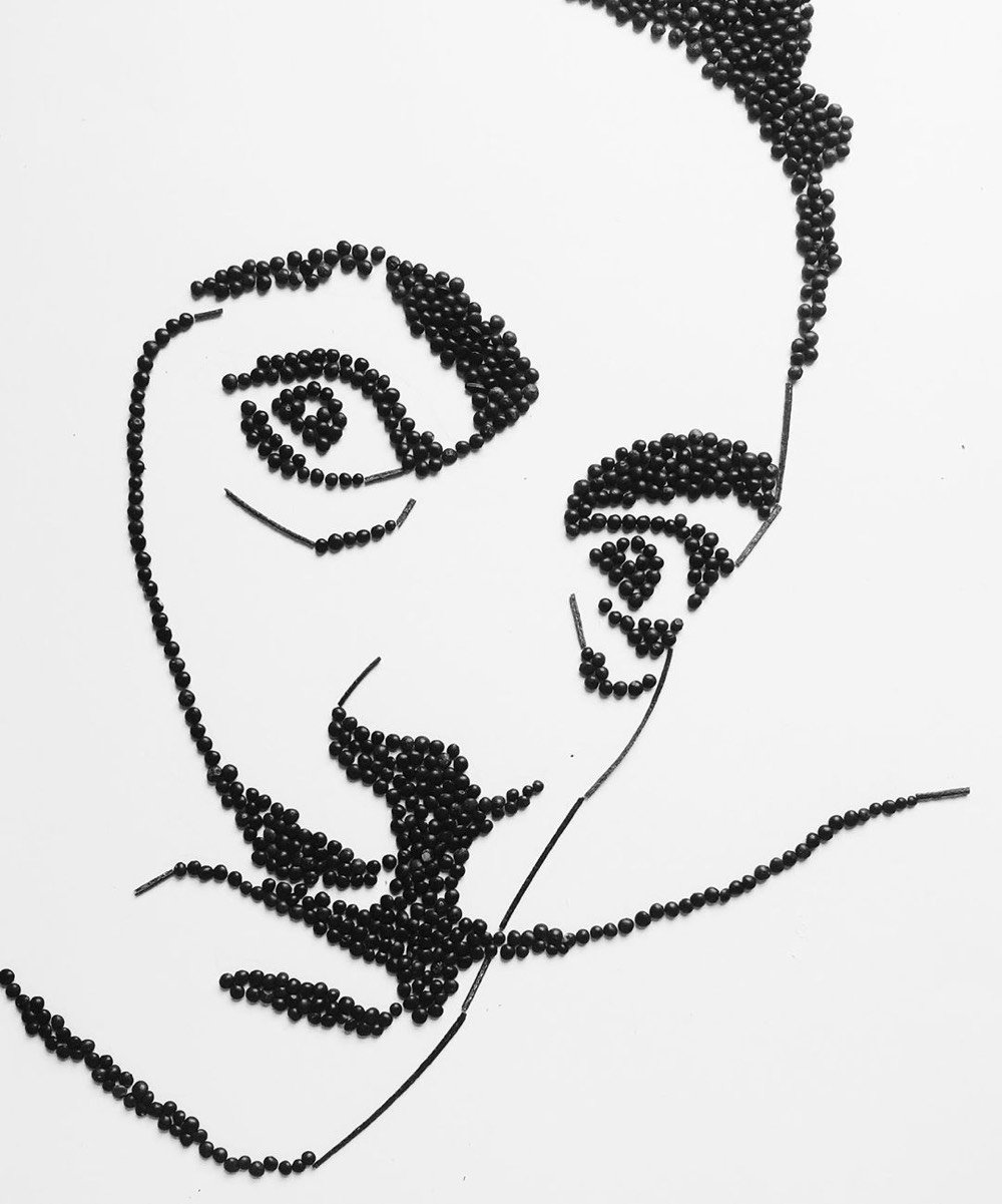
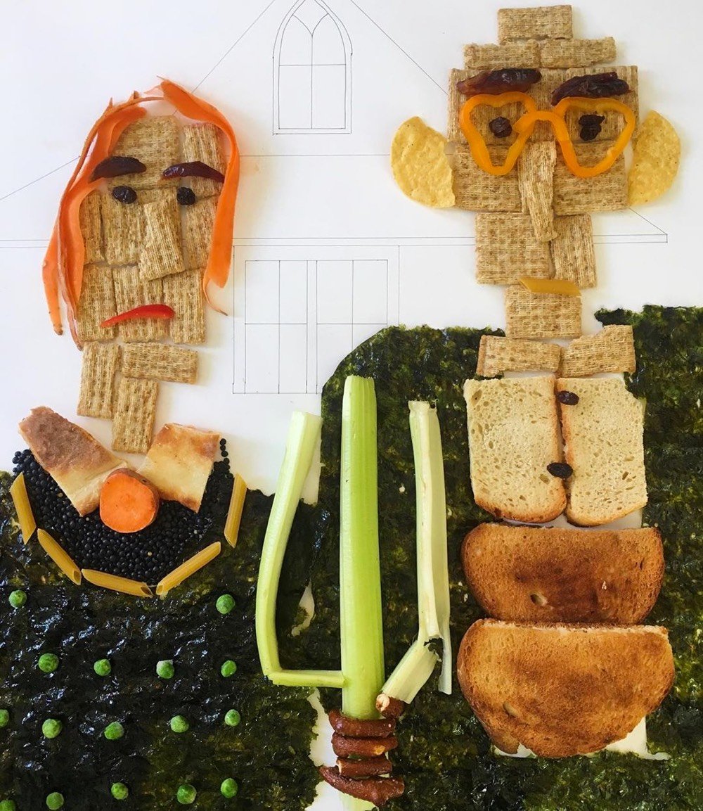
In yet another example of how the constraints of the pandemic are fostering creativity, LA-based artist Claire Salvo is creating edible versions of notable artworks and posting the results to Instagram. Says Salvo of her new pursuit:
i make art using a bunch of media, but one sleepless night a few weeks ago, i thought i’d try playing with food. these pieces make me laugh while i’m creating them, and i’m really enjoying the response from everyone watching the process. thanks for all the kind feedback.
i’ve spent nearly 30 years honing my drawing skills, and approximately 1 week pushing banana peels and lentils around a canvas. but i’m learning to #trusttheprocess because #art.
I think the Dali portrait is my favorite, closely followed by the Lichtenstein. And you know I love this: Girl with a Pea Earring.
See also Famous Art Recreated at Home During the Pandemic. (via jenni leder)
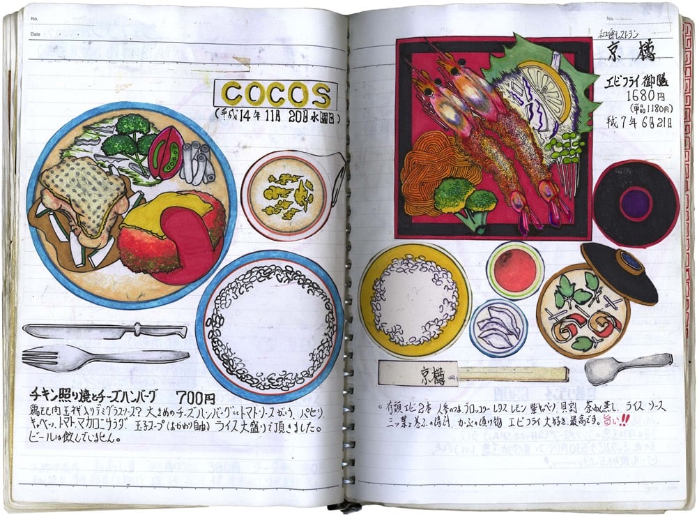
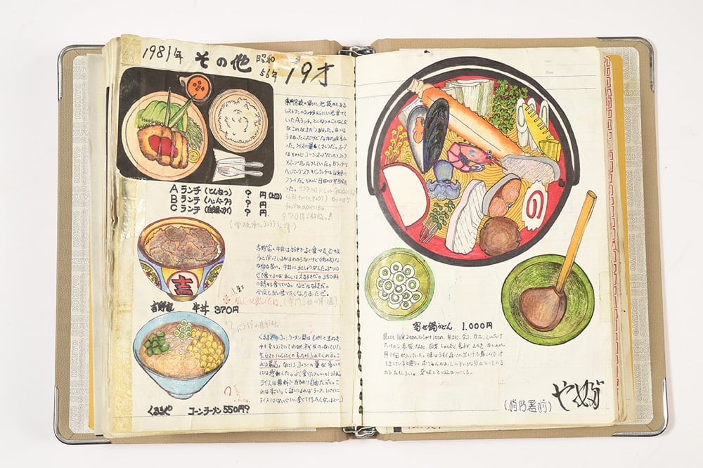
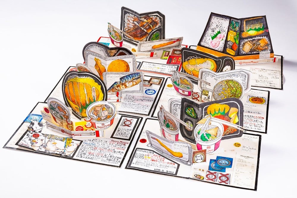
For 32 years, Itsuo Kobayashi has been painting top-down pictures of the meals he eats. The paintings are accompanied by descriptions of each meal. Kobayashi worked as a chef for years until he suffered an illness that left his movement impaired, causing him to double-down on his art.
Stay Connected