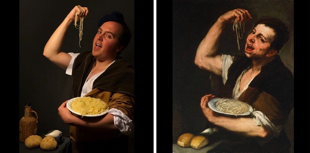
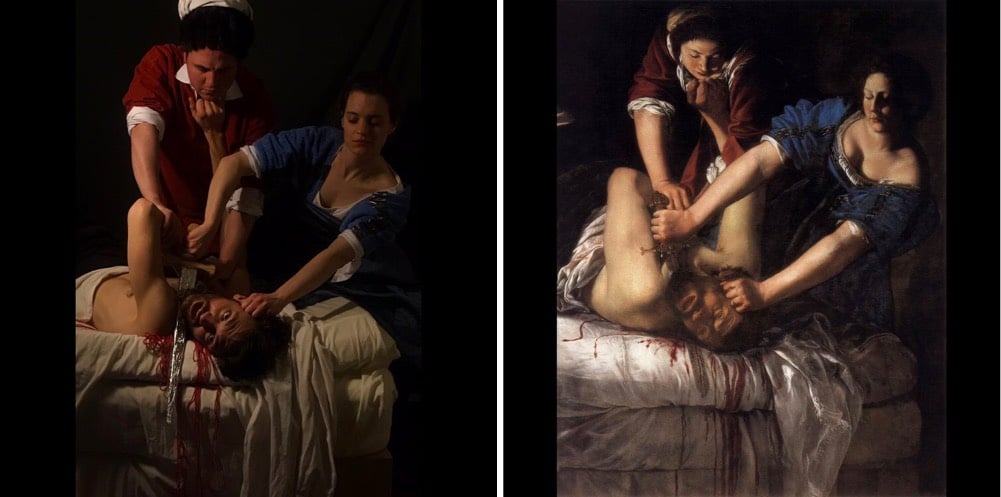
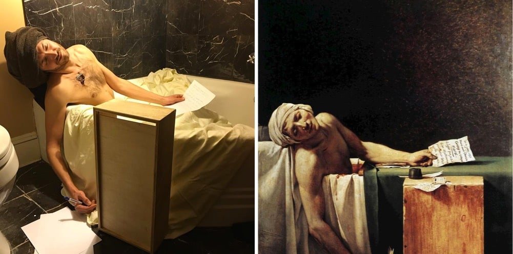
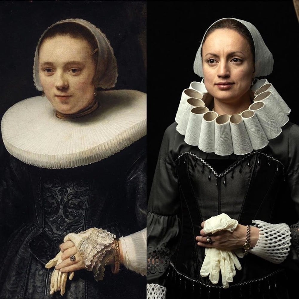
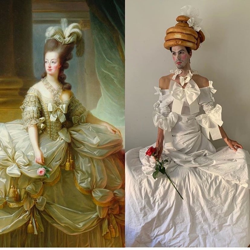
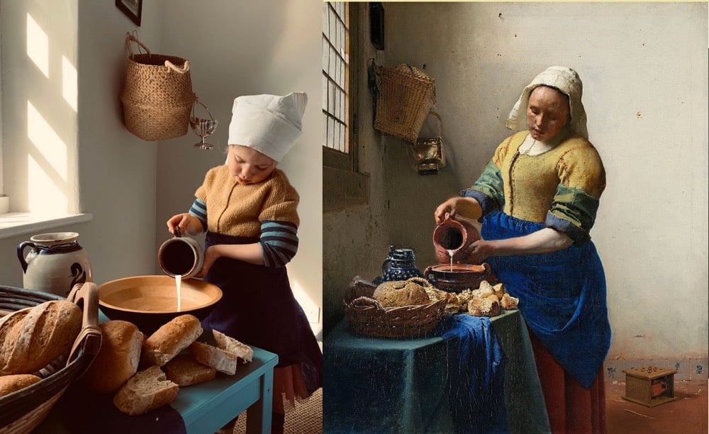
With art museums closed and people quarantined at home, some folks have taken to recreating famous artworks using stuff laying around the house. Some of the best recreations are from the Covid Classic Instagram account.
As part of a website refresh, The British Museum has made over 1.9 million photos of its collections freely available to the public. Visitors to their online collections website can download images, and share & adapt them for non-commercial purposes under a Creative Commons CC BY-NC-SA 4.0 license. Museum director Hartwig Fischer said of the refresh:
The British Museum Collection Online makes millions of objects accessible to the citizens of the world, wherever they might be. Whether you are a student, an artist, a scholar or are a lover of history and culture, this is an unparalleled resource to explore the richness, diversity and complexity of human history contained in the British Museum’s collection. It is also a platform where we can share the latest knowledge and research. We are delighted to be able to unveil this major revamp early, and hope that these important objects can provide inspiration, reflection or even just quiet moments of distraction during this difficult time.
However useful the new online collection is, it must be noted that the ownership of several of the items in the British Museum’s collection — including the Parthenon Marbles & Rosetta Stone — is disputed.
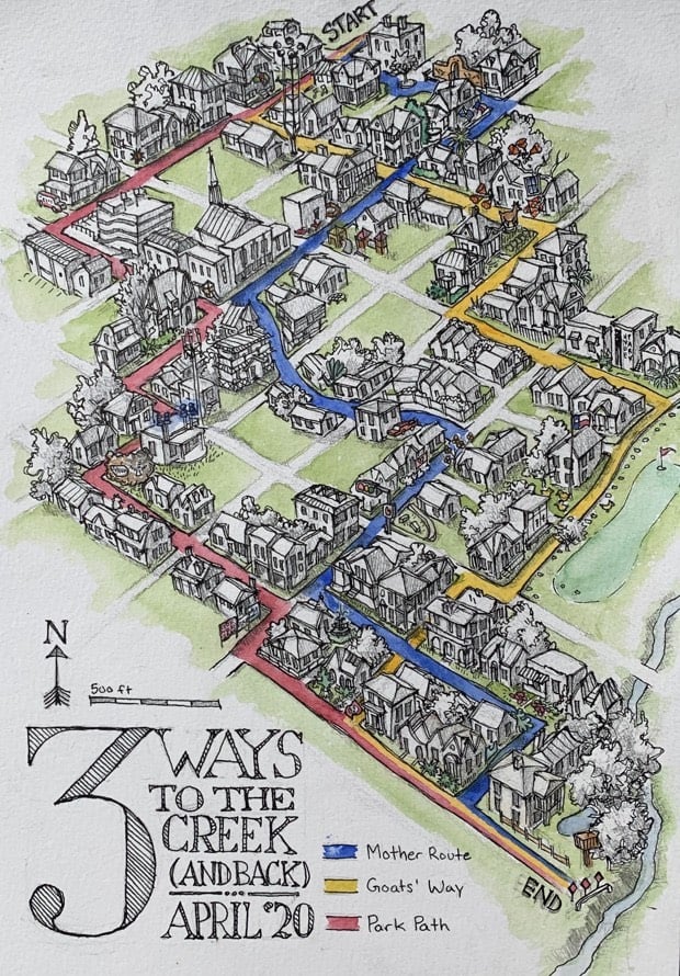
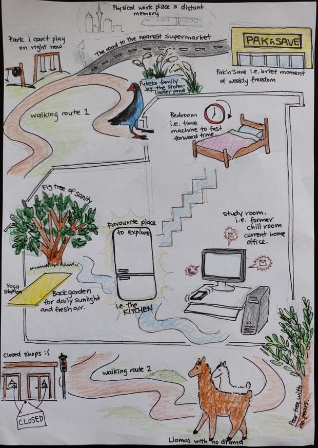
You charted how your homes, neighborhoods, cities and countries have transformed under social distancing and stay-at-home orders around the planet, from daily work routines and the routes of your “sanity walks,” to the people you miss and the places you fled.
While most used markers, pens, and computer-based drawing tools to sketch maps by hand, some used watercolors, clay, and photography. Some were humorous, others heart-wrenching - between them all, a full spectrum of quarantine-era emotion emerged.
For the cover of this week’s New Yorker, Chris Ware drew several vignettes of NYC arranged in his trademark grid as a companion to this incredible piece about a single day of the Covid-19 crisis in the city. About the cover, Ware wrote:
Teeming with unpredictable people and unimaginable places and unforeseeable moments, life there is measured not in hours but in densely packed minutes that can fill up a day with a year’s worth of life. Lately, however, closed up in our homes against a worldwide terror, time everywhere has seemed to slur, to become almost Groundhog Day-ish, forced into a sort of present-perfect tense — or, as my fellow New Yorker contributor Masha Gessen more precisely put it, ‘loopy, dotted, and sometimes perpendicular to itself.’ But disaster can also have a recalibrating quality. It reminds us that the real things of life (breakfast, grass, spouse) can, in normal times, become clotted over by anxieties and nonsense. We’re at low tide, but, as my wife, a biology teacher, said to me this morning, “For a while, we get to just step back and look.” And really, when you do, it is pretty marvellous.
One of my favorite museums I’ve visited in the past few years is the Van Gogh Museum in Amsterdam. Van Gogh’s art career lasted for only 10 years, and the museum provides a fascinating account (through his work, letters, and other material) of how a talented but unremarkable painter made the conceptual breakthrough for which he is now known the world over.
The museum is closed due to the pandemic, but anyone with an internet connection can experience the collection at home thanks to the museum’s dedication to accessibility. This 15-minute tour of the museum filmed in 4K resolution should get you started — here are the first two parts:
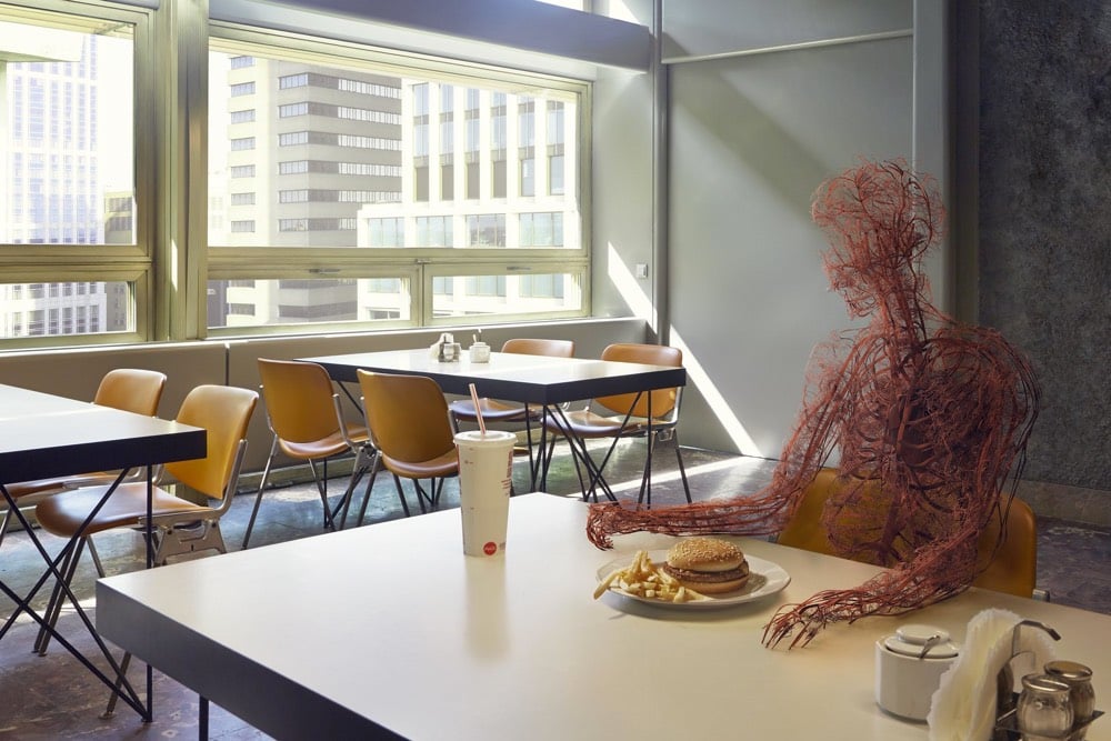
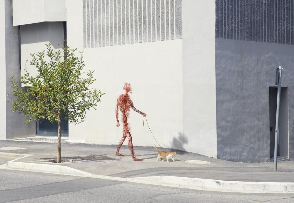
I am not quite sure what to say about Human After All, a collaboration between photographer Jan Kriwol and digital artist Markos Kay, other than it seems like a metaphor for something these days. (via colossal)
Directed by Halina Dyrschka, Beyond the Visible: Hilma af Klint is a new feature-length documentary on the groundbreaking abstract artist Hilma af Klint.
Before Kandinsky, Mondrian, and Klee made a name for abstraction in visual art, another artist had already beat them to their discovery. But until very recently, her name was absent from the history books. Swedish artist Hilma af Klint (1862-1944) painted her first abstract canvas in 1906, four years before Wassily Kandinsky, originally thought to be the movement’s pioneer. It would be more than a century before she would receive the same acknowledgment and acclaim as her male peers.
The film follows the recognition af Klint’s work received due to the 2018 show at the Guggenheim, which was one of my favorite exhibitions from the past few years.
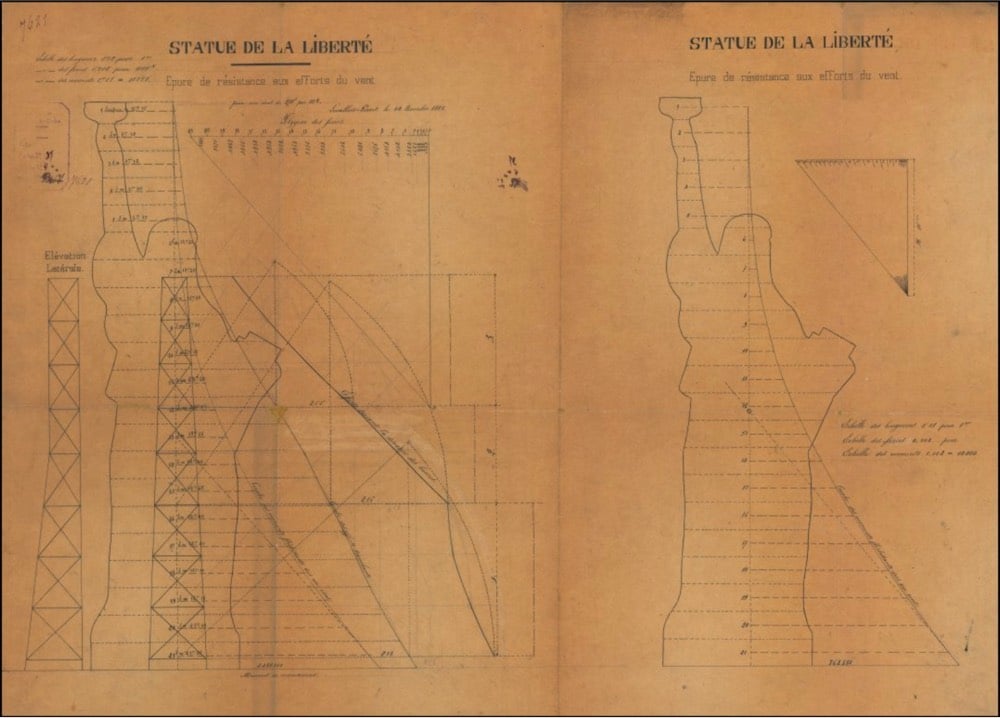
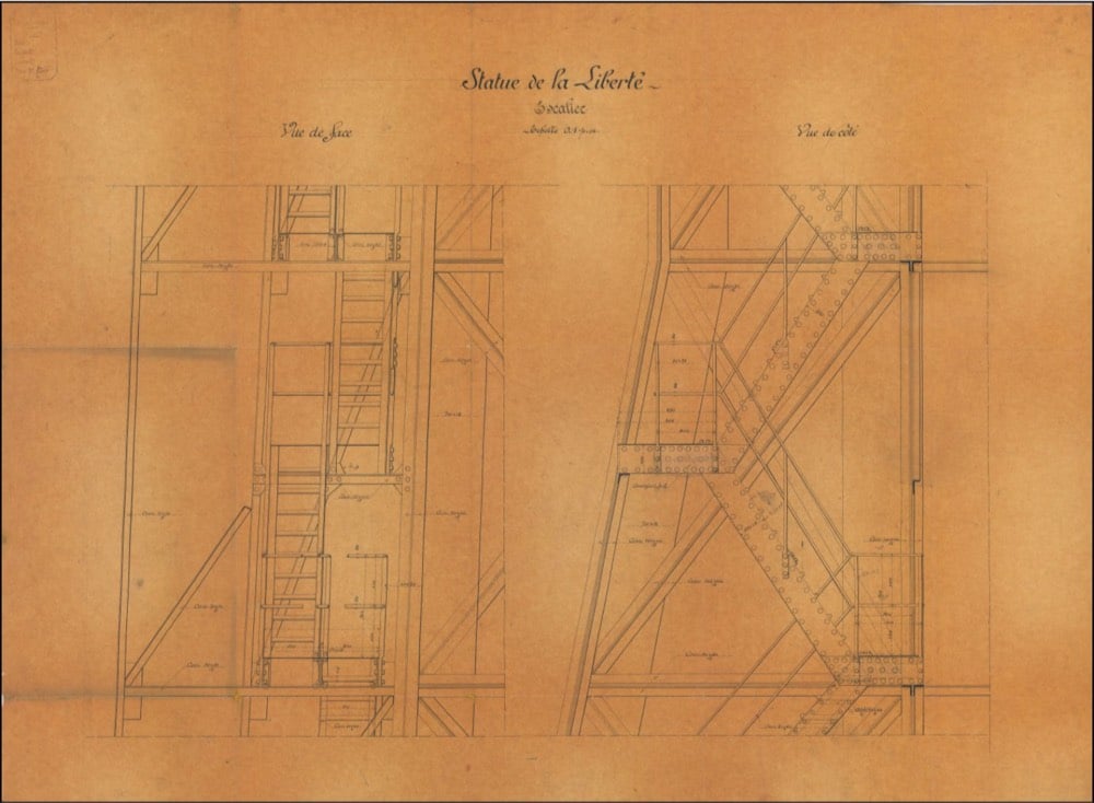
Berenson thinks the drawings may nail down something that historians have long suspected but not been able to prove: that Bartholdi disregarded Eiffel’s engineering plans when it came to the statue’s upraised arm, electing to make it thinner and tilted outward for dramatic and aesthetic appeal. Several drawings appear to depict a bulkier shoulder and more vertical arm — a more structurally sound arrangement. But one of these sketches (below) was marked up by an unidentified hand with red ink that tilts the arm outward, as Bartholdi wanted. “This could be evidence for a change in the angle that we ended up with in the real Statue of Liberty,” Berenson says. “It looks like somebody is trying to figure out how to change the angle of the arm without wrecking the support.”
Since the early 90s, biologist David Goodsell (previously) has been creating scientifically accurate paintings of the structures of cells, molecules, and, yes, viruses. In early February, Goodsell completed a painting of a SARS coronavirus (above).
This painting depicts a coronavirus just entering the lungs, surrounded by mucus secreted by respiratory cells, secreted antibodies, and several small immune systems proteins. The virus is enclosed by a membrane that includes the S (spike) protein, which will mediate attachment and entry into cells, M (membrane) protein, which is involved in organization of the nucleoprotein inside, and E (envelope) protein, which is a membrane channel involved in budding of the virus and may be incorporated into the virion during that process. The nucleoprotein inside includes many copies of the N (nucleocapsid) protein bound to the genomic RNA.
“You have to admit, these viruses are so symmetrical that they’re beautiful,” said Mr. Goodsell, an associate professor at Scripps Research Institute in La Jolla. “Are bright colors and pretty stuff the right approach? The jury’s still out. I’m not trying to make these things look dangerous, I want people to understand how they’re built.”
Seeing the infection count rise, Mr. Goodsell said he worried about the health of his aging parents in Los Angeles. But he hopes his painting can quell fears about the novel coronavirus by educating people on the virus’s workings: “I want people to think of viruses as being an entity that we can learn about and fight. They’re not nebulous nothings.”
The novel coronavirus, like all viruses, is covered with proteins that give it its character and traits. There are the spike proteins, or S-proteins — the red clusters in the image — which allow the virus to attach to human cells. Envelope or E-proteins, represented by yellow crumbs, help it get into those cells. And membrane proteins, or M-proteins, shown in orange, give the virus its form.
In a video released last February, Eckert explained a little about what she does at CDC.
Concatenation is a Rube Goldberg-esque video montage made up of cleverly arranged stock video footage. This is one of those things where I’m like, “ugh this is so good, why didn’t I think of this?” See also this clipart animation:
This is Chris Ware’s illustration for the cover of this week’s New Yorker, the magazine’s annual Health Issue. The pandemic had to be the topic for the cover, and Ware’s daughter suggested that the specific theme focus on the families of the healthcare workers on the front lines of the crisis.
“As a procrastination tactic, I sometimes ask my fifteen-year-old daughter what the comic strip or drawing I’m working on should be about — not only because it gets me away from my drawing table but because, like most kids of her generation, she pays attention to the world. So, while sketching the cover of this Health Issue, I asked her.
“‘Make sure it’s about how most doctors have children and families of their own,’ she said.
“Good idea. And a personal one: one of her friend’s parents are both doctors; that friend, now distilled into a rectangular puddle of light on my daughter’s nightstand, reported that her mom had temporarily stopped going to work, pending the results of a COVID-19 test.
While it predates the COVID-19 pandemic and its accompanying social distancing by several years, José Manuel Ballester’s Concealed Spaces project reimagines iconic works of art without the people in them (like what’s happening to our public spaces right now). No one showed up for Leonardo’s Last Supper:
Hieronymus Bosch’s The Garden of Earthly Delights is perhaps just as delightful without people:
And Botticelli’s The Birth of Venus has been rescheduled:
Amber Share of Subpar Parks is producing illustrations of real one-star reviews of America’s National Parks from apparently dissatisfied park visitors. Zion National Park is a bit standoffish:
Newsflash: Sequoia National Park is outdoors and has insects:
From a bored Joshua Tree guest:
Follow along with the rest of these on Instagram — Share is doing one drawing for each National Park and she’s got many more still to go. Prints, postcards, stickers, and tshirts are available from her shop (or will be soon).
Compiled from actual online real estate listings, the artwork collapses the high and low ends of the market, architectural periods and styles, and neighborhoods and affordability into a single space that cumulatively creates a portrait of New York’s living spaces and the real estate market. Like a standard real estate ad, the listing shows the price, number of bed- and bathrooms, and square footage, all of which are updated weekly based on the city’s aggregated real estate listings.
Take some time to explore the project — take the 3D virtual tour, scroll through all of the bathrooms & closets, peruse the apartment features, and take the video tour:
Do you crave brilliant sunshine and the peace Zen behind closed doors at home, and the bustle and excitement of the big city at your doorstep?
Do you dream of a Manhattan life?
Do you dream of Brooklyn living with Manhattan in reach?
Do you have a thing for top floor apartments?
Do you have vision?
Do you like light?
Do you love to cook?
Do you love to entertain?
Do you need lots of closet space?
Do you own or plan to buy a car?
Do you prefer simple shaker style wood cabinets with solid surface counters or custom lacquer cabinets paired with a travertine marble?
Do you want a home just steps to the beach?
Do you want Katz Deli, Russ and Daughters or maybe some Economy Candy?
Contact information for all of the brokers is listed on the site in case you’re interested.
For the first time in its 174-year history, the Smithsonian has released 2.8 million high-resolution two- and three-dimensional images from across its collections onto an open access online platform for patrons to peruse and download free of charge. Featuring data and material from all 19 Smithsonian museums, nine research centers, libraries, archives and the National Zoo, the new digital depot encourages the public to not just view its contents, but use, reuse and transform them into just about anything they choose — be it a postcard, a beer koozie or a pair of bootie shorts.
And this gargantuan data dump is just the beginning. Throughout the rest of 2020, the Smithsonian will be rolling out another 200,000 or so images, with more to come as the Institution continues to digitize its collection of 155 million items and counting.
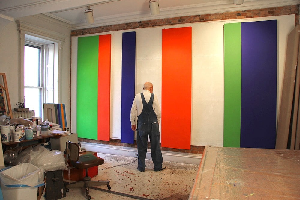
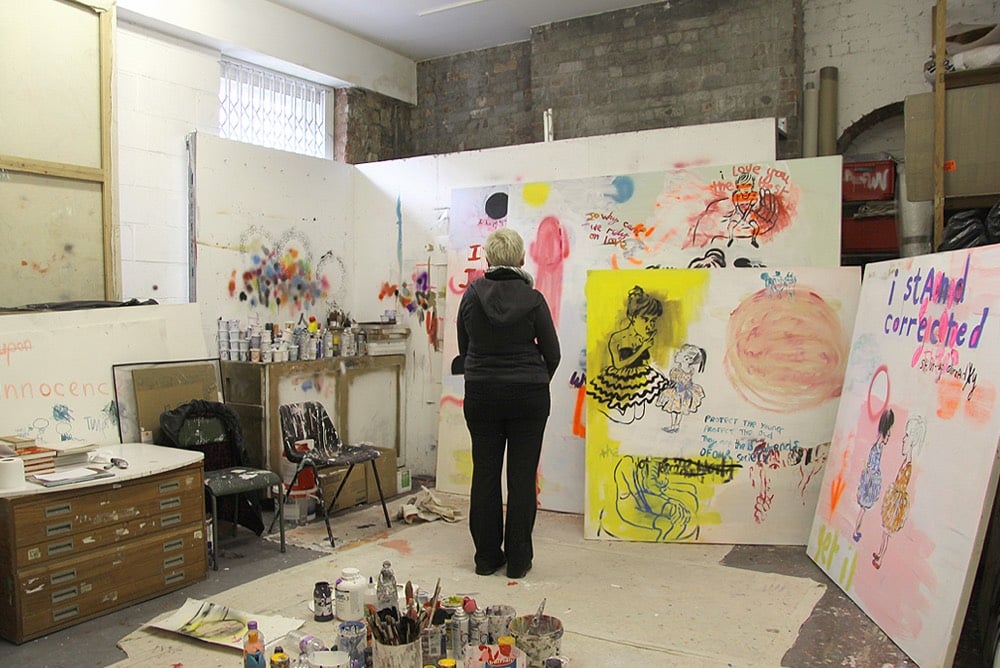
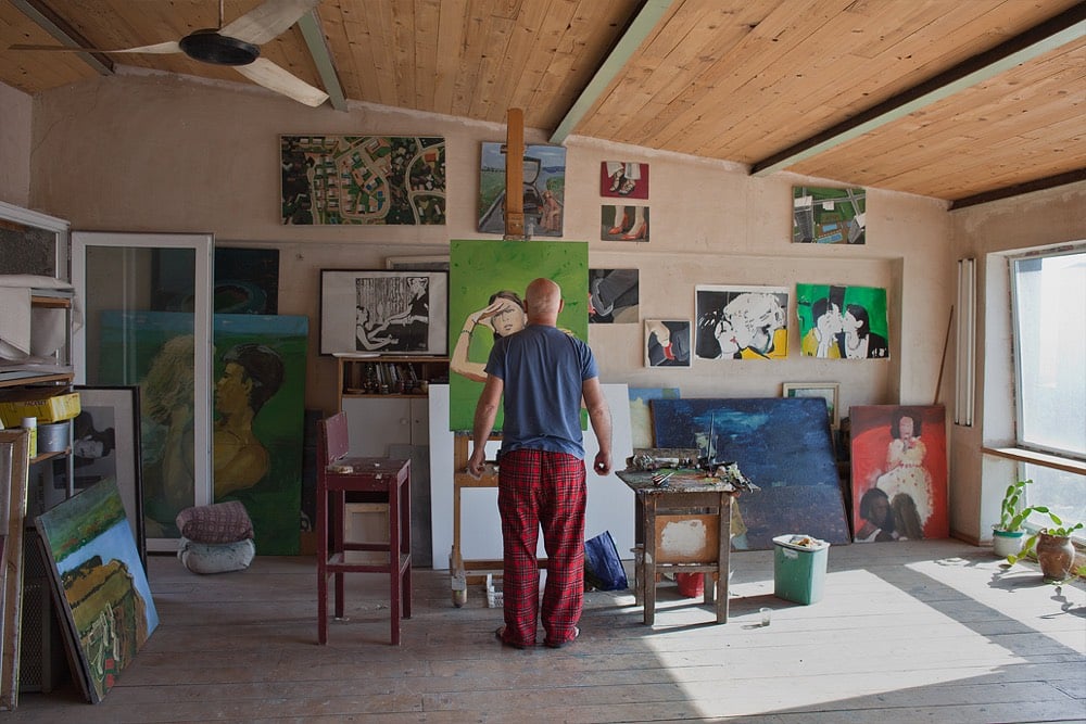
He laughs, “I realized it was an alibi for getting in their studios, because most artists keep their doors shut and otherwise I would not get to come in. That was the beginning of the project, really. Then artists from other buildings in Rotterdam asked me to come to their place, it was like a snowball, it just started happening,” he recalls.
After Rotterdam, he visited Amsterdam and Antwerp, realizing the strength of the concept could take him all over the world. “So, I sold my house, quit my job, and now I am traveling everywhere, the project was developing in all different directions.”
It’s fun to get a glimpse into so many studios of working artists — they’re all very similar and yet different in the details. (via Noah Kalina, who Smits photographed in 2015)
For her video “The Real Thing”, filmmaker Julianna Villarosa used footage of Coca-Cola’s famous “I’d Like to Buy the World a Coke” commercial ruined by pouring Coke on VHS and film copies to draw attention to the company’s water privatization practices in Chiapas, Mexico, where there’s a water shortage on. From the video:
The Chiapas Highlands, one of Mexico’s wettest regions, has a water shortage. Many drink Coca-Cola, which is bottled nearby and often easier to find than clean water. On average, residents drink more than half a gallon of soda per day. Indigenous Tzotzil use Coca-Cola in religious ceremonies and medicinal treatments. Diabetes has become the second-leading cause of death in Chiapas. The local Coca-Cola plant extracts more than 300,000 gallons of water per day.
Simple, direct, and brilliant activist art — Villarosa uses the company’s literally corrosive product to physically destroy their feel-good advertising to draw attention to the real harm this US company is doing to people & ecosystems around the world. Here’s more on the Chiapas region and the residents’ reliance on Coke:
Coca-Cola’s penetration of the market in Los Altos has also been aided by a strategy of charging less in remote rural areas where a Coke in a returnable glass bottle is often scarcely more expensive than bottled water. As in most of Mexico, clean drinking water is not generally available even to those who can count on running water in their homes, which means many turn to soft drinks for basic hydration.
The irony of this is clear in an area known for its constant downpours and abundant springs, such as the one that attracted the Coca-Cola bottling company. Local activists say the company has so overexploited the spring that the city of San Cristóbal is now facing water shortages.
The activists allege this has been possible in part because Coca-Cola has friends in high political places. Between 2000 and 2006 the country’s president was Vicente Fox, a former head of Coca-Cola Mexico.
It all adds up to a perfect storm of sugar-related health issues in Los Altos. María del Socorro Sánchez, who is in charge of nutrition at the main hospital in San Juan Chamula, says only about one in 10 of the indigenous patients with diabetes accept there is any need to cut out sugar-packed drinks. “They just don’t believe that it is bad for them,” she said.
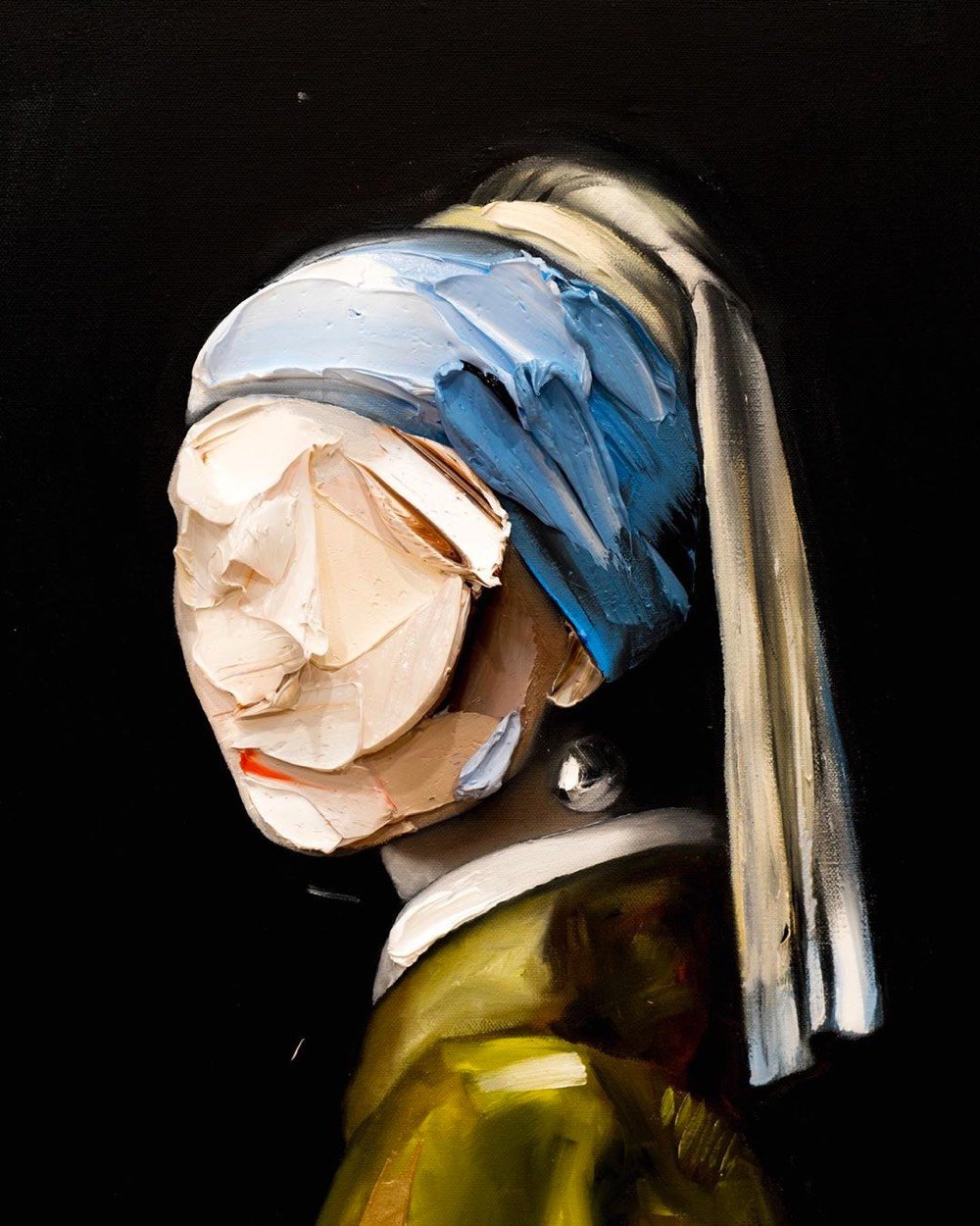
In Dutch (Vermeer’s native language) this one is even better. The original painting is called “Meisje met de parel” in Dutch, and corn is “mais”. So this one could be named “Maisje met de parel” which is pronounced almost identically.
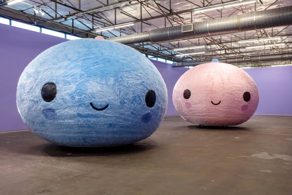
An interactive and communal experience, the exhibition actively incorporates audiences: two moving orbs serve as ambassadors as they meander along in a spiritual, cleansing, and comforting ritual set to a custom soundtrack in celebration of the beauty and power of togetherness.
Submerged in my pink bubble, I spin, wobble, and drift aimlessly. Between the darkness and the humming of the air compressor, it’s almost like being in a sensory deprivation tank. I’m brought out of my haze when Carolina Alvares-Mathies, the Contemporary’s new Deputy Director, comes to check on me. It’s been cool, but I’m ready to exit.
The zipper opens and I stumble out. I don’t remember being born, but I assume it’s a similarly jarring feeling. Everything is too bright and I’m a little queasy. Still, I reentered the real world with the information I needed: It was weird in there, but I did have fun.
In less than a minute, this Senegalese sand artist working on the island of Gorée creates a portrait by pouring sands of different colors over a wooden board with glue on it. The way that the painting emerges at the last second out of seeming disorder is a lovely shock, like a magic trick.
Here’s an enormous library of thousands of old book illustrations, with searchable name, artist, source, date, which book it was in, etc. There are also a number of collections to browse through, and each are tagged with multiple keywords so you can also get lost in there in that manner.
Though the team behind the site doesn’t specifically list the whole site as public domain, chances are a lot of the illustrations you’ll find are way out of copyright in most jurisdictions.
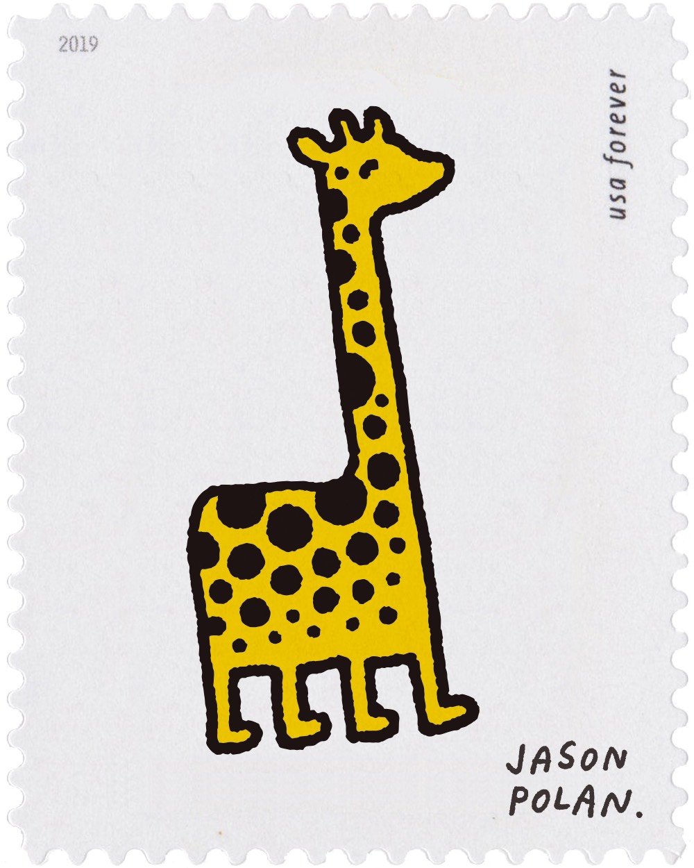
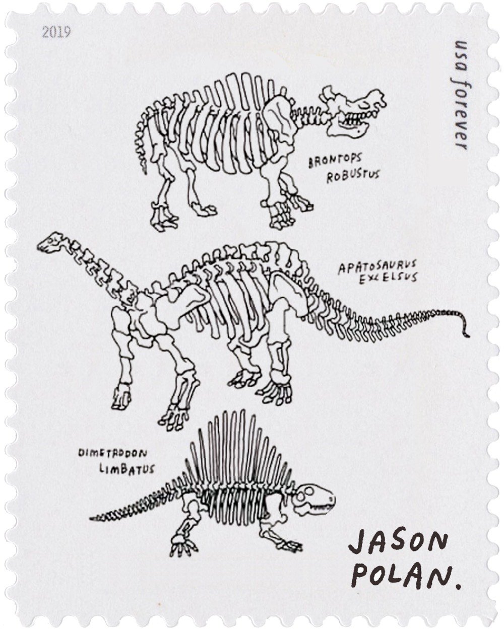
New York artist Jason Polan has passed away at the age of 37. The cause was colon cancer. From the NY Times obituary:
Mr. Polan’s signature project for the last decade or so was “Every Person in New York,” in which he set himself the admittedly impossible task of drawing everyone in New York City. He kept a robust blog of those sketches, and by the time he published a book of that title in 2015 — which he envisioned as Vol. 1 — he had drawn more than 30,000 people.
These were not sit-for-a-portrait-style drawings. They were quick sketches of people who often didn’t know they were being sketched, done on the fly, with delightfully unfinished results, as Mr. Polan wrote in the book’s introduction.
“If they are moving fast, the drawing is often very simple,” he wrote. “If they move or get up from a pose, I cannot cheat at all by filling in a leg that had been folded or an arm pointing. This is why some of the people in the drawings might have an extra arm or leg — it had moved while I was drawing them. I think, hope, this makes the drawings better.”
I never met Polan in person — we corresponded via email occasionally, were admirers of each other’s work (I have several of his drawings), and I linked to his stuff sometimes (not enough) — but many of my friends knew him well and are reeling. There was a gentleness, a loving attention, that really came through in his work and in talking with the folks who knew him, that’s the way he was in person too. A kind soul, gone too soon. Rest in peace, Jason.
Jason noticed. This was his thing. The effortlessness with which he could hone in on a person in the endless stream of the city, pick out just one or two details that made them unique and make art of them. People often asked me if I thought he had a photographic memory, and yea, maybe he did, but it wasn’t really the source of his genius. The source, I think, was his bottomless empathy and interest.
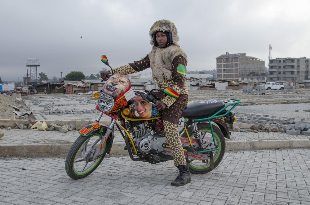
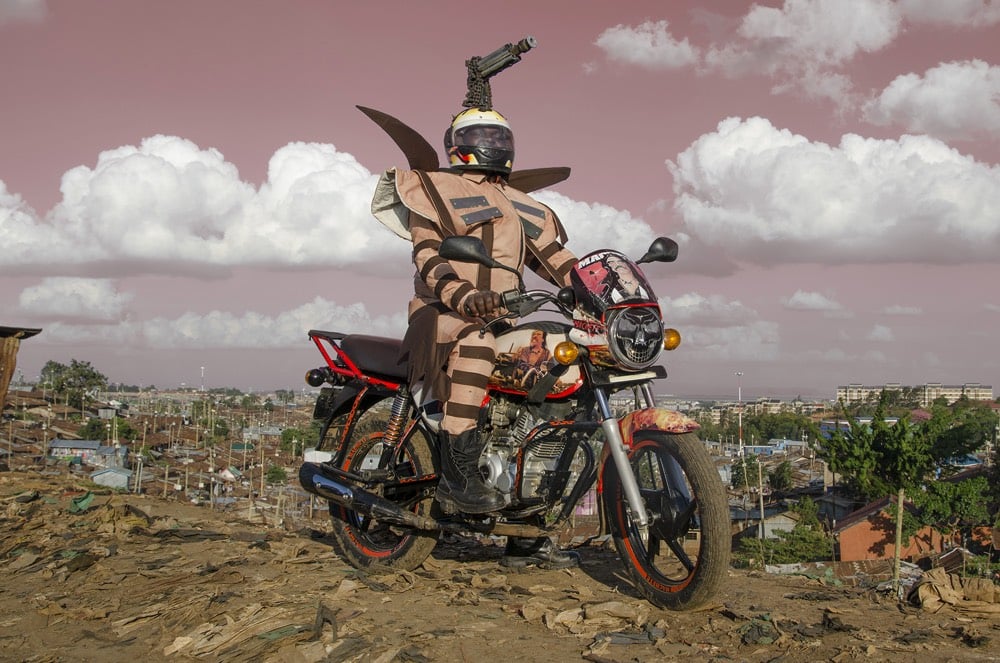
Ugandan-Kenyan fashion designer Bobbin Case and Dutch artist Jan Hoek have collaborated on a project called Boda Boda Madness. Inspired by the elaborate decorations used by some boda boda (motorbike taxi) drivers in Nairobi to attract customers, Case designed costumes to go with each bike’s decorations and Hoek photographed the results. After the fact, the coordinated outfits proved good for business:
The nice thing is that because of their new outfits their income went up, so they really kept on using their costumes.
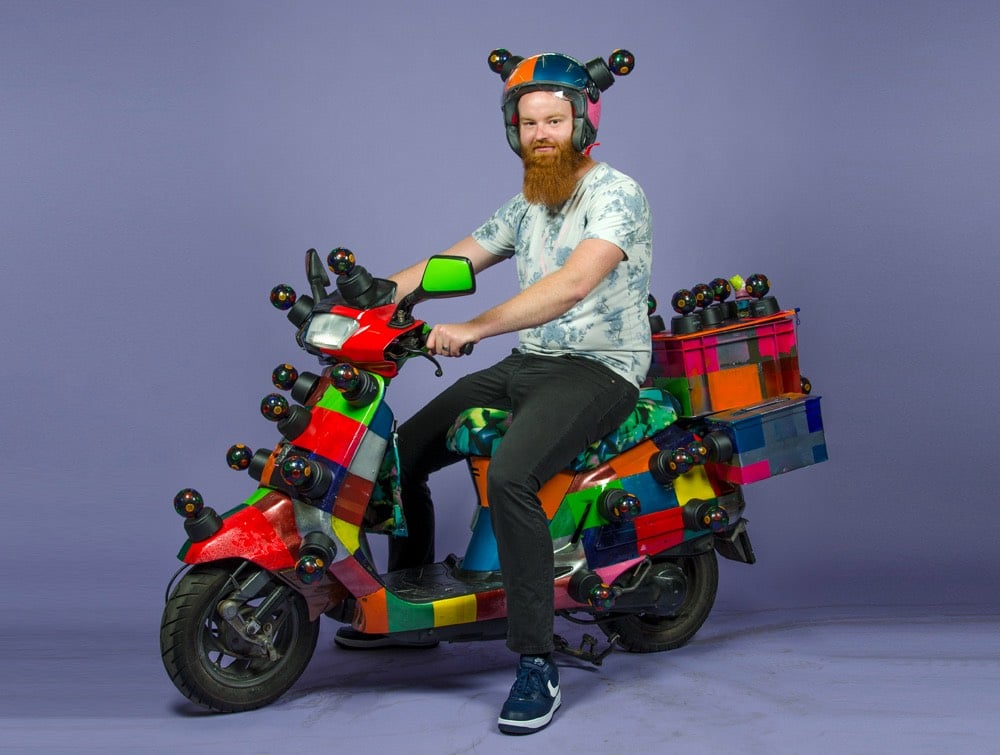
Hoek also did a project called Scooters Will Never Die, in which he worked with a group of Africa refugees in Amsterdam to customize scooters to their riders’ specifications.
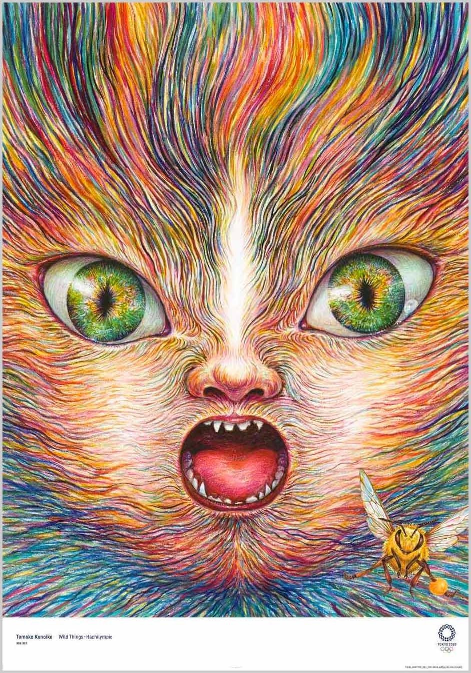
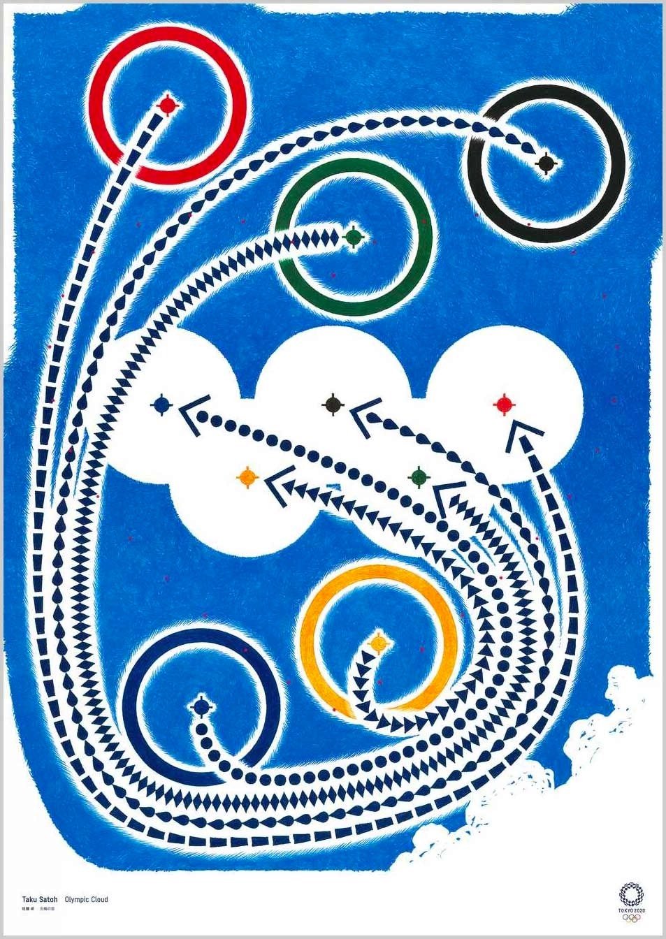
Wow, check out the official posters for the Tokyo 2020 Olympic and Paralympic Games.
What an amazing array of styles and disciplines — there’s manga, shodo (calligraphy), Cubism, photography, surrealism, and ukiyo-e. That stunning poster at the top is from Tomoko Konoike — fantastic. As you can see, posters from past Olympics have tended towards the literal, with more straightforward depictions of sports, the rings, stadiums, etc. Kudos to the organizers of the Tokyo Games for casting their net a little wider. Love it. (via sidebar)


Stay Connected