Forensic scientist Thiago Piwowarczyk and art historian Jeffrey Taylor are often called upon to authenticate purported paintings by well-known artists. Using a drip painting resembling Jackson Pollock’s work, they show how they use historical research, hardcore science, and good-ol’ human observation. The steps they go through are:
1. Provenance research. Is there any documentation of the artist painting this? Who owned it and when? Forged documentation can be an issue here.
2. Visual analysis. Does the material used for the painting fit the artist and the timeframe? Often, a forger won’t sign a fake to mitigate any potential legal ramifications.
3. Photography and ultraviolet analysis. Was the canvas reused? Is there an under-painting or drawing?
4. X-ray fluorescence spectroscopy. What elements are present in the paint? Do they match those in the paints normally used by the artist?
5. Microscopy & Raman spectroscopy. What kind of paint was used? Did that paint exist when the artist was working?
Super interesting. All of the craft aside, Piwowarczyk also says that “if the deal is too good, there’s something wrong”. $25,000 for a Pollack? Nope. (via open culture)
For a cultural program to accompany the 2012 Olympics in London, artist Sue Austin created a video of herself exploring a coral reef in a wheelchair outfitted with motors and wings to help it steer and go through the water.
It’s a tiny bit surreal to see how freely she moves around in something that many of us associate with an absence of a particular type of movement. But as Austin explains in her 2013 TED Talk, she thinks of her wheelchair in terms of freedom of movement, which is highlighted for others by the underwater video. (via colossal)
The last time I posted a video by Vladimir Tomin I struggled to describe what it was about, eventually punting with “just give it 5 seconds and you’ll get the idea”. They’re fun augmented reality sketches — like peeling up a road’s center line with a cursor — what’s not to like?! (via colossal)
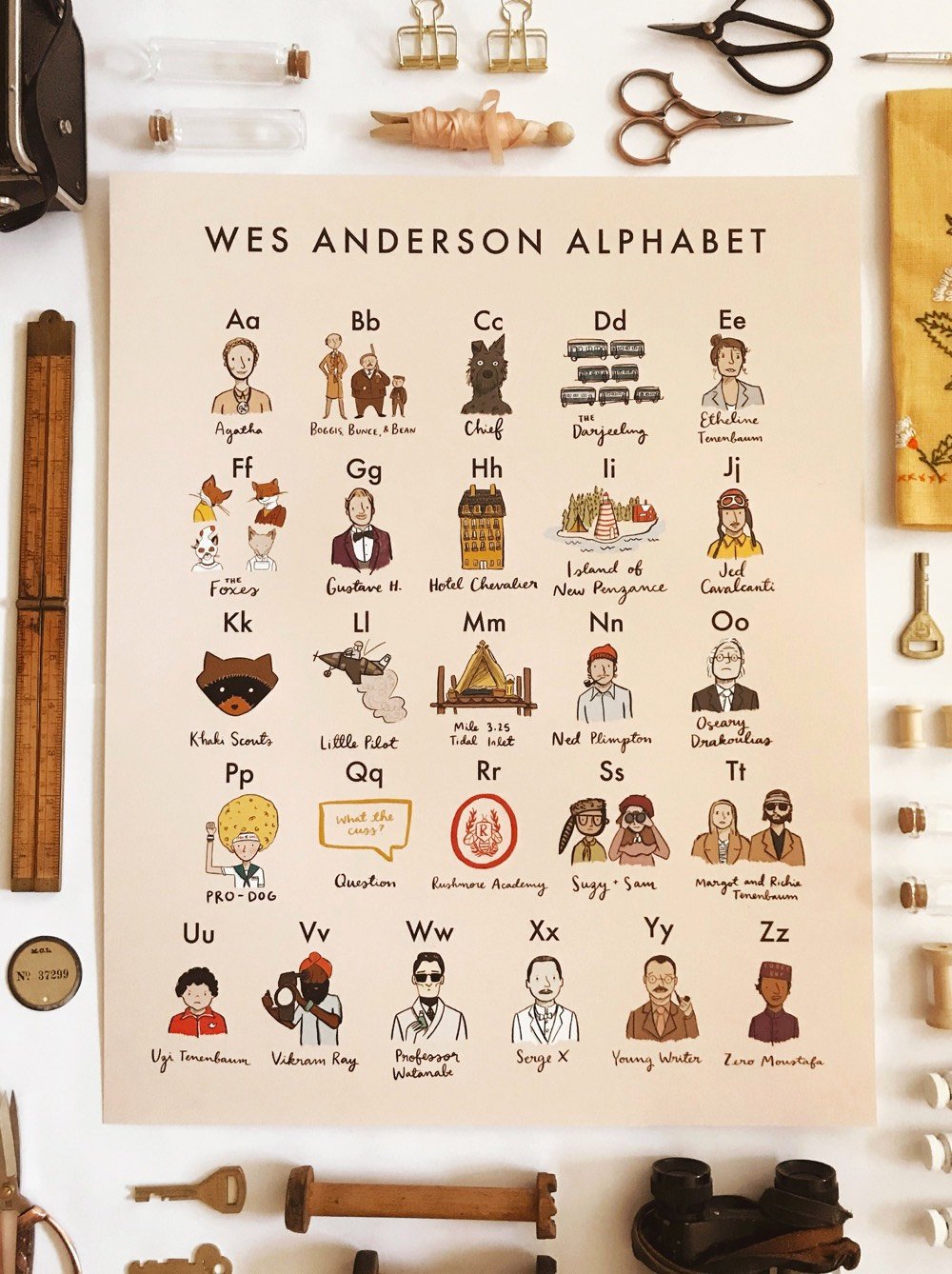
It features people, places, and objects from many of Anderson’s films (I didn’t see any Bottle Rocket references): B is for Boggis, Bunce, and Bean, N is for Ned Plimpton, and T is for Margot and Richie Tenenbaum.
Gil Scott Heron wrote that famous poem, “Whitey on the Moon”: “The man just upped my rent last night / Cause whitey’s on the moon / No hot water, no toilets, no lights / But whitey’s on the moon.”
I got thinking about a moon colony, which plenty of people have talked about pretty seriously over the years. So what I’d do is this: For every female child born on Earth, one sexist, white supremacist adult male would be shipped to the moon. They could colonize it to their heart’s content, and look down from a distance of a quarter-million miles. It’s a monochrome world up there; probably they’d love it. The colony would be hermetically sealed. And the rest of us could enjoy the sight of them from a safe distance. Maybe there could be some kind of selection ritual involved, something to do with menstruation and the tides — a touch of nature, to add a bit of irony justice to the endeavor.
For the supremacists, maybe traveling so far from home would help inspire a different worldview. And for the rest of us down on Earth, perhaps this is an opportunity to focus on the nature of our home planet with the same dreamy reverence we once reserved for the moon.
My son Noam is an astrophysicist at the Leibniz Institute in Germany, and we did some calculations about how it could work. We thought the best way would be to paint sections of it black, so they no longer reflect the sun’s light. To account for the curvature, you’d need to paint four spherical caps on the moon’s surface. That would create a kind of frame that looks square when you see it from earth.
Taking advantage of the fact that puzzle manufacturers typically use the same cut patterns to make many different puzzles, Tim Klein uses the interchangeable pieces to create surrealist mashups of puzzles.
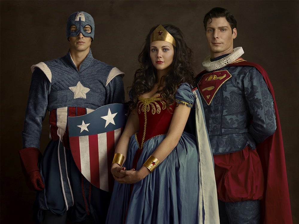
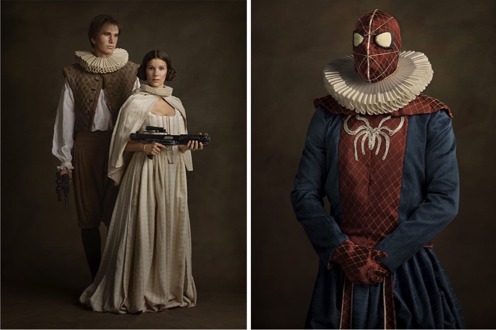
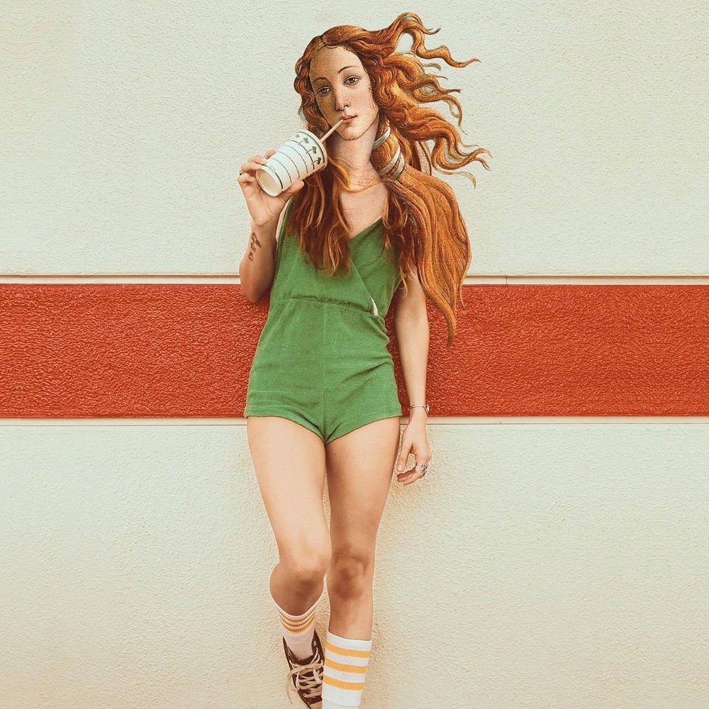
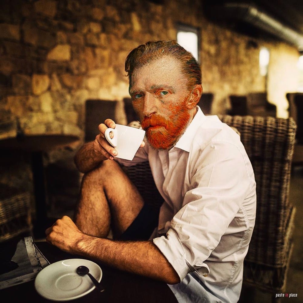
I seemingly cannot get enough of contemporizing old paintings and works of art. Here, from Rodrigo Pinheiro, are some familiar young people hanging out with modern beverages.
Students, educators, and just regular art lovers might be interested to learn that we’ve released thousands of images in the public domain on the new website in an open-access format (52,438 to be exact, and growing regularly). Made available under the Creative Commons Zero (CC0) license, these images can be downloaded for free on the artwork pages.
We’ve also enhanced the image viewing capabilities on object pages, which means that you can see much greater detail on objects than before. Check out the paint strokes in Van Gogh’s The Bedroom, the charcoal details on Charles White’s Harvest Talk, or the synaesthetic richness of Georgia O’Keeffe’s Blue and Green Music.
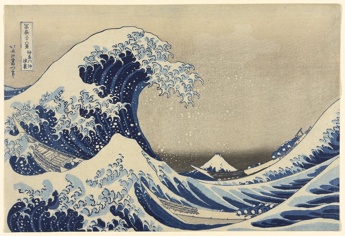
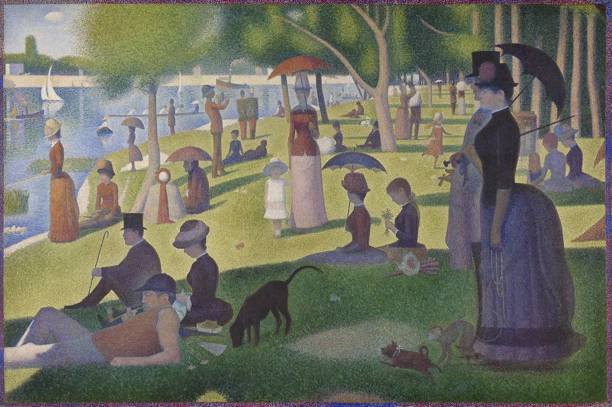
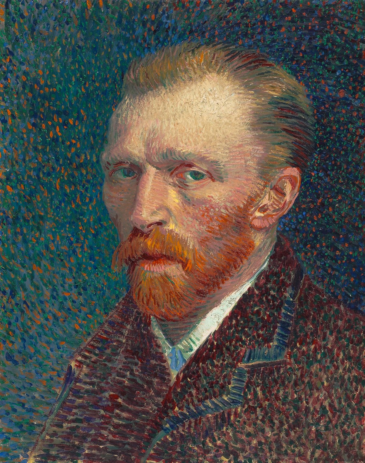
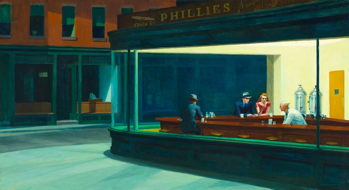
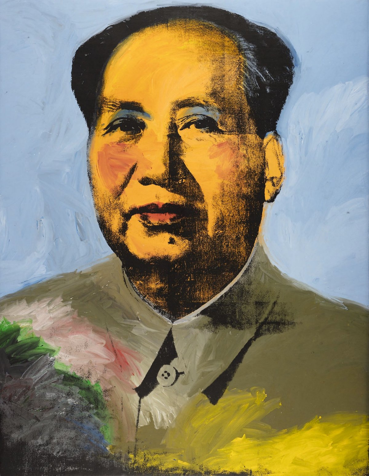
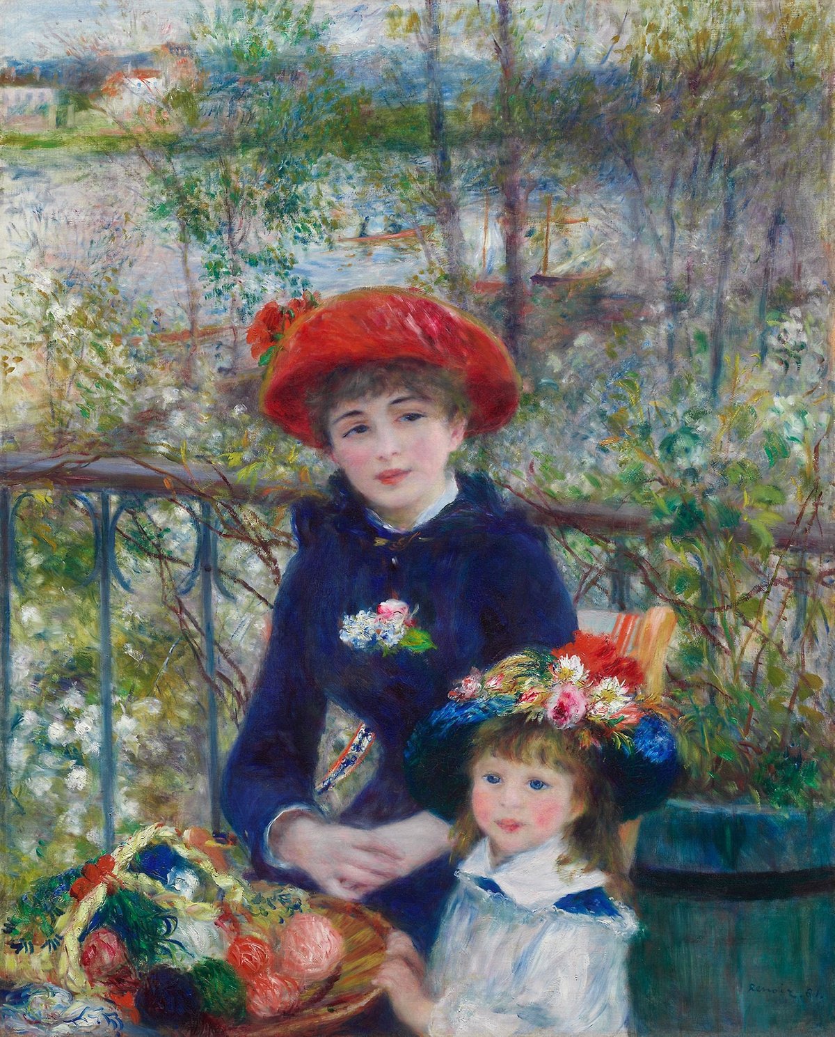
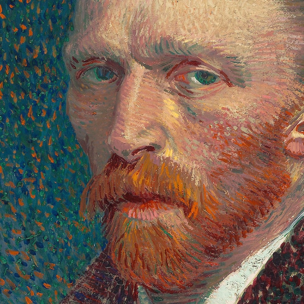
I’ve included a few notable works from their collection above: The Great Wave by Katsushika Hokusai, A Sunday on La Grande Jatte by Georges Seurat (which you can zoom and pretend you’re Cameron in Ferris Bueller’s Day Off), Self-Portrait by Vincent van Gogh, Nighthawks by Edward Hopper, Mao by Andy Warhol, and Two Sisters (On the Terrace) by Pierre-Auguste Renoir. The resolution on the images is high enough to check out the brushstrokes on the paintings. Here’s some detail on the van Gogh:
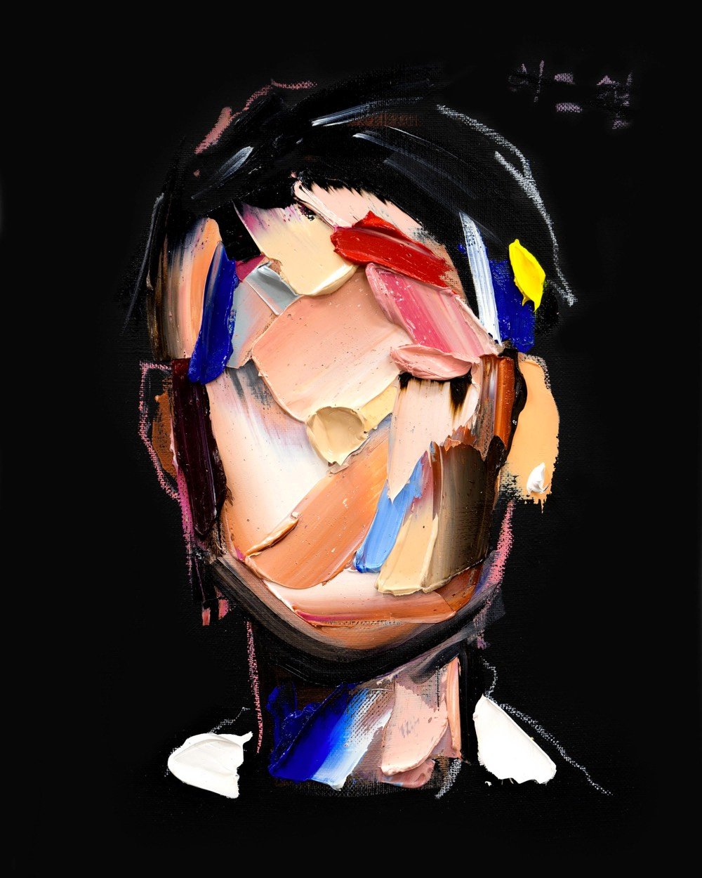
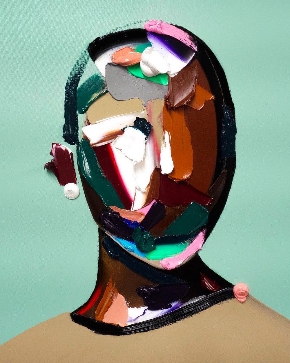
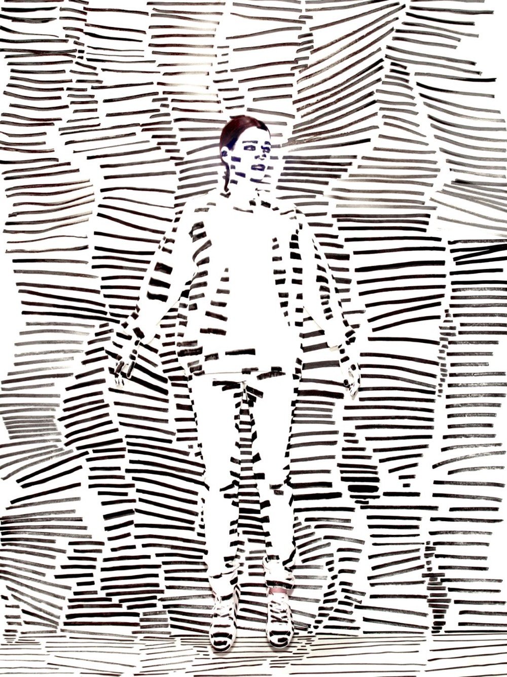
For his newest project IDENTITYCHRIST, Joseph Lee is pushing representational abstract painting to its limits.
I love how rough these are but you can still tell they’re people. Prints are available.
P.S. Lee is also an actor — you may have seen him playing the brother of the lead character in Searching, which is worth watching if only for the unique way the story is told. (via colossal)
Samer Dabra uses a drawing machine called the AxiDraw and a custom program to generate Impressionistic line drawings of people. The machine builds the portraits using four single lines drawn in the four CMYK colors, one on top of another, with minimal tweaking from Dabra. Rion Nakaya of The Kid Should See This edited together a video of the machine creating drawings.
There is something more than a little Vincent van Gogh & Georges Seurat about these. You can see the results on Instagram.
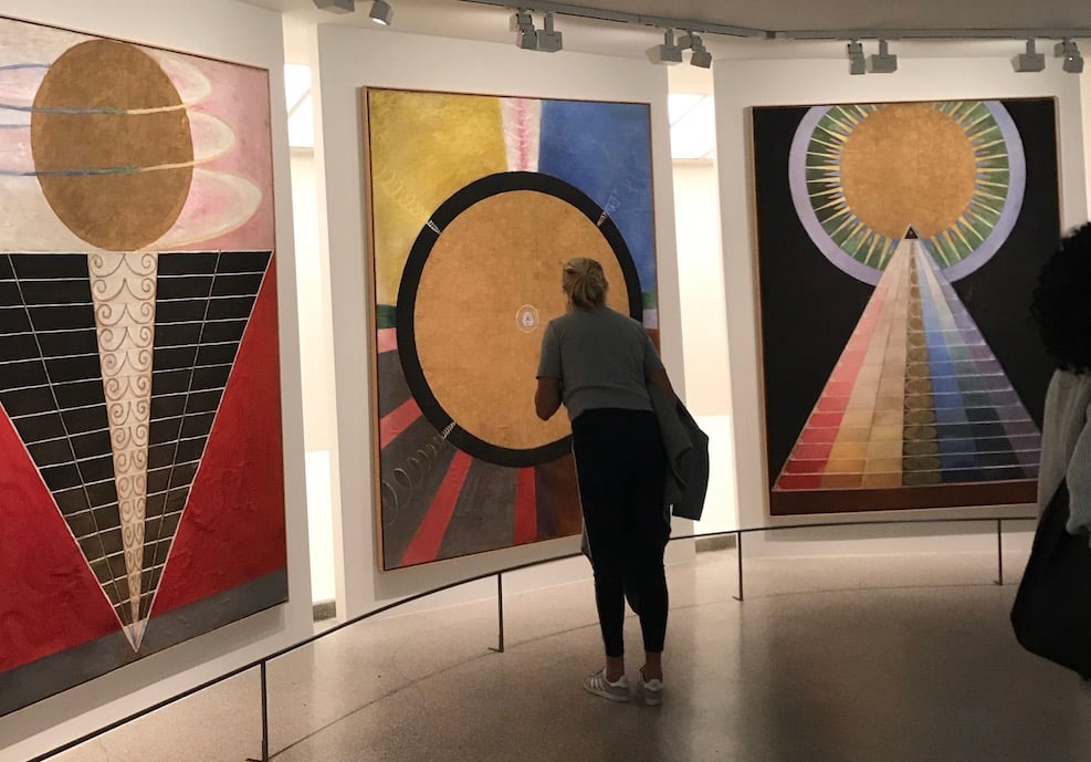
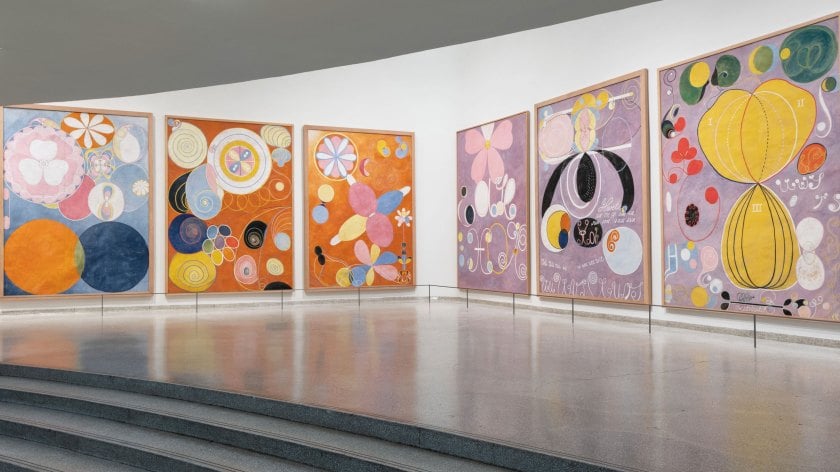
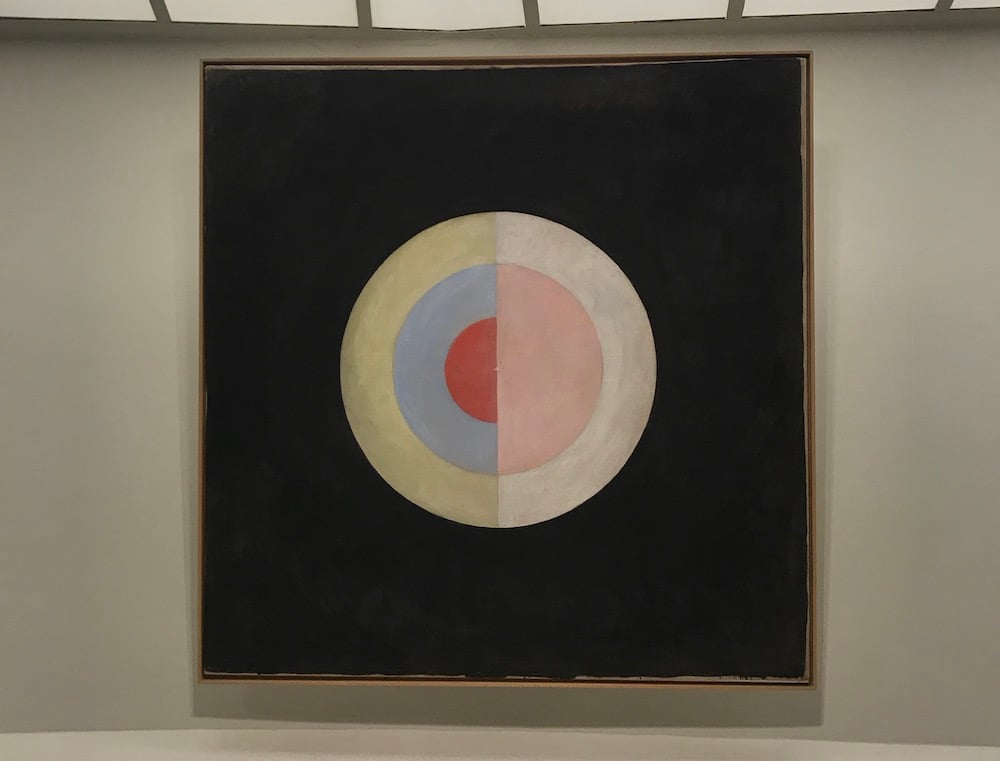
The Hilma af Klint retrospective at the Guggenheim is by far the trippiest thing I’ve seen within the confines of an esteemed art institution. The show is expansive and stunning and truly transcends time (images in her paintings look like things discovered decades later, from a double helix to the 80s electronic memory game Simon). As if to prove she’s a futurist, she envisioned that her major body of work would be displayed in a spiral temple.
Words cannot fully describe the power or style of her pieces, which are botanical, psychedelic, scientific, occult, and truly mystical. Her abstract paintings, which she started producing five years before Kandinsky or any other of the more famous men of her time created something of the sort, were channeled through her spiritualism. She was influenced by Rosicrucianism, Theosophy, and later in life, anthroposophy.
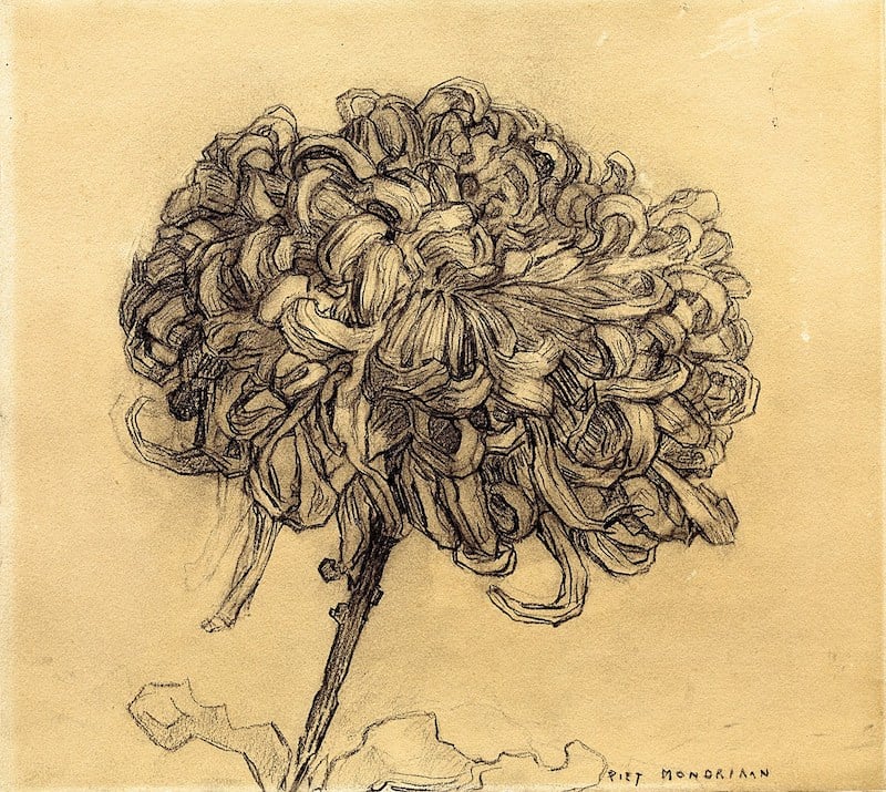
It’s all a bit mind-bending. af Klint knew that the world was not ready for her work, so she specified it not be shown until 20 years after her death. This was likely because, at a visit to her Stockholm studio in 1908, Rudolf Steiner was “unable to decipher the paintings and claims that no one during the coming 50 years will be able to.” She died in 1944, the same year as Kandinsky and Mondrian, and it was over four decades until there was a show that included her paintings.
The art is fearfully esoteric. But something about it resonates with a restlessly searching mood in present culture, hostile to old ideas. Af Klint has a lot of people’s rapt attention. From what I hear, young artists of many stripes are mad for her.
Yes, people are ready for it. Never before have I witnessed so many museum-goers studying paintings so up close (see my top photo, above) and really being with the art. And I’d argue our current #MeToo era is fertile ground for retelling origin stories with more representation of women and those who were otherwise overlooked.
The endlessly inspiring Hilma af Klint: Paintings for the Future is up at the Guggenheim in New York until April 23, 2019.
Barbara Kruger, Untitled (Questions)
(1990/2018)
Nine big questions by Barbara Kruger are now on display at MOCA in Los Angeles until November 2020. The museum will also host voter registration events in conjunction with the installation, made possible by an anonymous donor.
It’s worth noting that MOCA is just blocks away from LA’s Skid Row, where about 2,500 people live on the street. It’ll be interesting to see who shows up for their events and how they’ll do outreach.
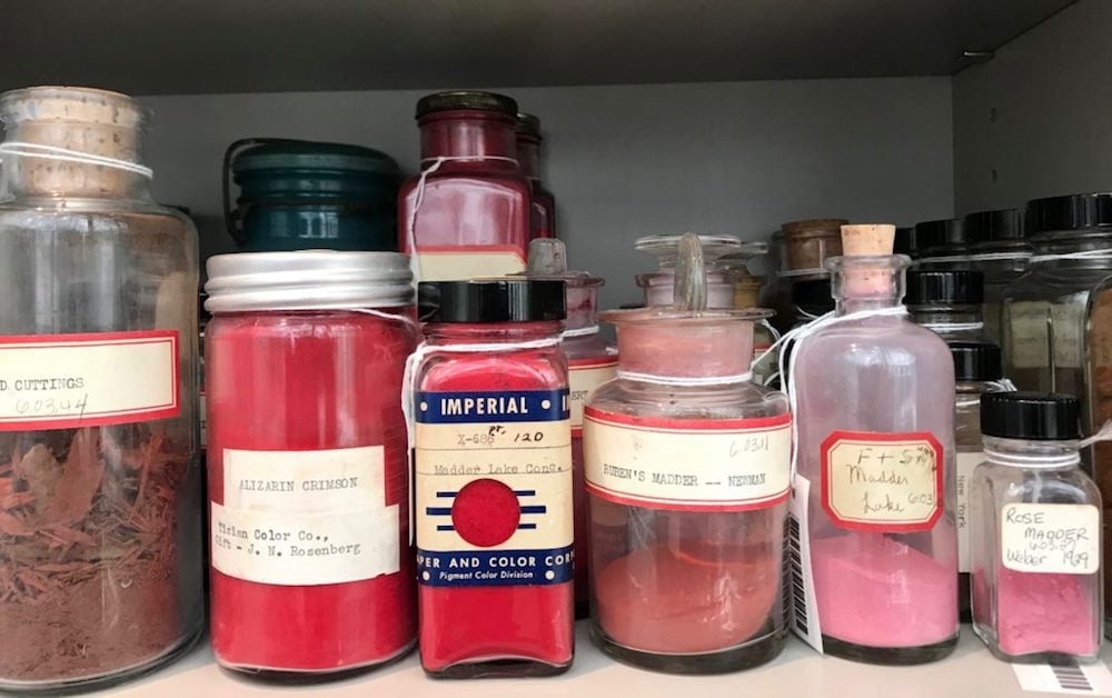
With the help of these rainbow-bright samples, scientists are able to ward off color loss. They can restore faded pieces through identifying what chemical response caused the fading in the first place. They can also reconstruct stories of paintings and people through an examination of the minerals they used to create their colors and the binding materials they sourced from nature. The color library is a working laboratory, one that traces the history of color from ancient stones to twenty-first-century nanotubes.
In the accompanying essay, the designers write that “we noticed that the advertising of the 1930s and ’40s seemed far less cynical or manipulative than it is today… Today’s distribution methods have created a relentless flood of messages, putting a torrent of information in the palm of your hand. How the public values, rejects, or embraces this version of public information is up to them.”
The other obvious difference is the overall mood of the messages. The WPA posters are direct, imperative, and point towards solutions, even when they’re being particularly grim about it. The contemporary versions are ironic, diffident, and uncertain about solutions — or at least, uncertain about solutions that can be reduced to a bold-type message across a poster. (Except “Don’t Send Dick Pics.” That one, they’ve got nailed.)
At the same time, there’s a yearning for that level of clarity, aesthetically if not intellectually. All of this seems frustrating but basically honest about the mood and limitations of this political moment.
In 1950, Swiss photographer Hans Namuth took some photos of Jackson Pollock painting some of his drip paintings, which were used to illustrate a 1951 article in ArtNews. Along with photos published alongside a piece in Life in 1949, they made Pollock and his unusual technique famous.
Namuth returned with a film camera and captured the artist painting in full color motion in a short film called Jackson Pollock 51.
In the film, you can see the physicality and performative aspect of Pollock’s work, the near repetition, the footwork, the precise imprecision of his arm movements, the cigarette dangling from his mouth. Pollock narrates part of the film:
I don’t work from drawings or color sketches. My painting is direct. I usually paint on the floor. I enjoy working on a large canvas. I feel more at home, more at ease, in the big area. Having the canvas on the floor, I feel nearer, more a part of the painting. This way, I can walk around it, work from all four sides, and be in the painting, similar to the Indian sand painters of the West.
At one point, Pollock paints on glass and Namuth shoots from underneath, so you can see how it looks from the point of view of the canvas. A 1998 NY Times piece by Sarah Boxer has an account of how the photos and film were captured, including a series of incidents that brought the Namuth/Pollock collaboration (and, some say, Pollock’s life six years later) to an end:
When Pollock and Namuth came in from outside, blue from the cold, the first thing Pollock did was pour himself a tumbler of bourbon. It was the beginning of the end. Pollock had been sober (some say) for two years. Soon Namuth and Pollock got into an argument — a volley of “I’m not a phony, you’re a phony.” Then Pollock tore a strap of cowbells off the wall and started swinging it around.
With the dinner guests seated and food on the table, Pollock and Namuth continued to argue. Finally Pollock grabbed the end of the table, shouting “Should I do it now?” to Namuth. “Now?” Then he turned over the whole table, plates, glasses, meat, gravy and all. (There is a scholarly disagreement about whether it was turkey or roast beef.) The dogs lapped at the glassy gravy. Krasner said, “Coffee will be served in the living room.”
After that night, Pollock never stopped drinking. He didn’t bring in the glass painting (“No. 29, 1950”) until it was covered with rain and leaves. He returned to a more figurative style of painting. Six years later, bloated, depressed and drunk, he drove his car into a tree, killing himself and a friend.
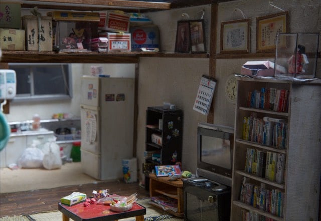
Dying alone in Japan is so common that they have a term for it: kodokushi (“lonely death”). Miyu Kojima works for a company that cleans up apartments after people die and for awhile now, she’s been creating miniature replicas of some of the rooms that she’s cleaned. Note: some of these images might be a little disturbing.
Kojima has been working for the clean-up company for about 4 years and explains that she cleans on average 300 rooms per year. To preserve and document the scene, the company always takes photographs of the rooms in case relatives want to see them. However, Kojima noticed that the photographs really don’t capture the sadness of the incident. And while she had no formal art training, she decided to go to her local craft store and buy supplies, which she used to create her replicas. She sometimes uses color-copies of the photographs, which she then sculpts into miniature objects. Kojima says that she spends about 1 month on each replica.
A few years ago, the artist Banksy built a shredder into the frame of one of his paintings “in case it was ever put up for auction”. On Friday, that painting came up for auction at Sotheby’s and after selling for ~$1.4 million, the shredder in the frame activated and cut the painting into little strips. The video of the sale and subsequent shredding is amazing:
Founded by Sophie Oliveira Barata, The Alternative Limb Project makes stylish & artistic prosthetic limbs for people who want to express their personality through those items.
As with fashion, where physical appearance becomes a form of self-expression, Sophie sees the potential of prosthetics as a extension of the wearer’s personality. Merging the latest technology with traditional crafts, Sophie’s creations explore themes of body image, modification, evolution and transhumanism, whilst promoting positive conversations around disability and celebrating body diversity.
See also Izzy Wheels, stylish wheelchair wheel covers.
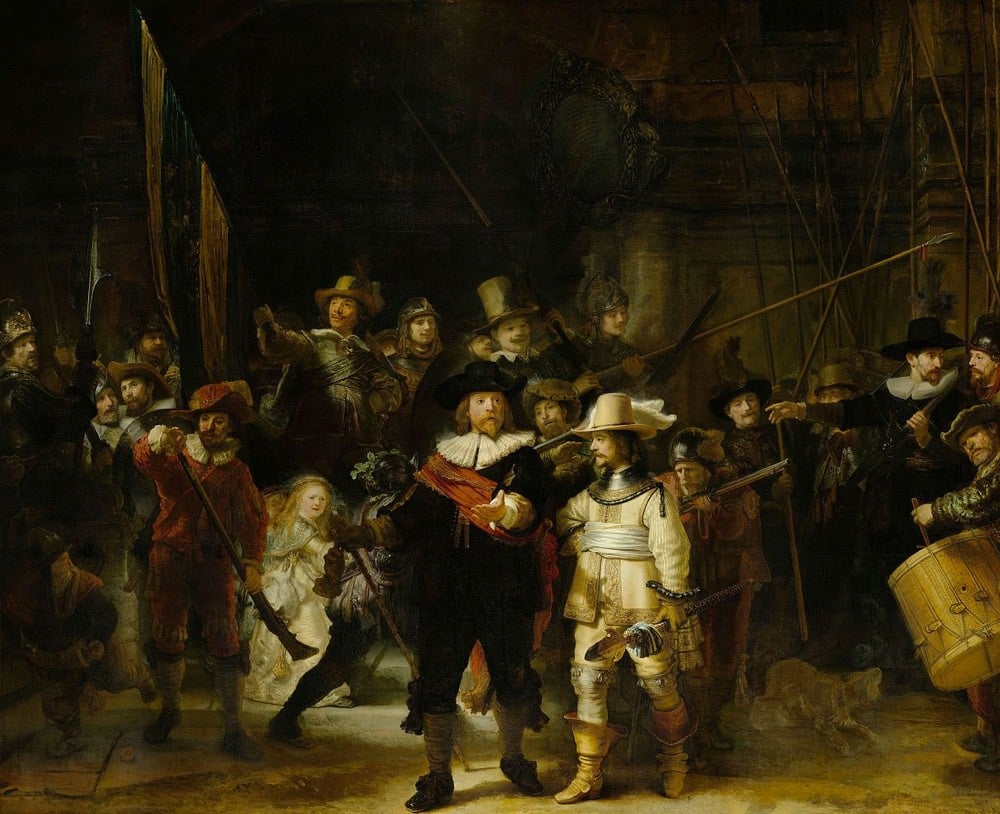
Ok folks, it’s time for some game theor- I mean, art history. In this video, Evan Puschak explains what makes Rembrandt’s The Night Watch so compelling from both a historical and artistic perspective.
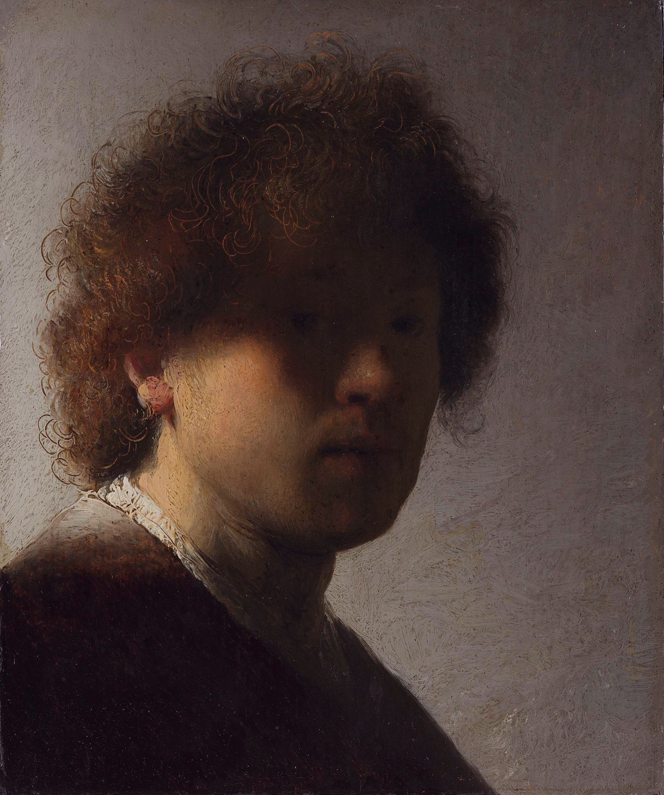
When I was in Amsterdam last year, I saw The Night Watch at the Rijksmuseum. As Puschak notes, it’s an impressive painting — for one thing, it’s more than 12 feet tall and weighs more than 740 pounds. However, I was even more keen on a nearby early self-portrait though.
Rembrandt painted this when he was 22 and while it lacks the subtle mastery of his later work, I couldn’t stop staring at it and kept looping back for one more view. If you look at a larger view of the painting, you can see where Rembrandt used the butt of his brush to scratch the wet paint to accentuate his curly hair. Something about seeing those tiny canyons on the canvas…I could almost see the young artist standing right where I was, flipping his brush around to scrape those marks before the paint dried, making his dent in the universe.
P.S. My absolute favorite piece at the Rijksmuseum was Vermeer’s The Milkmaid. Holy moly, what a painting.
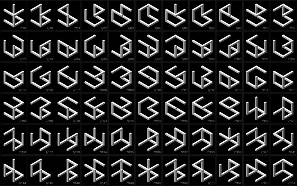
In Incomplete Open Cubes Revisited, Rob Weychert extends a 1974 project by Sol LeWitt called Variations on Incomplete Open Cubes that displayed 122 different ways that cubes with one or more edges missing could be depicted. Weychert’s project expands the number of incomplete cube possibilities to 4,094 by challenging LeWitt on three aspects of the original: dimensionality, contiguity, and rotation. See the about page for the explanation.
All of LeWitt’s cubes are contiguous; each part is connected to at least one other part. Since the cubes were intended to be physically fabricated, this appears to be a logistical concern: In the physical world, a detached part floating in space would be impossible. (It’s not clear, however, why detached, grounded parts were not permitted.)
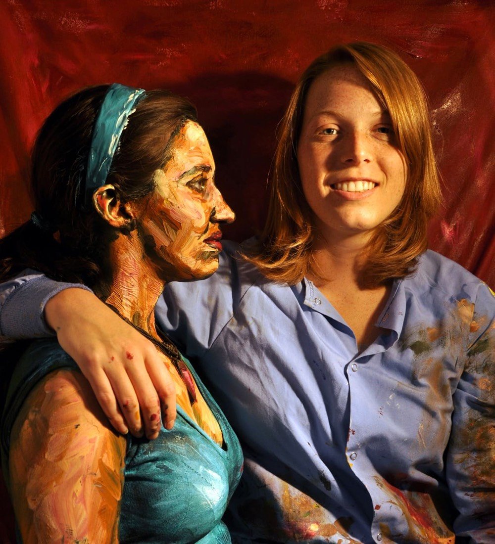
Artist Alexa Meade paints right on the bodies and clothes of living models to create the illusion that they’re in 2D paintings. It’s not body art…it’s like living trompe-l’œil in reverse.
Yeah, those are all actual people painted and posed in front of painted backdrops. Here’s Meade posing with one of her models:
Color Leap lets you time travel back through the color palettes of history, from colorful Egyptian sarcophagi circa 2000 BCE to stained glass windows circa 1000 CE to advertisements in the 1950s.
Clicking on the colors will copy the hex code for that color to your clipboard. (via design observer)
I’ve been keeping track of every media thing I “consume”, so here are quick reviews of some things I’ve read, seen, heard, and experienced in the last month or so. This installment has a few things on it from a trip to NYC and is also very movie-heavy. In addition to the stuff below, I also finished Sharp Objects (HBO series, not the book) and Star Trek: Voyager, both of which I reviewed last time. I’m almost done with Origin Story…might do a whole separate post on that one. Up next in the book department: Now My Heart Is Full, The Good Neighbor, or Fantasyland.
Bundyville. This podcast came highly recommended by a reader but as soon as Cliven Bundy opened his mouth to speak I realized I did not want to spend a single second of my life in this asshole’s ville or town or mind or anything. Maybe this makes me intolerant or incurious? Not sure I particularly care…there are worthier things I can choose spend my time on. (-)
Radiohead at TD Garden, 7/29/2018. I somehow won the Ticketmaster lottery and got floor tickets, so we were about 35 feet from the stage. Cool to see my favorite band that close. (A)
Kitchen Confidential by Anthony Bourdain. One of our culture’s recent great storytellers. It’s dated (and cringeworthy) in places, but that Bourdain voice and perspective is right there on the page, almost fully formed. In the chapter about Tokyo, you also get to witness the prototype for Bourdain’s third and, arguably, greatest career as a culinary and cultural observer of far-flung places. Pro tip: get the audiobook read by the man himself. (A)
My new electric toothbrush. Why didn’t anyone tell me about this sooner? My teeth feel (and probably are) so much cleaner now! (A-)
Holedown. I’ve spent too many hours playing this. It sucks I hate it it’s so good and I can’t stopppppppp. (A-/D+)
David Wojnarowicz exhibition at the Whitney. A strong show about an artist I didn’t know a lot about going in. (B+)
Eighth Grade. The feelings generated by watching this film — dread, crushing anxiety — closely approximated how I felt attending 8th grade. Well played. (B+)
Sorry to Bother You. If you haven’t seen this, don’t watch or read anything about it before you do. Just watch it. (A-)
Succession. This wasn’t quite as good as everyone said it was, but I still enjoyed it. My tolerance for watching rich, powerful, white assholes, however entertaining, is waning though… (B)
The Handmaid’s Tale by Margaret Atwood. Unsurprisingly more spare than the TV series but still powerful and unsparing. (A-)
The Dark Knight. If not the best superhero movie ever, it’s close. (A-)
Crazy Rich Asians. A romantic comedy with a strong dramatic element rooted in family & cultural dynamics, women who are strong & interesting & feminine in different ways, and a wondrous setting. Also, put Awkwafina in every movie from now on. (A-)
Won’t You Be My Neighbor?. Fred Rogers was a relentless person, a fantastic example of a different kind of unyielding masculinity. I sobbed like a baby for the last 20 minutes of this. (A)
BlacKkKlansman. Messy. I didn’t really know what to feel about it when it ended…other than shellshocked. Was that the point? (B+)
Bill & Ted’s Excellent Adventure. I watched this movie at least 100 times in high school. Despite not having seen it in probably 20 years, I still knew every single line of dialogue — inflections, timing, the whole thing. (A+)
Choreographer & acrobat Yoann Bourgeois and pianist Alexandre Tharaud have collaborated on a performance that combines a trampoline, a staircase, and Claude Debussy’s most famous composition, Clair de Lune. Even though I’ve seen a performance from Bourgeois before and knew what was coming, that first drop onto the trampoline was startling.
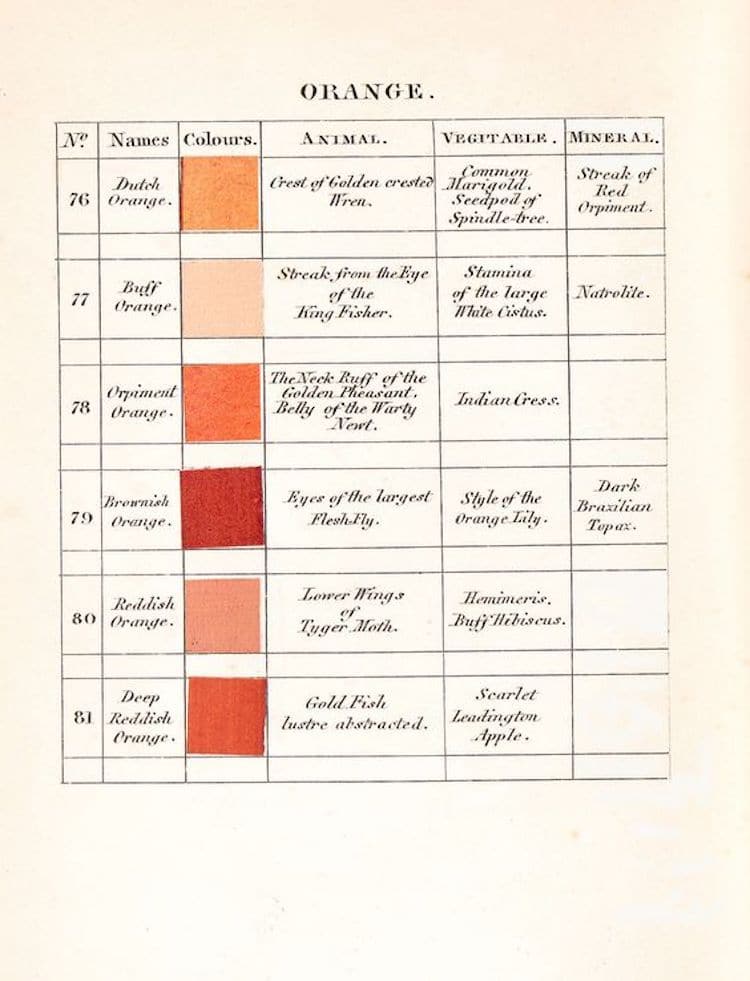
While Isaac Newton and the 17th century were more decisive for understanding the physics of color, you can’t beat the late 18th and early 19th century for a broader, subtler, more humanistic sense of the science of colors. The playwright and polymath J.W. von Goethe built up his Theory of Colours by collecting almost 18,000 meteorological and mineralogical specimens, with an emphasis on subtle distinctions between colors and their psychological perception in nature, rather than wavelengths of light.
Nomenclature of Colours served as a must-have reference for artists, scientists, naturalists, and anthropologists alike. The exquisitely rendered guide showcases the earth’s rich range of color by separating it into specific tones. Illustrated only by a small swatch, each handwritten entry is accompanied by a flowery name (like “Arterial Blood Red” and “Velvet Black”) as well as an identifying number. What the book is truly known for, however, is its poetic descriptions of where each tone can be found in nature.
Werner was a German mineralogist who created the system of color classification in the book to help distinguish between his own samples. His Scottish collaborators Patrick Syme and Robert Jameson were a painter and naturalist, respectively, who adapted the system into the book format in which it exists today. As you might guess, each color in the book includes a name, a swatch, and examples from the animal, vegetable, and mineral world showing where each color is found in nature.
Probably the most famous user of Werner’s book was Charles Darwin, who used it to help describe animals and other bits of the natural world in his books and journals. But if you think about it, before photography, anything that let naturalists describe what they were seeing in something resembling a universal vocabulary had to be essential. Essential enough that they were willing to produce the book by hand, with no real way to print in color.
Amazon sells a pocket-sized facsimile edition of the book. It may not be as handy as a color wheel for painting a room, but might be handier if you’re identifying bird eggs or a rare bit of stone.


Stay Connected