Liquid sculpture
Shinchi Maruyama throws water from his hands or from glasses and catches the temporary sculptures they make with his camera.
The Morning News has an interview with Maruyama and a photo gallery of his work; this one is really cool.
This site is made possible by member support. 💞
Big thanks to Arcustech for hosting the site and offering amazing tech support.
When you buy through links on kottke.org, I may earn an affiliate commission. Thanks for supporting the site!
kottke.org. home of fine hypertext products since 1998.
Shinchi Maruyama throws water from his hands or from glasses and catches the temporary sculptures they make with his camera.
The Morning News has an interview with Maruyama and a photo gallery of his work; this one is really cool.
This is a wonderfully whimsical introduction to doodling by way of graph theory, snakes, Oroborous and mobius strips. Oh, and the Mobiaboros.
(via vulture)
For a piece called Metropolis II, artist Chris Burden is building a huge track and put 1200 Hot Wheels cars on it…the noise is deafening when they’re all circulating.
It includes 1,200 custom-designed cars and 18 lanes; 13 toy trains and tracks; and, dotting the landscape, buildings made of wood block, tiles, Legos and Lincoln Logs. The crew is still at work on the installation. In “Metropolis II,” by his calculation, “every hour 100,000 cars circulate through the city,” Mr. Burden said. “It has an audio quality to it. When you have 1,200 cars circulating it mimics a real freeway. It’s quite intense.”
(thx, aaron)
The Pierre Bergé – Yves Saint Laurent Foundation in Paris is currently displaying an exhibition of David Hockney’s iPhone and iPad drawings. The exhibition is on display through Jan 30, 2011.
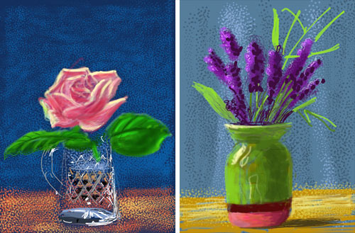
Hockney uses the Brushes app to create his digital paintings and even has his suits made with a pocket just for the iPad:
He picks up his iPad and slips it into his jacket pocket. All his suits have been made with a deep inside pocket so that he can put a sketchbook in it: now the iPad fits there just as snugly. Even his tux has the pocket, he tells me.
Mosaic collages like this one — where each “pixel” is a tiny self-contained image — are fairly common but I haven’t seen too many like these before:
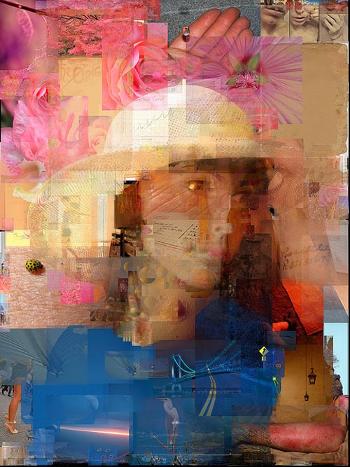
Lovely effect; they’re fun to look at zoomed in or out. (via matt)
Man, what if Spike Jonze had made Being Bill Murray instead? Casey Weldon did a series of paintings of Bill Murray as characters from Wes Anderson’s movies…but non-Murray characters like Max Fischer, Margot Tenenbaum, and the Baumer.
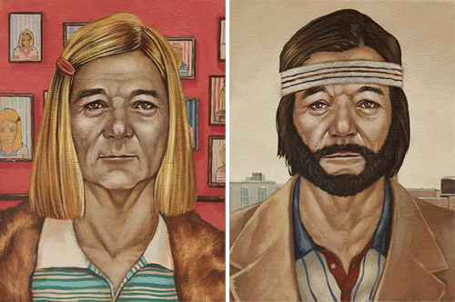
Prints are available. And these were a part of a show called Bad Dads, consisting of art inspired by various Anderson films. Again, prints are available.
Andy Denzler does these great paintings that look as though they’re highly compressed JPEGs with encoding issues.
The newest exhibition in The Tate Modern’s cavernous Turbine Room is Ai Weiwei’s Sunflower Seeds:
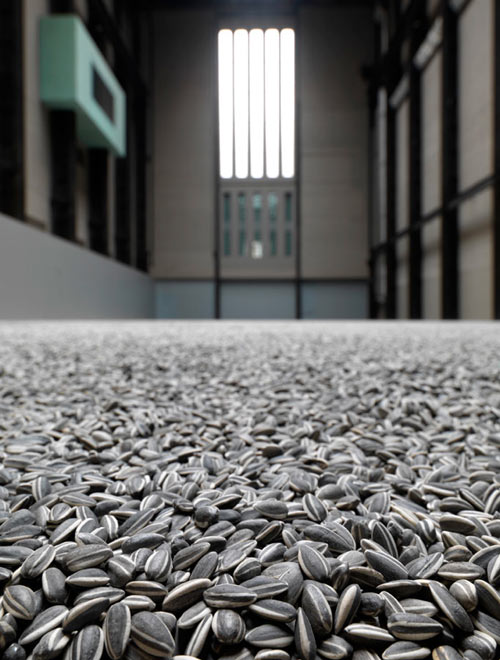
The room is filled with millions of handcrafted ceramic sunflower seeds:
Each seed has been individually sculpted and painted by specialists working in small-scale workshops in the Chinese city of Jingdezhen. Far from being industrially produced, they are the effort of hundreds of skilled hands. Poured into the interior of the Turbine Hall’s vast industrial space, the 100 million seeds form a seemingly infinite landscape.
Porcelain is almost synonymous with China and, to make this work, Ai Weiwei has manipulated traditional methods of crafting what has historically been one of China’s most prized exports. Sunflower Seeds invites us to look more closely at the ‘Made in China’ phenomenon and the geo-politics of cultural and economic exchange today.
For the first couple of days, people could walk around on the tiny sculptures (as you can see on Flickr), but health concerns prompted the museum to put a stop to that. Still pretty cool, but this remains my favorite Turbine Hall exhibition. (via hilobrow)
If you liked the video mapping on the IAC building, this one might be even better. For the 600th anniversary of the construction of the tower clock in Prague, The Macula projected a really great video on the tower…watch at least through the brick stacking animation.
Love this. In 1936, a 16-year-old Dutch girl played a shooting gallery game at the fair: hit the target and a camera takes a photo, which the girl receives as a prize. Almost every year between then and now, Ria van Dijk shot the target and got her prize.
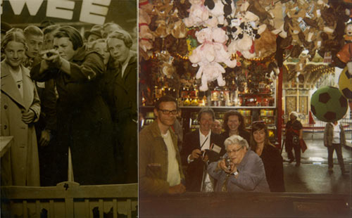
Van Dijk is now 88 and still shooting.
Last Saturday, the IAC building in Chelsea became the screen for a giant video art project.
Cassandra Jones takes photographs she finds online and stiches them together to form animations like this Eadweard Muybridge homage:
Really nice. Jones’ other work is worth a look as well. (via heading east)
Huh. The word “denim” comes from “serge de Nîmes”, a fabric made in Nîmes, France, and “blue jeans” comes from “Bleu de Genes”, blue pants made in Genoa (aka Genes). Both cities claim to have been manufacturing denim for centuries, but there has never been much proof in the way of artifacts and such. So the recent discovery of several paintings from the mid-1600s depicting people wearing jeans is surprising. Look at this jean jacket:
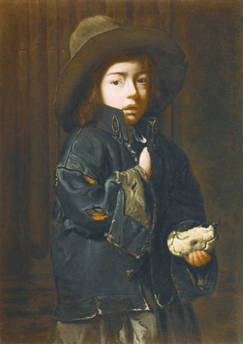
He’s even got his collar popped.
Rosmarie Fiore did this series of long exposure photographs of Atari games a few years ago.

Fiore did a similar project with pinball machines…instead of photos, the ball was covered in paint and left trails on vellum. Reminds me of some of the other time merge media I collected awhile back. (via @brainpicker)
Photographer Adam Magyar uses scanner cameras to take these huge panoramic photos which are a little difficult to explain.
Adam uses the same technologies as the finish line cameras at the Olympic Games, which take thousands of images a second and records through a 1 pixel wide slit. The time and space slices are then placed next to one another to generate an image without perspective. This method is capable of recording movement only, with static objects and buildings appearing as stripes and lines.
Here’s just a small slice of one of his photos…you’ll notice that it does look an awful lot like the photo-finish photos of sprinters.
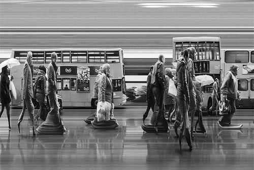
(via lens culture)
I remember reading that Greek and Roman statues were originally painted, but I didn’t know that through the use of modern scientific equipment, we actually know how they looked.

(via @brainpicker)
I don’t know what is being represented in either of these posts from but does it float, but they’re both capital G Gorgeous.
The images from ‘The most interesting trend in the development of the Internet is not how it is changing people’s ways of thinking but how it is adapting to the way that people think’ are from 3D compositions (concepts for Iron Man 2) by Prologue.
Here’s an example from ‘The most intense moments the universe has ever known are the next 15 seconds’, which is a gallery of the University of Florida Sparse Matrix Collection.

(Thanks, Adam)
Here’s a great story of Jami getting her bike stolen last night in Brooklyn. Wait, why is that great? Because, thanks to some internet sleuthing, a lot of luck (!!!), and solid police work from Brooklyn’s finest, she had it back by 11:30 this morning!
While we’re on the subject of bikes, according to a recently filed patent, Apple is looking at making a smart bike. I look to the future and I see 1) Consternation that Apple has signed an exclusive agreement to release the bike on Trek frames only for a period of 3, 4, or 5 years depending on which rumor you believe. 2) Several media stories crediting Apple for popularizing the riding of bikes. 3) Several media stories criticizing Apple for claiming they popularized the riding of bikes, even if they didn’t.make that claim, 4) Much rejoicing 3 weeks after release of the bike when someone has figure d out how to jail break the phone into a fixed gear. 5) 250 posts from John Gruber refudiating predictions of iBike failure. I look forward to all of it.
Lastly, on the topic of bikes. My friend Chris Piascik is drawing all the bikes he’s ever owned. This wouldn’t be a big deal for most people, Chris, however, has owned a gazillion bikes. The drawings are accompanied by vignettes on the bikes and I think the project will end up being more of a memoir than Chris originally anticipated. (Disclosure: If I had to name a favorite artist, it’d probably be Chris, and I post his art often on UW.)

Lauren Was and Adam Eckstrom, as Ghost of a Dream, create artstructuresculptures out of scratch tickets to show “unfulfilled dreams as well as money that could have been saved and possibly spent on the item itself”. “Dream Car” uses $39K worth of discarded tickets, and “Dream Home” uses $70K. That one’s really nice.
For what it’s worth, Was and Eckstrom aren’t the first to see art in scratch tickets. Rebecca Simering has explored the medium, as has the “I Love My Life The Way It Is” project. ILMLTWII is a project I want to believe in, but before sending scratch tickets to strangers in England, you should be aware of the risks.
(Via Cool Hunting / Derek)
Wikipedia has a page dedicated to controversial album art, which I found recently while looking up background on the 23rd birthday of Appetite for Destruction (yipe).
Eric Bana - Out of Bounds (1994)
The cover art features Bana naked from behind while streaking at a crowded AFL game. He is reaching for the ball and his buttocks are covered with the message “contents may offend”. The scene was created digitally, with the overlap of two photos. An alternative cover for the album was later released.
I was really hoping Eric Bana had a musical release in his background because musical releases by actors are usually hilarious, but this one appears to be comedy. Sigh.
This computer display covered by glass beads must be how bees see the web.
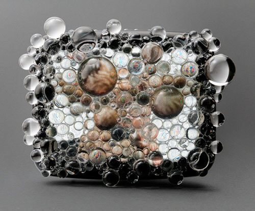
(via today and tomorrow, which is celebrating five years of excellence this week)
Scott Snibbe’s interactive art projects are available for sale on the iPhone/iPad and he’s pretty happy about it.
Over the past few days my first three apps became available on the iTunes store: Gravilux, Bubble Harp, and Antograph. I’ve been dreaming of this day for twenty years: a day when, for the first time, we can enjoy interactive art as a media commodity no different from books, music, and movies.
I remember the Gravilux Java applet from back in the day and happily bought it for the iPad.
In a barnburner of an article for the New Yorker, David Grann investigates the work of Peter Paul Biro and the forensic analysis of artworks for which he is well-known.
He does not merely try to detect the artist’s invisible hand; he scours a painting for the artist’s fingerprints, impressed in the paint or on the canvas. Treating each painting as a crime scene, in which an artist has left behind traces of evidence, Biro has tried to render objective what has historically been subjective. In the process, he has shaken the priesthood of connoisseurship, raising questions about the nature of art, about the commodification of aesthetic beauty, and about the very legitimacy of the art world. Biro’s research seems to confirm what many people have long suspected: that the system of authenticating art works can be arbitrary and, at times, even a fraud.
However, the more Grann and others dug into his past, the more Biro seemed to be in fraudulent territory himself.
Possible clues have emerged that Eadweard Muybridge may not have taken all the photographs attributed to him.
Naef explains why he thinks that stereographs attributed to Muybridge were in fact taken by Watkins, who sold the negatives to Muybridge. Muybridge then printed and sold them under his own name. “I think from what I’ve seen and knowing what I know about Muybridge - and I’m not an expert on Watkins by any mean and Weston is - I think yes Muybridge published pictures by other people,” Brookman said. “Some by Watkins potentially, but I think Muybridge was also a photographer and a significant photographer.”
Tyler Green of Modern Art Notes has a three-part interview with photography curator Weston Naef about why he thinks this is so. Part one is here. (No word yet on why Muybridge has so many unnecessary letters in his name.)
Michael Crawford monkeys around with a map of the US. This piece is called Los Angeles Getting More Annoying as We Speak:

I also liked his alteration to a Chuck Close portrait: Rauschenberg Minus Nebraska.
Composition with JavaScript is a Piet Mondrian painting with moveable lines and changeable colors so that you can make your own version.
Composition with Javascript is an interactive work made using HTML, CSS, Javascript and jQuery, based on Piet Mondrian’s “Composition with Yellow, Red, Black, Blue and Grey” (1920). It allows everybody deconstruct the original painting and form it again in whatever he or she wants. Lines are shiftable (just drag it with your mouse) and colours changeable (click on it). Texture of the painting was preserved for authentic look. One can play with composition, forms and colours, alter the harmony of the piece or even destroy it and compose something pictorial.
Pixel is a short documentary film exploring the artistic use of pixel-style animation in contemporary video games.
(via waxy)
A masked bandit broke into the Paris Museum of Modern Art last night and stole 5 paintings. Included in the grab were a Picasso and a Matisse.
Here is the list of paintings and what they look like:
”Le pigeon aux petits-pois” (The Pigeon with the Peas) by Pablo Picasso
”La Pastorale” (Pastoral) by Henri Matisse
‘L’olivier pres de l’Estaque” (Olive Tree near Estaque) by Georges Braque
‘La femme a l’eventail” (Woman with a Fan) by Amedeo Modigliani
”Nature-mort aux chandeliers” (Still Life with Chandeliers) by Fernand Leger
(via @jkottke)

Stay Connected