Hunter Loftis has built a terrain rendering engine in only 130 lines of Javascript. Here’s what the output looks like:

Programmers tend to be lazy (I speak from experience), and one nice side effect of laziness is really brilliant ways to avoid work. In this case, instead of spending mind-numbing hours manually creating what would likely be pretty lame rocky surfaces, we’ll get spiritual and teach the computer what it means to be a rock. We’ll do this by generating fractals, or shapes that repeat patterns in smaller and smaller variations.
I don’t have any way to prove that terrain is a fractal but this method looks really damn good, so maybe you’ll take it on faith.
You can try it out here…reload to get new landscapes. Callum Prentice built an interactive version. This obviously reminds me of Vol Libre, a short film by Loren Carpenter from 1980 that showcased using fractals to generate terrain for the first time.
Composition with JavaScript is a Piet Mondrian painting with moveable lines and changeable colors so that you can make your own version.
Composition with Javascript is an interactive work made using HTML, CSS, Javascript and jQuery, based on Piet Mondrian’s “Composition with Yellow, Red, Black, Blue and Grey” (1920). It allows everybody deconstruct the original painting and form it again in whatever he or she wants. Lines are shiftable (just drag it with your mouse) and colours changeable (click on it). Texture of the painting was preserved for authentic look. One can play with composition, forms and colours, alter the harmony of the piece or even destroy it and compose something pictorial.
This Javascript Nintendo emulator works amazingly well in Google Chrome. You can play Dr. Mario, Super Mario Bros., Tetris, The Legend of Zelda, etc.
I highly recommend you use Google Chrome to play JSNES. Thanks to its high performance canvas element, and a clever optimisation by Connor Dunn, it runs at full speed on modern computers. Mac builds are also available. Otherwise, it just about runs on Firefox 3.5 or Safari 4, but it’s hardly playable.
We’ve come a long way from the days of the 5K Awards.
Quick! Which photo sharing site community thingie is more popular: Fotolog or Flickr? You might be surprised at the answer…but first some history.
Fotolog launched in May 2002 and grew quite quickly at first. They’d clearly hit upon a good idea: sharing photos among groups of friends. As Fotolog grew, they ran into scaling problems…the site got slow and that siphoned off resources that could have been used to add new features to the site, etc. Problems securing funding for online businesses during the 3-4 years after the dot com bust didn’t help matters either.
Flickr launched in early 2004. By the end of their first year of operation, they had a cleaner design than Fotolog, more features for finding and organizing photos, and most of the people I knew on Fotolog had switched to Flickr more or less exclusively. They also had trouble with scaling issues and downtime. Flickr got the scaling issues under control and the site became one of the handful of companies to exemplify the so-called Web 2.0 revitalization of the web. The founders landed on tech magazine covers, news magazine covers, and best-of lists, the folks who built the site gave talks at technology conferences, and the company eventually sold to Yahoo! for a reported $30 million.
Fotolog eventually got their scaling and funding issues under control as well, but relative to Flickr, the site has changed little in the past couple of years. Fotolog has groups and message boards, but they’re not done as well as Flickr’s and there’s no tags, no APIs, no JavaScript widgets, no “embed this photo on your blog/MySpace”, and no helpful Ajax design elements, all supposedly required elements for a successful site in the Web 2.0 era. Even now, Fotolog’s feature set and design remains planted firmly in Web 1.0 territory.
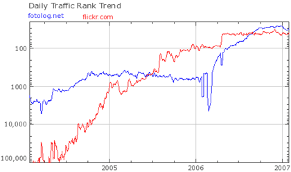
So. Then. Here’s where it gets puzzling. According to Alexa1, Fotolog is now the 26th most popular site on the web and recently became more popular than Flickr (currently #39). Here’s the comparison between the two over the last 3 years:

This is a somewhat stunning result because by all of the metrics held in high esteem by the technology media, Web 2.0 pundits, and those selling technology and design products & services, Flickr should be kicking Fotolog’s ass. Flickr has more features, a better design, better implementation of most of Fotolog’s features, more free features, critical praise, a passionate community, and access to the formidable resources & marketing power of Yahoo! And yet, Fotolog is right there with them. Perhaps this is a sign that those folks trapped in the Web 2.0 bubble are not being critical enough about what is responsible for success on the Web circa-2007. (As an aside, MySpace didn’t really fit the Web 2.0 mold either, nobody really talked about it until after it got huge, and yet here it is. And then there’s Craigslist, which is more Web 0.5 than 2.0, and is one of the most popular sites on the web. Google too.)
What’s going on here then? I can think of three possibilities (there are probably more):
1. Fotolog is very popular with Portugese and Spanish speakers, especially in Brazil. According to Wikipedia, almost 1/3rd of all Fotolog users are from Brazil and Chile. In comparing the two sites, what could account for this difference? Fotolog has a Spanish language option while Flickr does not (although I’m not sure when the Spanish version of Fotolog launched). Flickr is more verbose and text-intensive than Fotolog and much of Flickr’s personality & utility comes from the text while Fotolog is almost text-free; as a non-Spanish speaker, I could navigate the Spanish-language version quite easily. Gene Smith noted that a presentation made by a Brazilian internet company said that “Flickr is unappealing to Brazilians because they want to the customize the interface to express their individual identities”.
Cameron Marlow noticed that Orkut is set to pass MySpace as the world’s most popular social networking site (Orkut is also very popular in Brazil), saying that “Orkut’s growth reinforces the fact that the value of social networking services, and social software in general, comes from the base of active users, not the set of features they offer”. Marlow also notes that Alexa’s non-US reporting has improved over the past year, which might be the reason for Fotolog’s big jump in early 2006. If Alexa’s global reporting had been robust from the beginning, Fotolog may have been neck and neck with Flickr the whole time.
2. Flickr is more editorially controlled than Fotolog. The folks who run Flickr subtly and indirectly discourage poor quality photo contributions. Yes, upload your photos, but make them good. And the community reinforces that constraint to the point where it might seem restricting to some. Fotolog doesn’t celebrate excellence like that…it’s more about the social aspect than the photos.
3. Maybe tags, APIs, and Ajax aren’t the silver bullets we’ve been led to believe they are. Fotolog, MySpace, Orkut, YouTube, and Digg have all proven that you can build compelling experiences and huge audiences without heavy reliance on so-called Web 2.0 technologies. Whatever Web 2.0 is, I don’t think its success hinges on Ajax, tags, or APIs.
Update: You can see how much Fotolog depends on international usage for its traffic from this graph from Compete. They only use US statistics to compile their data. I don’t have access to the Comscore ratings, but they only count US usage and, like Alexa, undercount Firefox and Safari users. (thx, walter)
[1] Usual disclaimers about Alexa’s correctness apply. The point is that among some large amount of users, Fotolog is as popular (or even more) than Flickr. Whether those users are representative of the web as a whole, I dunno. ↩


Stay Connected