kottke.org posts about maps
The NY Times has an interactive look at how the Manhattan grid came to be.
In 1811, John Randel created a proposed street grid of Manhattan. Compare his map, along with other historic information, to modern-day Manhattan.
This article has more about the map. (via ★raul)
A map of the Mississippi River and all its tributaries drawn in the style of Harry Beck’s London Underground map.
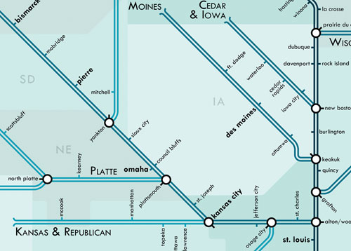
Prints are available. (via strange maps)
Alexander Chen made a version of the NYC subway map that plays music as the trains intersect routes.
At www.mta.me, Conductor turns the New York subway system into an interactive string instrument. Using the MTA’s actual subway schedule, the piece begins in realtime by spawning trains which departed in the last minute, then continues accelerating through a 24 hour loop. The visuals are based on Massimo Vignelli’s 1972 diagram.
Check out the full version; there are more details here. See also Isle of Tune. (via about 20 people on Twitter just now)
This illustrated map of Central Park individually depicts, labels, and categories by species every single significant tree in the park. All 19,630 of them.
Central Park Entire, The Definitive Illustrated Map is the most detailed map of any urban park in the world. I spent over two years creating it, walking more than 500 miles as I documented over 170 different kinds of trees and shrubs. Central Park contains over 58 miles of paved paths and many more miles of obscure woodland trails. I hiked along every one of them multiple times in order to identify and pinpoint each major tree. There are 19,630 trees drawn and placed in position on this map. There are no filler trees, no fluff. Every tree symbol represents a real tree in the Park, and you can identify its genus or species with the accompanying tree legend.
If you’ve got a subscription to the New Yorker, you can read about the map in this week’s issue. (thx, @bamstutz)
The Brooklyn Historical Society recently restored a 1770 map of New York City, one of a handful of “Ratzer maps” that have survived to the present day.
A British Army officer in America, Lieutenant Ratzer was a surveyor and draftsman, and his map was immediately praised as a step forward from those of his predecessors. For his trouble, his name was misspelled on initial versions of his maps, called the “Ratzen plan.”
The map included a detailed rendering of the island’s slips and shores and streets in Lower Manhattan, the familiar mixing with the long gone. Pearl, Broad, Grand and Prince lay beside Fair and Crown and the “Fresh Water” pond.
“Manhattan, at least the part shown here, was mapped as precisely as any spot on the Earth at the time,” said Robert T. Augustyn, co-author of “Manhattan in Maps: 1527-1995”. “There was no more beautiful or revealing a map of New York City ever done.”
The side-by-side comparison of the restored map with the pre-restored map is worth a look. And compare with the Viele map of Manhattan made in 1865.
Dorothy Gambrell looked up all of the state names on Google and made a map of what the autocomplete suggestions were. Here’s part of it:

Lots of sports and schools.
A really nice analysis of the readability of maps from the three big online mapping companies: Google, Bing, and Yahoo. As you might expect, Google is the clear winner; they pay more attention to the little details than the other two services.
It turns out that Google uses a variety of techniques and visual tricks to help make its city labels much more readable than those of its competitors. From the use of different shadings to decluttering areas outside of major metro areas, it sure seems like Google has put a lot of thought into how it displays the labels appearing on its maps. I have no doubt that little touches like these are among the many reasons why Google remains the web’s most popular mapping site.
If all the countries in the world swapped geographic positions based on population, then you’d have something that looked a bit like this:
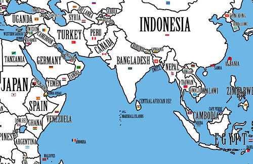
Take the world’s largest country: Russia. It would be taken over by its Asian neighbour and rival China, the country with the world’s largest population. Overcrowded China would not just occupy underpopulated Siberia - a long-time Russian fear - but also fan out all the way across the Urals to Russia’s westernmost borders. China would thus become a major European power. Russia itself would be relegated to Kazakhstan, which still is the largest landlocked country in the world, but with few hopes of a role on the world stage commensurate with Russia’s clout, which in no small part derives from its sheer size.
Canada, the world’s second-largest country, would be transformed into an Arctic, or at least quite chilly version of India, the country with the world’s second-largest population. The country would no longer be a thinly populated northern afterthought of the US. The billion Indians north of the Great Lakes would make Canada a very distinct, very powerful global player.
The full map is here. Interestingly, four countries stay in the same positions: the US, Ireland, Yemen, and Brazil.
Matthew Ericson tracked down the first national election map published in the NY Times; it showed William McKinley’s victory over William Jennings Bryan.
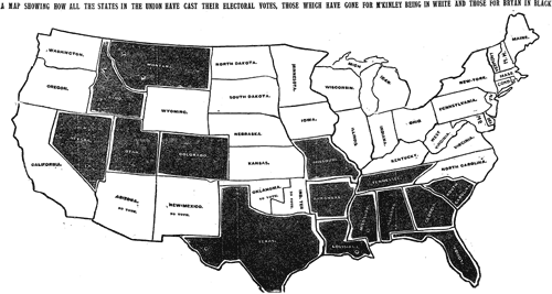
The speed with which the results made it into print boggles the mind given the technology of the day (especially considering that in the last few elections in the 2000s, with all of the technology available to us, there have been a number of states that we haven’t been able to call in the Wednesday paper).
(thx, tyson)
I’m a little late this year, but the 2010 NFL maps site has been up and humming for four weeks now. The site displays what games are going to be on TV in different parts of the country.
XKCD has updated their map of online communities.
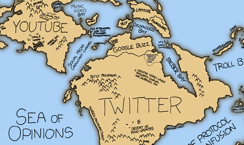
I like the Sea of Zero (0) Comments. (via waxy)

Larger version here. Other stereotype maps are available, including Europe According to Bulgaria and Europe According to Gay Men.
Starting tomorrow and continuing through November, Pratt Manhattan Gallery has an interesting show about maps and NYC. Among the works displayed will be:
- a three-dimensional map of the lower Manhattan skyline made of a Jell-O-like material by Liz Hickok
- a “Loneliness Map” from Craigslist’s Missed Connections by Ingrid Burrington
- personal maps created from a call for submissions by the Hand Drawn Map Association
- Bill Rankin’s maps of Not In My Back Yard-isms showcasing various geographies of community and exclusion
- a scratch-and-sniff map of New Yorkers’ smell preferences by Nicola Twilley
Opening reception is tonight from 6-8. (via edible geography)
The MTA in NYC is looking for someone to keep their transit maps fresh.
As part of a two-person team, the incumbent of this position is responsible for the design and timely updating of NYCT’s printed and online map products, including the extensive service schedule panels on the reverse side of all “pocket” bus maps; researching and responding to map design and information issues; identifying, researching, recommending, and adapting evolving map drawing and production technologies; adapting Transit’s map products to the agency website and providing modified products for third party publications; advising on or producing custom maps for major agency initiatives and proposals; advising and assisting on other product design, graphics technology procurements and related staff training for all graphics services in Marketing and Service Information.
This has to be some kottke.org reader’s dream job…go get it!
This is a Google Maps interface with everything but the location labels taken away.
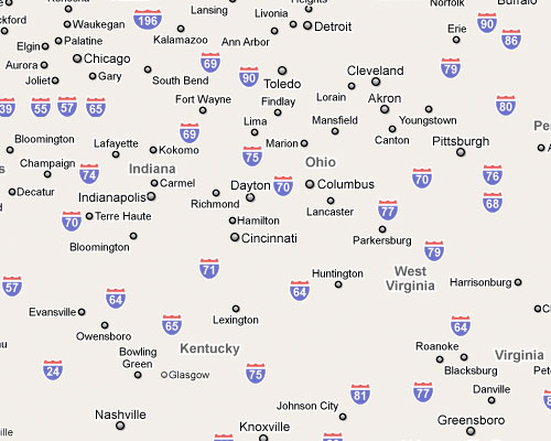
Take a little time with this one, zoom it in and out, especially on big cities. Excluding everything but the labels from the map emphasizes the Powers of Ten-like design of highly effective zoomable online maps. (via waxy)
The Rap Map plots locations mentioned in rap songs on Google Maps. For instance:
Back in the late 90s, Club New York was one of the hottest clubs in the city, even though it sounds like some sort of fictional club in the direct-to-DVD Night at the Roxbury 2
Then, one wintry evening in 1999, Diddy, J-Lo, and Shyne were at the club when all hell broke loose. Guns were pulled, women were shot in the face, and when all the dust settled, Shyne and Diddy were on trial at Manhattan Criminal Court
Diddy was acquitted, while Shyne was sent to prison for 9 years.
From Bill Rankin’s excellent Radical Cartography, maps of the world’s population graphed by latitude and longitude. Here’s the latitude map:
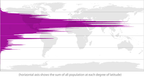
You can almost see the Guns, Germs, and Steel in there.
#OhMyGodICan’tBelieveHowManyPostsJason’sWrittenAboutMapsInTwelveYears
This is a very slim, highly-curated selection of some of Kottke’s favorite maps, emphasizing the old, weird, and awesome:
- Marco. Polo. Google. Rachel Leow retraces MP’s voyage in annotations to Google Maps. I’m in this post!
- Maps as metaphor. Things like a recipe for omelettes conveyed in the form of maps.
- The beauty of maps, a BBC series.
- A Milky Way tube map.
- Ten maps that changed the world.
- 20 cool ancient maps.
- Maps of tunnel networks, the physical kind, not IPvWhatever. Great map of the Maginot line.
- Aerial map of NYC from 1924.
- A three-year-old’s view of the NYC subway. OP drew a map showing landmarks most relevant to her niece.
- Caricature map of Europe, 1914. France is a kepi-wearing elephant, Norway and Sweden are trolls that look a lot like fish. (Probably just the shape.)
- Strange maps. You don’t say.
- Nazi invasion of the USSR. This one’s in Flash.
- Harry Beck’s Paris Metro map. Beck designed the London tube map and tried Paris. Actual map’s behind a firewall, but Jason’s description is good.
- Typographic map of London. Like synthetic cubism with letters.
- Maps drawn from memory.
- “Wikipedia has a series of maps showing the political and social boundries of the world in 2000 BC, 1000 BC, 500 BC, 323 BC and so on.”
- Historical maps on Google Earth.
- Map of the galaxy in which Star Wars takes place. Update: This one has succumbed to linkrot, but Wikipedia’s got your back.
- “The Mannahatta Project is constructing maps of what Manhattan was like in 1609, before its ‘discovery’ by Henry Hudson.”
Enjoy!
In a long excerpt from O’Reilly’s recent book “Beautiful Visualization”, KickMap designer Eddie Jabbour talks about his process for redesigning the NYC Subway map.
While I felt that it was important to show certain shapes aboveground, I also felt that it was important to leave out certain pieces of belowground information. There are several places where the subway tunnels cross and overlap each other beneath the surface. This may be important information for city workers or utility companies trying to make repairs, but for the average commuter, showing these interactions just creates visual noise. I tried to reduce that noise by cleanly separating the lines on the map so they don’t overlap. Consider the different depictions of the 4 line and the 5 line in the Bronx; sure, the MTA’s paths may be accurate, but they’re also confusing, and riders don’t really need to see those particular details to understand where they’re going.
(Via @TheJames)
I’m hoping this will be a new option on Google Maps alongside “satellite” soon: thermographic view. It’s basically a heat map of all the buildings on a map…pop in your address and see how energy efficient your roof is. Belgium only. Unfortunately…unless you live in Belgium. (via infosthetics)
Michael Crawford monkeys around with a map of the US. This piece is called Los Angeles Getting More Annoying as We Speak:
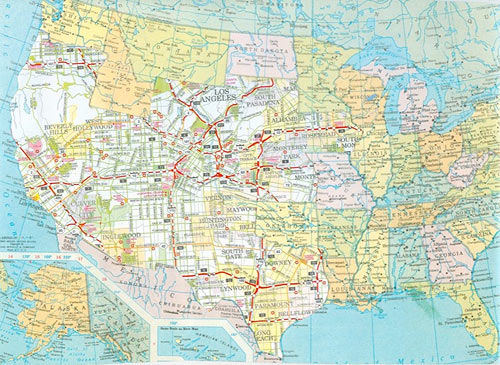
I also liked his alteration to a Chuck Close portrait: Rauschenberg Minus Nebraska.
Locals and Tourists is a set of maps showing where people take photos in various cities around the world. The results are broken down into tourist photos and photos taken by locals. Here’s NYC:
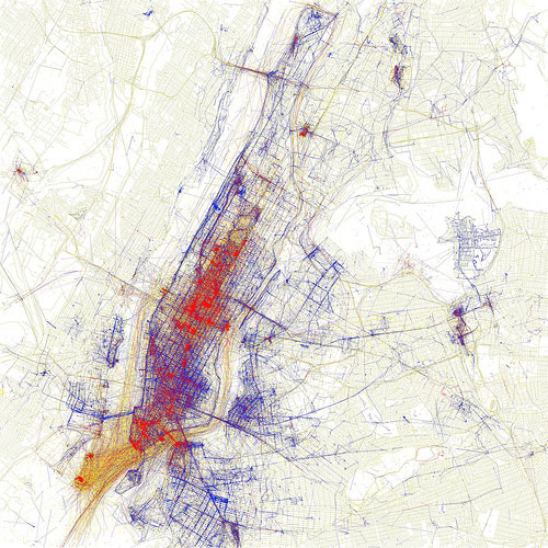
Blue points on the map are pictures taken by locals (people who have taken pictures in this city dated over a range of a month or more). Red points are pictures taken by tourists (people who seem to be a local of a different city and who took pictures in this city for less than a month).
If you’re travelling abroad with the iPhone and understandably wish to avoid AT&T’s ridiculously high data roaming charges when trying to find the train station in a new city, I would highly recommend OffMaps.
OffMaps lets you take your maps offline. It is the ideal companion for any iPhone and iPod Touch user, who wants to access maps when travelling abroad (and avoid data roaming charges) and who wants to have fast access to maps at all times. This app (and the icon) just has to be on the right hand side of Apple’s built-in maps app.
OffMaps uses OpenStreetMap that include a lot more information than simple road maps: from ATMs and train stations to restaurants and pubs! You choose which areas to download instead of buying a new app for every city you want to visit.
I used it for a week in Paris and it worked great; the GPS and compass both still work when data is off so locating yourself isn’t a problem. Just download the proper maps before you leave for your trip and you’re good to go.
Next month, the MTA will release a new subway map. The NY Times has a look at the new map.
The new subway map makes Manhattan even bigger, reduces Staten Island and continues to buck the trend of the angular maps once used here and still preferred in many other major cities. Detailed information on bus connections that was added in 1998 has been considerably shortened.
Manhattan will be shown on the map as nearly twice as wide as in real life. Cut back on the chili-cheese fries, my friend!
The head of the map collections department at the British Library shares ten maps that changed the world.
5. Google Earth. Google Earth presents a world in which the area of most concern to you (in this instance, Avebury in Wiltshire) can be at the centre, and which - with mapped content overlaid - can contain whatever you think is important. Almost for the first time, the ability to create an accurate map has been placed in the hands of everyone, and it has transformed the way we view the world.
As our devices converge, the infrastructure necessary to support them grows and grows. The iPhone costs $200, fits in a pocket, and relies on “a vast array of infrastructures, data ecologies, and device networks” to function…from the mines where the indium for the touchscreen is mined to the cell towers that allow you to locate that coffee shop in Brooklyn.
Until we see that the iPhone is as thoroughly entangled into a network of landscapes as any more obviously geological infrastructure (the highway, both imposing carefully limited slopes across every topography it encounters and grinding/crushing/re-laying igneous material onto those slopes) or industrial product (the car, fueled by condensed and liquefied geology), we will consistently misunderstand it.
See also I, Pencil and this neat Harry Beckian map of the iPhone’s connections and capabilities. (via lone gunman)
Newer posts
Older posts





Stay Connected