kottke.org posts about maps
Detailed hand-drawn Dungeons and Dragons dungeon map. See also maps drawn from memory.
Update: The map is not from Dungeons and Dragons but from the “original mini-computer” version of Zork, then called Dungeon. (thx, everyone in the world)
A French map shows that the Portuguese were the first Europeans to discover Australia in the early 1520s, almost 250 years before Captain Cook claimed them for Britain. “‘The Vallard cartographer has put these individual charts together like a jigsaw puzzle. Without clear compass markings its possible to join the southern chart in two different ways. My theory is it had been wrongly joined.’ Using a computer Trickett rotated the southern part of the Vallard map 90 degrees to produce a map which accurately depicts Australia’s east coast.”
The must-see link for today is Social Explorer. Jump right to the maps section or to the New York City % White 1910-2000 and the the New York City % Black 1910-2000 slideshows. Running the shows forward, you can see blacks settling into Harlem, Brooklyn, and Queens and then spreading out from there. I wish it were slightly easier to make slideshows, but it’s still really fun to play around with all the maps. (via vsl)
Wikipedia has a series of maps showing the political and social boundries of the world in 2000 BC, 1000 BC, 500 BC, 323 BC and so on.
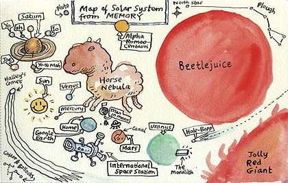
The first time I saw a world map drawn from memory was at Christopher Fahey’s apartment. I forget how long it took him to draw, but it was remarkably accurate and fairly large (a few feet across). Ever since then, I’ve kept an eye out for other hand-drawn maps (you know what they say: if you can’t do, collect). Via waxy this morning comes the From Memory Flickr group. My favorites from the group are this map of the male human body and a fanciful drawing of the solar system, both by Ellis Nadler:
Mapping.com has links to several maps from memory drawn by grade- and middle-school children; this world map by a 7th grade class is not too shabby. I’m struck by how much some of these world maps from memory resemble world maps drawn in the 16th and 17th centuries, like this Dutch map from 1689. All the parts are (mostly) there…it’s just that everything is a little wrong-sized and slightly skewed.
Lori Napoleon collects “personal maps” from various people. This tactical guide for nourishing yukio includes directions to the owner’s house, outlines of the two different keys (outside door, inside door), and what to feed the cat and when.
Also slightly related is the Fool’s World Map, a deliberately addled world map prompted by a question asked of the map-maker by a Texan: “How many hours does it take to go to Japan by car?”
Update: Despite having featured his work on kottke.org late last year, I completely forgot about Stephen Wiltshire’s super-realistic drawings from memory. Here’s video of Stephen drawing Tokyo from memory and Rome from memory. (thx, matt)
Update: Christopher Fahey uploaded a photo of his world map drawn from memory.
If Strangemaps wasn’t such a reliable source, I’d think this was a hoax. A small part of East Germany lives on in the Caribbean. Cuba gave the tiny island to the GDR in 1972 while on a state visit to East Berlin and it wasn’t mentioned in the German unification treaties. Commenters on the thread have found satellite images of the island in question, including this one.
Not sure when these features were added, but Google Maps now displays public transportation stops (NYC subway, the T in Boston, the L in Chicago) and building outlines for metropolitan areas. Here’s a shot of the West Village in NYC:
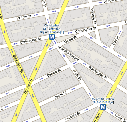
Tiny but useful improvements. (thx, meg)
World map of driving orientations. “An estimated 66% of people worldwide live in right-hand side countries, and 72% of all distances are completed while driving on the right side of the road.”
Dumb interface, but here are some neat maps of global fish catch locations, mostly tuna. For example, on these maps you can see the dramatic increase of purse seine fishing from 1964-1998. (thx, spencer)
Map of the Land of Oz. “Oz is completely surrounded by deserts, insulating the country from invasion and discovery. The isolation may be splendid, it is not total: children from our world got through, as well as the Wizard of Oz and the more sinister Nome King. To prevent further incursions, Glinda created a barrier of invisibility around Oz.”
Strange Maps post about the Vinland Map, a document proported to have been drawn in the 15th century from a 13th century map. The Vinland Map depicts an unknown land across the Atlantic Ocean called Vinland which some think is the part of North America visited by the Vikings in the 11th century.
A pair of trend maps for 2007, both based on subway maps. The top one depicts the top online companies/brands & how they’re connected while the bottom one deals with ideas (with the River of Consciousness standing in for the Thames).

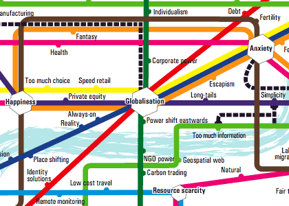
Both maps were found in this article about internet predictions in 2007. I don’t know about you, but I find these types of maps fun to look at, but completely inscrutable informationally speaking. Surely there’s a more enlightening way to present this information than in Tube map form.
A tourist map of Gotham City. Gotham resembles “Manhattan below 14th Street at 11 minutes past midnight on the coldest night in November”.
A nearly continuous wire that encompasses 150 city blocks of Manhattan forms the “walls” of a symbolic Jewish household called an eruv.
The Orthodox and other observant Jews living within this ‘home’ are permitted certain actions outside their literal homes — pushing a stroller to the synagogue, carrying keys, walking a dog on a leash — that would otherwise be forbidden on the Sabbath.
Prewalking: walking down the subway platform so that when you board the train, you’ll be close to the exit or transfer point when the train reaches its destination.
Update: Photo of the Way Out -> tube map, which marks which side of the train to exit from and where exits/transfers are for each station. (thx, tom)
Update: Exit maps are available for the Toronto and Toyko subways. (thx, adam)
Test yourself: how well can you pick out countries on a map of the world? I got a 59 my first time through…better than I thought I would do. (via plasticbag)
NFL TV distribution maps: where in the US certain football games are broadcast…a visual representation of why you’ll almost never see a Vikings game in Maine. (via fakeisthenewreal)
The Time-Gun Map of Edinburgh “was produced in 1861 to show the time taken for the sound of the one o’clock gun to travel from Edinburgh Castle to different parts of Edinburgh and Leith”. (via moon river)
Google Earth recently added some maps from the David Rumsey Historical Map Collection to their software, so you can just click them on and off on the globe. Included are a US map from 1833, a 1680 map of Tokyo, Paris from 1716, and a world map from 1790. I spent some time exploring the map of New York from 1836. Here’s a screenshot of the southern tip of Manhattan with the present-day buildings turned on:
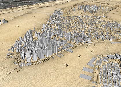
A larger version is available on Flickr. Google Earth continues to be a fantastic software product. It’s almost more of a game than an atlas or educational program…so much fun.
Related: I did a project using Google Earth called Manhattan Elsewhere and made a scrollable, zoomable version of Viele’s Map of Manhattan.
From Strange Maps, a great new blog I stumbled across the other day, comes a map originally done by the Boston Globe of the 10 regions of American politics.
Genealogy of Influence: “a graph of biographical entries at Wikipedia with connections denoting creative influence between philosophers, social scientists, writers, artists, scientists, mathematicians”. Reminds me peripherally of Simon Patterson’s The Great Bear (a print of which is hanging behind me right now).
One of the coolest little gadgets at PopTech is Onomy Labs’ Twisty Table. This one is round and it’s got a satellite map of the world projected on it. When you spin the table, the map zooms in and out and tilting the table scrolls it. Here’s a photo of the table in action at Foo Camp.
Newer posts
Older posts


Stay Connected