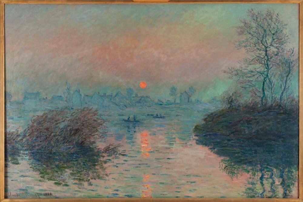
Paris Musées, a collection of 14 museums in Paris have recently made high-res digital copies of 100,000 artworks freely available to the public on their collections website. Artists with works in the archive include Rembrandt, Monet, Picasso, Cézanne, and thousands of others. From Hyperallergic:
Paris Musées is a public entity that oversees the 14 municipal museums of Paris, including the Musée d’Art Moderne de la Ville de Paris, Petit Palais, and the Catacombs. Users can download a file that contains a high definition (300 DPI) image, a document with details about the selected work, and a guide of best practices for using and citing the sources of the image.
“Making this data available guarantees that our digital files can be freely accessed and reused by anyone or everyone, without any technical, legal or financial restraints, whether for commercial use or not,” reads a press release shared by Paris Musées.
What a treasure trove this is. I was particularly happy to see a bunch of work in here from Eugène Atget, chronicler of Parisian streets, architecture, and residents and one of my favorite photographers.
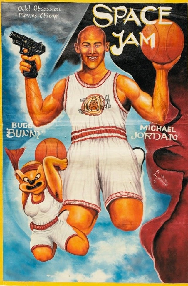
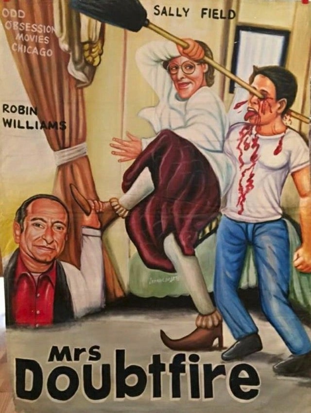
When Frank Armah began painting posters for Ghanaian movie theaters in the mid-1980s, he was given a clear mandate: Sell as many tickets as possible. If the movie was gory, the poster should be gorier (skulls, blood, skulls dripping blood). If it was sexy, make the poster sexier (breasts, lots of them, ideally at least watermelon-sized). And when in doubt, throw in a fish. Or don’t you remember the human-sized red fish lunging for James Bond in The Spy Who Loved Me?
“The goal was to get people excited, curious, to make them want to see more,” he says. And if the movie they saw ended up surprisingly light on man-eating fish and giant breasts? So be it. “Often we hadn’t even seen the movies, so these posters were based on our imaginations,” he says. “Sometimes the poster ended up speaking louder than the movie.”
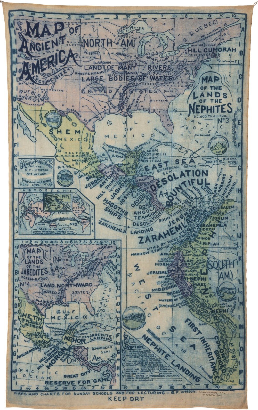
The map was an official production of the Reorganized Church of Jesus Christ of Latter Day Saints (RLDS) in Independence, Missouri. The RLDS (known since 2001 as the Community of Christ), is a reformist branch of the Church of Latter Day Saints, established in 1860.
The Book of Mormon is based on the premise that two families of Israelites escaped from Israel shortly before the sacking of Jerusalem by Nebuchadnezzar and that they constructed a ship, sailed across the ocean, and arrived in the New World as founders of Native American tribes and eventually the Polynesians. Adherents believe the two founding tribes were called Nephites and Lamanites, that the Nephites were white and practiced Christianity, and that the Lamanites were rebellious and received dark skin from God as a mark to separate the two tribes. Eventually the Lamanites wiped out the Nephites around 400 AD, leaving only dark skinned Native Americans. The descent of Native Americans from Israel is a key part of The Church of Jesus Christ of Latter-day Saints’s foundational beliefs.
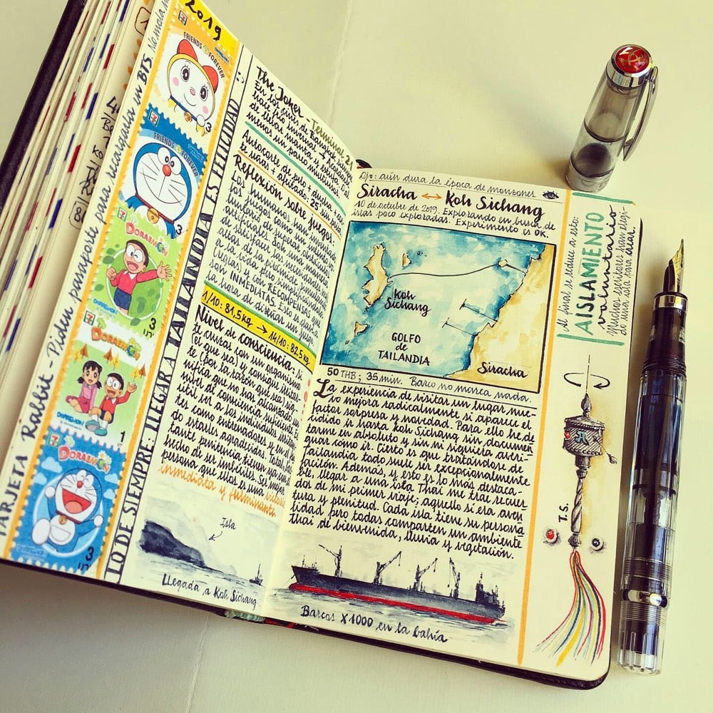
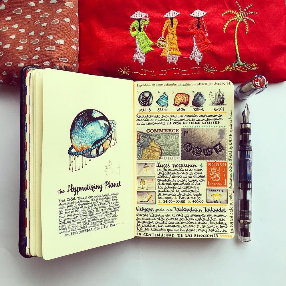
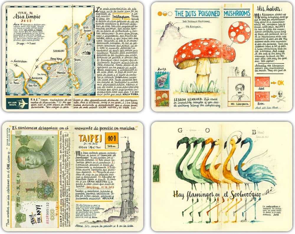
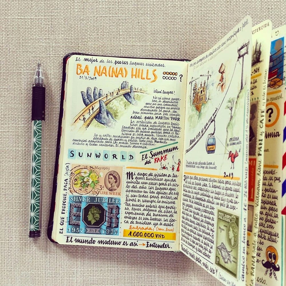
Formerly an aeronautic engineer, Naranja now archives his thoughts while visiting foreign countries by hand-crafting journals replete with items like collected stamps, an illustration of the periodic table, and a study of fountain pens. Each mixed-media page centers on a theme, such as the culture surrounding eating a bowl of ramen or the flamingos found in a zoo.
Whenever I see something like this, it makes me want to learn how to draw/paint better than my current 4th grade level.1 I spent about 45 minutes poring over his work just now. So creative & exacting…look at that handwriting! And check out the tiny box of watercolors he carries with him.
You can keep up with Naranja’s latest adventures on his blog or on Instagram. If you’d like to buy some of his art — including a bound copy of some of his notebooks — there’s a small shop. (via colossal, which is also endlessly creative & meticulous)
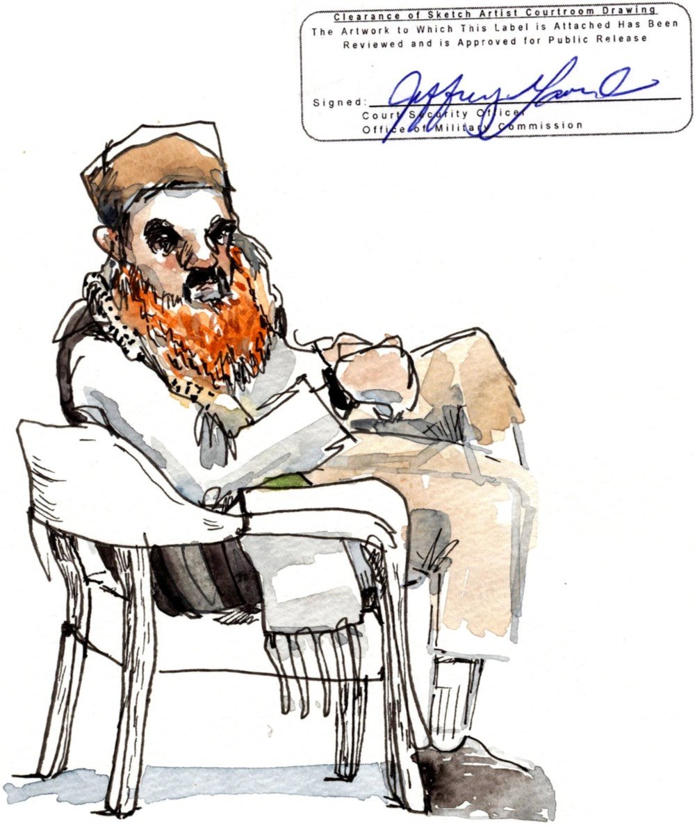
Illustrator Wendy MacNaughton spent a week at Guantánamo Bay sketching the proceedings at the 9/11 military court for this NY Times piece. In a behind-the-scenes piece, MacNaughton describes how she made the drawings, including the creative challenge posed by the restrictions and censorship enforced by US military officials.
Of the 30-something drawings I presented, Mr. Lavender shook his head at only two. The first contained some classified items in the courtroom. That made sense. The second was a handwritten list of everything that I was not allowed to draw, which I’d made to use as a reminder while working. I wanted to keep it. He refused.
I argued that the information it contained had been disclosed elsewhere. But Mr. Lavender and his supervisor came to the conclusion that my handwritten list was indeed a drawing, technically containing things I couldn’t draw. My “No” list was a no-go.
That’s Guantánamo.
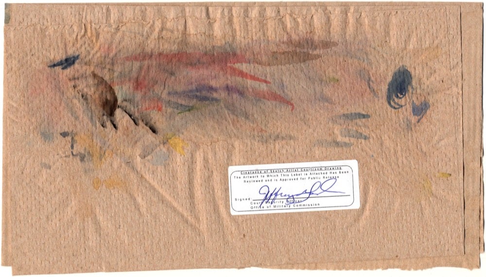
Every drawing she made needed a signed approval sticker from the court’s censor, and in this piece and on Instagram, MacNaughton didn’t photoshop the sticker out, reinforcing that the censorship is a vital part of the story she’s trying to tell. Even the paper towel she used to clean her paint brushes needed a sticker:
Check out her Instagram or Etsy shop — she does a lot of other Simpsons-based embroidery as well as Charlie Brown, The Office, Dr. Seuss, Frog & Toad, Stranger Things, and Futurama. Looks like she takes commissions via Instagram DM.
I did pretty much all the paintings except the one that’s without a face. Céline and the actresses would work out how the scene was going to go. Once that was set up, I’d come, take a photo and while they were shooting the scenes, I went to a little corner of the castle and did my sketches.
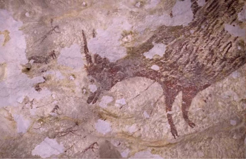
A team of archaeologists has found a massive painting in a cave in Indonesia that uranium dating analysis shows to be around 43,900 years old, which they say is “currently the oldest pictorial record of storytelling and the earliest figurative artwork in the world”.
Cave painting was assumed to have originated in Europe, but these Indonesian paintings are thousands of years older. From an NPR piece on the discovery:
Genevieve von Petzinger, a paleoanthropologist at the University of Victoria, says the discoveries in her field are happening very quickly, thanks to newer technology such as the technique used to date the hunting scene. “I think the overall theme here really is that we’ve vastly underestimated the capacity of our ancestors,” she says.
She says the oldest cave paintings in Europe and Asia have common elements. And she thinks that even older paintings will eventually be found in the place where both groups originated from.
“Personally, I think that our ancestors already knew how to do art before they left Africa,” von Petzinger says.
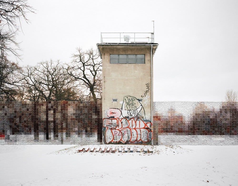
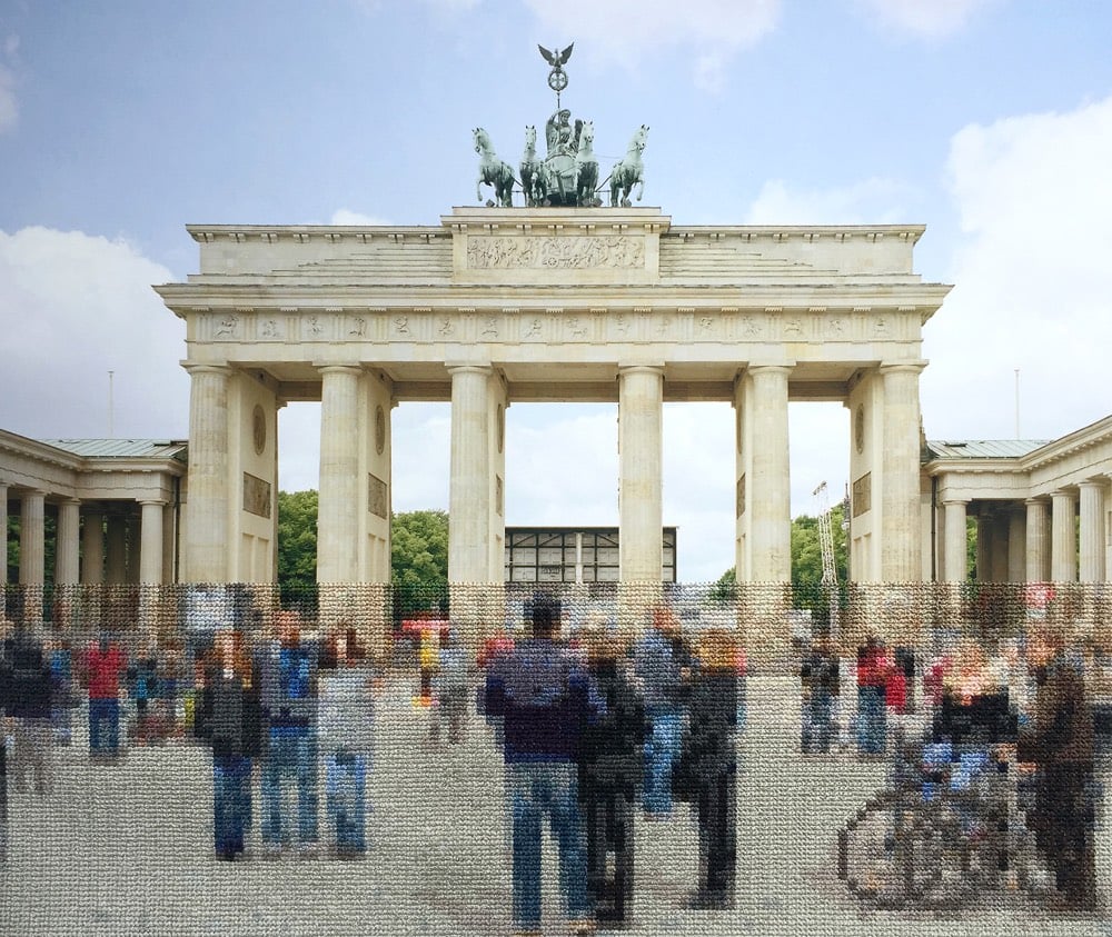
For her series called Berlin, artist Diane Meyer embroiders the Berlin Wall back into modern-day scenes of the once-divided German city. Meyer hand-sews the thread right onto the photographs.
In many images, the embroidered sections represent the exact scale and location of the former Wall offering a pixelated view of what lies behind. In this way, the embroidery appears as a translucent trace in the landscape of something that no longer exists but is a weight on history and memory.
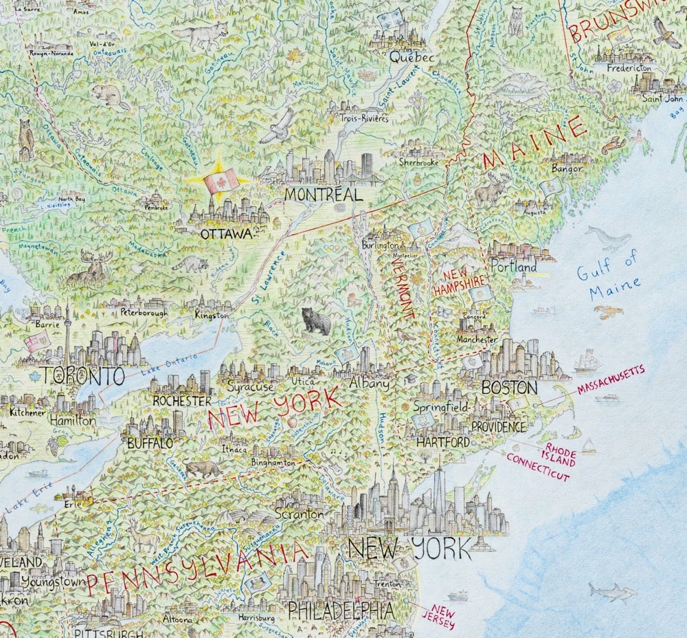
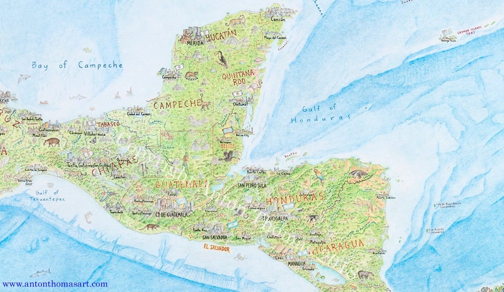
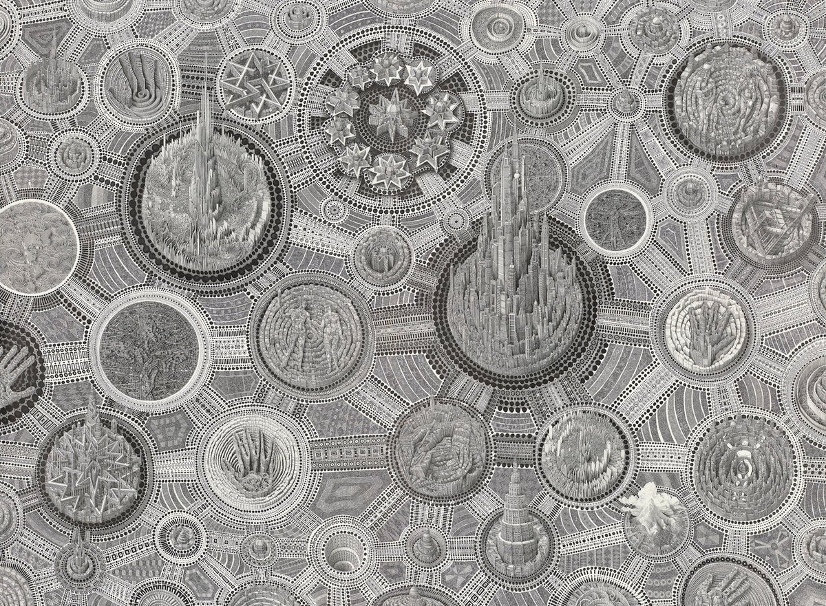
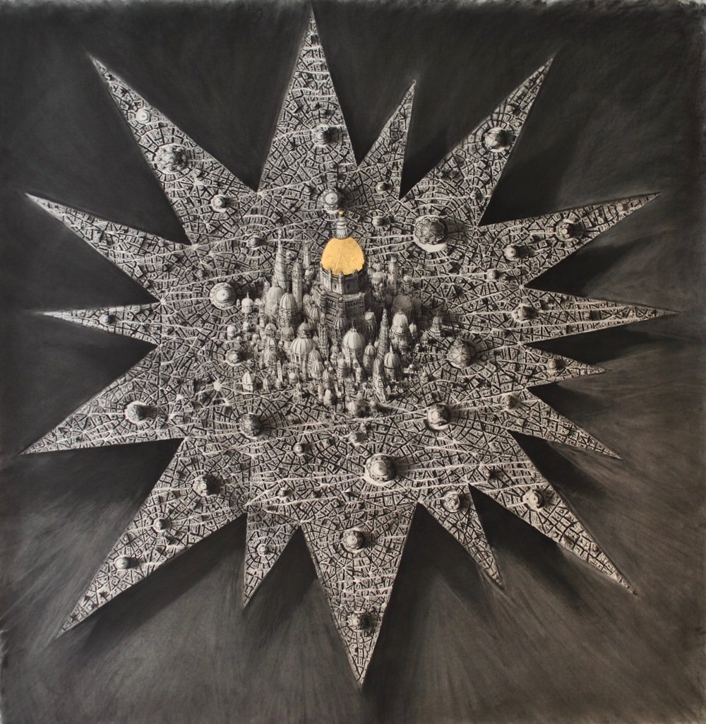
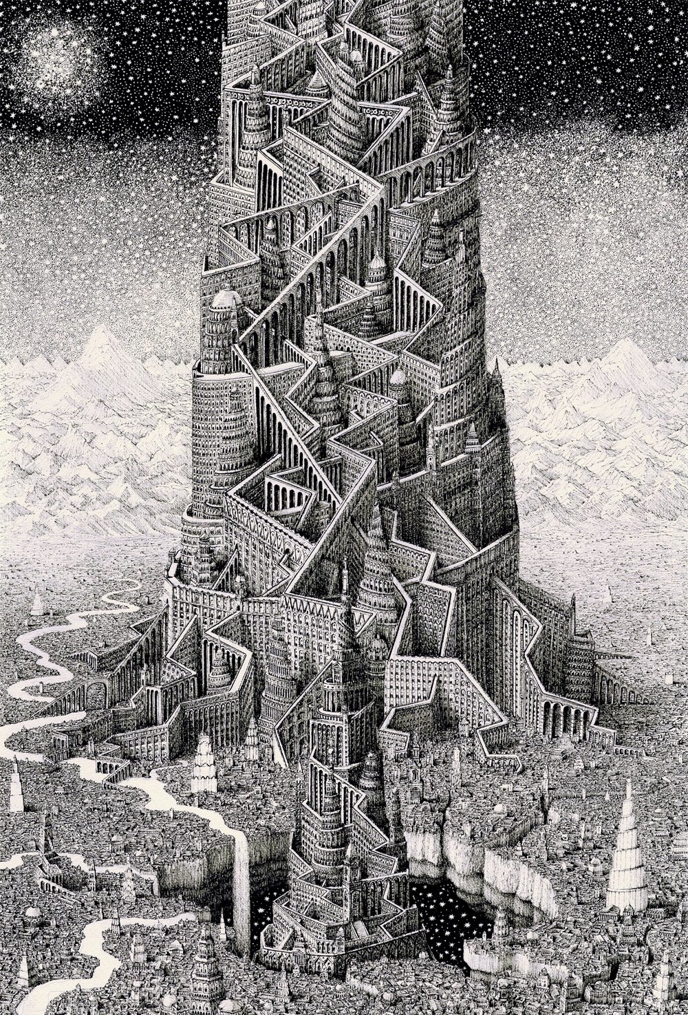
North America: Portrait of a Continent is drawn completely by hand with colour pencil and pen. It is a 5 x 4 feet (150 x 120 cm) perspective projection of the entire region, spanning from Alaska to Panama; Greenland to the Caribbean. There are tens of thousands of features, including 600 individual cities and towns.
Looks fantastic. He finished it in February and is getting ready to open pre-orders for prints sometime this month.
Update: Prints of the map are available on Thomas’ store. He also made a video tour of the Mississippi River, in which he shares what all the little details on the map signify along the river’s meandering course.
Artist Rob Kesseler is a master of the microphotography of plants and their intricately small parts (like pollen, cells, and seeds). At Colossal, Kessler says a childhood gift of a microscope set him on his way.
“What the microscope gave me was an unprecedented view of nature, a second vision,” he writes, “and awareness that there existed another world of forms, colours and patterns beyond what I could normally see.” The artist says his use of color is inspired by the time he spends researching and observing, and that just like nature, he employs it to attract attention.
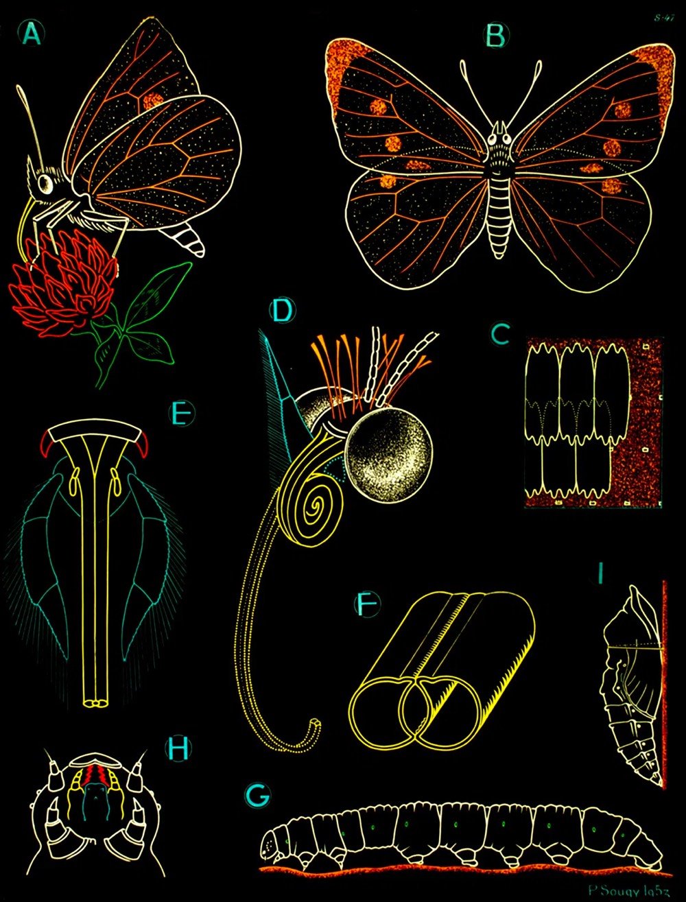
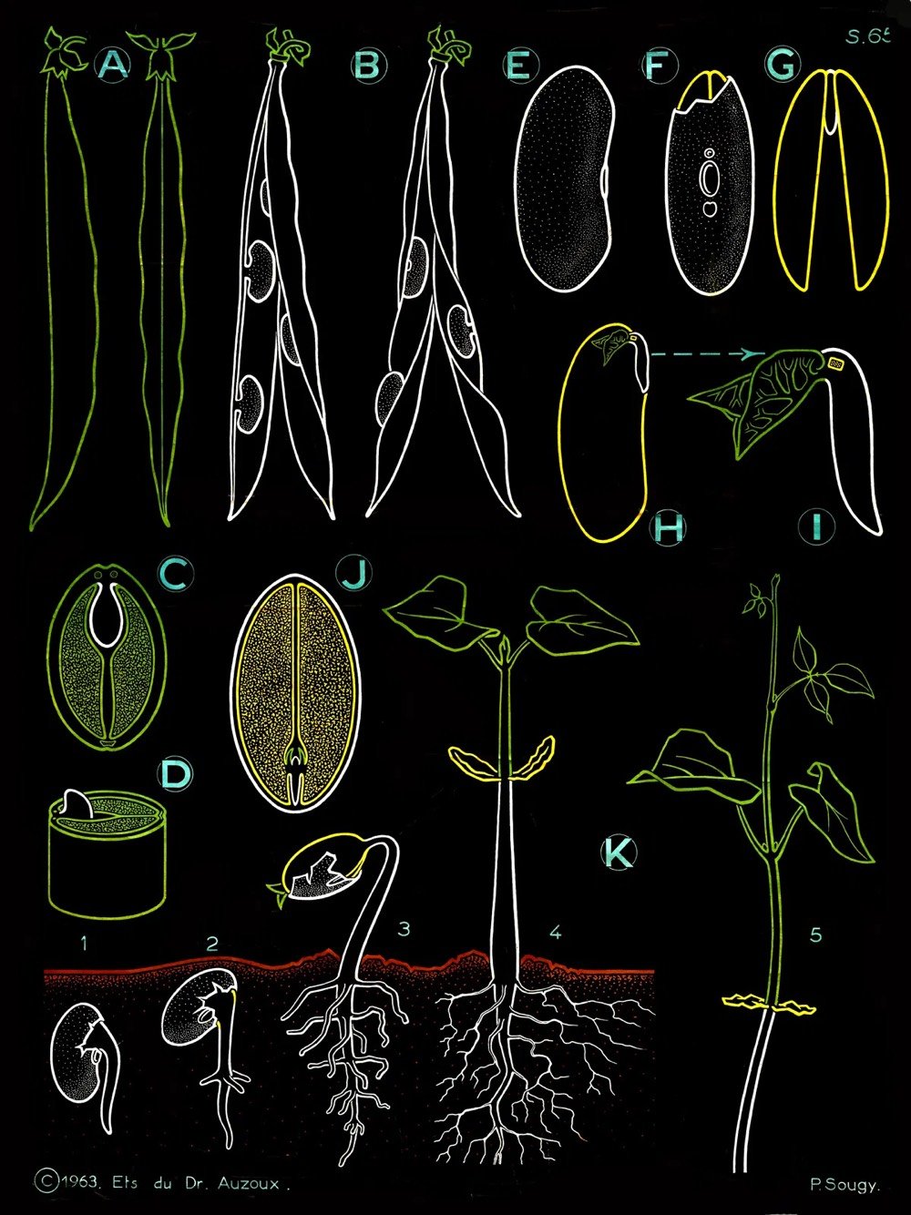
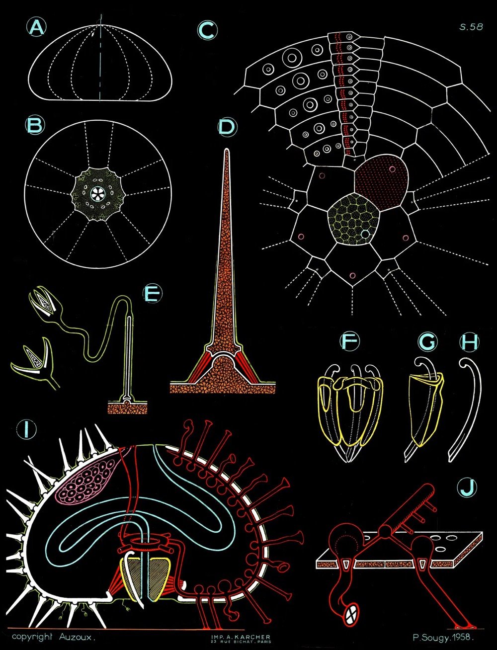
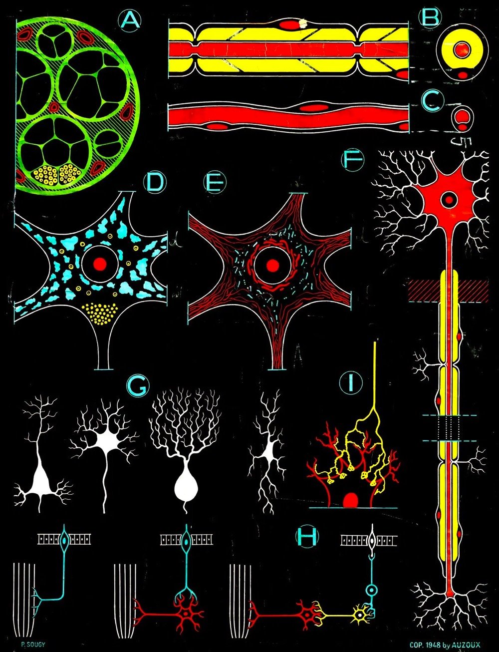
In the 1940s, Paul Sougy — a curator of natural history at the science museum of the French city of Orléans, and a gifted artist — was commissioned by the estate of the pioneering 18th-century French naturalist and anatomist Louis Thomas Jérôme Auzoux to create a series of illustrations based on Auzoux’s work, to be used in textbooks, workbooks, transparencies, and large-scale educational charts for classroom walls.
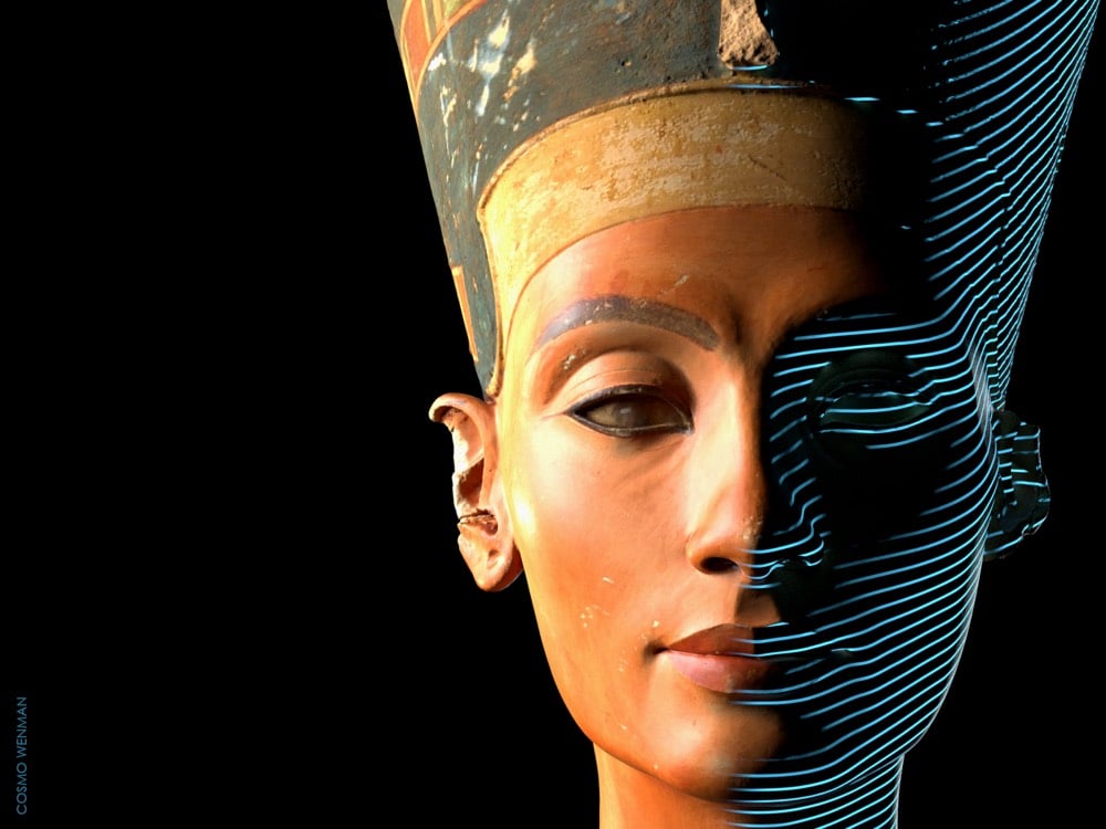
For more than a decade, museums around the world have been making high-quality 3D scans of important sculptures and ancient artifacts. Some institutions, such as the Smithsonian and the National Gallery of Denmark, have forward-thinking programs that freely share their 3D scans with the public, allowing us to view, copy, adapt, and experiment with the underlying works in ways that have never before been possible. But many institutions keep their scans out of public view.
The Louvre, for example, has 3D-scanned the Nike of Samothrace and the Venus de Milo. The Galleria dell’Accademia in Florence 3D-scanned Michelangelo’s David. The Bargello has a scan of Donatello’s David. Numerous works by Auguste Rodin, including the Gates of Hell, have been scanned by the Musée Rodin in Paris. The Baltimore Museum of Art got in on the Rodin action when it scanned The Thinker. The Metropolitan Museum of Art has scans of works by Bernini, Michelangelo, and many others. But instead of allowing them to be studied, copied, and adapted by scholars, artists, and digitally savvy art lovers, these museums have kept these scans, and countless more, under lock and key.
In Berlin, the state-funded Egyptian Museum and Papyrus Collection has a high-quality, full-color 3D scan of the most iconic portrait sculpture ever produced, the 3,364-year-old Bust of Nefertiti. It has held this artifact since 1920, just a few years after its discovery in Amarna, Egypt; Egypt has been demanding its repatriation ever since it first went on display. The bust is one of the most copied works of ancient Egyptian art, and has become a cultural symbol of Berlin. For reasons the museum has difficulty explaining, this scan too is off-limits to the public.
Rather, it was off-limits. I was able to obtain it after a 3-year-long freedom of information effort directed at the organization that oversees the museum.
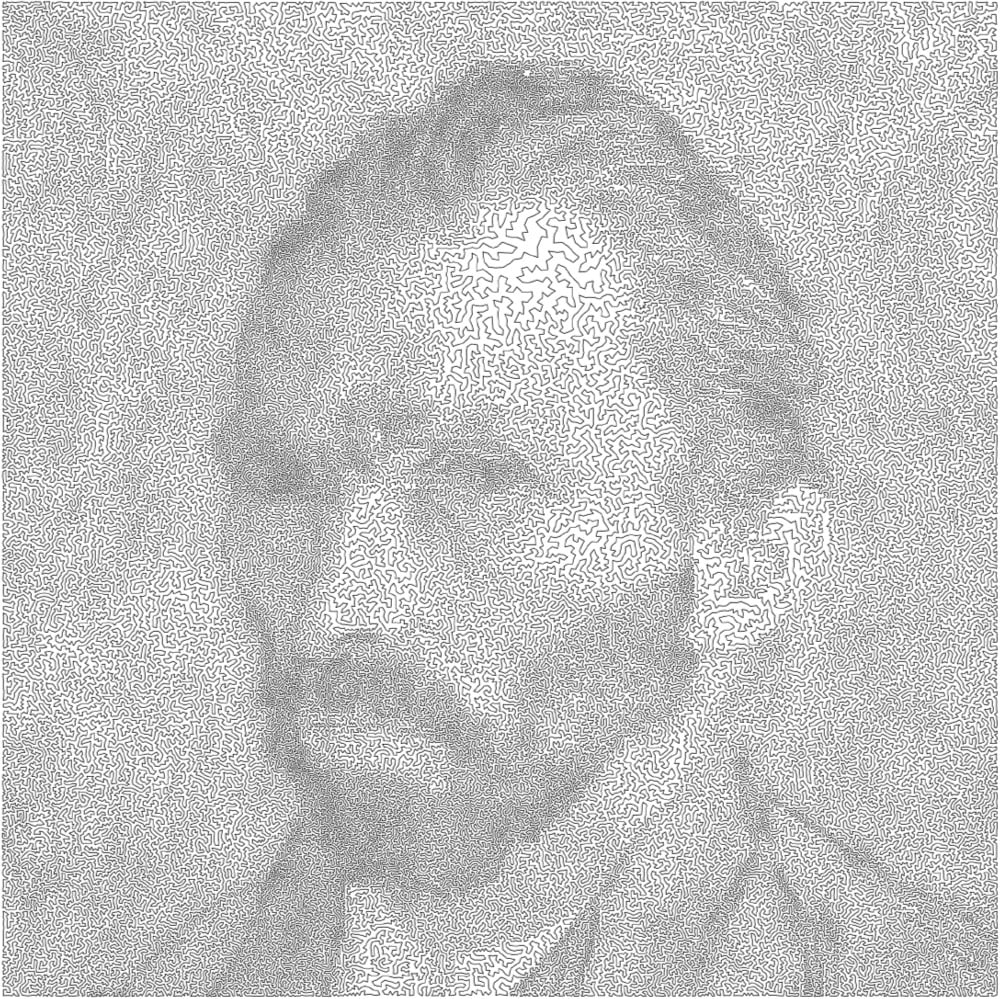
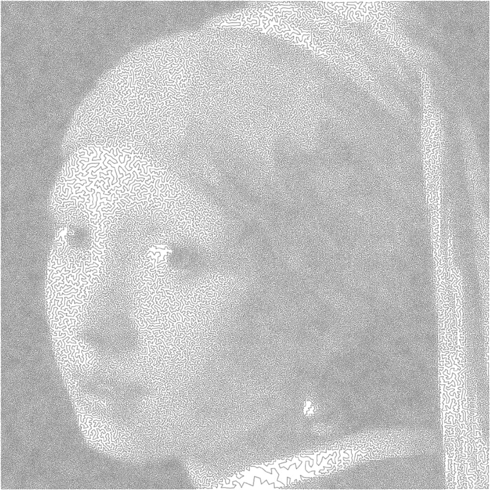
All art is bounded by one constraint or another. Mathematician Robert Bosch makes what he calls “optimization art”, which is best embodied by theseimages produced as solutions to the travelling salesman problem. Each image is made up of a continuous line that is the shortest possible route through a series of points without revisiting any single point, much like the optimal route of a travelling salesperson visiting cities. The rendition of a van Gogh self-portrait uses a solution for 120,000 “cities” while the single line forming the Girl with the Pearl Earring visits 200,000 cities.
I would love to see an Observable notebook where you could upload any photo to make images like these. (via @Ianmurren)
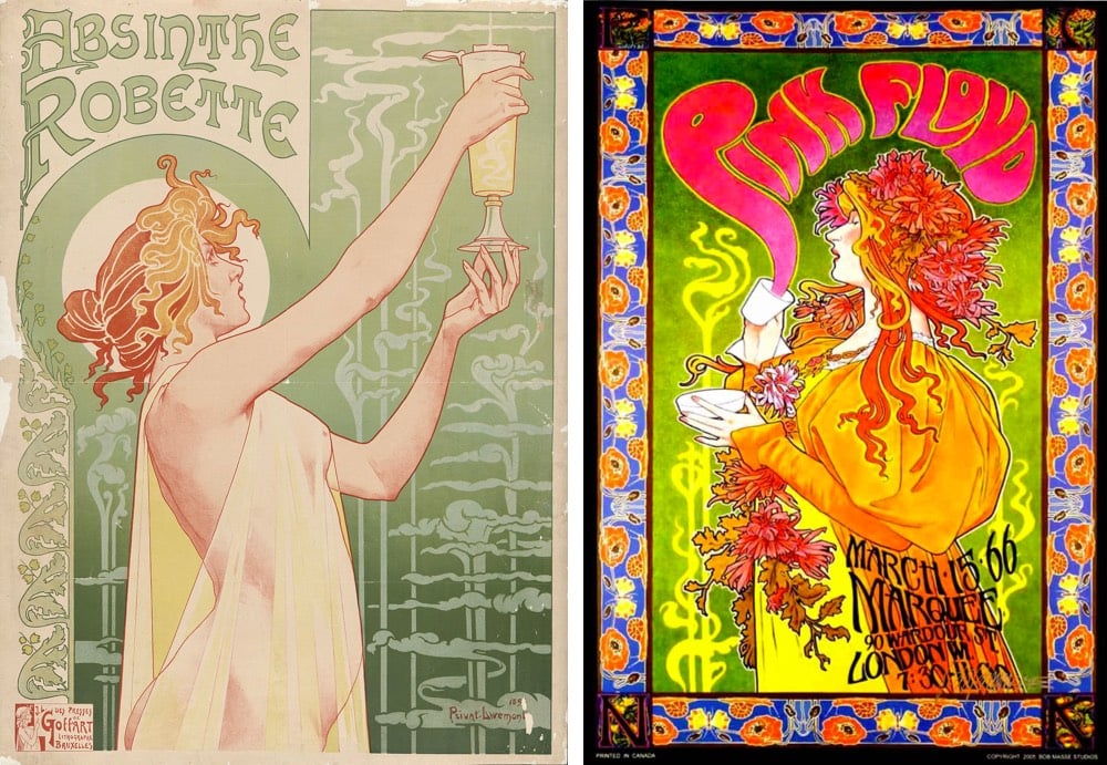
I had somehow never registered this before, but it was (ridiculously) obvious once it was pointed out to me in this video: the psychedelic design of music posters in the 60s were inspired in part by the Art Nouveau movement of the late 1800s. For instance, here’s an absinthe advertisement from the 1890s and a 1966 Pink Floyd poster.
“You can draw a straight line between Art Nouveau and psychedelic rock posters,” Martin Hohn, president of the Rock Poster Society, says. “Mucha, Jules Chéret, Aubrey Beardsley. Borrow from everything. The world is your palette. It was all meant to be populist art. It was always meant to be disposable.” He later adds: “What the artists were saying graphically was the same thing the rock bands were saying musically.”
At the end of the day, our job as artists is to tell the truth as we see it. If telling the truth is an inherently political act, so be it. Times may change and politics may change, but if we do our best to tell the truth as specifically as possible, time will reveal those truths and reverberate beyond the era in which we created them. We keep revisiting Shakespeare’s Macbeth because ruthless political ambition does not belong to any particular era. We keep listening to Public Enemy because systemic racism continues to rain tragedy on communities of color. We read Orwell’s 1984 and shiver at its diagnosis of doublethink, which we see coming out of the White House at this moment.
In a 1969 piece, Kurt Vonnegut asserted that art is an early warning system for society:
I sometimes wondered what the use of any of the arts was. The best thing I could come up with was what I call the canary in the coal mine theory of the arts. This theory says that artists are useful to society because they are so sensitive. They are super-sensitive. They keel over like canaries in poison coal mines long before more robust types realize that there is any danger whatsoever.
I’ve always had difficulty believing that the work I do here is in some way important to the world and since the election, that feeling has blossomed into a profound guilt-ridden anxiety monster. I mean, who in the actual fuck cares about the new Blade Runner movie or how stamps are designed (or Jesus, the blurry ham) when our government is poised for a turn towards corruption and authoritarianism?
I have come up with some reasons why my work here does matter, at least to me, but I’m not sure they’re good ones. In the meantime, I’m pressing on because my family and I rely on my efforts here and because I hope that in some small way my work, as Webb writes, “is capable of enabling righteous acts”.
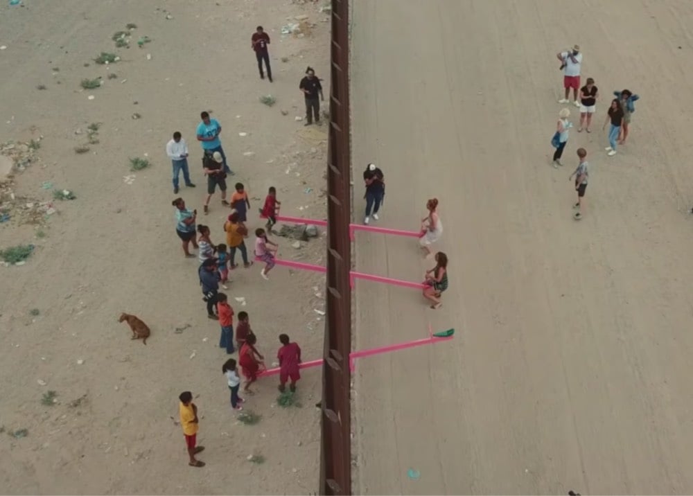
You may remember the Border Wall Seesaw implemented by activist architects Ronald Rael and Virginia San Fratello earlier this year; they installed seesaws through the US/Mexico border wall, enabling people from both countries to play together on them.
This short documentary called Borderlands follows Rael to three communities along the wall — San Diego & Tijuana, Brownsville & Matamoros, El Paso & Juárez (where he installed the seesaws) — where the connections between the US & Mexican sides persist and flourish despite their artificial separation.
Rael is well aware that, not too long ago, the boundary between the United States and Mexico, which is now delineated by more than seven hundred miles of fencing, was an open frontier, dotted with stone monuments. His book “Borderwall as Architecture” makes clear that the billions of dollars the U.S. government has spent on curbing migration and enhancing border security have done little to deter those intent on crossing by foot, using wooden ladders and ramps, or through tunnels. Decades of flawed policies suggest that the building of a grand wall is entirely divorced from the reality on the ground.
See also Best of Luck With the Wall, Josh Begley’s satellite image tour of the wall from the Pacific to the Gulf.
Ok, this post doesn’t have anything to do with boy detective Encyclopedia Brown…I just needed him for the title. In the NY Times, art critic Jason Farago argues that in order to improve the visitor experience at the Louvre, the Mona Lisa and her smile have got to go.
Yet the Louvre is being held hostage by the Kim Kardashian of 16th-century Italian portraiture: the handsome but only moderately interesting Lisa Gherardini, better known (after her husband) as La Gioconda, whose renown so eclipses her importance that no one can even remember how she got famous in the first place.
Some 80 percent of visitors, according to the Louvre’s research, are here for the Mona Lisa — and most of them leave unhappy. Content in the 20th century to be merely famous, she has become, in this age of mass tourism and digital narcissism, a black hole of anti-art who has turned the museum inside out.
Enough!
I visited the Louvre back in 2017 and the Mona-driven crowds were very distracting. I wrote a short review for my media diet:
The best-known works are underwhelming and the rest of this massive museum is overwhelming. The massive crowds, constant photo-taking, and selfies make it difficult to actually look at the art. Should have skipped it.
The Louvre is actually not a good place to look at art and if moving the Mona Lisa to a dedicated gallery elsewhere can help solve that problem, they should do it. (via @fimoculous)
“I’m pragmatic,” Mr. Glass said. “I don’t know what’s going to happen in 10 years. We don’t even get to know what’s going to happen after someone dies. We need to wait until everyone who knew them is dead, too.”
If that’s true, it won’t be until nearly 2100 when a full measure of Mr. Glass’s footprint will be possible. But some weighing can start now. The most instantly recognizable voice in contemporary music, he opened a new chapter in operatic history, pushing the bounds of duration and abstraction. At a time when the most lauded composers disdained overproduction, Mr. Glass wrote unashamedly for everyone and everything — and all stubbornly in the distinctive style he created, establishing a model for serious artists moving from the opera house to the concert hall to the film studio, garnering both Met commissions and Academy Award nominations.
But if the question is whether, a century from now, his operas will get new productions, his symphonies will circulate more frequently, or pianists will take on his études, Mr. Glass couldn’t care less.
“I won’t be around for all that,” he said. “It doesn’t matter.”
I like this idea of thinking about lineage vs. legacy, because it means you can sort of reframe any worrying about immortality and how you’re going to project yourself into the future, and think more about what you’re taking from the past and what you’re adding to it that creates a more interesting and helpful present.
“Over many years my interest in architecture and cityscapes has evolved.” [These pieces have] “become a way and means of expressing the infinite, playing with perspective and exploring a range of histories, cultures, places.”
There’s growing visibility and demand for the work of female artists of the Renaissance and Baroque periods, from The Museo Nacional del Prado showcasing the work of Sofonisba Anguissola and Lavinia Fontana as part of its 200th anniversary programming, to Sotheby’s achieving record-breaking prices for female Old Masters, to D.C.’s National Museum of Women in the Arts current “Women Artists of the Dutch Golden Age.”
Anguissola was a celebrated portraitist in the late 16th and early 17th centuries whose fame earned her a place as a lady-in-waiting to Isabel de Valois at the court of King Philip II of Spain. Fontana worked around the same time in Rome and Bologna, disregarding the limits of genres imposed on her sex, even painting from the nude—a practice from which women were generally excluded at the time.
As often happens when trying to right some imbalances, it starts with breaking the loop of being too unknown to be featured but needing to be exhibited to become known.
Art historian Katlijne Van der Stighelen first rediscovered the Baroque painter Michaelina Wautier in the 1990s, but found it impossible to get support for an exhibition as museums would not risk gambling on an unknown artist. It was not until the Flanders tourism department decided to invest heavily in a three-year exhibition program, beginning in 2018 with Peter Paul Rubens and Baroque painting, that she finally got her chance.
Until of course someone finally “takes a chance” only to find out that yes, there is a thirst for more diversity of voices in all domains.
The response exceeded anything Van der Stighelen or MAS could have hoped for. Both the national and international press were attracted by the “surprise element” of an artist so technically accomplished, yet completely unknown. By the time the show came down in September 2018, some 40,000 visitors had seen it—about four times the usual number for a summer show at MAS, according to Van der Stighelen.
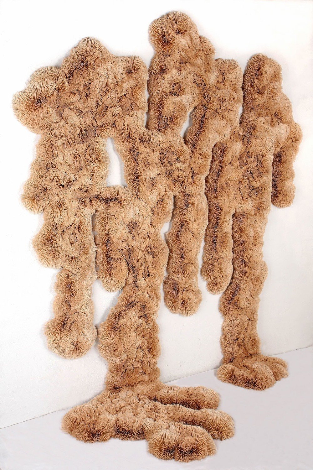
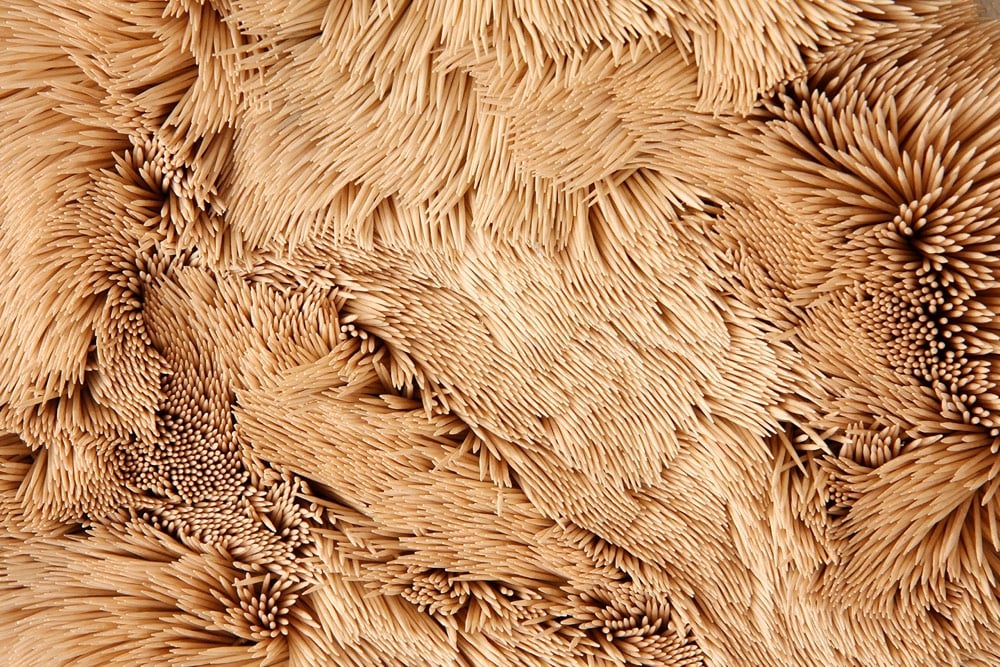
Artist Chris Soal makes these shaggy-looking sculptures out of thousands of toothpicks. Here’s a closeup of one of his works, where you can see the whorls created by the toothpicks:
In a recent episode of The Art Assignment, they make the case for Impressionism.
The arrival of photography had also revealed new ways of framing images, suggesting the possibility of unbalanced, snapshot-like compositions, long before cameras would reach snapshot size and speed. Some have theorized that now that photography could capture reality so well, painting was then freed from the shackles of realism and could do what paint does best, which is being colorful and tactile, and you know, painty.
This new kind of art also involved more women and represented them in new ways. Berthe Morisot participated in all but one of the Impressionist exhibitions, and gave us remarkable views into the domestic sphere and lives of well-to-do women. Mary Cassatt joined the ranks as well, and became known for depicting women and children as well as her own family. Women of a variety of classes were subjects for the Impressionists, and not just nude and lying on a bed anymore, but shown doing the things they actually do, in the home as well as out in the world, enjoying Paris’s nightlife, and also being it.
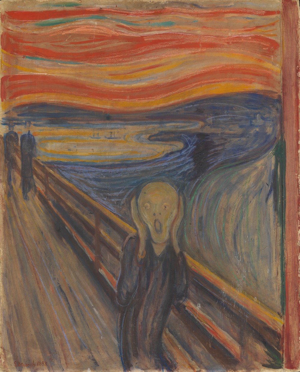
Ever since I read this tweet the other day, I can’t unsee Munch’s The Scream as a painting of a spaniel dog. (The tweet’s photo has been doctored but I can still see it in the original above.)
Have we considered that it’s possible that Munch was just trying to paint a spaniel, but he was a bit shit, and then people got excited about it so he went along with it?
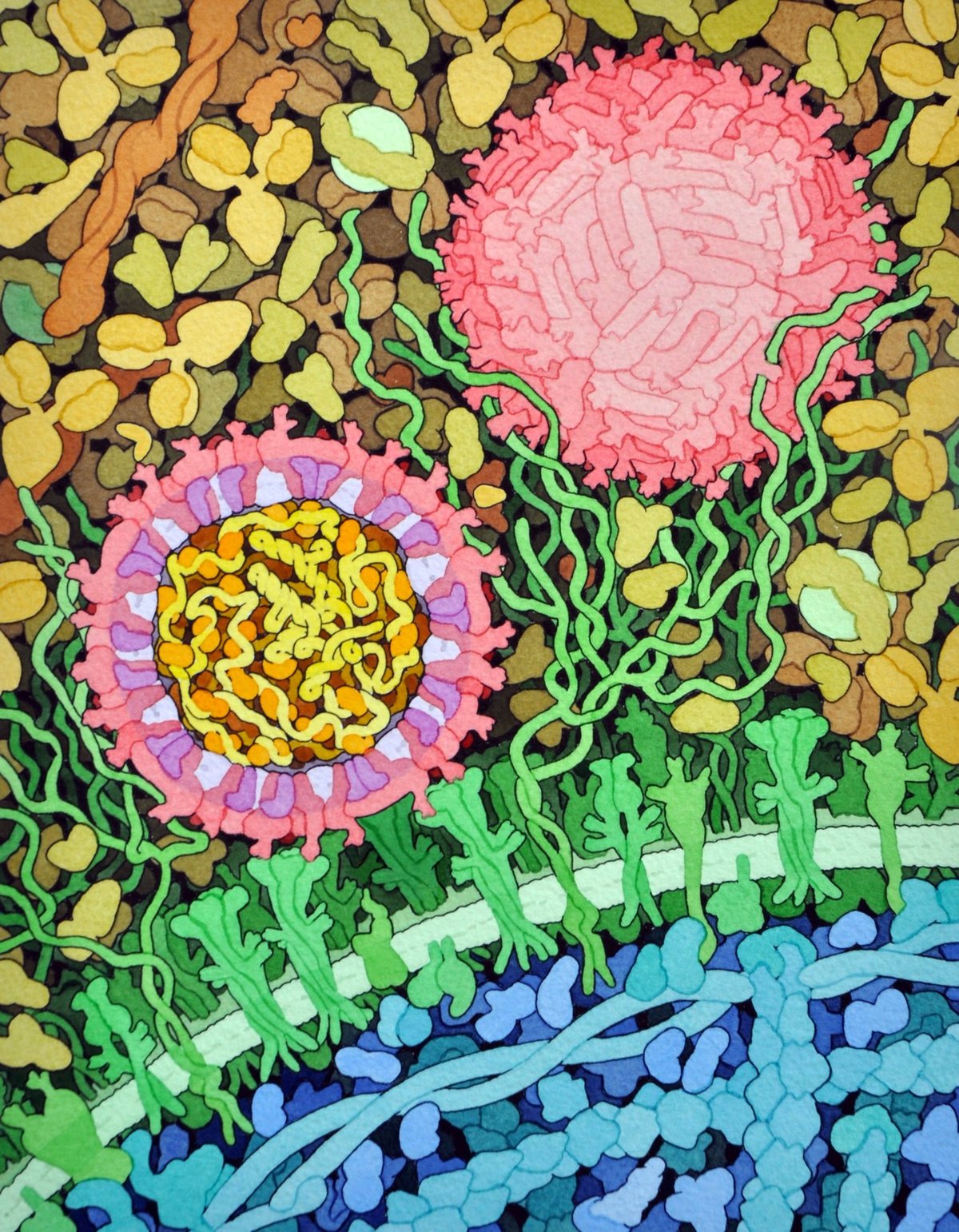
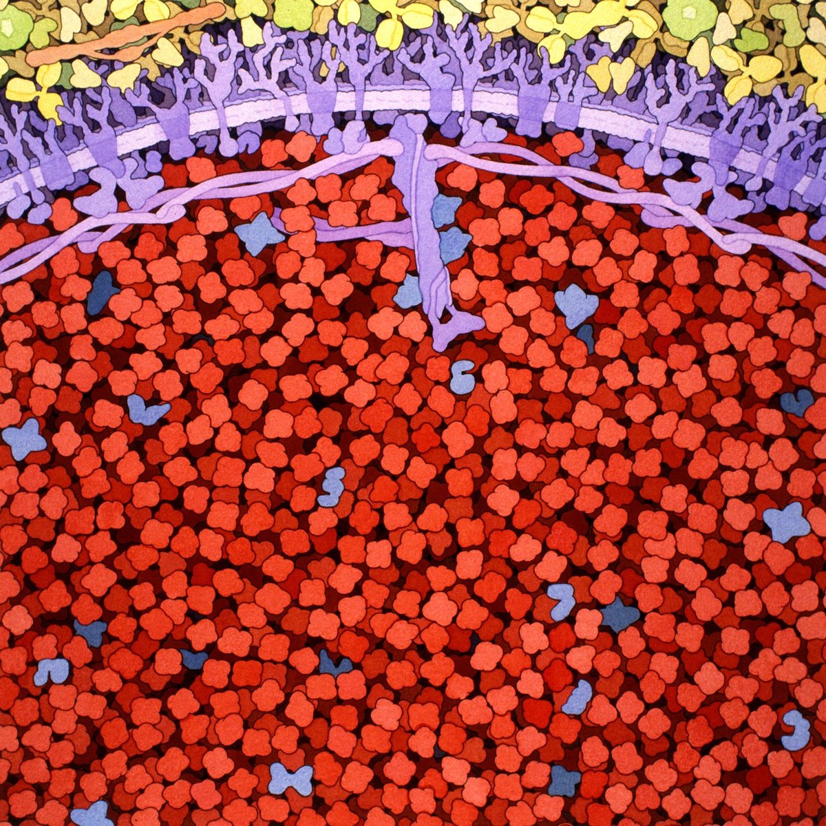
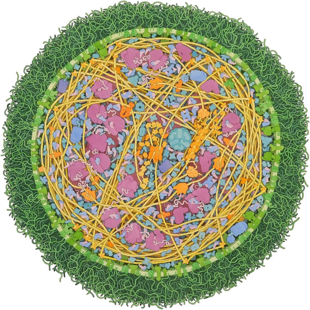
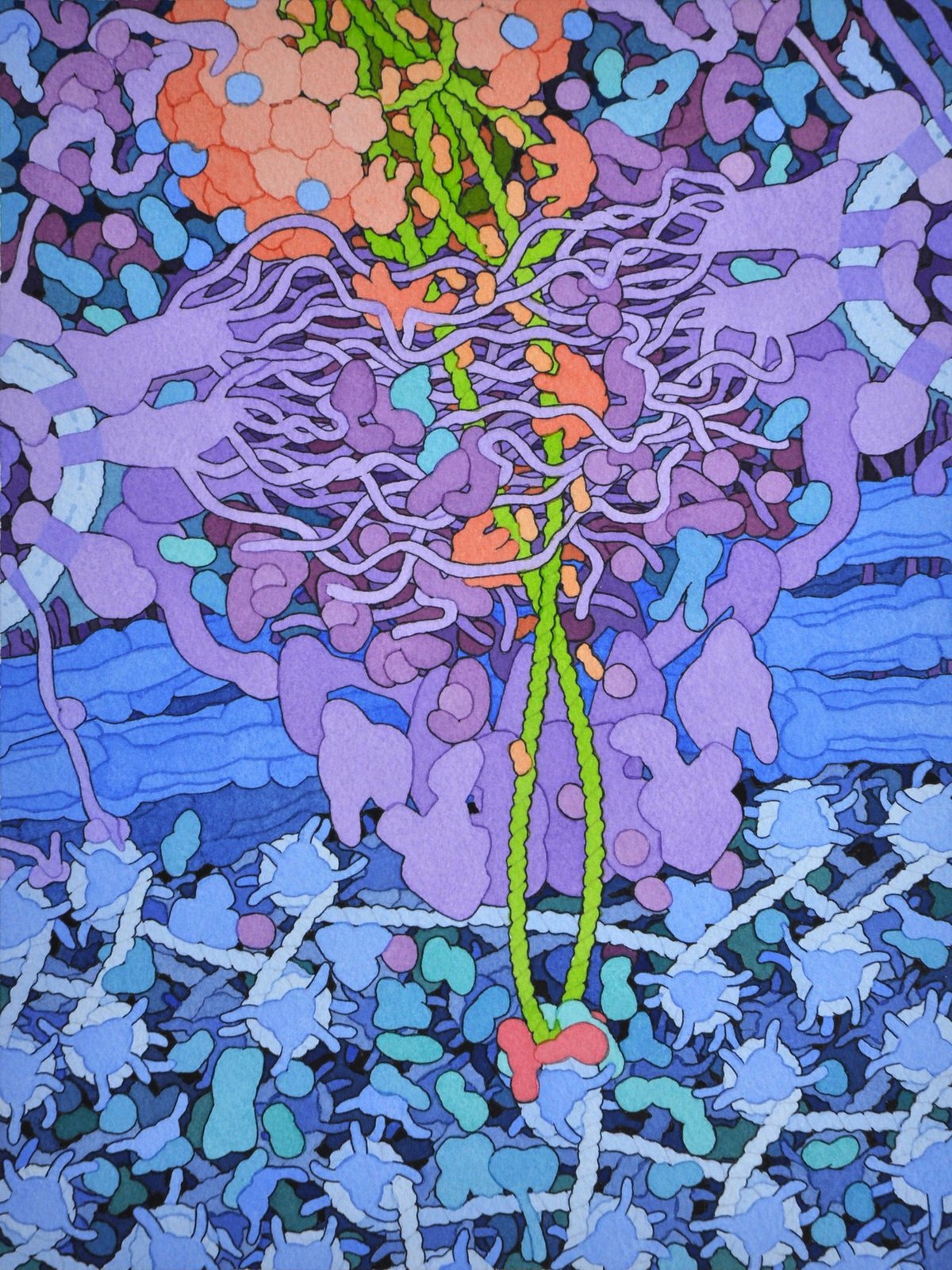
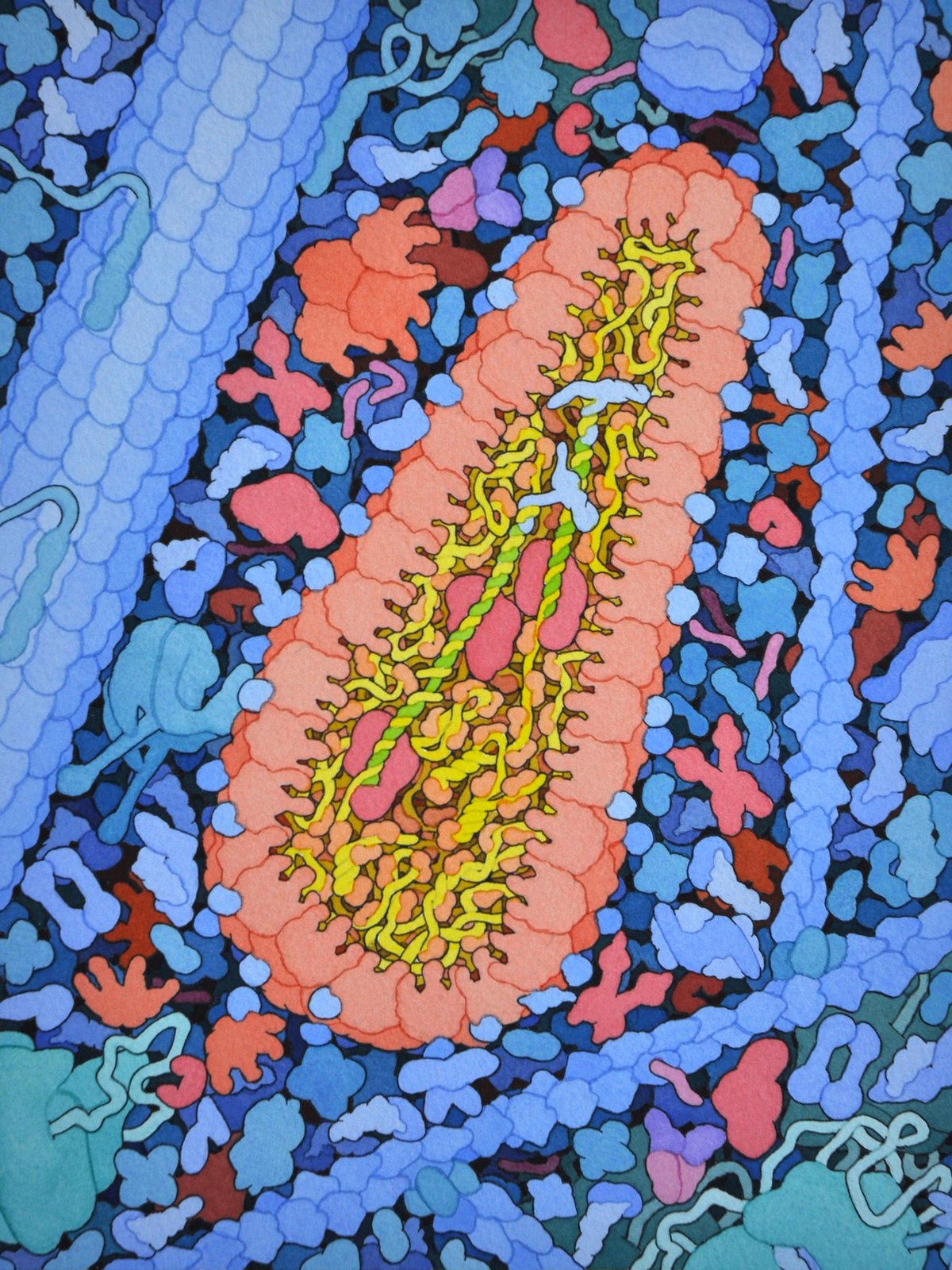
For more than 25 years, biologist David Goodsell has been making scientifically accurate paintings and illustrations of the molecular structures of things related to HIV, cancer cells, ebola, Zika, diabetes, proteins, enzymes, and hundreds of other scientific and medical processes.
Since the early 1990s, I have been working with a type of illustration that shows portions of living cells magnified so that you can see individual molecules. I try to make these illustrations as accurate as possible, using information from atomic structure analysis, electron microscopy, and biochemical analysis to get the proper number of molecules, in the proper place, and with the proper size and shape.
In addition to studying pictures of cells from high-powered microscopes, Goodsell relies on molecular structures from electron microscopy (EM), x-ray crystallography, and nuclear magnetic resonance spectroscopy to make his paintings, which show the often crowded and complex world of cells and the microbes that infect them. He even uses the known weights of molecules if that’s all he has so that he can at least draw, say, a correctly sized circle. “I’m a scientist first,” he says. “I’m not making editorial images that are meant to sell magazines. I want to somehow inform the scientists and armchair scientists what the state of knowledge is now and hopefully give them an intuitive sense of how these things really look — or may look,” he says.
May look?
“These pictures have tons and tons and tons of artistic license,” he says. “They’re just one snapshot of something that’s intrinsically superdynamic. Every time I do a painting, the next day it’s out of date because there’s so much more data coming out.”
Here’s a quick video profile as well:
All images are by David S. Goodsell, the Scripps Research Institute. (via alexandra kammen)


Stay Connected