Futurama’s Planet Express in Hell’s Kitchen
According to Bender’s Game (good title!), a direct-to-DVD Futurama movie, the Planet Express HQ is located in Hell’s Kitchen right on the Hudson.


This site is made possible by member support. 💞
Big thanks to Arcustech for hosting the site and offering amazing tech support.
When you buy through links on kottke.org, I may earn an affiliate commission. Thanks for supporting the site!
kottke.org. home of fine hypertext products since 1998.
According to Bender’s Game (good title!), a direct-to-DVD Futurama movie, the Planet Express HQ is located in Hell’s Kitchen right on the Hudson.
The 2008 election voting patterns in the southern United States followed the big cotton production areas in 1860 which in turn followed the shoreline of the shallow tropical seas that covered the southern part of the US 85 million years ago.
This is not a political blog. However, this is a story I couldn’t pass up: the story of how voting patterns in the 2008 election were essentially determined 85 million years ago, in the Cretaceous Period. It’s also a story about how soil science relates to political science, by way of historical chance.
Headline I’d like to see in 96 pt. type in the NY Times: Obama Elected By Rich Loamy Soils of Cretaceous Seas.
Alex Tabarrok proposes that now is a good time for the US government to form the Buffalo Commons, a huge nature preserve in the western US.
The western Great Plains are emptying of people. Some 322 of the 443 Plains counties have lost population since 1930 and a majority have lost population since 1990. Now is the time for the Federal government to sell high-priced land in the West, use some of the proceeds to deal with current problems and use some of the proceeds to buy low-priced land in the Plains creating the world’s largest nature park, The Buffalo Commons.
According to this map, the US government owns more than 50% of the land in some western states (Nevada 84.5%, Utah 57.4%, Oregon 53.1%, Arizona 48.1%, California 45.3%).
Alternate Manhattan maps, #510 in an infinite series: map of where the Marvel comic book characters hang out in the city.
Update: And of course, fans have made even better, more detailed maps. (thx, sam)

Obamaland

McCainland
I think it works much better when it’s all together, don’t you?
I added 16 new maps to the 2008 Election Maps page in what is probably the final update. Big thanks to everyone who sent in maps.
Flickr is getting slammed right now (I’m getting a lot of “hold your clicks” messages) because of the behind-the-scenes election night photos the Obama campaign put up yesterday. Maybe bookmark and come back in a few hours?
I’ve updated the post about the NY Times’ use of 96-pt type for their Obama headline. They’ve used the big type at least one additional time, on 1/1/2000.
Kristen Borchardt made an awesome video that takes a number of Nov 5th newspaper front pages and animates through them using each papers’ Obama photo as the focal point…very much like YTMND’s Paris Hilton doesn’t change facial expressions.
I’ve also updated the election headlines post with a few more collections that popped up.
Hopefully I’ll have some time this afternoon to update the 2008 Election Maps page; I’ve got lots of good submissions waiting in my inbox. Thanks to everyone who sent in links and screenshots.
Idea for the Obama administration: fireside chats. On the radio, on satellite radio, as a podcast, transcripts available online soon after airing. Done live if possible, a genuine lightly scripted chat. Maybe Obama could have special guests on to talk about different aspects of policy and government. Bush does weekly radio addresses but they’re short, boring, and scripted.
Newsweek has posted the rest of their seven-part piece on the 2008 election: part four, part five, part six, part seven. I wrote about the first three installments yesterday.
More related stuff on kottke.org: the barackobama, 2008election, and politics tags.
And I gotta tell you, if change.gov is indicative of how the Obama administration is going to use the web to engage with Americans, this is going to be an interesting four years.
Ok, that’s probably the last Obama post for a bit. Back to your irregularly unscheduled programming.
I added ten more maps to the 2008 Election Maps page, including one drawn on a dry erase board.
Last night as the election results were coming in online, I took screenshots of a bunch of the now-familiar red/blue electoral maps being used by the larger media sites to show election results and posted them all on this page. (There are currently 25 maps…I’m adding more in a few minutes.)
Hit me on my burner if you run across any others. A couple of quick notes:
1. No one strayed from the red and blue. The red/blue combo is overwhelmingly symbolic but there are plenty of other colors in the crayon box; I would like to have seen someone try something different.
2. In the 2000 and 2004 elections, the red/blue map was the focal point of the media coverage. People were fixated by it. This time around, it didn’t matter so much. The maps were interesting for 3-4 hours until the overwhelming nature of Obama’s victory became apparent and then, not so much. By this morning, the maps are already shrinking or disappearing from the home pages of the Times, CNN, and the like.
3. Nate Silver and the rest of the 538 guys nailed it. They got Indiana wrong and there are a couple more states that are still too close to call, but they got the rest of the map right. Their final projection had Obama getting 348.6 electoral votes and they currently have him at 349.
Flickr has enough geographically tagged photographs — 90+ million — that they are able to reverse engineer from them the shapes of continents, countries, cities, and neighborhoods.
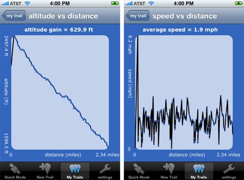
When we were up in Vermont earlier this month, we rode the single chair to the top of the mountain at Mad River Glen and then hiked down. Before we left, we installed iTrail on Meg’s phone. iTrail uses the iPhone’s GPS capability to track your progress along a trail, jogging path, etc. The reviews at the iTunes Store aren’t glowing but we found that it worked pretty well for us. Here are a couple of graphs generated by iTrail of our hike:
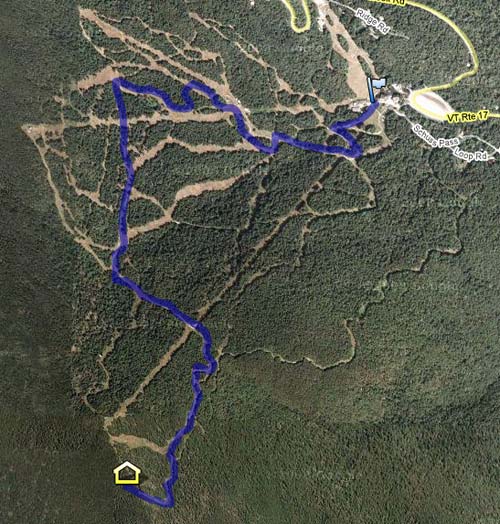
iTrail also allows data export to a Google Docs speadsheet. From there, you can import that data into Google Maps, like so:
It’s not perfect (we weren’t doing 8.2 mph at the beginning of the hike) and GPS mapping apps are hardly new, but I’ve never done this before and it feels like living in the future.
SNL’s Fred Armisen shows off his interactive touchscreen skills on some political maps of the US.
Check out Michigan…I can make it bounce.
Nice commentary on TV news anchor busywork. See also Anderson Cooper’s magic pie chart. (And sorry, Hulu = US viewers only.)
Update: For non-US viewers, here’s an alternative link that includes the clip in question and a bunch of other stuff. And please don’t yell at me for using Hulu…it’s often the only alternative and it’s relatively easy to watch outside of the US. (thx, nebel)
Wow, Google Earth is now available for the iPhone. The early reviews at the iTunes Store are mixed; looks like it’s crashing a lot. (via df)
Philip Kromer took the newspaper endorsement data from the Editor and Publisher page I linked to this morning and mapped the results. The states are colored according to FiveThirtyEight’s current projections and those newspapers with larger circulations have larger circles. From Kromer’s blog post:
This seems to speak of why so many on the right feel there’s a MSM bias - 50% of the country is urban, 50% rural, but newspapers are located exclusively in urban areas. So, surprisingly, the major right-leaning papers are all located in parts of the country we consider highly leftish. The urban areas that are the largest are thus both the most liberal and the most likely to have a sizeable conservative target audience.
Nice 25-minute documentary on the London Tube map, “the pinnacle of London Transport’s modernist design”.
Christoph Niemann shares a series of his New York City cheatsheets, including tips for getting on and off the subway at the proper points, muffin poking (you know, for checking freshness), and a door opening maneuver called “The Northside Eagle”.
Whenever I rode the subway with my two older boys, I tried to hold on to their hands at all times. In the process, I developed a special move. I think anyone who saw it must have been impressed.
I would hold the boys’ hands as we briskly made our way out of the station, then, just as we reached the turnstiles, I would let go. We would pass through the turnstiles simultaneously, and so smoothly that the boys’ hands would still be up in the air when we got to the other side, where I would grab their little fingers again in one fluid motion. (Requires practice.)
These are great fun.
Need to find a central meeting spot between two locations? Try MeetWays. It’ll even find you a restaurant for a coffee or bite. (thx, kristen)
A map of the world showing a simulation of all of the air traffic in a 24-hour period. Here’s a higher-quality video. Like Aaron Koblin’s Flight Patterns videos, only not just covering North America.
Strange Maps ran across a wristwatch-like contraption from the 1920s that holds little scrolls of paper used for navigation, an analog version of Hertz’s NeverLost and other in-car GPS navigation systems.
This fantastic contraption, called the ‘Routefinder’, showed 1920s drivers in the UK the roads they were travelling down, gave them the mileage covered and told them to stop when they came at journey’s end. The technology — a curious cross between the space age and the stone age — consisted of a little map scroll inside a watch, to be ‘scrolled’ (hence the word) as the driver moved along on the map. A multitude of scrolls could be fitted in the watch to suit the particular trip the driver fancied taking.
Google has added transit directions to Google Maps. Finally.
We’ve just added comprehensive transit info for the entire New York metro region, encompassing subway, commuter rail, bus and ferry services from the Metropolitan Transit Agency (MTA), the Port Authority of New York and New Jersey, New Jersey Transit and the City of New York.
One feature I’d like: a quick at-a-glance comparison of the three travel methods (walking, subway/train, driving) to see which is going to take less time.
Outside.in has launched a new feature called StoryMaps. When you sign up, they crawl your blog looking for mentions of places and then make a map of your posts. It doesn’t work so well for my site (mostly because — giggedy — kottke.org is all over the map, har har), but for sites that post about a lot of local stuff, it works pretty well. See Gothamist’s implementation, for instance. More on the outside.in blog. (Disclosure: I am an advisor to outside.in.)
Google Maps map annotated with all the places Marco Polo visited during his travels to China and back. Larger map here. (via short schrift)
New for the 2008 NFL season: the NFL TV distribution maps that tell you which football games are going to be broadcast is which parts of the country. They’re using zoomable Google Maps this year…here’s what a typical coverage map looks like:
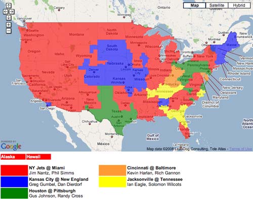
During football season in a TV market like NYC, which is dominated by coverage of two local teams (Giants and Jets), this is an essential tool for determining if you’re actually gonna get to watch the game you want to on Sunday.
Update: There’s an interview on Yahoo with the guy that runs the site, J.P. Kirby.
Here’s MSNBC’s nifty new hurricane tracker tracking Gustav bearing down on Louisiana like a shotgun full of wind and rain. Built by Stamen. (via jimray)
Kristin Armstrong, the Olympic gold medalist in the women’s individual time trial in road cycling, took a GPS unit along with her when she previewed the road course in Beijing in December 2007. When she got home to Idaho, she d/led the data, put it into Google Earth, and found a similar local loop on which to train.
This capability along with having the elevation profile proved invaluable in my preparation for my Gold Medal race.
(via matt’s a.whole)
Christoph Niemann has used some unusual image sources to tile his bathrooms. For the shower, an appropriation of Warhol’s Brillo box. For the kids bathroom, a NYC subway map.
Someone make this map, please:
It occurred to me that you could make a map — a whole book of maps — detailing all possible routes of bank robbery within the underground foundations of a city. What basements to tunnel through, what walls can be hammered down: you make a labyrinth of well-placed incisions and the city is yours. Perforated from below by robbers, it rips to pieces. The city is a maze of unrealized break-ins.
Good Magazine has a nice little map feature on some of the world’s greatest journeys, including Magellan’s circumnavigation, the old Silk Road, and Around the World in 80 Days. (via justin blanton)
Stay Connected